The following is purely a fun exercise for a highly hypothetical scenario. I’m posting it more as an illustration of thought process, and not really in advocacy of the proposal itself. (There are many things I would prioritize above an Urban Ring LRT station in the Seaport!)
The scenario
Let’s assume a few things are true for this scenario:
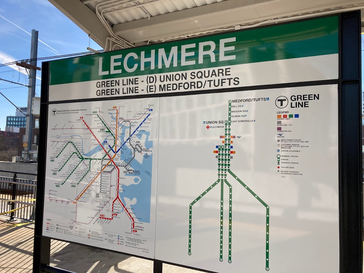
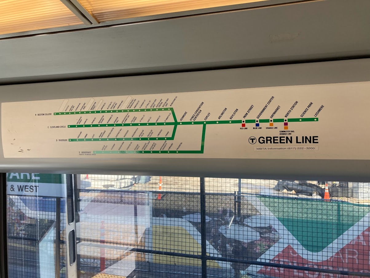
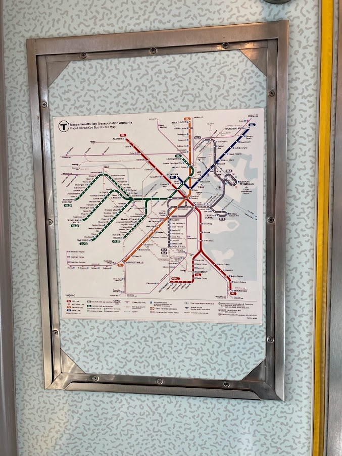
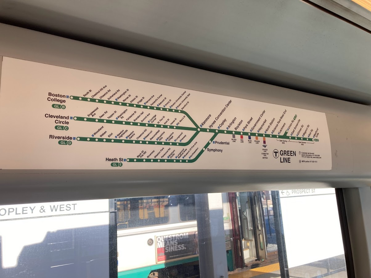
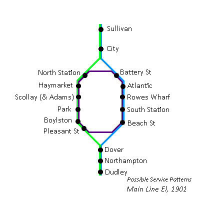
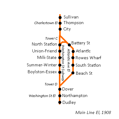
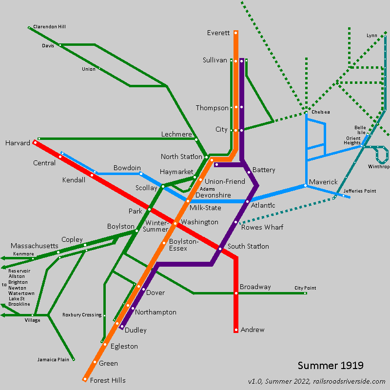
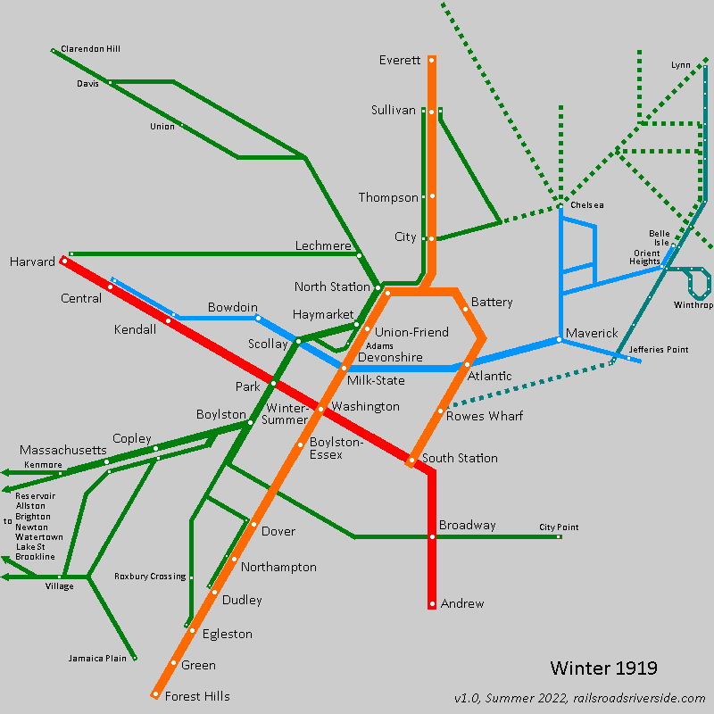
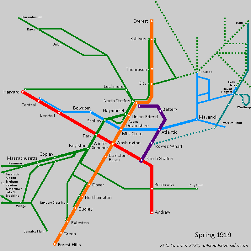
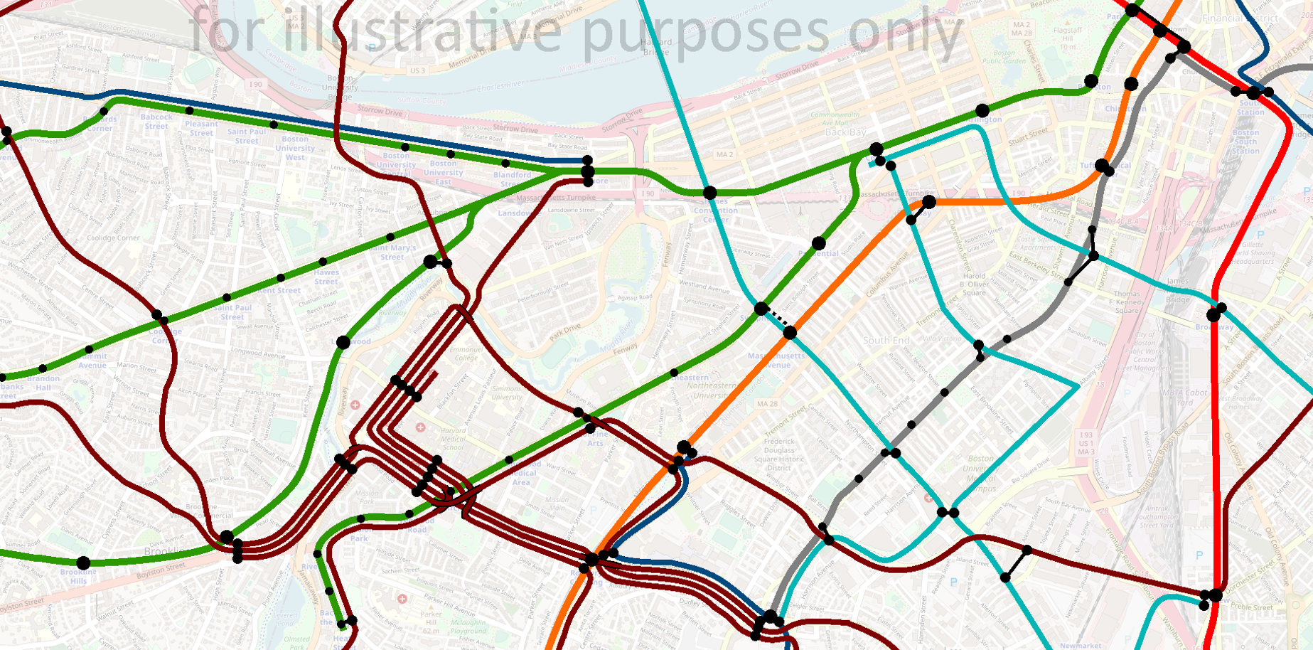
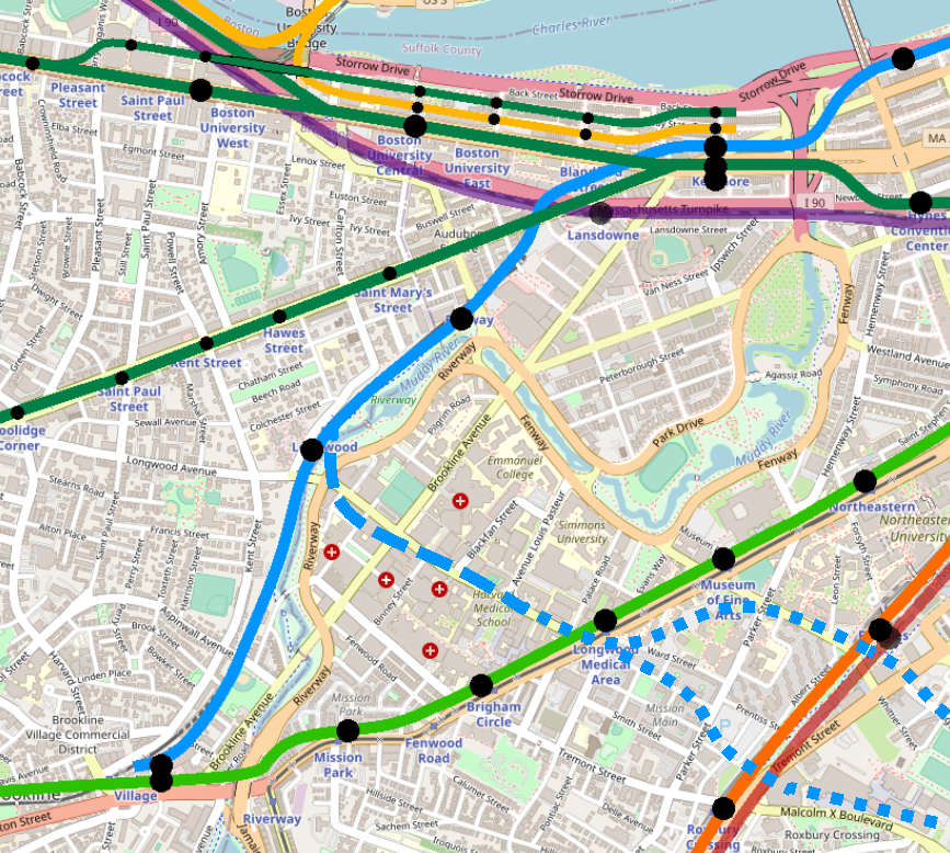
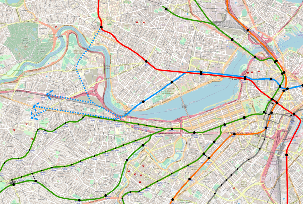
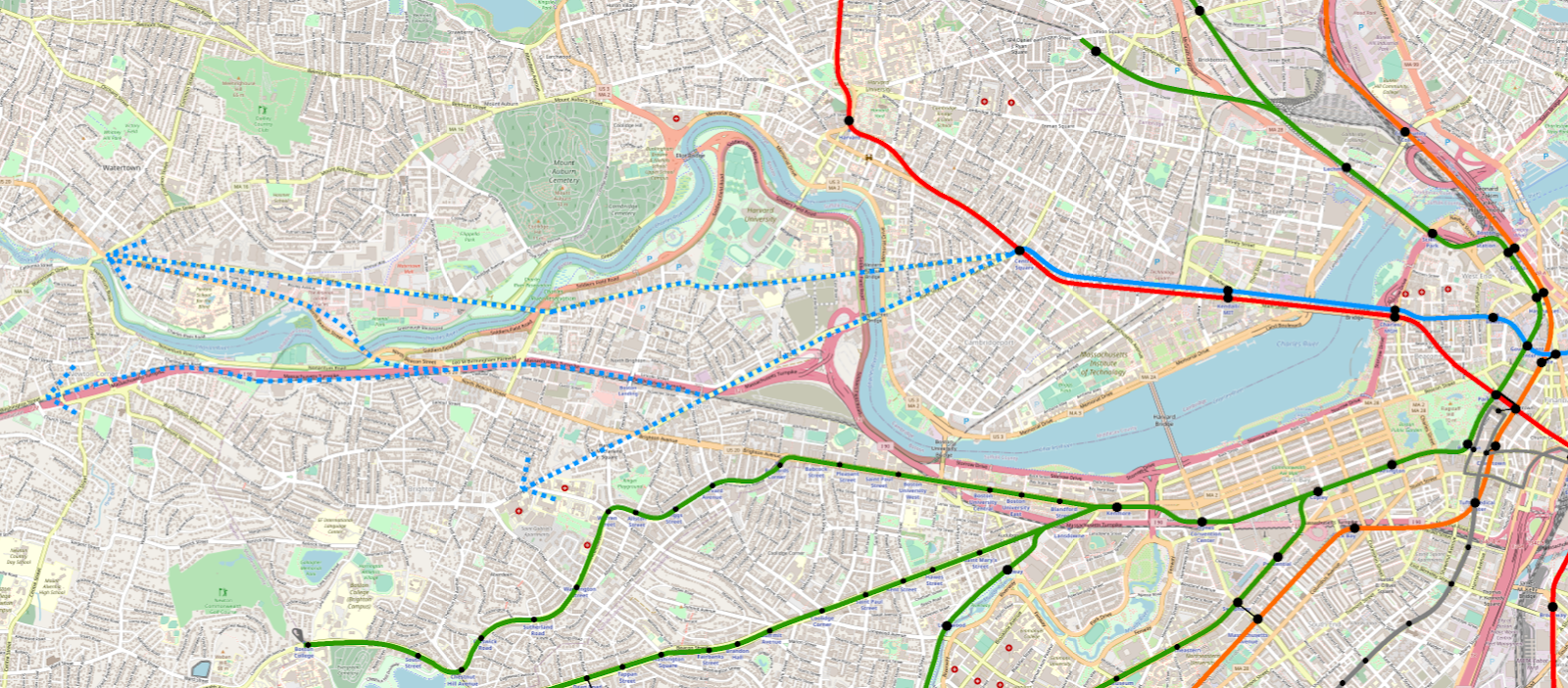
- The Piers Transitway (currently serving SL1, SL2, and SL3) is converted to light rail and connected to the larger light rail network via a subway running from Huntington Ave to Back Bay to South Station — we’ll call this the “Magenta Line”
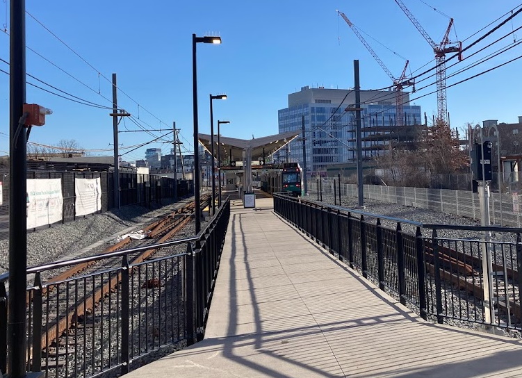
- “T-under-D” has been completed, meaning the subway now extends from World Trade Center station under the current grade crossing at D St to a portal near the current Silver Line Way station
- Center-running bus lanes on Congress St in downtown and Summer Street in the Seaport have been built, and the T7 upgraded into a full bus rapid transit service, which we’ll call the “Navy Line”
- SL1 service has been transferred to the Navy Line, to provide a one-seat ride connecting North Station, the Financial District, South Station, the Seaport, and the Airport
- We’ll loosely assume that a lane in each direction of the Ted Williams Tunnel has been dedicated to mass transit use
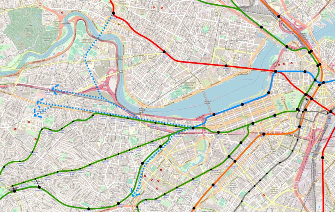
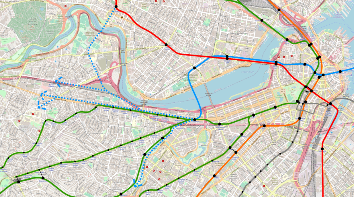
- An LRT iteration of the Urban Ring has been built on the southside of the network, connecting Longwood, Nubian, and the Seaport, approaching the Seaport via the Track 61/South Boston Haul Road ROW
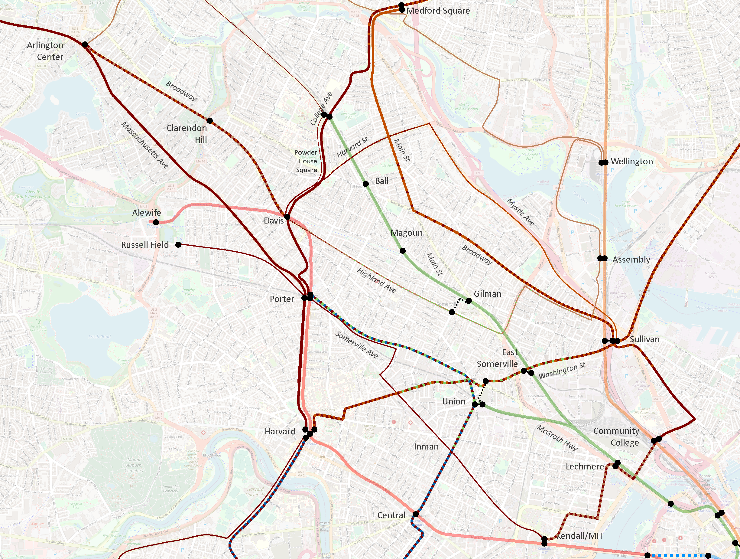
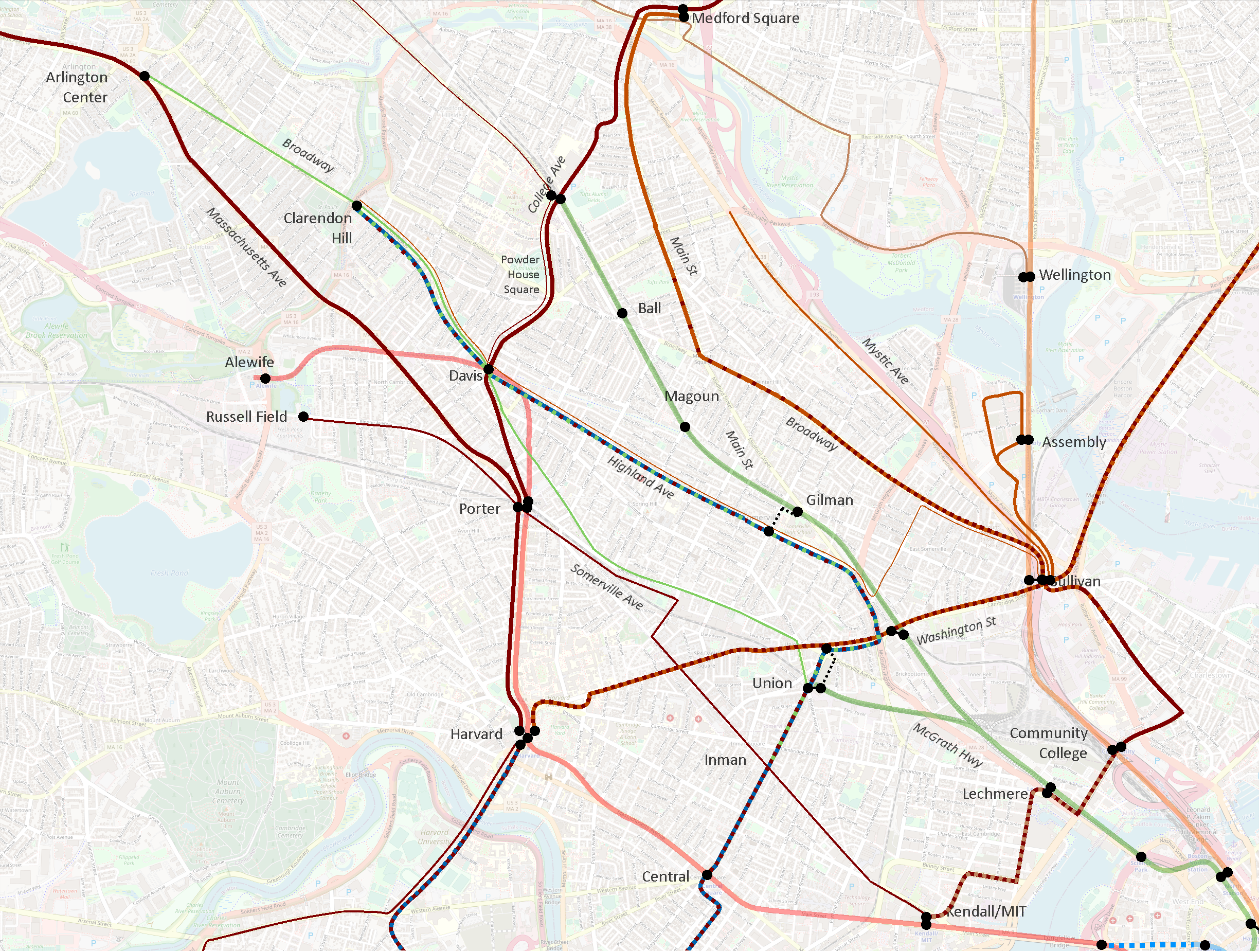
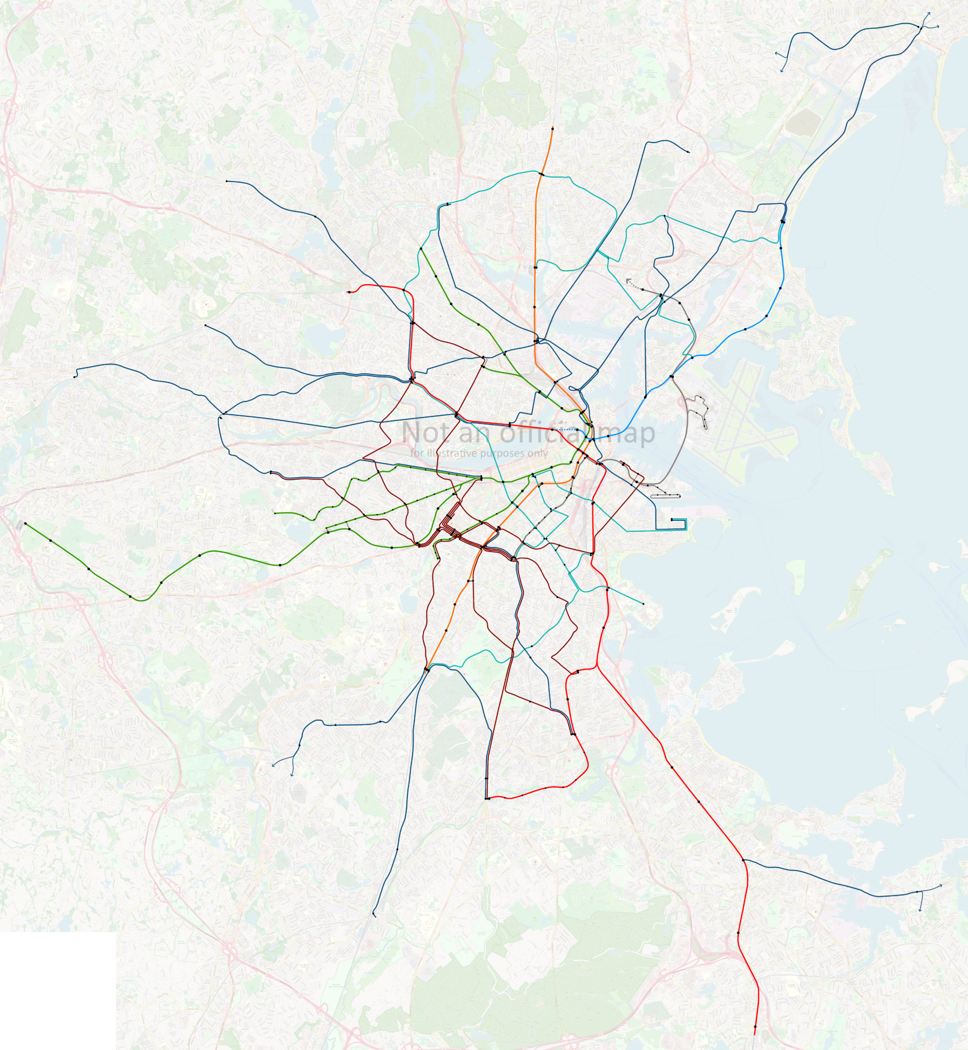
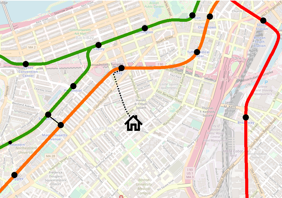
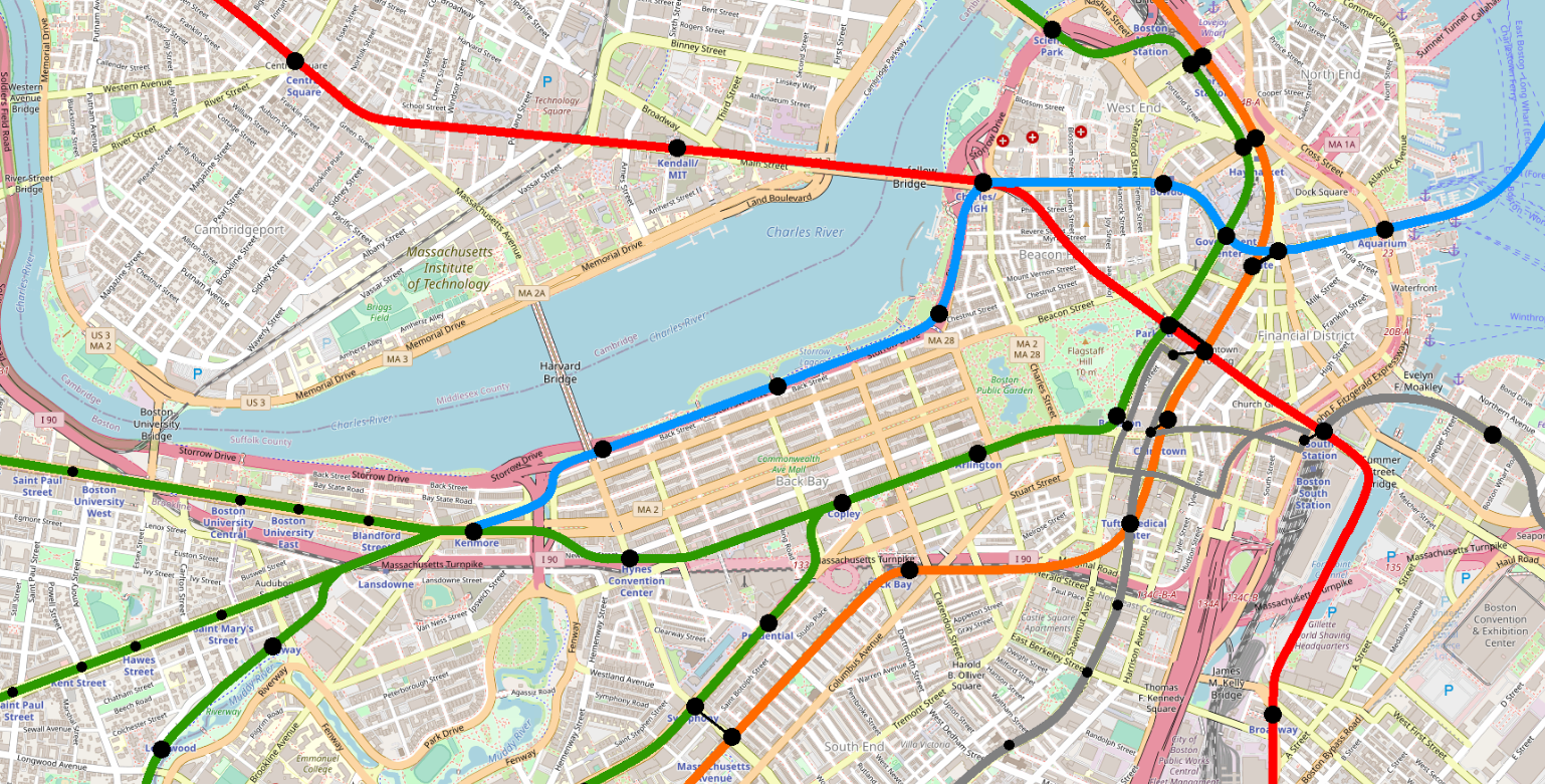
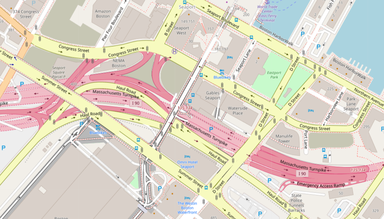
In short, our starting point looks like this:
The satellite image doesn’t tell us the whole story, however. This is a highly three-dimensional space, where Summer St and World Trade Center Ave sit elevated above the rest of the street grid, and where a slew of highway tunnels sit under the surface.
Where to place an Urban Ring LRT station?
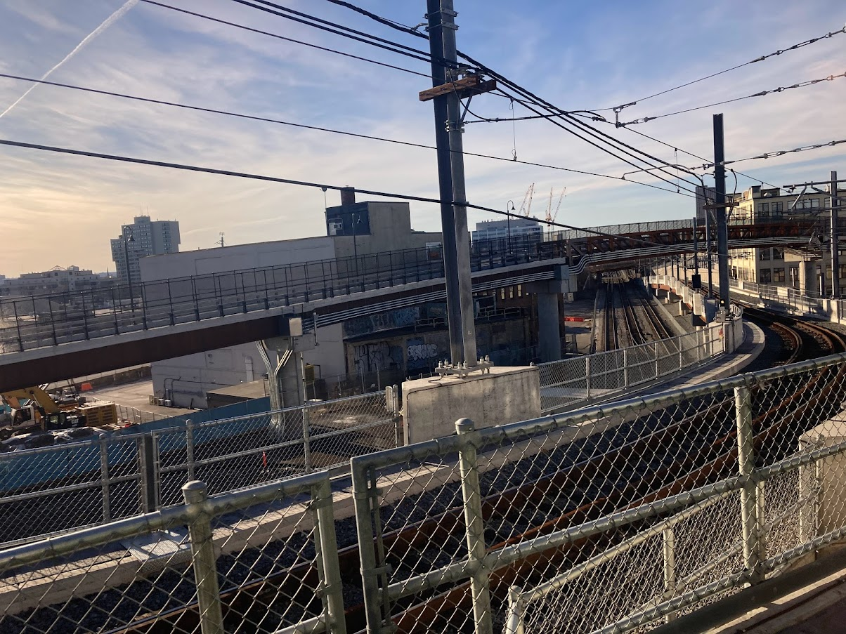
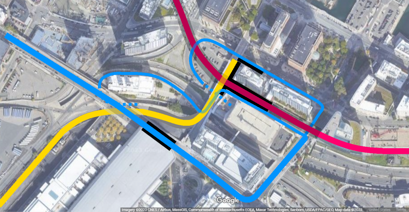
“The gravel pile”
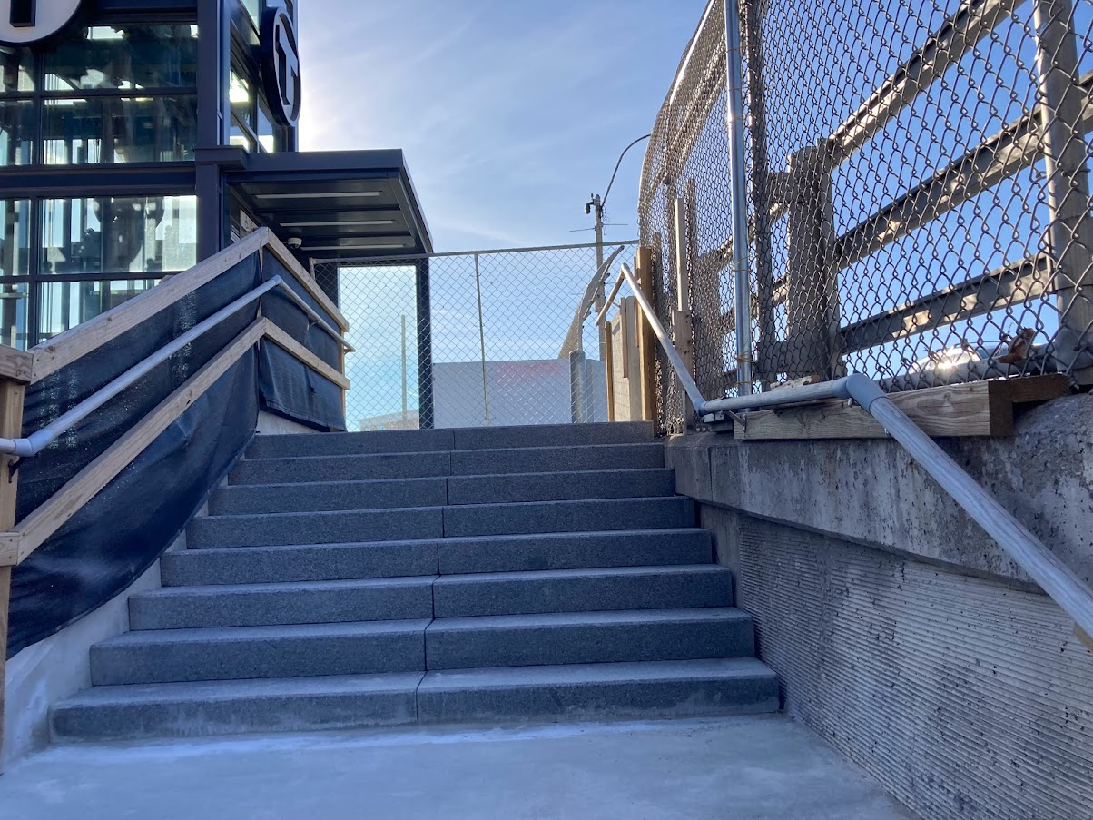
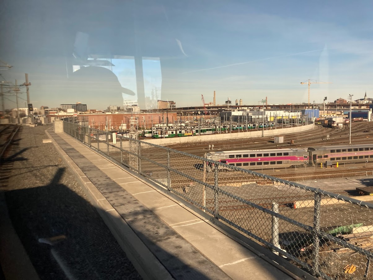
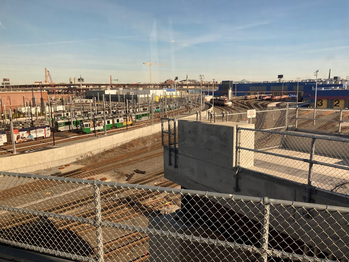
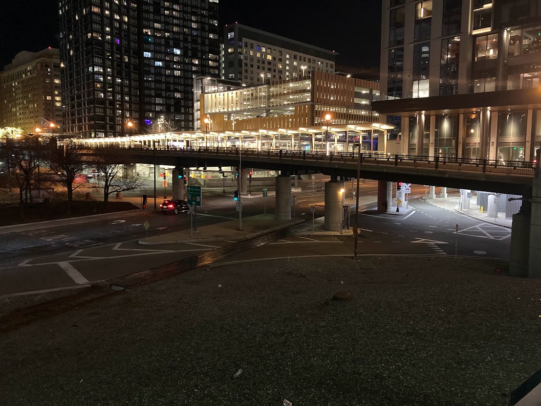
As visible in the photo above looking west along Summer St, there is a triangular plot of land bounded by Track 61, the embankment of Summer St, and (effectively) the elevated WTC Ave. (There’s actually an access road that cuts off the corner of the plot slightly east of WTC Ave.) That plot currently is occupied by a massive pile of gravel. (Last I checked, the plot is owned by MassPort, though I assume they would sell it off to a developer if/when they could.)
This is probably the most obvious place to plop down an LRT platform. It’s accessible from the current ROW with minimal modification and landtaking required; it provides good access to BCEC and easy transfer to the Navy Line services (including services to the airport); the Magenta Line subway station at World Trade Center is about 400′ away, which isn’t ideal but is certainly manageable, especially if one of the sidewalks can be covered for protection from the elements.
There are some downsides. The plot is a little small; if we leave the access road untouched, it’s just about 230′ along the long edge, which would be barely long enough for a double-set of the 114′ Type 10 “supertrains” that are expected on the Green Line in the next several years. So it’s likely the modifications at the east end, west end, or both would be needed to fit a center platform, two side tracks and a crossover. (Depending on how the Track 61 ROW is converted to double track LRT, some space might already be reclaimed from Haul Road at the western end, which might simplify the design somewhat.)
The other downside is that this location serves the Seaport, but only somewhat so. A lot of the Seaport is located on the other side of the “highway canyon” that Track 61 and Haul Road sit within, so Urban Ring passengers would need to go “up-and-over” for the last segment of their journey. The current World Trade Center station is much more centrally located.
The gravel pile is potentially an adequate location for a station, and would likely be the least expensive option. On the other hand, if we are going to go to the expense of building an LRT Urban Ring, there’s an argument that it should be built for maximum efficacy, rather than just minimal cost.
The underground parking lots
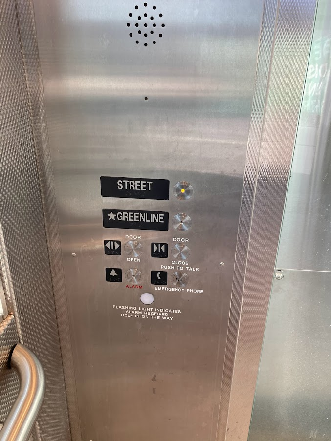
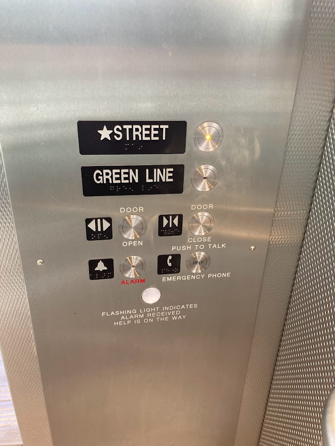
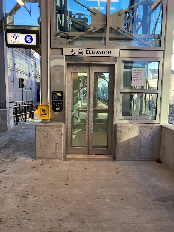
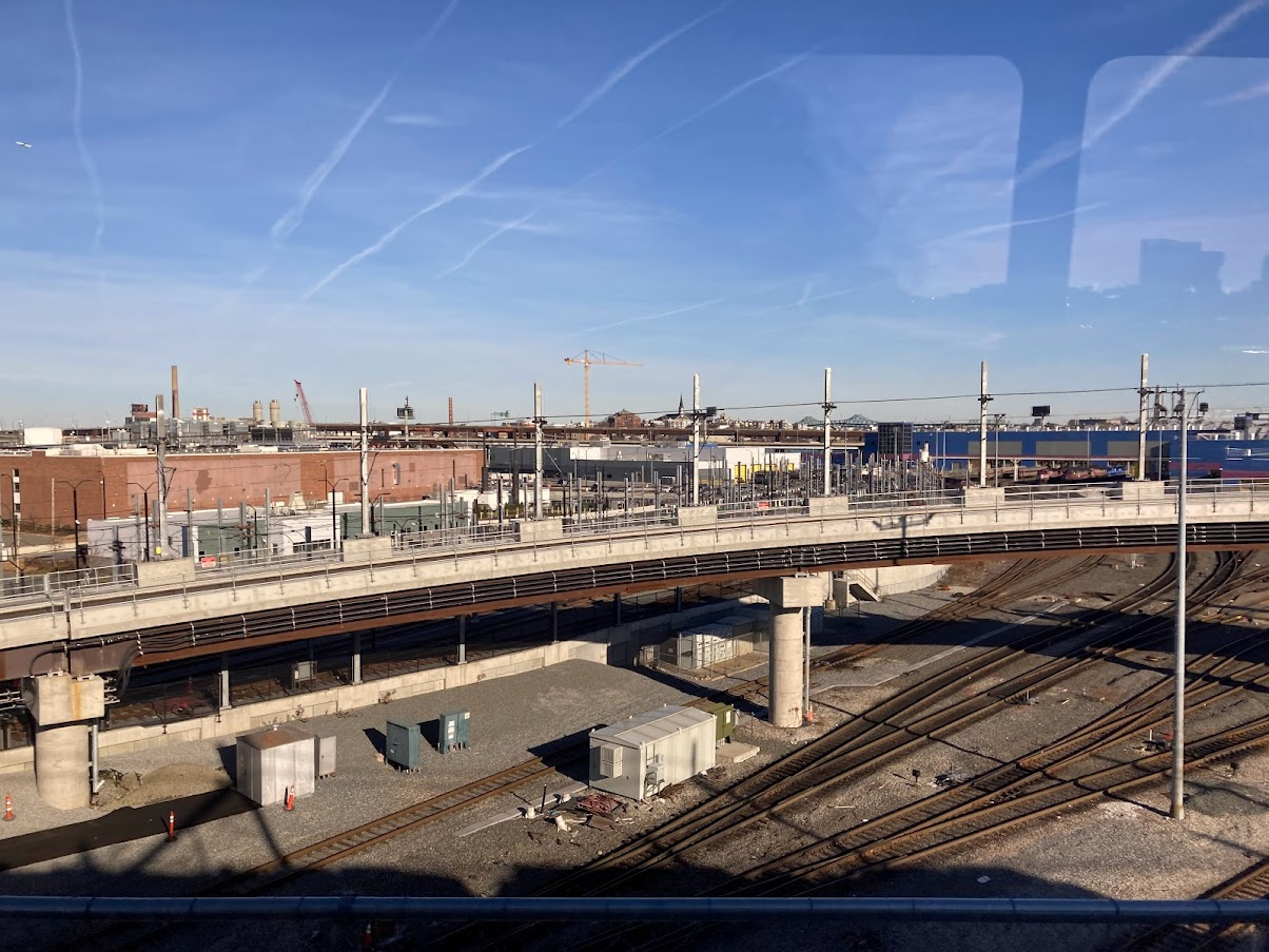
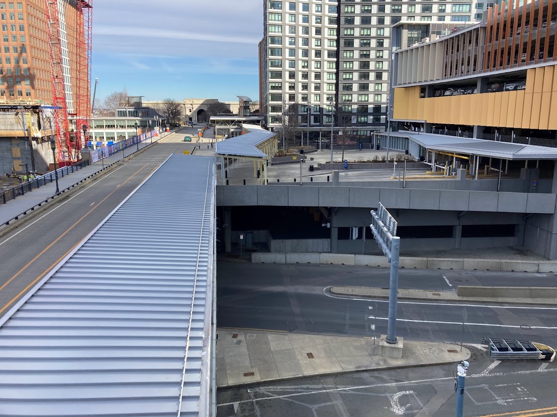
As can be seen in the photos, there are a number of parking lots at the grade level of Track 61, including one parking lot that directly abuts the southern wall of the current World Trade Center station; open that wall up, and you have a strong transfer to the Magenta Line.
The problem here is that you need to cut across Haul Road and the Mass Pike ramps in order to access the lot. And while that’s doable, it’s far from ideal. There actually already is a traffic light directly underneath WTC Ave on Haul Road, so in theory the disruption to traffic flow would not be new. On the other hand, you could only run trains so often if they need to disrupt traffic, probably capping headways at 5 minutes. Again, that is doable, but seems to trigger the same question as above — if we’re gonna build this thing, why not do it properly?
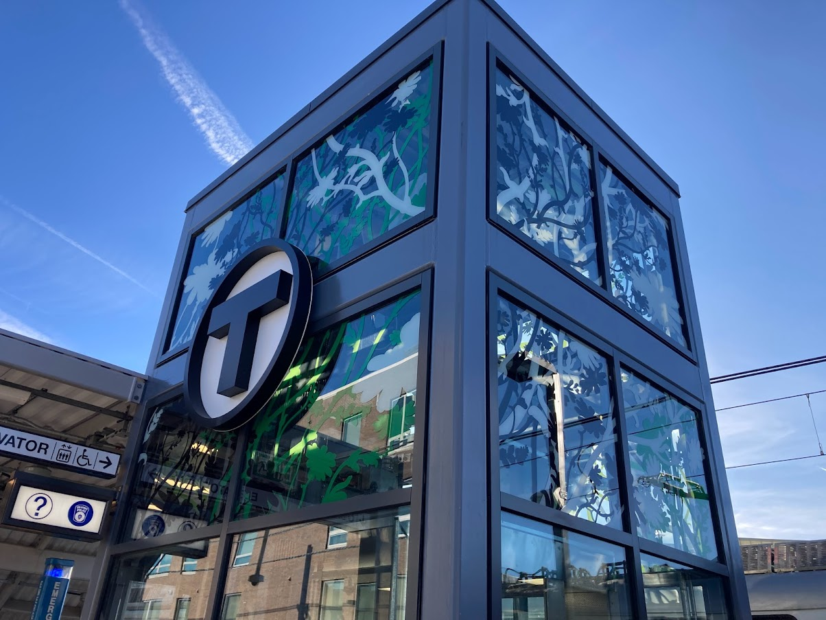
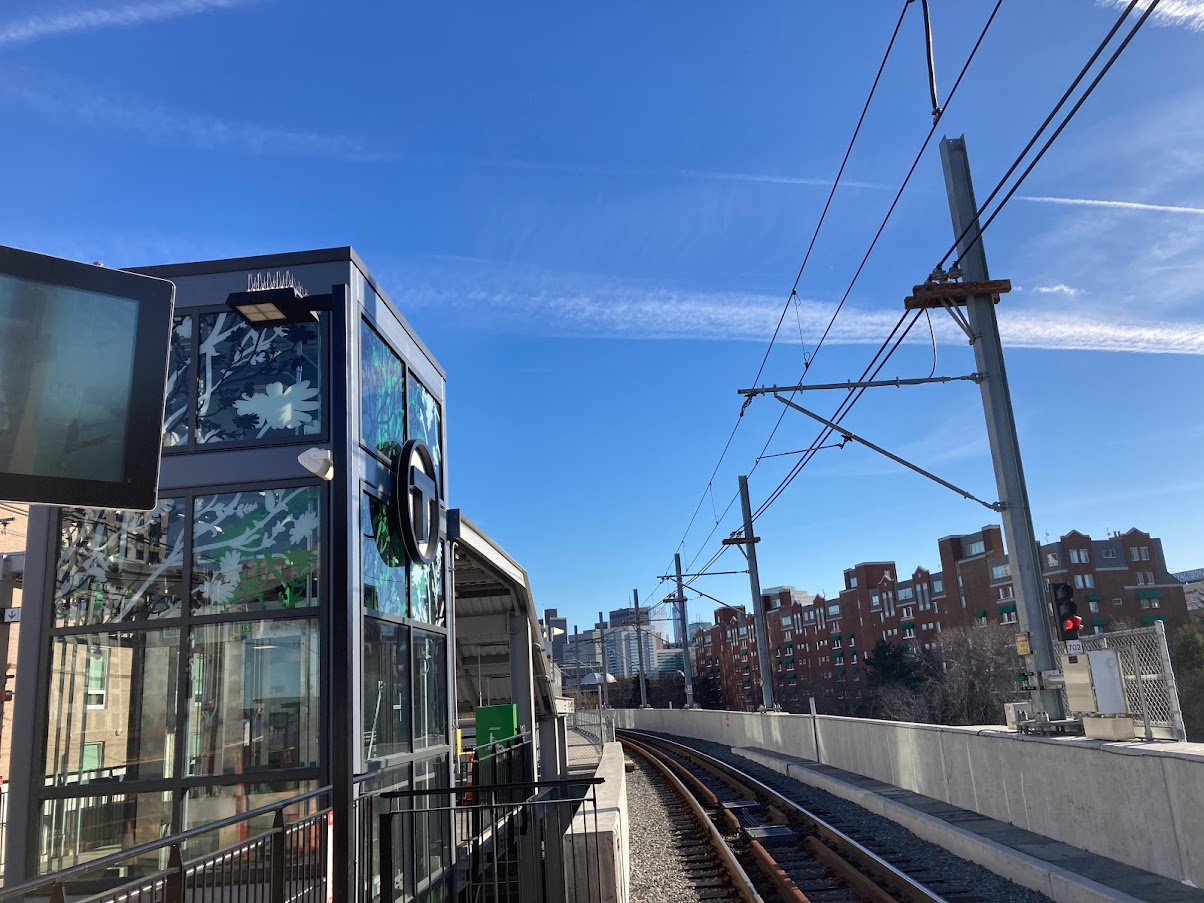
World Trade Center Ave
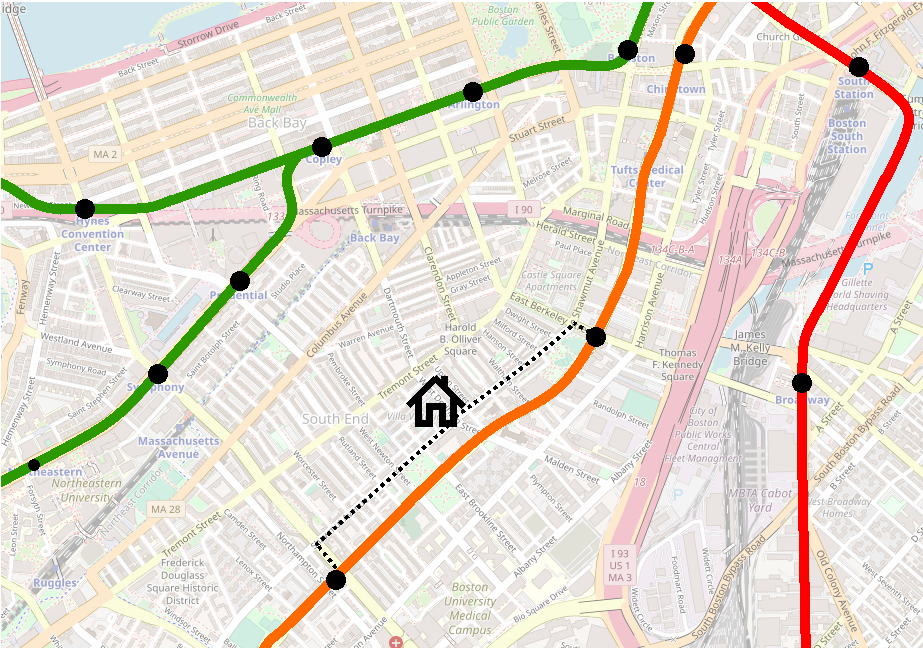
One thing that bothered me when thinking about mini-project was how to provide good transfers to both Summer St BRT and Transitway LRT. The distance between a stop in front of BCEC and the entrance to WTC station is roughly 650′, which is long for a transfer but not unheard of. (If I recall correctly, it’s roughly the distance of the transfer between Southbound Orange and Blue at State. Of course, State has the benefit of being entirely indoors, while BCEC <> WTC would have significant exposure to the elements, even if the sidewalk were covered.)
Having two Urban Ring stations — one for the Transitway and one for Summer St — seemed excessive. So then I got to thinking more about what the objectives are for stations/connections at each location.
Summer St
- Boston Convention and Exhibition Center
- Transfer to Summer St BRT toward downtown: South Station, Post Office Square, Haymarket, North Station
- Transfer to Summer St BRT toward Logan
- Transfer to Summer St BRT toward South Boston
Transitway (World Trade Center)
- Seaport core, including Congress St and Seaport Boulevard
- Transfer to Magenta Line westbound: western Seaport, South Station, Back Bay, Longwood
- Transfer to Magenta Line eastbound: eastern Seaport
On paper, that looks like a lot of reasons for each, and maybe even more in favor of Summer St due to its connectivity, but when you look closer, some are less relevant:
Summer St
- Boston Convention and Exhibition Center
Transfer to Summer St BRT toward downtown: South Station, Post Office Square, Haymarket, North Station- By definition, the Urban Ring will have multiple connections to downtown, so this is not a vital benefit
- Also, Urban Ring riders will all but certainly be coming from locations that already have direct service to downtown — it’ll be a very uncommon journey to transfer in the Seaport
Transfer to Summer St BRT toward Logan- As you’ll see below, this benefit is in fact not going to be unique to Summer St
- Transfer to Summer St BRT toward South Boston
- I won’t put strikethrough on this one, but I will point out that most of the previous connection points along the Urban Ring corridor (e.g. Broadway, Mass Ave/BU Medical Center, Nubian) will hopefully have — and will be better served anyway — by direct bus service from South Boston
- Again, the Seaport itself wouldn’t be a common transfer point
Transitway (World Trade Center)
- Seaport core, including Congress St and Seaport Boulevard
- Transfer to Magenta Line westbound: western Seaport
, South Station, Back Bay, Longwood- As mentioned above, pretty much all of the Urban Ring stops between Nubian and the Seaport will have better ways to connect to South Station, Back Bay, and Longwood than via the Seaport
- Transfer to Magenta Line eastbound: eastern Seaport
So, to me, the goal of an Urban Ring LRT station would be twofold: connect to the Seaport, and connect to Logan. A stop anchored by the Transitway station better serves the Seaport and, as you will shortly see, also serves Logan. So, insofar as we need to choose which connection to prioritize, we should focus on a Magenta Line connection at World Trade Center station.
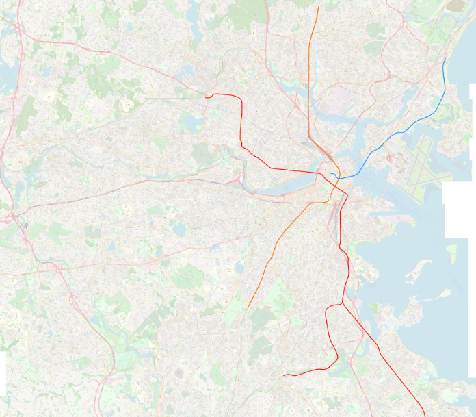
Getting to Logan
In some alternate timeline, the Ted Williams Tunnel was built with a third tunnel to carry rapid transit rail service to Logan. This would’ve been so much better than today’s system, but alas.
In the scenario I’ve outlined here (and, in my opinion, in any vaguely realistic scenario), service to Logan is provided by BRT. Now, to be clear, BRT can be a lot better than what we have today. For one, a lane in each tunnel could be dedicated to transit and perhaps very-high-occupancy vehicles, with semi-permanent lane protection to ensure speedy and unencumbered journeys.
But our BRT services still need to get in to the tunnel, and the solution to that problem also solves the problem of Summer St vs the Transitway.
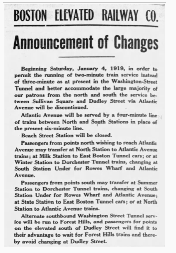
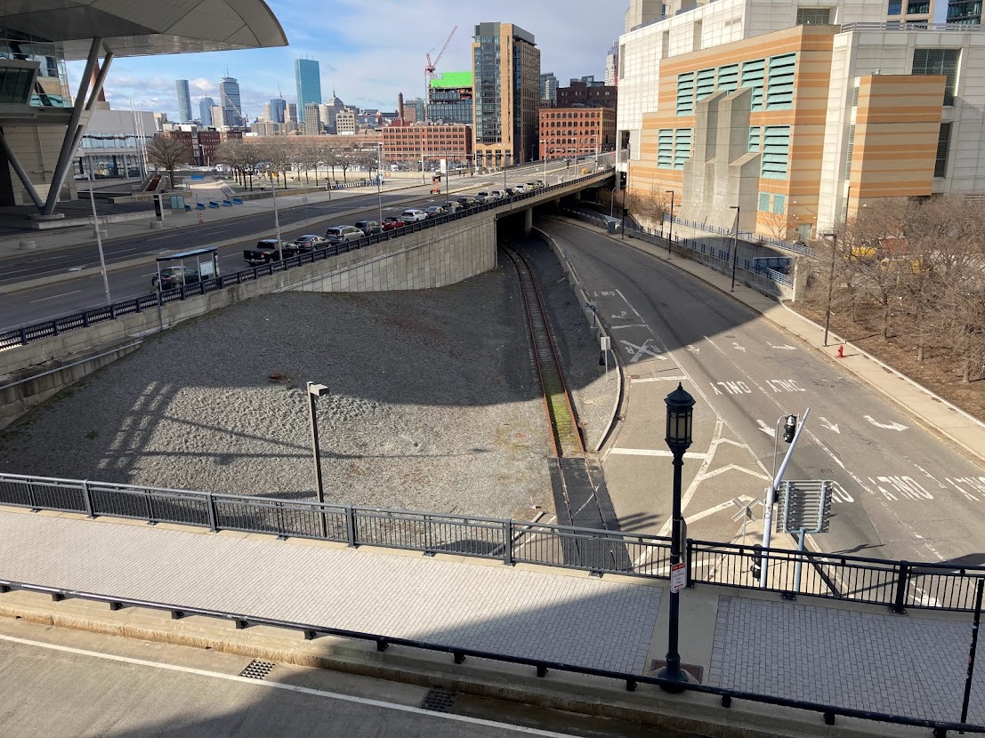
Today’s SL1 and SL3 services make a semi-unadvertised stop at street level on Congress St just outside of World Trade Center station; they do this immediately after exiting the off-ramp, which has the benefit of getting travelers from Logan to a stop in the Seaport quickly, without needing to double back from Silver Line Way.
This stop is marked on my diagram from the top of the post (though I am supposing that the simple sidewalk stop has been expanded into something more like a proper BRT platform):

As far as I can tell, absent a major rework of the Mass Pike tunnels, Logan-originating buses will exit from that off-ramp for the foreseeable future. Now, it is true that Logan buses could instead turn left and use Congress St bus lanes to head toward downtown. However, that would duplicate the lanes on Summer St which would still be needed for South Boston service (i.e. the T7), and would be more awkward to connect to South Station. And while Logan -> South Station is mildly more direct via Congress, the journey in the opposite direction is significantly worse, requiring a lengthy diversion down Haul Road in order to reach the on-ramp.
Funneling Downtown <> Logan service through Summer St maximizes frequencies on the shared trunk, minimizes redundant infrastructure, and maintains good Logan -> World Trade Center service. It is somewhat more roundabout, but connects to more places. (And if we are really worried about an express South Station <> Logan connection, using dedicated lanes in the Mass Pike tunnel running direct into the South Station Bus Terminal is probably a stronger solution anyway.)
So we’ve identified a way for our Logan -> South Station service to transfer at WTC station, but what about the other direction? Well, that’s where those parking garages can come in handy.
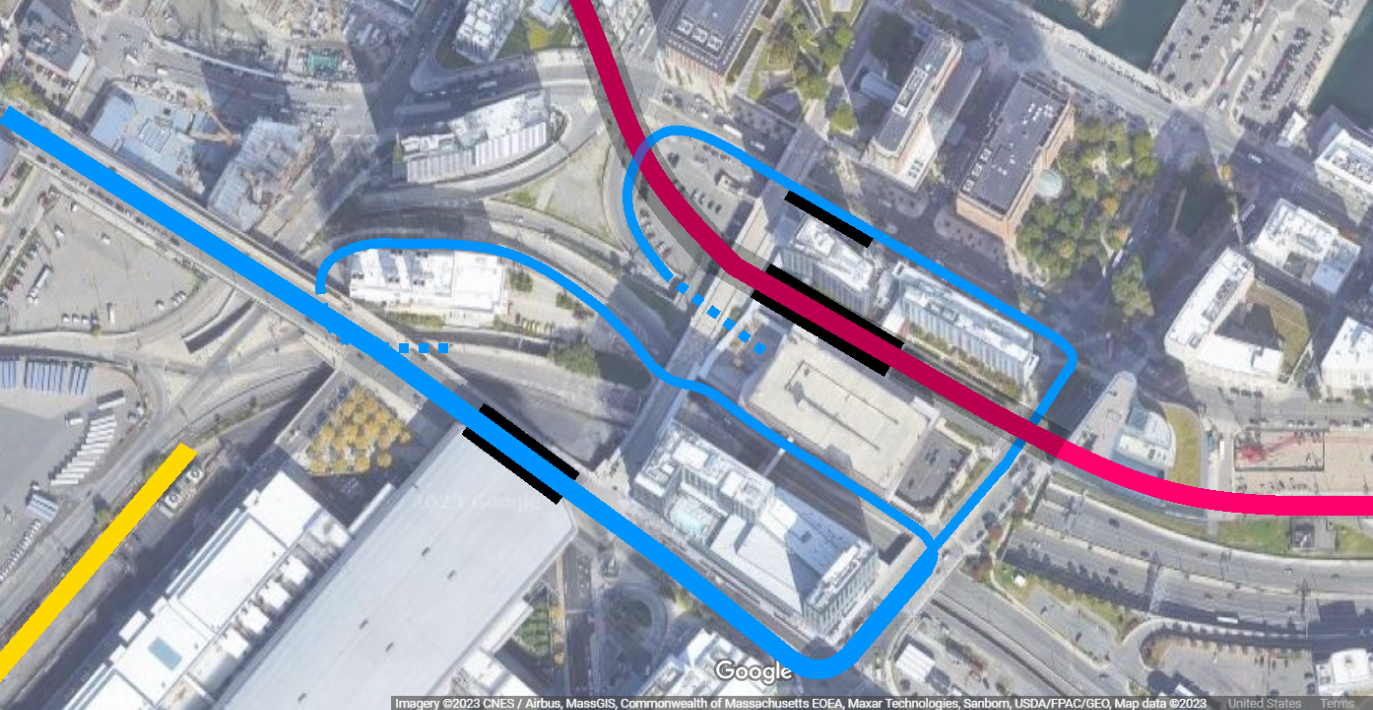
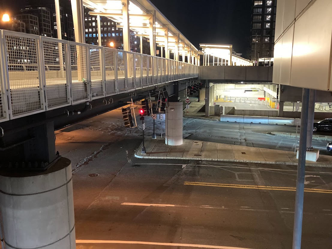
Running directly parallel to the Transitway is a small side street/alley that runs into the lower level of the parking garage, and which, I think exits on to Haul Road just underneath World Trade Center Ave. Visible in the second Streetview photo are two large metal doors: I am pretty sure that those lead directly into the lobby of the World Trade Center station — meaning that with some modifications, you could put a BRT platform near there, and have buses immediately proceed to the on-ramp.
This would then provide a strong transfer point to Logan-bound services at World Trade Center proper — benefitting Magenta Line riders, but also providing a crucial transfer point enabling an Urban Ring station at World Trade Center.
Placing an Urban Ring LRT station at World Trade Center
So, where to put a new LRT station at World Trade Center?
We can’t put it at grade level without disrupting all the highway ramps, or otherwise settling for a station at Summer St instead.
We can’t put it below grade level because of the highway tunnels.
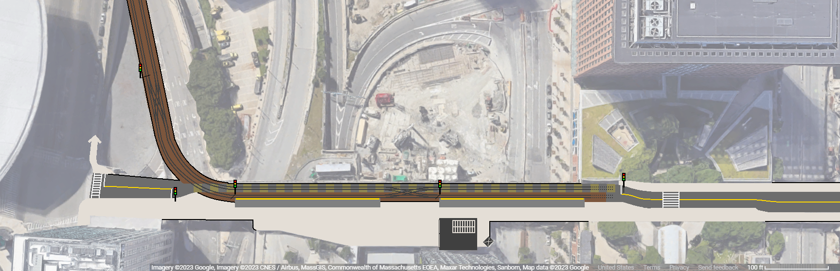
What about above grade along the World Trade Center viaduct?
Building a short rising viaduct on the gravel pile’s plot and claiming some of World Trade Center Ave (more details on that below) to add a above-grade LRT platform, combined with building an at-grade BRT platform for Downtown -> Logan services by reclaiming some space under the parking garage and adding a BRT platform on Congress St for Logan -> Downtown service, enables all three services to be centralized in a single station for easy transfers between all three.
So how do you reach the World Trade Center Ave viaduct?
Some of this will depend on how Haul Road is reconfigured for double-track LRT, particularly in terms of the horizontal alignment (do you steal a lane, or eat into the gravel pile?), but I think there’s enough open space to feel comfortable that something could fit, even if we don’t work out the details right now.
One area we have less flexibility on is the vertical alignment: there’s approximately 310 feet of horizontal running space between the Summer St underpass and the edge of the World Trade Center Ave viaduct, and we have to fit our rising viaduct in there.
The WTC Ave viaduct is approximately 25 feet high; 25 feet rise over 310 feet run yields a grade of 4.61°, which is well within the comfort zone for LRT grades. Even a rise of 33 feet over that distance would still come in at our 6° threshold. Likewise, rising 25 feet at <6° is doable in as little as 240 feet. Therefore, even with the known limits, it should be possible to rise from the Summer St underpass to the World Trade Center Ave viaduct at a reasonable grade.
Fitting a terminal on the World Trade Center Ave viaduct
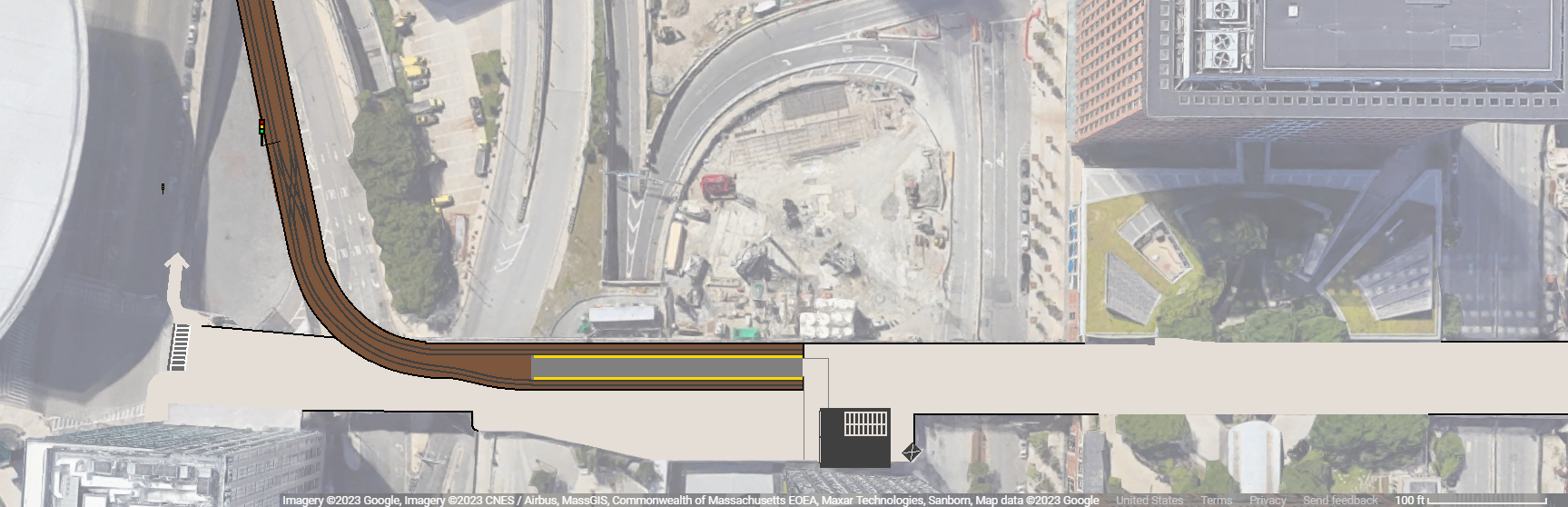
The main question facing us here is whether to maintain some level of automobile access through WTC Ave. I believe I’ve come across proposals to fully pedestrianize that street, which, honestly, based on my experience, seems pretty reasonable. Mostly it seems like the street is used to deliver goods to the World Trade Center proper.
If I needed to maintain some level of automobile access, I would use a staggered pair of side platforms to maintain LRT capacity and keep a shared bidirectional lane open for vehicles to pass through on a limited as-needed basis, placing signals/traffic lights at each entry to coordinate passes through the right-of-way.
Obviously, this arrangement is complicated and would create some disruption to the system, depending on the road traffic volume. This option would need to be considered carefully to assess the cost vs benefit.
The key thing to note is that there is horizontal space to fit all the necessary elements:
- First 230′ platform (enough to accommodate a doubleset of the 114′ Type 10 supertrains)
- 90′ to fit a crossover to provide passing access
- Second 230′ platform
- A 100′ radius curve from the rising viaduct on to WTC Ave
- Reasonably short walking distance between platform and current headhouse to streamline transfers
- Maintain pedestrian access to the elevated greenspace between Congress St and Seaport Blvd
The second option is more conventional and straightforward: pedestrianize the whole viaduct, and claim part of it for a GLX-style center-platform terminal station.
There are lots of potential variations on this design — adjusting the width, length, and placement of the platform, trying out different methods of pedestrian access — but they all more-or-less look like this.
Keen observers will note that none of these designs feature fare gates or paid-access vs unpaid-access areas. Numerous transit systems, both in the US and around the world, have demonstrated that it is possible to run ticketed transit systems that do not require metal barriers to enforce payment. Eliminating fare gates makes it possible to build transit access more directly into the fabric of a neighborhood. Both station designs, but particularly the staggered platforms alternative, see no clear demarcation of the “edge” of the station, but rather allow the space to be woven together into a seamless whole.
So how do you site an Urban Ring LRT station in the Seaport?
To me, it looks like this:
- Add a BRT platform at World Trade Center station for Downtown -> Logan services (under the parking garage just south of the station)
- Build a viaduct to connect Track 61 LRT to the WTC Ave viaduct
- Add an LRT station at-grade on the elevated World Trade Center Ave viaduct
Should you put an Urban Ring LRT station in the Seaport?
One thing this exercise illustrates is that the Seaport is not very wide. This sounds obvious and trivial, but one result is that there isn’t really space nor need for a “crosstown” service. The Piers Transitway and Summer St already form strong “east-west” transit corridors (whose elevation difference reduces their overlapping walksheds slightly). But they’re still close enough that a perpendicular service between/across them wouldn’t make much sense (particularly since both originate at South Station and come very close to connecting again at World Trade Center).
So a Track 61 LRT service basically needs to choose a particular point along the “linear Seaport corridor” to terminate. That increases the pressure on that station to be located optimally to maximize access to jobs as well as to transfers. World Trade Center does reasonably well on that front, but both the eastern Seaport (e.g. Design Center) and western Seaport (e.g. Courthouse) would require transfers for short last-mile journeys. But this need to choose lies at the heart of why siting an Urban Ring LRT station in the Seaport is difficult in the first place.
A Track 61 LRT service will likely reach the Seaport in part by passing near Broadway station. Regardless of origin point beyond there, a service near Broadway likely could instead be aligned to pass through South Station instead — and then continue to Seaport along one of the east-west corridors. (For reasons I won’t get into here, a Piers Transitway LRT corridor would very likely have excess capacity to absorb Urban Ring LRT in addition to the Magenta Line LRT I’ve described here.)
Sending an “Urban Ring” LRT service down one of the east-west corridors would provide better access to the entire Seaport, and reduce/eliminate the need for transfers. Running LRT service via Track 61 may in fact be unnecessary.
This brings us to a key difference between an LRT Urban Ring and a BRT one: BRT can continue to Logan Airport and on to Chelsea much more easily than LRT. Rapid transit on the Track 61 ROW, with a transfer station roughly at World Trade Center, and continuing service to Logan is able to catch a much broader swath of journeys (in italics below), compared to service terminating in the Seaport:
- Longwood <> Seaport
- Nubian <> Seaport
- Red Line transfer point TBD (e.g. Broadway) <> Seaport
- Longwood <> Logan
- Nubian <> Logan
- Red Line transfer <> Logan
- Longwood <> Chelsea
- Nubian <> Chelsea
- Red Line transfer <> Chelsea
- Seaport <> Chelsea
- Logan <> Chelsea
The concept of the Urban Ring was to provide circumferential service that bypasses downtown, for speedier journeys and reduced crowding in the core. A route that terminates at Seaport curtails possible destination pairs, and becomes less competitive against transferring downtown via the radial services (especially for long circumferential journeys).
Returning to the point about connecting at Broadway vs South Station: South Station is, to be clear, the bigger fish. Nubian <> South Station journeys surely outnumber Nubian <> Broadway journeys. Urban Ring concepts usually favor a transfer at Broadway or to the south — but can justify skipping South Station because they are providing speedier service to Logan and Chelsea. Track 61 LRT can’t do that.
So I think Urban Ring LRT service via Track 61 presents a weaker case than it first appears. Now, it bears mentioning that capital costs for a Track 61 LRT route would probably be less expensive than a journey via South Station. If given the choice between Track 61 LRT and nothing, I’ll be entirely in favor of the former.
Conclusion
Ultimately, this is a fun thought exercise. The scenario I’ve contrived here presupposes a lot of things, so its “real-world relevance” is somewhat limited. A few final thoughts:
- The problems I’ve outlined here will impact any Track 61 proposal; Track 61 will always be on the wrong side of the Mass Pike between Summer and Congress Streets, so you’ll always need to figure out a way to bridge that gap
- This conversation becomes radically different if an LRT connection between Seaport and Logan is built — although even then, Track 61 will still be on the wrong side relative to the Transitway
- Urban Ring considerations aside, I’d suggest that a Navy Line service to Logan would significantly benefit from the “under-the-garage” platform I propose here, especially if the Transitway is converted to LRT and thus cut off from Logan
- The Seaport is centered on two east-west corridors, and there’s an argument to make that almost all services, even circumferential ones, would do well to feed into or otherwise align with those
For all the reasons outlined here, and others, most of my crayon maps going forward will favor both LRT and BRT Urban Ring services that run via South Station, rather than Track 61/Haul Road. At most, I can see Haul Road being useful for express service to Logan that bypasses the Seaport — that, it could do quite well. But for serving the Seaport proper, I think it comes up short.