Last year, I attempted to redesign the MBTA’s rapid transit + key bus routes map. My first iteration was just downright ugly (and yet somehow I still decided to post it), while my second iteration was a bit better, though still unsatisfying.
This year, I have returned to this concept, with the same goals as before, to design a diagram that includes:
Key (frequent) bus routes, designed into the map from the start
All stops on the Green Line branches
Walking transfers, such as State – Downtown Crossing and Brookline Village – Riverway
All stops on the Fairmount Line (future-proofed for its eventual conversion to near-rapid transit standards)
All information included on the present map
And achieve all of the above while fitting into a square and attempting to comply with relevant ADA visual design requirements by using the same canvas and font sizes as the official diagram. I also set a goal of having all labels appear on a solid background, not intersecting or overlapping any lines or other visual elements, and having all labels be horizontal for readability.
While I hestitate to trust my own judgement (like I said, it did somehow seem like a good idea last year to post my previous redesign), I do think that this iteration is more successful.
screenshots below are from the initial version of the diagram and have some minor differences
Design details
Many elements from last year’s version are carried over here, including:
Alignment of bus routes
Stations are aligned so that connecting bus routes form strong visual links
Color-coded bus routes
Bus routes are given colors based on the transfer hub they operate into; in the example below, orange bus routes feeding into Ruggles are contrasted with the green routes that feed into Kenmore/Longwood or Back Bay; the two routes in red both go to Harvard:
The transfer system at Park St & Downtown Crossing
The proposed realignment of SL4/SL5 will relocate its Downtown Crossing stop to Chauncy St, where it will provide a good transfer to the Red Line, but a more distant transfer to Orange; Silver <> Orange riders will be better off transfering at Tufts Medical Center. I’ve attempted to convey that here, along with the Red <> Blue walking transfer at State
Coequal bus routes
The most important change is that this diagram incorporates the key bus routes as coequal “stakeholders” in the design of the map, meaning, for example, that the complexity of the bus network in Longwood was treated as equally important to accommodate as the complexity of the subway network in Downtown. This meant, among other things, that labels for bus stops were sized identically to labels for rapid transit stops.
An organic by-product of the coequal emphasis on bus routes is an expansion of the “grid” formed by Park-DTX-State-GC downtown:
The parallel Red and Blue Lines, horizontal on the Cambridge Seven diagram, are now joined by the parallel lines of:
the 9, 8, 1, 15, the Longwood-Nubian bus corridor, the 23, and 22.
The historically vertical Orange and Green Lines are now joined by:
the Ashmont Branch, the 16, Fairmount Line, portions of the 8 and 1, SL4, the 32, the E Line, the Brookline Ave bus corridor, and the D Line
In particular, the lengthy parallel alignment of the Ashmont, Fairmount, SL4, and Orange Lines created a strong “ladder” effect, where the complex Dorchester bus network can be articulated in terms of which anchor stations a route connects to. For example, my diagram more clearly articulates that Newmarket sits on the same cross-street as Mass Ave and Symphony, and that Uphams Corner sits on the same cross-street as Nubian, Roxbury Crossing, and Brigham Circle.
(The fact that the Uphams Corner <> Brigham Circle street changes names four times — Dudley St, Malcom X Blvd, Tremont St, Francis St — points to the utility of a mildly simplified visualization of Boston’s [apocryphal] cow paths.)
Complexity and tradeoffs
Now, it has to be said that this diagram is complex and still rather visually overwhelming. In general, I argue that’s inevitable with this much information being put into this little space. Fellow ArchBoston contributer TheRatmeister has created a gorgeous map that presents an elegant counterargument, as his map does indeed show all of the above information while still looking amazing.
A key difference between our maps is that his utilizes non-horizontal text and overlapping text. (His text is also slightly smaller than mine, although I believe it still falls well within accessibility guidelines.) So this highlights a tradeoff: the visual complexity of overlapping/non-horizontal text, vs the visual complexity of a highly visible bus network.
Lines on a map
An earlier draft of this map took the emphasis on coequal bus representation even further, by depicting the very highest frequency bus routes (as currently planned in the Bus Network Redesign) with visually distinct medium-thickness lines (nearly as thick as the rapid transit lines) bisected by a thin white line.
This iteration made the Longwood-Nubian corridor too busy. It also ultimately is misleading — the differences in proposed frequencies between my “thick” and “thin” bus routes just aren’t that stark.
However, this version of the diagram presents something worth closer examination: a visualization that vaguely suggests what the subway map might look like if the T’s most important bus routes were full rapid transit:
(no high res link because I didn’t build out a high res version of this, just a screenshot as a proof-of-concept)
As a political position, I submit that we should not tolerate “slow zones” on the bus corridors depicted above — important enough that they have a legitimate claim to being “on the map” — any more than we’ve been willing to tolerate slow zones on the subway.
Boston, the “Hub(s) of the Universe”
Both in my final map and in the proof-of-concept screenshot above, it is Back Bay that sits visually centered. On the one hand, this is partially an artifact of compression that I implemented on the northern half of the map. On the other hand, that compression was only possible because the T’s system is less complex (and less robust) on the north side. The network out of Longwood/Nubian alone could be its own map.
The fact is that Boston no longer has a single downtown, but at least three, if not more: Downtown, Back Bay, Longwood, and arguably the Seaport, and maybe Kendall Sq. To depict the full breadth of the T’s system, a diagram can’t be solely focused on the historical Park-DTX-State-GC core.
In the past, I’ve argued that a poorly understood aspect of the Urban Ring proposal was the extent to which it was actually designed to provide radial transit services to Boston’s “other” downtowns. This diagram illustrates the pluricentric nature of the region’s transit needs.
A Map-Making Note
With respect to avoiding overlapping text, one of the key pieces, I discovered, is finding the “critical triangles” — places where the horizontal label is constrained by the two legs of crossing triangular lines. I found at least three such triangles on this diagram:
Prudential: bound by the E and the 1 (and the Central Subway too)
Chinatown (or Tufts Medical Center, depending on font size and spacing tweaks): bound by Red/Silver and Orange/Silver, and hemmed in by the commuter rail as well
And finally Longwood Medical Area: bound by the E/39 and the Francis St buses
These “critical triangles” in turn govern both stop spacing and line spacing.
For example, the “Prudential critical triangle” needs to also place the Prudential stop marker itself roughly halfway between Copley and Symphony, thereby setting up a general “cadence” for the stop spacing.
In this design, I found that the “LMA critical triangle” ultimately forms the lowest denominator; the spacing of everything else on the entire map unfolds from the stop spacing between LMA and Brigham Circle arising from that critical triangle:
Brigham Circle<>Longwood Medical Area need to be far enough apart to fit labels, but also need to be roughly as far apart as Longwood Medical Area<>Museum of Fine Arts
(I cheated a little bit here: the stop icons are unevenly spaced, but the texts of the labels appear less severely unevenly spaced)
In turn, Brigham Circle <> Museum of Fine Arts need to be roughly as far apart as Roxbury Crossing <> Ruggles — the Orange Line stop spacing becoming twice that of the E
Museum of Fine Arts <> Northeastern <> Symphony needs to match up with Ruggles <> Mass Ave, again emphasizing the Orange Line’s stop spacing being 2x that of the E
…which gets recapitulated again with Symphony <> Prudential <> Copley needing to broadly match Mass Ave <> Back Bay
The “ladder effect” I described above then in turn means that the Fairmount Line’s Uphams Corner <> Newmarket spacing needs to match Roxbury Crossing <> Mass Ave, and Newmarket <> South Station needs to broadly align with Mass Ave <> Downtown Crossing — giving the Fairmount Line 4x that of the E
Now, obviously, there’s a lot more nuance than this. Both the Orange Line’s and Fairmount Line’s stop spacing get mildly compresssed toward the outer sections of the map — I didn’t rigidly copy-and-paste the spacing. But in general, the principle holds that the “atomic” spacing unit for most of the map derives from the E Line. I hesitate to draw too strong of a conclusion here, but I suspect that this principle will hold true for any T map that seeks to show all of the surface stops on the E Line.
What could be more patriotic than posting a map of New York City ferries? (That comment was unserious, but it belatedly occurs to me that I probably could have cleverly woven in something about the Statue of Liberty. “Fourth of July” -> “Lady Liberty” -> “The ferry that goes to the Statue of Liberty” -> “all the other ferries” -> “here’s a map”, something like that.)
As described in the top right of the map, there are something like half a dozen of companies running commuter and/or full-time ferry services on the waters surrounding New York City. As far as I can tell, no one has made a consolidated map showing all of these services in one place. I suspect this is because there isn’t a huge amount of geographical overlap between the “territories” of the companies.
NYC Ferry runs a dense network on the East River and along Brooklyn’s shores (plus a Hudson River route to Staten Island)
Seastreak runs services to the Jersey Shore; these are mostly peak-only, but there are handful of mid-day and late-evening trips sprinkled in, plus a Sandy Hook Beach service that mostly runs on weekends
Liberty Landing City Ferry runs to its namesake, with an additional stop just across the Morris Canal at Warren St in Jersey City (which I omitted here, bowing to the challenges of a complex diagram)
Statue City Cruises runs ferries to Liberty Island and Ellis Island, primarily between 9am and 5pm, though with some later evening departures available from the islands only
The Trust for Governors Island runs a network of routes, alongside a weekend-only route run by NYC Ferry
The all-day services usually run on 20-minute frequencies,
while the peak-only services are usually every 30 or 40 minutes.
The Paulus Hook <> Brookfield Place route runs on 15-minute frequencies, except during the morning peak when it increases to 7.5-minute frequencies
NY Waterway also runs two services much further north, connecting cross-river to Metro-North’s Hudson Line
NYC Ferry runs a dense network on the East River and along Brooklyn’s shores (plus a Hudson River route to Staten Island)
Most routes run approximately 45-minute frequencies, with some falling to 60 minutes off-peak, and the Staten Island and Hunters Point South routes increasing to 20-25 minutes during peak
Seastreak runs services to the Jersey Shore; these are mostly peak-only, but there are handful of mid-day and late-evening trips sprinkled in, plus a Sandy Hook Beach service that mostly runs on weekends
Frequencies vary widely, but usually see an hour or more between departures
Liberty Landing City Ferry runs to its namesake, with an additional stop just across the Morris Canal at Warren St in Jersey City (which I omitted here, bowing to the challenges of a complex diagram)
This route runs hourly from 6:30am to 7:00pm
Statue City Cruises runs ferries to Liberty Island and Ellis Island, primarily between 9am and 5pm, though with some later evening departures available from the islands only
The New York route runs on 25-min frequencies on weekdays, which gets bumped to 20-min frequencies on weekends and holidays. The New Jersey route runs every 35-40 minutes
The Trust for Governors Island runs a network of routes, alongside a weekend-only route run by NYC Ferry
Its Manhattan Route runs daily with half-hour frequencies most of the day
This service runs 24 hours a day, 7 days a week, with 30-min frequencies off-peak that rise to 15-20-min during peak
Almost none of these services run SUAG (“show up and go”) frequencies, with the exception of peak Paulus Hook <> Brookfield Place service, which bops back and forth between Jersey City and Downtown (only 4000 feet apart) every 7.5 minutes during rush hour.
The higher-frequency services might be considered “SUAW” (show up and wait). Many of the ferry terminals are enclosed, with seating and sometimes light food options, making a wait more tolerable. Other routes do not reach this threshold, and a traveler must take the schedule into account when planning journeys.
Larger Implications
Ferries are cool but weird, embodying a cool but weird tension in our urban spaces.
In an earlier era — we might call it the “modern era” or the “industrial era” or the “pre-war” era –, cities grew up around water. Rivers were transportation corridors, harbors were doorways to the rest of the world. Being close to the water was an unambiguous asset.
In the current era — “post-modern”, or “post-industrial”, or “post-war” –, water has lost its primacy and now vies among a family of other factors in shaping our cities. Being close to “pretty water” is an asset to commercial and residential development, but being close to “industrial water” is a strong negative. Water becomes an obstacle for transit to build around or navigate through, seen as a constraint rather than an enabler of mobility.
Where cities were once drawn to water, now it is often a neutral or slightly repelling force, as cities instead develop in other directions. This in turn impacts transportation.
Boston had a dramatic example of this: the Atlantic Avenue Elevated, built along the city’s wharves, stupendously underperformed as water’s royal status was gradually revoked in the early twentieth century. With the docks no longer a transportation center of gravity, the El became a rapid transit route whose walkshed was half water. Its demolition seems inevitable in hindsight.
For ferries to work at large scale, they need to be connected to unusually strong centers of gravity. This is visible in New York’s ferry network, which is heavily weighted toward Lower Manhattan. For many commuters, the ferry is probably their last mode of transit before walking the last few steps to work — there are just that many jobs crammed into Downtown, within a 10 minute walk of the pier.
The problem with ferries is illustrated by NY Waterway‘s free bus shuttle network, which radiates out from their Midtown West pier, running along major cross-streets to 3rd Avenue. The edge of the traditional core of Midtown is about a mile inland, limiting the ferry’s ability to get people where they need to go. A subway can travel under both water and road, creating a seamless journey where the ferry requires a transfer.
(New development around, for example, Hudson Yards, is increasing the ferry’s usefulness, of course, which reflects a larger trend in New York’s ferries: they often connect to formerly industrial redeveloping areas.)
The continued role of ferries is illustrated by NY Waterway’s full-time network (seeing 20-min headways all day) and the Staten Island Ferry (with 15-30 min headways 24/7): crossing water that lacks bridges and tunnels. Along New York City’s entire 14 mile Hudson shore, there are only six fixed crossings, most of which are in the southernmost four miles. By contrast, the East River has eight crossings just in its southernmost two miles (from the Williamsburg Bridge to the subway tunnels). The Hudson ferries essentially double the number of cross-river connections.
Ferries will probably never again enjoy the popularity of their heyday. But, at least in New York, they clearly still have a part to play.
Design Process
This is another early attempt at mapmaking using Illustrator. (Very late to the party.) From a design perspective, there were two key challenges (beyond the logistical challenge of finding, cataloguing, and untangling the web of overlapping services).
First, the scope and scale. The distant edges of the network stretch anywhere from 12 to 20 miles away from Downtown. At the same time, most of the network was constrained to a much smaller area. And in terms of mapping, the real painpoint is a pair of very small areas where there are lots of overlapping routes (the lower Hudson and the mouth of the East River), with extra space required to accommodate the necessary level of detail.
The physical nature of the ferry network meant that the diagram would inevitably have a bare minimum of geographic fidelity. But I tried not to provide much more detail than that — not only to simplify my own work, but to avoid the appearance of more precision than intended. For example, Paulus Hook, Liberty Harbor, and Liberty Landing are all a stone’s throw from each other. In fact, “The Battery/South Ferry/Whitehall” as I’ve drawn it is actually a consolidation of three terminals that are pretty far apart. In both cases, the contraction and expansion of geography was needed in order to show complicated service patterns clearly.
The second challenge was the range of service levels that needed to be readily distinguishable. I wanted the full-time network to be immediately visible and unambiguously distinct from the other services. In practice, this meant that I had to come up with three visual tiers “below” a “standard full thickness” line similar to what I’d use on a subway diagram. I opted to use two dimensions to create the four levels: weight and solid/dashed. How effective that strategy was is a question I will leave to the reader.
Finally, one unexpected challenge was the multiplicity of names used for “stops”. Some of this challenge was self-imposed, such as the aforementioned consolidation of The Battery, South Ferry, and Whitehall Terminal. But, for example, nearly all of the NY Waterway piers had double names, such as Pier 11 Wall Street or Brookfield Place/Battery Party City. In some cases, their second name was an indication of their city — for example, the two piers in Weehawken. This was a convention I expanded a bit, such as including Staten Island alongside St. George.
In my previous post, I described how large swaths of today’s MBTA run on land that was set aside for transit use anywhere from 140 to 170 years ago. (The converse of this is also notable: how little new space has been set aside in the last five generations.) I described how, outside of the core, the T almost entirely runs on the ROWs of 19th century railroads. And I mentioned that the downtown subways were, in a sense, the “original” North South Rail Link.
The “Boston Metropolitan Railway” imagines, in loose alternate history fashion, a system where those railroads built a turn-of-the-century North South Rail Link and ran their suburban services directly through downtown, filling the niche currently occupied by the T’s subway lines. This produces a system with some similarities to Tokyo’s system or Philadelphia’s SEPTA… with some surprises.
This map essentially superimposes Boston’s early 20th century railroad network on top of a modified version of its streetcar network. There are three key differences (with loose but not developed alternate history “lore” behind each):
The Washington St, Atlantic Ave, and Charlestown Elevateds are built for streetcars, using the “Kenmore Model” still used by today’s B and C Lines, in which surface routes feed into a transfer station before running in a grade-separated ROW into downtown. The Washington St Subway (today’s Orange Line) is never built.
The Cambridge Subway is built as an extension of the East Boston Tunnel (today’s inner Blue Line), as was originally considered in initial planning; an extension to a transfer station with the BRB&L (outer Blue Line) gave that railroad a reliable link across the harbor, allowing it to survive the rise of the automobile; the cross-harbor cross-Charles subway is called the Central Line.
The suburban railroads somehow (magically?) build a “Suburban Rail Link” tunnel connecting North and South Stations, electrify their inner routes, and start running mid-high frequency service directly into downtown, with transfers to the Streetcar Subway, Streetcar El, and Central Line.
Don’t look too hard at the alternate history lore behind the scenes here — it’s not meant to be precise, and instead serves as source material for reimagination.
I’ll probably write more about this map in a future post, but previous readers of my blog will recognize a challenge here: core and branch capacity.
To provide “show-up-and-go” (SUAG) headways of 12 minutes or better to all Suburban stations on the above map, the core tunnel would need a capacity of 40 tph or more in each direction. SEPTA’s Center City connection, and recent analysis of the proposed NSRL, suggest that a realistic capacity for a single dual-track mainline tunnel would be about 22 tph. This imaginary “Suburban Rail Link” would need to be quad-tracked (and I don’t even know if that would’ve been possible at the time). This also illustrates a key point: providing SUAG frequencies to all suburbs requires at least two dual-track subways across downtown.
A single tunnel Suburban Rail Link
Let’s imagine what the system looks like if the Suburban Rail Link is a single tunnel with a constrained capacity of about 22 tph:
Now we get a map that looks much more like the subway maps we are familiar with, where there is a division between higher frequencies in the inner section, and lower frequencies further out. In our real MBTA, this division is largely between the subway lines and the commuter rail, whereas for the BMR it is the division between higher frequency mainline trunks (“Metropolitan” services) and lower frequency branches (“Suburban” services).
While not exactly the same, the BMR has transition points in several of the same places as today’s MBTA:
Somerville Junction (today’s Magoun Square)
Cambridge station (Porter Square)
Forest Hills
Likewise, Harrison (playing the role of JFK/UMass) and Brookline Junction (Kenmore) serve as branch points for the T’s unusually long lines to Braintree and Riverside.
One key difference is the character of the SUAG frequencies: in a well-functioning version of today’s MBTA, the SUAG headways on its subway lines are usually 5-6 minutes, whereas the BMR’s Metropolitan headways would be roughly 12 minutes. The Suburban branch lines to Braintree, Riverside, and Malden would be relegated to roughly half-hour headways. On the other hand, stations like Newtonville, Hyde Park, and Chelsea would see much higher frequencies than they do today.
A pair of Suburban Rail Links
Finally, let’s imagine a third version of this map, in which two separate dual-track subways (instead of a single quad-track tunnel) are built across downtown, providing sufficient capacity for SUAG frequencies on most Suburban branches:
Now we start to see a convergence between the BMR’s system and the MBTA’s, made more obvious by my use of orange for the “Washington Tunnel Suburban” network. With the increased capacity, the BMR can match the MBTA’s 5-6 minute headways to
Sullivan
Magoun Square
Porter
Kenmore
Forest Hills
Mattapan
Braintree
And provide 12-minute headways to the entire MBTA rapid transit system, as well as to the target corridors for higher-frequency Regional Rail, including:
Lynn
Reading
Winchester
Lexington
Waltham
Watertown
Auburndale
Needham
(The Fairmount Line is harder to analyze in this context, since it lost most of its passenger stations much earlier on, and has current stations in greenfield locations. However, it could easily be added to the purple “Franklin Suburban” network, with 6 min headways to Fairmount, and 12-min to Braintree and Mattapan.)
(The Fairmount Line was also going to be harder to map as a full line, so I admit I took the easy way out to avoid mapping it.)
Are the BMR systems “fit for purpose”? Are they better than today’s MBTA network? There are definitely pros and cons to each, but I will save those for a later post (along with some comments about the BMR’s Central Line and “Revere-Lynn High Speed Line”).
Tunnels and takeaways
These maps illustrate that serving Boston’s suburbs with SUAG frequencies physically requires the capacity of at least two downtown tunnels. The MBTA’s Orange Line addresses the need for one of these. The other “tunnel equivalent” is split between the Green Line and Red Line: the northern Red Line fulfills the Central Line’s obligation to link Cambridge and downtown, and then attempts to capture some of the niche occupied by the BMR’s Watertown, Waltham, and Lexington/Bedford branches; the southern Red Line captures the BMR’s Braintree and Mattapan branches; and the Green Line handles the BMR’s Winchester/Woburn, Lexington/Bedford, and Riverside branches.
But note that that second “tunnel equivalent” is also pulling double duty, shouldering some of the burden of the BMR’s (absurd and surely barely functional) Subway-Streetcar network, plus half of the Central Line. And note that today’s Green Line runs services in all four niches described above: Surface (B, C, E), Subway (e.g. to Kenmore), Metropolitan (e.g. to Medford), and Suburban (to Riverside).
Those niches demonstrate the final point I want to make today: the BMR thought exercise elucidates characteristics about different components of the MBTA network, in particular by dividing services up based on their distance from downtown and number of interlined branches. By better understanding those characteristics, we can design a better MBTA for the future.
Let’s look at a map of Boston’s railroads (courtesy of Alexander Rapp, links at end of post).
Let’s add highlighting to show the railroad ROWs that are now used by, or shared with, rapid transit.
Let’s also add dashed marks to indicate common proposals. Aside from the Red-Blue Connector, most of the SLX alignment, and the North-South Rail Link, all common proposals travel along historical ROWs. (The Union Freight RR doesn’t count.)
And now let’s also add (imprecisely drawn) solid lines to indicate the new subways that were built across downtown, which now connect historical ROWs on opposite sides of the city. (This reveals that the subway was in fact “the original North South Rail Link”.)
Now, here’s the kicker: the original underlying map showing Boston’s railroads… shows how they looked in 1890.
Which brings us to our first point: the large majority of the T’s (rapid transit) route miles run on the same paths that were carved out before 1890 (many before 1870, and quite a few as early as 1855).
What’s more: many common proposals to expand the T simply reactivate ROWs that were first carved out in the 19th century (in some cases, as much as 170 years ago).
The core of Greater Boston was the exception to this. Like London’s railroads forbidden from entering the City of London, the late 19th century saw railroad terminals circling downtown, with clusters at the sites of today’s North and South Stations, and one terminal near today’s Back Bay. As a result, when rapid transit was first built around the turn of the century, new routes across downtown had to be built from scratch.
But there are three other corridors, outside of downtown, which also needed to be built for the burgeoning network. These three corridors – and why they were needed – still hold lessons for us today. And it comes down to water, wetlands, and peninsulas.
Wetlands and Peninsulas
While today’s Orange Line runs along the historical Boston & Providence ROW along the Southwest Corridor, its original route ran down Washington St to what is now Nubian Square, and then further south to Forest Hills. The lack of a historical ROW continues to vex transit designs to Nubian to this day.
So, if so much of today’s network did already exist in 1890, why wasn’t there a railroad ROW to Nubian? A map from 1852 sheds some light:
(courtesy of mapjunction.com, this is the 1852 Boston McIntyre map from their collection)
For much of the 19th century, Boston northwest of Tremont St in what is now the South End… was wetland. (Technically a mudflat.) When the Boston & Providence went to survey the route between their eponymous cities, they opted to build a nearly-straight route on a trestle over the mudflat – entirely bypassing the long-settled Boston Neck, which centered on Washington St from downtown to Nubian Square.
For an intercity railroad, this made a lot of sense. They weren’t in the business of providing local service, and plowing through a long-standing neighborhood in the city would have been costly and complicated.
What is now the Fairmount Line had a similar story. Built by the Norfolk County Railroad as an alternative to the B&P’s route through Back Bay, they opted for a route that reached downtown Boston by way of the South Bay… which, at the time, like Back Bay, was an actual “bay” but also was basically wetlands. Again, the new ROW bypassed the Boston Neck altogether.
And Boston Neck hardly lacked access to downtown. Horsecars and streetcars ran down Washington and Tremont, and Boston Neck held the only route into downtown that did not require a water crossing by bridge or ferry.
By the turn of the century, Boston’s built-up environment had expanded significantly. No longer a bucolic suburb, Dorchester was now indisputedly part of the city. Streetcars trundled on a long slow journey into the center of the city, where they joined streetcars coming in from all across the region. Congestion was extreme and the city needed a way to get streetcars off its downtown streets.
So, a subway was built to send local streetcars from nearby neighborhoods underground, and an elevated was constructed to reimagine the commutes from more distant neighborhoods and suburbs: instead of a single long streetcar ride, commuters would make a short streetcar trip to a transfer station, and then take an express rapid transit train into downtown.
The El running south of downtown traveled directly down Washington St, the heart of the historic settlements on Boston Neck. Unlike the steam railroads’ avoidance of the neighborhood, the elevated railroad was designed to be woven into the expanding cityscape.
The rest is an ironic history. Arguably because it was among the oldest part of the city, Boston Neck never received the kind of railroad ROW which, by the end of the 20th century, was essentially the only place rail transit was allowed to run.
The wetlands surrounding Boston Neck were easier to go through than the neighborhood itself, which doomed the neighborhood to miss out on the “transit land grab” of the 19th century, which continues to govern the location of rapid transit to this day.
Water – Rivers
Rivers divide and unite cities. They split cities into left banks and right banks, and they simultaneously attract settlement to their shores as urban centers of gravity. The city of Boston-Cambridge is no different.
In their earliest days, the cores of Cambridge and Boston/Charlestown sat about 3 miles apart as the crow flies, with Boston/Charlestown sitting at the mouth of the Charles as it empties into Boston Harbor, and Cambridge (its earliest village located in Harvard Square) located about 4 miles upriver. By road, it was a circuitous journey of 8 miles via Boston Neck, Roxbury, and Brookline (along a route likely similar to today’s Silver Line and 66 buses) to cross between them.
(Map courtesy of mapjunction.com and the Library of Congress; this is from the 1775 Boston and Environs map.)
A bit more than 150 years after their founding, the effective distance between Boston and Cambridge was cut in half by the construction of the West Boston Bridge (where the Longfellow Bridge is today) in 1792.
(Map reproduction courtesy of the Norman B. Leventhal Map & Education Center at the Boston Public Library; this is a 1795 map with a lengthy titled which begins To the select-men of the town of Boston; the West Boston Bridge is visible in the top left.)
In the ensuing hundred years, Cambridge’s center of gravity drifted closer and closer to Boston, as main thoroughfares stretched from the West Boston Bridge straightaway across to Harvard Square.
Broadway (originally a turnpike), Harvard St, and today’s Main St and Mass Ave ran in parallel between the two poles of Old Cambridge and Boston, forming the backbone of the city that would eventually develop along their roughly east-west axes. Cambridge St connected East Cambridge to the rest of the town, and gradual land reclamation filled in Cambridgeport and expanded East Cambridge, bringing the edge of Cambridge’s shores literally closer to Boston.
The Charles River, in its meandering, deposited Old Boston and Old Cambridge a mere three miles apart. The settlements were far enough apart to develop separately, but close enough that they were inevitably drawn toward each other. Boston was anchored by the Harbor and could not move, but Cambridge had plenty of open space to expand into. The opening of the West Boston Bridge created a focal point for Cambridge’s expansion.
(Map reproduction courtesy of the Norman B. Leventhal Map & Education Center at the Boston Public Library; this is James Hayward’s 1838 A map of Cambridge, Mass, showing Cambridge’s east-west growth.)
The combination of the new river crossing and the original location of the settlement at Harvard Square effectively ensured Cambridge’s development stretching west from downtown Boston.
Notably absent, once again, were the railroads. A mid-century short-lived branchline to Harvard Square lasted a mere six years. Cambridge’s expansion was instead fueled by its horsecar and streetcar connections to Boston via the bridges. (Indeed, the first horsecars in the region ran across the bridge, from Bowdoin Sq to Harvard Sq.)
Municipal boundaries notwithstanding, Cambridge became indisputably part of the Boston-Cambridge city, just as Dorchester had. And just like Dorchester, its streetcars were choking Downtown. Dorchester got an elevated railway, and while an elevated was also considered for Cambridge, eventually a subway was chosen instead – a fateful stroke of luck that continues to impact transit access inequity to this day.
Just as the geography of the Boston Neck did, the opening of the West Boston Bridge meant that, by the time railroads started being built, the corridor between downtown Boston and Harvard Square was already well-settled. The railroads had incentive to avoid the area, not serve it.
The dual examples of Cambridge and Boston Neck demonstrate that the construction of railroad ROWs has frozen in time the idiosyncratic mid-19th century divisions between “old” and “new” settlements.
A note on South Boston and the South Bay
I exclude the southern half of the Red Line from my set of corridors that needed to be created to tie the emerging rapid transit network together, beyond merely stringing together railroad ROWs.
While it is true that the subway between Andrew and South Station was not itself ever a railroad ROW, it runs parallel to the historical Old Colony ROW (which ran in part along what is now Old Colony Ave), and to the historical ROW of the Midland Route (which ran along what is now Track 61 before curving west to a terminal near South Station, producing a route of similar shape, though different location, to today’s Red Line). The decision to run the subway under Dorchester Avenue was not forced by a lack of other options.
(Map reproduction courtesy of the Norman B. Leventhal Map & Education Center at the Boston Public Library; this is an excerpt from JG Chase’s 1865 railroad map showing how the Old Colony and Norfolk County railroads presaged the path of today’s Red Line.)
The South Bay was, and remains, an odd no-man’s-land separating South Boston from the rest of the city. 150 years ago, water separated the two, and today they are divided by railroad yards and a highway. As such, like Back Bay, it is unsurprising that the Old Colony and Norfolk County Railroads used it as their route in and out of the city.
I argue that the Dorchester Ave subway is essentially a modest relocation and consolidation of these two historical ROWs, and therefore does not represent a “new” taking of land for transit use in the way that the Cambridge Tunnel and the Washington St El did.
(To put it another way, in some alternate history, BERy used either/both of the ROWs in lieu of the Dorchester Ave subway, producing a Red Line very similar to our real one.)
South Boston provides a third example to support the pattern demonstrated by Cambridge and Boston Neck: areas already-settled by the mid-19th century were bypassed by the new railroad ROWs that now serve as our primary space for transit. The Old Colony RR built their ROW along the edge of Southie, just as they built their Dorchester ROW along the edge of the neighborhood hugging the shoreline.
Water – Harbors
The last piece of today’s MBTA rapid transit system that was not built on land set aside in the 19th century (see below) is the East Boston Tunnel, crossing the waters of Boston Harbor.
(In this piece, I don’t discuss the Green Line’s development, as I’ve covered that elsewhere — see links above. I will note, however, that the B and C’s reservations on Beacon and Commonwealth both also date from the 19th century. The vast majority of our dedicated transit land comes from this era.)
There’s an argument to make that the East Boston Tunnel was, in fact, set aside by private railroads in the 19th century. The Boston, Revere Beach and Lynn Railroad ran from the wharves of East Boston to Lynn along what is today the Blue Line. The railroad was enormously successful, running high frequency electric trains with (I believe) near-24 hour service at some points. The “last mile” of the journey was completed by ferry across the Harbor to Rowes Wharf (likely the reason for BERy’s construction of an el station there).
Given the close connection between the rail service and the ferry service, there’s an argument to make that the cross-Harbor corridor was, in fact, “claimed” by a private railroad in the 19th century, just as I argue most of the T’s current network was.
The popularity of the BRB&L, and the 1924 conversion of BERy’s East Boston Tunnel to heavy rail, speaks to the importance of a Boston Harbor Crossing. East Boston itself, originally an island, remained isolated from the mainland by Chelsea Creek. And Revere, though served by the B&M’s Eastern Route (today’s Newburyport/Rockport Line), was much more directly served by the near-direct 4.5 mile corridor via East Boston, compared to the 7 miles via Chelsea.
Crossing Boston Harbor has a similar effect to crossing the Charles River – providing an alternative to the roundabout route (whether via Brookline or Chelsea or via an unreliable ferry) creates a strong focal point at the crossing, drawing the previously remote far shore closer (both metaphorically and sometimes literally).
(Off-topic but I always want to emphasize this: the BRB&L ran rapid-transit-like service to Lynn until 1940; only eight years later, the MTA began construction of a true rapid transit line along that ROW, intended to once again reach Lynn. The first phase opened in 1952, and the second phase, to Wonderland, opened in 1954, truncated short of Lynn for budgetary and political reasons. There was only an eight year gap in service before public plans were made to restore service to Revere and Lynn, and Revere’s service was restored a mere four years after that. We shouldn’t talk about extending the Blue Line to Lynn – we should talk about restoring the Blue Line to Lynn.)
Like the rapid transit lines across Boston Neck and Cambridge, a rapid transit line across Boston Harbor was needed precisely because it had been too expensive and unappealing for a private intercity railroad company to build the ROW.
And that’s where the rubber hits the road on this topic, even today.
Implications
Most of the MBTA is built along corridors where for-profit railroads found it advantageous to build in the mid-19th century, usually through areas that were lightly settled, avoiding the historical cores that had driven the growth of the region until that point.
Setting aside the Green Line, there are four exceptions to this pattern:
Downtown: where the Main Line’s Washington St Subway provided the “original North-South Rail Link”
Boston Neck: where the El ran above one of Boston’s earliest pieces of land, to serve the large streetcar suburbs in Dorchester beyond, in the 1.6 mile gap between the Boston & Providence RR and the Norfolk County RR’s Midland Route – the largest gap between railroad lines in Boston’s immediate suburbs, except for the gap in Cambridge
Cambridge: where the subway ran along an east-west axis that had been rapidly settled starting at the dawn of the century, filling a 2 mile gap between the B&A’s railroad in Allston and the Fitchburg Railroad’s line in Somerville
Boston Harbor: where a tunnel literally was dug under the ocean to clear a 3,000 foot gap, replacing the choice between an unreliable ferry and a detour of 4 miles (or more)
Among other things, this highlights – yet again – how damaging the loss of a radial line to Nubian is. Imagine if the Red Line had been relocated out of its tunnel to a route along the B&A ROW with a Ruggles-like transfer station near Braves Field, or along the Fitchburg ROW, with a transfer station at Union Square.
I believe this demonstrates that a transit approach that limits itself to existing transit ROWs threatens to overlook corridors that could be as vital in the 21st century as the above corridors were in the 20th.
In December of last year, I submitted two maps to the Boston Public Library’s Norman B. Leventhal Map & Education Center’s Transportation Dreams contest. The first is entitled “Project Electric Sheep,” and the second is “Project Gold Line.”
I’m a firm believer in dual creative processes — “campaign in poetry, govern in prose,” “write drunk, edit sober” (in the metaphorical sense), creation and refinement. These two maps present a similar duality: one is wider-ranging in its creativity; the other is a refinement into a focused proposal.
I do want to emphasize that, even on the creative map, all proposals are grounded in examinations of feasibility, cost-effectiveness, and efficiency. These are indeed “transportation dreams”, but they absolutely could be realities.
(I am told these and the other submissions will be on display at the BPL through the end of February!)
“Project Electric Sheep” — a feasible yet fun “crayon map”
This is the statement accompanying my submission:
This map has been perhaps a decade or more in the making. Drawing heavily on discussions I’ve participated in on ArchBoston, I have sought to generate a vision for Boston transit that is both inspiring and feasible.
This design adds over 44 miles of rail to the T’s existing network, only about 9 miles of which would require new tunneling. By focusing on existing infrastructure, extant ROWs, and opportunities for low-cost construction (such as wide streets and areas with well-mapped geologies), we can achieve a radical increase in transit access across the region.
My proposals are built on data from a range of sources, including:
newspaper clippings sourced through Wikipedia (with grateful thanks to the tireless contributors there), and
numerous historical works by Frank Cheney, Anthony Sammarco, Bradley Clarke, O.R. Cummings, George Chiasson, Jr, Jonathan Belcher, Thomas Humphrey and others
I have also drawn on the qualitative experiences of myself and other T riders.
This map would not have been possible without the years of collaborative discussion at ArchBoston. Much of my thought process in developing this map is documented there, and some proposals are also documented on my website (ever a work in progress).
A small number of stations have been renamed on this map, for ease of wayfinding and to celebrate a fuller array of figures from Boston’s rich history.
This diagram includes the “Gold Line,” an articulation of a long-discussed idea on ArchBoston, which is presented in greater detail in my second submission (below) and here on my website.
(The submitted map had the Bronze Line J service terminating at West Station rather than Boston Landing. Further details in the appendix. The submitted map also had the labels for Edgeworth, River’s Edge, and Wellington in incorrect order, which I have fixed here.)
This diagram is, in some ways, meant to be “fun” (in a way that crayon maps are supposed to be). There isn’t a specific date tied to this map, and it neither represents a “preferred build” nor a “full build” nor a “must build”. Rather, it’s a vision of one possible future.
Project Gold Line
This is the statement accompanying my submission:
Like my other submission, this map has also been long in the making.
Over the last decade, an ongoing discussion on ArchBoston has examined ways to remake the Green Line into a better version of itself. These discussions have been wide-ranging, at times ruthless in pragmatism, and equally unbound in imagination.
Only in the last couple of years has a consensus emerged on certain key pieces of this “Green Line Reconfiguration”. I myself have struggled to find a way to articulate the possibilities afforded by these (relatively mundane and unflashy) key pieces.
Which brings us to: the Gold Line. The “Gold Line” concept seeks to pithily capture the key projects needed to unlock the system’s full potential:
Reroute the E Line via Back Bay to utilize the unused Tremont St Subway
Extend the E Line’s subway west down Huntington, at least to Brigham Circle
Construct a short subway to South Station and run trains through the Silver Line tunnel, linking the Seaport, Downtown, Back Bay, and Longwood
There are additional components beyond these, including connecting the D and E Lines to create a full-length rapid transit line, as well as extending the Green Line to Nubian Square, but the three investments listed above would, in tandem, be transformative.
Beyond ArchBoston, some of these proposals are also documented on my website (ever a work in progress).
Additional details on the Gold Line concept are available here on my website.
~~~
Teban54Transit also submitted a map to Transportation Dreams detailing the Green Line Reconfiguration concept. He and I corresponded while creating our maps and we decided to intentionally pursue different approaches. My Gold Line map focuses on a set of core components, while Project Electric Sheep shows the Gold Line in a systemwide context with other extensions, such as a Bronze Line through Kendall; his map falls in between, showing a larger and more detailed view of the expansions to the existing Green Line that become possible through the Green Line Reconfiguration. Our maps have some differences, which intentionally demonstrates the flexibility of the improvements we propose.
I can never stop fiddling with things, and my redesign of the MBTA’s system diagram is no different. In organizing some files as I finished up the BPL’s Transportation Dreams map contest, I found a few revisions of my redesign that I hadn’t posted here yet. They are also far from perfect, but they’re definitely improvements on my last.
Version 10.0.1 looked somewhat promising:
This version adjusted the Red Line branches, which were probably the ugliest part of the last diagram. I also extended out the southern part of the Orange Line to take better advantage of the extra space at the bottom of the diagram.
Definitely still had problems though — lots of crowding at the top, for one.
Version 10.0.3 looked to address that spacing issue at the top:
I do feel this is the strongest version yet. The spacing is gentler, as are the curves. I feel that the subway lines on a map should create an image that is distinctive but simple enough to remember, and I think this version comes closest to that.
Having experimented with designs that are exclusively 45° / 90°, exclusively 30°/ 60°/ 90°, and a mix of the two (like this one), I wish I had designed this diagram with fewer angles. The bend at Brookline Village, for example, is distracting; my goal had been to align it with the straightaway of the E Line, but that didn’t really have the visual effect I was hoping for. I think that this concept could work with 45° / 90°, so I might eventually give that a try.
The other big change with this version was getting rid of the coloring of the bus routes. It certainly makes the diagram “quieter”, which ultimately is a good thing. I had originally been very opposed to the idea of uniformly brown bus routes, because I didn’t want it to look like cobwebs criss-crossing all over the map. But I don’t think that turned out to be the outcome, and in fact if anything it seems like the quieter bus routes provide a stronger “grounding” for the map.
I also added a text inset to call out the key bus routes that are gonna have really high frequencies, as I feel that’s a valuable piece of information.
I still would like to try to bring some color back into the bus routes. But for now, that version 10.0.3 seems like a satisfying enough place to leave things.
Last summer, I wrote that 2022 marks the (true) centennial of the Green Line, with the 1922 opening of the Lechmere transfer station commencing a transition from the “local streetcar network” model to the “rapid transit” model. I point to the rapid demise of the streetcar network in the ensuing two decades as evidence of an intentional transformation.
Understanding the pre-transformation network
To understand the scope and scale of that transformation, it’s worth looking at what the “subway-streetcar network” looked like immediately before that transformation. One might think that that would be a simple task: simply Google 1921 BERy map boston and this is the first result:
Except… this map doesn’t tell the whole story. A little bit of further digging reveals that many of the surface lines on this map didn’t actually operate into the subway – the far-flung lines in West Roxbury, for example. Moreover, this map omits the foreign cars that weren’t run by the Boston Elevated Railway but still operated into the subway, turning at the Brattle Loop.
Finding the “subway-streetcar routes”
Identifying which routes operated into the subway 101 years ago is actually not a simple task. Again, I believe this is a consequence of how BERy saw the Tremont Street Subway: it wasn’t a rapid transit line and it wasn’t a “trunk” of the network – it was just a way to get streetcars off of congested streets in downtown. From what I’ve seen, it probably never would have even occurred to BERy officials to publish a map of the “subway-streetcar network” – they were all just “surface lines”.
Making matters more difficult is that BERy also did not (to my knowledge) publish public timetables for specific routes. There were internal timetables, though my understanding is that they were very internal indeed, and are difficult to parse a century later. Most notifications of changes in routes, for example, appear to have occurred in newspaper announcements.
The Map
Here I am indebted to the labors of love of numerous local transit historians. Building on their work, I have created what I believe is the first map of its kind: a full diagram of all BERy services that offered one-seat rides into the downtown subways in 1921.
Click to enlarge
Applying the anachronistic visual language of today’s Green Line and Blue Line, I’ve framed the 1921 network with modern points-of-reference, to make it easier to understand its scope and complexity.
Again, it’s important to understand that this diagram does not represent how BERy officials or riders would have conceptualized their system. However, thinking of the streetcar network in these terms is also vital for understanding the decline of Boston’s streetcar network (which began much earlier than we often think of it as.)
List of Routes
The routes operating into the subways included the following (note that many routes had short-turn turnbacks, the same way some trains on today’s E Line terminate at Brigham Circle); I have included some modern comparisons based on today’s routes in parentheses:
Kenmore Portal lines
Watertown (57)
Lake Street [Boston College] via Commonwealth Ave (B)
Reservoir [Cleveland Circle] via Beacon Street (C)
Ipswich Street lines
Chestnut Hill and the Cypress St Carhouse (55 + 60)
Huntington Ave lines
Lake Street [Boston College] via Village Sq [Brookline Village] (E + 65)
Jamaica Plain Carhouse (just south of Jamaica St) (E + 39, but not all the way to Arborway/Forest Hills)
Pleasant St Portal lines
Egleston (43)
Dudley [Nubian] (similar to SL5, but on Dover St [East Berkeley St] from Washington to Tremont)
City Point (9)
East Boston lines
Central Square, Cambridge via Joy St Portal (no equivalent, but somewhat similar to the proposed Blue-Red Connector)
Jefferies Point (120)
East Boston and Chelsea (114/116/117, 112, and 121)
Orient Heights (120)
Revere Beach (paralleling the route of today’s Blue Line on Bennington St and Ocean Ave)
Lechmere lines
Harvard (69)
Davis, and Clarendon Hill, via Somerville Ave or Highland Ave (87 and 88)
Canal Street Incline lines
Sullivan via Main St (92)
Sullivan via Bunker Hill (93)
Foreign streetcars
Beachmont (using part of today’s 119)
Revere Beach (116 and 117)
Lynn (probably most similar to today’s 455)
Salem and the North Shore (450)
Woodlawn (111)
Melrose Highlands via Malden & Chelsea (I believe roughly using today’s 131 north of Malden Center)
Acknowledgements
This has been a gargantuan project, far more perhaps than the map itself would suggest. The details needed to pinpoint the system exactly as it existed in 1921 are numerous and scattered. As in my previous post, I must heartily thank the army of transit historians who have come before me, including Ron Newman, Bradley Clarke, O.R. Cummings, Frank Cheney, and Anthony Sammarco.
I want to extend a special thanks to DAS, who has expertly collated the primary source material upon much of this map is based, enabling us to expand, contextualize, and occasionally correct the work done by Newman, Clarke, Cummings, Cheney, Sammarco, and others. His expert review caught many errors of mine, answered numerous arcane questions of mine, and uncovered the fine details at the margins of this project to ensure this map was as accurate as possible.
When I was a child, reading the copy of Trolleys Under The Hub my parents had given me, my imagination was enchanted by the idea of a “Green Line” that apparently had so many branches. This is the map that I had wanted to see then, so it is a profound delight to finally see it brought to life; as such, I offer my profound thanks to all those who helped me create it.
Notes and Further Reading
As printed in the image:
Services on this map operated into the Tremont Street Subway and the East Boston Tunnel in 1921.
Street names included here are illustrative and not exhaustive; some routes used additional streets not marked.
Additional transfer points existed but are not shown here.
Huntington and Ipswich services ran at street level along Boylston, paralleling the subway below.
Additional surface-only services ran over shared stretches of track, but are not marked here (for example, an Allston-Dudley service that ran through Village Square).
Services intermingled in the Central Subway, and sometimes were through-routed on to new routes once exiting the subway as needed.
Occasional additional suburban services may have been through-routed in the subway (for example, from Arlington), but these services appear to have been irregular.
Some foreign transfers may have been available at additional locations than are marked here (e.g. Watertown, which likely almost certainly had transfers to the Middlesex & Boston Street Railway).
Tracking down which routes were running into the subway in 1921 was surprisingly difficult. When possible, I’ve used primary sources, but in some cases have relied on secondary sources, particularly since some transit historians have obtained access to archive materials that are more difficult to access remotely or as a member of the public.
I did a poor job of cataloguing my references when building this map. As such, I am currently in the process of rebuilding the reference list for this post. My WIP reference list is available as an appendix to this post.
Everything old is new again. The T is, once again, shuttering significant parts of its network this summer, in order to accommodate maintenance and construction. The Red Line is seeing a string of late evening closures, while the Green Line is seeing much longer shutdowns — including over 40 days of closure on the Union Square branch.
Naturally, I have made some maps.
(I didn’t want to sink too much time into this project, so the maps below are not free from imperfection.)
During this period, the Union Sq shutdown will overlap with a bustitution of the B Line.
The T will apparently not be providing a shuttle for the Union Sq branch, instead directing riders to local bus routes with transfers at Lechmere and East Somerville. I’ve tried to illustrate those here. Alas, it is a bit cramped.
Phase 2: July 29 – August 9
Following the resumption of service on the B Line, a complete shutdown of service between North Station and Government Center will be instituted to accommodate demolition work on the Government Center Garage. It appears that no shuttle will be provided, and the T’s advice is simply to walk from one station to the other.
Phase 3: August 10 – August 28
During these two-and-a-half weeks, the core segment will be restored and the only ongoing long-term disruption will be the unshuttled closure of the Union Sq branch.
As often happens when one returns to something, on review several months later, I strongly dislike the original version of this map (linked further down), and I am mildly dismayed to have been satisfied enough with it to post. I later posted about the latest iteration of this concept, but I’ll keep this post in place for posterity. The first diagram in this post is the latest version; older versions are available at the hyperlinks.
The original draft is available here. It keeps showing up in Google Image Search, and I’d much prefer the latest version be more prominently displayed there, so I’m trying to deemphasize it on this page. Original post below is in regard to the original draft, although you’ll see that a lot of the details apply to the latest iteration as well.
My original comments begin here:
To be clear, this is a proof of concept; there are a number of small details that need correcting, and while I think the overall concept works, there are some clear areas for improvement in a subsequent revision. But, I think it does prove out the concept.
Background
The current diagram draws clear lineage to the Cambridge Seven Associates’ original diagram (which captured my imagination as a child with its simplicity and elegance, particularly when it looked more like this). Today’s diagram is much more complicated than the original, due to the need to add additional information, including
Accessibility markers
Explicit markers for all stops on the Riverside Line
Explicit labels for all stops on the B, C, E, and Mattapan Lines
The Silver Line
Commuter rail stops (particularly along the Fairmount Line)
Key bus routes
Plus the editorial decision to include the geographic markers of the shoreline.
That last point reveals a fundamental difference between the original and current diagrams: the original made zero effort to appear geographically accurate, while the current makes some effort to hint at accurate geography… in some places.
The right half of the map – the South Shore, South Boston, the Shawmut Peninsula (a.k.a. Downtown), Charlestown, East Boston, and the communities along the Mystic River – is vaguely accurate, albeit somewhat compressed.
The left half, by contrast, is much more diagrammatic: straightening and simultaneously stretching & compressing the four branches of the Green Line, straightening and simplifying the Red Line and Key Bus Routes, while maintaining some suggestion of a geographically accurate Charles River.
Kenneth Dumas, the designer of the current diagram (and its previous iterations going back to 2000 when the shift was made away from a purely non-geographic diagram), has spoken about the process by which we arrived at today’s diagram; it’s a fascinating watch that I highly recommend if you enjoy transit maps. Suffice it to say, the current diagram represents an effort to harmonize the desires of a wide range of stakeholders.
My goals
I have long wanted to design a diagram for the T that includes the following:
Key bus routes, shown as cleanly as possible and designed into the map from the start
All stops on the Green Line branches
(I actually have not particularly wanted to list out all of the surface stops on the B/C/E Lines, but my understanding is that there is user research showing clear preference for their inclusion)
Walking transfers, including
State – Downtown Crossing,
Copley – Back Bay,
Symphony – Mass Ave,
Brookline Village – Riverway, and
Reservoir – Cleveland Circle
All stops on the Fairmount Line (future-proofed for its eventual conversion to near-rapid transit standards)
The design concept: geographically accurate inner zone & diagrammatic outer zone
Achieving my goals, while maintaining the information on the current diagram, posed several challenges. But as I thought about it further, I realized that several of the thornier issues could all be solved by a highly-geographically accurate diagram, including:
Walking transfers,
the Silver Line, and
to a lesser extent, baking the key bus routes harmoniously into the design of the map
The physical paths of the Green and Orange Lines themselves provided a design to show the walking transfers; this was a key revelation for me: use the physical paths as the starting point for the design, rather than abstract ideas such as “I want the Orange Line to be as straight as possible and form a perfect right angle with a Red Line that is also as straight as possible” (see for example Michael Kvrivishvili’s original design).
At the other end of the spectrum, I got to thinking about Harry’s Beck’s use of a “To” box, listing off-map stops on a line. Cameron Booth offers a modern illustration of this in his Tube map redesign. This is probably the most extreme version of a non-geographic diagram: just a straightforward list of stops.
But, I wondered: was the use of the “To” box really that different from the current diagram’s treatment of the B/C/D/E Lines (and to a lesser extent the Blue Line and Braintree Line)?
There’s very little geographic information being conveyed on those outer lines; there are few or no transfers being shown; there are few or no eye-catching bends that might provide implicit visual cues. Especially on the Green Line branches, the current diagram really just uses a list of stations, along a colored line with white dots.
So, I wondered, what would happen if we had a diagram with a geographically accurate inner section and a maximally diagrammatic outer section?
This design uses the original map’s labels and other elements at their original size relative to the page. If printed on a piece of paper the same size as the current map, all of the labels (along with the widths of the subway and bus lines) should be the same size. I know there are ADA guidelines around things like sizing and visual contrast; by reusing as much of the original map’s design language as possible, I’m hoping to generally satisfy those requirements, even if I’m unfamiliar with them.
Alignment for bus routes
Stations are aligned so that connecting bus routes (in this design, the highest frequency “all-day-15-min” routes from the Bus Network Redesign) are maximally straight. These include:
T101: Kendall/MIT – Lechmere – Community College
T9: Copley – Broadway
T12: Andrew – World Trade Center
T109: Sullivan – East Somerville – Union Sq – Harvard
T1: the various stations along Mass Ave
Non-geographic diagram in outer zone
Outside of the “inner zone”, the geographic fidelity of the diagram drops so severely that there’s no way it can be interpreted as being anything other than what it is: a list of stations. This is reinforced by the disappearance of the bus routes and the coastline, and the addition of the “transfer labels” at each station. An earlier version of the diagram featured an explicit “box” delineating the inner vs outer zone; this became unwieldy, however, especially when dealing with the Green Line branches, so I opted instead for an implicit transition.
Color-coded bus routes
Instead of using the current diagram’s “light brown” for the Key Bus Routes, or the official brand guidelines’ “Brand Bus Yellow”, the bus routes have been color-coded based on the hub they operate into. This is far from a perfect system, and in some cases I had to make arbitrary choices. (For example, the T7 and many of the routes running through Roxbury Crossing are colored based on running through State St and Roxbury Crossing respectively, e.g. major transfer points the route travels through rather than to.) Still, I think it is a useful way to differentiate the routes, and somewhat inadvertently highlights the new connectivity of the redesigned routes (e.g. the T28 being a Green route, or the T110 connecting Wonderland to the Orange Line).
Fairmount Line
With today’s timetables, the Fairmount Line should not appear on the map using equal visual language to the rapid transit lines. However, increasing frequencies to “turn-up-and-go” levels should be a major priority for the T and the City, and I wanted this diagram to be future-proofed to enable that.
Silver Line, simplified
The Bus Network Redesign has given us would-be transit map designers a godsend: the elimination of the SL4/SL5 reverse branching & loops. Now we have a simple dog-leg that slots nicely alongside the Orange and Red Lines. The only hiccup is (as I interpret the Remix map), Chinatown will receive northbound service only. I have opted to subtly mark this using a directional triangular for the stop, instead of a circle, and excluding a Silver-Orange transfer indicator at Chinatown (compare to Tufts Medical Center). On a “real” version of this map, the Chinatown label would probably get an asterisk with a note in the legend to the effect of, Silver Line stops at Chinatown going northbound only.
Park St, Winter, Summer, and Washington
This probably falls under the heading of “too clever by half”, but I’m still pleased with it. In general, this map does not mark transfers particularly explicitly. I experimented using black circles, or black dots within circles, but the black circles created contrast problems and the black dots were too subtle.
Instead, the indication of transfers is derived from the physical positions of the stops. For example, the Blue-Green transfer at Government Center is indicated by the Blue and Green Lines sharing a stop indicator. As it happens, only two transfers are marked in this manner: Park St and Government Center.
The rest are marked using transfer bars to connect visually distinct stops. In some cases, the visual distance is a design artifact: for example, the Green-Orange transfer at North Station or the SL1/2/3-Red transfer at South Station are in reality basically as proximate as, e.g., the Red-Green transfer at Park St.
But one benefit is that two of the more complicated transfers are visualized accurately: State, and Park/Downtown Crossing.
State
The transfer between the Blue Line and the southbound Orange Line (the platform formerly known as “Milk” after the cross-street above) is, I believe, the longest in-station transfer on the system. From the western end of the Blue Line platforms to the northern end of the Milk Street platform (I believe under the intersection with School St) is about 800 feet, as I estimate. By comparison, the Green-Orange transfer via the Winter Street Concourse is about 550 feet.
All things being equal, I don’t see a particular need to visually indicate this lengthy transfer distance. However, I chose to add it because I wanted to implicitly indicate that the T7 transfer (on Congress St) is more proximate to the Blue Line than to the Orange Line. So I wanted to separate out the Blue Line station from the Orange Line.
The offset Red Line platforms historically haven’t mattered too much from a map-making perspective. However, with the redesigned SL4/5 route, there will be a minor distinction worth making:
In a clever bit of route design, SL4 and SL5 are going to be combined into a single route that serves Tufts Medical Center, Downtown Crossing, and South Station in a linear fashion, with bidirectional service at each stop. However, instead of serving Downtown Crossing at Temple Place, the new Silver Line stop will be flipped over to Chauncy St – directly outside the entrance to Downtown Crossing at the far end of the Red Line platform.
So, I wanted to indicate on the map that Downtown Crossing will provide a good Silver-Red transfer but subtly suggest that Silver-Orange transfers are better taken at Tufts Medical Center. By separating out the Red Line station (nee “Washington”) from the Orange Line stations (“Winter” and “Summer”), the diagram is able to show exactly that. Again, in this case the physical layout of the network in the real-world has provided the needed design specification.
Drawbacks
There are two sets of problems with my diagram: some problems are execution-related and presumably could be remedied by the touch of a professional; others are conceptual and endemic to the idea of the map itself. Of the drawbacks listed below, I’m not sure which are execution-related and therefore “salvageable”, but I’ll make some guesses.
Busy margins and excess inner blank space
This one I think is execution-related and could be ameliorated by some mild tweaking. This diagram is very busy at the margins overall. To a certain extent, this is by design: I always knew that the outer regions of the diagram were going to be busy with station lists. However, I think the “inner map” section could be compressed by maybe 20%, and free up much needed space, especially at the bottom of the diagram. (For example, there really doesn’t need to be that much space between stops on the Southwest Corridor; the SL4/5 stops probably are the limiting factor here, but they too definitely could be closer together.)
Likewise, I think the “inner map” could also be further compressed along the “Red Line axis”, particularly in the northeast corner. Harvard and Central could both be moved in closer to the core, which would free up more space. For example, the T47 does a small bend at Central right now: in a future revision, I would move Central in closer to the core so that the T47 could run in a straight line between BU Bridge and Union Sq, which would “tug” the northern branches of the Green Line and Red Line further in toward the center. (Looking at it now, I think this would also actually place Central in a more geographically correct location, for what it’s worth.)
Ironically, even though I’m talking about freeing up more space in the top left quadrant of the diagram, in all likelihood I would instead use that space to simply relocate the rest of the map upward, in order to free up more space in the bottom half. The centerpoint of the diagram is currently roughly at the Hatch Shell on the edge of the Charles. In a future revision, I would probably shift things so that the centerpoint is at Back Bay Station.
The busyness of Longwood and Dorchester
These are the parts of the diagram where the shape of the bus network is most germane. The criss-crossing lattice of the Dorchester network does not lend itself to simple labels like “to Ashmont” placed just south of Nubian (which would mirror what I did at Harvard and Sullivan). As for Longwood, the Bus Network Redesign will radically increase bus service to LMA, which definitely merits inclusion on the map, but is challenged by:
Fitting in labels for four bus routes on one segment (between Roxbury Crossing and Brigham Circle)
Fitting in a parallel-but-nearby route for the T47
Showing appropriate proximity to the E Line
Showing appropriate proximity to the D Line (farther away from the E Line)
Illustrating connectivity to Kenmore and Ruggles
Fitting in labels for the E Line and D Line
Fitting everything within the obtuse triangle defined by Copley, Kenmore, and Brookline Village/Riverway
I think the busyness can be partially alleviated by adjusting the compression of the inner core and re-centering the inner core a bit higher up in the diagram to open up a bit more space.
That being said, I think this is a conceptual shortcoming of the map: Longwood and Dorchester both represent areas where higher geographic fidelity is needed, in part simply because the topologies are complicated enough that the geographic representation already is pretty close to the maximally simplified representation of the network.
Unfortunately, this diagram is less effective at fitting in geographic accuracy the further away from the core you get. That’s why re-centering the diagram on Back Bay (or even something further south) is necessary – we need to provide more space for Longwood to fit comfortably within the inner zone.
Dorchester, on the other hand, will likely still have to remain within the “diagrammatic outer zone”, although I think it would also benefit from a little more “breathing” room. That being said, this may be where my design concept for this diagram really breaks down: I dislike the current diagram’s treatment of the Dorchester bus network because I think it looks confusing and hard to read, but I’m not sure mine does that much better.
The “starfish” design centered on Franklin Park feels pleasantly clever, but I worry is still too noisy. Likewise, I’m not wild about the physical disconnect: the bus line ends with an arrow, followed by a “To Destination” label, followed by a relatively small amount of blank space, followed by the diagrammatic stop label with the transfer label (e.g. the T16 going toward Forest Hills). Why not just extend the bus lines all the way to their destination?
Look how close the T16’s to Forest Hills marker is to the actual FOREST HILLS label, alas
(The reason I didn’t do that is because I’m using the absence of the bus and regional rail lines as a visual cue to the shift from geographic fidelity to diagrammatic lists. Now, it is true that the visual distortion would still remain so extreme that the transition would probably still remain visible. But, that corner of the diagram is already so busy that I’d be hesitant to layer on additional visuals.)
I suppose it could be possible to redesign the diagram such that the geographically accurate “inner zone” extends as far south as Forest Hills and Ashmont. Looking at the diagram now, that actually might be more feasible than it sounds, particularly with some compression and reduced scale, so I may need to play around with that!
Branches on the Green Line
The Green Line branches pose a problem: there are way more stops on the B, C, and D branches than there are on any other leg of the network (though Ashmont + Mattapan come close). What’s more, they are the only legs of the network that fan out to the side of the map, rather than the top or bottom, which makes the “diagrammatic list of stations” less obviously different in appearance. And on top of that, I ultimately wanted to make sure all three branches terminated “lower” on the map than Kenmore – meaning I couldn’t, say, turn the B Line upwards to fit it in as a list of stations.
I’m not thrilled with how the Green Line branches turned out, but I do think the concept can be sound, particularly if I can free up a bit more space to let me put the B Line labels on the outside rather than the inside (where they mix confusingly with C Line labels).
(One note: this design is meant to be future-proofed for an addition of a Needham branch: flip the D Line labels past Newton Highlands over to the left side, and use an upside-down tuning fork approach to add the Needham labels on the right, similar to the Red Line branches.)
Conclusion
Does the design concept of a geographic inner zone and a diagrammatic outer zone “work”?
Ultimately, I think the answer is “yes”: I think the fundamentals of this concept are sound, and it’s a question of execution.
As the “15-minute Bus Network” is rolled out over the next few years, it’ll be more and more important for the T to update its map to integrate those routes properly into the design. I hope that an approach similar to what I’ve illustrated here can be helpful in such a redesign.
Earlier this year, I described how Aldgate Junctions can be used to provide additional service along branchlines without impacting capacity on the core. But Aldgate Junctions have their limitations – a lesson that the Boston Elevated Railway (BERy) learned the hard way, 100 years ago.
The original Main Line El network
When what is now the Orange Line was first built, it was very different. In fact, the earliest iteration of the Orange Line did not use a single piece of track, tunnel, station, or right-of-way that the current Orange Line uses.
The Main Line El, as it was called, was opened in 1901, as a collection of three elevateds and one subway: the Charlestown El, the Washington St El, the Atlantic Ave El, and the Tremont St Subway. Yes – despite being opened less than 5 years before as a streetcar subway, the Tremont St Subway was semi-temporarily converted to third-rail and high-level platforms. (The four-track sections of the subway saw the inner tracks maintained for streetcars.)
The infrastructure of the Main Line El when it opened looked something like this:
Single els at the northern and southern ends were connected by a pair of downtown trunk lines, all linked together by a pair of Aldgate Junctions, the northern junction called “Tower C”, and the southern one called “Tower D”. This arrangement allowed all trains to run everywhere. For example, the following array of service patterns would have been readily achievable, with bidirectional service on each “line”:
(Note that I’m not sure a full service pattern like this ever existed; but, as you will see below, it looks like BERy experimented with many permutations, so this one may have been attempted at one point or another.)
Shifting into the Washington Street Tunnel and reshaping the network
The original network was short-lived. Within the decade, the Washington Street Tunnel opened:
As you can see, the Aldgate Junction at Tower C was preserved, but Tower D was modified into a simple flat junction. I argue that the asymmetric presence of the northern Aldgate Junction fatally undercut the Atlantic Ave El’s ability to contribute usefully to the network.
Mapping the lasting impact of the asymmetric Aldgate Junction
In the course of researching another project, I ended up doing a deep dive into BERy’s experiments with different service patterns on the Atlantic Ave El from 1919 to 1924. You can follow the evolution step-by-step below.
Ultimately, I would argue that the problem they were trying to tackle was a geometric one. Without an Aldgate Junction at Tower D, the Washington St El is hobbled by reverse-branching: every train you try to send from Dudley to Atlantic is one fewer train that you can send from Dudley to downtown; as it is today, downtown was the more popular destination and could hardly afford to lose service.
Trying out a shuttle service + deinterlining
This is why it is unsurprising that in 1919, BERy stopped running trains from Dudley to Atlantic via Beach St – all trains from Dudley would run through the Washington St Subway, as detailed in this newspaper announcement:
As you can see, BERy sought to increase frequencies on both the Tunnel and the El by isolating each other’s services; the Tunnel would be served by Forest Hills/Dudley-Sullivan trains, and the El would be served by North Station-South Station shuttles. (Not mentioned here is a dedicated track that existed at North Station, allowing Atlantic shuttles to reverse direction without blocking Tunnel traffic.) Drawing on the style of the Cambridge Seven Associates “spider map”, a diagram of the system at the time might have looked like this:
This was certainly a reasonable idea, and is a technique called “deinterlining” that remains in use to this day. (Every so often, you will see someone put forward a proposal to deinterline the NYC Subway, for example.) Two low-freq services offering dedicated one-seat-rides to multiple destinations are reshuffled into two high-freq services that provide higher frequencies to all stations, improve reliability, and maintain some OSRs, at the cost of turning other journeys into two-seaters.
The push for deinterlining highlights a common pitfall of Aldgate Junctions: it entangles all three branches into a single shared timetable. Trains on one branch need to be coordinated with trains on both other branches. Even if your train is bypassing a branch, delays on that branch will still impact your journey through ripple effects.
Pitfalls of a deinterlined main line + shuttle, and an attempt at remediation
But BERy’s own announcement reveals a fatal flaw in their plan: most of the major destinations on the Atlantic Ave El could be reached by other two-seat rides that were often more direct, especially for riders coming from the south. Why would anyone board a train at Dudley, ride it all the way to North Station, and then transfer to a shuttle and ride it the long way round to disembark at Atlantic (today’s Aquarium)? It would likely be significantly faster to transfer at State/Milk/Devonshire and ride an East Boston train one stop. (And probably would be just as fast to walk.)
And from a convenience perspective: a two-seater is a two-seater, so Washington + East Boston is equally convenient as Washington + Atlantic. At that point, journey time becomes the deciding factor.
Perhaps an Atlantic shuttle service could have been more successful if it had offered a southern transfer at Dover. Unfortunately, the Washington St El’s station construction style meant that significant capital investments would have been required to turn trains at Dover.
As it stood, the 1919 Atlantic shuttle service was useful for three specific things:
Shuttling passengers between South Station and North Station
Perhaps of limited use to long-distance travelers, but hardly a large market
Serving Battery St
Located at the farthest edge of the North End, with half of its walkshed underwater
Serving Rowes Wharf
Faced with declining ferry ridership and likewise only half of a walkshed
That is pretty wobbly, especially given the cost of maintaining the El and the diversion of rolling stock away from more heavily used segments.
(Of note – though I believe ultimately not of very much consequence to this particular topic – is the Great Molasses Flood, a disaster that occurred about two weeks after BERy’s announcement, and which put the Atlantic Ave El out of service for over two months.)
This experiment in pure deinterlining was short-lived. Just six months later (and less than three months into the service actually being consistently run following the flood), a Dudley-Atlantic-Sullivan service was reinstated:
Which would have looked like this (although I am unclear whether the Sullivan-Dudley service itself was weekends-only):
Implementing a “wraparound” service
The Dudley-South Station-Sullivan service – whether it was truly daily or only on weekends – only lasted another six months. In December of 1919, a fascinating “wraparound” service was instituted that essentially turned the Atlantic Ave El into a second northern branch of this predecessor to the Orange Line:
The core stretch through the Washington Street Tunnel would see 24 trains per hour (tph) at peak. To the north, 8 of those trains would head to South Station, while the other 16 would go to Sullivan; in essence, BERy “paid” for a one-seat-ride to the Atlantic Ave El by diverting about one-third of Sullivan trains.
(To the south, it should be noted, the 8 tph from South Station were short-turned at Dudley, again leaving the other 16 tph available to serve Forest Hills, though I’m not sure that they all did.)
Seasonal direct service
Sometime in the summer of 1920, a direct Dudley-South Station-Sullivan service was reinstated, to accommodate increased traffic from summer travelers. It’s unclear to me whether a North Station-South Station service remained during this time.
Wraparound service + shuttle
However, by the end of September, the through-run was canceled, replaced by a return of the wraparound service – now only 6 tph – but now supplemented by a dedicated North Station-South Station shuttle, also running at 6 tph.
Again, we see BERy reducing the frequency of one-seat rides, but adding additional short-turn service to raise frequencies on the El itself higher.
Low-freq seasonal direct service + high-freq shuttle
Once again, the wraparound service was discontinued. This time around, however, BERy reduced the frequency of the direct service lower than I believe they ever had before: only 5 trains per hour. This was again supplemented by a much higher frequency on the North Station-South Station shuttle, which saw 10 tph during rush hour.
I think there’s actually a lot to be said for this arrangement. The lack of wraparound services means that trains aren’t doubling back on themselves; the frequency for Dudley-Atlantic-Sullivan services seems to match the present-but-low demand, sitting at the edge (but still within) the realm of “turn up and go”; and frequencies remain high on the core segments, meaning that riders who are impatient have the alternative of a two-seat journey between services with high frequencies (and therefore short transfer times).
Reverse branching from the south
It’s unclear to me whether BERy returned to a “Winter” service pattern after the 1921 Summer was over, and if so, which Winter service pattern they used.
However, it appears that the Summer pattern was again used in Summer 1922, before being replaced in September 1922 with yet another new service pattern:
This pattern essentially extended the North Station-South Station shuttle – a relatively constant fixture of all these variations – from South Station to Dudley. This again turned the Atlantic Ave El into a second northern branch of the Main Line El, but shifted the split point to the south to avoid the roundabout journeys of the wraparound pattern. This of course came at the classic cost of reverse branching: radial service from Dudley was rerouted away from the core, reducing the number of trains that could run between Dudley and Downtown.
As I understand it, this service pattern remained somewhat stable, though I am unsure how long it remained in place. By 1924, the predecessors to the Blue and Green Lines saw many of their surface routes truncated at Maverick and Lechmere respectively, which leaves us a map like this:
Writing on the wall
In 1926, the Report on improved transportation facilities in the Boston Metropolitan District noted that (p. 26):
At the present time the Atlantic Avenue Elevated loop is utilized principally as a rapid transit connection between the North and South Stations. It also affords a convenient means of reaching the several steamboat and ferry terminals along the waterfront. The total traffic served by this loop is not particularly important in a comparative sense.
That same report called for the demolition of the Atlantic Ave El and replacing it with an “elevated roadway” (p. 41 and on) – essentially proposing the Central Artery, some 30 years before its time.
To be clear, there were a number of factors that put the Atlantic Ave El at a disadvantage. For one, running along the shoreline meant that half of its walkshed was literally underwater. The route also avoided the densest parts of downtown Boston, in favor of serving the docks, which also reduced transfer opportunities to the Tremont Street streetcar services and to mainline railroads at North Station.
(Transfer opportunities to the East Boston Tunnel were available at Atlantic, and to the Cambridge-Dorchester Subway at South Station; I would speculate, however, that passengers would likely prefer the shorter and fully-indoors transfers available on the Washington St Tunnel.)
Serving the docks was an understandable design decision at the time, but became more problematic as time went on. Tunnels under the harbor significantly reduced ferry ridership; for reference, the highly popular Boston, Revere Beach & Lynn Railroad ferried passengers across the harbor from their terminal at Jefferies Point to Rowes Wharf – surely a large source of passengers for the El.
Finally, it bears mentioning that Elevateds themselves quickly became unpopular. They were noisy, unsightly, and brought the noise of transportation up from street-level directly outside residents’ windows. Furthermore, since the Els were a rapid transit service that BERy used to express riders in from streetcar transfer hubs further out from downtown, stops were spaced distantly, and thus provided that much less advantage to residents who endured the costs of living nearby.
What if?
Would things have been different if Tower D had been maintained as an Aldgate Junction? It’s hard to say. Maintaining a central “loop” service as I showed in my diagram above would still mean reducing the number of trains that could run directly between Dudley and downtown.
On the other hand, a loop would have kept frequencies maximally high within the core Washington Street Tunnel, keeping capacity high for transfers from Cambridge, Dorchester, East Boston, and North Station. A loop service would also have created a one-seat ride from South Station to (what is now) Chinatown, State, and Haymarket.
Would it have been enough to save the Atlantic Ave El? In the end, I doubt it. The waterfront routing and probably the mere fact of being an elevated likely would have doomed it anyway. These were the early days of rapid transit – some ideas were simply best guesses, and so some ideas were inevitably wrong.
Lessons for today
It’s clear that the asymmetric availability of an Aldgate Junction following the construction of the Washington Street Tunnel is the fundamental reason BERy kept changing the service patterns seemingly every six months circa 1920. BERy was trying, I would argue, to solve a physically impossible puzzle, experimenting with basically every possible permutation of service on the El, and failing to make any of them work.
The history of the Main Line El offers a lesson, not in the benefits of Aldgate Junctions, but in the perils of reverse branching and doubleback services. A key advantage of an Aldgate Junction is the “branch bypass” service: recall BART’s Orange Line that runs from Richmond to the East Bay without entering the core in San Francisco.
In the case of the Atlantic Ave El, that advantage was negated: the experimental wraparound service was inefficient because it was a doubleback service that was roundabout and not fast enough to compete with more direct two-seat journeys. South Station-Sullivan service avoided the core of downtown, and consumed slots needed for the more valuable Sullivan-Dudley service.
Why does it work in London?
London’s example may be a closer comparison than the BART’s: the eastern end of the Circle Line is also a doubleback service, as can be seen in the 2015 London Connections Map:
Why does it work in London where something similar failed in Boston? I think there are a few reasons:
London has more people – a lot more people. Greater London had about 7.5 million residents in 1920, while Boston had a tenth of that (see pg. 143). Being physically smaller, 1920s Boston may actually have been roughly as dense as London, but you could probably fit (and I’m making a wild guess here) four or five “Bostons” into London’s areas of high density.
With that many people, the numbers game really begins to change. (This is a useful point to remember when comparing [Western] cities to London, New York, and to a certain extent Paris and Los Angeles – those cities are simply different due to their scale and are hard to use for comparisons.)
The northern and southern legs of the Circle Line are a little bit further apart than the El and the Tunnel were, increasing incentive for passengers to ride around the bend even if it is slightly more roundabout.
The Circle Line has fewer “crossing services” than Boston did: recall that riders could use the predecessors to the Red and Blue Lines to access most of the stops served by the El; London by contrast had more stops and fewer crossing services.
If you were coming from Farringdon or points west and wanted to go to Monument, you could alight from the Circle Line at Moorgate and transfer to the Northern Line and go south one stop… but if you were going to Cannon Street or Mansion House, then you’d need to get back on a Circle or District Line train anyway, so why not stay on? The Central Line and Thameslink also presented options, but might have been undesirable for other reasons (see below).
London’s large population becomes relevant when considering transfers; I don’t know what it was like in 1920, but today those segments of the Northern Line and Central Line are extremely crowded, while the Circle Line is noticeably less so. This again incentivizes riders to continue “round the bend”, to avoid an extremely crowded transfer.
Planning and crayoning
So what does all this mean from a transit planning and crayon mapmaking perspective? It means that an Aldgate Junction can solve some problems with branching, but it’s not a cure-all.
It’s still vulnerable to the pitfalls of reverse-branching, diverting radial services away from the core. Every train from Dudley that went to South Station was a train taken away from the more valuable Dudley-Downtown route.
If the branches are close together, then an Aldgate Junction becomes less useful because it won’t be used for through-journeys from branch to branch – there will be other “crossing services” (including walking or biking) that are faster. Someone journeying from Scollay Square to what is now Aquarium was better off traveling via the East Boston Tunnel than going the long way around.
If the branches are long and are corridors unto themselves, then the Aldgate Junction can still be a useful way to increase frequencies within the corridor – but in that case it may be more efficient and reliable simply to short-turn supplementary services within the branchline itself, rather than deal with the logistics of a junction.
In a Boston context, this would be relevant on the western branches of the Green Line: a “wraparound service” that jumps from the B to C Lines while avoiding Kenmore would be a poor alternative to the (idealized, well-running) 66, 65, or 47 buses. If frequencies need to increase within the Beacon or Commonwealth corridors, short-turning trains at Blandford St, St. Mary St or Kenmore would be more reliable and less complex than a junction.
(This also holds true, in my opinion, at the western end of those branches, where there is a true set of Aldgate Junctions at Cleveland Circle and Chestnut Hill Ave.)
Summary
An Aldgate Junction is more useful when as many of the following are true:
Branches are evenly distributed geographically
The region is pluricentric, where key destinations are located across multiple branches
The branches are long and form corridors unto themselves
Direct “crossing services” (such as circumferential routes) are not available between the branches, or are too centralized resulting in three-seat-journeys (such as Farringdon-Moorgate-Monument-Cannon Street)
Even before the elimination of the Aldgate Junction at Tower D, the Atlantic Avenue El failed all of these. Following the relocation into the Washington Street Tunnel, BERy was hamstrung with no way to serve the El without incurring reverse-branching, doubleback services, or both. This is vividly illustrated by the rapid changes and experimentation with service patterns circa 1920.
While the Atlantic Avenue El was demolished over sixty years ago, its history can still teach us lessons today.
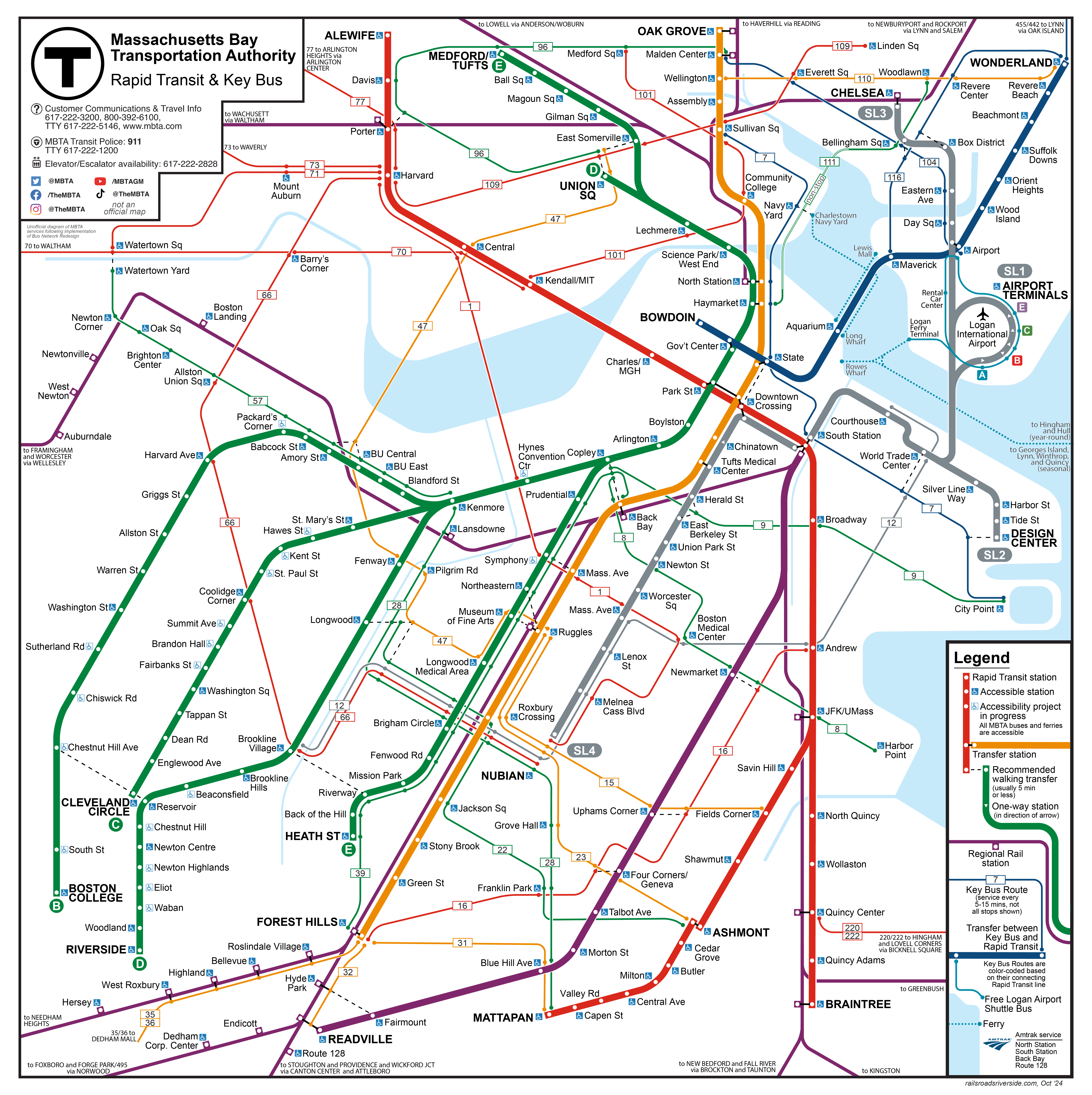
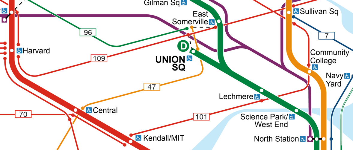
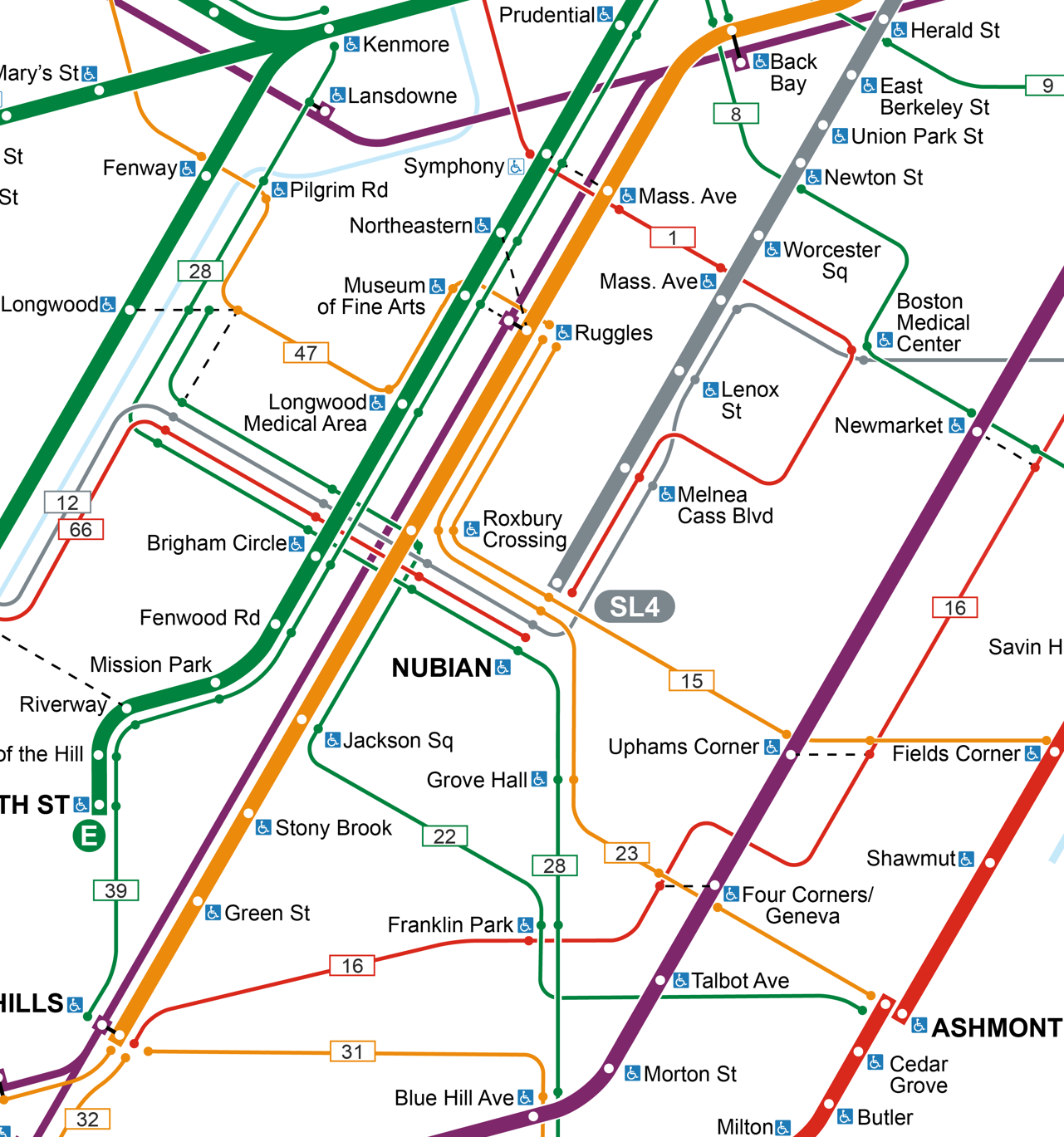
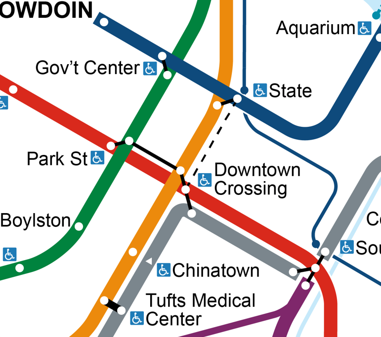
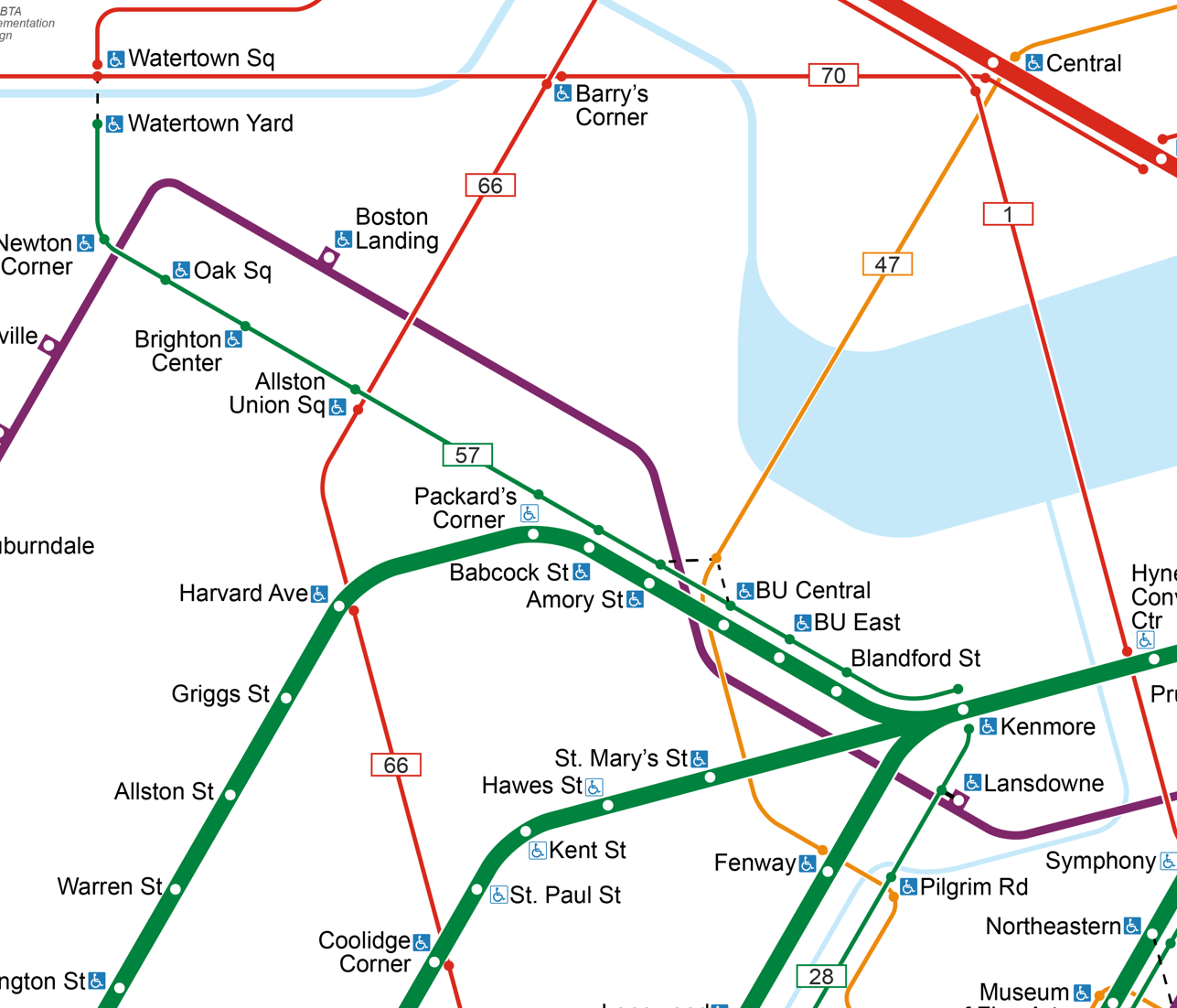
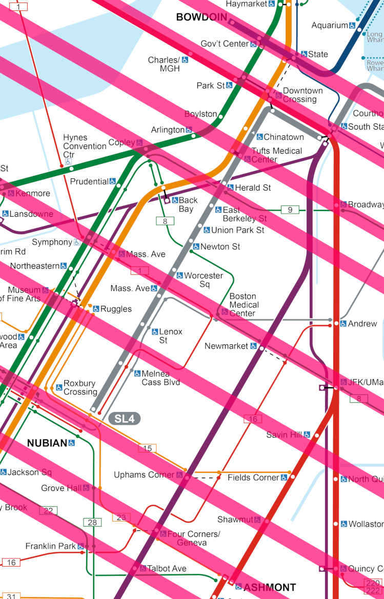
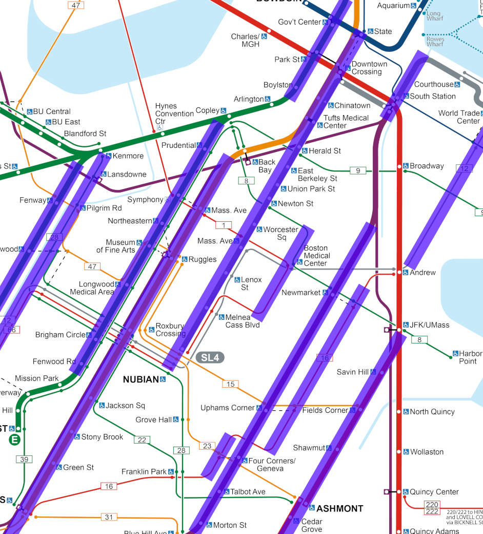
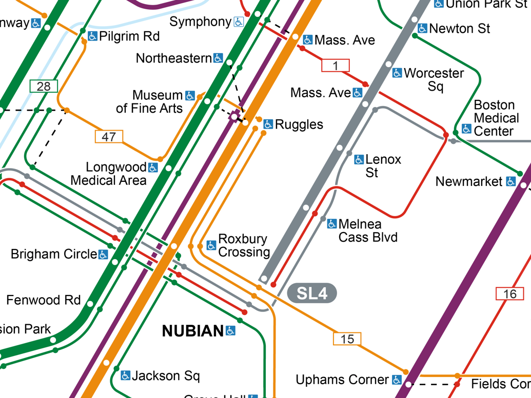
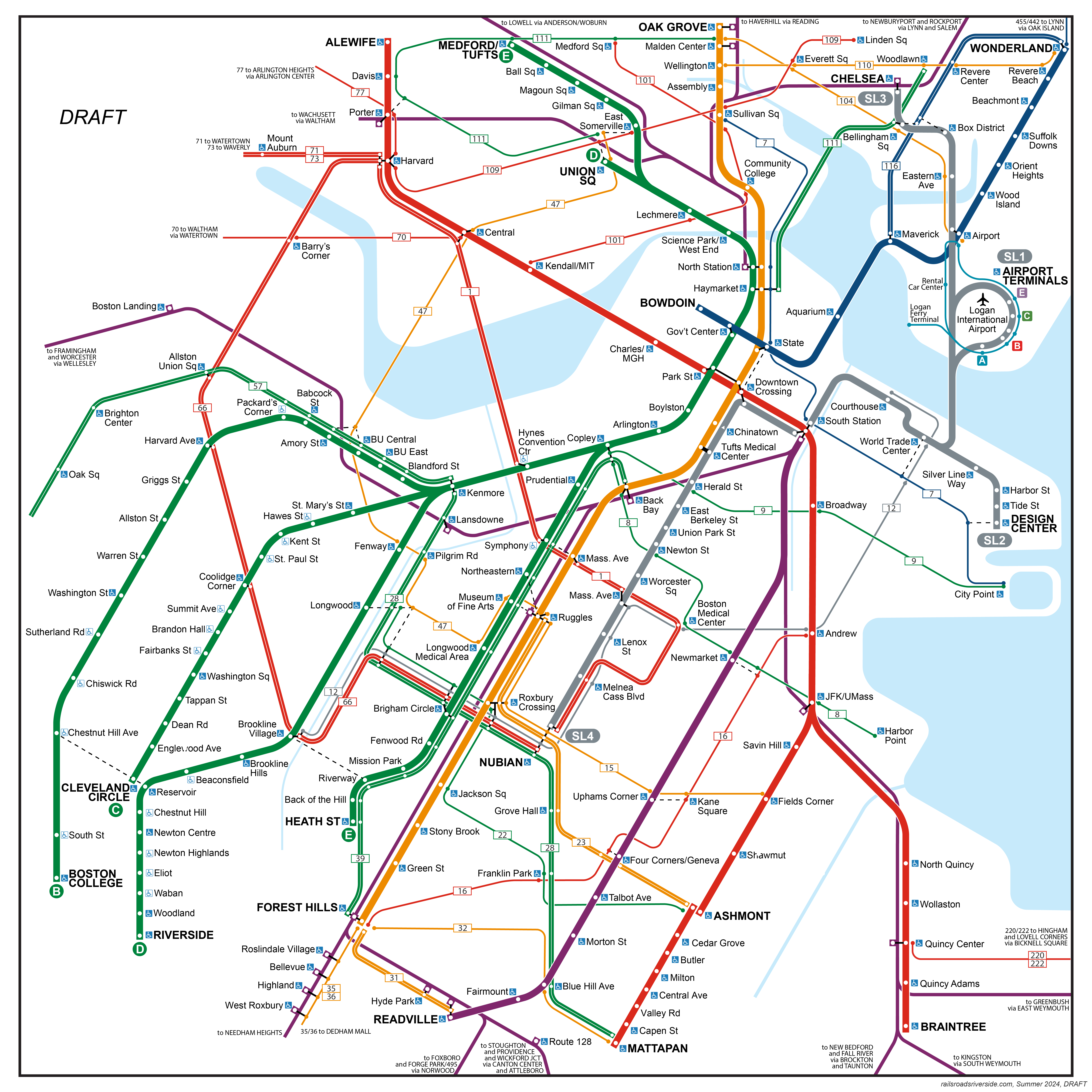
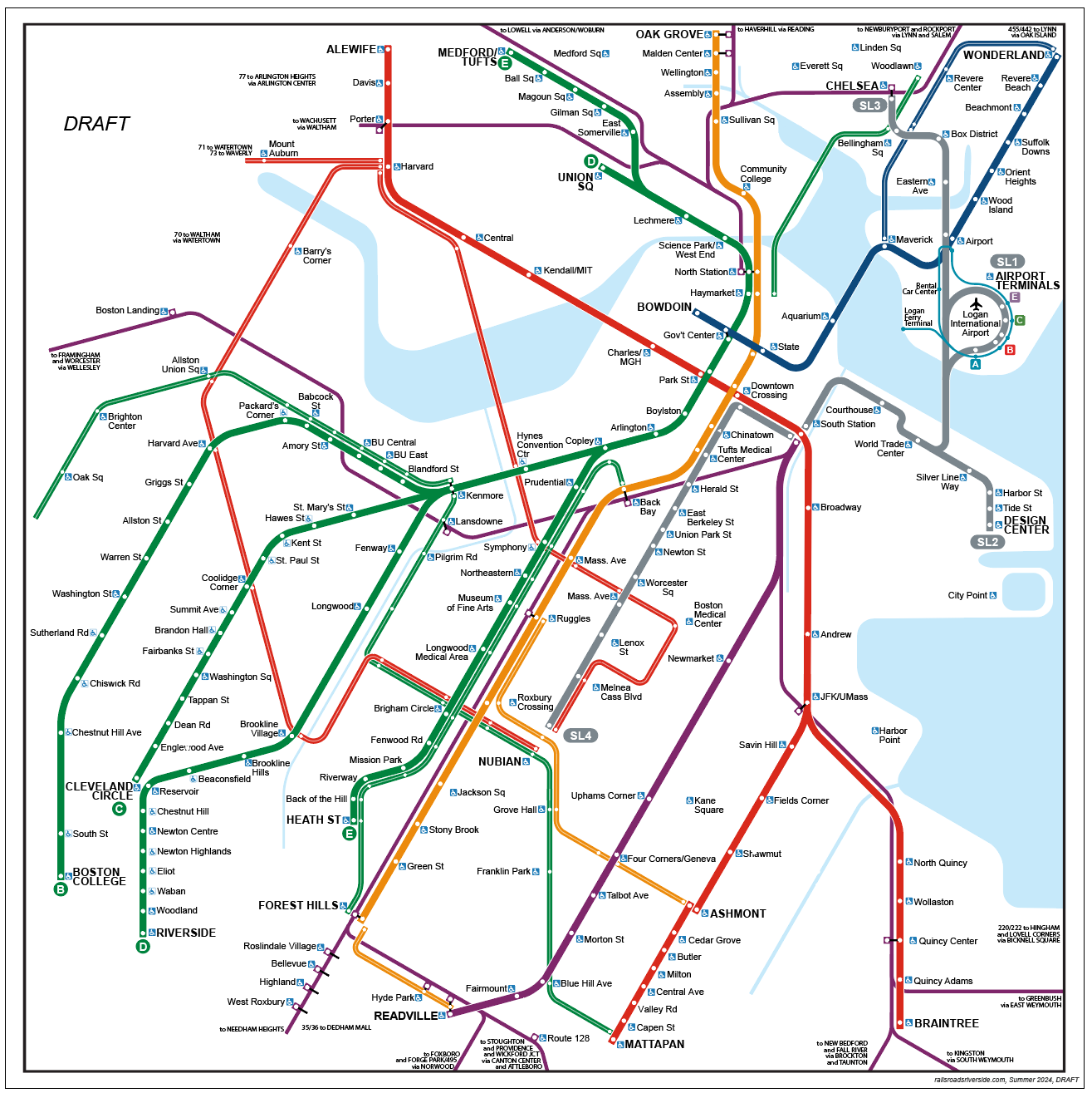
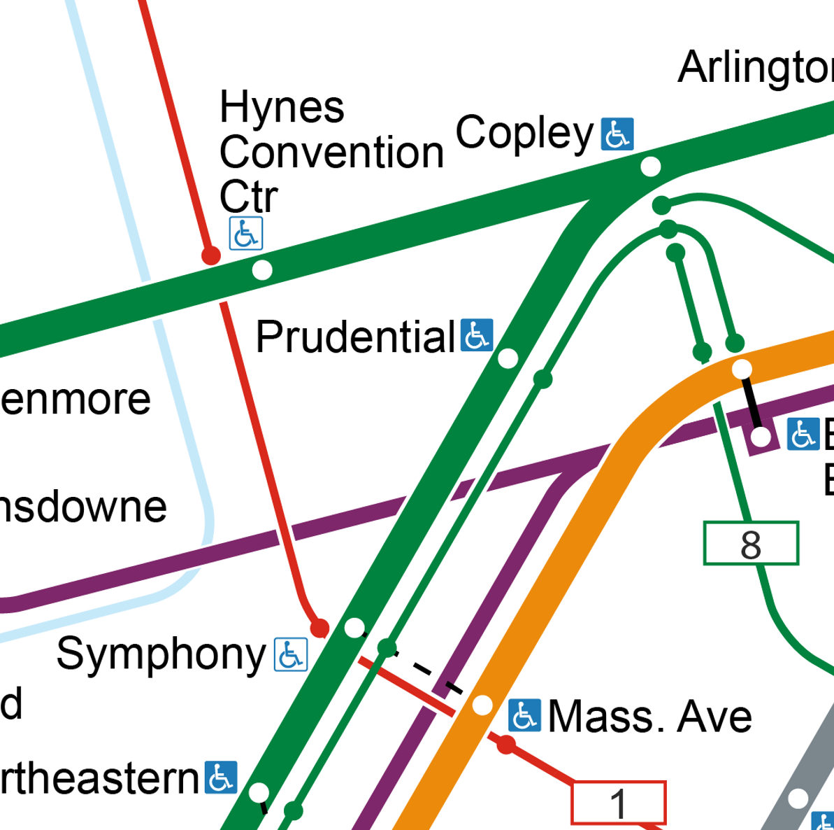
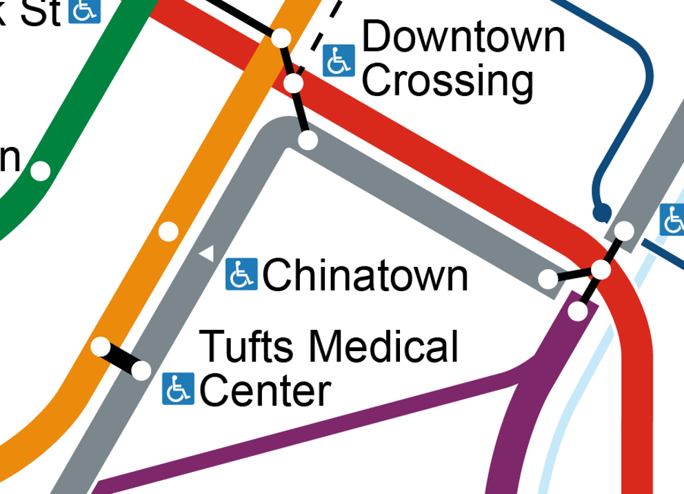
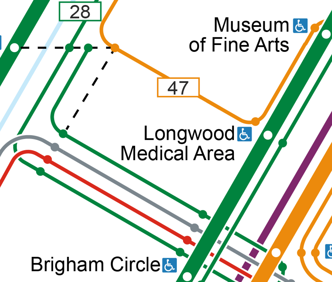
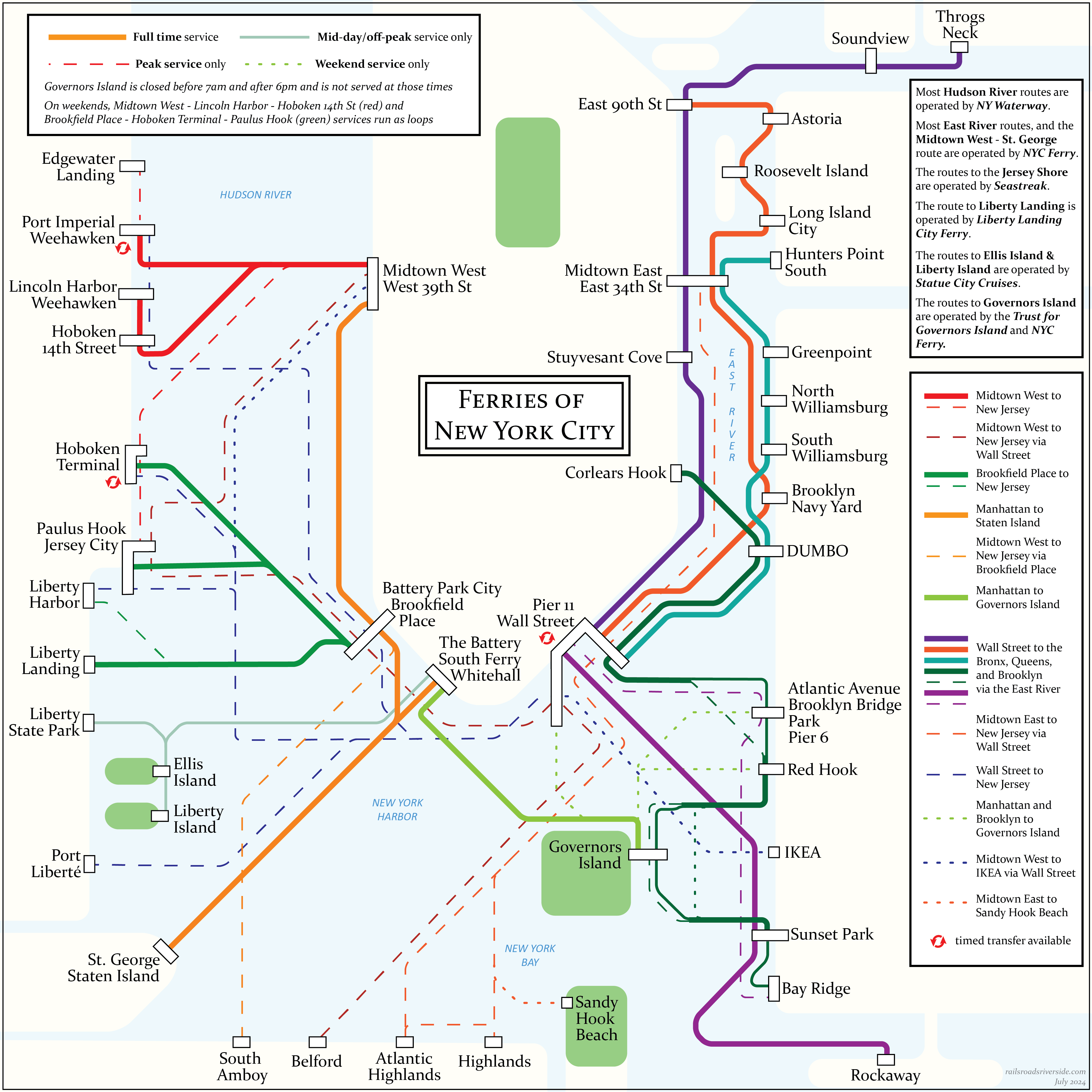
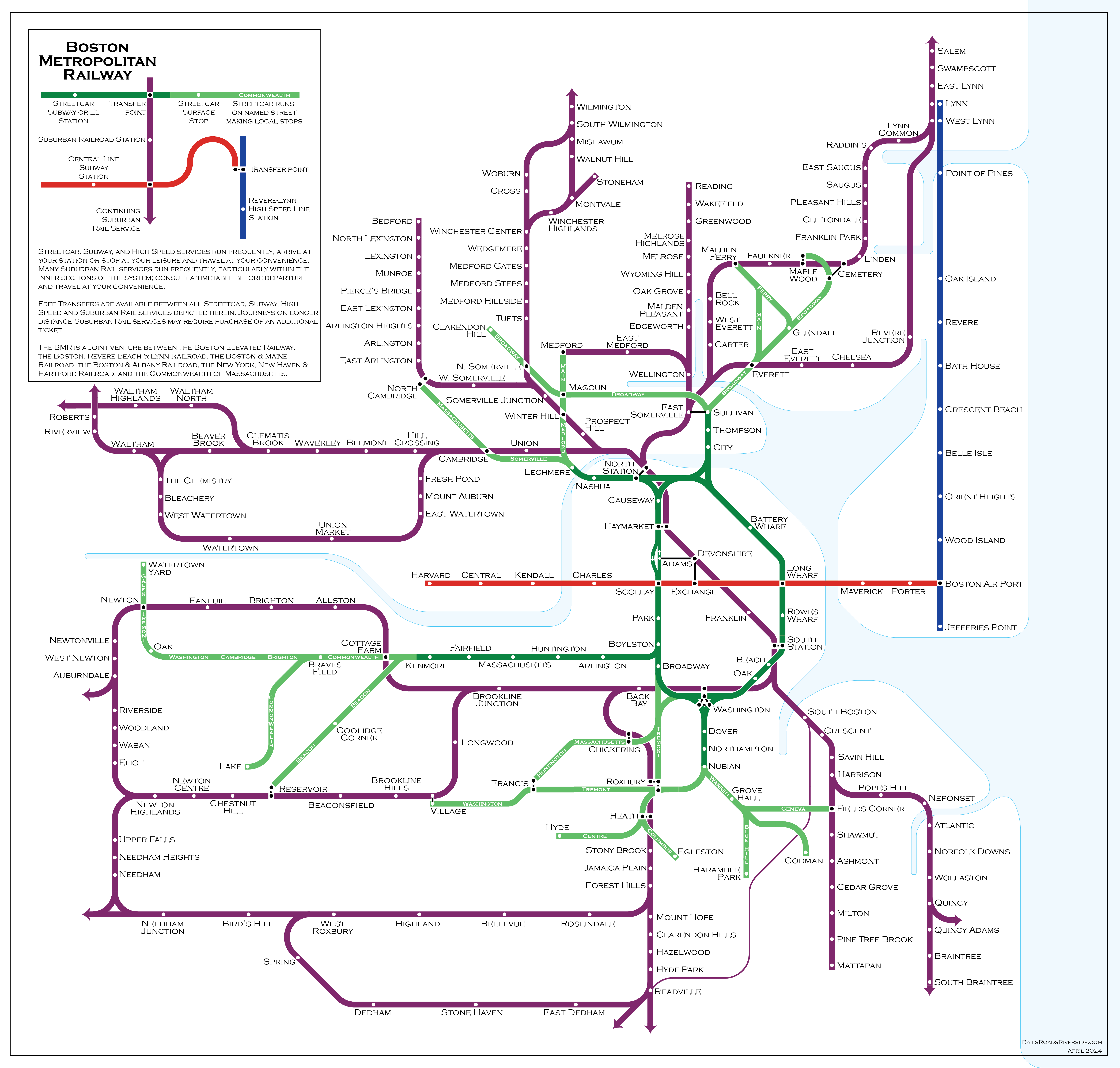
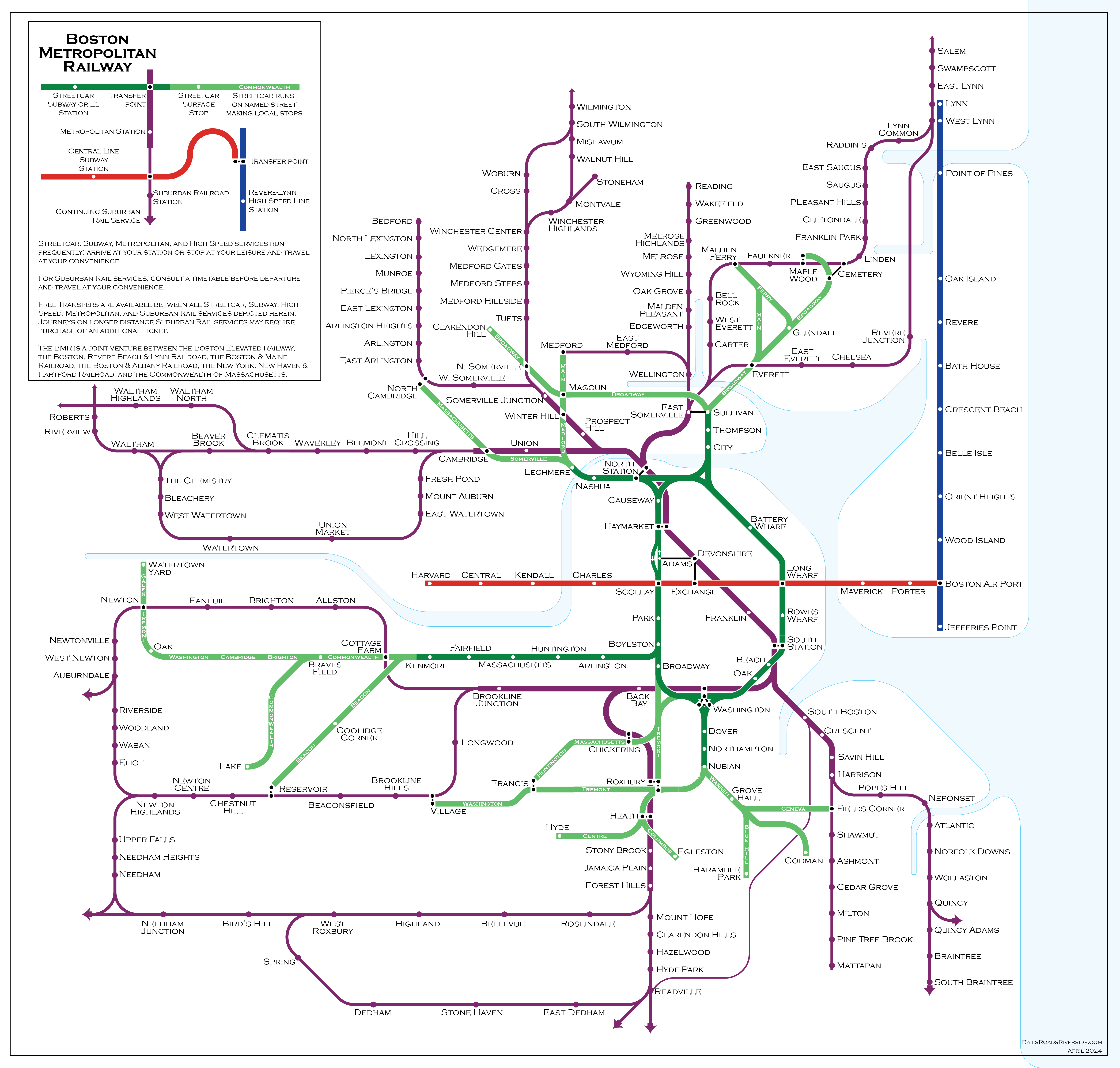
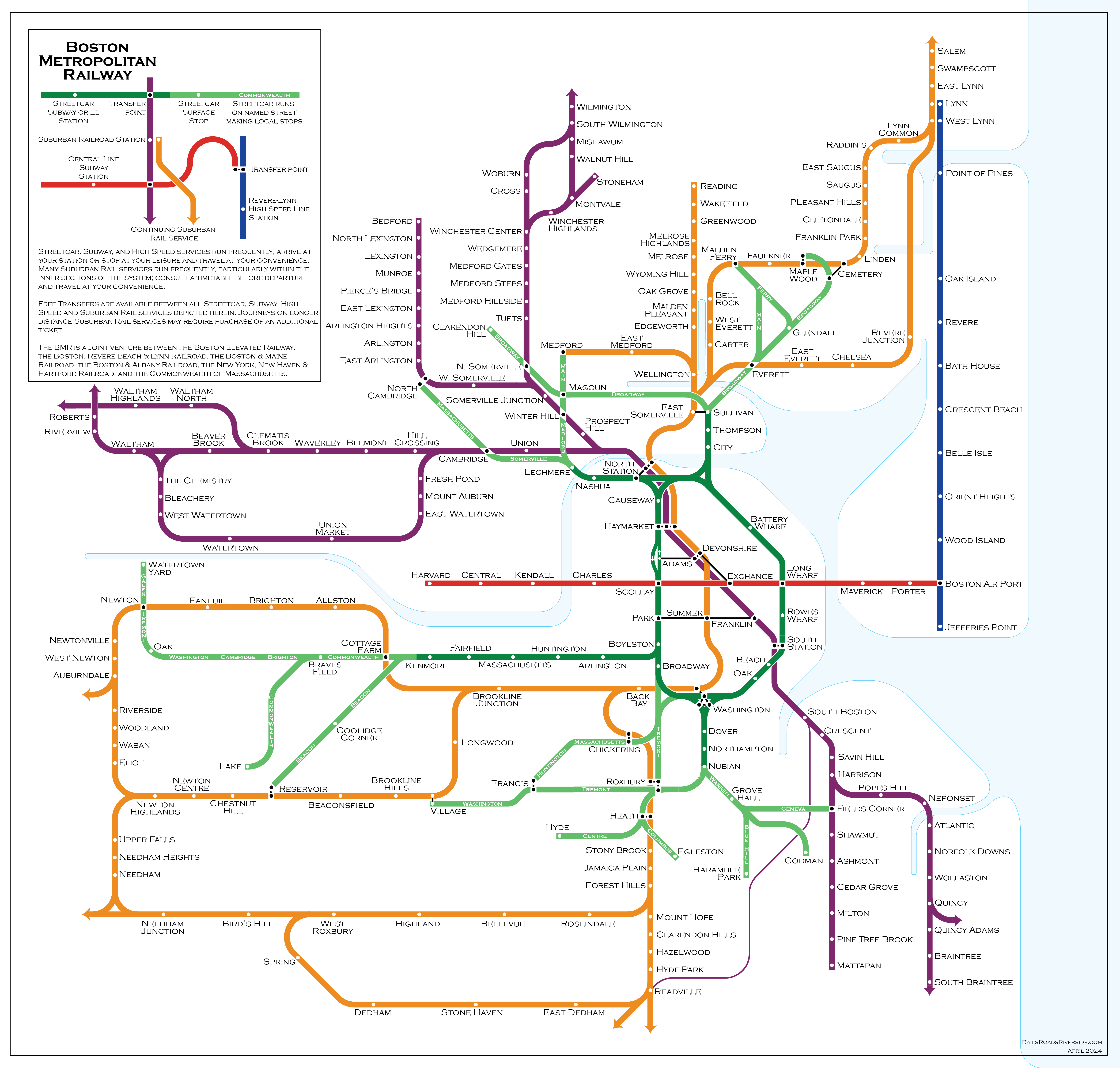

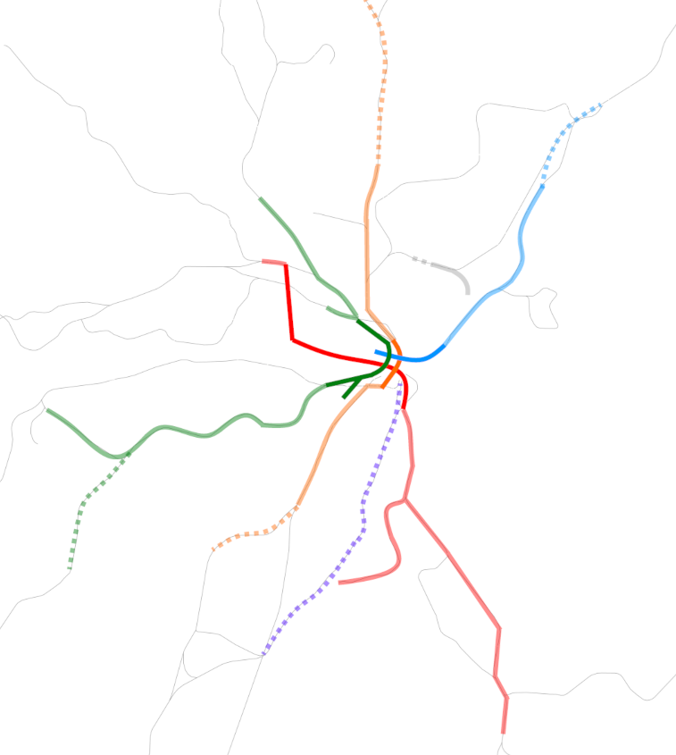
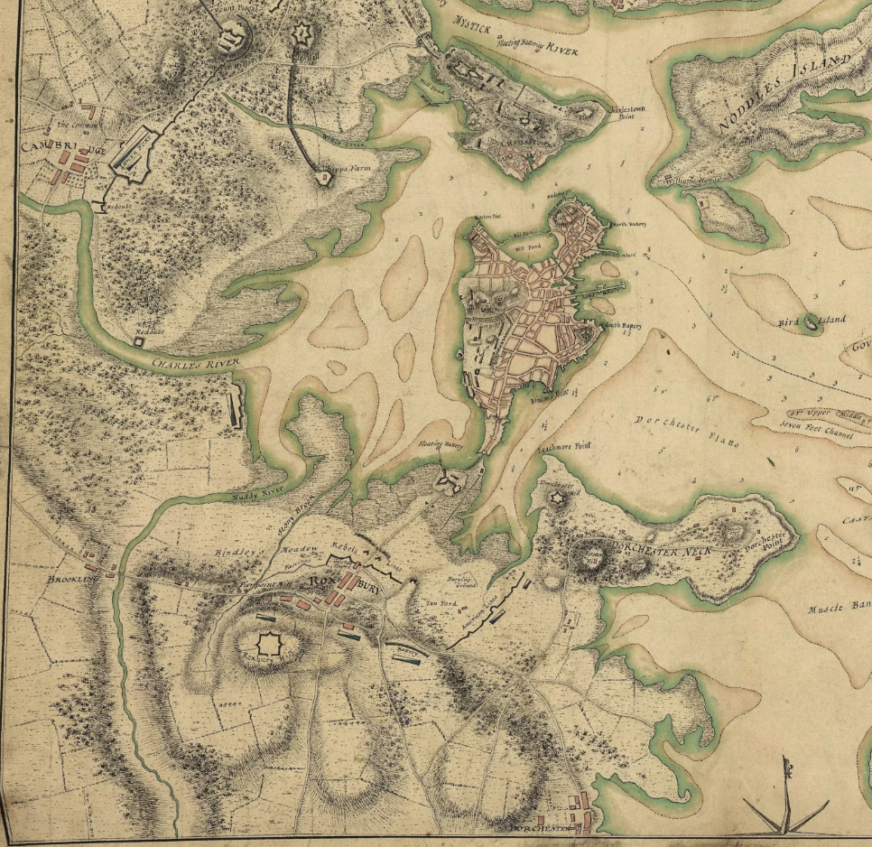
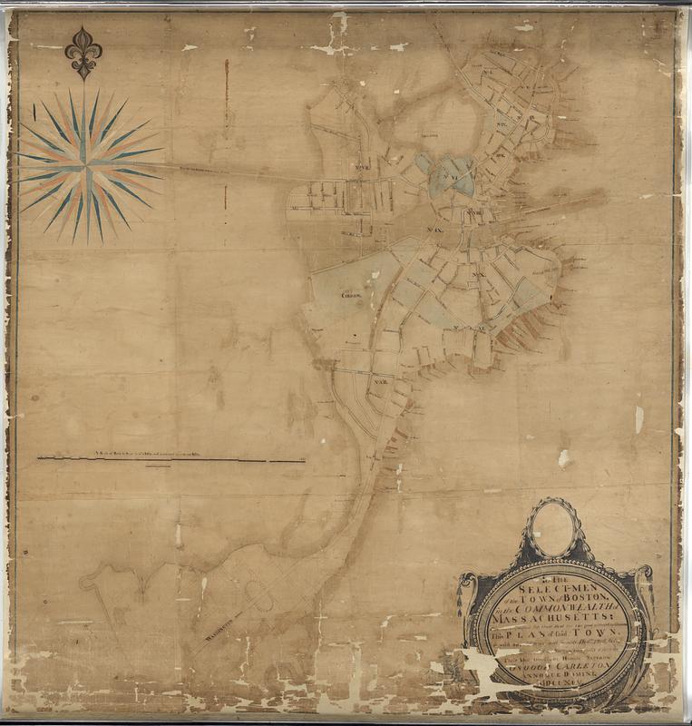
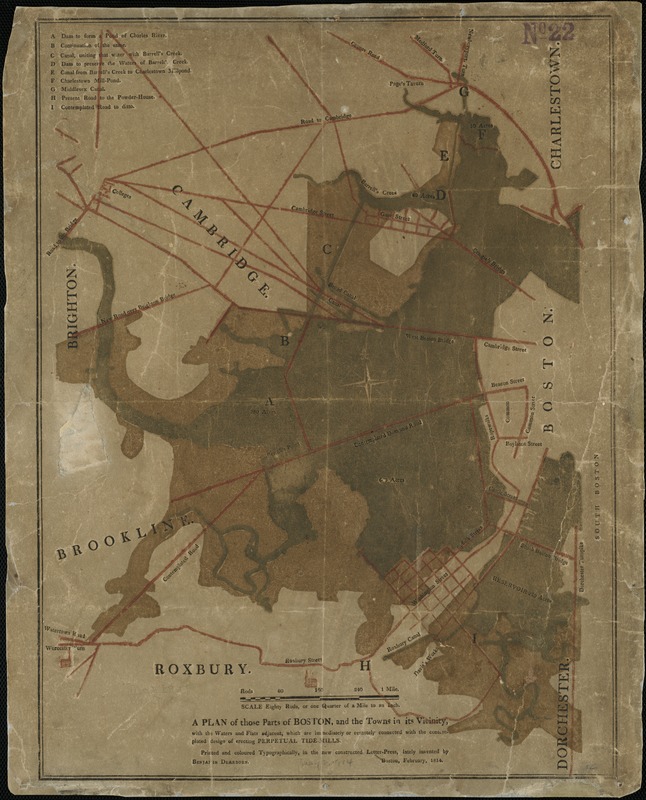
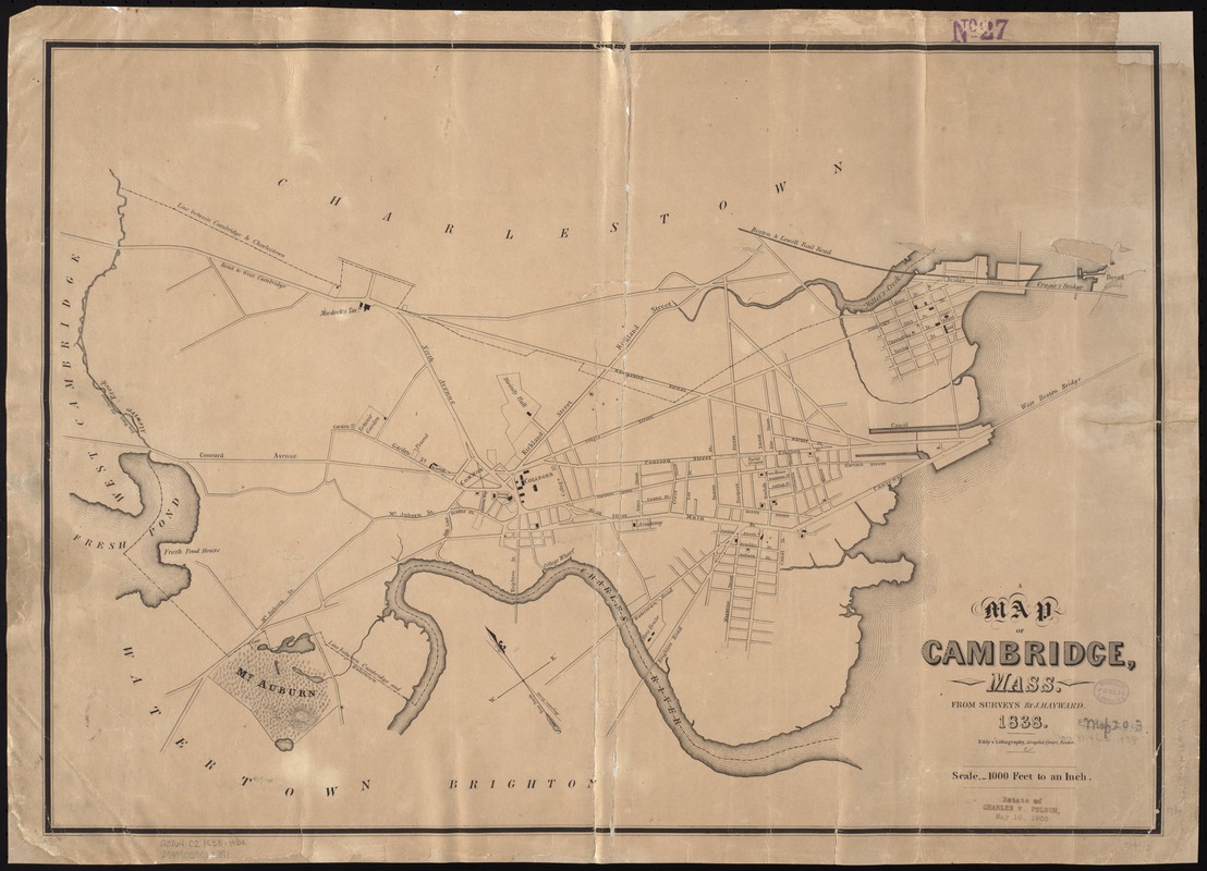
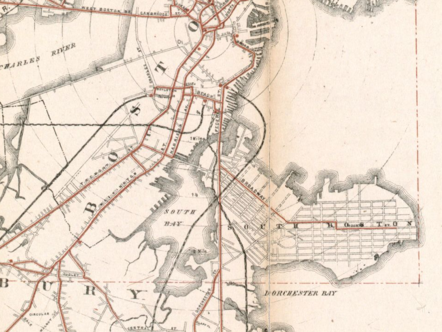
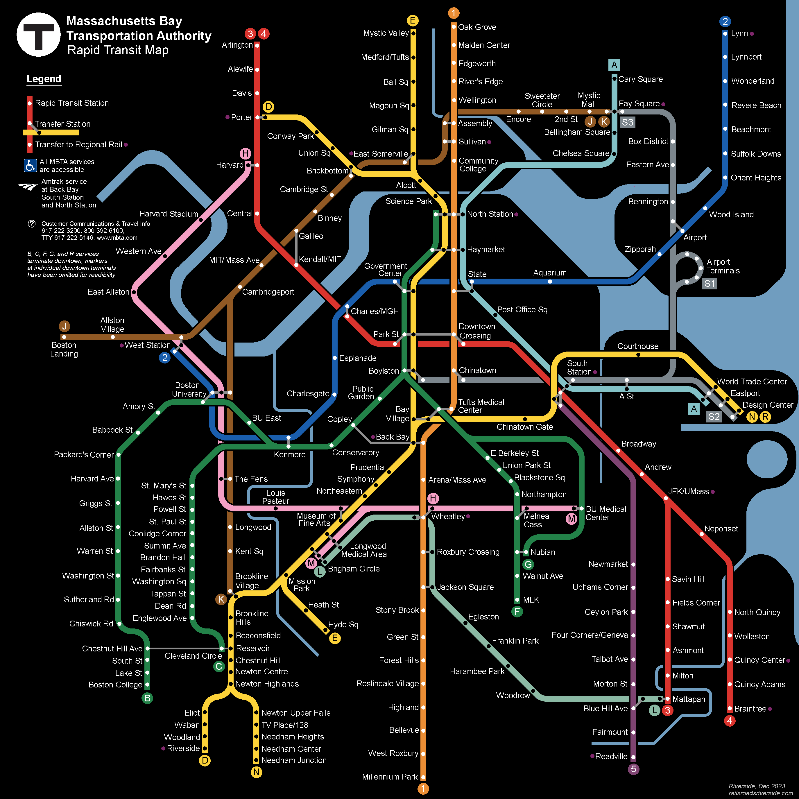
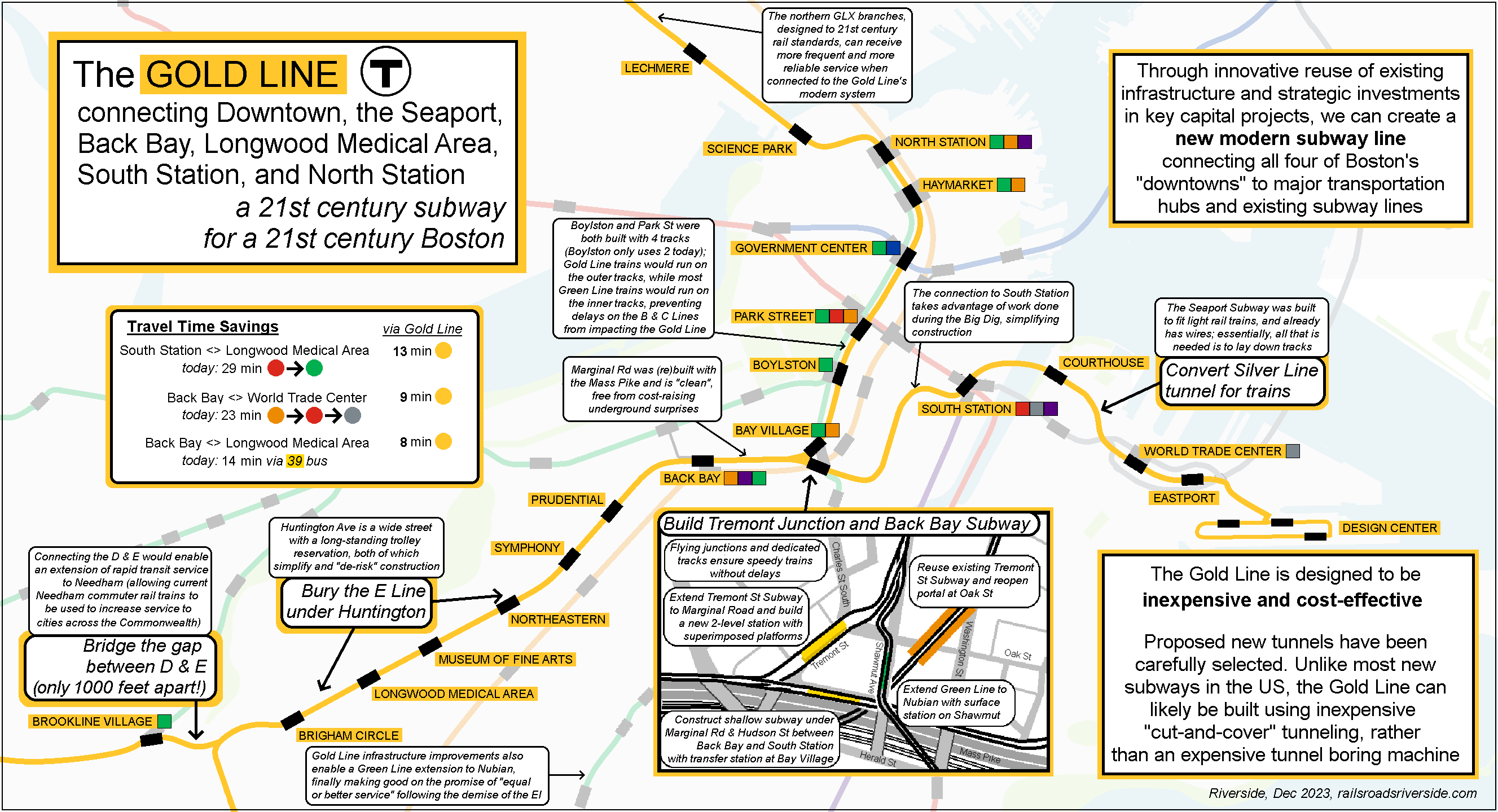
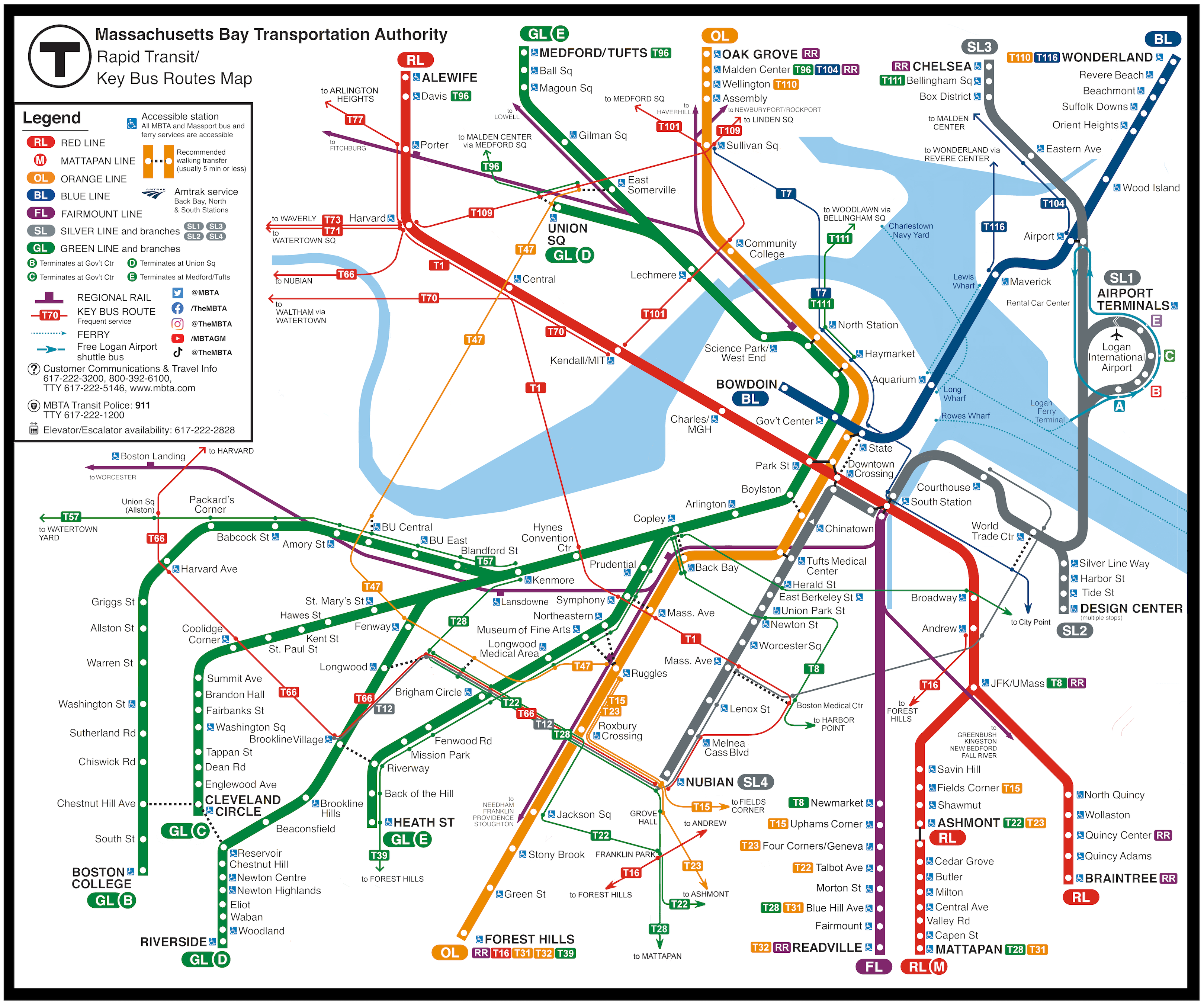
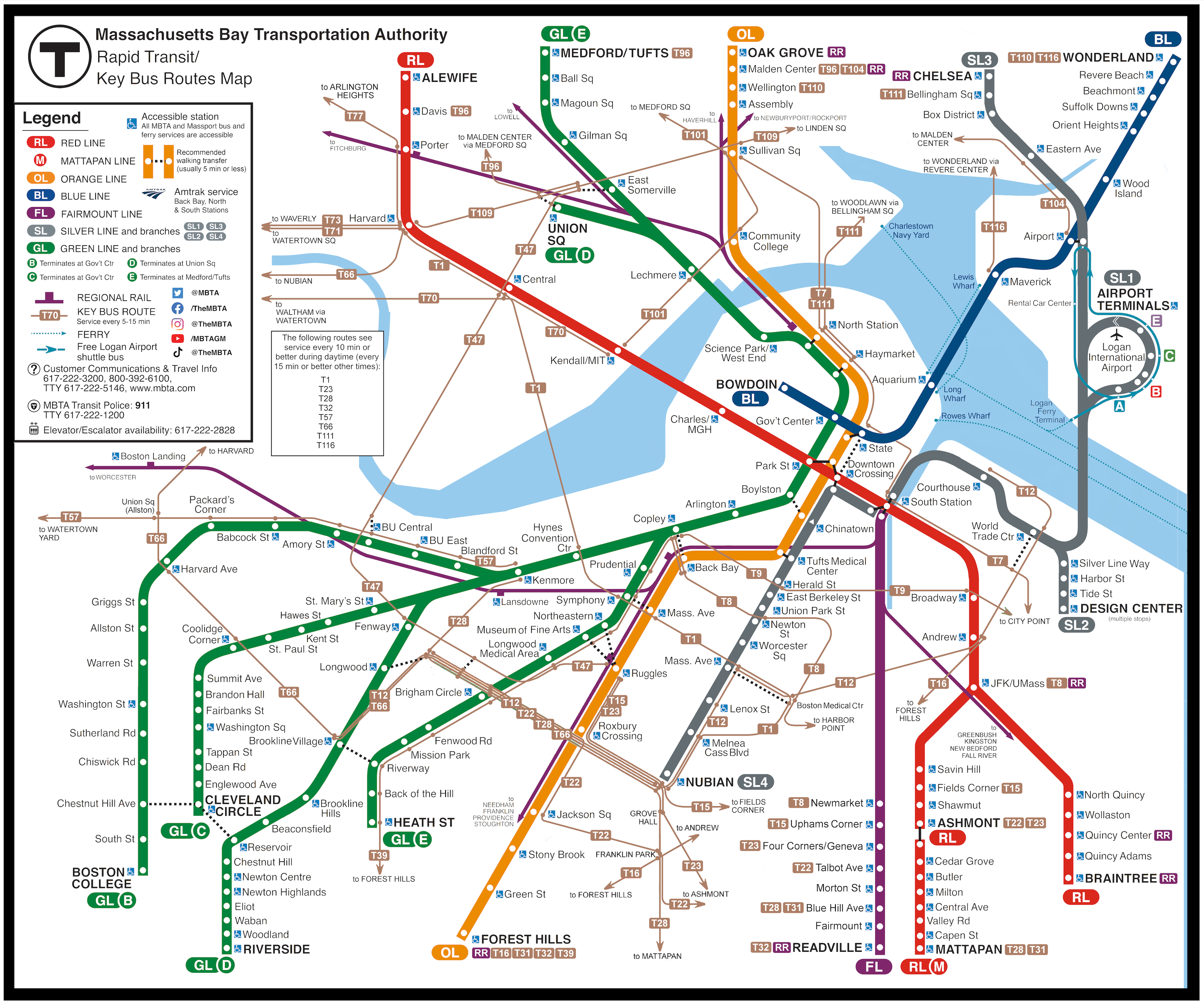
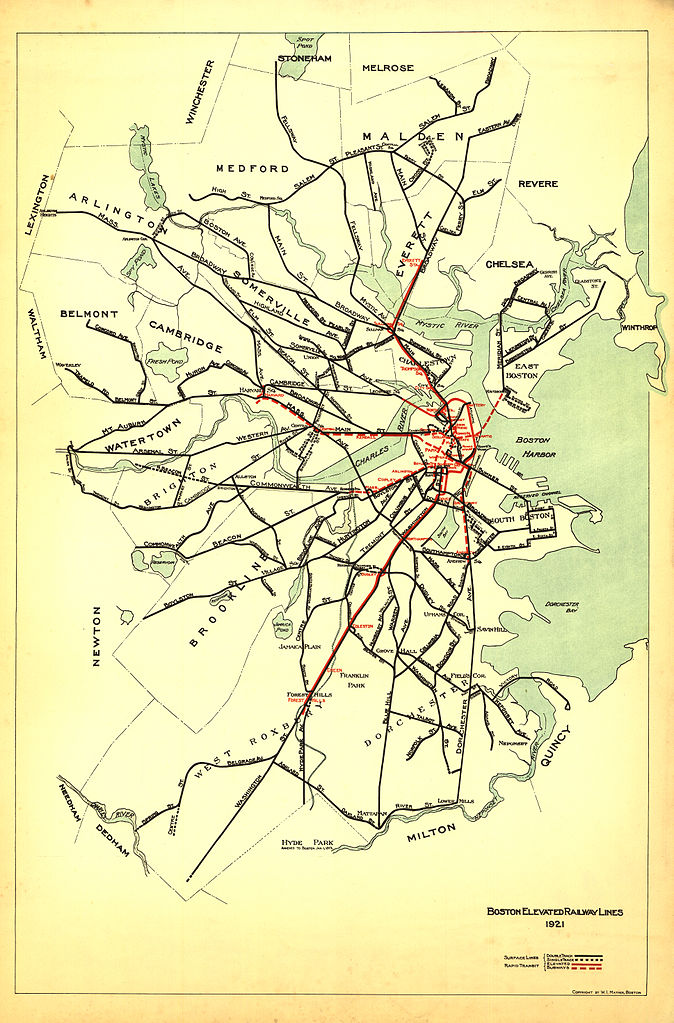
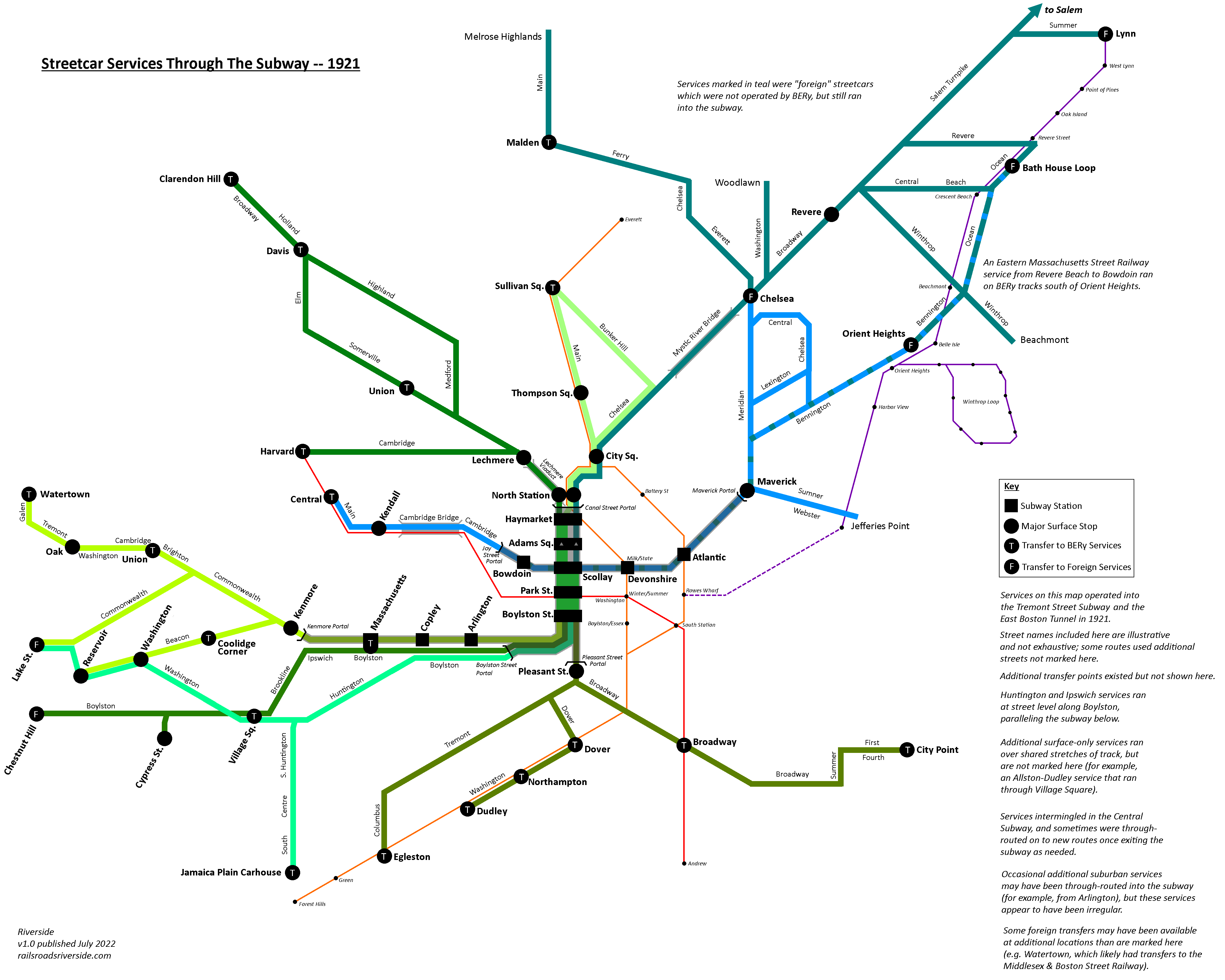
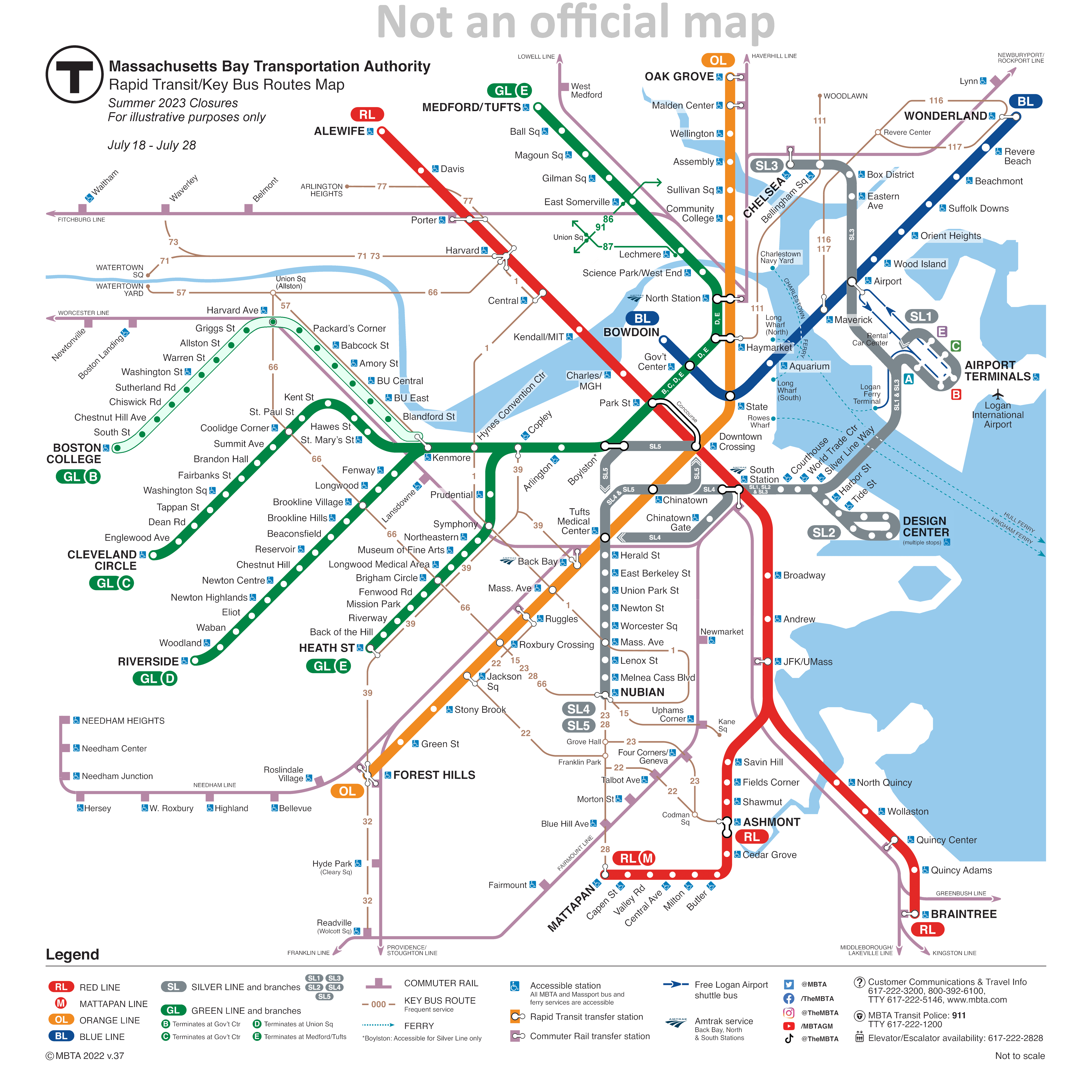
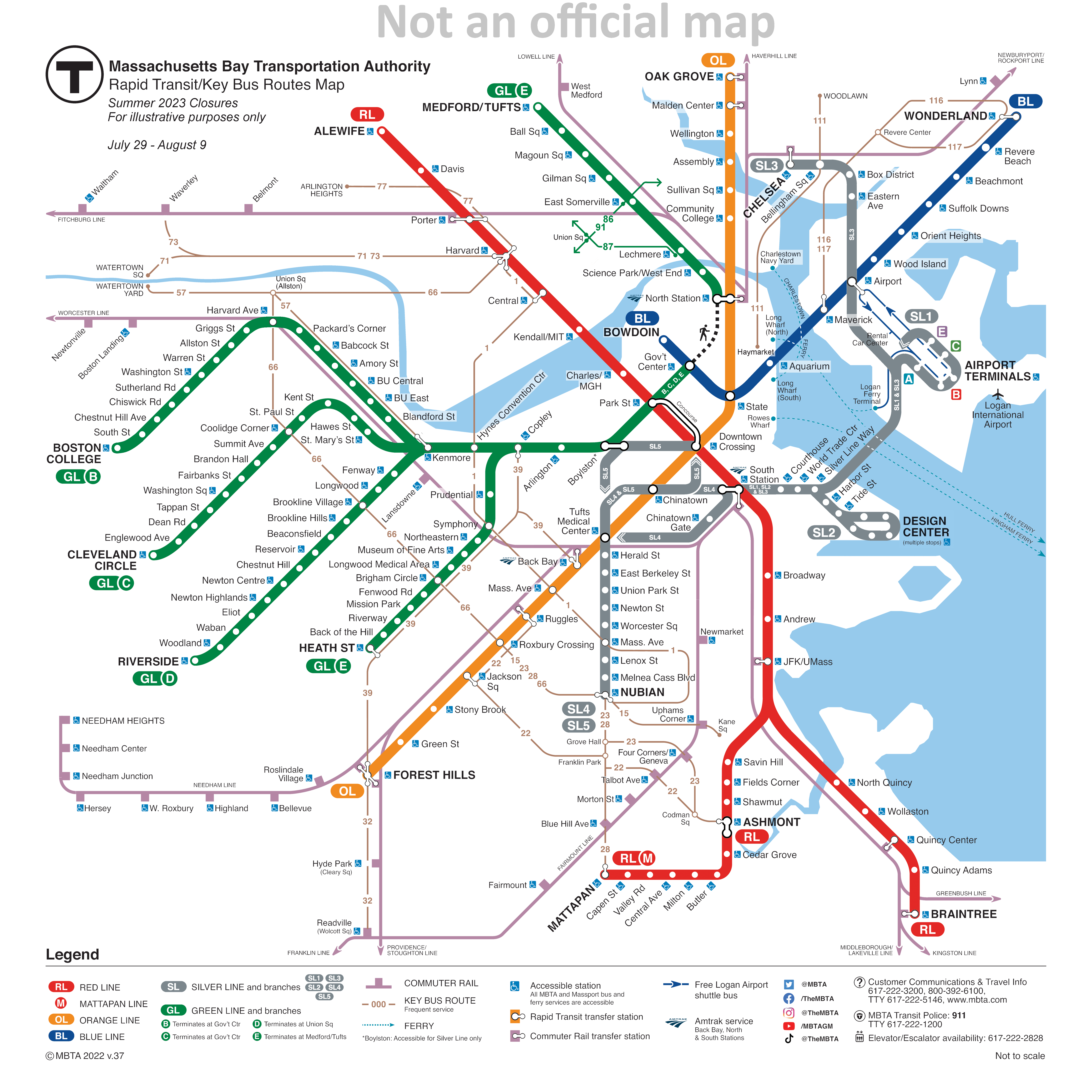
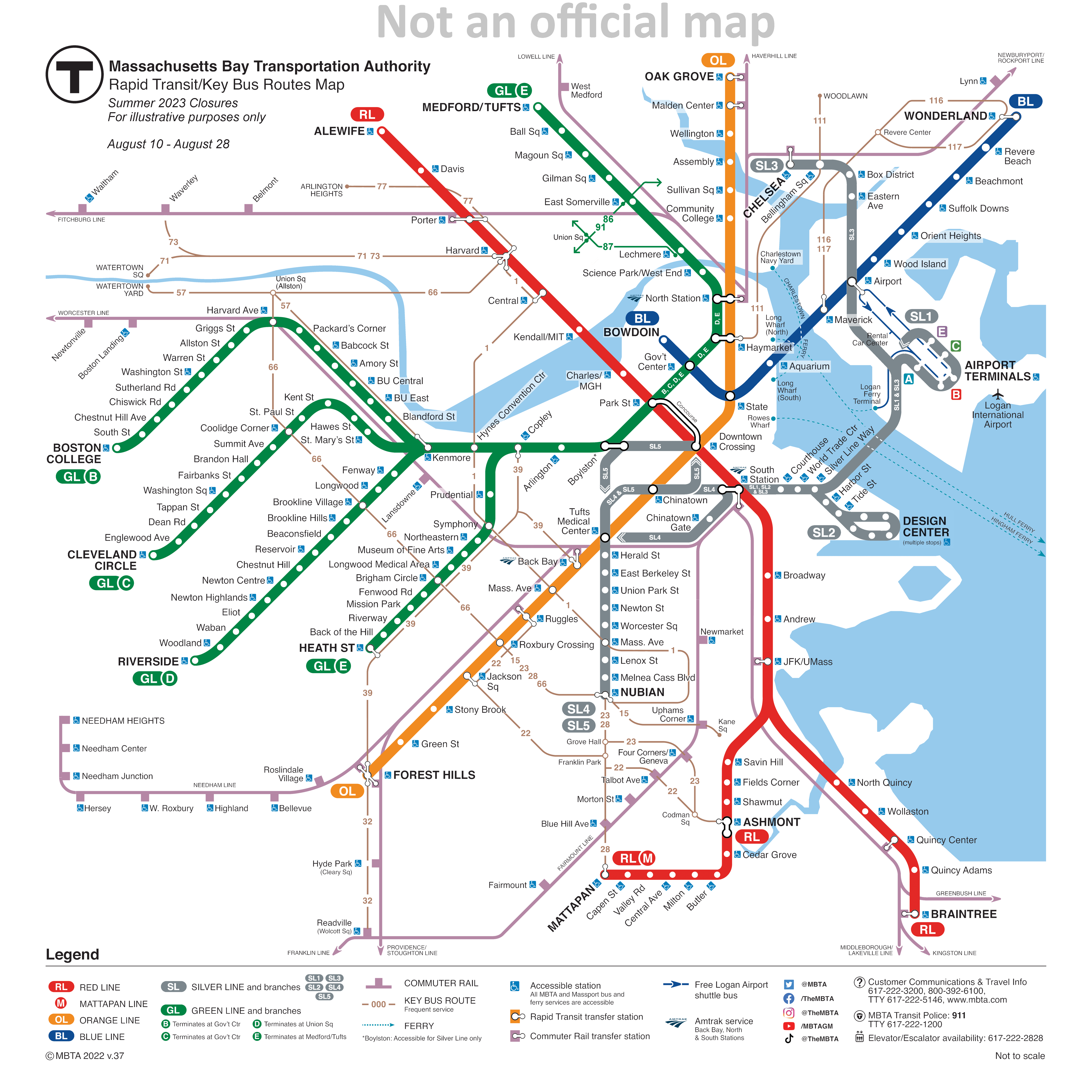
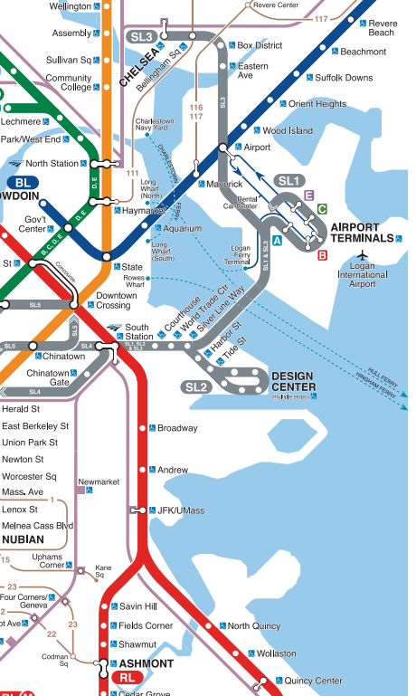
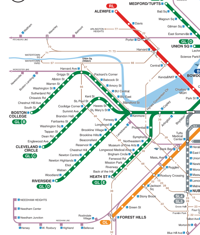
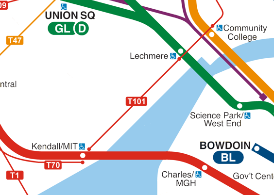
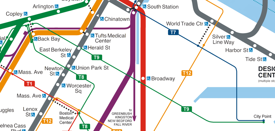
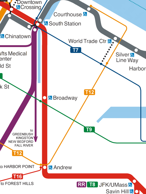
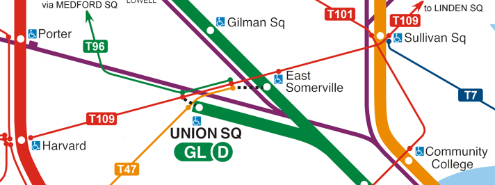
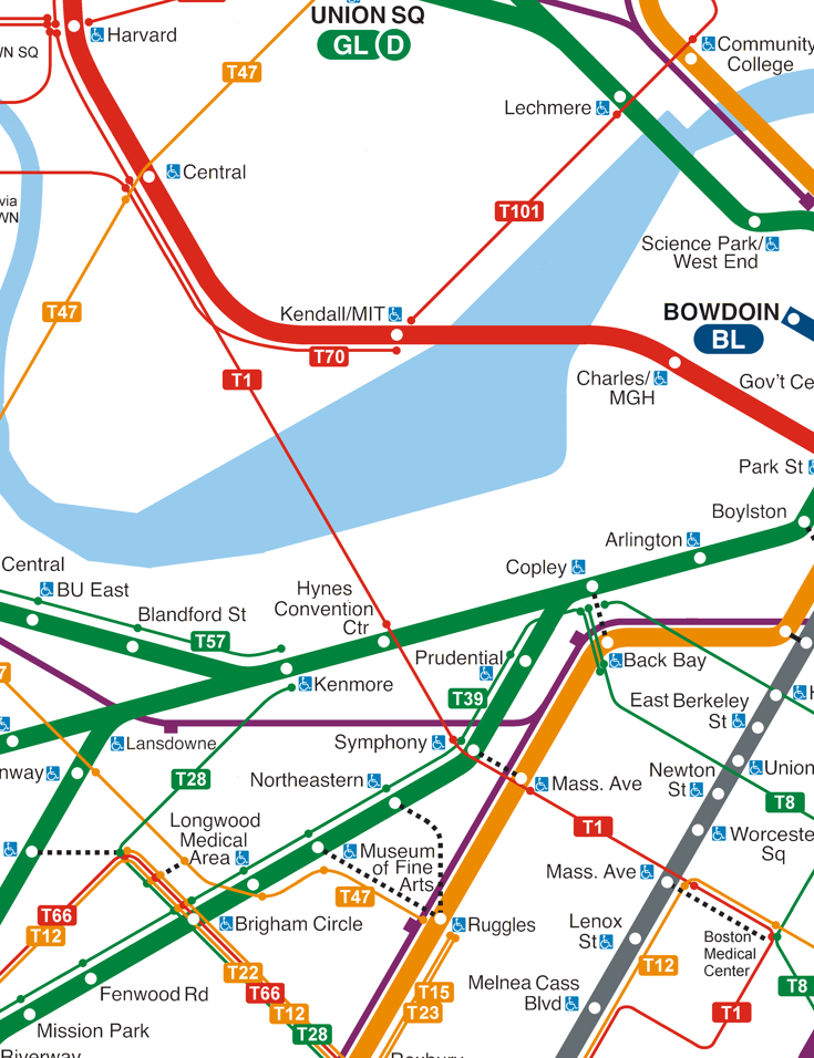
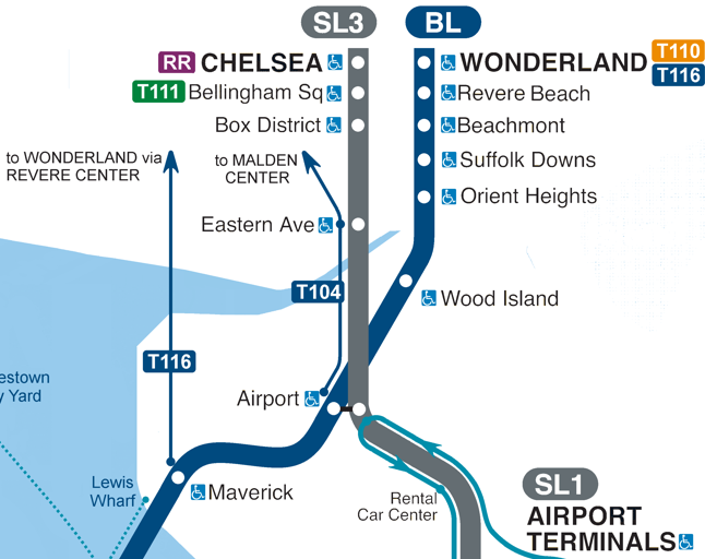
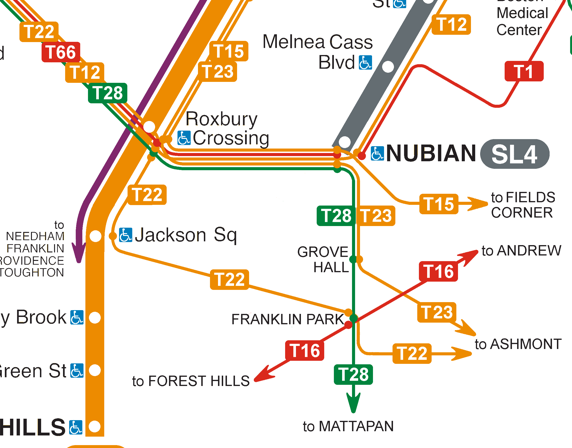
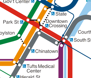

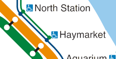

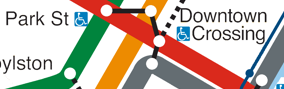
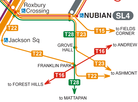
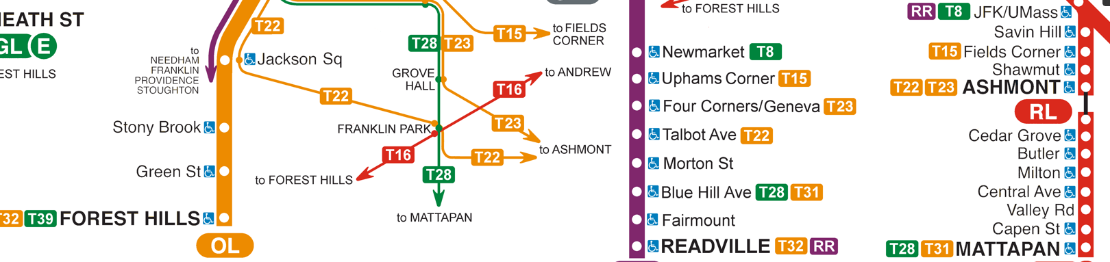
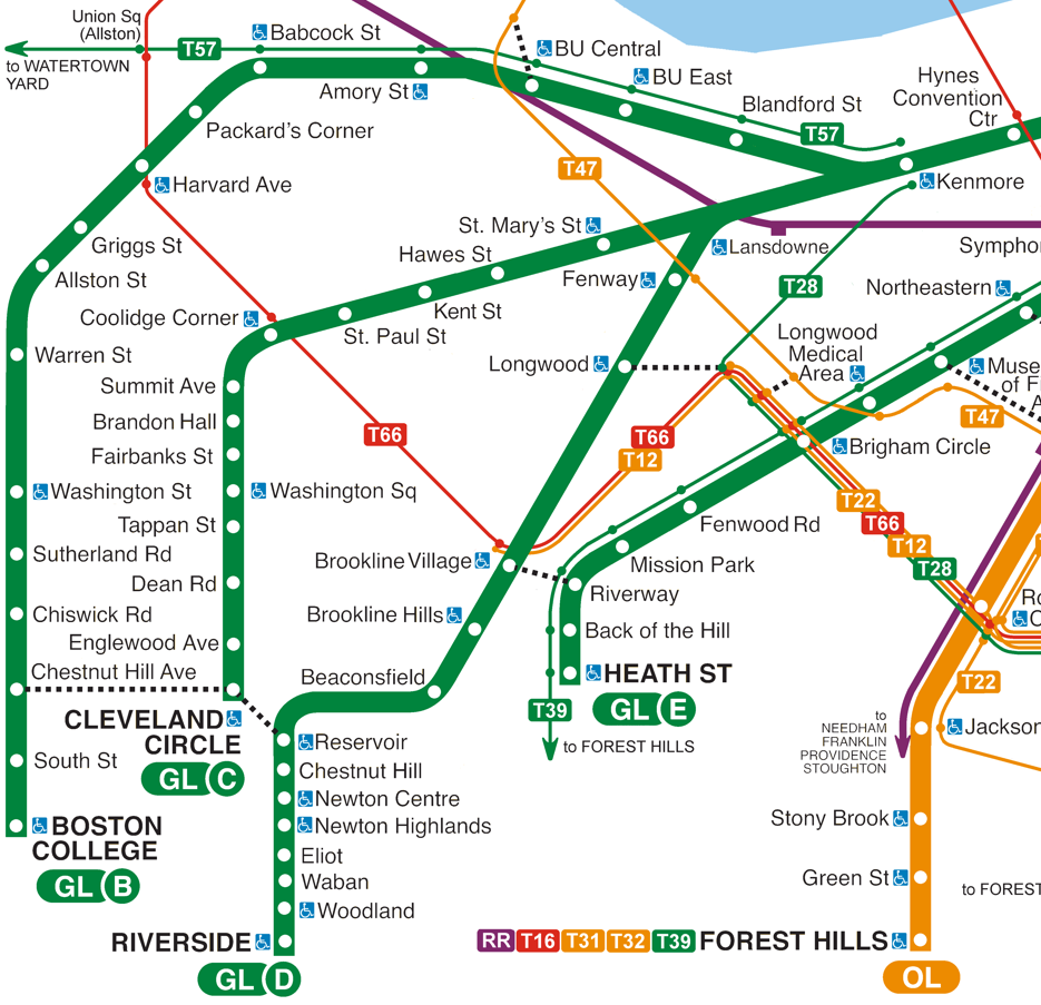
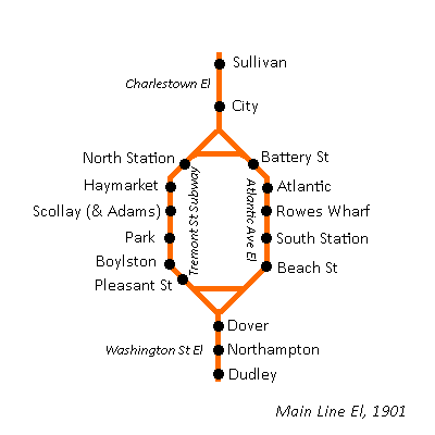
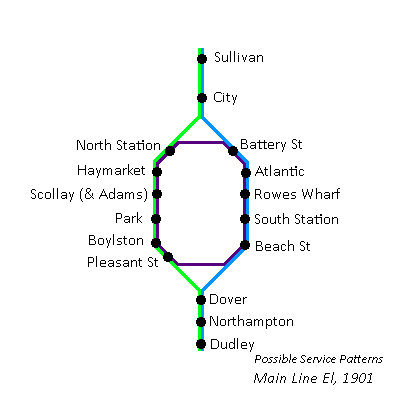
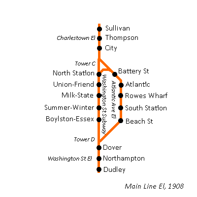
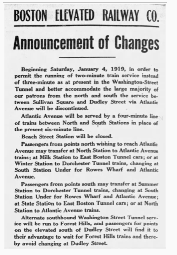


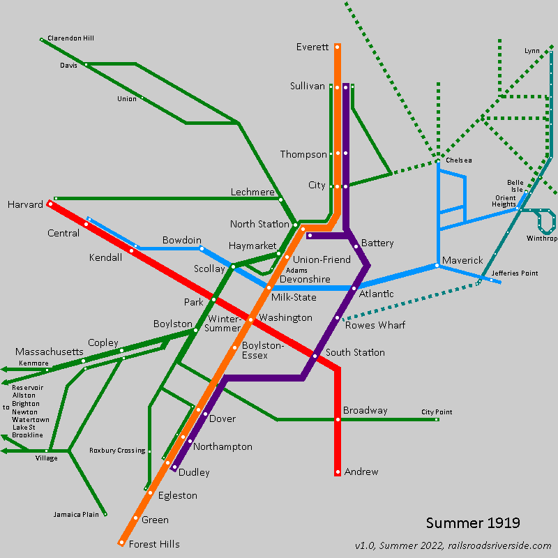
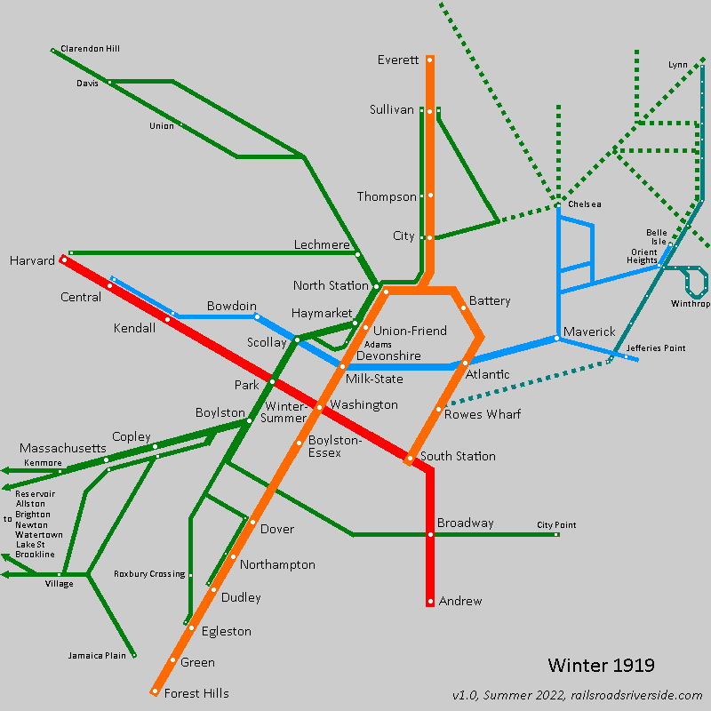
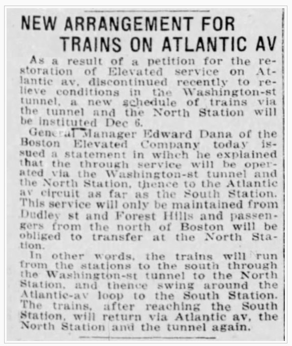
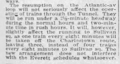
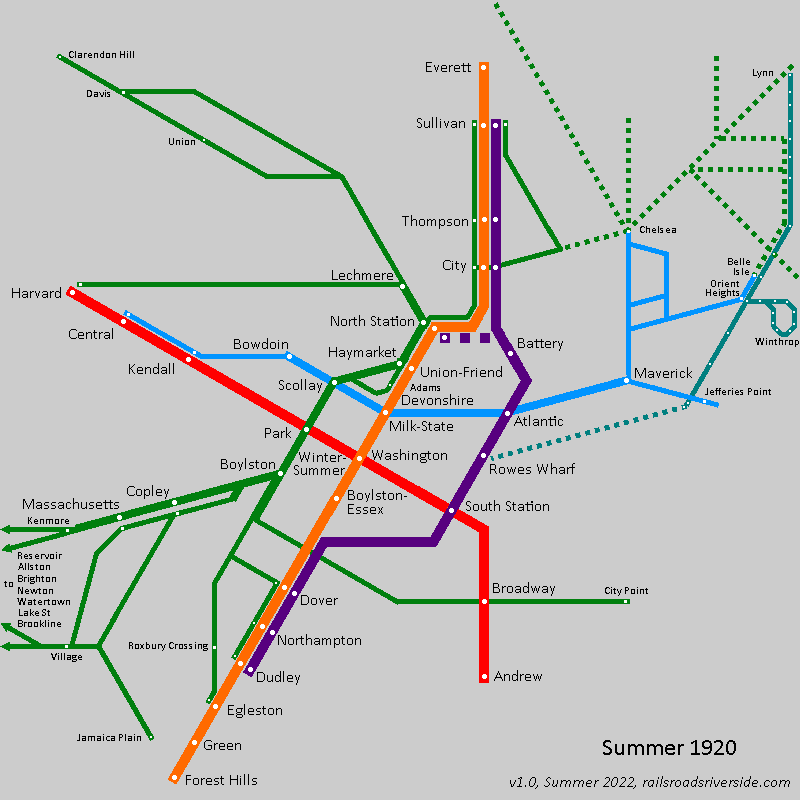
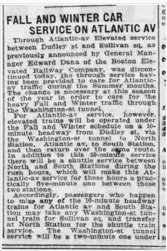
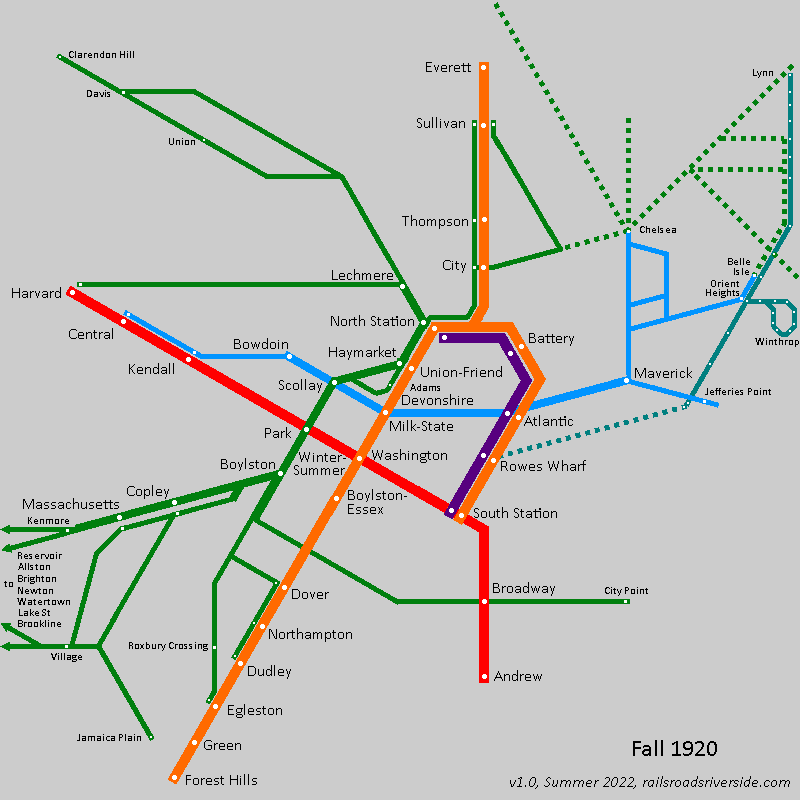
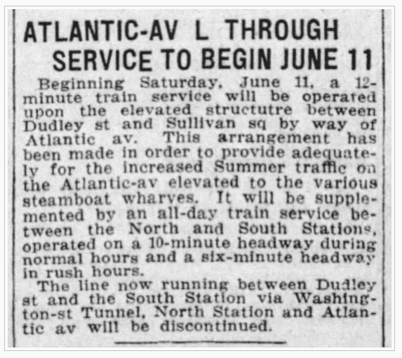
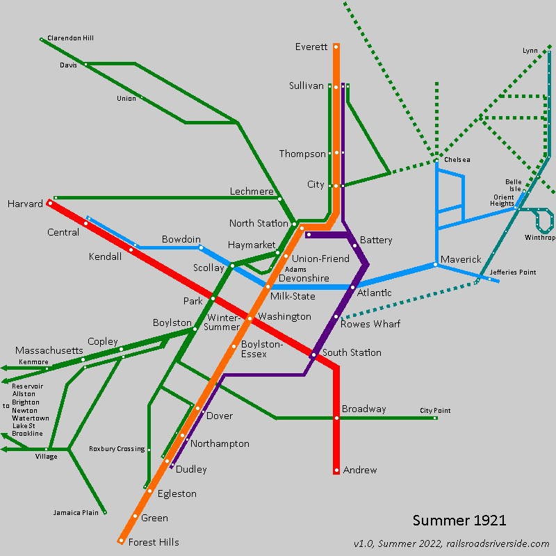
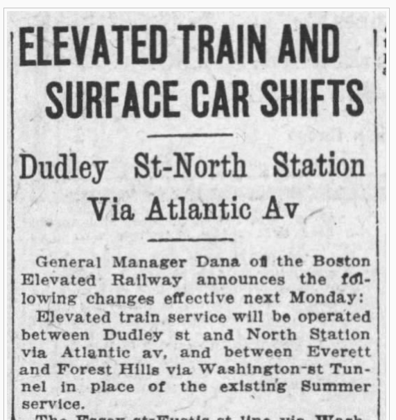
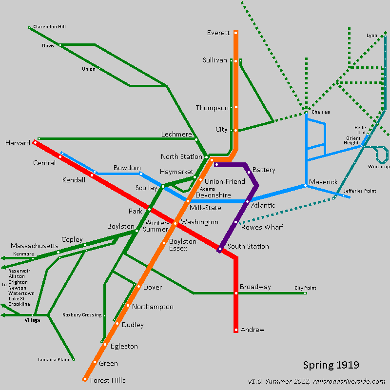