NYC’s Super Commuter Rail Network

Some time ago (before the pandemic), I considered taking a job in New York City. Having no desire to relocate, and understanding that there would be some flexibility for how often I actually needed to be in the office, I pondered whether I would be interested in becoming a “super commuter”.

What is a “super commuter”?

According to most definitions I’ve found, a super commuter is someone who lives in one city/metropolitan area but works in another. This seems like a somewhat uselessly vague definition, at least in the Northeast Corridor, but (with apologies to Justice Potter Stewart) you definitely know a super commute when you see it. 

A 2012 report by Moss & Qing out of NYU gives an excellent overview of common super commutes in the US, which include journeys like:

  • Boston to NYC
  • Pittsburgh to Philadelphia
  • Dallas/Fort Worth to Houston
  • Bay Area to Los Angeles

As well as more modest journeys such as:

  • Philadelphia to NYC
  • Albany to NYC
  • Milwaukee to Chicago
  • San Diego to Los Angeles

Most super commuters do not go to the office five days a week, which is one reason they are willing to make the longer journey. For my part, I’d argue that a super commute is one which takes, let’s say, 2.5 hours or more one-way. 

This definition probably encompasses more commuters than Moss & Qing’s analysis did, but it seems to me that travel time is more likely to affect behavior than raw distance or crossing MSA boundaries. Philadelphia-NYC takes 1h50m by Amtrak, but numerous Metro North journeys are comparable, such as from Poughkeepsie (1h50m), Wassaic (2h), Danbury (2h), New Haven (2h), or Waterbury (2h45m). 

Amtrak schedules for super commuters

In any case, as I began to ponder this lifestyle change, I started looking at the Amtrak schedule. From what the hiring officer had told me, it would be alright for me to do some flexible hours when I showed up at the Manhattan office — for example, it’d be fine to arrive around 10:30, and then either leave at 3 on a short day, or put in the extra hours and leave around 6 or so.

Morning inbound journeys

Christopher Juckins’ Amtrak schedule archive lets us review Amtrak timetables from before the pandemic (and before Amtrak stopped publishing PDFs on their website). As can be seen on the Boston-Washington Northeast Corridor schedule, getting into Midtown from Eastern New England for a 9am start is barely doable, but additional options open up as the morning goes on:

A screenshot of an Amtrak timetable from Boston to New York; the key journey times are listed in the text below

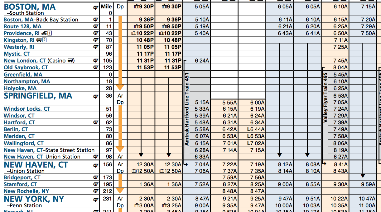
In summary, journeys which arrive in NYC before lunch included:

  • 5:05am to 8:47am
  • 6:05am to 9:47am
  • 6:10am to 10:22am
  • 7:15am to 10:47am

I figured I would probably aim for those 6am departures, maybe with some of the 7:15’s mixed in. That seemed manageable to me. 

Afternoon & evening outbound journeys

So then I took a look at the trip home. There are too many trips to took a screenshot, but in summary:

  • 3pm to 6:46pm
  • 3:30pm to 8:12pm
  • 4pm to 7:40pm
  • 5pm to 8:50pm
  • 5:38pm to 10:10pm
  • 6pm to 9:45pm
  • 7pm to 10:50pm
  • 7:50pm to 12:20am

Now, to be fair, some of those later trains really do get you home quite late. But that 4pm trip in particular struck me as perfectly fine — especially if your job is one where having uninterrupted time at the beginning and end of the day is valuable (for example, time to write or read). That could really work (and held some real appeal to an introvert like myself).

But the other thing that struck me was, “Damn. that’s a better schedule than the MBTA Commuter Rail.” Hourly departures, predictable journey times, a couple of extra trips layered in? Not bad!

The map

And this got me thinking… there are several other corridors that feed into NYC; do they all have frequencies to support this super commute?

And by now, you surely can guess that that is true (otherwise there would be no post!). I have some further observations in the appendix below about individual routes (which I think are worthwhile reading, as they illustrate what a behemoth the Northeast Corridor is), but the main reason I’ve written all this is as prelude to a map:

A diagram of Amtrak services running into New York. Services to Boston, Springfield/Greenfield, and Virginia are in red; services to Albany are in orange; services to Harrisburg via Philadelphia are in light blue. The legend indicates three "tiers" of stops: "most trains stop," "some trains stop" and "few trains stop", and a note at the bottom says "Not all trains stop at all stations. Consult individual timetables before travel." A textual description of which tier each station on each services falls into is included at the end of this post.

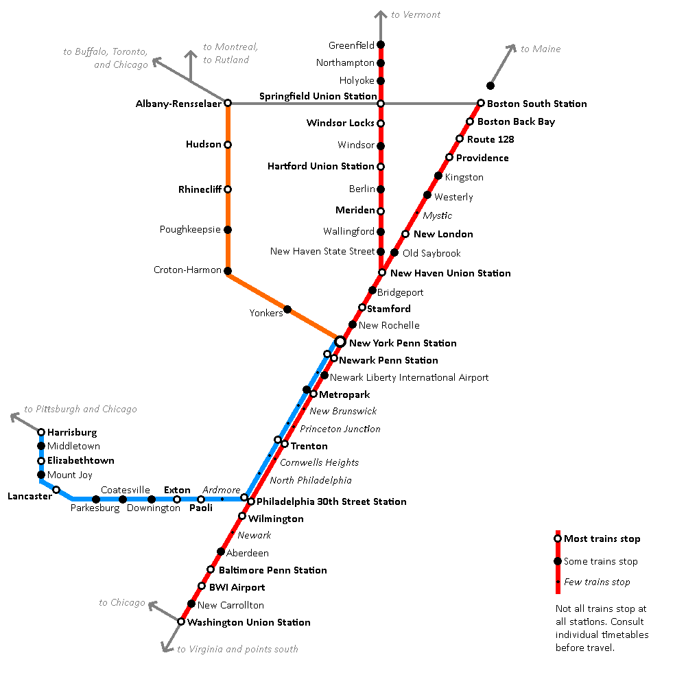
This map treats Amtrak’s services into New York like commuter rail services — and I would argue that they essentially are indeed a “super commuter rail” network. All of the stations and routes marked on this map have the ability to support the kind of “super commute” I was considering for myself: leave home early, get to New York mid-morning, leave New York mid-afternoon-ish, get home late, repeat once or twice a week, depending on distance.

Scope of the network

As you can see, it’s actually quite a sprawling network — stretching from Albany to Washington, Boston to Harrisburg, close to 200 miles in each direction. Boston, with the itineraries I listed above, is actually on the extreme end of the network, with its ~4h travel times; a place like Wilmington, DE is a mere 1h40m journey, comfortably below Metro North’s longest journeys (and in significantly more comfortable seating). Hartford, CT and Lancaster, PA are both about a 3h journey.

All of the journeys depicted on this map are available via services with modest frequencies (to enable flexibility) and a short enough travel time to accommodate a same-day round trip.

Local and express tiers

One of the things that was fun about making this map was poring over the different timetables to look at which stations were frequently served. For example, the Northeast Corridor schedule for NYC-Washington lists out a whole bunch of stations, which most trains then skip. Despite the timetable listing 8 stations between New York and Philadelphia, most trains only stop at 4: Newark Penn, Newark Airport, Metropark, and Trenton.

In this way, Amtrak builds an informal tiered network akin to a local-express model. Virtually all trains stop at places like Stamford, Trenton, and Rhinecliff; some trains skip stations like Kingston, Poughkeepsie, or Downington; and then there are some stations, like Princeton Junction and Newark, DE, which may only get one train a day, or even less (spiritual successors to “whistle stops”). Acela service mainly restricts itself to the major stations, leaving the Regionals to pick up the leftovers.

The big picture

Amtrak (and/or the City of New York) would do well to publish a formal map like this, one which highlights that these are routes with high frequency service, modest journey times, and flexible schedules, and one which likewise differentiates between different service levels at each station. This network is a tremendous success story for Amtrak, and for American rail in general. 

A map like this also illustrates what is possible with a strong piece of core infrastructure — in this case, the Northeast Corridor. Even communities which aren’t directly on the Northeast Corridor, such as Harrisburg, Springfield, or Albany, are able to benefit, as it becomes possible for them to “tag along” for the ride. 

When advocates talk about high speed rail in places like Texas, Florida, or the Piedmont Corridor, it’s not just about connecting Atlanta to Charlotte, but about building a core piece of infrastructure that then enables branch lines to be built to Birmingham, Chattanooga, and Augusta. High speed rail infrastructure not only enables long-distance travel (for business or pleasure), it also enables daily commutes — and super commutes.

Further analysis, as well as a text version of the map, available in the appendix.

How to Draw Transit Crayon Maps (part 1 of many)

There are many ways to draw crayon maps – many more than could fit in one post. In this post I will talk about the software that I use to create maps for this blog.

Software

Really we should be starting with something more fundamental like “pen-and-paper” or “the ideas”. But, assuming you’ve got some of the basics in mind, one of the big questions next is the software. (Although, don’t underestimate the effectiveness of a good hand-drawn diagram that is scanned/photographed and uploaded! No need for software if you feel like going old-school.)

It’s worth distinguishing two kinds of goals one can have with transit maps and diagrams. First, one can focus on elegant design solutions (especially for existing systems); TransitMap.net is a great blog that focuses on transit map/diagram design. Second, one can focus on conveying detail, particularly of proposed systems, with less focus on “looking good”. While these two obviously overlap in significant measure (elegant design also usually is particularly good at conveying detail), my focus is usually on the latter more than the former.

Put another way: I don’t worry too much about my diagrams looking pretty. In my case, this is somewhat self-serving, because I don’t have the know-how to make good-looking diagrams at a pro or even semi-pro level. But put more positively: this also means that you don’t need to worry about getting your diagrams to look good either! Don’t let that be a barrier to getting started!

Okay, but actually, what software should I use?

Okay, sorry for getting distracted. The short answer: start with what you have, and then try some of the ones I suggest here. 

Microsoft Paint or Paintbrush (for Mac)

I can guarantee you that any designer who happens to read this post will physically grimace at this suggestion, so I do want to be clear that both of these programs are extremely limited; if you are going to use them, keep things simple: straight lines, 45-degree angles, simple text. 

That being said, especially when you just want to sketch something out, Paint is a very useful tool, precisely because of its simplicity. With some effort and care, you can indeed use it to make clear, straightforward diagrams. 

For example, this is something I threw together in MS Paint just now, illustrating a possible commuter rail network for Rhode Island, with the existing MBTA Commuter Rail line, a new RI Commuter Rail service from Worcester to Westerly, and an extra layer of local trains running between Pawtucket and TF Green:

A simple diagram showing a commuter rail network for Rhode Island. In addition to the MBTA's Providence Line (running to TF Green Airport, with the under-construction station at Pawtucket now open), a light blue line runs from Worcester to Westerly, with intermediate stops at Woonsocket, Manville/295, Pawtucket, Providence, Olneyville, Cranston, TF Green Airport, East Greenwich, Wickford Junction, and Kingston. A dark blue line additionally runs between Pawtucket and TF Green, making all local stops.

Is it pretty? No, not really. Is it even particularly clean or neat? No – my spacing of station names is inconsistent, the size of the station markers varies, and the bends of the lines are a bit sloppy.

But does it convey the information I needed to? Yes. Station are clearly and legibly marked (yes, I got tired of labeling the MBTA stations), the service patterns are clearly indicated (at least I hope they are clear – can you tell which stops the MBTA skips?), and there are enough nods to geographic fidelity (such as the curve through Providence) to provide context for the viewer. 

And while it’s true that a lot of the details are sloppy, the overall design is generally symmetrical and balanced, the stop spacing is mostly even, and the visual is streamlined and simplified – all of which means that even though the design itself is hardly inspired, it’s also not going to be too distractingly bad.

(To editorialize briefly: there is something to be said for transit diagrams and transit proposals which are straightforward enough to visualize using Paint.)

There are several downsides to using Paint, though. As mentioned above, you can get clear diagrams – “with some effort and care”. The time and effort is where you pay the price. It takes a while to do simple things nicely with Paint, and it takes a long time to do complicated things at all.

If you’re just getting started, I highly recommend playing around with Paint a little bit – get a feel for what “looks good” in the kinds of diagrams you’re making, but aim to “level up” once you can. 

Metro Map Maker

This website lets you make transit diagrams from scratch, or remix those created by other users. It is very simple to learn, and can be pretty fun to use. That said, I myself don’t use Metro Map Maker, and I think there are a couple of things to bear in mind if you choose to do so. 

First, I myself find the interface “fiddly” and difficult to draw things precisely the way I intend (which is my main reason for using a computer rather than sketching something by hand). I think this is visible in some of the maps in the gallery, some of which are quite clean and clear, and others of which struggle a bit. In particular, I have a hard time with the way Metro Map Maker renders Y junctions, where two branches feed into a single trunk; the way Metro Map Maker does it, it’s very easy to mistake those for three-way junctions.

The other thing to be aware of is that Metro Map Maker diagrams sometimes get poo-pooed by folks on aesthetic or “professionalism” grounds. There are some venues where such criticisms are appropriate – I would not, for example, recommend that transit advocates use this site to create visualizations of the services they are advocating for. But, especially if you’re just doing this for fun, I think it’s a perfectly reasonable tool. Just keep in mind who your audience is!

Paint.NET 

This is my application of choice these days, and the way I create most of the visualizations on this blog. (Unfortunately it is Windows-only, and I haven’t yet found a Mac equivalent that has the same “sweet spot” of features.) Paint.NET is available on its website and on the Windows store. 

For me, Paint.NET has an excellent balance of ease-of-use and useful-features. Eventually I plan to “graduate” into one of the programs listed below, but for now, I’ve gotten pretty darn good with Paint.NET, so I’m sticking with it for now.

One of the biggest reasons to use Paint.NET instead of MS Paint is the ability to use layers. For example, let’s say that I’m drawing up plans for Super High Speed Rail between Boston and New York, but I’m trying to decide between an alignment via Hartford and an alignment via New London. In MS Paint, I’d have to settle for a workaround: draw both using different colors, make a copy of my file after drawing the Boston-Providence and NYC-NH segments and work on two separate diagrams, or just pick one and forget about the other. In Paint.NET, on the other hand, I can just create a new layer for each alternative, and show/hide them depending on which version I want to look at.

You can also use layers to add and hide different levels of detail. For example, in one of my big maps, I have the local bus routes drawn in a layer of their own; I keep it hidden most of the time to reduce clutter, but sometimes show it in order to see things in full context.

I also recommend isolating lines, station markers, and labels each into their own layer. This will make it easier later on to make quick changes en masse, such as changing the color of a line.

Paint.NET still has downsides. It produces raster graphics and not vector graphics, which means things are pixellated when zoomed, and you actually physically cannot create pure curves (although if you are zoomed out reasonably, no one will notice the difference aside from professional designers). And as far as I know, Paint.NET has no concept of “linked objects”, meaning that if you create a fancy icon as a station marker, you’ll have to copy and paste it each time you want to use it, and you’ll have to manually modify every single copy if you want to make changes later. (This is why I just use a simple black circle for my station markers.)

Overall, however, I’ve found Paint.NET to be extremely useful.

Inkscape and Adobe Illustrator

Now we have “graduated” into the top tier: vector graphics. These are the programs used by professionals, and damn can you make things look good with them! Vector graphics allow you to infinitely zoom without pixelation and draw perfect curves without jagged edges. 

Adobe Illustrator is part of the Adobe Creative Cloud suite (along with the perhaps more famous Adobe Photoshop program). Inkscape is open-source, and available for free. 

Becoming more comfortable with Inkscape is a medium-term goal of mine, but it’s not a tool that I am experienced with at this point. So, for once, I don’t have much to say on the topic. But if you get the opportunity to practice with either of these programs, I highly recommend it! 

What about Google Maps?

Good question. You also may have questions about using Paint.NET specifically, or what I’m talking about in the footer of my blog about “basemaps” (and why I have that footer in the first place), or why I’ve been talking more about “diagrams” than about “maps”. All great questions! I hope to get to them in a subsequent post. In the meantime, hopefully I’ve given curious readers enough to get a running start! Have fun crayoning!