Over the past week, I’ve been iterating on modified versions of the T’s official subway map to illustrate the closures and shuttle services that begin tonight and will continue for 30 days. This map will likely continue to evolve, and I will continue to post the latest revision here. As always, please note that this is not an official map — always refer to the MBTA’s website and to the City of Boston’s website for up-to-date information.
Notes for transit and design nerds
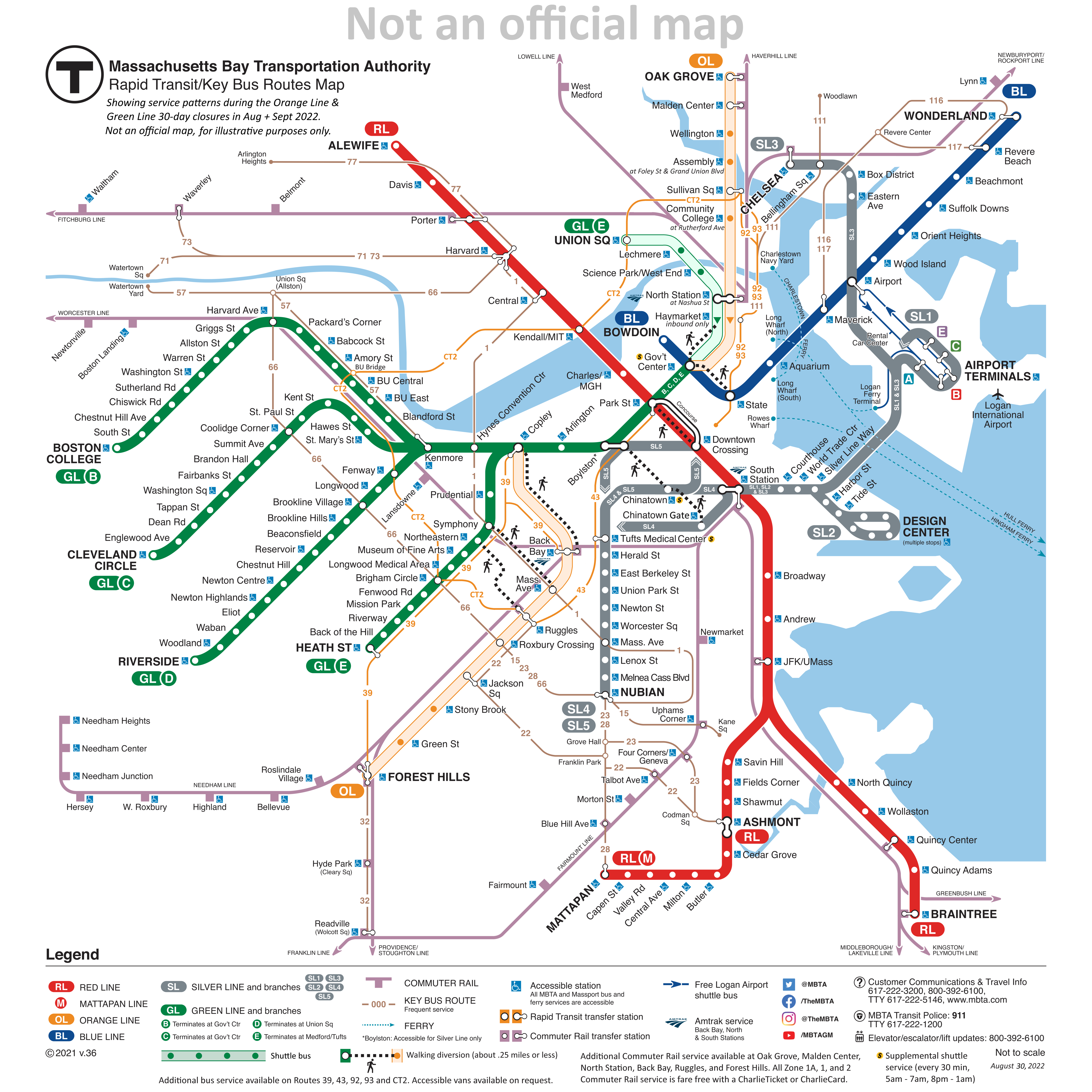
This exercise started relatively simple: show the Orange Line and northern Green Line in some alternate manner to indicate the bustituted segments. This was relatively straightforward: I borrowed design language from the Arborway bustitution in the late ’80s, with a colored outline, white fill, and colored circles for the stops.
On the further advice of someone with better aesthetic sense than I, I shifted the white fill to a lightly colored fill, to better differentiate the lines, and avoid the perception of a total absence of service. The light fill seemed to strike a good balance between maintaining the line’s identity, showing the continued existence of service, and also indicating a significant difference in service.
But, as happens with many projects, I kept on thinking of, “Oh, just one more thing I can add!”
Which brings us to the current design, which pushes the original map’s information design to the limits. I wanted to show:
- The bustituted segments
- The un-bustituted segments
- Text notes on significantly relocated shuttle stops
- The one-way service at Haymarket
- The early-morning/late-night shuttle to Chinatown and Tufts Medical
- The bus routes the T suggests as alternatives to the Orange Line (39, 43, 92, 93, CT2)
- The suggested walking transfers between Orange Line and Green Line stations
That is a lot of information to cram onto a diagram that was originally designed to be rather sparse. The current official subway map is an evolution of a design from the early 2000s that primarily showed the rapid transit routes, with commuter rail and ferries being shown secondarily, and limited-access highways being shown tertiarily. In the late 2000s, the key bus routes were added, and a subsequent redesign shifted some parts of the map around while maintaining the same visual language overall.
Evaluating my attempts
Was I successful? Ehn.
I was pleasantly surprised when an earlier version of this map gained a small amount of traction of Twitter, so it’s nice to know that at least some people found it useful. But at a certain point, I fear the level of detail hinders rather than helps. Part of the brilliance of Cambridge Seven Associates’ original “spider map” design was in its simplicity; even if you didn’t memorize the whole thing, the visual concept was highly memorable: four lines, crossing each other in a square and radiating out. That basic schema was easy to recognize and recall, and created a foundation to understand the rest of the system, even if it wasn’t put into one single map.
The eventual addition of commuter rail lines, key bus routes, and now all of the additional information I’ve added here is all very reasonable, especially when done incrementally. But I find myself questioning the ultimate usefulness of the diagram I’ve created. Is it really useful enough for journey-planning? Or is it too confusing to parse?
Simple maps and specific signage
Ultimately, I’ve come to believe that clear and specific wayfinding signage in and around stations is much more important than a detailed system diagram, both under ordinary and extraordinary circumstances such as the Orange Line Closure. (This despite my own love for detailed system diagrams.) In that way, perhaps my earlier, simpler diagrams were more effective.
Shuttle routes only
In this simplest version, the shuttle routes are shown and nothing else:
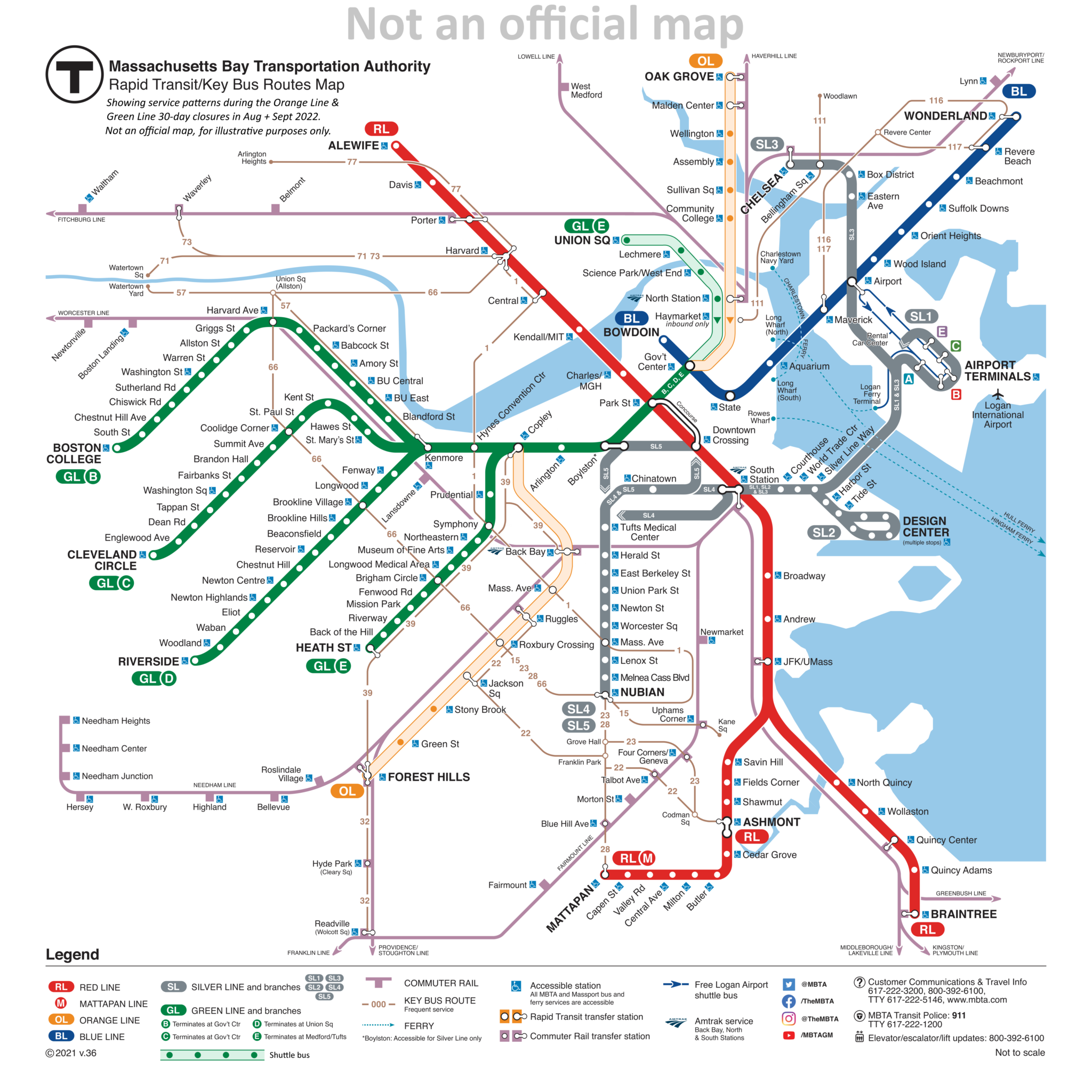
The advantage of this design is how minimally it alters the original, and (hopefully) how starkly clear the changes are: the most important thing is that the Orange Line and northern Green Line are different and need to be planned around. The question all of this hinges on: can the diagram provide enough information to adequately re-plan the journey? And that’s the part I don’t know.
Walking transfers
The second-simplest iteration added the walking transfers:
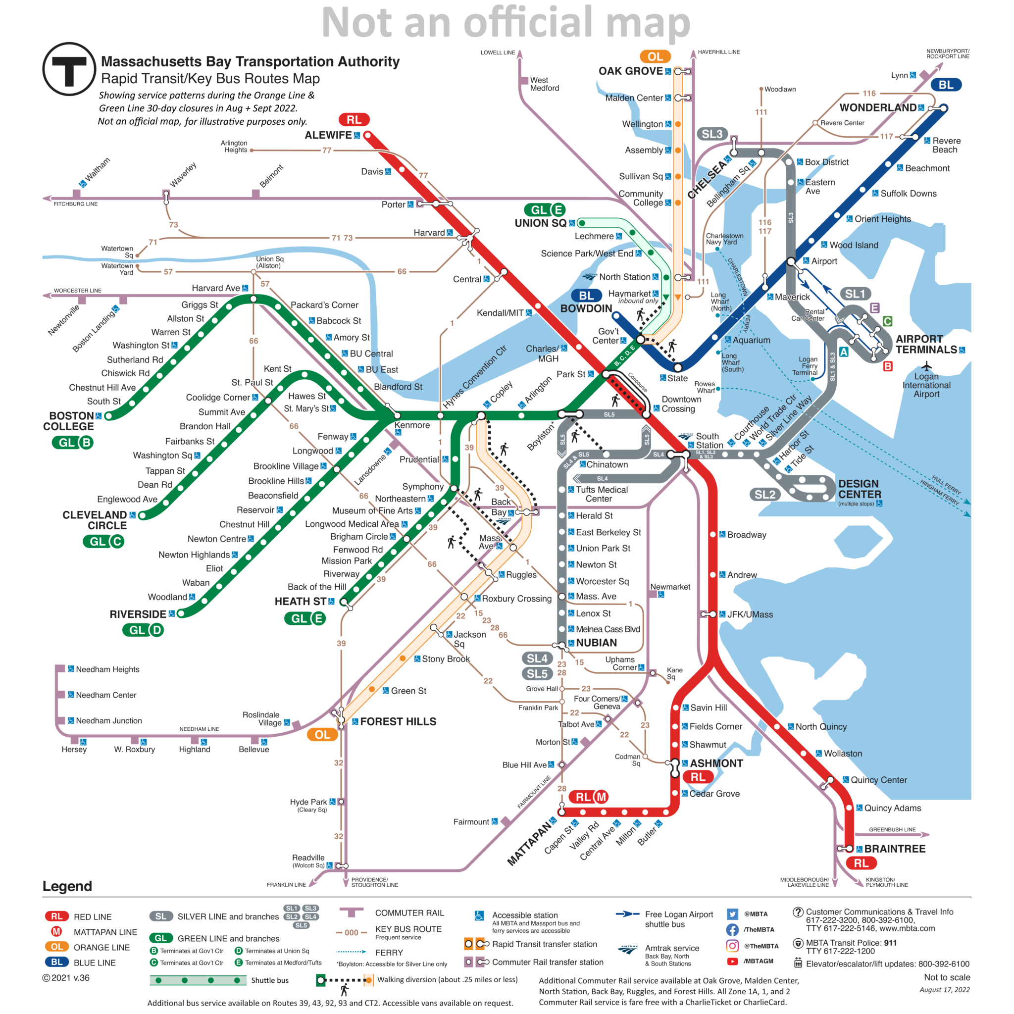
Including the walking transfers worked better than I expected. Quite frankly, I’d like to see these added to the official map (though hopefully a little more elegantly than I’ve done here). There are a lot of walking transfers that ought to be indicated on the system diagram, such as the ones I’ve included here, but also additionally:
- State – Downtown Crossing
- Government Center – Park
- Riverway – Brookline Village
- Reservoir – Cleveland Circle – Chestnut Hill Ave
- Kenmore – Lansdowne
These transfers would not be suitable for everyone — and it should be noted that they are not free transfers under the current model — but if you are able-bodied and have a monthly pass that doesn’t charge per ride, these transfers are useful, speedy, and potentially can relieve congestion on key sections of the network.
Adding these transfers to the map is a good idea in general, but does it help in the case of the Orange Line & Green Line Closures? Again, I’m not quite sure. In most of these cases, I would guess that regular commuters are pretty familiar with the areas in question, and likely are well-aware that, for example, State and Gov’t Center are practically a stone’s throw apart. And if you aren’t a regular commuter… well, the pretty clear (and dire) direction from both the City and the T has been, “Please, stay away.”
Concluding Thoughts
Working on this diagram has been fun. It also has been nice to see positive response from numerous folks on Twitter. (Shout out to Jeremy Siegel at WGBH for sharing it with his followers!) And at least some of those positive responses have made comments to the effect of, “This is easier to understand than the materials the T has put out.” A few comments on Twitter aren’t necessarily a representative sample; however, the negative reaction to the T’s materials have been widespread and resounding — the Boston Globe going so far as to publish a parody of the official closure diagram.
That negative reaction suggests that there is room for improvement in how the T communicates these closures. I’d argue that the positive reaction to my diagram has been driven by its recognizable similarity to the “normal” map, combined with the clear-and-obvious differences that are blatant and draw attention to themselves.
With rumors swirling of partial shutdowns of the Green and Red Lines later this year, perhaps the T might consider adopting a similar strategy to what I’ve presented here.