Last year, I attempted to redesign the MBTA’s rapid transit + key bus routes map. My first iteration was just downright ugly (and yet somehow I still decided to post it), while my second iteration was a bit better, though still unsatisfying.
This year, I have returned to this concept, with the same goals as before, to design a diagram that includes:
Key (frequent) bus routes, designed into the map from the start
All stops on the Green Line branches
Walking transfers, such as State – Downtown Crossing and Brookline Village – Riverway
All stops on the Fairmount Line (future-proofed for its eventual conversion to near-rapid transit standards)
All information included on the present map
And achieve all of the above while fitting into a square and attempting to comply with relevant ADA visual design requirements by using the same canvas and font sizes as the official diagram. I also set a goal of having all labels appear on a solid background, not intersecting or overlapping any lines or other visual elements, and having all labels be horizontal for readability.
While I hestitate to trust my own judgement (like I said, it did somehow seem like a good idea last year to post my previous redesign), I do think that this iteration is more successful.
screenshots below are from the initial version of the diagram and have some minor differences
Design details
Many elements from last year’s version are carried over here, including:
Alignment of bus routes
Stations are aligned so that connecting bus routes form strong visual links
Color-coded bus routes
Bus routes are given colors based on the transfer hub they operate into; in the example below, orange bus routes feeding into Ruggles are contrasted with the green routes that feed into Kenmore/Longwood or Back Bay; the two routes in red both go to Harvard:
The transfer system at Park St & Downtown Crossing
The proposed realignment of SL4/SL5 will relocate its Downtown Crossing stop to Chauncy St, where it will provide a good transfer to the Red Line, but a more distant transfer to Orange; Silver <> Orange riders will be better off transfering at Tufts Medical Center. I’ve attempted to convey that here, along with the Red <> Blue walking transfer at State
Coequal bus routes
The most important change is that this diagram incorporates the key bus routes as coequal “stakeholders” in the design of the map, meaning, for example, that the complexity of the bus network in Longwood was treated as equally important to accommodate as the complexity of the subway network in Downtown. This meant, among other things, that labels for bus stops were sized identically to labels for rapid transit stops.
An organic by-product of the coequal emphasis on bus routes is an expansion of the “grid” formed by Park-DTX-State-GC downtown:
The parallel Red and Blue Lines, horizontal on the Cambridge Seven diagram, are now joined by the parallel lines of:
the 9, 8, 1, 15, the Longwood-Nubian bus corridor, the 23, and 22.
The historically vertical Orange and Green Lines are now joined by:
the Ashmont Branch, the 16, Fairmount Line, portions of the 8 and 1, SL4, the 32, the E Line, the Brookline Ave bus corridor, and the D Line
In particular, the lengthy parallel alignment of the Ashmont, Fairmount, SL4, and Orange Lines created a strong “ladder” effect, where the complex Dorchester bus network can be articulated in terms of which anchor stations a route connects to. For example, my diagram more clearly articulates that Newmarket sits on the same cross-street as Mass Ave and Symphony, and that Uphams Corner sits on the same cross-street as Nubian, Roxbury Crossing, and Brigham Circle.
(The fact that the Uphams Corner <> Brigham Circle street changes names four times — Dudley St, Malcom X Blvd, Tremont St, Francis St — points to the utility of a mildly simplified visualization of Boston’s [apocryphal] cow paths.)
Complexity and tradeoffs
Now, it has to be said that this diagram is complex and still rather visually overwhelming. In general, I argue that’s inevitable with this much information being put into this little space. Fellow ArchBoston contributer TheRatmeister has created a gorgeous map that presents an elegant counterargument, as his map does indeed show all of the above information while still looking amazing.
A key difference between our maps is that his utilizes non-horizontal text and overlapping text. (His text is also slightly smaller than mine, although I believe it still falls well within accessibility guidelines.) So this highlights a tradeoff: the visual complexity of overlapping/non-horizontal text, vs the visual complexity of a highly visible bus network.
Lines on a map
An earlier draft of this map took the emphasis on coequal bus representation even further, by depicting the very highest frequency bus routes (as currently planned in the Bus Network Redesign) with visually distinct medium-thickness lines (nearly as thick as the rapid transit lines) bisected by a thin white line.
This iteration made the Longwood-Nubian corridor too busy. It also ultimately is misleading — the differences in proposed frequencies between my “thick” and “thin” bus routes just aren’t that stark.
However, this version of the diagram presents something worth closer examination: a visualization that vaguely suggests what the subway map might look like if the T’s most important bus routes were full rapid transit:
(no high res link because I didn’t build out a high res version of this, just a screenshot as a proof-of-concept)
As a political position, I submit that we should not tolerate “slow zones” on the bus corridors depicted above — important enough that they have a legitimate claim to being “on the map” — any more than we’ve been willing to tolerate slow zones on the subway.
Boston, the “Hub(s) of the Universe”
Both in my final map and in the proof-of-concept screenshot above, it is Back Bay that sits visually centered. On the one hand, this is partially an artifact of compression that I implemented on the northern half of the map. On the other hand, that compression was only possible because the T’s system is less complex (and less robust) on the north side. The network out of Longwood/Nubian alone could be its own map.
The fact is that Boston no longer has a single downtown, but at least three, if not more: Downtown, Back Bay, Longwood, and arguably the Seaport, and maybe Kendall Sq. To depict the full breadth of the T’s system, a diagram can’t be solely focused on the historical Park-DTX-State-GC core.
In the past, I’ve argued that a poorly understood aspect of the Urban Ring proposal was the extent to which it was actually designed to provide radial transit services to Boston’s “other” downtowns. This diagram illustrates the pluricentric nature of the region’s transit needs.
A Map-Making Note
With respect to avoiding overlapping text, one of the key pieces, I discovered, is finding the “critical triangles” — places where the horizontal label is constrained by the two legs of crossing triangular lines. I found at least three such triangles on this diagram:
Prudential: bound by the E and the 1 (and the Central Subway too)
Chinatown (or Tufts Medical Center, depending on font size and spacing tweaks): bound by Red/Silver and Orange/Silver, and hemmed in by the commuter rail as well
And finally Longwood Medical Area: bound by the E/39 and the Francis St buses
These “critical triangles” in turn govern both stop spacing and line spacing.
For example, the “Prudential critical triangle” needs to also place the Prudential stop marker itself roughly halfway between Copley and Symphony, thereby setting up a general “cadence” for the stop spacing.
In this design, I found that the “LMA critical triangle” ultimately forms the lowest denominator; the spacing of everything else on the entire map unfolds from the stop spacing between LMA and Brigham Circle arising from that critical triangle:
Brigham Circle<>Longwood Medical Area need to be far enough apart to fit labels, but also need to be roughly as far apart as Longwood Medical Area<>Museum of Fine Arts
(I cheated a little bit here: the stop icons are unevenly spaced, but the texts of the labels appear less severely unevenly spaced)
In turn, Brigham Circle <> Museum of Fine Arts need to be roughly as far apart as Roxbury Crossing <> Ruggles — the Orange Line stop spacing becoming twice that of the E
Museum of Fine Arts <> Northeastern <> Symphony needs to match up with Ruggles <> Mass Ave, again emphasizing the Orange Line’s stop spacing being 2x that of the E
…which gets recapitulated again with Symphony <> Prudential <> Copley needing to broadly match Mass Ave <> Back Bay
The “ladder effect” I described above then in turn means that the Fairmount Line’s Uphams Corner <> Newmarket spacing needs to match Roxbury Crossing <> Mass Ave, and Newmarket <> South Station needs to broadly align with Mass Ave <> Downtown Crossing — giving the Fairmount Line 4x that of the E
Now, obviously, there’s a lot more nuance than this. Both the Orange Line’s and Fairmount Line’s stop spacing get mildly compresssed toward the outer sections of the map — I didn’t rigidly copy-and-paste the spacing. But in general, the principle holds that the “atomic” spacing unit for most of the map derives from the E Line. I hesitate to draw too strong of a conclusion here, but I suspect that this principle will hold true for any T map that seeks to show all of the surface stops on the E Line.
I can never stop fiddling with things, and my redesign of the MBTA’s system diagram is no different. In organizing some files as I finished up the BPL’s Transportation Dreams map contest, I found a few revisions of my redesign that I hadn’t posted here yet. They are also far from perfect, but they’re definitely improvements on my last.
Version 10.0.1 looked somewhat promising:
This version adjusted the Red Line branches, which were probably the ugliest part of the last diagram. I also extended out the southern part of the Orange Line to take better advantage of the extra space at the bottom of the diagram.
Definitely still had problems though — lots of crowding at the top, for one.
Version 10.0.3 looked to address that spacing issue at the top:
I do feel this is the strongest version yet. The spacing is gentler, as are the curves. I feel that the subway lines on a map should create an image that is distinctive but simple enough to remember, and I think this version comes closest to that.
Having experimented with designs that are exclusively 45° / 90°, exclusively 30°/ 60°/ 90°, and a mix of the two (like this one), I wish I had designed this diagram with fewer angles. The bend at Brookline Village, for example, is distracting; my goal had been to align it with the straightaway of the E Line, but that didn’t really have the visual effect I was hoping for. I think that this concept could work with 45° / 90°, so I might eventually give that a try.
The other big change with this version was getting rid of the coloring of the bus routes. It certainly makes the diagram “quieter”, which ultimately is a good thing. I had originally been very opposed to the idea of uniformly brown bus routes, because I didn’t want it to look like cobwebs criss-crossing all over the map. But I don’t think that turned out to be the outcome, and in fact if anything it seems like the quieter bus routes provide a stronger “grounding” for the map.
I also added a text inset to call out the key bus routes that are gonna have really high frequencies, as I feel that’s a valuable piece of information.
I still would like to try to bring some color back into the bus routes. But for now, that version 10.0.3 seems like a satisfying enough place to leave things.
As often happens when one returns to something, on review several months later, I strongly dislike the original version of this map (linked further down), and I am mildly dismayed to have been satisfied enough with it to post. I later posted about the latest iteration of this concept, but I’ll keep this post in place for posterity. The first diagram in this post is the latest version; older versions are available at the hyperlinks.
The original draft is available here. It keeps showing up in Google Image Search, and I’d much prefer the latest version be more prominently displayed there, so I’m trying to deemphasize it on this page. Original post below is in regard to the original draft, although you’ll see that a lot of the details apply to the latest iteration as well.
My original comments begin here:
To be clear, this is a proof of concept; there are a number of small details that need correcting, and while I think the overall concept works, there are some clear areas for improvement in a subsequent revision. But, I think it does prove out the concept.
Background
The current diagram draws clear lineage to the Cambridge Seven Associates’ original diagram (which captured my imagination as a child with its simplicity and elegance, particularly when it looked more like this). Today’s diagram is much more complicated than the original, due to the need to add additional information, including
Accessibility markers
Explicit markers for all stops on the Riverside Line
Explicit labels for all stops on the B, C, E, and Mattapan Lines
The Silver Line
Commuter rail stops (particularly along the Fairmount Line)
Key bus routes
Plus the editorial decision to include the geographic markers of the shoreline.
That last point reveals a fundamental difference between the original and current diagrams: the original made zero effort to appear geographically accurate, while the current makes some effort to hint at accurate geography… in some places.
The right half of the map – the South Shore, South Boston, the Shawmut Peninsula (a.k.a. Downtown), Charlestown, East Boston, and the communities along the Mystic River – is vaguely accurate, albeit somewhat compressed.
The left half, by contrast, is much more diagrammatic: straightening and simultaneously stretching & compressing the four branches of the Green Line, straightening and simplifying the Red Line and Key Bus Routes, while maintaining some suggestion of a geographically accurate Charles River.
Kenneth Dumas, the designer of the current diagram (and its previous iterations going back to 2000 when the shift was made away from a purely non-geographic diagram), has spoken about the process by which we arrived at today’s diagram; it’s a fascinating watch that I highly recommend if you enjoy transit maps. Suffice it to say, the current diagram represents an effort to harmonize the desires of a wide range of stakeholders.
My goals
I have long wanted to design a diagram for the T that includes the following:
Key bus routes, shown as cleanly as possible and designed into the map from the start
All stops on the Green Line branches
(I actually have not particularly wanted to list out all of the surface stops on the B/C/E Lines, but my understanding is that there is user research showing clear preference for their inclusion)
Walking transfers, including
State – Downtown Crossing,
Copley – Back Bay,
Symphony – Mass Ave,
Brookline Village – Riverway, and
Reservoir – Cleveland Circle
All stops on the Fairmount Line (future-proofed for its eventual conversion to near-rapid transit standards)
The design concept: geographically accurate inner zone & diagrammatic outer zone
Achieving my goals, while maintaining the information on the current diagram, posed several challenges. But as I thought about it further, I realized that several of the thornier issues could all be solved by a highly-geographically accurate diagram, including:
Walking transfers,
the Silver Line, and
to a lesser extent, baking the key bus routes harmoniously into the design of the map
The physical paths of the Green and Orange Lines themselves provided a design to show the walking transfers; this was a key revelation for me: use the physical paths as the starting point for the design, rather than abstract ideas such as “I want the Orange Line to be as straight as possible and form a perfect right angle with a Red Line that is also as straight as possible” (see for example Michael Kvrivishvili’s original design).
At the other end of the spectrum, I got to thinking about Harry’s Beck’s use of a “To” box, listing off-map stops on a line. Cameron Booth offers a modern illustration of this in his Tube map redesign. This is probably the most extreme version of a non-geographic diagram: just a straightforward list of stops.
But, I wondered: was the use of the “To” box really that different from the current diagram’s treatment of the B/C/D/E Lines (and to a lesser extent the Blue Line and Braintree Line)?
There’s very little geographic information being conveyed on those outer lines; there are few or no transfers being shown; there are few or no eye-catching bends that might provide implicit visual cues. Especially on the Green Line branches, the current diagram really just uses a list of stations, along a colored line with white dots.
So, I wondered, what would happen if we had a diagram with a geographically accurate inner section and a maximally diagrammatic outer section?
This design uses the original map’s labels and other elements at their original size relative to the page. If printed on a piece of paper the same size as the current map, all of the labels (along with the widths of the subway and bus lines) should be the same size. I know there are ADA guidelines around things like sizing and visual contrast; by reusing as much of the original map’s design language as possible, I’m hoping to generally satisfy those requirements, even if I’m unfamiliar with them.
Alignment for bus routes
Stations are aligned so that connecting bus routes (in this design, the highest frequency “all-day-15-min” routes from the Bus Network Redesign) are maximally straight. These include:
T101: Kendall/MIT – Lechmere – Community College
T9: Copley – Broadway
T12: Andrew – World Trade Center
T109: Sullivan – East Somerville – Union Sq – Harvard
T1: the various stations along Mass Ave
Non-geographic diagram in outer zone
Outside of the “inner zone”, the geographic fidelity of the diagram drops so severely that there’s no way it can be interpreted as being anything other than what it is: a list of stations. This is reinforced by the disappearance of the bus routes and the coastline, and the addition of the “transfer labels” at each station. An earlier version of the diagram featured an explicit “box” delineating the inner vs outer zone; this became unwieldy, however, especially when dealing with the Green Line branches, so I opted instead for an implicit transition.
Color-coded bus routes
Instead of using the current diagram’s “light brown” for the Key Bus Routes, or the official brand guidelines’ “Brand Bus Yellow”, the bus routes have been color-coded based on the hub they operate into. This is far from a perfect system, and in some cases I had to make arbitrary choices. (For example, the T7 and many of the routes running through Roxbury Crossing are colored based on running through State St and Roxbury Crossing respectively, e.g. major transfer points the route travels through rather than to.) Still, I think it is a useful way to differentiate the routes, and somewhat inadvertently highlights the new connectivity of the redesigned routes (e.g. the T28 being a Green route, or the T110 connecting Wonderland to the Orange Line).
Fairmount Line
With today’s timetables, the Fairmount Line should not appear on the map using equal visual language to the rapid transit lines. However, increasing frequencies to “turn-up-and-go” levels should be a major priority for the T and the City, and I wanted this diagram to be future-proofed to enable that.
Silver Line, simplified
The Bus Network Redesign has given us would-be transit map designers a godsend: the elimination of the SL4/SL5 reverse branching & loops. Now we have a simple dog-leg that slots nicely alongside the Orange and Red Lines. The only hiccup is (as I interpret the Remix map), Chinatown will receive northbound service only. I have opted to subtly mark this using a directional triangular for the stop, instead of a circle, and excluding a Silver-Orange transfer indicator at Chinatown (compare to Tufts Medical Center). On a “real” version of this map, the Chinatown label would probably get an asterisk with a note in the legend to the effect of, Silver Line stops at Chinatown going northbound only.
Park St, Winter, Summer, and Washington
This probably falls under the heading of “too clever by half”, but I’m still pleased with it. In general, this map does not mark transfers particularly explicitly. I experimented using black circles, or black dots within circles, but the black circles created contrast problems and the black dots were too subtle.
Instead, the indication of transfers is derived from the physical positions of the stops. For example, the Blue-Green transfer at Government Center is indicated by the Blue and Green Lines sharing a stop indicator. As it happens, only two transfers are marked in this manner: Park St and Government Center.
The rest are marked using transfer bars to connect visually distinct stops. In some cases, the visual distance is a design artifact: for example, the Green-Orange transfer at North Station or the SL1/2/3-Red transfer at South Station are in reality basically as proximate as, e.g., the Red-Green transfer at Park St.
But one benefit is that two of the more complicated transfers are visualized accurately: State, and Park/Downtown Crossing.
State
The transfer between the Blue Line and the southbound Orange Line (the platform formerly known as “Milk” after the cross-street above) is, I believe, the longest in-station transfer on the system. From the western end of the Blue Line platforms to the northern end of the Milk Street platform (I believe under the intersection with School St) is about 800 feet, as I estimate. By comparison, the Green-Orange transfer via the Winter Street Concourse is about 550 feet.
All things being equal, I don’t see a particular need to visually indicate this lengthy transfer distance. However, I chose to add it because I wanted to implicitly indicate that the T7 transfer (on Congress St) is more proximate to the Blue Line than to the Orange Line. So I wanted to separate out the Blue Line station from the Orange Line.
The offset Red Line platforms historically haven’t mattered too much from a map-making perspective. However, with the redesigned SL4/5 route, there will be a minor distinction worth making:
In a clever bit of route design, SL4 and SL5 are going to be combined into a single route that serves Tufts Medical Center, Downtown Crossing, and South Station in a linear fashion, with bidirectional service at each stop. However, instead of serving Downtown Crossing at Temple Place, the new Silver Line stop will be flipped over to Chauncy St – directly outside the entrance to Downtown Crossing at the far end of the Red Line platform.
So, I wanted to indicate on the map that Downtown Crossing will provide a good Silver-Red transfer but subtly suggest that Silver-Orange transfers are better taken at Tufts Medical Center. By separating out the Red Line station (nee “Washington”) from the Orange Line stations (“Winter” and “Summer”), the diagram is able to show exactly that. Again, in this case the physical layout of the network in the real-world has provided the needed design specification.
Drawbacks
There are two sets of problems with my diagram: some problems are execution-related and presumably could be remedied by the touch of a professional; others are conceptual and endemic to the idea of the map itself. Of the drawbacks listed below, I’m not sure which are execution-related and therefore “salvageable”, but I’ll make some guesses.
Busy margins and excess inner blank space
This one I think is execution-related and could be ameliorated by some mild tweaking. This diagram is very busy at the margins overall. To a certain extent, this is by design: I always knew that the outer regions of the diagram were going to be busy with station lists. However, I think the “inner map” section could be compressed by maybe 20%, and free up much needed space, especially at the bottom of the diagram. (For example, there really doesn’t need to be that much space between stops on the Southwest Corridor; the SL4/5 stops probably are the limiting factor here, but they too definitely could be closer together.)
Likewise, I think the “inner map” could also be further compressed along the “Red Line axis”, particularly in the northeast corner. Harvard and Central could both be moved in closer to the core, which would free up more space. For example, the T47 does a small bend at Central right now: in a future revision, I would move Central in closer to the core so that the T47 could run in a straight line between BU Bridge and Union Sq, which would “tug” the northern branches of the Green Line and Red Line further in toward the center. (Looking at it now, I think this would also actually place Central in a more geographically correct location, for what it’s worth.)
Ironically, even though I’m talking about freeing up more space in the top left quadrant of the diagram, in all likelihood I would instead use that space to simply relocate the rest of the map upward, in order to free up more space in the bottom half. The centerpoint of the diagram is currently roughly at the Hatch Shell on the edge of the Charles. In a future revision, I would probably shift things so that the centerpoint is at Back Bay Station.
The busyness of Longwood and Dorchester
These are the parts of the diagram where the shape of the bus network is most germane. The criss-crossing lattice of the Dorchester network does not lend itself to simple labels like “to Ashmont” placed just south of Nubian (which would mirror what I did at Harvard and Sullivan). As for Longwood, the Bus Network Redesign will radically increase bus service to LMA, which definitely merits inclusion on the map, but is challenged by:
Fitting in labels for four bus routes on one segment (between Roxbury Crossing and Brigham Circle)
Fitting in a parallel-but-nearby route for the T47
Showing appropriate proximity to the E Line
Showing appropriate proximity to the D Line (farther away from the E Line)
Illustrating connectivity to Kenmore and Ruggles
Fitting in labels for the E Line and D Line
Fitting everything within the obtuse triangle defined by Copley, Kenmore, and Brookline Village/Riverway
I think the busyness can be partially alleviated by adjusting the compression of the inner core and re-centering the inner core a bit higher up in the diagram to open up a bit more space.
That being said, I think this is a conceptual shortcoming of the map: Longwood and Dorchester both represent areas where higher geographic fidelity is needed, in part simply because the topologies are complicated enough that the geographic representation already is pretty close to the maximally simplified representation of the network.
Unfortunately, this diagram is less effective at fitting in geographic accuracy the further away from the core you get. That’s why re-centering the diagram on Back Bay (or even something further south) is necessary – we need to provide more space for Longwood to fit comfortably within the inner zone.
Dorchester, on the other hand, will likely still have to remain within the “diagrammatic outer zone”, although I think it would also benefit from a little more “breathing” room. That being said, this may be where my design concept for this diagram really breaks down: I dislike the current diagram’s treatment of the Dorchester bus network because I think it looks confusing and hard to read, but I’m not sure mine does that much better.
The “starfish” design centered on Franklin Park feels pleasantly clever, but I worry is still too noisy. Likewise, I’m not wild about the physical disconnect: the bus line ends with an arrow, followed by a “To Destination” label, followed by a relatively small amount of blank space, followed by the diagrammatic stop label with the transfer label (e.g. the T16 going toward Forest Hills). Why not just extend the bus lines all the way to their destination?
Look how close the T16’s to Forest Hills marker is to the actual FOREST HILLS label, alas
(The reason I didn’t do that is because I’m using the absence of the bus and regional rail lines as a visual cue to the shift from geographic fidelity to diagrammatic lists. Now, it is true that the visual distortion would still remain so extreme that the transition would probably still remain visible. But, that corner of the diagram is already so busy that I’d be hesitant to layer on additional visuals.)
I suppose it could be possible to redesign the diagram such that the geographically accurate “inner zone” extends as far south as Forest Hills and Ashmont. Looking at the diagram now, that actually might be more feasible than it sounds, particularly with some compression and reduced scale, so I may need to play around with that!
Branches on the Green Line
The Green Line branches pose a problem: there are way more stops on the B, C, and D branches than there are on any other leg of the network (though Ashmont + Mattapan come close). What’s more, they are the only legs of the network that fan out to the side of the map, rather than the top or bottom, which makes the “diagrammatic list of stations” less obviously different in appearance. And on top of that, I ultimately wanted to make sure all three branches terminated “lower” on the map than Kenmore – meaning I couldn’t, say, turn the B Line upwards to fit it in as a list of stations.
I’m not thrilled with how the Green Line branches turned out, but I do think the concept can be sound, particularly if I can free up a bit more space to let me put the B Line labels on the outside rather than the inside (where they mix confusingly with C Line labels).
(One note: this design is meant to be future-proofed for an addition of a Needham branch: flip the D Line labels past Newton Highlands over to the left side, and use an upside-down tuning fork approach to add the Needham labels on the right, similar to the Red Line branches.)
Conclusion
Does the design concept of a geographic inner zone and a diagrammatic outer zone “work”?
Ultimately, I think the answer is “yes”: I think the fundamentals of this concept are sound, and it’s a question of execution.
As the “15-minute Bus Network” is rolled out over the next few years, it’ll be more and more important for the T to update its map to integrate those routes properly into the design. I hope that an approach similar to what I’ve illustrated here can be helpful in such a redesign.
The following is purely a fun exercise for a highly hypothetical scenario. I’m posting it more as an illustration of thought process, and not really in advocacy of the proposal itself. (There are many things I would prioritize above an Urban Ring LRT station in the Seaport!)
The scenario
Let’s assume a few things are true for this scenario:
The Piers Transitway (currently serving SL1, SL2, and SL3) is converted to light rail and connected to the larger light rail network via a subway running from Huntington Ave to Back Bay to South Station — we’ll call this the “Magenta Line”
“T-under-D” has been completed, meaning the subway now extends from World Trade Center station under the current grade crossing at D St to a portal near the current Silver Line Way station
Center-running bus lanes on Congress St in downtown and Summer Street in the Seaport have been built, and the T7 upgraded into a full bus rapid transit service, which we’ll call the “Navy Line”
SL1 service has been transferred to the Navy Line, to provide a one-seat ride connecting North Station, the Financial District, South Station, the Seaport, and the Airport
We’ll loosely assume that a lane in each direction of the Ted Williams Tunnel has been dedicated to mass transit use
An LRT iteration of the Urban Ring has been built on the southside of the network, connecting Longwood, Nubian, and the Seaport, approaching the Seaport via the Track 61/South Boston Haul Road ROW
In short, our starting point looks like this:
The satellite image doesn’t tell us the whole story, however. This is a highly three-dimensional space, where Summer St and World Trade Center Ave sit elevated above the rest of the street grid, and where a slew of highway tunnels sit under the surface.
World Trade Center Ave looking east, as seen from Summer StWorld Trade Center Ave from above, looking north, with Haul Road below and to the rightWorld Trade Center Ave at “elevated street level” looking north, from nearly the same vantage point as above, but lower downTrack 61 and Haul Road passing underneath Summer St, from above World Trade Center Ave, looking west; the Boston Convention and Exhibition Center is visible at the far leftOpenStreetMap showing the tunnels below the surface
Where to place an Urban Ring LRT station?
“The gravel pile”
As visible in the photo above looking west along Summer St, there is a triangular plot of land bounded by Track 61, the embankment of Summer St, and (effectively) the elevated WTC Ave. (There’s actually an access road that cuts off the corner of the plot slightly east of WTC Ave.) That plot currently is occupied by a massive pile of gravel. (Last I checked, the plot is owned by MassPort, though I assume they would sell it off to a developer if/when they could.)
This is probably the most obvious place to plop down an LRT platform. It’s accessible from the current ROW with minimal modification and landtaking required; it provides good access to BCEC and easy transfer to the Navy Line services (including services to the airport); the Magenta Line subway station at World Trade Center is about 400′ away, which isn’t ideal but is certainly manageable, especially if one of the sidewalks can be covered for protection from the elements.
There are some downsides. The plot is a little small; if we leave the access road untouched, it’s just about 230′ along the long edge, which would be barely long enough for a double-set of the 114′ Type 10 “supertrains” that are expected on the Green Line in the next several years. So it’s likely the modifications at the east end, west end, or both would be needed to fit a center platform, two side tracks and a crossover. (Depending on how the Track 61 ROW is converted to double track LRT, some space might already be reclaimed from Haul Road at the western end, which might simplify the design somewhat.)
The other downside is that this location serves the Seaport, but only somewhat so. A lot of the Seaport is located on the other side of the “highway canyon” that Track 61 and Haul Road sit within, so Urban Ring passengers would need to go “up-and-over” for the last segment of their journey. The current World Trade Center station is much more centrally located.
The gravel pile is potentially an adequate location for a station, and would likely be the least expensive option. On the other hand, if we are going to go to the expense of building an LRT Urban Ring, there’s an argument that it should be built for maximum efficacy, rather than just minimal cost.
The underground parking lots
As can be seen in the photos, there are a number of parking lots at the grade level of Track 61, including one parking lot that directly abuts the southern wall of the current World Trade Center station; open that wall up, and you have a strong transfer to the Magenta Line.
The problem here is that you need to cut across Haul Road and the Mass Pike ramps in order to access the lot. And while that’s doable, it’s far from ideal. There actually already is a traffic light directly underneath WTC Ave on Haul Road, so in theory the disruption to traffic flow would not be new. On the other hand, you could only run trains so often if they need to disrupt traffic, probably capping headways at 5 minutes. Again, that is doable, but seems to trigger the same question as above — if we’re gonna build this thing, why not do it properly?
World Trade Center Ave
One thing that bothered me when thinking about mini-project was how to provide good transfers to both Summer St BRT and Transitway LRT. The distance between a stop in front of BCEC and the entrance to WTC station is roughly 650′, which is long for a transfer but not unheard of. (If I recall correctly, it’s roughly the distance of the transfer between Southbound Orange and Blue at State. Of course, State has the benefit of being entirely indoors, while BCEC <> WTC would have significant exposure to the elements, even if the sidewalk were covered.)
Having two Urban Ring stations — one for the Transitway and one for Summer St — seemed excessive. So then I got to thinking more about what the objectives are for stations/connections at each location.
Summer St
Boston Convention and Exhibition Center
Transfer to Summer St BRT toward downtown: South Station, Post Office Square, Haymarket, North Station
Transfer to Summer St BRT toward Logan
Transfer to Summer St BRT toward South Boston
Transitway (World Trade Center)
Seaport core, including Congress St and Seaport Boulevard
Transfer to Magenta Line westbound: western Seaport, South Station, Back Bay, Longwood
Transfer to Magenta Line eastbound: eastern Seaport
On paper, that looks like a lot of reasons for each, and maybe even more in favor of Summer St due to its connectivity, but when you look closer, some are less relevant:
Summer St
Boston Convention and Exhibition Center
Transfer to Summer St BRT toward downtown: South Station, Post Office Square, Haymarket, North Station
By definition, the Urban Ring will have multiple connections to downtown, so this is not a vital benefit
Also, Urban Ring riders will all but certainly be coming from locations that already have direct service to downtown — it’ll be a very uncommon journey to transfer in the Seaport
Transfer to Summer St BRT toward Logan
As you’ll see below, this benefit is in fact not going to be unique to Summer St
Transfer to Summer St BRT toward South Boston
I won’t put strikethrough on this one, but I will point out that most of the previous connection points along the Urban Ring corridor (e.g. Broadway, Mass Ave/BU Medical Center, Nubian) will hopefully have — and will be better served anyway — by direct bus service from South Boston
Again, the Seaport itself wouldn’t be a common transfer point
Transitway (World Trade Center)
Seaport core, including Congress St and Seaport Boulevard
Transfer to Magenta Line westbound: western Seaport, South Station, Back Bay, Longwood
As mentioned above, pretty much all of the Urban Ring stops between Nubian and the Seaport will have better ways to connect to South Station, Back Bay, and Longwood than via the Seaport
Transfer to Magenta Line eastbound: eastern Seaport
So, to me, the goal of an Urban Ring LRT station would be twofold: connect to the Seaport, and connect to Logan. A stop anchored by the Transitway station better serves the Seaport and, as you will shortly see, also serves Logan. So, insofar as we need to choose which connection to prioritize, we should focus on a Magenta Line connection at World Trade Center station.
Getting to Logan
In some alternate timeline, the Ted Williams Tunnel was built with a third tunnel to carry rapid transit rail service to Logan. This would’ve been so much better than today’s system, but alas.
In the scenario I’ve outlined here (and, in my opinion, in any vaguely realistic scenario), service to Logan is provided by BRT. Now, to be clear, BRT can be a lot better than what we have today. For one, a lane in each tunnel could be dedicated to transit and perhaps very-high-occupancy vehicles, with semi-permanent lane protection to ensure speedy and unencumbered journeys.
But our BRT services still need to get in to the tunnel, and the solution to that problem also solves the problem of Summer St vs the Transitway.
Today’s SL1 and SL3 services make a semi-unadvertised stop at street level on Congress St just outside of World Trade Center station; they do this immediately after exiting the off-ramp, which has the benefit of getting travelers from Logan to a stop in the Seaport quickly, without needing to double back from Silver Line Way.
This stop is marked on my diagram from the top of the post (though I am supposing that the simple sidewalk stop has been expanded into something more like a proper BRT platform):
As far as I can tell, absent a major rework of the Mass Pike tunnels, Logan-originating buses will exit from that off-ramp for the foreseeable future. Now, it is true that Logan buses could instead turn left and use Congress St bus lanes to head toward downtown. However, that would duplicate the lanes on Summer St which would still be needed for South Boston service (i.e. the T7), and would be more awkward to connect to South Station. And while Logan -> South Station is mildly more direct via Congress, the journey in the opposite direction is significantly worse, requiring a lengthy diversion down Haul Road in order to reach the on-ramp.
Funneling Downtown <> Logan service through Summer St maximizes frequencies on the shared trunk, minimizes redundant infrastructure, and maintains good Logan -> World Trade Center service. It is somewhat more roundabout, but connects to more places. (And if we are really worried about an express South Station <> Logan connection, using dedicated lanes in the Mass Pike tunnel running direct into the South Station Bus Terminal is probably a stronger solution anyway.)
So we’ve identified a way for our Logan -> South Station service to transfer at WTC station, but what about the other direction? Well, that’s where those parking garages can come in handy.
Running directly parallel to the Transitway is a small side street/alley that runs into the lower level of the parking garage, and which, I think exits on to Haul Road just underneath World Trade Center Ave. Visible in the second Streetview photo are two large metal doors: I am pretty sure that those lead directly into the lobby of the World Trade Center station — meaning that with some modifications, you could put a BRT platform near there, and have buses immediately proceed to the on-ramp.
This would then provide a strong transfer point to Logan-bound services at World Trade Center proper — benefitting Magenta Line riders, but also providing a crucial transfer point enabling an Urban Ring station at World Trade Center.
Placing an Urban Ring LRT station at World Trade Center
So, where to put a new LRT station at World Trade Center?
We can’t put it at grade level without disrupting all the highway ramps, or otherwise settling for a station at Summer St instead.
We can’t put it below grade level because of the highway tunnels.
What about above grade along the World Trade Center viaduct?
Building a short rising viaduct on the gravel pile’s plot and claiming some of World Trade Center Ave (more details on that below) to add a above-grade LRT platform, combined with building an at-grade BRT platform for Downtown -> Logan services by reclaiming some space under the parking garage and adding a BRT platform on Congress St for Logan -> Downtown service, enables all three services to be centralized in a single station for easy transfers between all three.
So how do you reach the World Trade Center Ave viaduct?
Some of this will depend on how Haul Road is reconfigured for double-track LRT, particularly in terms of the horizontal alignment (do you steal a lane, or eat into the gravel pile?), but I think there’s enough open space to feel comfortable that something could fit, even if we don’t work out the details right now.
One area we have less flexibility on is the vertical alignment: there’s approximately 310 feet of horizontal running space between the Summer St underpass and the edge of the World Trade Center Ave viaduct, and we have to fit our rising viaduct in there.
The WTC Ave viaduct is approximately 25 feet high; 25 feet rise over 310 feet run yields a grade of 4.61°, which is well within the comfort zone for LRT grades. Even a rise of 33 feet over that distance would still come in at our 6° threshold. Likewise, rising 25 feet at <6° is doable in as little as 240 feet. Therefore, even with the known limits, it should be possible to rise from the Summer St underpass to the World Trade Center Ave viaduct at a reasonable grade.
Fitting a terminal on the World Trade Center Ave viaduct
The main question facing us here is whether to maintain some level of automobile access through WTC Ave. I believe I’ve come across proposals to fully pedestrianize that street, which, honestly, based on my experience, seems pretty reasonable. Mostly it seems like the street is used to deliver goods to the World Trade Center proper.
If I needed to maintain some level of automobile access, I would use a staggered pair of side platforms to maintain LRT capacity and keep a shared bidirectional lane open for vehicles to pass through on a limited as-needed basis, placing signals/traffic lights at each entry to coordinate passes through the right-of-way.
Obviously, this arrangement is complicated and would create some disruption to the system, depending on the road traffic volume. This option would need to be considered carefully to assess the cost vs benefit.
The key thing to note is that there is horizontal space to fit all the necessary elements:
First 230′ platform (enough to accommodate a doubleset of the 114′ Type 10 supertrains)
90′ to fit a crossover to provide passing access
Second 230′ platform
A 100′ radius curve from the rising viaduct on to WTC Ave
Reasonably short walking distance between platform and current headhouse to streamline transfers
Maintain pedestrian access to the elevated greenspace between Congress St and Seaport Blvd
The second option is more conventional and straightforward: pedestrianize the whole viaduct, and claim part of it for a GLX-style center-platform terminal station.
There are lots of potential variations on this design — adjusting the width, length, and placement of the platform, trying out different methods of pedestrian access — but they all more-or-less look like this.
Keen observers will note that none of these designs feature fare gates or paid-access vs unpaid-access areas. Numerous transit systems, both in the US and around the world, have demonstrated that it is possible to run ticketed transit systems that do not require metal barriers to enforce payment. Eliminating fare gates makes it possible to build transit access more directly into the fabric of a neighborhood. Both station designs, but particularly the staggered platforms alternative, see no clear demarcation of the “edge” of the station, but rather allow the space to be woven together into a seamless whole.
So how do you site an Urban Ring LRT station in the Seaport?
To me, it looks like this:
Add a BRT platform at World Trade Center station for Downtown -> Logan services (under the parking garage just south of the station)
Build a viaduct to connect Track 61 LRT to the WTC Ave viaduct
Add an LRT station at-grade on the elevated World Trade Center Ave viaduct
Should you put an Urban Ring LRT station in the Seaport?
One thing this exercise illustrates is that the Seaport is not very wide. This sounds obvious and trivial, but one result is that there isn’t really space nor need for a “crosstown” service. The Piers Transitway and Summer St already form strong “east-west” transit corridors (whose elevation difference reduces their overlapping walksheds slightly). But they’re still close enough that a perpendicular service between/across them wouldn’t make much sense (particularly since both originate at South Station and come very close to connecting again at World Trade Center).
So a Track 61 LRT service basically needs to choose a particular point along the “linear Seaport corridor” to terminate. That increases the pressure on that station to be located optimally to maximize access to jobs as well as to transfers. World Trade Center does reasonably well on that front, but both the eastern Seaport (e.g. Design Center) and western Seaport (e.g. Courthouse) would require transfers for short last-mile journeys. But this need to choose lies at the heart of why siting an Urban Ring LRT station in the Seaport is difficult in the first place.
A Track 61 LRT service will likely reach the Seaport in part by passing near Broadway station. Regardless of origin point beyond there, a service near Broadway likely could instead be aligned to pass through South Station instead — and then continue to Seaport along one of the east-west corridors. (For reasons I won’t get into here, a Piers Transitway LRT corridor would very likely have excess capacity to absorb Urban Ring LRT in addition to the Magenta Line LRT I’ve described here.)
Sending an “Urban Ring” LRT service down one of the east-west corridors would provide better access to the entire Seaport, and reduce/eliminate the need for transfers. Running LRT service via Track 61 may in fact be unnecessary.
This brings us to a key difference between an LRT Urban Ring and a BRT one: BRT can continue to Logan Airport and on to Chelsea much more easily than LRT. Rapid transit on the Track 61 ROW, with a transfer station roughly at World Trade Center, and continuing service to Logan is able to catch a much broader swath of journeys (in italics below), compared to service terminating in the Seaport:
Longwood <> Seaport
Nubian <> Seaport
Red Line transfer point TBD (e.g. Broadway) <> Seaport
Longwood <> Logan
Nubian <> Logan
Red Line transfer <> Logan
Longwood <> Chelsea
Nubian <> Chelsea
Red Line transfer <> Chelsea
Seaport <> Chelsea
Logan <> Chelsea
The concept of the Urban Ring was to provide circumferential service that bypasses downtown, for speedier journeys and reduced crowding in the core. A route that terminates at Seaport curtails possible destination pairs, and becomes less competitive against transferring downtown via the radial services (especially for long circumferential journeys).
Returning to the point about connecting at Broadway vs South Station: South Station is, to be clear, the bigger fish. Nubian <> South Station journeys surely outnumber Nubian <> Broadway journeys. Urban Ring concepts usually favor a transfer at Broadway or to the south — but can justify skipping South Station because they are providing speedier service to Logan and Chelsea. Track 61 LRT can’t do that.
So I think Urban Ring LRT service via Track 61 presents a weaker case than it first appears. Now, it bears mentioning that capital costs for a Track 61 LRT route would probably be less expensive than a journey via South Station. If given the choice between Track 61 LRT and nothing, I’ll be entirely in favor of the former.
Conclusion
Ultimately, this is a fun thought exercise. The scenario I’ve contrived here presupposes a lot of things, so its “real-world relevance” is somewhat limited. A few final thoughts:
The problems I’ve outlined here will impact any Track 61 proposal; Track 61 will always be on the wrong side of the Mass Pike between Summer and Congress Streets, so you’ll always need to figure out a way to bridge that gap
This conversation becomes radically different if an LRT connection between Seaport and Logan is built — although even then, Track 61 will still be on the wrong side relative to the Transitway
Urban Ring considerations aside, I’d suggest that a Navy Line service to Logan would significantly benefit from the “under-the-garage” platform I propose here, especially if the Transitway is converted to LRT and thus cut off from Logan
The Seaport is centered on two east-west corridors, and there’s an argument to make that almost all services, even circumferential ones, would do well to feed into or otherwise align with those
For all the reasons outlined here, and others, most of my crayon maps going forward will favor both LRT and BRT Urban Ring services that run via South Station, rather than Track 61/Haul Road. At most, I can see Haul Road being useful for express service to Logan that bypasses the Seaport — that, it could do quite well. But for serving the Seaport proper, I think it comes up short.
Over the past week, I’ve been iterating on modified versions of the T’s official subway map to illustrate the closures and shuttle services that begin tonight and will continue for 30 days. This map will likely continue to evolve, and I will continue to post the latest revision here. As always, please note that this is not an official map — always refer to the MBTA’s website and to the City of Boston’s website for up-to-date information.
Notes for transit and design nerds
This exercise started relatively simple: show the Orange Line and northern Green Line in some alternate manner to indicate the bustituted segments. This was relatively straightforward: I borrowed design language from the Arborway bustitution in the late ’80s, with a colored outline, white fill, and colored circles for the stops.
On the further advice of someone with better aesthetic sense than I, I shifted the white fill to a lightly colored fill, to better differentiate the lines, and avoid the perception of a total absence of service. The light fill seemed to strike a good balance between maintaining the line’s identity, showing the continued existence of service, and also indicating a significant difference in service.
But, as happens with many projects, I kept on thinking of, “Oh, just one more thing I can add!”
Which brings us to the current design, which pushes the original map’s information design to the limits. I wanted to show:
The bustituted segments
The un-bustituted segments
Text notes on significantly relocated shuttle stops
The one-way service at Haymarket
The early-morning/late-night shuttle to Chinatown and Tufts Medical
The bus routes the T suggests as alternatives to the Orange Line (39, 43, 92, 93, CT2)
The suggested walking transfers between Orange Line and Green Line stations
That is a lot of information to cram onto a diagram that was originally designed to be rather sparse. The current official subway map is an evolution of a design from the early 2000s that primarily showed the rapid transit routes, with commuter rail and ferries being shown secondarily, and limited-access highways being shown tertiarily. In the late 2000s, the key bus routes were added, and a subsequent redesign shifted some parts of the map around while maintaining the same visual language overall.
Evaluating my attempts
Was I successful? Ehn.
I was pleasantly surprised when an earlier version of this map gained a small amount of traction of Twitter, so it’s nice to know that at least some people found it useful. But at a certain point, I fear the level of detail hinders rather than helps. Part of the brilliance of Cambridge Seven Associates’ original “spider map” design was in its simplicity; even if you didn’t memorize the whole thing, the visual concept was highly memorable: four lines, crossing each other in a square and radiating out. That basic schema was easy to recognize and recall, and created a foundation to understand the rest of the system, even if it wasn’t put into one single map.
The eventual addition of commuter rail lines, key bus routes, and now all of the additional information I’ve added here is all very reasonable, especially when done incrementally. But I find myself questioning the ultimate usefulness of the diagram I’ve created. Is it really useful enough for journey-planning? Or is it too confusing to parse?
Simple maps and specific signage
Ultimately, I’ve come to believe that clear and specific wayfinding signage in and around stations is much more important than a detailed system diagram, both under ordinary and extraordinary circumstances such as the Orange Line Closure. (This despite my own love for detailed system diagrams.) In that way, perhaps my earlier, simpler diagrams were more effective.
Shuttle routes only
In this simplest version, the shuttle routes are shown and nothing else:
The advantage of this design is how minimally it alters the original, and (hopefully) how starkly clear the changes are: the most important thing is that the Orange Line and northern Green Line are different and need to be planned around. The question all of this hinges on: can the diagram provide enough information to adequately re-plan the journey? And that’s the part I don’t know.
Walking transfers
The second-simplest iteration added the walking transfers:
Including the walking transfers worked better than I expected. Quite frankly, I’d like to see these added to the official map (though hopefully a little more elegantly than I’ve done here). There are a lot of walking transfers that ought to be indicated on the system diagram, such as the ones I’ve included here, but also additionally:
State – Downtown Crossing
Government Center – Park
Riverway – Brookline Village
Reservoir – Cleveland Circle – Chestnut Hill Ave
Kenmore – Lansdowne
These transfers would not be suitable for everyone — and it should be noted that they are not free transfers under the current model — but if you are able-bodied and have a monthly pass that doesn’t charge per ride, these transfers are useful, speedy, and potentially can relieve congestion on key sections of the network.
Adding these transfers to the map is a good idea in general, but does it help in the case of the Orange Line & Green Line Closures? Again, I’m not quite sure. In most of these cases, I would guess that regular commuters are pretty familiar with the areas in question, and likely are well-aware that, for example, State and Gov’t Center are practically a stone’s throw apart. And if you aren’t a regular commuter… well, the pretty clear (and dire) direction from both the City and the T has been, “Please, stay away.”
Concluding Thoughts
Working on this diagram has been fun. It also has been nice to see positive response from numerous folks on Twitter. (Shout out to Jeremy Siegel at WGBH for sharing it with his followers!) And at least some of those positive responses have made comments to the effect of, “This is easier to understand than the materials the T has put out.” A few comments on Twitter aren’t necessarily a representative sample; however, the negative reaction to the T’s materials have been widespread and resounding — the Boston Globe going so far as to publish a parody of the official closure diagram.
That negative reaction suggests that there is room for improvement in how the T communicates these closures. I’d argue that the positive reaction to my diagram has been driven by its recognizable similarity to the “normal” map, combined with the clear-and-obvious differences that are blatant and draw attention to themselves.
With rumors swirling of partial shutdowns of the Green and Red Lines later this year, perhaps the T might consider adopting a similar strategy to what I’ve presented here.
Some of the earliest public feedback on the MBTA’s Bus Network Redesign (mapped in a previous post) came from residents of Somerville (and, to a lesser extent, Cambridge) who were – almost unanimously – unhappy with the proposals.
Based on my anecdotal observation on social media platforms, it appears that initial reaction from other communities has been more muted; this may change in the coming weeks with the further feedback sessions the T has planned. But still, I thought it was interesting that there was such an immediate and resounding response by comparison from Somerville.
I don’t envy the Redesigners their task with the Northwest Quadrant um, Sextant (?). Uniquely, they had to design for a system that doesn’t exist yet: GLX will be a seismic shift in transit access for Somerville, and while some of its effects are predictable, some are not. That’s a pretty big wildcard to toss into the mix.
The early signs suggest the Redesigners missed the mark, at least from the perspective of the community. I wanted to dig in to this and – of course – wanted to make a map to add to the conversation. I believe that I have been able to piece together a visualization that offers context and some explanation for this initial pushback; based on these, I have also generated some modest suggestions for revisions to the Redesign.
Further details are below, but the core of my suggestion is “swapping” the proposed T39 and proposed 90; this provides an increase in service to most riders, but is a more conservative change that does not disrupt existing travel patterns. This extension can be “paid for” by a dramatic shortening of the proposed 87 to its core service area, a reroute of the 90 to a shorter well-established corridor, and the use of a lower-freq crosstown route and a shuttle service to address connectivity gaps to Sullivan and Assembly.
The Map
I had two goals with this map: visualize frequency, and visualize potential destinations. I chose these goals because they reflected themes I saw in the initial feedback: frustration at multiple transfers (meaning, need for direct access to a larger number of destinations), and loss of service, particularly for lower-income residents (which I believe in some cases was a result of the Redesign’s shift away from “mid-low frequency” routes – think 45-min peak headways, that kind of thing).
Line color denotes reachable destinations. This system isn’t perfect, but I think captured some key dynamics.
Dark red lines reach Red Line stations
Dark orange lines reach Sullivan Square specifically, and light orange lines serve other Orange Line stations
Dark green lines reach Lechmere
Dark blue lines serve Longwood Medical Area
Some lines see multiple colors, meaning a rider might board a bus for multiple destinations; a good example of this is the 87 & 88 north of Davis, where a rider might board destined for Davis or for Lechmere.
Line width indicates frequency.
The thinnest lines have peak headways more than 30 minutes
such as the 85 or 90
The next size up, forming a large swath of the network, denotes headways between 15 and 30 minutes at peak, including
the 95 along Mystic Ave,
the 87 along Somerville Ave,
the 83 along Somerville Ave and Beacon St
Thick lines indicate peak headways of 15 minutes or better – matching the target for the Redesign’s frequent network, and including major corridors along
Broadway
Highland Ave,
College Ave,
Washington St
The thickest lines – matching the width of the rapid transit lines – see peak headways of less than 10 minutes, including
the 77,
the cumulative 87 & 88 between Davis and Clarendon Hill,
the 101 & 89 on Broadway running into Sullivan
Here’s a version of the current system only showing routes that see 15-min peak headways or better.
Here we see six distinct corridors emerge:
Medford Square (and Malden) – Main St – Broadway – Sullivan
Powder House Square – Broadway – Sullivan
College Ave – Powder House Square – Davis
Clarendon Hill – Davis – Highland Ave – Lechmere
Arlington Center – Porter – Harvard
Sullivan – Union – Harvard – Allston/Brighton and Reservoir
I then created a map using the same design language to visualize the Redesign proposal.
(I recommend opening the “before” and “after” images in separate tabs, and then switching between them to hone in on the differences. I tried creating a GIF, but was unsatisfied with the results.)
Impact to current high-freq corridors
Let’s first review the impact to the current high-freq corridors:
Medford Square (and Malden) – Main St – Broadway – Sullivan
Largely intact
Goes near but does not provide transfer to GLX at Ball Sq
Extended beyond Sullivan to provide a (long) one-seat ride to Lechmere and Kendall
Powder House Square – Broadway – Sullivan
Eliminated
Moreover, this route is actually composed of a pair of branching routes:
a mid-freq route to Davis
a low-freq route direct to Clarendon Hill
Davis and Clarendon Hill lose direct service to Ball Sq GLX and Broadway
Davis and Clarendon Hill maintain roundabout access to Sullivan via Mystic Ave, an increase of 0.5 miles
College Ave – Powder House Square – Davis
Intact and strengthened
Newly anchored at north by Medford/Tufts GLX and extension to Medford Sq
Worth noting that the twice-hourly one-seat ride beyond Davis to Porter and Harvard is eliminated
Clarendon Hill – Davis – Highland Ave – Lechmere
Significantly reduced, and partially eliminated
Clarendon Hill – Davis gets a pair of the Redesign’s “30-min-or-better” routes, which could approximate 15-min headways, but still does not meet the current service’s average sub-10-min frequencies
Highland Ave drops into the Redesign’s “30-min-or-better” routes, but does not connect to Lechmere, or to Union GLX, or even to Gilman GLX (though it comes close), but instead is rerouted over toward Sullivan… which it doesn’t actually reach, instead ultimately diverting to Assembly
Arlington Center – Porter – Harvard
Intact
Sullivan – Union – Harvard – Allston/Brighton and Reservoir
Partially eliminated
Sullivan – Harvard is maintained, and combined with through-service to Everett
However, ridership from one side of Harvard to the other is actually surprisingly high, so this elimination is not trivial
Of the six current high-frequency corridors, three are maintained and three are significantly impacted. This does seem counterintuitive – as far as I can tell, all other existing high-freq corridors across the system were maintained in the Redesign, and most were significantly strengthened. I suspect the difference in Somerville was the future presence of the Green Line Extension.
Green Line integration (or lack thereof)
One of my biggest surprises on seeing the Redesign was how little integration there was to the GLX stations. Ball Sq and Gilman Sq will both see bus routes pass less than a quarter mile from the station without offering door-to-door service.
In addition, despite the arrival of the Green Line, Union Square now sees less connectivity than it did before, including the loss of one-seat rides from Clarendon Hill, Davis, and Kendall. As Councilor Pineda Neufeld pointed out, this also reduces access to the Market Basket in Union Square, as well as the Star Markets on Beacon St and Elm St.
I would argue that the Redesign treats the Green Line Extension more like one of its high-freq bus routes than like a rapid transit line – as if the GLX has said, “Don’t worry buses, I’ve got this stretch”, and thus bus routes are routed away from it. That is not done with any other rapid transit lines, and with good reason: rapid transit access is concentrated in discrete areas around stations; a key role of surface transit is to provide access to a station from beyond its walkshed. Unlike rapid transit, the close stop spacing of bus routes provides continuous access along the entire route, which GLX lacks.
To be clear, for over a century now, Somerville’s surface transit routes have had to play double-duty, providing both feeder service into rapid transit stations, as well as longer-distance service to support journeys that would in other areas be covered by rapid transit. GLX relieves them of the second burden, but not the first.
To wit: the entire Red Line from Davis to Kendall is doubled by surface transit routes in the Redesign. It is true that GLX’s stop spacing is closer than the Red Line’s, but it’s still well-above typical surface transit stop spacing. The Green Line is not a wholesale replacement of local buses.
Highland Ave vs Elm St & Somerville Ave
In the current system, Highland Ave sees mostly 15-min-or-better service at peak on the 88, from Davis to Lechmere. Pre-pandemic, the average AM Peak frequency was 10 minutes. (The 90 layers on about one trip per hour to Sullivan.)
By contrast, in the current system, Elm St & Somerville Ave sees lower frequencies on the 87, wobbling between 15 and 20 minute headways. Pre-pandemic, the average AM Peak frequency was 22 minutes.
(A short stretch of half-a-mile between Elm and Park Sts on the northern half of Somerville Ave sees additional 20 minute headways on the 83, running to Central Square via Inman. North of Elm, the 87 and 83 split, though remain only a couple of blocks apart for some distance. Pre-pandemic, the 83’s average AM Peak frequency was also 22 minutes.)
In the Redesign, Highland Ave drops into the 30-min-or-better category, and loses direct connections both to the Green Line and to Sullivan. (I should again note that 30-min-or-better routes still may see high-frequency peak service, which perhaps is the vision in this case.)
By contrast, Somerville Ave sees a significant increase: the 83 holds its place, while the 87 between Union and Porter is supercharged as the T39, receiving 15-min-or-better service. Somerville Ave also maintains a direct connection to the Green Line – only one of two radial routes in Somerville that do so, the other being the T96.
In essence, the Redesign swaps the frequency tiers of Highland Ave and Elm St & Somerville Ave. As mentioned above, Highland Ave is one of the current high-freq corridors, so its exclusion is puzzling.
I am guessing that the Redesigners saw the extent to which the 88 parallels GLX, and believed the Green Line would be an adequate replacement. As discussed above, however, surface transit and rapid transit are different beasts; the 88 is being relieved of its rapid transit duties by GLX, but not its surface transit duties.
Moreover, while it’s true that the 88 parallels GLX for a lengthy distance, they diverge significantly after Magoun Sq GLX – GLX aims for Tufts and beyond, while the 88 aims for Davis and beyond. And as numerous people noted in the reactions I linked earlier, the 88’s corridor north of Davis is not meaningfully accessible from GLX.
Increasing frequency on Somerville Ave is not necessarily a bad thing – the problem is how the increase is achieved. The current Somerville Ave corridor runs uninterrupted from Clarendon Hill to Davis to Porter to Union to Lechmere. The Redesign shears off the southern half of this corridor, and joins it to an extended T39, running Porter to Union to Central and beyond to Longwood. That is a bold proposal, but it also dismantles a one-seat ride that has been in place for over a century.
This reflects a larger challenge introduced by treating the Clarendon Hill buses as feeders to Davis Sq, rather than acknowledging their actual roles as parallel spines threading the city together, radiating not from the Red Line at Davis, but from the Green Line at Lechmere.
Lack of through-running from Clarendon Hill
It is worth highlighting that the current system offers one-seat rides at least half-hourly from Clarendon Hill to:
Davis station
Porter station
Harvard station
Powder House Square
Ball Square
Magoun Square
Broadway
Sullivan station
Highland Ave
Somerville Ave
Union Square
Lechmere station
The Redesign reduces that list significantly:
Davis station
Powder House Square
Highland Ave
Sullivan station (bus journey lengthened by half mile)
Southernmost Broadway, near Sullivan
Ball Square (via a 6 minute walk)
Porter station
Harvard station
Magoun Square
Most of Broadway
Somerville Ave
Union Square
Lechmere station
For over 100 years, Somerville has been tied together by crosstown routes on Highland and Somerville. The Redesign makes the unfortunate decision to reduce the Highland corridor, and breaks what is currently a single seat journey across the city from Clarendon Hill to Union Square via Somerville Ave into an almost-certainly three-seat journey.
On paper, it may look like Clarendon Hill is all set with feeding into a hub at Davis; in reality, the Redesign takes numerous journeys that have been single-seat rides for – again I emphasize – over 100 years and makes them essentially impossible.
Suggested revisions
I want to emphasize that I don’t mean to besmirch the Redesigners or their efforts: this was a herculean task that is impossible to get perfect. Tradeoffs had to be made, and balances struck. I can understand how they arrived at their current proposal, and I also can understand why community members are deeply unhappy.
In this post, I have attempted to detail the nuances of the current system, to illustrate some of the features that I believe underlie many of the criticisms that have been levied against the Redesign. I want to conclude by offering some modest suggestions for revising the Redesign to address the concerns that have been raised.
The Map
Methodology and fudge functors
While I am not sure that it has been stated explicitly, I believe the Redesign was undertaken with a “net zero” assumption – meaning the Redesigners assumed they could only work with the existing buses the system has today, and not increase the number of buses overall. As such, I am going to frame my suggested modifications through a reallocation lens: if I propose lengthening one route, I will attempt to balance it out by shortening another.
There are also fudge factors at play here that may provide some wiggle room on these proposals. First, infrastructure upgrades such as bus lanes and transit priority signaling may enable faster service and thereby reduce the number of buses needed to maintain frequencies. Second, it may be possible to spread minor frequency decreases across multiple routes to free up enough buses to add a new route – enabling the creation of a new high-freq route without eliminating routes elsewhere.
These fudge factors cut both ways, of course – in some cases, they may make things harder, not easier. So while I’ve done my best to consider these suggestions as carefully as I can, I am of course limited to the data available to me; these suggestions should thus be considered preliminary.
Shorten the proposed 87 along Mystic Ave to terminate at Harvard St
Shorten and reroute the proposed 90 to Union Sq GLX via Somerville Ave (essentially recreating the current 87’s route)
Institute an MBTA-run frequent shuttle service between Sullivan and the Assembly Row development, potentially leveraging public-private partnerships
Cumulatively, these modifications generate a surplus of 6.18 “route-miles” at 30-min-or-better frequencies.
Utilizing the surplus
Reroute and extend the proposed T39, running Union Sq – Highland Ave – Davis – Clarendon Hill
Revise the proposed network to include a 60-min-or-better route running Davis – Highland Ave – Sullivan, along the corridor of the current 90 (it may be possible to run this service at 30-min-or-better)
Suggested revisions in review
The core of my suggestion is “swapping” the proposed T39 and proposed 90; this provides an increase in service to most riders, but is a more conservative change that does not disrupt existing travel patterns. This extension can be “paid for” by a dramatic shortening of the proposed 87 to its core service area, a reroute of the 90 to a shorter well-established corridor, and the use of a lower-freq crosstown route and a shuttle service to address connectivity gaps to Sullivan and Assembly.
As detailed in my appendix, I believe these changes
are achievable with a net-zero impact on the overall Redesign
maintain better continuity with established travel patterns and community corridors
still provide specific and general enhancements of service to most riders, per the Redesign’s objectives and philosophy
I commend the Redesign team on their thorough and innovative work. I hope they will carefully review these suggestions and the further feedback provided by the community, and consider adopting these changes into a revised version of the Bus Network Redesign.
Thank you, as always, for taking the time to read!
In short, the MBTA is undertaking its first bottom-up redesign of its surface transport network in 100 years. The vast majority of the T’s bus routes once were streetcar routes; some routes have seen minor-to-moderate modifications in the ensuing decades, but the need to avoid disrupting the live system — which governs the day-to-day realities of thousands of people — has always capped how much could be done. As part of the long-running Better Bus Project, the T has conducted a deep dive review of its existing routes, including their ridership and reliability (see the Better Bus Profiles) and user research speaking directly to riders and community members.
Years in the making, the T this month released a proposed redesign of its bus network — details at the first link. This is a massive undertaking, and I give the redesigners credit for very clearly trying to avoid the “We’ve Always Done It Like This” Syndrome that plagues so much of American transit planning (especially in Boston).
Like any proposal, it has its imperfections and flaws. From my perspective, there are some things I like, and some things I don’t. There already has been some initial community feedback, and the T has a docket of public meetings (in-person and virtual) through mid-summer to collect feedback.
For the most part, I don’t intend to use my platform here to evaluate the merit of these proposals. The most important voices here are those of community members — their opinions should be listened to first, and given paramount consideration. Instead, my hope is to add to the discourse by providing additional ways to view and conceptualize the redesigned network — mainly through maps.
(There is one area of the proposal which received swift and strong public criticism. I have a post, and a pair of maps, in the works on that, where I will attempt to illustrate the flaws that have been pointed out by the community, and hopefully offer some modest suggestions to improve the proposal to address those problems. Stay tuned.)
In this post, I will share a map I have created to illustrate the Redesign’s “15-minute network”: a series of bus routes that are proposed to have 15-min-or-better headways all day from 5am to 1am, seven days a week. I’ll use the map to highlight some system-level features of the Redesign, and hopefully provide a framework for deeper discussion.
Very few circumferential or crosstown corridors — almost everything was radial
Morning peak frequencies were often higher than afternoon
The bus network “breathes”
An entire subnetwork of high frequency services turns on and off during the peak, providing much more comprehensive service during rush hour, but a signficantly sparser network during middays, evenings, and weekends
The entire northern quadrant of the network — everything between the Red Line and the Blue Line — was bereft of (intentional) high-frequency all-day routes, with the sole exceptions of the 111 in Chelsea and the 116/117 in Chelsea/Revere
Some communities, like Everett, don’t show up on the “Gold Network” (high freq all day) because they are instead served by a more diffuse number of routes spread across the city, operating at lower frequencies
The absence of the North Shore network — meaning the absence of consistent high frequency service — was conspicuous
The Dorchester network is one-of-a-kind, with features that don’t exist elsewhere
The network itself is actually three networks superimposed: a “10-minute all-day network”, a “15-min peak, low off-peak network”, and a “low frequency network” — most routes fall very cleanly into one of these three buckets
(Interestingly, that last point about the Dorchester network[s] seemed to be on the mind of the Redesigners as well — they’ve also adopted three primary tiers: a “≤15-minute all-day network,” a mid-frequency network that I’m guessing will be “15-min peak, 30-min off-peak”, and a low frequency network that, like Dorchester’s, would mostly see hourly services. I won’t really go into much detail here, but in my previous analysis, I did note consistent characteristics about each of the Dorchester subnetworks, and I see many of those ideas applied systemwide in the Redesign.)
I mention all of these points because I believe the Redesign recognized these features as well, and explicitly designed their proposal to address them.
The Proposed 15-Minute Network
The Redesign calls for a series of 26 high-frequency routes that would see 15-min-or-better headways all day everyday from 5am to 1am. This proposal goes much farther than the system I described above — in particular with its commitment to late night and weekend service. Vanishingly few corridors see any level of service approaching this currently. Routes on this network would be indicated by a “T” prepended to their route number: the T39, the T111, and so on.
I’ve spent a while digging through the weeds of the Redesign, and have concluded that the 15-Minute Network is composed of three kinds of routes.
Radial Routes
These are straightforward: routes that radiate out from the core, and which feed into major transfer stations such as Harvard or Forest Hills. On my map below, I have used a dark blue for these routes. Most of these routes are unsurprising, and many of them are identified on my Gold Network map above.
Circumferential Routes
These routes offer crosstown service that goes around the core rather than pointing toward it. Some of these routes behave like radial routes as they approach their terminals; for example, the southern half of the T96 essentially radiates out from Porter and Davis. So these routes still will be used by commuters going to downtown — but they also will enable journeys between multiple subway lines that can avoid going all the way to downtown. The T1 is a classic example, connecting Roxbury and Cambridge without requiring riders to change at Downtown Crossing.
Two exceptions
There are two proposed routes that do not fit cleanly into the categories above or below: the T109 and T101, both running through Sullivan. North of Sullivan, they behave clearly like radial routes, to Medford/Malden, and to Everett/Malden. South of Sullivan, they do something that bus routes historically have not done: continue on from one transfer station to another.
Traditionally, these would be considered circumferential routes. However, I have mapped them as radial routes — I believe the Redesigners are trying to reconceptualize these corridors as radiating instead from Harvard and from Kendall, passing through Sullivan somewhat incidentally. I of course have no insight into their actual thought process, but I think it reflects general trends they’ve shown in favor of longer routes that pass through multiple quadrants of the system.
Longwood Medical Area Routes
This is by far the most seismic shift in the redesigned network. For the first time, Boston is proposing a transit network that acknowledges that Longwood is a major employment center, a third “downtown” equivalent to Back Bay and the Financial District. See for yourself:
The Redesign proposes extending most major routes from Ruggles beyond to Longwood; it extends Cambridge crosstown service beyond Central to Inman, Union, and Porter; it adds a new crosstown route to the Seaport; and it increases frequencies on most existing routes.
When I did my analysis in 2020, the Kenmore-Longwood-Ruggles corridor saw 15 buses per hour during the morning peak, 4 per hour midday, and 6 per hour during the evening peak. The Redesign notes that exact routings through LMA are tentative pending further study, but by my count, the number of buses per hour between Longwood and Ruggles, Nubian, or Roxbury Crossing is proposed to increase to at least 20 buses per hour, all day.
I’ve colored the Longwood routes in dark red on the map. Some also act as radial routes to other hubs, and some do double duty as circumferential services in the larger network. But Longwood is undeniably the center of gravity, and makes for a distinct subnetwork, worthy of its own identification.
The Map
A few additional notes here:
This map is my creation, based on materials published by the MBTA; it is not an official map and any errors are mine. I recommend using my map as a jumping off point before reviewing the official materials.
Each route is marked separately and indicates a minimum of 15-minute headways (4 buses per hour) all day every day — I am sure that many if not most routes will see significantly higher headways during peak
Certain major bus stops are indicated, largely for the purpose of indicating transfer points to rapid transit; stop placement is not exact
Some potential “transfers” would require some walking, indicated by a dotted black line
The proposed Blue-Red Connector and potential Silver Line Extensions are indicated with dotted lines
Some corridors see high-frequency service provided by layered mid-frequency services; these are mostly indicated by the line splitting and ending with arrows
This map is not precise and is meant to illustrate the overall network, not detail individual routes
Some routes have been simplified to reduce clutter. For example, the T39, T9, T70, and most of the routes in Chelsea, all have significant stretches where the route splits on to parallel one-way streets; most of these, I have simplified by drawing the route through the block in between the streets
Here’s a detail view on Back Bay and Longwood, probably the most visually cluttered part of the map:
Conclusion
I do want to emphasize again that I am not trying to evaluate the quality or suitability of the Better Bus Project’s Bus Network Redesign proposals. There are elements of the proposal that I believe are transformative in that they are shifting the conversation in ways that are vitally necessary: centering Longwood, insisting on consistent high frequencies all day everyday, and creating wholesale new corridors that do not descend from the old streetcar network.
But the devil is always in the details, and there are many details to sort through in this proposal. My hope is that my overview and map can make it easier for you to wrap your head around this sprawling project, and from there, dive into the details, well-armed with a larger context.
Update, September 2024: These maps are now extremely out of date. ArchBoston user Delvin4519 has created a fantastic set of updated maps which should be referenced going forward.
Original content below, posted in September 2021 but written some time before that
Over the course of 2020, I undertook an exercise to identify all MBTA bus services which run at “rapid transit frequencies” at some point during the day. (I chose to focus on pre-pandemic schedules, under the theory that eventually we would return to those levels.) Unsurprisingly, I made a map, which can be viewed on Google Maps: MBTA Subway + Frequent Bus.
At a high level, what I found was that there were two layers of frequent bus networks: those that were frequent all day and those that were frequent at peak only. I termed the all-day services as “Gold Line” services, and the peak-only services as “Bronze Line”.
Turning on and off the Bronze layer on the Google Map reveals how the MBTA’s network “breathes” over the course of the day, in and out of peak periods. During the height of rush hour, a comprehensive hub-and-spoke network emerges, which then fades away in the mid-day, only to return in the afternoon.
Additionally, more notably within the Bronze network, multiple “cumulative corridors” appear when you stack several modest-frequency routes on top of each other. Washington Street south of Forest Hills, or Broadway in Everett, are good examples of this phenomenon.
To my knowledge, there is no other map or analysis that examines this particular topic. (If I am wrong, please let me know! I’d love to see that!) So I hope this is useful, or at least of interest, to someone out there.
Taken altogether, this map gives a truer picture of where Greater Boston’s high-frequency than either the Key Bus Route system (which aligns somewhat but not entirely with the Gold network) or the MBTA Bus Map (which is useful, but overwhelming). Take a look: play around with turning on and off the different layers, click into individual corridors to see their frequencies and constituent routes, and let me know about any corridors I may have missed!
The full network during peak hours. The off-peak network, with routes that see high frequencies all day.The rapid transit network.
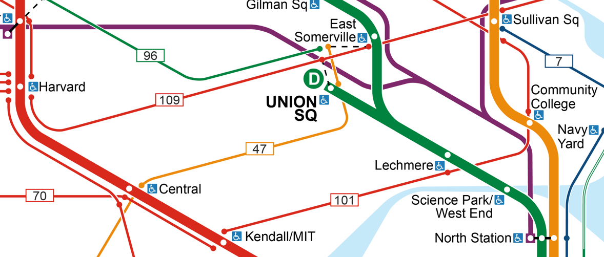
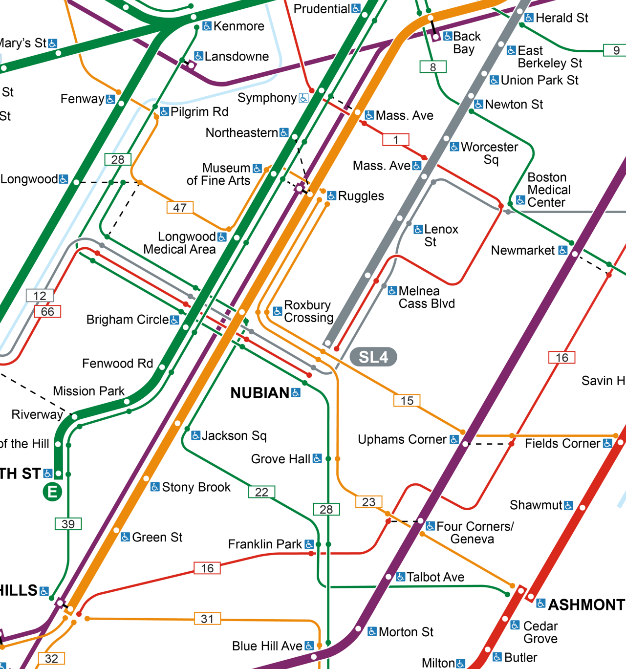
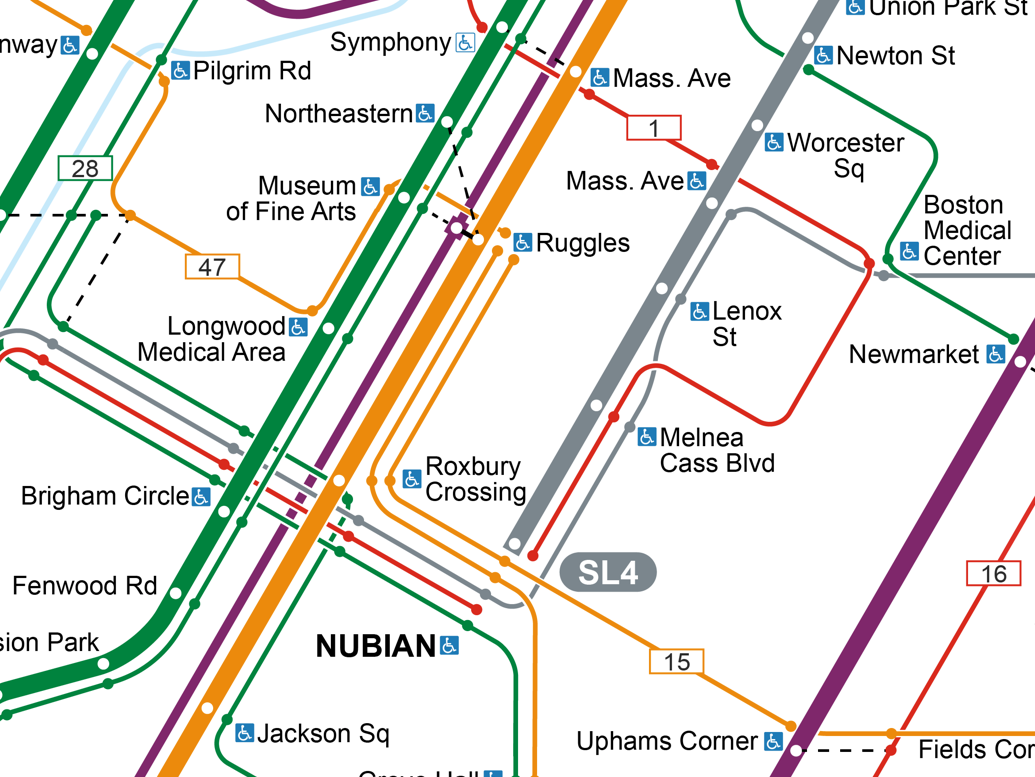
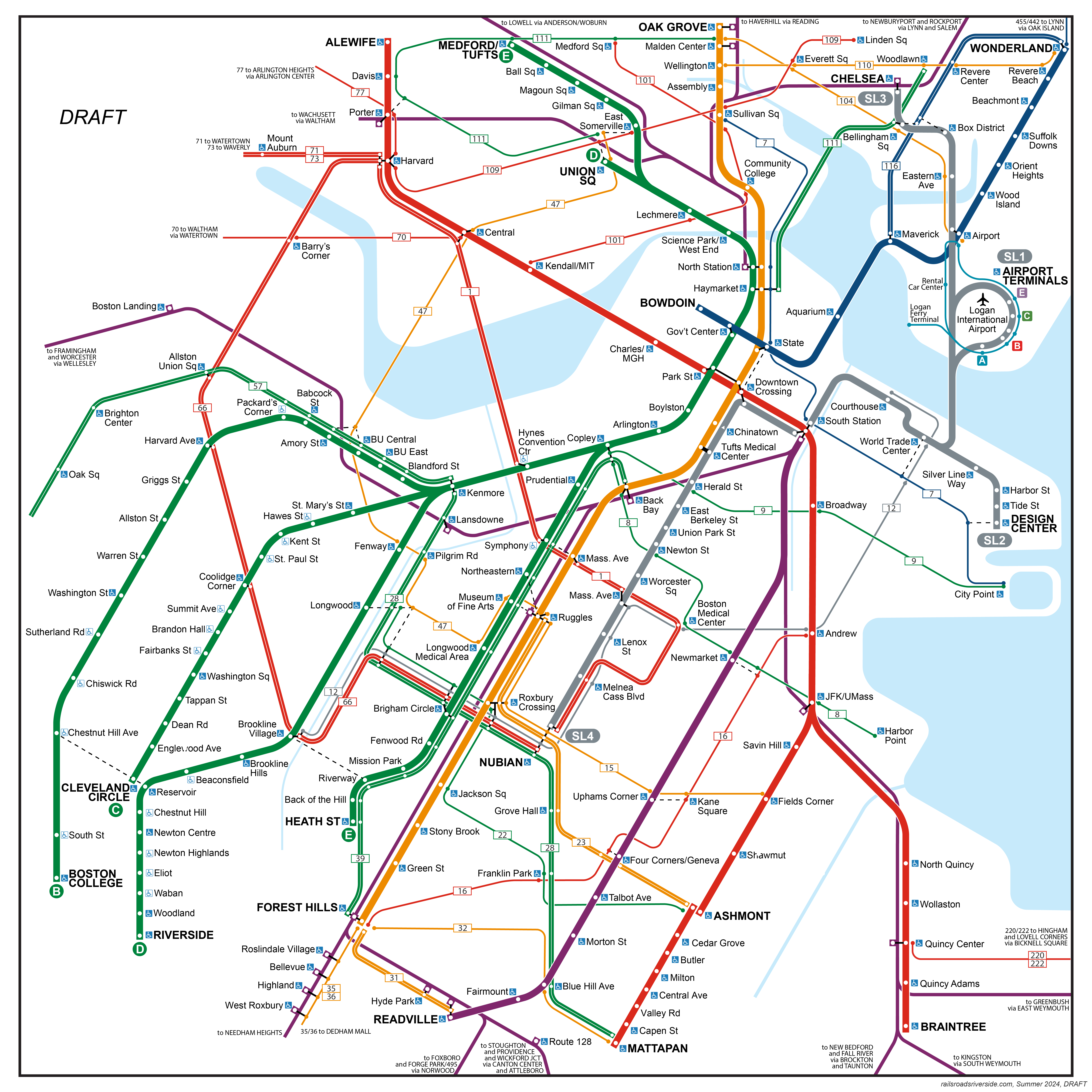
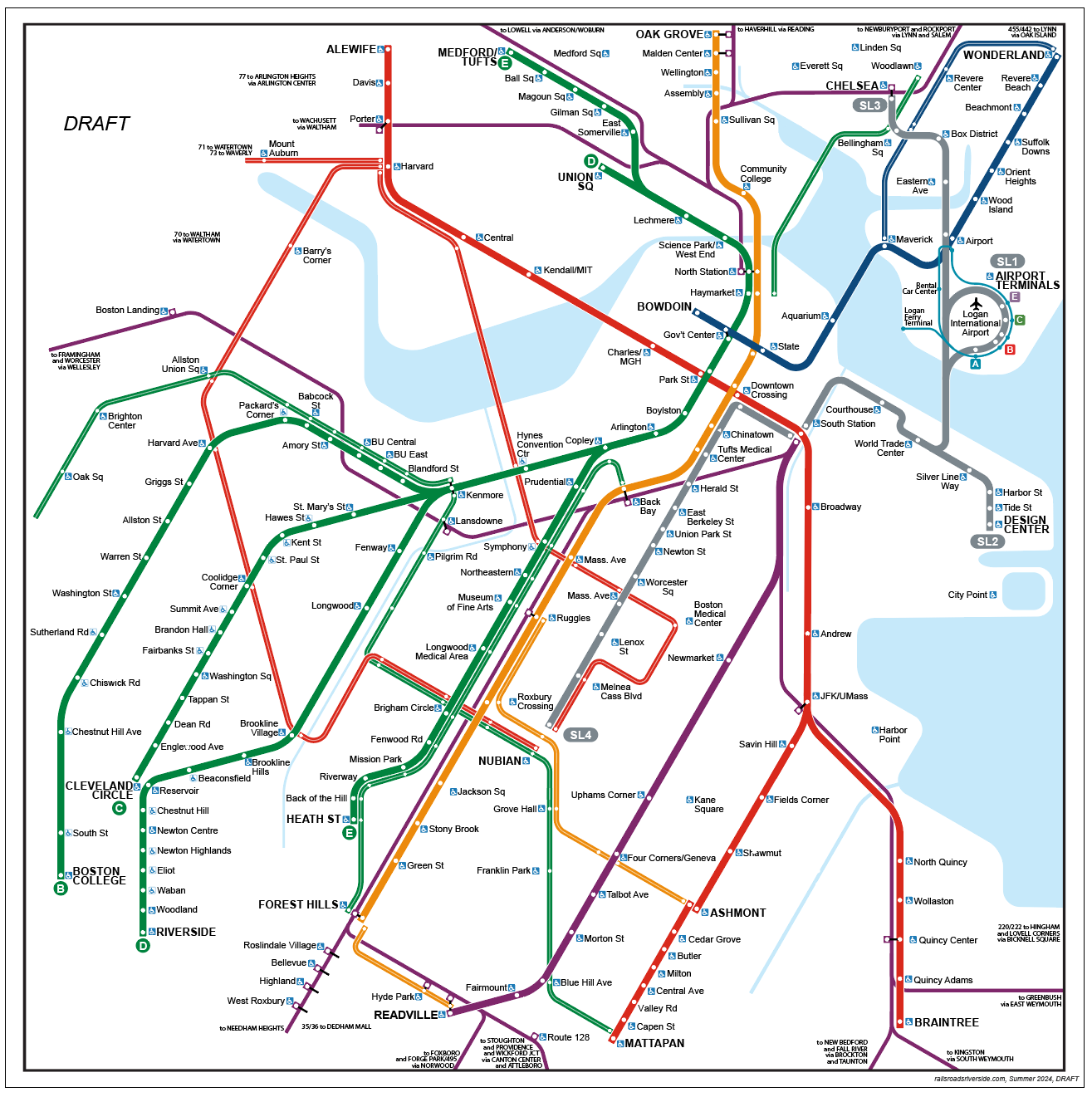
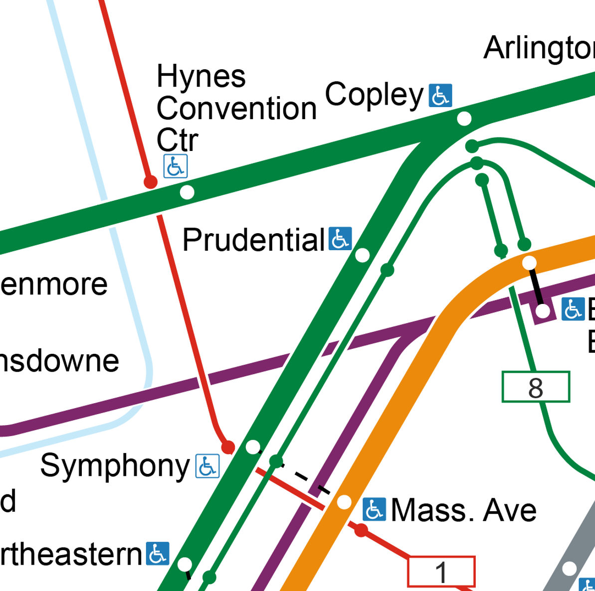
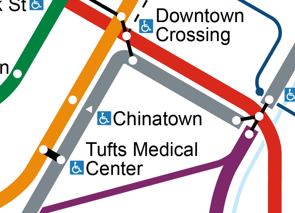
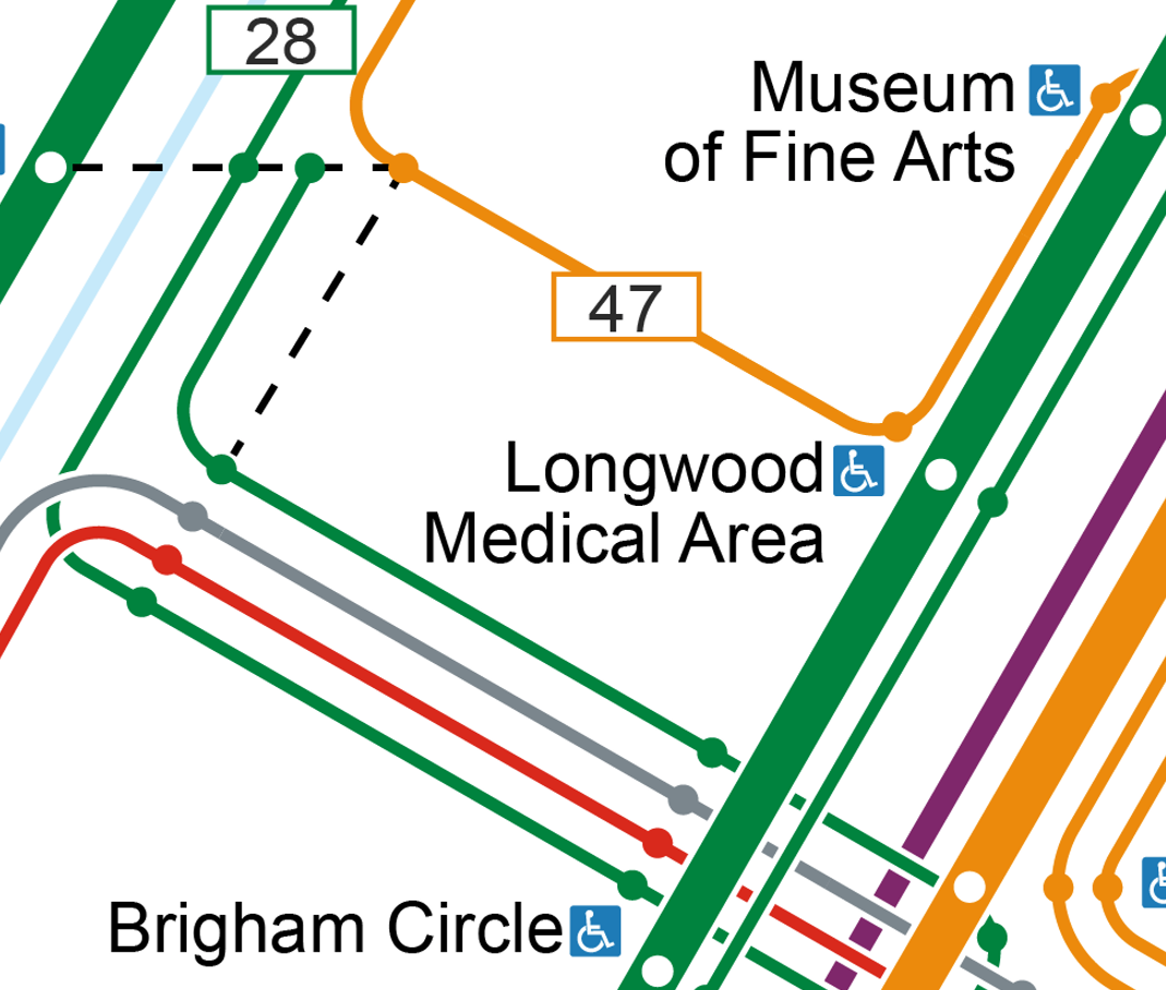
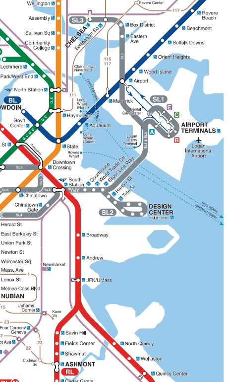
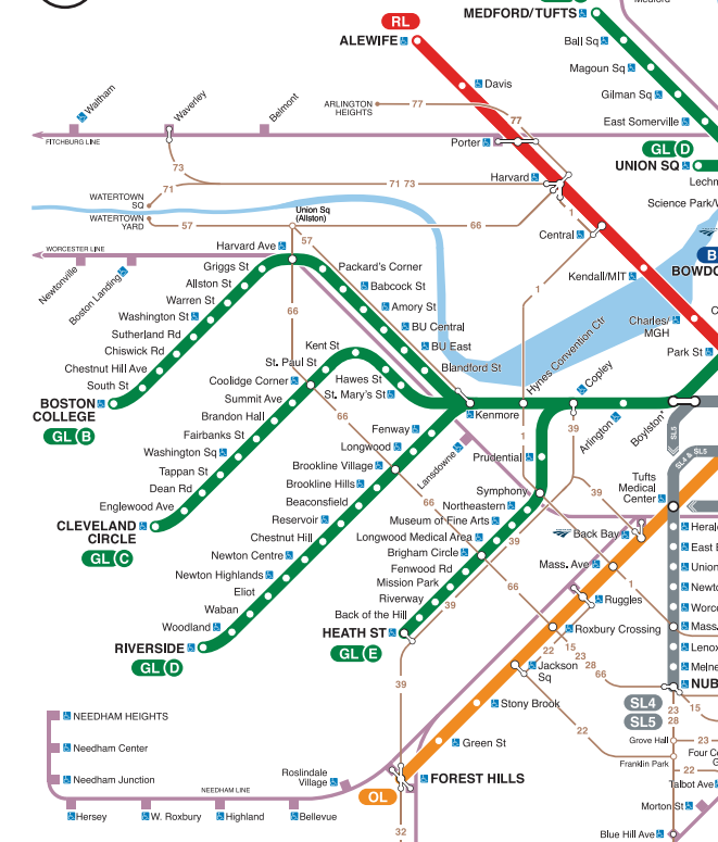
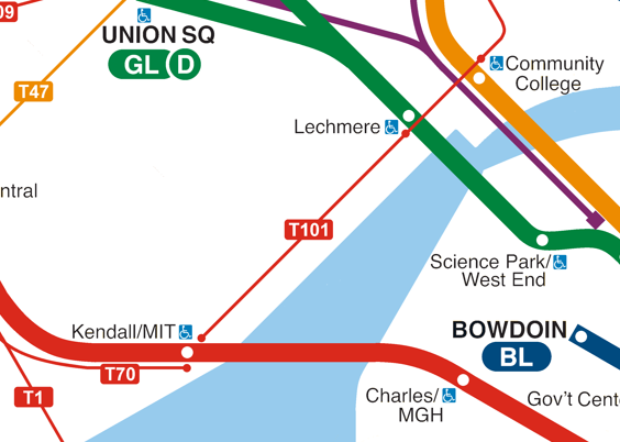
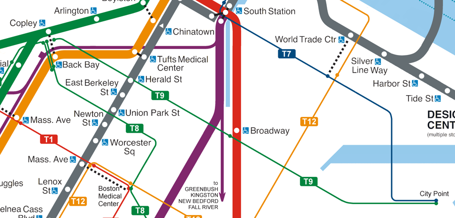
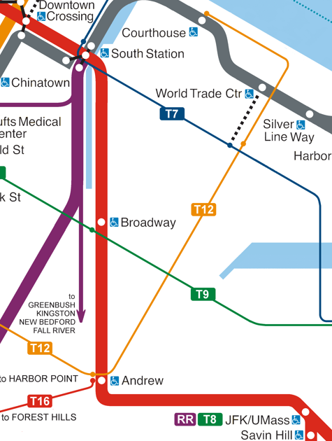
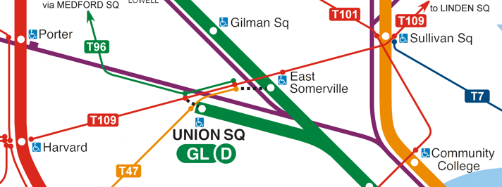
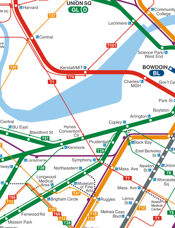
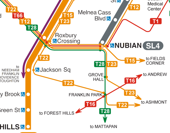
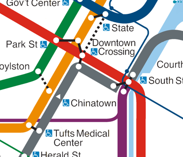

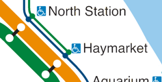

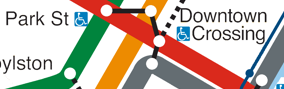
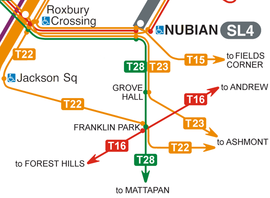
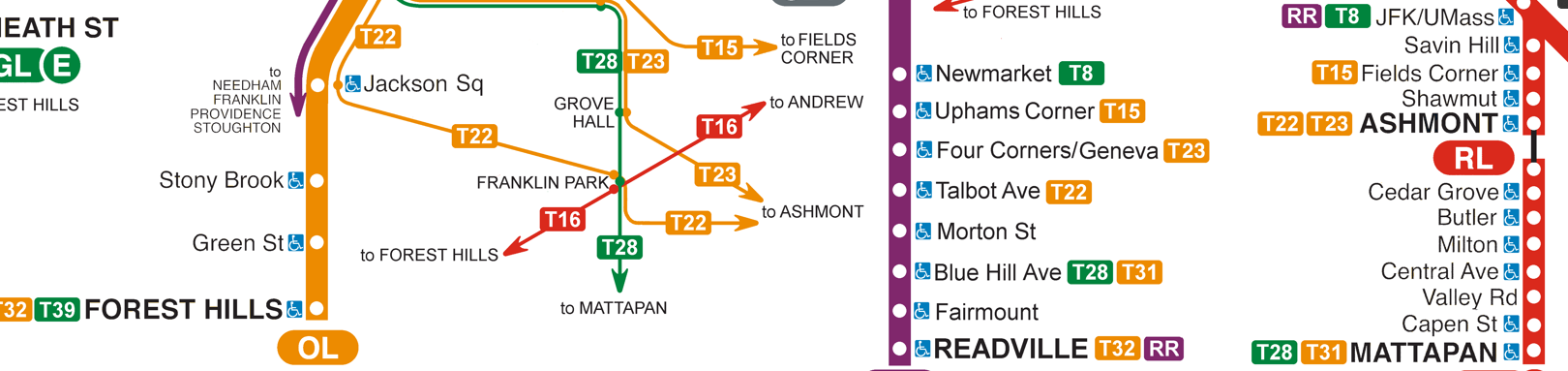
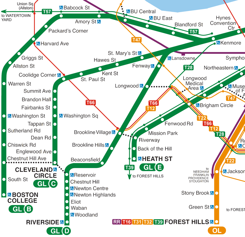
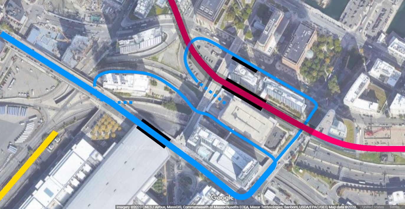
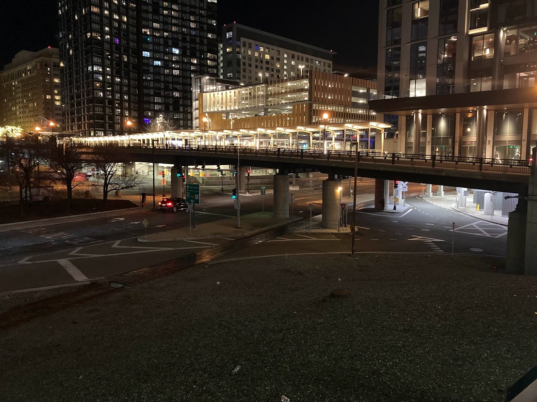
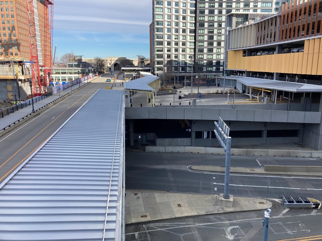
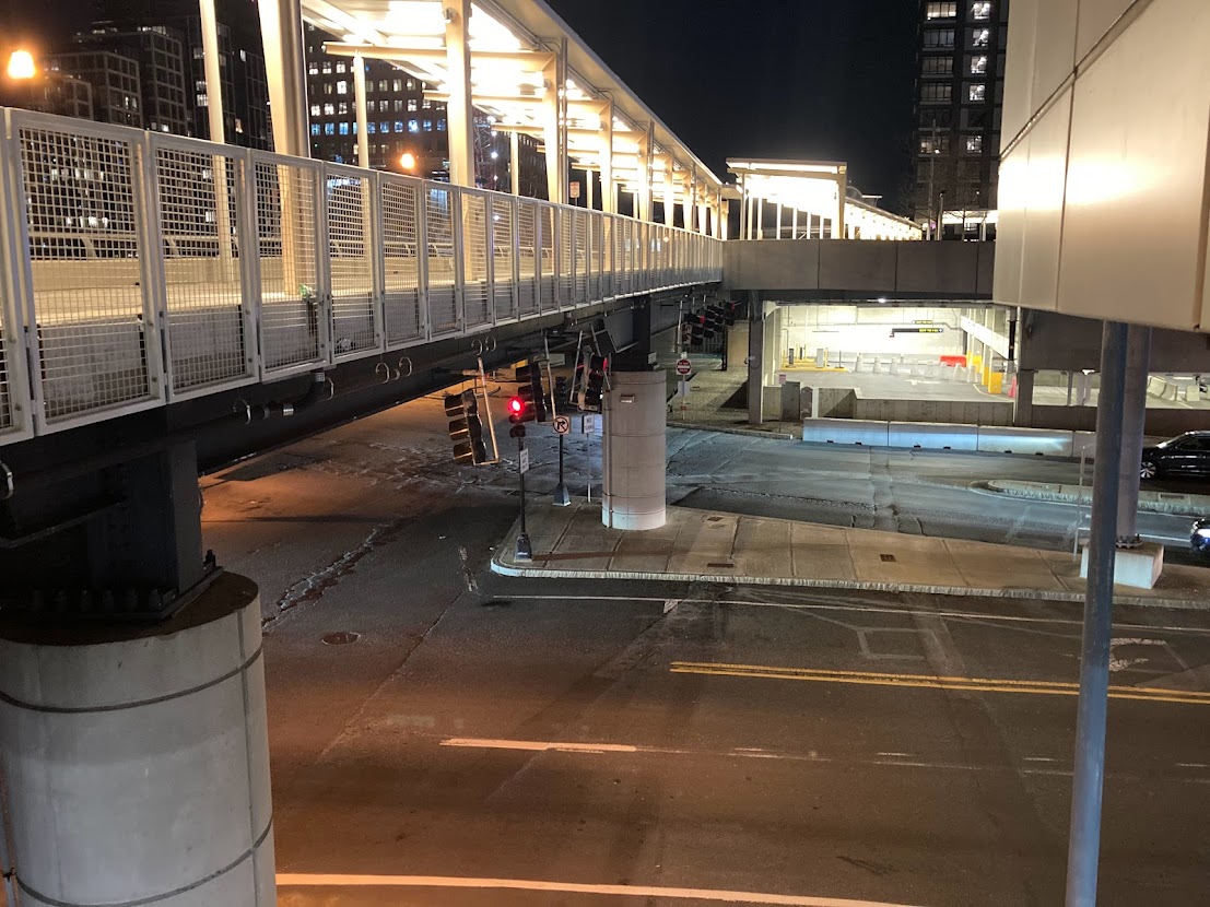
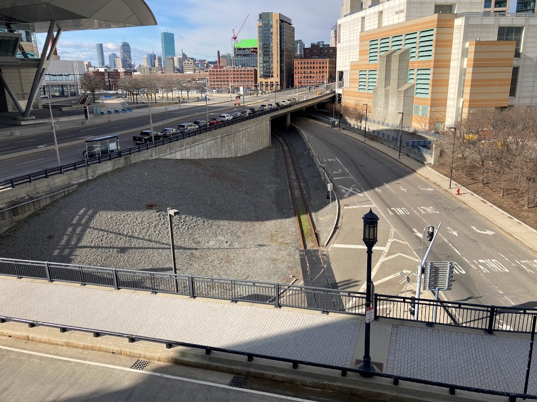
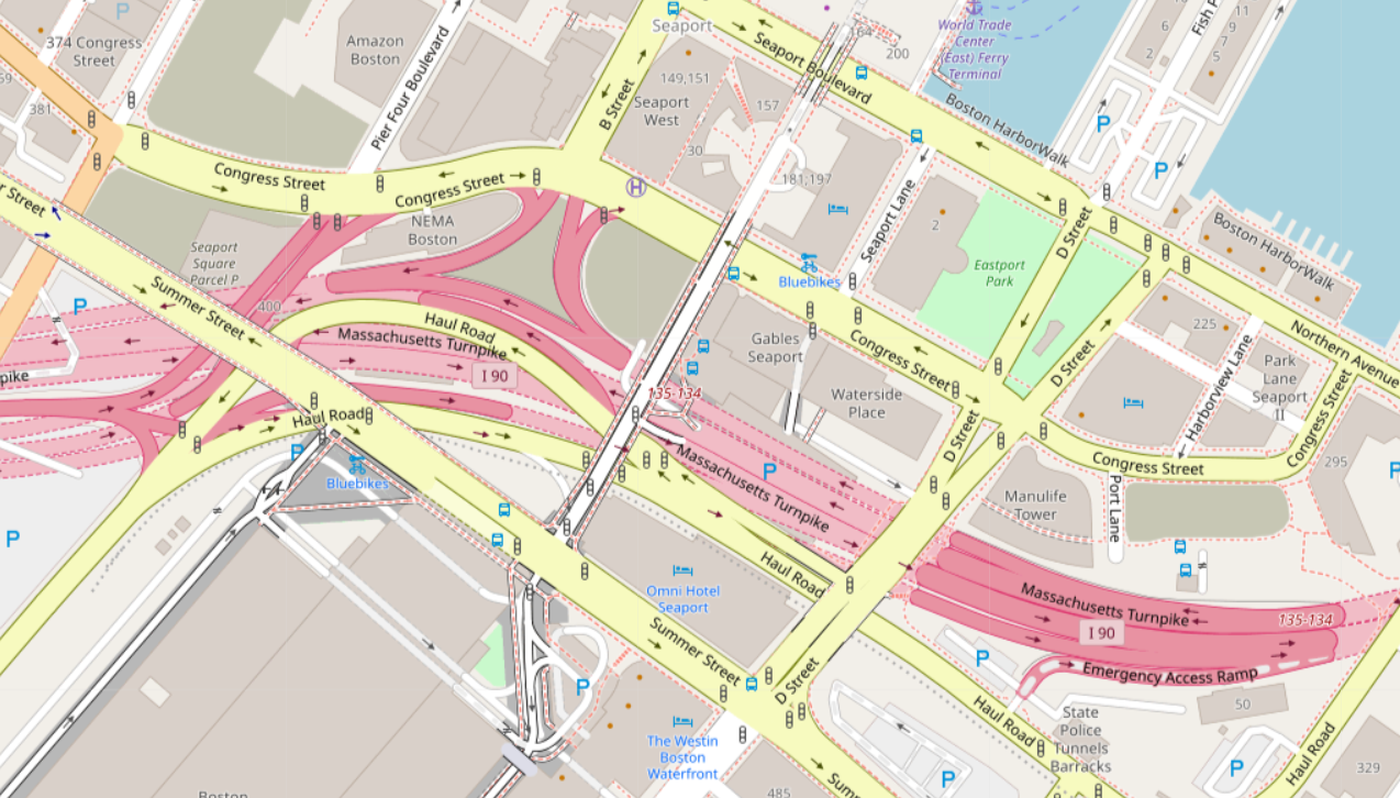

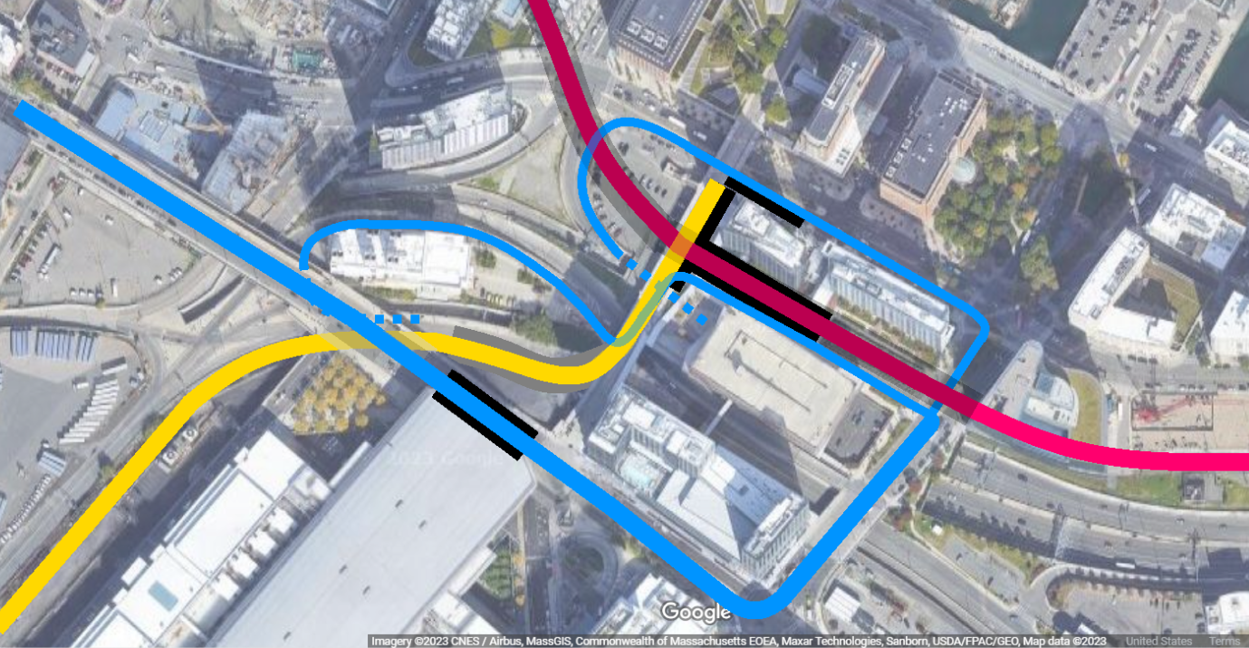
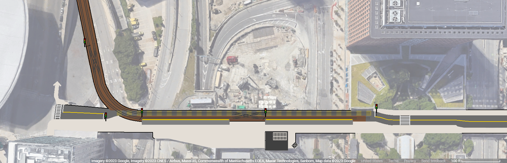
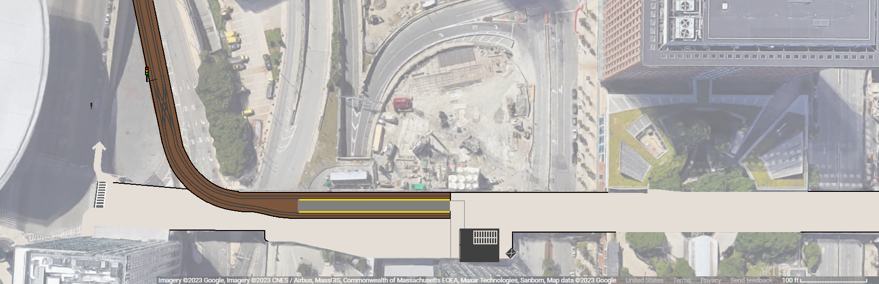
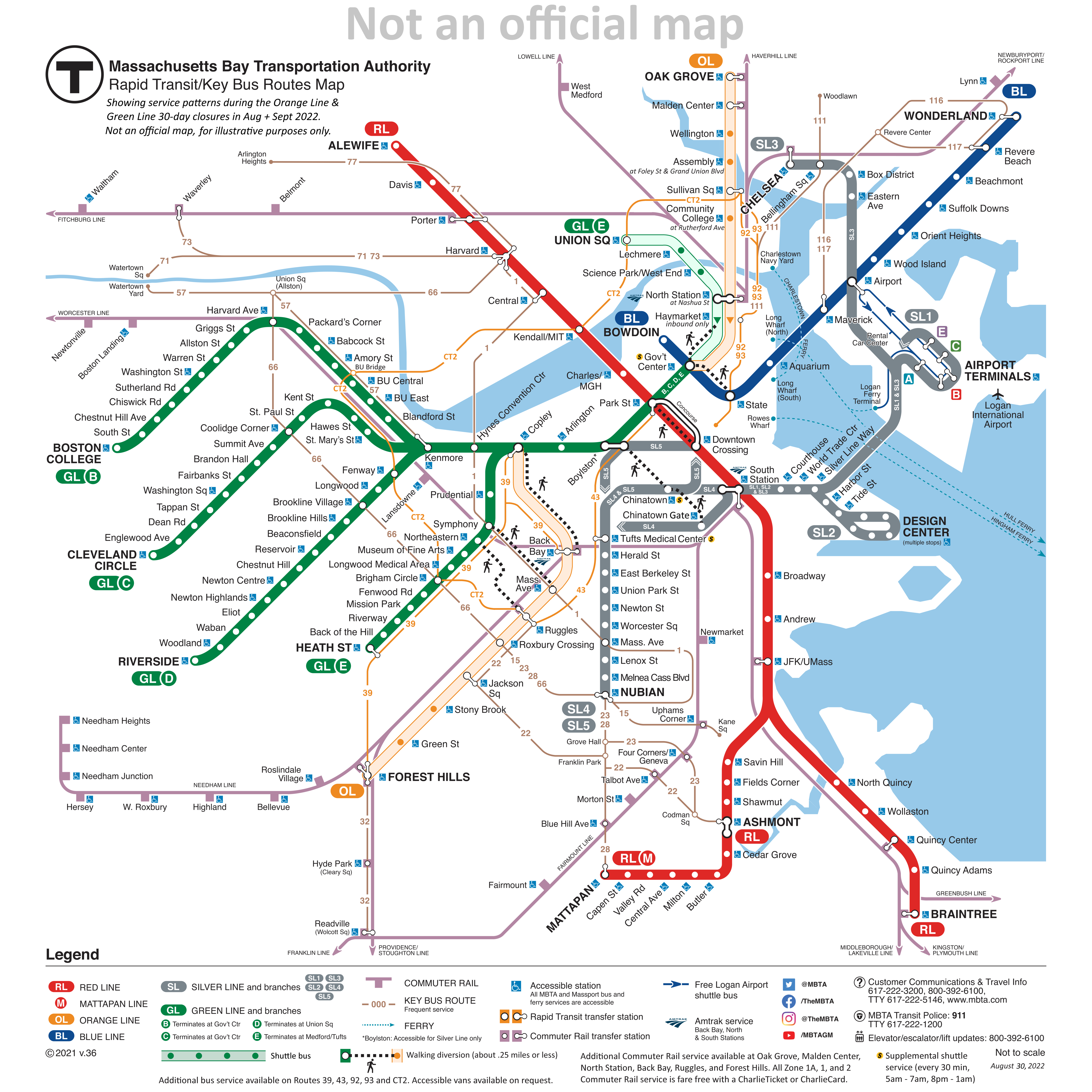
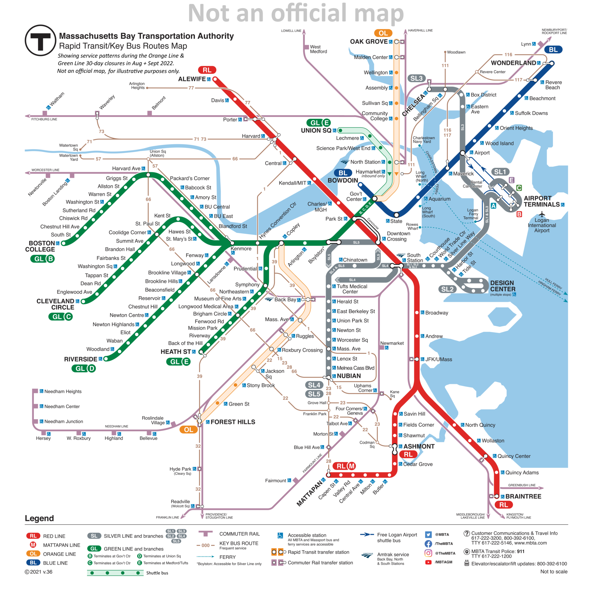
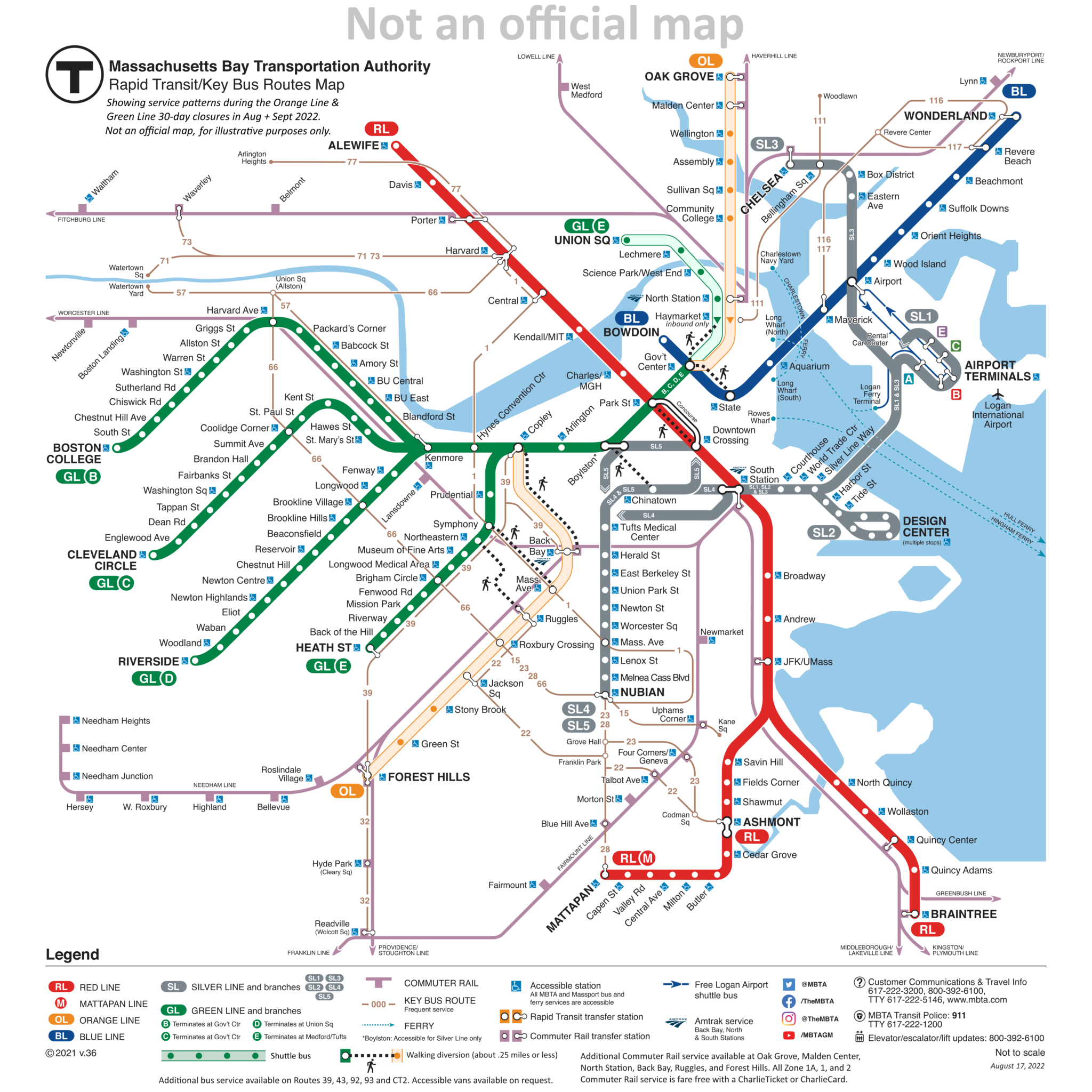
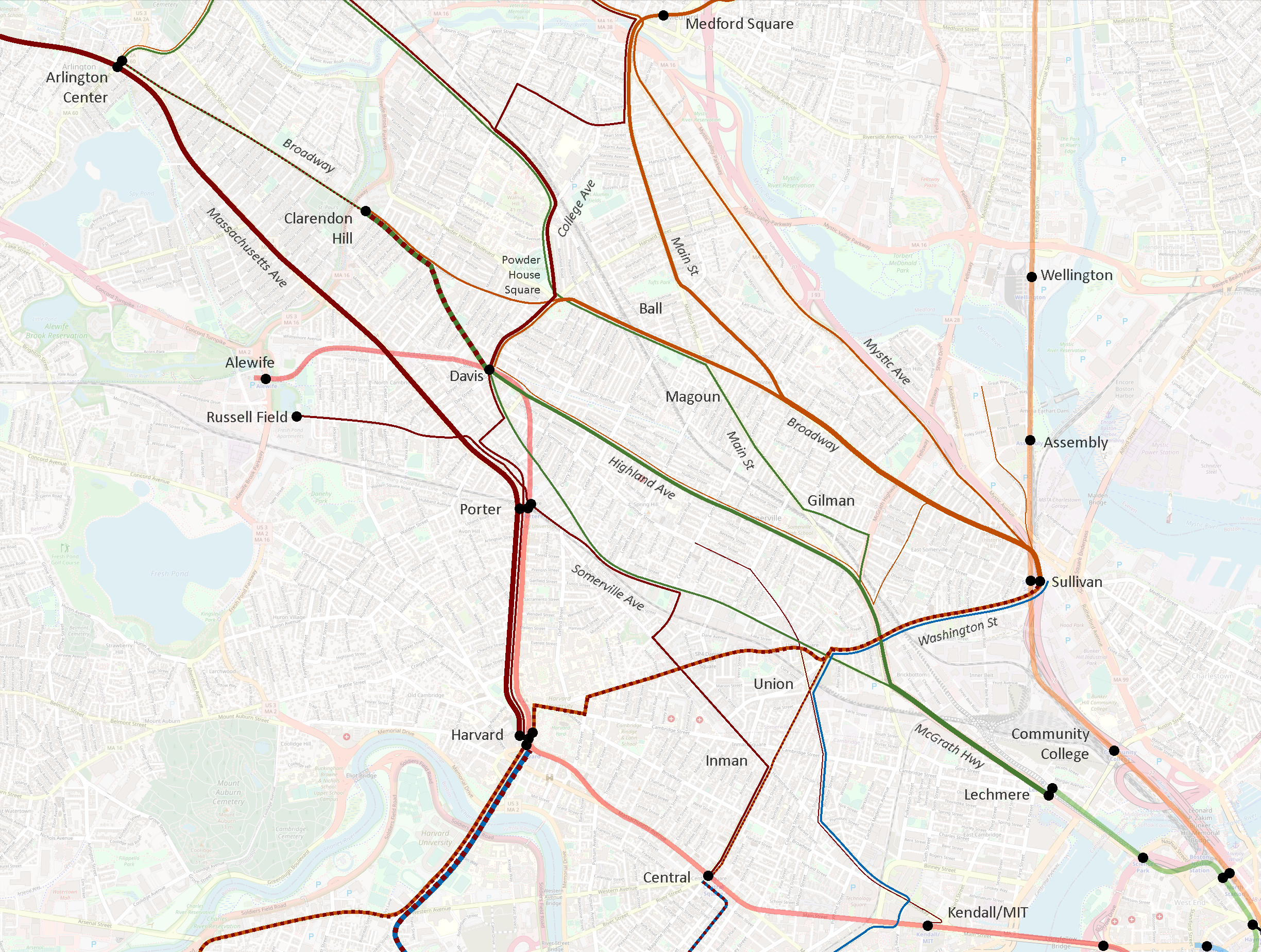
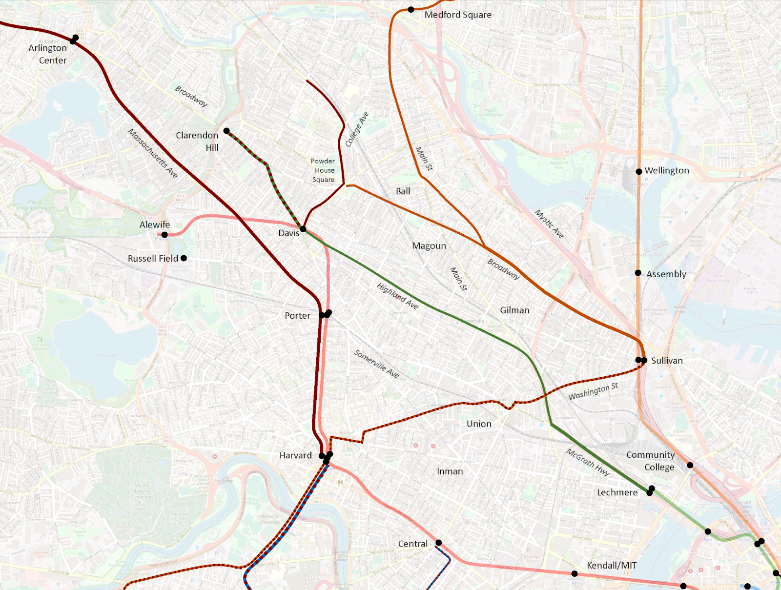
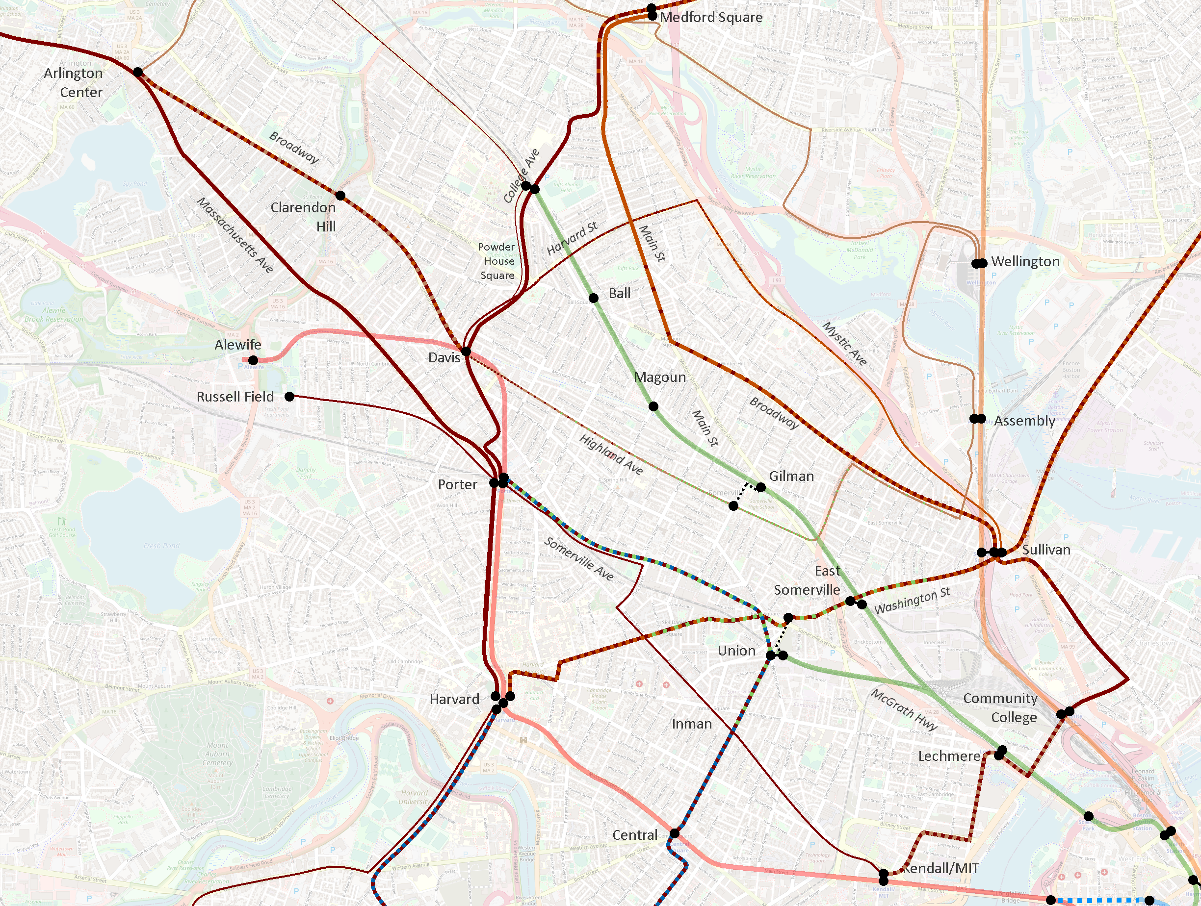
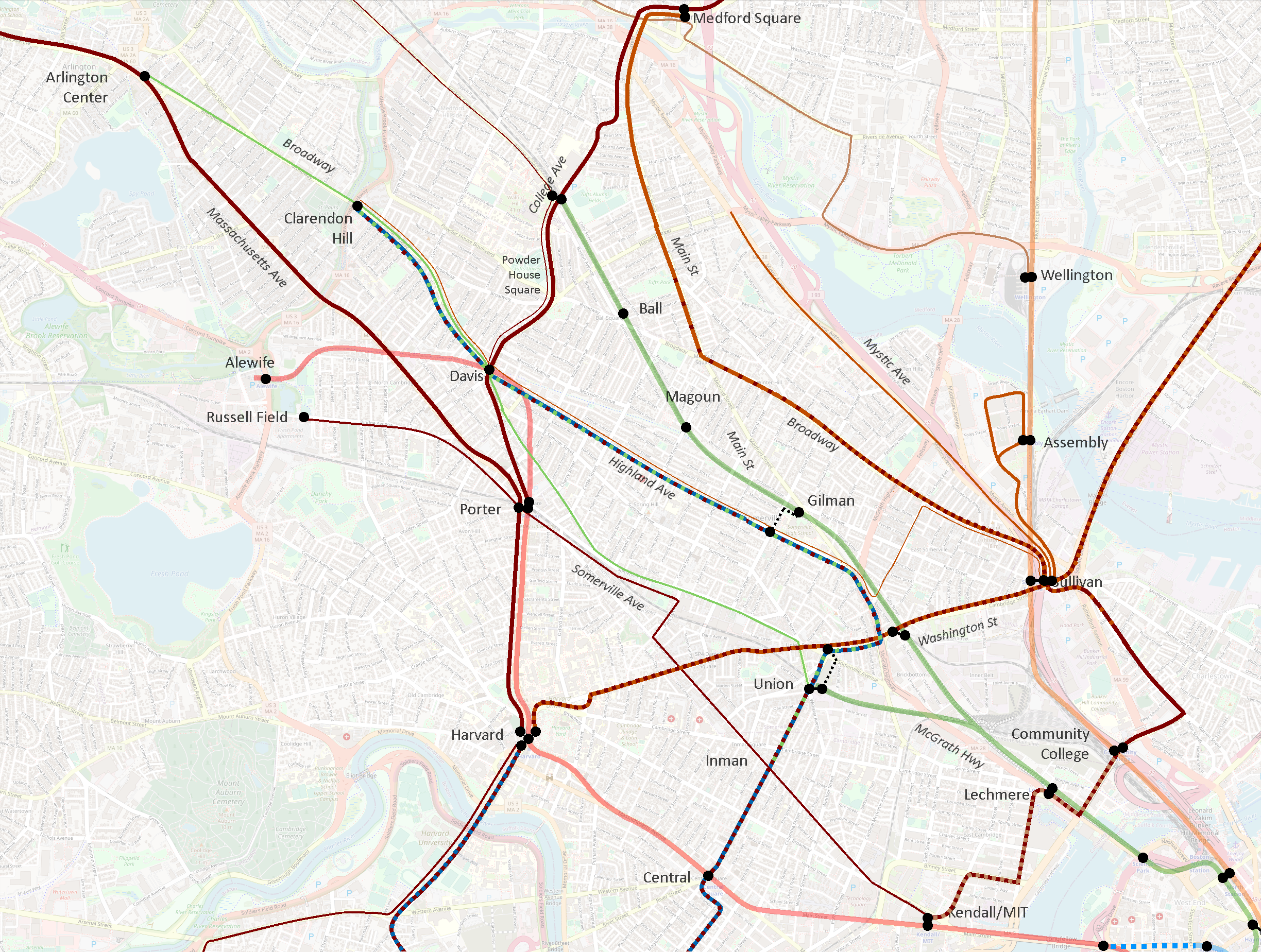

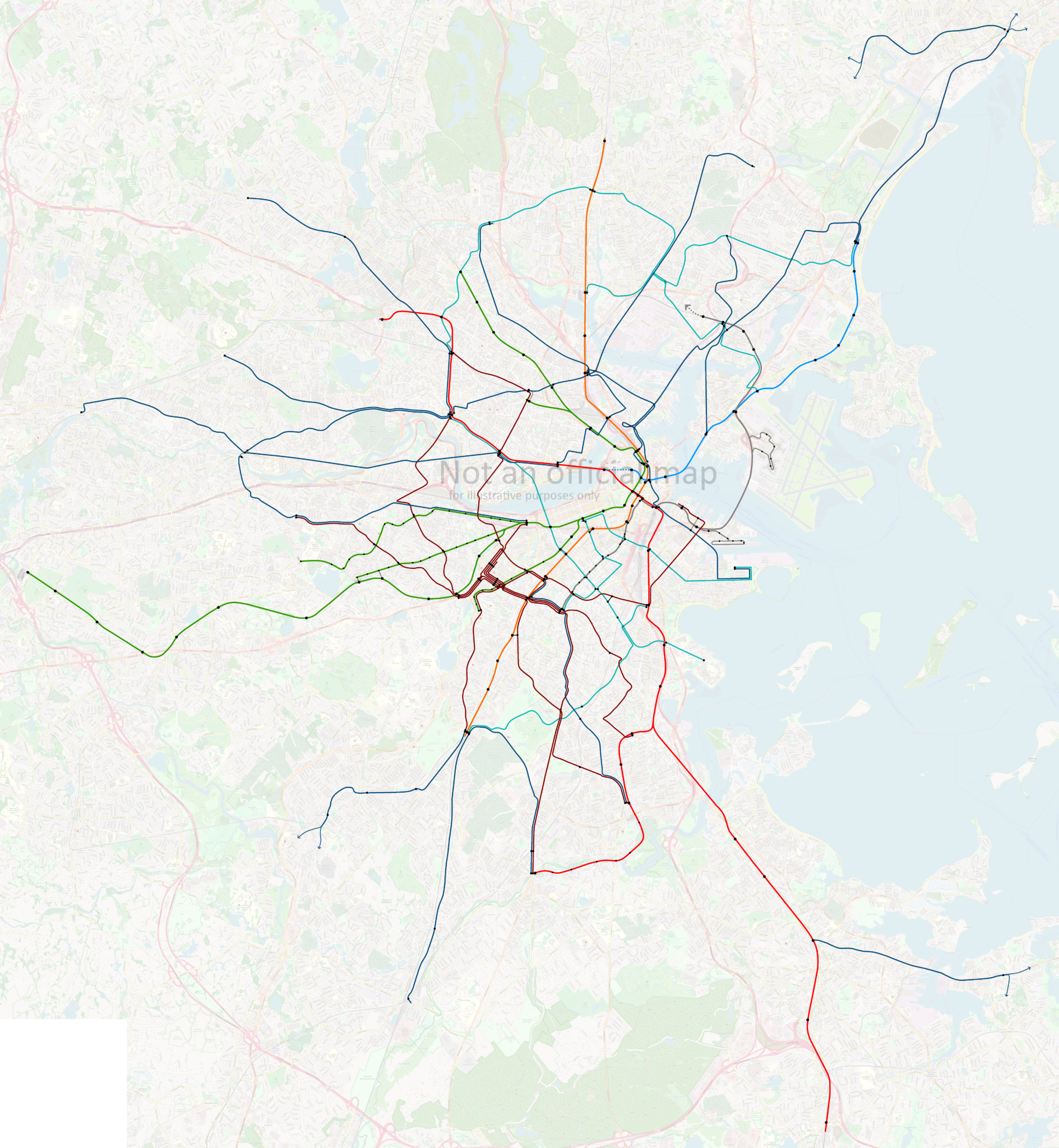
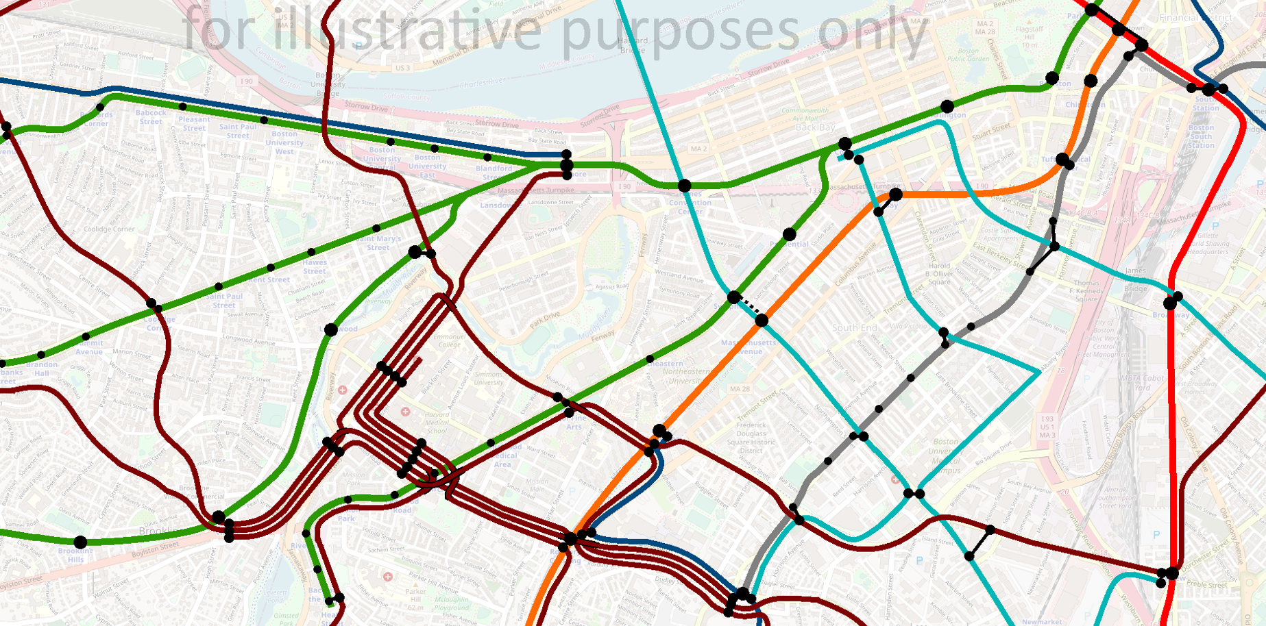
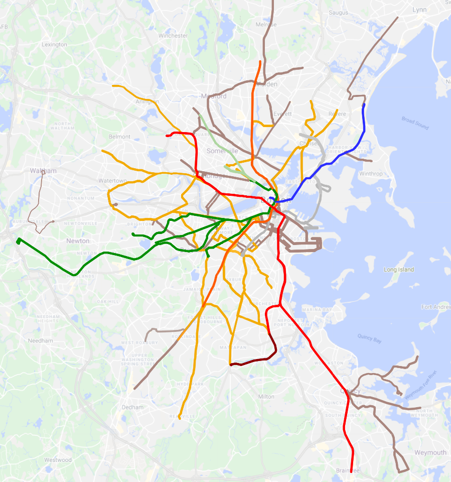
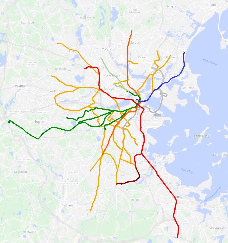