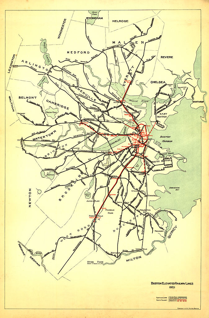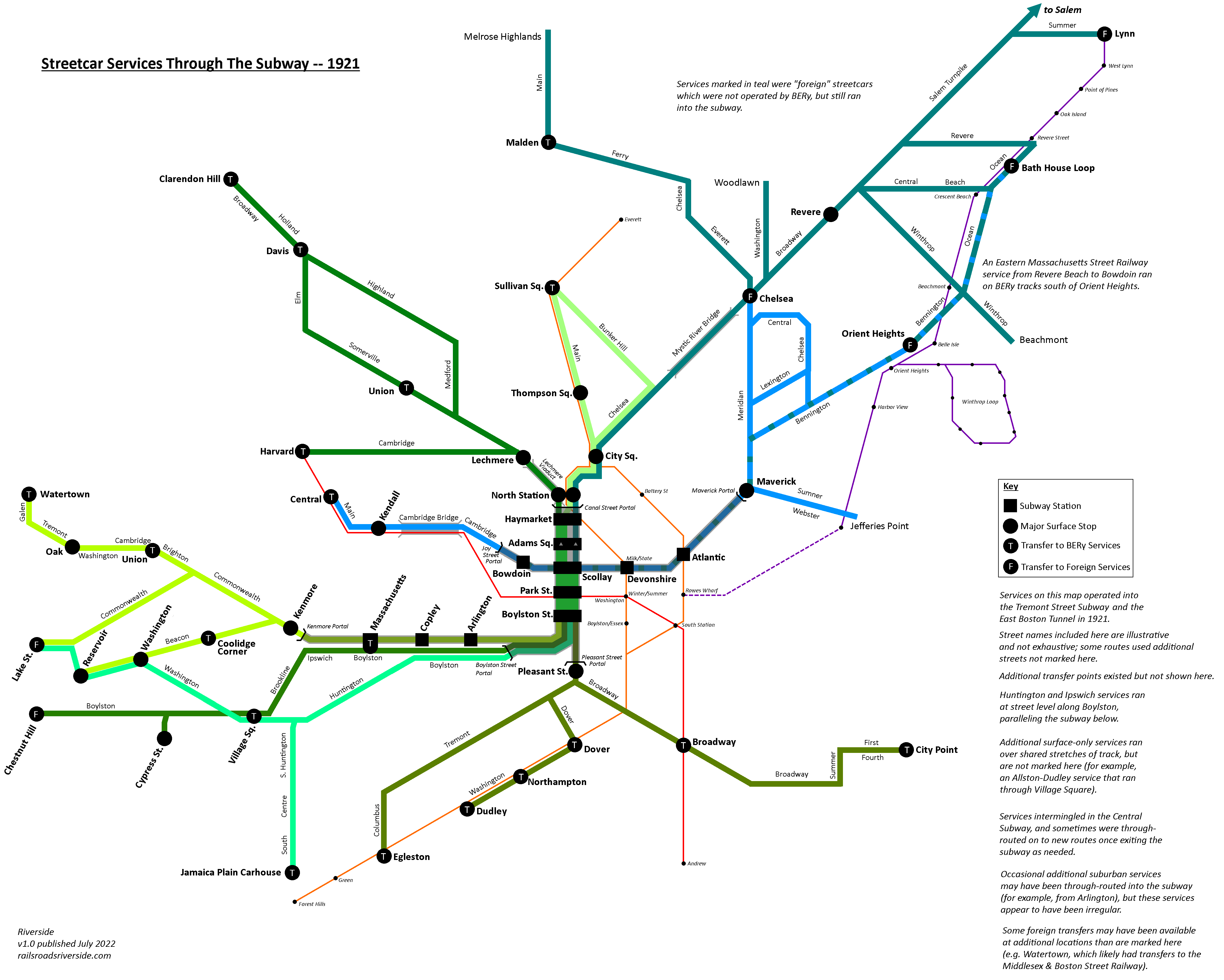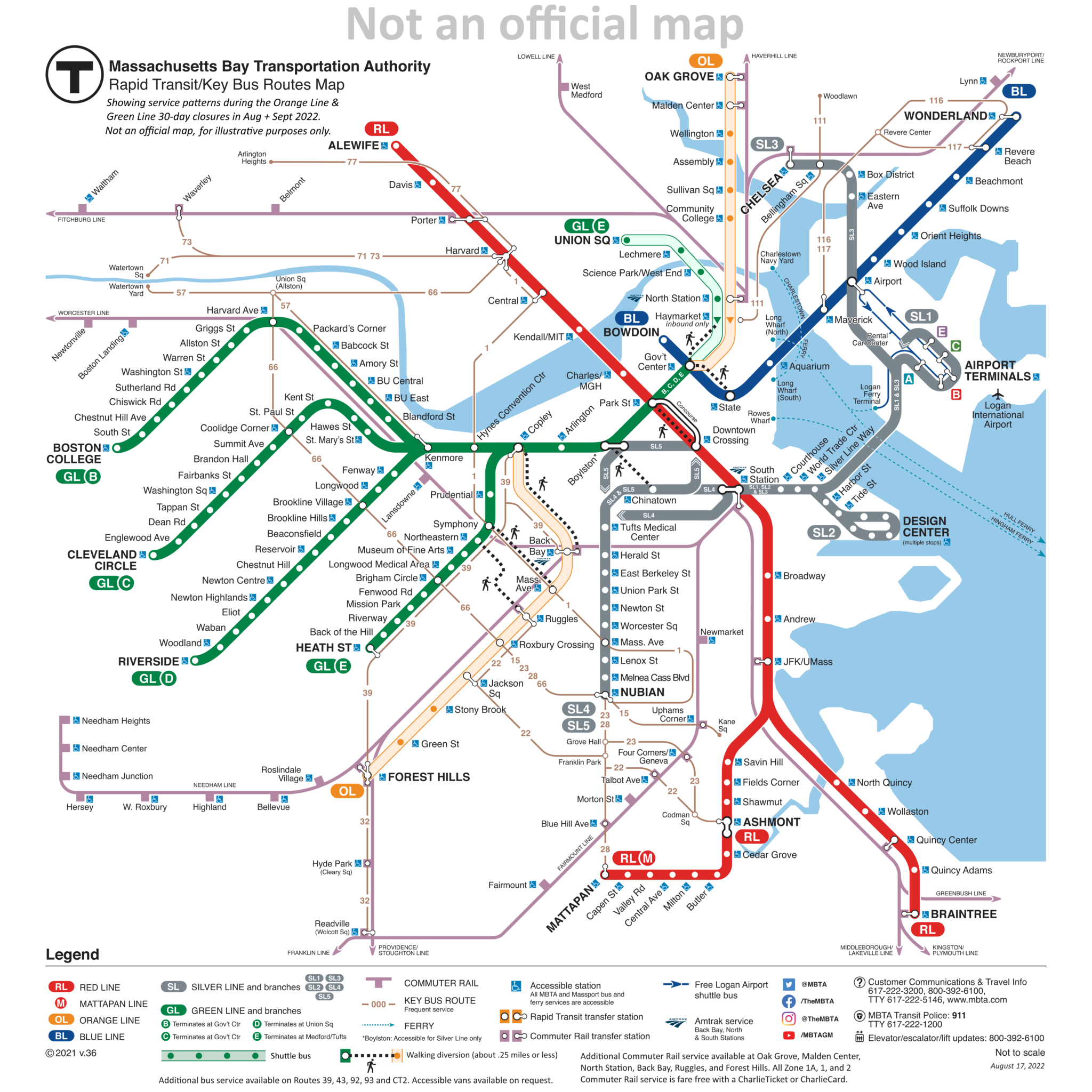
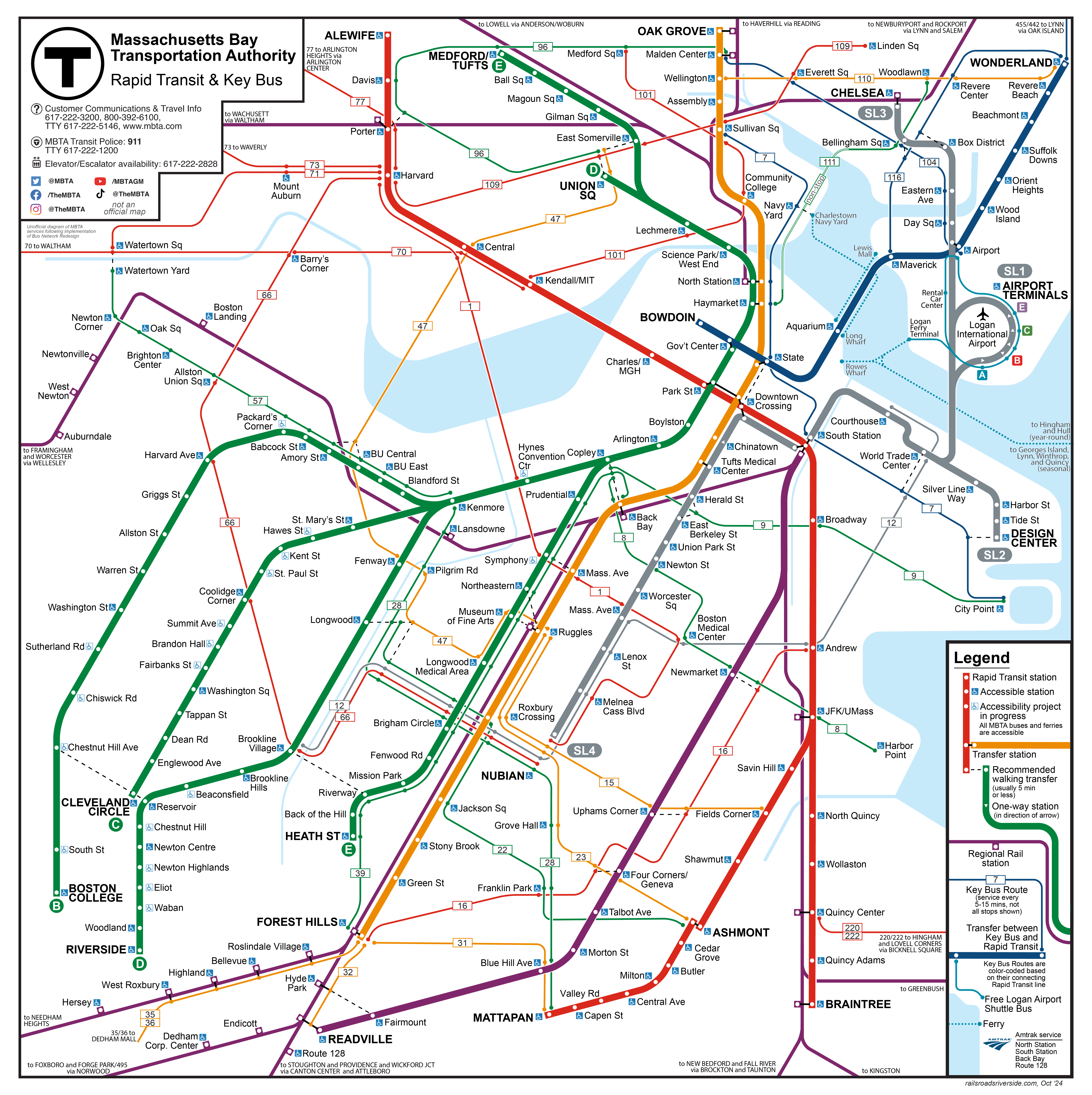
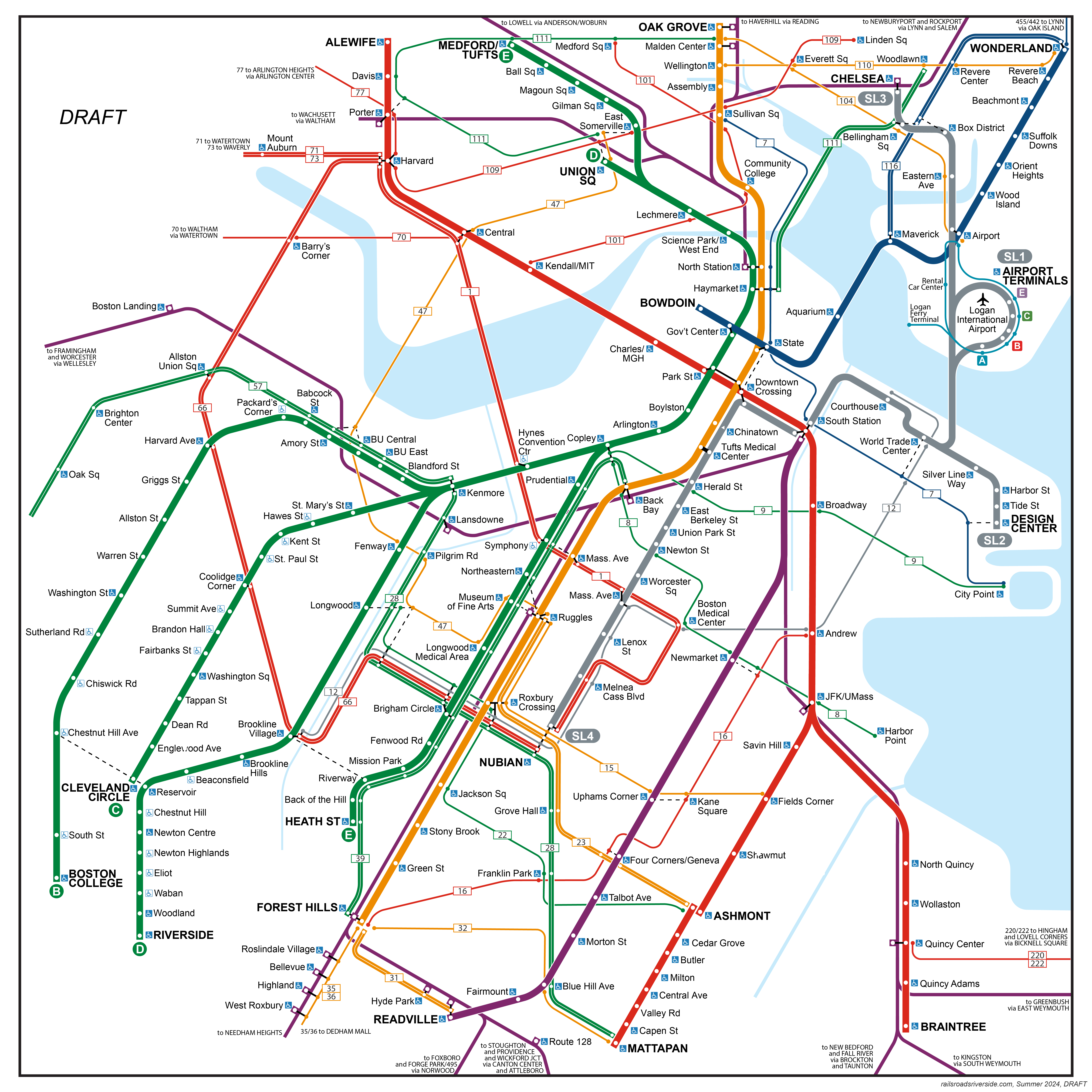
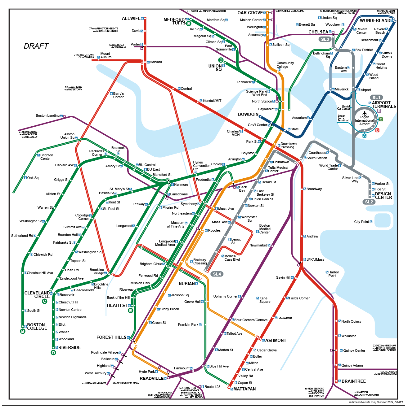
Last year, I attempted to redesign the MBTA’s rapid transit + key bus routes map. My first iteration was just downright ugly (and yet somehow I still decided to post it), while my second iteration was a bit better, though still unsatisfying.
This year, I have returned to this concept, with the same goals as before, to design a diagram that includes:
- Key (frequent) bus routes, designed into the map from the start
- All stops on the Green Line branches
- Walking transfers, such as State – Downtown Crossing and Brookline Village – Riverway
- All stops on the Fairmount Line (future-proofed for its eventual conversion to near-rapid transit standards)
- All information included on the present map
And achieve all of the above while fitting into a square and attempting to comply with relevant ADA visual design requirements by using the same canvas and font sizes as the official diagram. I also set a goal of having all labels appear on a solid background, not intersecting or overlapping any lines or other visual elements, and having all labels be horizontal for readability.
While I hestitate to trust my own judgement (like I said, it did somehow seem like a good idea last year to post my previous redesign), I do think that this iteration is more successful.
screenshots below are from the initial version of the diagram and have some minor differences
Design details
Many elements from last year’s version are carried over here, including:
Alignment of bus routes
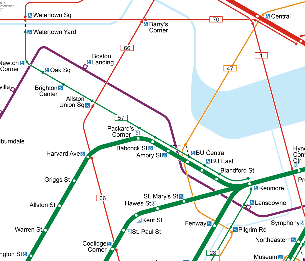
Stations are aligned so that connecting bus routes form strong visual links
Color-coded bus routes
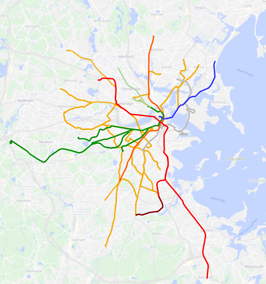
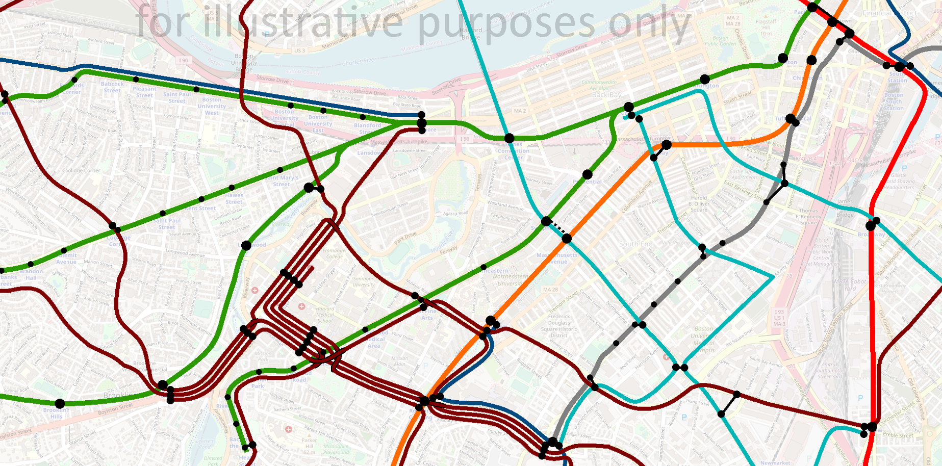
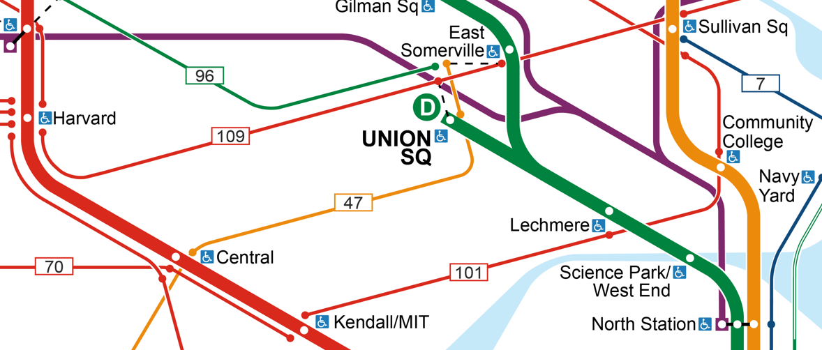
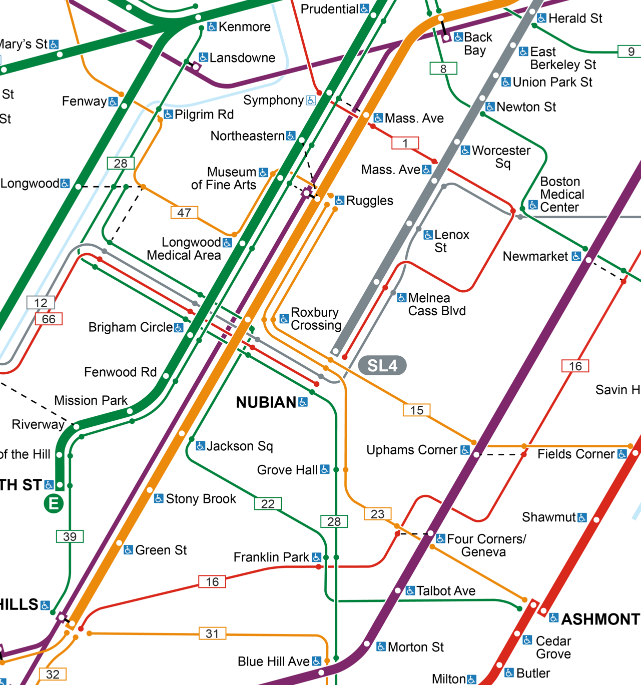
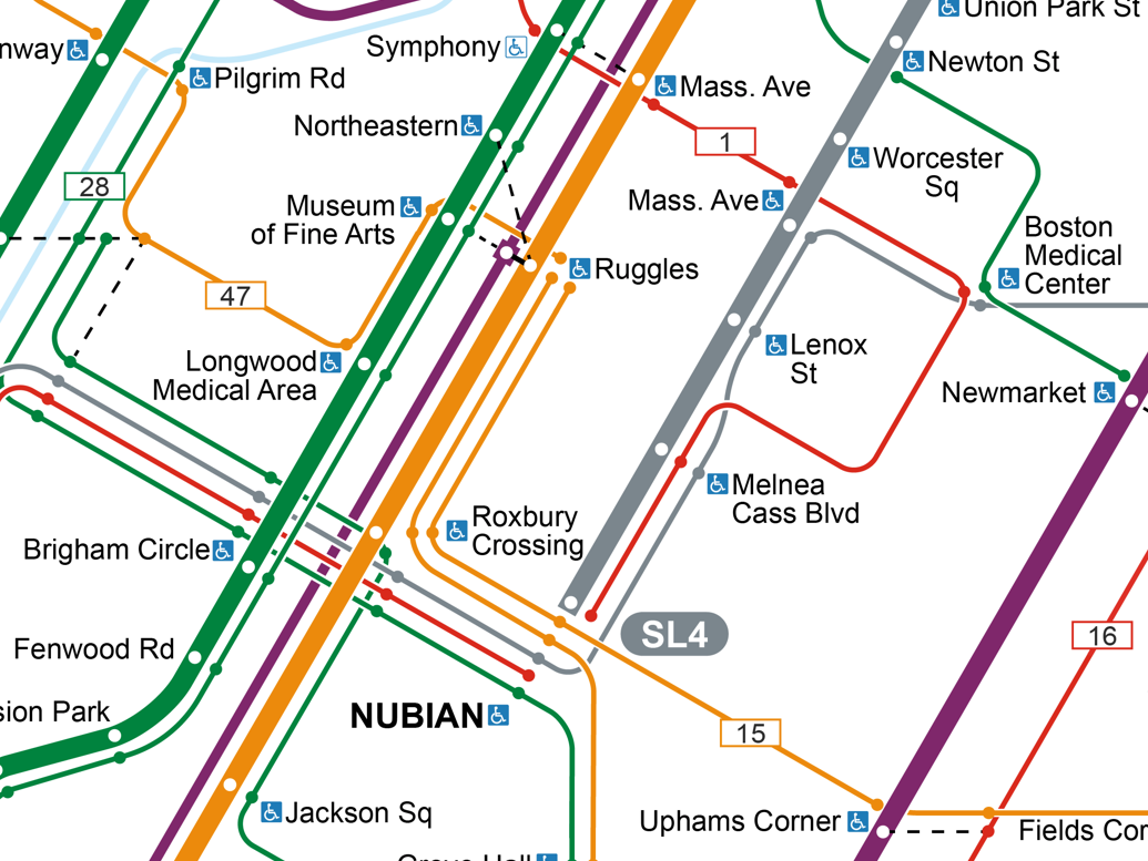
Bus routes are given colors based on the transfer hub they operate into; in the example below, orange bus routes feeding into Ruggles are contrasted with the green routes that feed into Kenmore/Longwood or Back Bay; the two routes in red both go to Harvard:
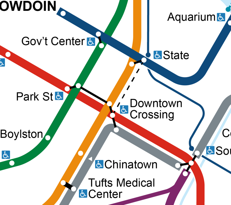
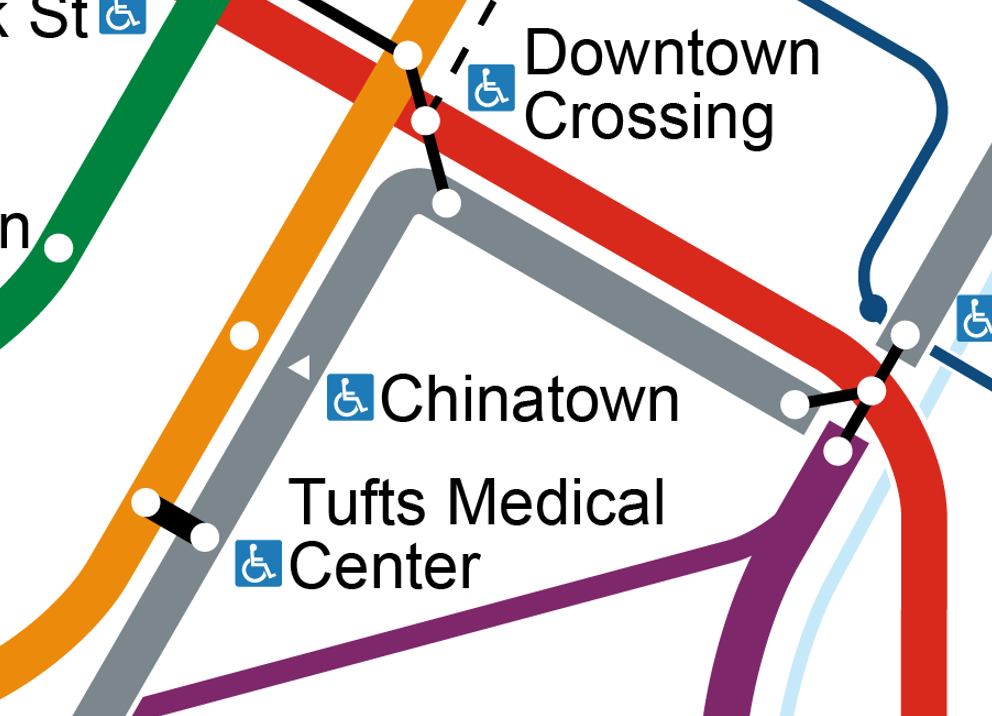
The transfer system at Park St & Downtown Crossing
The proposed realignment of SL4/SL5 will relocate its Downtown Crossing stop to Chauncy St, where it will provide a good transfer to the Red Line, but a more distant transfer to Orange; Silver <> Orange riders will be better off transfering at Tufts Medical Center. I’ve attempted to convey that here, along with the Red <> Blue walking transfer at State
Coequal bus routes
The most important change is that this diagram incorporates the key bus routes as coequal “stakeholders” in the design of the map, meaning, for example, that the complexity of the bus network in Longwood was treated as equally important to accommodate as the complexity of the subway network in Downtown. This meant, among other things, that labels for bus stops were sized identically to labels for rapid transit stops.
An organic by-product of the coequal emphasis on bus routes is an expansion of the “grid” formed by Park-DTX-State-GC downtown:
- The parallel Red and Blue Lines, horizontal on the Cambridge Seven diagram, are now joined by the parallel lines of:
- the 9, 8, 1, 15, the Longwood-Nubian bus corridor, the 23, and 22.
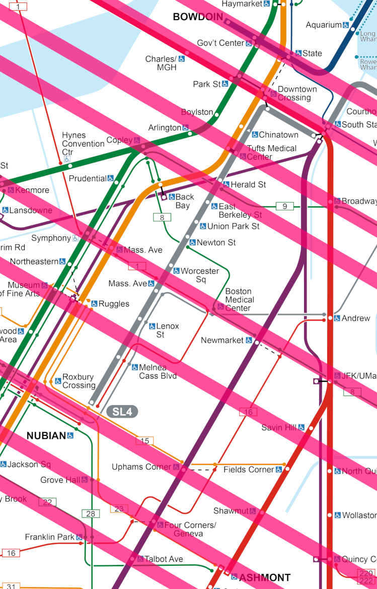
- The historically vertical Orange and Green Lines are now joined by:
- the Ashmont Branch, the 16, Fairmount Line, portions of the 8 and 1, SL4, the 32, the E Line, the Brookline Ave bus corridor, and the D Line
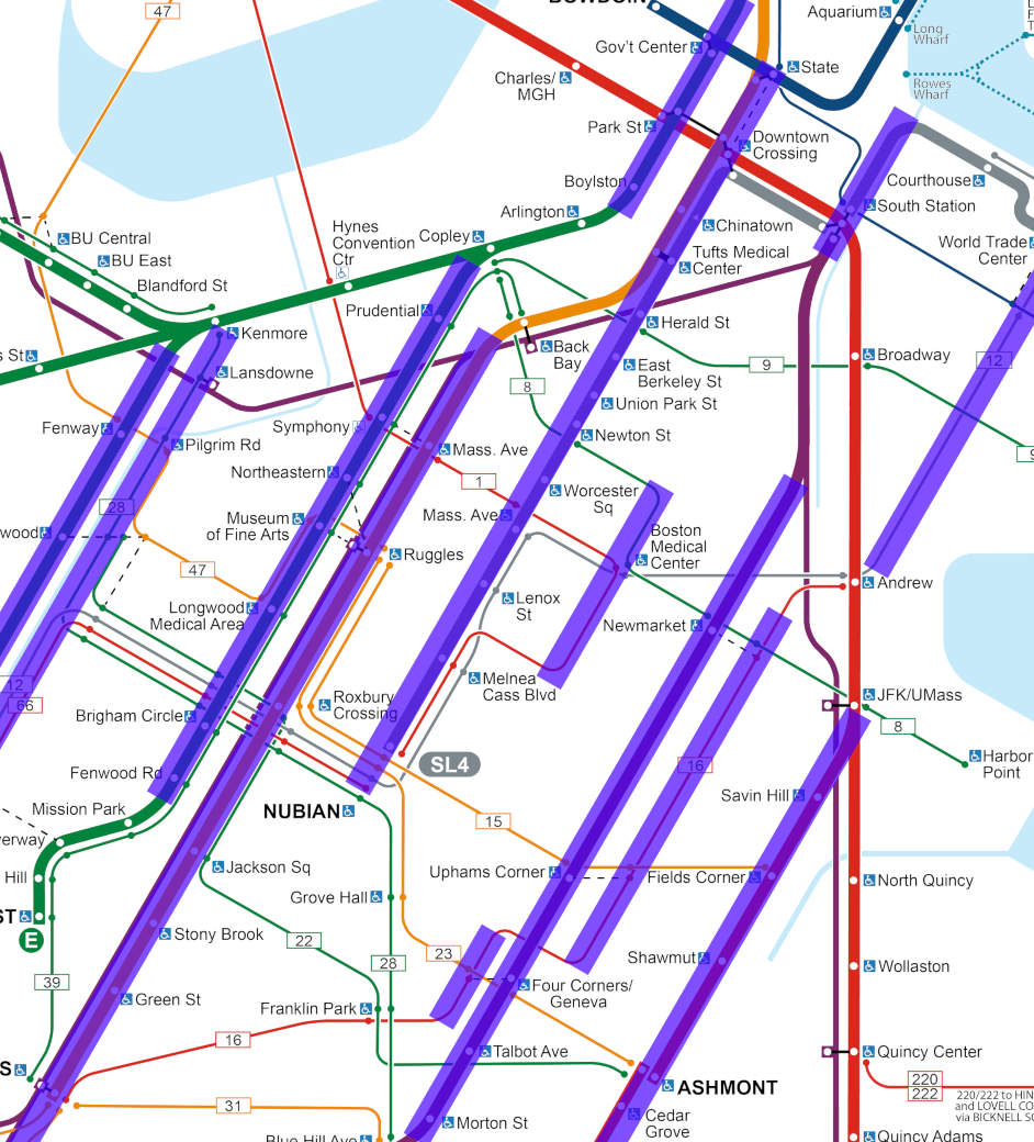
In particular, the lengthy parallel alignment of the Ashmont, Fairmount, SL4, and Orange Lines created a strong “ladder” effect, where the complex Dorchester bus network can be articulated in terms of which anchor stations a route connects to. For example, my diagram more clearly articulates that Newmarket sits on the same cross-street as Mass Ave and Symphony, and that Uphams Corner sits on the same cross-street as Nubian, Roxbury Crossing, and Brigham Circle.
(The fact that the Uphams Corner <> Brigham Circle street changes names four times — Dudley St, Malcom X Blvd, Tremont St, Francis St — points to the utility of a mildly simplified visualization of Boston’s [apocryphal] cow paths.)
Complexity and tradeoffs
Now, it has to be said that this diagram is complex and still rather visually overwhelming. In general, I argue that’s inevitable with this much information being put into this little space. Fellow ArchBoston contributer TheRatmeister has created a gorgeous map that presents an elegant counterargument, as his map does indeed show all of the above information while still looking amazing.
A key difference between our maps is that his utilizes non-horizontal text and overlapping text. (His text is also slightly smaller than mine, although I believe it still falls well within accessibility guidelines.) So this highlights a tradeoff: the visual complexity of overlapping/non-horizontal text, vs the visual complexity of a highly visible bus network.
Lines on a map
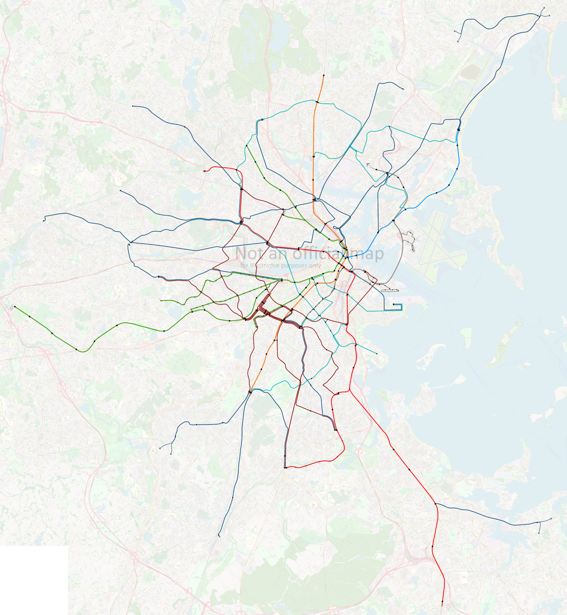
An earlier draft of this map took the emphasis on coequal bus representation even further, by depicting the very highest frequency bus routes (as currently planned in the Bus Network Redesign) with visually distinct medium-thickness lines (nearly as thick as the rapid transit lines) bisected by a thin white line.
This iteration made the Longwood-Nubian corridor too busy. It also ultimately is misleading — the differences in proposed frequencies between my “thick” and “thin” bus routes just aren’t that stark.
However, this version of the diagram presents something worth closer examination: a visualization that vaguely suggests what the subway map might look like if the T’s most important bus routes were full rapid transit:
As a political position, I submit that we should not tolerate “slow zones” on the bus corridors depicted above — important enough that they have a legitimate claim to being “on the map” — any more than we’ve been willing to tolerate slow zones on the subway.
Boston, the “Hub(s) of the Universe”
Both in my final map and in the proof-of-concept screenshot above, it is Back Bay that sits visually centered. On the one hand, this is partially an artifact of compression that I implemented on the northern half of the map. On the other hand, that compression was only possible because the T’s system is less complex (and less robust) on the north side. The network out of Longwood/Nubian alone could be its own map.
The fact is that Boston no longer has a single downtown, but at least three, if not more: Downtown, Back Bay, Longwood, and arguably the Seaport, and maybe Kendall Sq. To depict the full breadth of the T’s system, a diagram can’t be solely focused on the historical Park-DTX-State-GC core.
In the past, I’ve argued that a poorly understood aspect of the Urban Ring proposal was the extent to which it was actually designed to provide radial transit services to Boston’s “other” downtowns. This diagram illustrates the pluricentric nature of the region’s transit needs.
A Map-Making Note
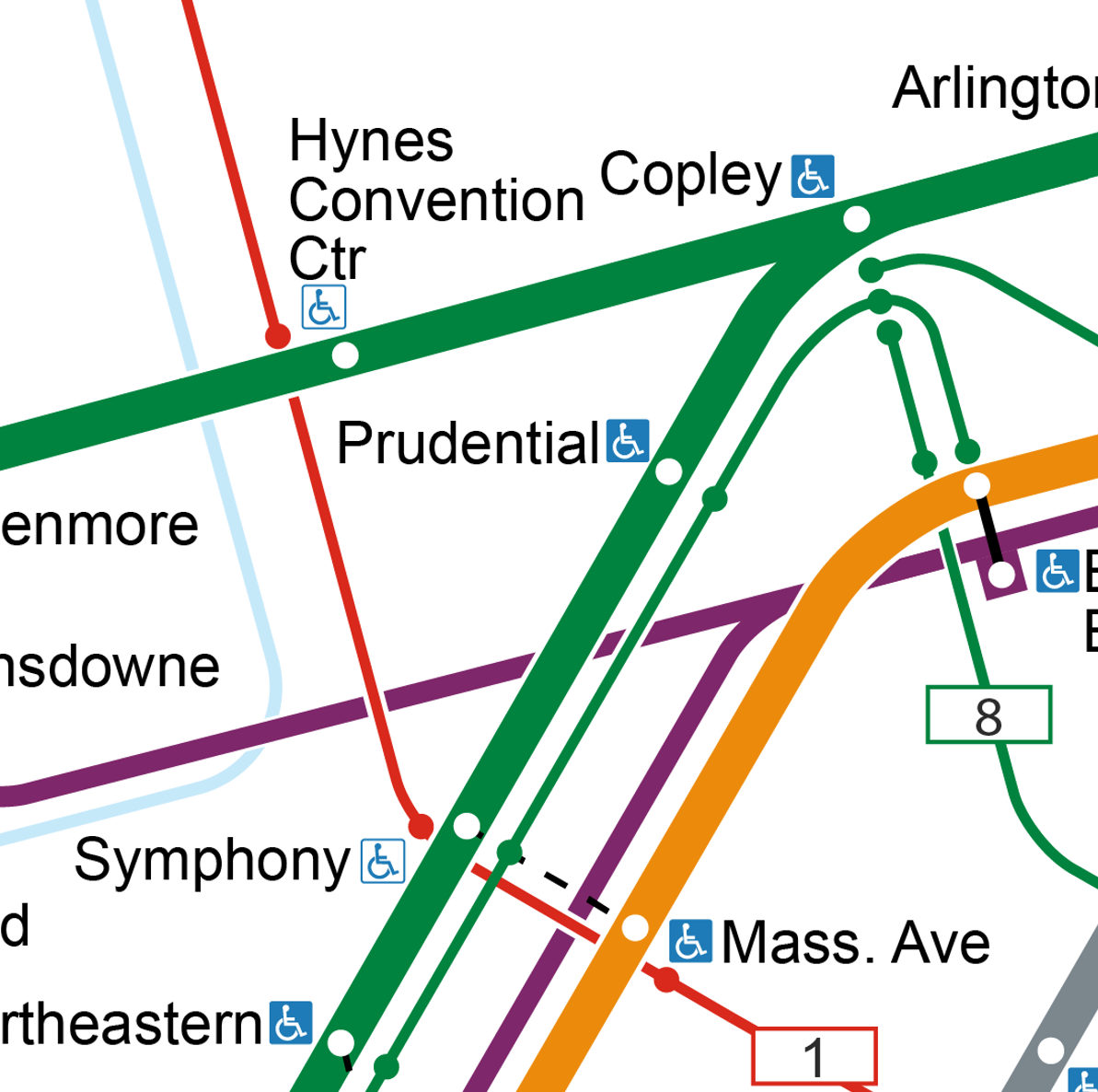
With respect to avoiding overlapping text, one of the key pieces, I discovered, is finding the “critical triangles” — places where the horizontal label is constrained by the two legs of crossing triangular lines. I found at least three such triangles on this diagram:
Prudential: bound by the E and the 1 (and the Central Subway too)
Chinatown (or Tufts Medical Center, depending on font size and spacing tweaks): bound by Red/Silver and Orange/Silver, and hemmed in by the commuter rail as well
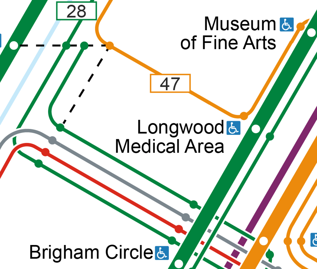
And finally Longwood Medical Area: bound by the E/39 and the Francis St buses
These “critical triangles” in turn govern both stop spacing and line spacing.
For example, the “Prudential critical triangle” needs to also place the Prudential stop marker itself roughly halfway between Copley and Symphony, thereby setting up a general “cadence” for the stop spacing.
In this design, I found that the “LMA critical triangle” ultimately forms the lowest denominator; the spacing of everything else on the entire map unfolds from the stop spacing between LMA and Brigham Circle arising from that critical triangle:
- Brigham Circle <> Longwood Medical Area need to be far enough apart to fit labels, but also need to be roughly as far apart as Longwood Medical Area <> Museum of Fine Arts
- (I cheated a little bit here: the stop icons are unevenly spaced, but the texts of the labels appear less severely unevenly spaced)
- In turn, Brigham Circle <> Museum of Fine Arts need to be roughly as far apart as Roxbury Crossing <> Ruggles — the Orange Line stop spacing becoming twice that of the E
- Museum of Fine Arts <> Northeastern <> Symphony needs to match up with Ruggles <> Mass Ave, again emphasizing the Orange Line’s stop spacing being 2x that of the E
- …which gets recapitulated again with Symphony <> Prudential <> Copley needing to broadly match Mass Ave <> Back Bay
- The “ladder effect” I described above then in turn means that the Fairmount Line’s Uphams Corner <> Newmarket spacing needs to match Roxbury Crossing <> Mass Ave, and Newmarket <> South Station needs to broadly align with Mass Ave <> Downtown Crossing — giving the Fairmount Line 4x that of the E
Now, obviously, there’s a lot more nuance than this. Both the Orange Line’s and Fairmount Line’s stop spacing get mildly compresssed toward the outer sections of the map — I didn’t rigidly copy-and-paste the spacing. But in general, the principle holds that the “atomic” spacing unit for most of the map derives from the E Line. I hesitate to draw too strong of a conclusion here, but I suspect that this principle will hold true for any T map that seeks to show all of the surface stops on the E Line.