In the 1910s and early 20s, the Boston Elevated Railway Company (BERy, predecessor to the MTA and MBTA) expanded and modified their streetcar subway, making critical additions that transformed it into something recognizable as an early version of the Green Line.
I have written about these changes in the past, but want to briefly summarize the two models that emerged from BERy’s modifications. In both cases, BERy was trying to address the problem of long trolley routes that stretched from the suburbs all the way into downtown, running slowly at street level, usually in mixed traffic, the buses of their day. The original Tremont Street Subway was built with the relatively narrow goal of getting trolleys off of downtown’s congested streets. BERy’s expansions broadened the scope of the streetcar subway significantly.
Kenmore Model
To the west ran some of the oldest surface lines in Greater Boston, the predecessors to today’s B and C Lines, and the now defunct A Line. When the Tremont Street Subway first opened, these trolleys trundled all the way down Boylston St at surface level, entering the subway at the Public Garden Incline between Arlington St and Charles St.
In 1914, the Boylston Street Subway opened, adding a new tunnel that extended through Back Bay with stations at Copley and Massachusetts (now Hynes Convention Center) before emerging at the surface just before Kenmore Square. (A one-stop extension underneath Kenmore Square opened about twenty years later, giving us the station we know today.)
The proto-A, B, and C Lines thereafter entered the portal at Kenmore and ran “express” underground into downtown. Other shorter distance routes continued to operate into the now-relocated Public Garden Incline, but those longer distance routes were given a (comparatively) high speed bypass.
This was BERy’s first attempt to address the needs of suburban surface lines. Under the Kenmore Model, surface routes run like buses before entering a subway in which streetcars run in a dedicated ROW at high speed into downtown, often producing rapid transit-like service as multiple routes layer to form very high frequencies.
The two other legacy streetcar subway networks in the US – San Francisco’s MUNI Metro and Philadelphia’s SEPTA – also utilize the Kenmore Model. The need to travel underground is arguably what spared these systems from “bustitution”, since buses couldn’t adequately run in the subways.
(San Francisco’s Kenmore Model is actually somewhat coincidental: its Market Street Subway, which mimics the Boylston Street Subway, wasn’t built until the late 1960s; instead, the need for streetcars in order to utilize the Twin Peaks Tunnel, to the west, was likely the protective factor in that system.)
EDIT: I am reminded the Pittsburgh also enjoys a long-surviving first generation streetcar system. Topologically, it’s similar to the Kenmore Model, with a lengthy subway running into the core. However, after leaving the subway, the Pittsburgh Light Rail branches operate primarily on dedicated railroad ROWs, with rapid transit spacing. For this reason, I would not classify Pittsburgh Light Rail as a “streetcar subway”, its street-running segments notwithstanding. Its at-grade routes do not behave like buses the way that the T’s, SEPTA’s, and MUNI Metro’s do. In that sense, the term “Kenmore Model” isn’t applicable.
Lechmere Model
When BERy extended their dedicated streetcar ROW out of the subway at Haymarket north to an elevated along Causeway Street and across the Charles River, they initially employed the Kenmore Model at Lechmere as well. Streetcars from Harvard Square, Union Square, Davis Square, and Clarendon Hill ran directly from street-level on to the viaduct and eventually into the subway.
In 1922, BERy constructed a transfer terminal at Lechmere Square. Surface cars from the northwest terminated at what became the bus terminal, while cars coming from the subway looped within the dedicated ROW of the station. This marked a key transformation in BERy’s treatment of its streetcar subway, now treating it as a service that could potentially act as rapid transit.
The Lechmere Model mirrored BERy’s approach at its other rapid transit terminals. At Sullivan, Harvard, Dudley, and Maverick, surface routes that had once run all the way into downtown were truncated, with riders transferring to high-speed rapid transit service. This model remains in use across the system today.
BERy intended to eventually deploy a Lechmere Model approach in the Kenmore area as well. The C would have been truncated to the Kenmore Loop, while the Central Subway itself would’ve been converted similarly to the Blue Line, and extended to a transfer station in Allston to meet truncated versions of the A and B. Obviously, that never happened.
Broader Implications
The Lechmere and Kenmore Models speak to the various factors that govern a transit service’s character:
The dedicated ROW of a subway or elevated, versus (semi-)mixed traffic-running at surface level
The close stop spacing of a slower surface line, versus the fast speed of a subway line with fewer stops
The rider experience of a one-seat ride, versus transferring at a hub
Both models present benefits and drawbacks. The B and C are among the highest ridership surface routes, in favor of the Kenmore Model. After the opening of Lechmere Terminal, BERy was able to run higher-capacity cars in the subway. On the other hand, reliability in the Central Subway is impacted by the amalgamation of multiple surface routes; and transfers exact a penalty on both ridership and rider experience.
Differentiating between the Kenmore and Lechmere Models allows for a more precise analysis of existing services and potential future expansions.
Addendum
Dec 21 2024
Following discussion on ArchBoston, I’m adding two additional models to the framework above.
Tremont Model
This was the original model of the Tremont Street Subway, whose purpose was simple: just get the dang trolleys off of downtown’s streets.
The Tremont Model is marked primarily by having a short distance of grade-separated ROW through a congested core. Rapid transit-like features may emerge, but as a side effect rather than an objective.
The Downtown Seattle Transit Tunnel operated under the Tremont Model for about 25 years before being converted exclusively to rapid transit-style light rail service. Bus routes from across the region converged and traversed downtown in their own grade-separated right-of-way. (Many of those buses also ran on highways, making them a bit less like the local streetcar service that originally ran into the Tremont Street Subway.)
The Newark City Subway historically would not have fit the Tremont Model, as its originally sole service ran in its own ROW on the surface with rapid transit stop spacing. However, with the opening of the Broad Street Extension, the network has now assumed characteristics of a Tremont Model, where a surface route making local stops enters a subway for a relatively short segment to avoid congestion on the surface.
Perhaps the clearest example of an extant Tremont Model is in Toronto (unsurprisingly), where a short streetcar subway runs from Union Station to Queens Quay before emerging to run at street level. Queens Quay in particular highlights a good example of the non-rapid transit goals of a Tremont Model subway: the station itself does not have fare control. Passengers pay as they board, just as they do on the street. This reflects the primary purpose of a Tremont Model: just get the surface vehicles off the street; any rapid transit-like results are secondary.
Medford Model
While the Medford Branch does feature bus connections, I argue that it does not prioritize integration with the surface network the way the Lechmere Model does. Its transfer points notwithstanding, none of its stops (aside from Lechmere) serves as a transfer hub or even a terminus point. Rather, the Medford Branch, particularly with its closer stop spacing, seeks to serve its suburbs directly, rather than relying on the 2SR of the Lechmere Model or the 1SR of the Kenmore Model.
The Medford Model was really first implemented on the Highland Branch in the 1950s when it was converted from a commuter rail line. As modern light rail lines acquire more and more characteristics and responsibilities of rapid transit, the Medford Model has emerged as a predominent model in the 21st century.
In my previous post, I described how large swaths of today’s MBTA run on land that was set aside for transit use anywhere from 140 to 170 years ago. (The converse of this is also notable: how little new space has been set aside in the last five generations.) I described how, outside of the core, the T almost entirely runs on the ROWs of 19th century railroads. And I mentioned that the downtown subways were, in a sense, the “original” North South Rail Link.
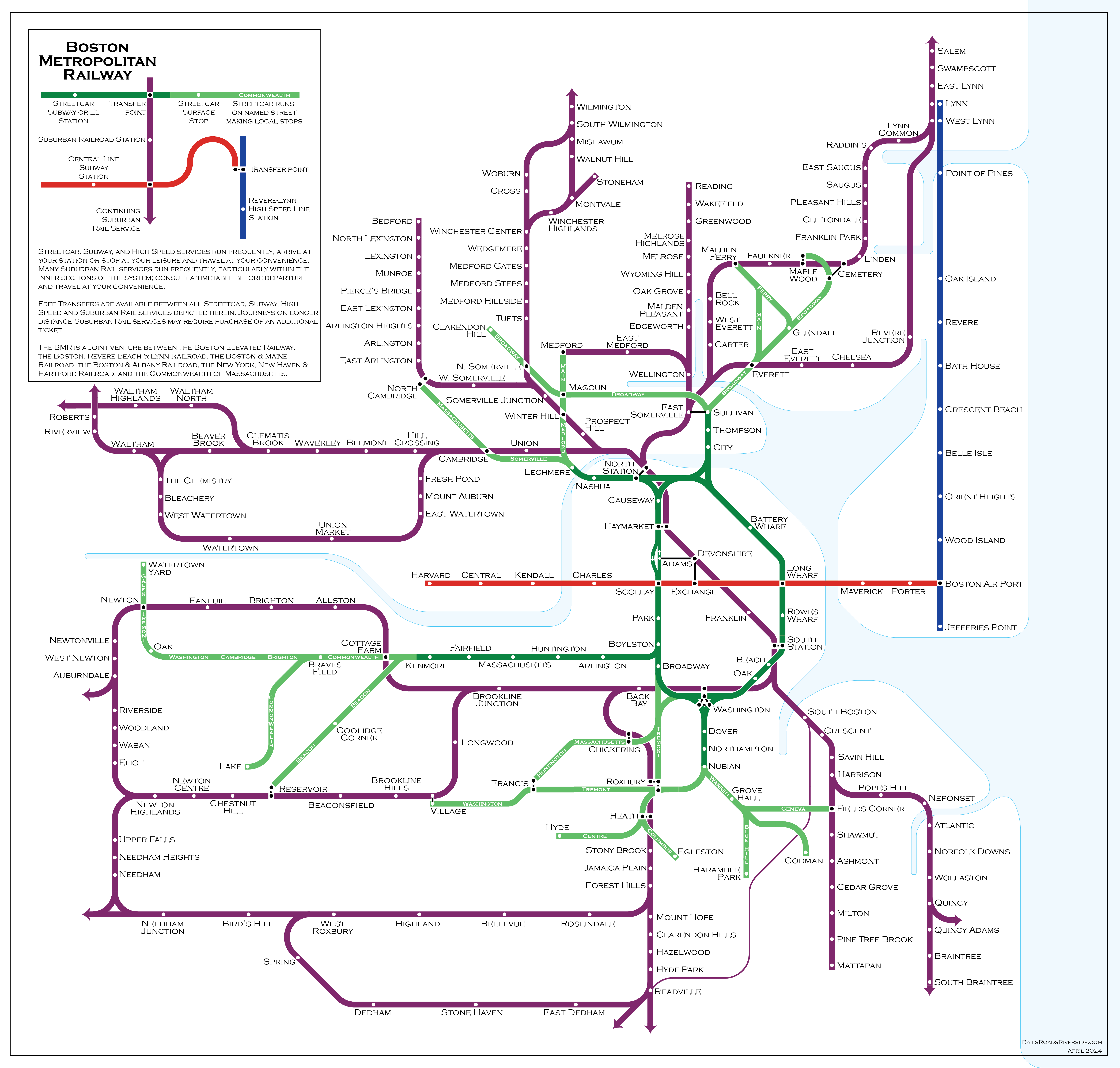
The “Boston Metropolitan Railway” imagines, in loose alternate history fashion, a system where those railroads built a turn-of-the-century North South Rail Link and ran their suburban services directly through downtown, filling the niche currently occupied by the T’s subway lines. This produces a system with some similarities to Tokyo’s system or Philadelphia’s SEPTA… with some surprises.
This map essentially superimposes Boston’s early 20th century railroad network on top of a modified version of its streetcar network. There are three key differences (with loose but not developed alternate history “lore” behind each):
The Washington St, Atlantic Ave, and Charlestown Elevateds are built for streetcars, using the “Kenmore Model” still used by today’s B and C Lines, in which surface routes feed into a transfer station before running in a grade-separated ROW into downtown. The Washington St Subway (today’s Orange Line) is never built.
The Cambridge Subway is built as an extension of the East Boston Tunnel (today’s inner Blue Line), as was originally considered in initial planning; an extension to a transfer station with the BRB&L (outer Blue Line) gave that railroad a reliable link across the harbor, allowing it to survive the rise of the automobile; the cross-harbor cross-Charles subway is called the Central Line.
The suburban railroads somehow (magically?) build a “Suburban Rail Link” tunnel connecting North and South Stations, electrify their inner routes, and start running mid-high frequency service directly into downtown, with transfers to the Streetcar Subway, Streetcar El, and Central Line.
Don’t look too hard at the alternate history lore behind the scenes here — it’s not meant to be precise, and instead serves as source material for reimagination.
I’ll probably write more about this map in a future post, but previous readers of my blog will recognize a challenge here: core and branch capacity.
To provide “show-up-and-go” (SUAG) headways of 12 minutes or better to all Suburban stations on the above map, the core tunnel would need a capacity of 40 tph or more in each direction. SEPTA’s Center City connection, and recent analysis of the proposed NSRL, suggest that a realistic capacity for a single dual-track mainline tunnel would be about 22 tph. This imaginary “Suburban Rail Link” would need to be quad-tracked (and I don’t even know if that would’ve been possible at the time). This also illustrates a key point: providing SUAG frequencies to all suburbs requires at least two dual-track subways across downtown.
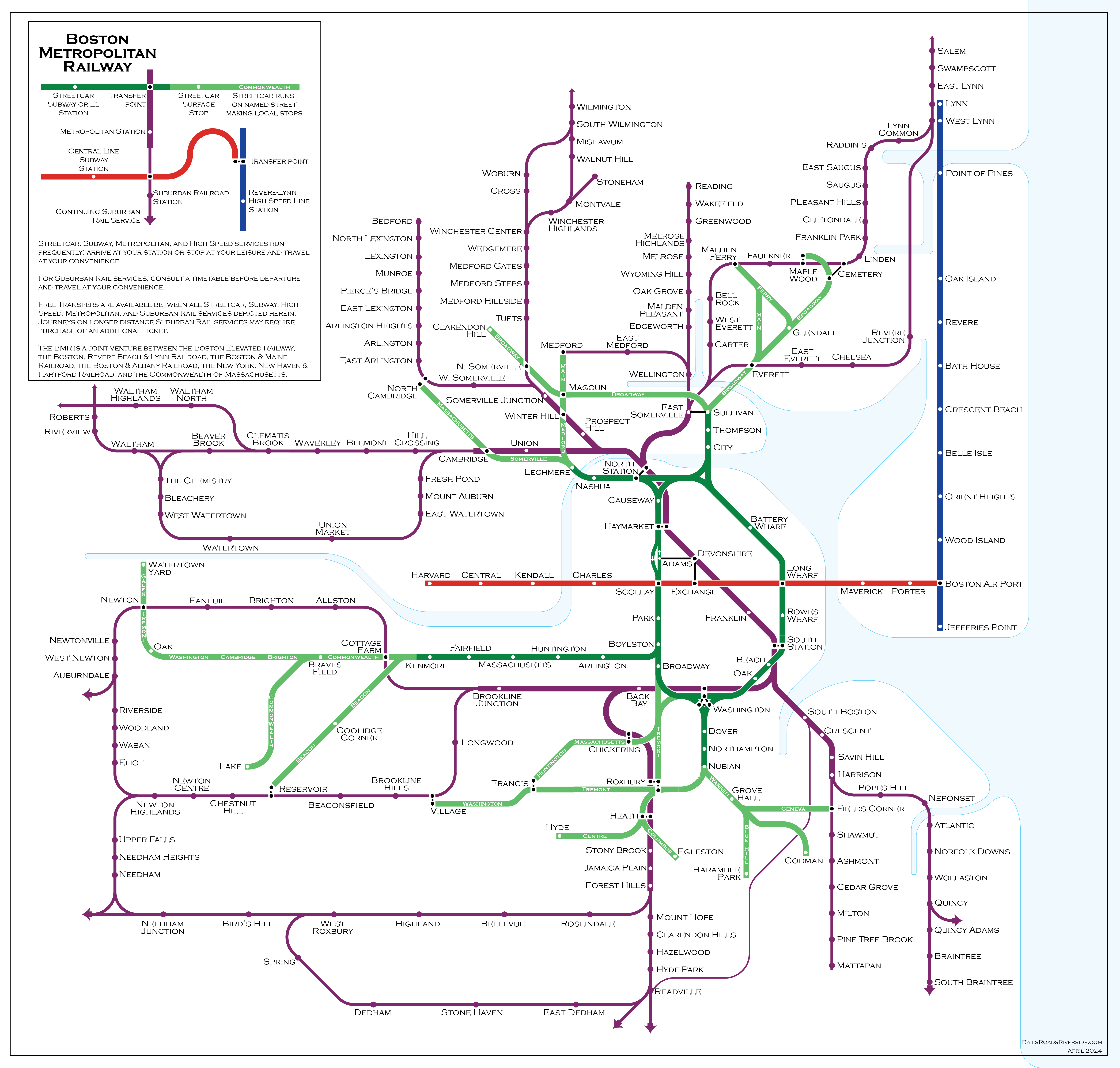
A single tunnel Suburban Rail Link
Let’s imagine what the system looks like if the Suburban Rail Link is a single tunnel with a constrained capacity of about 22 tph:
Now we get a map that looks much more like the subway maps we are familiar with, where there is a division between higher frequencies in the inner section, and lower frequencies further out. In our real MBTA, this division is largely between the subway lines and the commuter rail, whereas for the BMR it is the division between higher frequency mainline trunks (“Metropolitan” services) and lower frequency branches (“Suburban” services).
While not exactly the same, the BMR has transition points in several of the same places as today’s MBTA:
Somerville Junction (today’s Magoun Square)
Cambridge station (Porter Square)
Forest Hills
Likewise, Harrison (playing the role of JFK/UMass) and Brookline Junction (Kenmore) serve as branch points for the T’s unusually long lines to Braintree and Riverside.
One key difference is the character of the SUAG frequencies: in a well-functioning version of today’s MBTA, the SUAG headways on its subway lines are usually 5-6 minutes, whereas the BMR’s Metropolitan headways would be roughly 12 minutes. The Suburban branch lines to Braintree, Riverside, and Malden would be relegated to roughly half-hour headways. On the other hand, stations like Newtonville, Hyde Park, and Chelsea would see much higher frequencies than they do today.
A pair of Suburban Rail Links
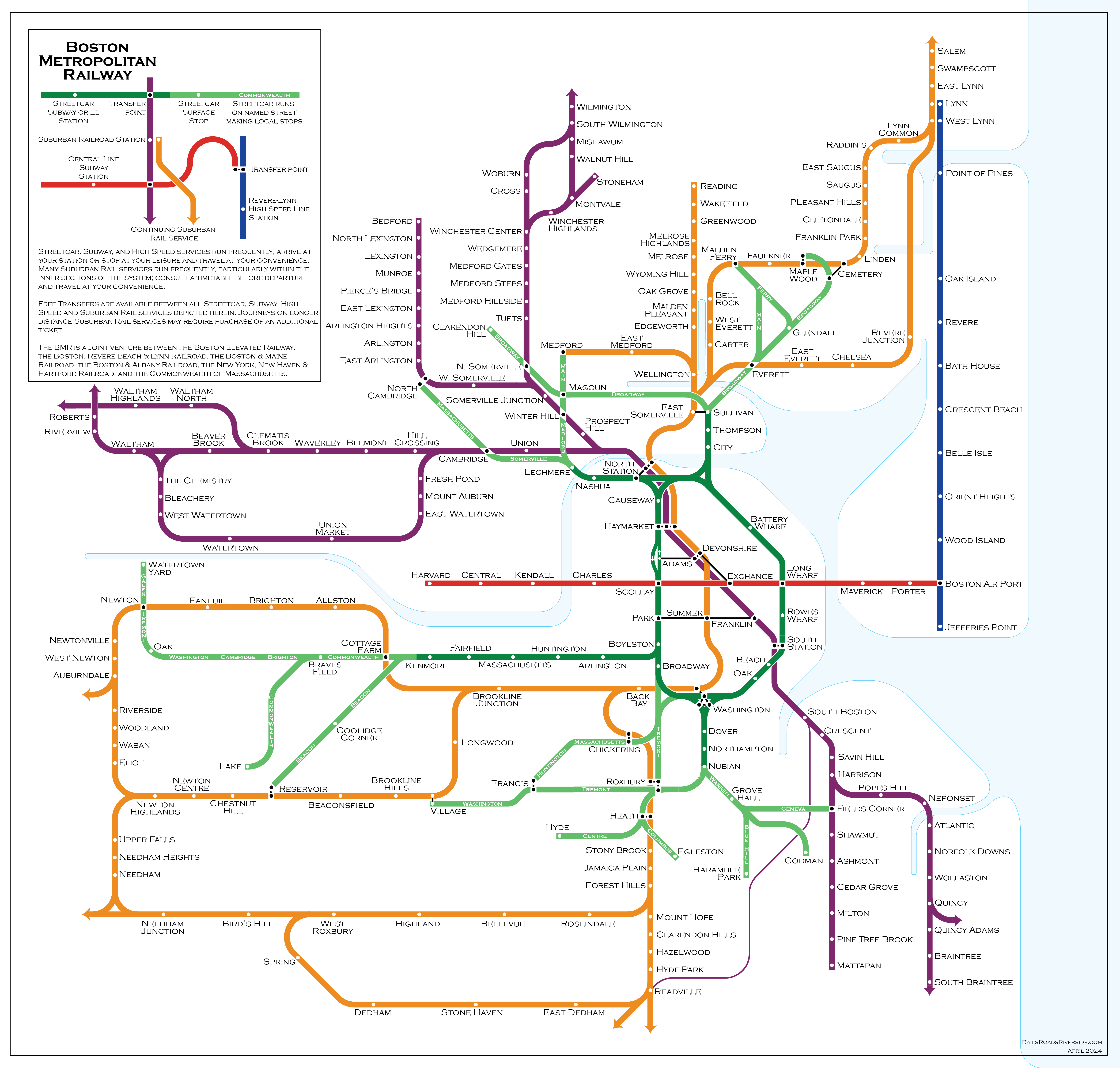
Finally, let’s imagine a third version of this map, in which two separate dual-track subways (instead of a single quad-track tunnel) are built across downtown, providing sufficient capacity for SUAG frequencies on most Suburban branches:
Now we start to see a convergence between the BMR’s system and the MBTA’s, made more obvious by my use of orange for the “Washington Tunnel Suburban” network. With the increased capacity, the BMR can match the MBTA’s 5-6 minute headways to
Sullivan
Magoun Square
Porter
Kenmore
Forest Hills
Mattapan
Braintree
And provide 12-minute headways to the entire MBTA rapid transit system, as well as to the target corridors for higher-frequency Regional Rail, including:
Lynn
Reading
Winchester
Lexington
Waltham
Watertown
Auburndale
Needham
(The Fairmount Line is harder to analyze in this context, since it lost most of its passenger stations much earlier on, and has current stations in greenfield locations. However, it could easily be added to the purple “Franklin Suburban” network, with 6 min headways to Fairmount, and 12-min to Braintree and Mattapan.)
(The Fairmount Line was also going to be harder to map as a full line, so I admit I took the easy way out to avoid mapping it.)
Are the BMR systems “fit for purpose”? Are they better than today’s MBTA network? There are definitely pros and cons to each, but I will save those for a later post (along with some comments about the BMR’s Central Line and “Revere-Lynn High Speed Line”).
Tunnels and takeaways
These maps illustrate that serving Boston’s suburbs with SUAG frequencies physically requires the capacity of at least two downtown tunnels. The MBTA’s Orange Line addresses the need for one of these. The other “tunnel equivalent” is split between the Green Line and Red Line: the northern Red Line fulfills the Central Line’s obligation to link Cambridge and downtown, and then attempts to capture some of the niche occupied by the BMR’s Watertown, Waltham, and Lexington/Bedford branches; the southern Red Line captures the BMR’s Braintree and Mattapan branches; and the Green Line handles the BMR’s Winchester/Woburn, Lexington/Bedford, and Riverside branches.
But note that that second “tunnel equivalent” is also pulling double duty, shouldering some of the burden of the BMR’s (absurd and surely barely functional) Subway-Streetcar network, plus half of the Central Line. And note that today’s Green Line runs services in all four niches described above: Surface (B, C, E), Subway (e.g. to Kenmore), Metropolitan (e.g. to Medford), and Suburban (to Riverside).
Those niches demonstrate the final point I want to make today: the BMR thought exercise elucidates characteristics about different components of the MBTA network, in particular by dividing services up based on their distance from downtown and number of interlined branches. By better understanding those characteristics, we can design a better MBTA for the future.
Let’s look at a map of Boston’s railroads (courtesy of Alexander Rapp, links at end of post).
Let’s add highlighting to show the railroad ROWs that are now used by, or shared with, rapid transit.
Let’s also add dashed marks to indicate common proposals. Aside from the Red-Blue Connector, most of the SLX alignment, and the North-South Rail Link, all common proposals travel along historical ROWs. (The Union Freight RR doesn’t count.)
And now let’s also add (imprecisely drawn) solid lines to indicate the new subways that were built across downtown, which now connect historical ROWs on opposite sides of the city. (This reveals that the subway was in fact “the original North South Rail Link”.)
Now, here’s the kicker: the original underlying map showing Boston’s railroads… shows how they looked in 1890.
Which brings us to our first point: the large majority of the T’s (rapid transit) route miles run on the same paths that were carved out before 1890 (many before 1870, and quite a few as early as 1855).
What’s more: many common proposals to expand the T simply reactivate ROWs that were first carved out in the 19th century (in some cases, as much as 170 years ago).
The core of Greater Boston was the exception to this. Like London’s railroads forbidden from entering the City of London, the late 19th century saw railroad terminals circling downtown, with clusters at the sites of today’s North and South Stations, and one terminal near today’s Back Bay. As a result, when rapid transit was first built around the turn of the century, new routes across downtown had to be built from scratch.
But there are three other corridors, outside of downtown, which also needed to be built for the burgeoning network. These three corridors – and why they were needed – still hold lessons for us today. And it comes down to water, wetlands, and peninsulas.
Wetlands and Peninsulas
While today’s Orange Line runs along the historical Boston & Providence ROW along the Southwest Corridor, its original route ran down Washington St to what is now Nubian Square, and then further south to Forest Hills. The lack of a historical ROW continues to vex transit designs to Nubian to this day.
So, if so much of today’s network did already exist in 1890, why wasn’t there a railroad ROW to Nubian? A map from 1852 sheds some light:
(courtesy of mapjunction.com, this is the 1852 Boston McIntyre map from their collection)
For much of the 19th century, Boston northwest of Tremont St in what is now the South End… was wetland. (Technically a mudflat.) When the Boston & Providence went to survey the route between their eponymous cities, they opted to build a nearly-straight route on a trestle over the mudflat – entirely bypassing the long-settled Boston Neck, which centered on Washington St from downtown to Nubian Square.
For an intercity railroad, this made a lot of sense. They weren’t in the business of providing local service, and plowing through a long-standing neighborhood in the city would have been costly and complicated.
What is now the Fairmount Line had a similar story. Built by the Norfolk County Railroad as an alternative to the B&P’s route through Back Bay, they opted for a route that reached downtown Boston by way of the South Bay… which, at the time, like Back Bay, was an actual “bay” but also was basically wetlands. Again, the new ROW bypassed the Boston Neck altogether.
And Boston Neck hardly lacked access to downtown. Horsecars and streetcars ran down Washington and Tremont, and Boston Neck held the only route into downtown that did not require a water crossing by bridge or ferry.
By the turn of the century, Boston’s built-up environment had expanded significantly. No longer a bucolic suburb, Dorchester was now indisputedly part of the city. Streetcars trundled on a long slow journey into the center of the city, where they joined streetcars coming in from all across the region. Congestion was extreme and the city needed a way to get streetcars off its downtown streets.
So, a subway was built to send local streetcars from nearby neighborhoods underground, and an elevated was constructed to reimagine the commutes from more distant neighborhoods and suburbs: instead of a single long streetcar ride, commuters would make a short streetcar trip to a transfer station, and then take an express rapid transit train into downtown.
The El running south of downtown traveled directly down Washington St, the heart of the historic settlements on Boston Neck. Unlike the steam railroads’ avoidance of the neighborhood, the elevated railroad was designed to be woven into the expanding cityscape.
The rest is an ironic history. Arguably because it was among the oldest part of the city, Boston Neck never received the kind of railroad ROW which, by the end of the 20th century, was essentially the only place rail transit was allowed to run.
The wetlands surrounding Boston Neck were easier to go through than the neighborhood itself, which doomed the neighborhood to miss out on the “transit land grab” of the 19th century, which continues to govern the location of rapid transit to this day.
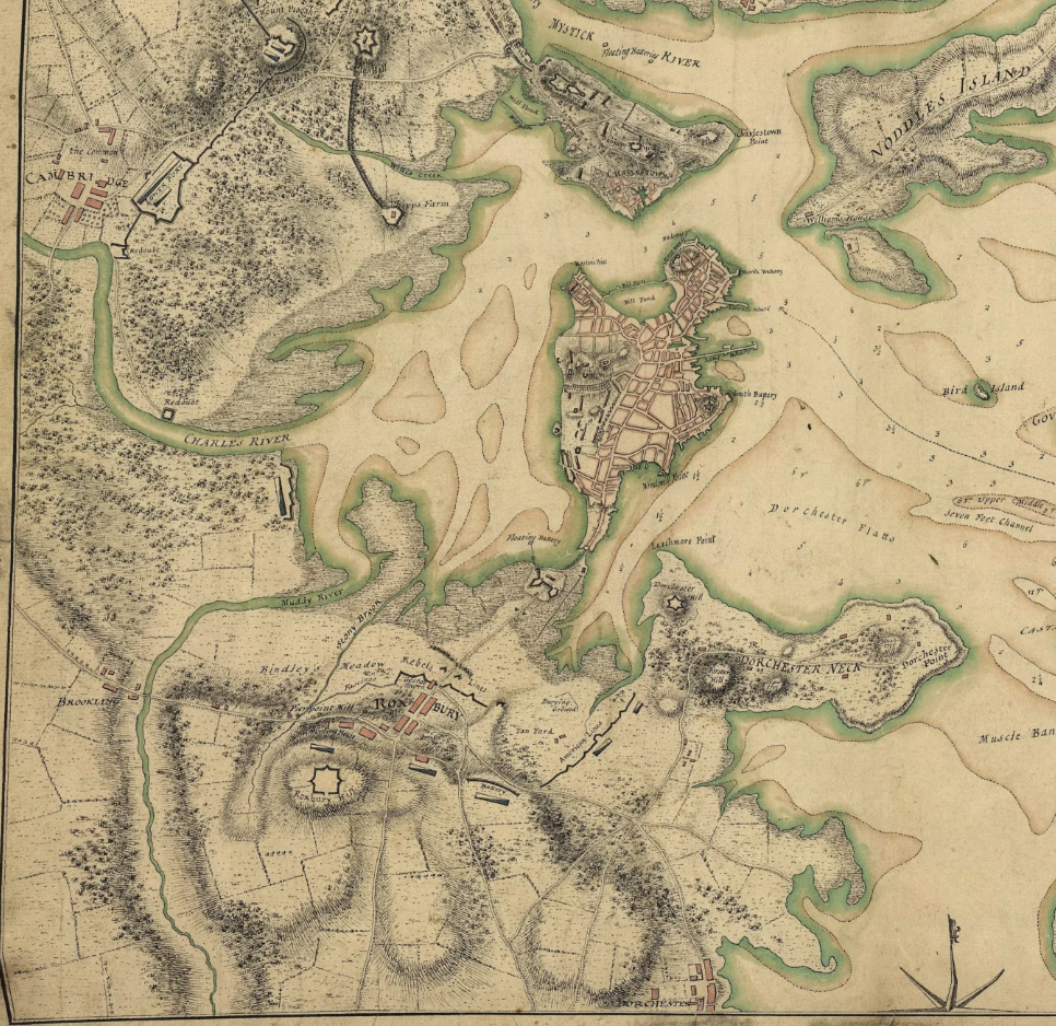
Water – Rivers
Rivers divide and unite cities. They split cities into left banks and right banks, and they simultaneously attract settlement to their shores as urban centers of gravity. The city of Boston-Cambridge is no different.
In their earliest days, the cores of Cambridge and Boston/Charlestown sat about 3 miles apart as the crow flies, with Boston/Charlestown sitting at the mouth of the Charles as it empties into Boston Harbor, and Cambridge (its earliest village located in Harvard Square) located about 4 miles upriver. By road, it was a circuitous journey of 8 miles via Boston Neck, Roxbury, and Brookline (along a route likely similar to today’s Silver Line and 66 buses) to cross between them.
(Map courtesy of mapjunction.com and the Library of Congress; this is from the 1775 Boston and Environs map.)
A bit more than 150 years after their founding, the effective distance between Boston and Cambridge was cut in half by the construction of the West Boston Bridge (where the Longfellow Bridge is today) in 1792.
(Map reproduction courtesy of the Norman B. Leventhal Map & Education Center at the Boston Public Library; this is a 1795 map with a lengthy titled which begins To the select-men of the town of Boston; the West Boston Bridge is visible in the top left.)
In the ensuing hundred years, Cambridge’s center of gravity drifted closer and closer to Boston, as main thoroughfares stretched from the West Boston Bridge straightaway across to Harvard Square.
Broadway (originally a turnpike), Harvard St, and today’s Main St and Mass Ave ran in parallel between the two poles of Old Cambridge and Boston, forming the backbone of the city that would eventually develop along their roughly east-west axes. Cambridge St connected East Cambridge to the rest of the town, and gradual land reclamation filled in Cambridgeport and expanded East Cambridge, bringing the edge of Cambridge’s shores literally closer to Boston.
The Charles River, in its meandering, deposited Old Boston and Old Cambridge a mere three miles apart. The settlements were far enough apart to develop separately, but close enough that they were inevitably drawn toward each other. Boston was anchored by the Harbor and could not move, but Cambridge had plenty of open space to expand into. The opening of the West Boston Bridge created a focal point for Cambridge’s expansion.
(Map reproduction courtesy of the Norman B. Leventhal Map & Education Center at the Boston Public Library; this is James Hayward’s 1838 A map of Cambridge, Mass, showing Cambridge’s east-west growth.)
The combination of the new river crossing and the original location of the settlement at Harvard Square effectively ensured Cambridge’s development stretching west from downtown Boston.
Notably absent, once again, were the railroads. A mid-century short-lived branchline to Harvard Square lasted a mere six years. Cambridge’s expansion was instead fueled by its horsecar and streetcar connections to Boston via the bridges. (Indeed, the first horsecars in the region ran across the bridge, from Bowdoin Sq to Harvard Sq.)
Municipal boundaries notwithstanding, Cambridge became indisputably part of the Boston-Cambridge city, just as Dorchester had. And just like Dorchester, its streetcars were choking Downtown. Dorchester got an elevated railway, and while an elevated was also considered for Cambridge, eventually a subway was chosen instead – a fateful stroke of luck that continues to impact transit access inequity to this day.
Just as the geography of the Boston Neck did, the opening of the West Boston Bridge meant that, by the time railroads started being built, the corridor between downtown Boston and Harvard Square was already well-settled. The railroads had incentive to avoid the area, not serve it.
The dual examples of Cambridge and Boston Neck demonstrate that the construction of railroad ROWs has frozen in time the idiosyncratic mid-19th century divisions between “old” and “new” settlements.
A note on South Boston and the South Bay
I exclude the southern half of the Red Line from my set of corridors that needed to be created to tie the emerging rapid transit network together, beyond merely stringing together railroad ROWs.
While it is true that the subway between Andrew and South Station was not itself ever a railroad ROW, it runs parallel to the historical Old Colony ROW (which ran in part along what is now Old Colony Ave), and to the historical ROW of the Midland Route (which ran along what is now Track 61 before curving west to a terminal near South Station, producing a route of similar shape, though different location, to today’s Red Line). The decision to run the subway under Dorchester Avenue was not forced by a lack of other options.
(Map reproduction courtesy of the Norman B. Leventhal Map & Education Center at the Boston Public Library; this is an excerpt from JG Chase’s 1865 railroad map showing how the Old Colony and Norfolk County railroads presaged the path of today’s Red Line.)
The South Bay was, and remains, an odd no-man’s-land separating South Boston from the rest of the city. 150 years ago, water separated the two, and today they are divided by railroad yards and a highway. As such, like Back Bay, it is unsurprising that the Old Colony and Norfolk County Railroads used it as their route in and out of the city.
I argue that the Dorchester Ave subway is essentially a modest relocation and consolidation of these two historical ROWs, and therefore does not represent a “new” taking of land for transit use in the way that the Cambridge Tunnel and the Washington St El did.
(To put it another way, in some alternate history, BERy used either/both of the ROWs in lieu of the Dorchester Ave subway, producing a Red Line very similar to our real one.)
South Boston provides a third example to support the pattern demonstrated by Cambridge and Boston Neck: areas already-settled by the mid-19th century were bypassed by the new railroad ROWs that now serve as our primary space for transit. The Old Colony RR built their ROW along the edge of Southie, just as they built their Dorchester ROW along the edge of the neighborhood hugging the shoreline.
Water – Harbors
The last piece of today’s MBTA rapid transit system that was not built on land set aside in the 19th century (see below) is the East Boston Tunnel, crossing the waters of Boston Harbor.
(In this piece, I don’t discuss the Green Line’s development, as I’ve covered that elsewhere — see links above. I will note, however, that the B and C’s reservations on Beacon and Commonwealth both also date from the 19th century. The vast majority of our dedicated transit land comes from this era.)
There’s an argument to make that the East Boston Tunnel was, in fact, set aside by private railroads in the 19th century. The Boston, Revere Beach and Lynn Railroad ran from the wharves of East Boston to Lynn along what is today the Blue Line. The railroad was enormously successful, running high frequency electric trains with (I believe) near-24 hour service at some points. The “last mile” of the journey was completed by ferry across the Harbor to Rowes Wharf (likely the reason for BERy’s construction of an el station there).
Given the close connection between the rail service and the ferry service, there’s an argument to make that the cross-Harbor corridor was, in fact, “claimed” by a private railroad in the 19th century, just as I argue most of the T’s current network was.
The popularity of the BRB&L, and the 1924 conversion of BERy’s East Boston Tunnel to heavy rail, speaks to the importance of a Boston Harbor Crossing. East Boston itself, originally an island, remained isolated from the mainland by Chelsea Creek. And Revere, though served by the B&M’s Eastern Route (today’s Newburyport/Rockport Line), was much more directly served by the near-direct 4.5 mile corridor via East Boston, compared to the 7 miles via Chelsea.
Crossing Boston Harbor has a similar effect to crossing the Charles River – providing an alternative to the roundabout route (whether via Brookline or Chelsea or via an unreliable ferry) creates a strong focal point at the crossing, drawing the previously remote far shore closer (both metaphorically and sometimes literally).
(Off-topic but I always want to emphasize this: the BRB&L ran rapid-transit-like service to Lynn until 1940; only eight years later, the MTA began construction of a true rapid transit line along that ROW, intended to once again reach Lynn. The first phase opened in 1952, and the second phase, to Wonderland, opened in 1954, truncated short of Lynn for budgetary and political reasons. There was only an eight year gap in service before public plans were made to restore service to Revere and Lynn, and Revere’s service was restored a mere four years after that. We shouldn’t talk about extending the Blue Line to Lynn – we should talk about restoring the Blue Line to Lynn.)
Like the rapid transit lines across Boston Neck and Cambridge, a rapid transit line across Boston Harbor was needed precisely because it had been too expensive and unappealing for a private intercity railroad company to build the ROW.
And that’s where the rubber hits the road on this topic, even today.
Implications
Most of the MBTA is built along corridors where for-profit railroads found it advantageous to build in the mid-19th century, usually through areas that were lightly settled, avoiding the historical cores that had driven the growth of the region until that point.
Setting aside the Green Line, there are four exceptions to this pattern:
Downtown: where the Main Line’s Washington St Subway provided the “original North-South Rail Link”
Boston Neck: where the El ran above one of Boston’s earliest pieces of land, to serve the large streetcar suburbs in Dorchester beyond, in the 1.6 mile gap between the Boston & Providence RR and the Norfolk County RR’s Midland Route – the largest gap between railroad lines in Boston’s immediate suburbs, except for the gap in Cambridge
Cambridge: where the subway ran along an east-west axis that had been rapidly settled starting at the dawn of the century, filling a 2 mile gap between the B&A’s railroad in Allston and the Fitchburg Railroad’s line in Somerville
Boston Harbor: where a tunnel literally was dug under the ocean to clear a 3,000 foot gap, replacing the choice between an unreliable ferry and a detour of 4 miles (or more)
Among other things, this highlights – yet again – how damaging the loss of a radial line to Nubian is. Imagine if the Red Line had been relocated out of its tunnel to a route along the B&A ROW with a Ruggles-like transfer station near Braves Field, or along the Fitchburg ROW, with a transfer station at Union Square.
I believe this demonstrates that a transit approach that limits itself to existing transit ROWs threatens to overlook corridors that could be as vital in the 21st century as the above corridors were in the 20th.
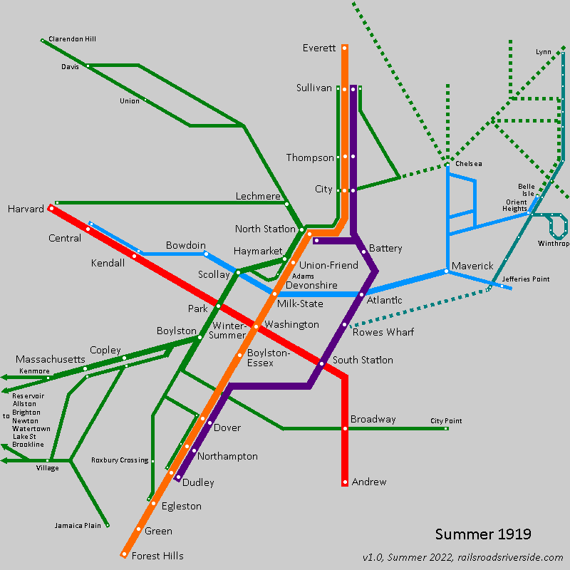
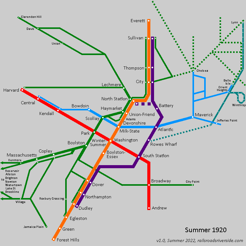
Last summer, I wrote that 2022 marks the (true) centennial of the Green Line, with the 1922 opening of the Lechmere transfer station commencing a transition from the “local streetcar network” model to the “rapid transit” model. I point to the rapid demise of the streetcar network in the ensuing two decades as evidence of an intentional transformation.
Understanding the pre-transformation network
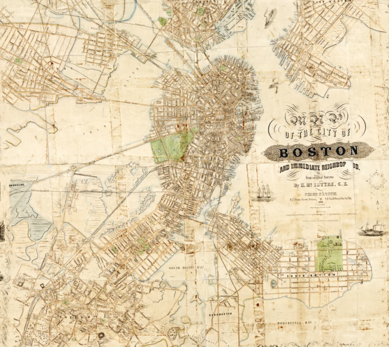
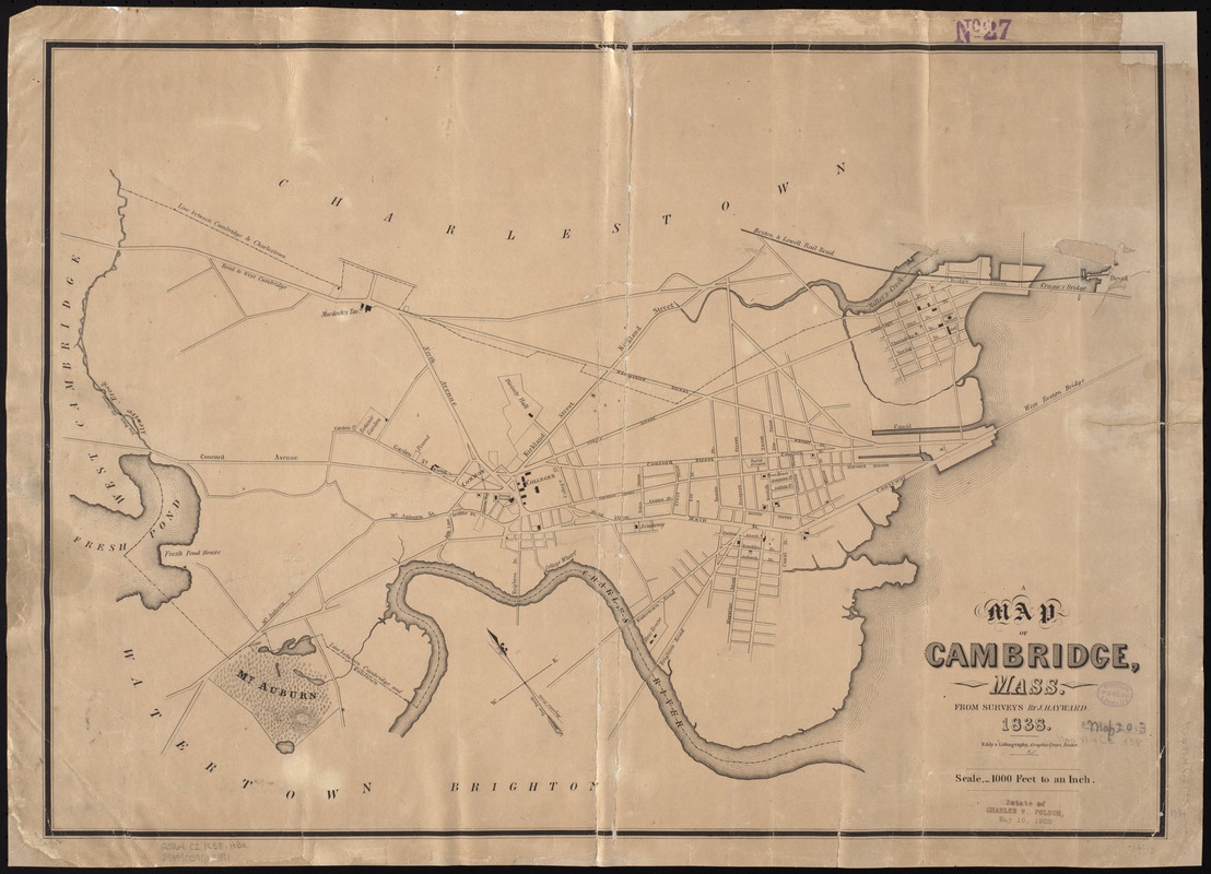
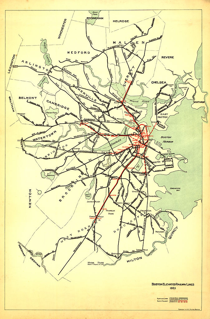
To understand the scope and scale of that transformation, it’s worth looking at what the “subway-streetcar network” looked like immediately before that transformation. One might think that that would be a simple task: simply Google 1921 BERy map boston and this is the first result:
Except… this map doesn’t tell the whole story. A little bit of further digging reveals that many of the surface lines on this map didn’t actually operate into the subway – the far-flung lines in West Roxbury, for example. Moreover, this map omits the foreign cars that weren’t run by the Boston Elevated Railway but still operated into the subway, turning at the Brattle Loop.
Finding the “subway-streetcar routes”
Identifying which routes operated into the subway 101 years ago is actually not a simple task. Again, I believe this is a consequence of how BERy saw the Tremont Street Subway: it wasn’t a rapid transit line and it wasn’t a “trunk” of the network – it was just a way to get streetcars off of congested streets in downtown. From what I’ve seen, it probably never would have even occurred to BERy officials to publish a map of the “subway-streetcar network” – they were all just “surface lines”.
Making matters more difficult is that BERy also did not (to my knowledge) publish public timetables for specific routes. There were internal timetables, though my understanding is that they were very internal indeed, and are difficult to parse a century later. Most notifications of changes in routes, for example, appear to have occurred in newspaper announcements.
The Map
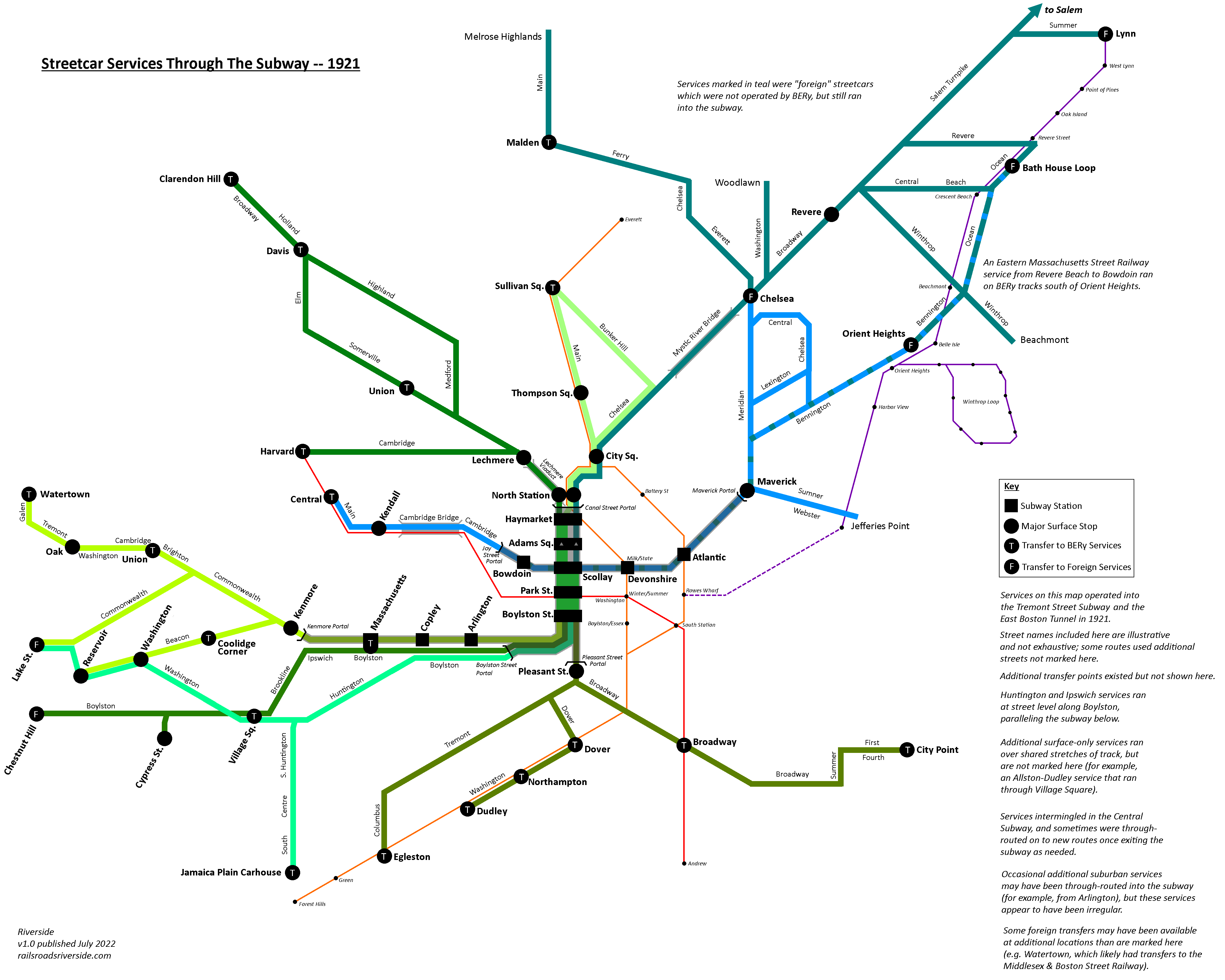
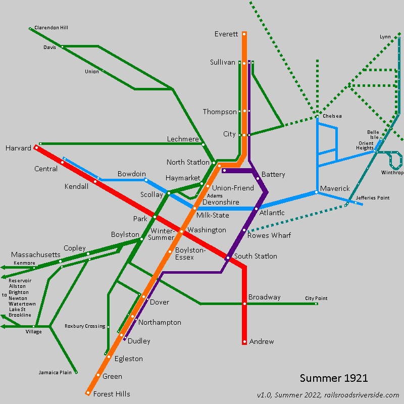
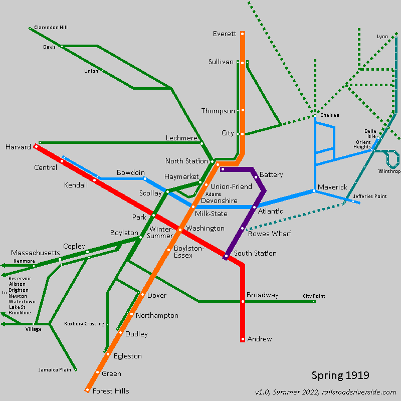
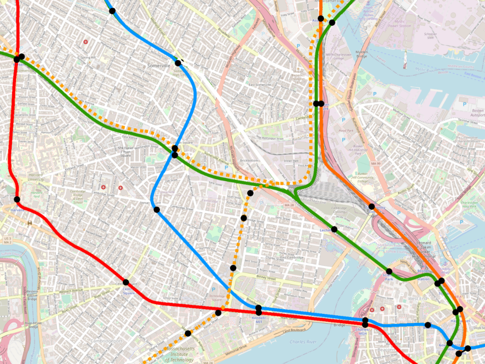
Here I am indebted to the labors of love of numerous local transit historians. Building on their work, I have created what I believe is the first map of its kind: a full diagram of all BERy services that offered one-seat rides into the downtown subways in 1921.
Click to enlarge
Applying the anachronistic visual language of today’s Green Line and Blue Line, I’ve framed the 1921 network with modern points-of-reference, to make it easier to understand its scope and complexity.
Again, it’s important to understand that this diagram does not represent how BERy officials or riders would have conceptualized their system. However, thinking of the streetcar network in these terms is also vital for understanding the decline of Boston’s streetcar network (which began much earlier than we often think of it as.)
List of Routes
The routes operating into the subways included the following (note that many routes had short-turn turnbacks, the same way some trains on today’s E Line terminate at Brigham Circle); I have included some modern comparisons based on today’s routes in parentheses:
Kenmore Portal lines
Watertown (57)
Lake Street [Boston College] via Commonwealth Ave (B)
Reservoir [Cleveland Circle] via Beacon Street (C)
Ipswich Street lines
Chestnut Hill and the Cypress St Carhouse (55 + 60)
Huntington Ave lines
Lake Street [Boston College] via Village Sq [Brookline Village] (E + 65)
Jamaica Plain Carhouse (just south of Jamaica St) (E + 39, but not all the way to Arborway/Forest Hills)
Pleasant St Portal lines
Egleston (43)
Dudley [Nubian] (similar to SL5, but on Dover St [East Berkeley St] from Washington to Tremont)
City Point (9)
East Boston lines
Central Square, Cambridge via Joy St Portal (no equivalent, but somewhat similar to the proposed Blue-Red Connector)
Jefferies Point (120)
East Boston and Chelsea (114/116/117, 112, and 121)
Orient Heights (120)
Revere Beach (paralleling the route of today’s Blue Line on Bennington St and Ocean Ave)
Lechmere lines
Harvard (69)
Davis, and Clarendon Hill, via Somerville Ave or Highland Ave (87 and 88)
Canal Street Incline lines
Sullivan via Main St (92)
Sullivan via Bunker Hill (93)
Foreign streetcars
Beachmont (using part of today’s 119)
Revere Beach (116 and 117)
Lynn (probably most similar to today’s 455)
Salem and the North Shore (450)
Woodlawn (111)
Melrose Highlands via Malden & Chelsea (I believe roughly using today’s 131 north of Malden Center)
Acknowledgements
This has been a gargantuan project, far more perhaps than the map itself would suggest. The details needed to pinpoint the system exactly as it existed in 1921 are numerous and scattered. As in my previous post, I must heartily thank the army of transit historians who have come before me, including Ron Newman, Bradley Clarke, O.R. Cummings, Frank Cheney, and Anthony Sammarco.
I want to extend a special thanks to DAS, who has expertly collated the primary source material upon much of this map is based, enabling us to expand, contextualize, and occasionally correct the work done by Newman, Clarke, Cummings, Cheney, Sammarco, and others. His expert review caught many errors of mine, answered numerous arcane questions of mine, and uncovered the fine details at the margins of this project to ensure this map was as accurate as possible.
When I was a child, reading the copy of Trolleys Under The Hub my parents had given me, my imagination was enchanted by the idea of a “Green Line” that apparently had so many branches. This is the map that I had wanted to see then, so it is a profound delight to finally see it brought to life; as such, I offer my profound thanks to all those who helped me create it.
Notes and Further Reading
As printed in the image:
Services on this map operated into the Tremont Street Subway and the East Boston Tunnel in 1921.
Street names included here are illustrative and not exhaustive; some routes used additional streets not marked.
Additional transfer points existed but are not shown here.
Huntington and Ipswich services ran at street level along Boylston, paralleling the subway below.
Additional surface-only services ran over shared stretches of track, but are not marked here (for example, an Allston-Dudley service that ran through Village Square).
Services intermingled in the Central Subway, and sometimes were through-routed on to new routes once exiting the subway as needed.
Occasional additional suburban services may have been through-routed in the subway (for example, from Arlington), but these services appear to have been irregular.
Some foreign transfers may have been available at additional locations than are marked here (e.g. Watertown, which likely almost certainly had transfers to the Middlesex & Boston Street Railway).
Tracking down which routes were running into the subway in 1921 was surprisingly difficult. When possible, I’ve used primary sources, but in some cases have relied on secondary sources, particularly since some transit historians have obtained access to archive materials that are more difficult to access remotely or as a member of the public.
I did a poor job of cataloguing my references when building this map. As such, I am currently in the process of rebuilding the reference list for this post. My WIP reference list is available as an appendix to this post.
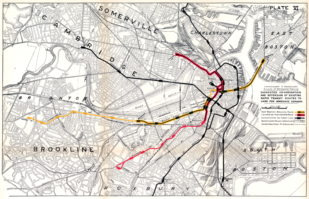
Earlier this year, I described how Aldgate Junctions can be used to provide additional service along branchlines without impacting capacity on the core. But Aldgate Junctions have their limitations – a lesson that the Boston Elevated Railway (BERy) learned the hard way, 100 years ago.
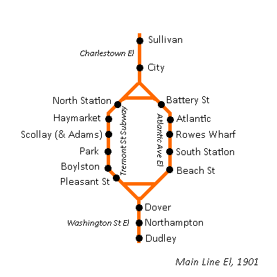
The original Main Line El network
When what is now the Orange Line was first built, it was very different. In fact, the earliest iteration of the Orange Line did not use a single piece of track, tunnel, station, or right-of-way that the current Orange Line uses.
The Main Line El, as it was called, was opened in 1901, as a collection of three elevateds and one subway: the Charlestown El, the Washington St El, the Atlantic Ave El, and the Tremont St Subway. Yes – despite being opened less than 5 years before as a streetcar subway, the Tremont St Subway was semi-temporarily converted to third-rail and high-level platforms. (The four-track sections of the subway saw the inner tracks maintained for streetcars.)
The infrastructure of the Main Line El when it opened looked something like this:
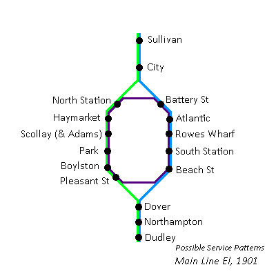
Single els at the northern and southern ends were connected by a pair of downtown trunk lines, all linked together by a pair of Aldgate Junctions, the northern junction called “Tower C”, and the southern one called “Tower D”. This arrangement allowed all trains to run everywhere. For example, the following array of service patterns would have been readily achievable, with bidirectional service on each “line”:
(Note that I’m not sure a full service pattern like this ever existed; but, as you will see below, it looks like BERy experimented with many permutations, so this one may have been attempted at one point or another.)
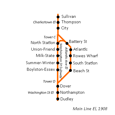
Shifting into the Washington Street Tunnel and reshaping the network
The original network was short-lived. Within the decade, the Washington Street Tunnel opened:
As you can see, the Aldgate Junction at Tower C was preserved, but Tower D was modified into a simple flat junction. I argue that the asymmetric presence of the northern Aldgate Junction fatally undercut the Atlantic Ave El’s ability to contribute usefully to the network.
Mapping the lasting impact of the asymmetric Aldgate Junction
In the course of researching another project, I ended up doing a deep dive into BERy’s experiments with different service patterns on the Atlantic Ave El from 1919 to 1924. You can follow the evolution step-by-step below.
Ultimately, I would argue that the problem they were trying to tackle was a geometric one. Without an Aldgate Junction at Tower D, the Washington St El is hobbled by reverse-branching: every train you try to send from Dudley to Atlantic is one fewer train that you can send from Dudley to downtown; as it is today, downtown was the more popular destination and could hardly afford to lose service.
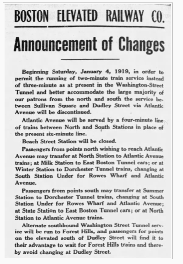
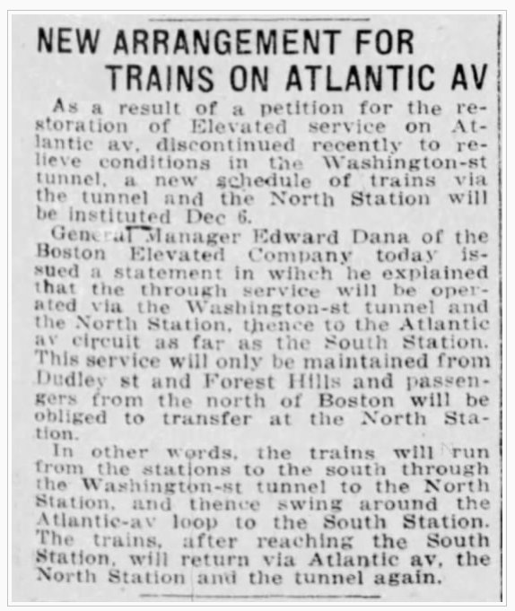
Trying out a shuttle service + deinterlining
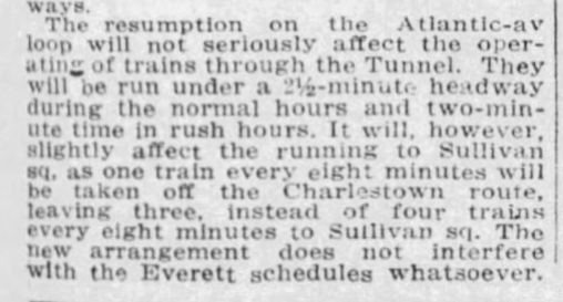
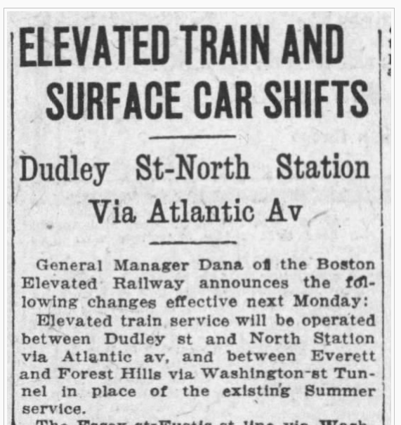
This is why it is unsurprising that in 1919, BERy stopped running trains from Dudley to Atlantic via Beach St – all trains from Dudley would run through the Washington St Subway, as detailed in this newspaper announcement:
As you can see, BERy sought to increase frequencies on both the Tunnel and the El by isolating each other’s services; the Tunnel would be served by Forest Hills/Dudley-Sullivan trains, and the El would be served by North Station-South Station shuttles. (Not mentioned here is a dedicated track that existed at North Station, allowing Atlantic shuttles to reverse direction without blocking Tunnel traffic.) Drawing on the style of the Cambridge Seven Associates “spider map”, a diagram of the system at the time might have looked like this:
This was certainly a reasonable idea, and is a technique called “deinterlining” that remains in use to this day. (Every so often, you will see someone put forward a proposal to deinterline the NYC Subway, for example.) Two low-freq services offering dedicated one-seat-rides to multiple destinations are reshuffled into two high-freq services that provide higher frequencies to all stations, improve reliability, and maintain some OSRs, at the cost of turning other journeys into two-seaters.
The push for deinterlining highlights a common pitfall of Aldgate Junctions: it entangles all three branches into a single shared timetable. Trains on one branch need to be coordinated with trains on both other branches. Even if your train is bypassing a branch, delays on that branch will still impact your journey through ripple effects.
Pitfalls of a deinterlined main line + shuttle, and an attempt at remediation
But BERy’s own announcement reveals a fatal flaw in their plan: most of the major destinations on the Atlantic Ave El could be reached by other two-seat rides that were often more direct, especially for riders coming from the south. Why would anyone board a train at Dudley, ride it all the way to North Station, and then transfer to a shuttle and ride it the long way round to disembark at Atlantic (today’s Aquarium)? It would likely be significantly faster to transfer at State/Milk/Devonshire and ride an East Boston train one stop. (And probably would be just as fast to walk.)
And from a convenience perspective: a two-seater is a two-seater, so Washington + East Boston is equally convenient as Washington + Atlantic. At that point, journey time becomes the deciding factor.
Perhaps an Atlantic shuttle service could have been more successful if it had offered a southern transfer at Dover. Unfortunately, the Washington St El’s station construction style meant that significant capital investments would have been required to turn trains at Dover.
As it stood, the 1919 Atlantic shuttle service was useful for three specific things:
Shuttling passengers between South Station and North Station
Perhaps of limited use to long-distance travelers, but hardly a large market
Serving Battery St
Located at the farthest edge of the North End, with half of its walkshed underwater
Serving Rowes Wharf
Faced with declining ferry ridership and likewise only half of a walkshed
That is pretty wobbly, especially given the cost of maintaining the El and the diversion of rolling stock away from more heavily used segments.
(Of note – though I believe ultimately not of very much consequence to this particular topic – is the Great Molasses Flood, a disaster that occurred about two weeks after BERy’s announcement, and which put the Atlantic Ave El out of service for over two months.)
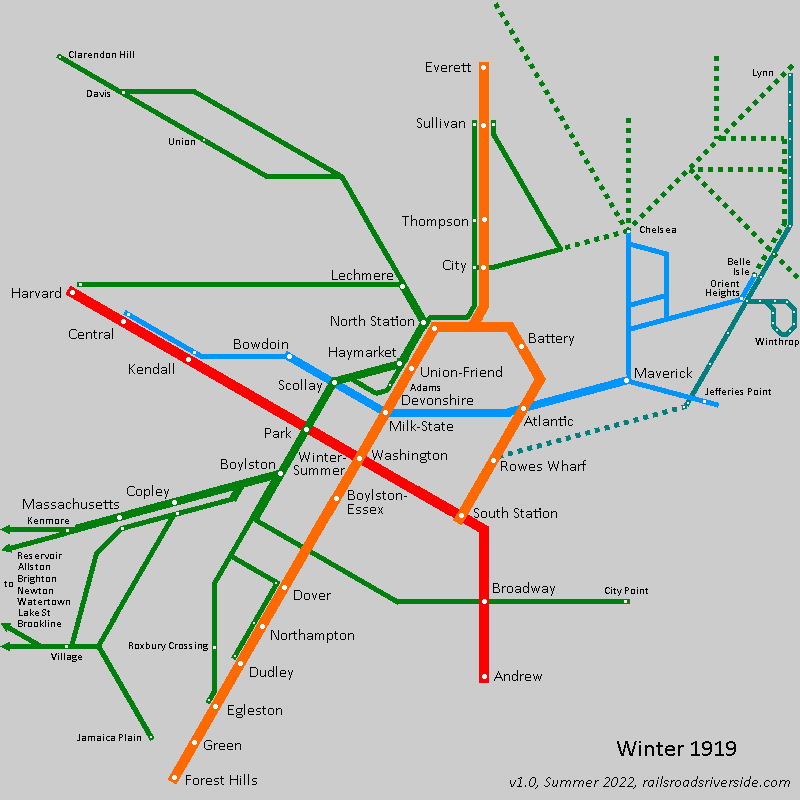
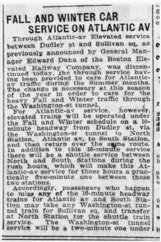
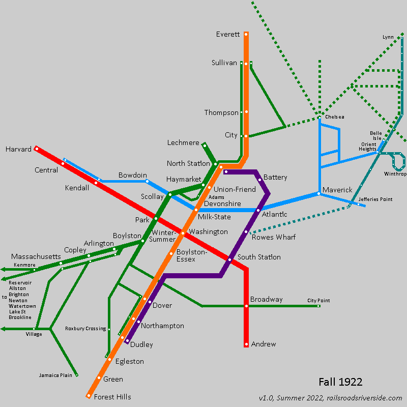
This experiment in pure deinterlining was short-lived. Just six months later (and less than three months into the service actually being consistently run following the flood), a Dudley-Atlantic-Sullivan service was reinstated:
Which would have looked like this (although I am unclear whether the Sullivan-Dudley service itself was weekends-only):
Implementing a “wraparound” service
The Dudley-South Station-Sullivan service – whether it was truly daily or only on weekends – only lasted another six months. In December of 1919, a fascinating “wraparound” service was instituted that essentially turned the Atlantic Ave El into a second northern branch of this predecessor to the Orange Line:
The core stretch through the Washington Street Tunnel would see 24 trains per hour (tph) at peak. To the north, 8 of those trains would head to South Station, while the other 16 would go to Sullivan; in essence, BERy “paid” for a one-seat-ride to the Atlantic Ave El by diverting about one-third of Sullivan trains.
(To the south, it should be noted, the 8 tph from South Station were short-turned at Dudley, again leaving the other 16 tph available to serve Forest Hills, though I’m not sure that they all did.)
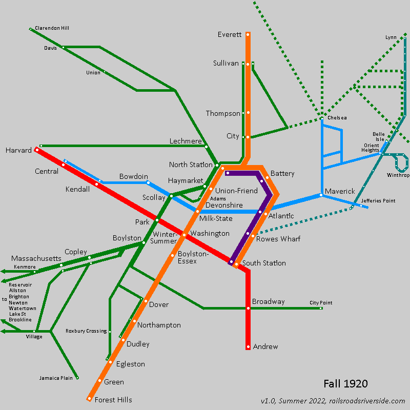
Seasonal direct service
Sometime in the summer of 1920, a direct Dudley-South Station-Sullivan service was reinstated, to accommodate increased traffic from summer travelers. It’s unclear to me whether a North Station-South Station service remained during this time.
Wraparound service + shuttle
However, by the end of September, the through-run was canceled, replaced by a return of the wraparound service – now only 6 tph – but now supplemented by a dedicated North Station-South Station shuttle, also running at 6 tph.
Again, we see BERy reducing the frequency of one-seat rides, but adding additional short-turn service to raise frequencies on the El itself higher.
Low-freq seasonal direct service + high-freq shuttle
Once again, the wraparound service was discontinued. This time around, however, BERy reduced the frequency of the direct service lower than I believe they ever had before: only 5 trains per hour. This was again supplemented by a much higher frequency on the North Station-South Station shuttle, which saw 10 tph during rush hour.
I think there’s actually a lot to be said for this arrangement. The lack of wraparound services means that trains aren’t doubling back on themselves; the frequency for Dudley-Atlantic-Sullivan services seems to match the present-but-low demand, sitting at the edge (but still within) the realm of “turn up and go”; and frequencies remain high on the core segments, meaning that riders who are impatient have the alternative of a two-seat journey between services with high frequencies (and therefore short transfer times).
Reverse branching from the south
It’s unclear to me whether BERy returned to a “Winter” service pattern after the 1921 Summer was over, and if so, which Winter service pattern they used.
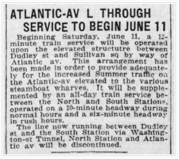
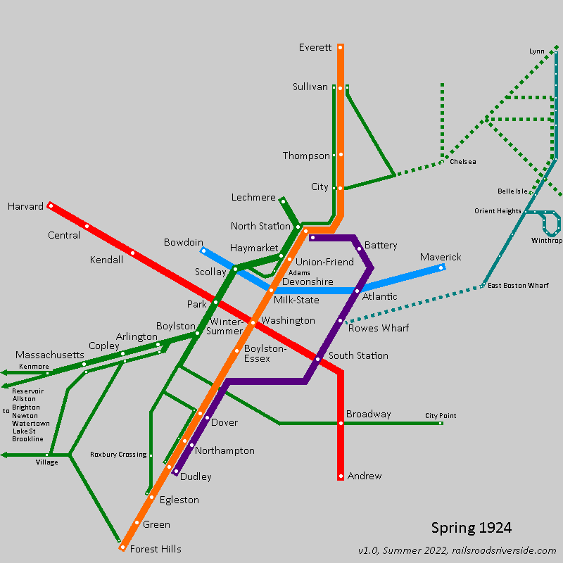
However, it appears that the Summer pattern was again used in Summer 1922, before being replaced in September 1922 with yet another new service pattern:
This pattern essentially extended the North Station-South Station shuttle – a relatively constant fixture of all these variations – from South Station to Dudley. This again turned the Atlantic Ave El into a second northern branch of the Main Line El, but shifted the split point to the south to avoid the roundabout journeys of the wraparound pattern. This of course came at the classic cost of reverse branching: radial service from Dudley was rerouted away from the core, reducing the number of trains that could run between Dudley and Downtown.
As I understand it, this service pattern remained somewhat stable, though I am unsure how long it remained in place. By 1924, the predecessors to the Blue and Green Lines saw many of their surface routes truncated at Maverick and Lechmere respectively, which leaves us a map like this:
Writing on the wall
In 1926, the Report on improved transportation facilities in the Boston Metropolitan District noted that (p. 26):
At the present time the Atlantic Avenue Elevated loop is utilized principally as a rapid transit connection between the North and South Stations. It also affords a convenient means of reaching the several steamboat and ferry terminals along the waterfront. The total traffic served by this loop is not particularly important in a comparative sense.
That same report called for the demolition of the Atlantic Ave El and replacing it with an “elevated roadway” (p. 41 and on) – essentially proposing the Central Artery, some 30 years before its time.
To be clear, there were a number of factors that put the Atlantic Ave El at a disadvantage. For one, running along the shoreline meant that half of its walkshed was literally underwater. The route also avoided the densest parts of downtown Boston, in favor of serving the docks, which also reduced transfer opportunities to the Tremont Street streetcar services and to mainline railroads at North Station.
(Transfer opportunities to the East Boston Tunnel were available at Atlantic, and to the Cambridge-Dorchester Subway at South Station; I would speculate, however, that passengers would likely prefer the shorter and fully-indoors transfers available on the Washington St Tunnel.)
Serving the docks was an understandable design decision at the time, but became more problematic as time went on. Tunnels under the harbor significantly reduced ferry ridership; for reference, the highly popular Boston, Revere Beach & Lynn Railroad ferried passengers across the harbor from their terminal at Jefferies Point to Rowes Wharf – surely a large source of passengers for the El.
Finally, it bears mentioning that Elevateds themselves quickly became unpopular. They were noisy, unsightly, and brought the noise of transportation up from street-level directly outside residents’ windows. Furthermore, since the Els were a rapid transit service that BERy used to express riders in from streetcar transfer hubs further out from downtown, stops were spaced distantly, and thus provided that much less advantage to residents who endured the costs of living nearby.
What if?
Would things have been different if Tower D had been maintained as an Aldgate Junction? It’s hard to say. Maintaining a central “loop” service as I showed in my diagram above would still mean reducing the number of trains that could run directly between Dudley and downtown.
On the other hand, a loop would have kept frequencies maximally high within the core Washington Street Tunnel, keeping capacity high for transfers from Cambridge, Dorchester, East Boston, and North Station. A loop service would also have created a one-seat ride from South Station to (what is now) Chinatown, State, and Haymarket.
Would it have been enough to save the Atlantic Ave El? In the end, I doubt it. The waterfront routing and probably the mere fact of being an elevated likely would have doomed it anyway. These were the early days of rapid transit – some ideas were simply best guesses, and so some ideas were inevitably wrong.
Lessons for today
It’s clear that the asymmetric availability of an Aldgate Junction following the construction of the Washington Street Tunnel is the fundamental reason BERy kept changing the service patterns seemingly every six months circa 1920. BERy was trying, I would argue, to solve a physically impossible puzzle, experimenting with basically every possible permutation of service on the El, and failing to make any of them work.
The history of the Main Line El offers a lesson, not in the benefits of Aldgate Junctions, but in the perils of reverse branching and doubleback services. A key advantage of an Aldgate Junction is the “branch bypass” service: recall BART’s Orange Line that runs from Richmond to the East Bay without entering the core in San Francisco.
In the case of the Atlantic Ave El, that advantage was negated: the experimental wraparound service was inefficient because it was a doubleback service that was roundabout and not fast enough to compete with more direct two-seat journeys. South Station-Sullivan service avoided the core of downtown, and consumed slots needed for the more valuable Sullivan-Dudley service.
Why does it work in London?
London’s example may be a closer comparison than the BART’s: the eastern end of the Circle Line is also a doubleback service, as can be seen in the 2015 London Connections Map:
Why does it work in London where something similar failed in Boston? I think there are a few reasons:
London has more people – a lot more people. Greater London had about 7.5 million residents in 1920, while Boston had a tenth of that (see pg. 143). Being physically smaller, 1920s Boston may actually have been roughly as dense as London, but you could probably fit (and I’m making a wild guess here) four or five “Bostons” into London’s areas of high density.
With that many people, the numbers game really begins to change. (This is a useful point to remember when comparing [Western] cities to London, New York, and to a certain extent Paris and Los Angeles – those cities are simply different due to their scale and are hard to use for comparisons.)
The northern and southern legs of the Circle Line are a little bit further apart than the El and the Tunnel were, increasing incentive for passengers to ride around the bend even if it is slightly more roundabout.
The Circle Line has fewer “crossing services” than Boston did: recall that riders could use the predecessors to the Red and Blue Lines to access most of the stops served by the El; London by contrast had more stops and fewer crossing services.
If you were coming from Farringdon or points west and wanted to go to Monument, you could alight from the Circle Line at Moorgate and transfer to the Northern Line and go south one stop… but if you were going to Cannon Street or Mansion House, then you’d need to get back on a Circle or District Line train anyway, so why not stay on? The Central Line and Thameslink also presented options, but might have been undesirable for other reasons (see below).
London’s large population becomes relevant when considering transfers; I don’t know what it was like in 1920, but today those segments of the Northern Line and Central Line are extremely crowded, while the Circle Line is noticeably less so. This again incentivizes riders to continue “round the bend”, to avoid an extremely crowded transfer.
Planning and crayoning
So what does all this mean from a transit planning and crayon mapmaking perspective? It means that an Aldgate Junction can solve some problems with branching, but it’s not a cure-all.
It’s still vulnerable to the pitfalls of reverse-branching, diverting radial services away from the core. Every train from Dudley that went to South Station was a train taken away from the more valuable Dudley-Downtown route.
If the branches are close together, then an Aldgate Junction becomes less useful because it won’t be used for through-journeys from branch to branch – there will be other “crossing services” (including walking or biking) that are faster. Someone journeying from Scollay Square to what is now Aquarium was better off traveling via the East Boston Tunnel than going the long way around.
If the branches are long and are corridors unto themselves, then the Aldgate Junction can still be a useful way to increase frequencies within the corridor – but in that case it may be more efficient and reliable simply to short-turn supplementary services within the branchline itself, rather than deal with the logistics of a junction.
In a Boston context, this would be relevant on the western branches of the Green Line: a “wraparound service” that jumps from the B to C Lines while avoiding Kenmore would be a poor alternative to the (idealized, well-running) 66, 65, or 47 buses. If frequencies need to increase within the Beacon or Commonwealth corridors, short-turning trains at Blandford St, St. Mary St or Kenmore would be more reliable and less complex than a junction.
(This also holds true, in my opinion, at the western end of those branches, where there is a true set of Aldgate Junctions at Cleveland Circle and Chestnut Hill Ave.)
Summary
An Aldgate Junction is more useful when as many of the following are true:
Branches are evenly distributed geographically
The region is pluricentric, where key destinations are located across multiple branches
The branches are long and form corridors unto themselves
Direct “crossing services” (such as circumferential routes) are not available between the branches, or are too centralized resulting in three-seat-journeys (such as Farringdon-Moorgate-Monument-Cannon Street)
Even before the elimination of the Aldgate Junction at Tower D, the Atlantic Avenue El failed all of these. Following the relocation into the Washington Street Tunnel, BERy was hamstrung with no way to serve the El without incurring reverse-branching, doubleback services, or both. This is vividly illustrated by the rapid changes and experimentation with service patterns circa 1920.
While the Atlantic Avenue El was demolished over sixty years ago, its history can still teach us lessons today.
“Wait”, you say, “that’s not right. The Green Line turned 100 in 1997, with the centennial of the Tremont Street Subway’s opening.”
True enough. But the Tremont Street Subway, for its first quarter-century of operation, looked quite different from the modern Green Line. It was only in the early 1920s that it began to resemble the system we know today, and it was only in 1922 – not 1897 – that the modern Green Line was born.
An Underground Street
BERy (the Boston Elevated Railway Company, the MBTA’s primary private predecessor) saw the tunnel more like a substitute for the crowded street above than as a proper rapid transit subway.
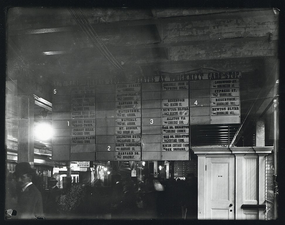
Streetcars funneled in from all over the city and distant suburbs, squeezing into the subway and crawling along at the speed of a modern bicycle. Contemporary accounts describe crowds surging down the platform at Park Street when the boarding location of the next trolley to such-and-such suburb was announced. The destination board at Park Street in 1899 resembles a departure board at a mainline station like South Station or Grand Central much more than that of a rapid transit station:
The streetcar subways draw a clear contrast with the services which BERy did consider rapid transit (the predecessors to today’s Red and Orange Lines). Beyond the difference in rolling stock (high-platform third rail vs low-platform wired), the rapid transit lines were also distinguished by their use of transfer stations.
A Tale of Two Transit Trips
Compare these two rider experiences:
A commuter from Somerville boards a trolley at the intersection Highland Avenue and Willow Avenue.
The car trundles down Highland, stopping every couple of blocks to pick up passengers.
After 2.7 miles, the car reaches Lechmere Square…
…where it departs from the street and enters the streetcar-only Lechmere Viaduct…
…which snakes over the Charles and around the West End before…
…diving into the subway just north of Haymarket.
After another 1.5 miles, the commuter disembarks at Scollay Square
Vs.
A commuter from Dorchester boards a trolley at the intersection of Blue Hill Avenue and Seaver Street (equidistant from downtown to the Highland/Willow intersection in Somerville).
They actually have a choice of trolleys – bound for Egleston, or bound for Dudley (now Nubian).
They travel by streetcar for 1 to 1.7 miles, stopping every couple of blocks to pick up passengers,
before arriving at their rapid transit station where they get a (free) transfer to the Elevated.
The Elevated speeds into downtown, with stops roughly every three-quarters of a mile.
The commuter disembarks at State Street.
The Somerville commuter takes a long slow ride from the suburb to the core, while the Dorchester commuter takes a short slow ride followed by a short fast ride, enabled by a transfer station.
A Tunnel Filled With Buses
For BERy, in those first 25 years, the Tremont Street and Boylston Street Subways were just ways of getting the huge volumes of streetcars off of the streets in downtown. In today’s terms, those tunnels were essentially filled with buses. This was useful transit service, to be sure, but it wasn’t rapid transit.
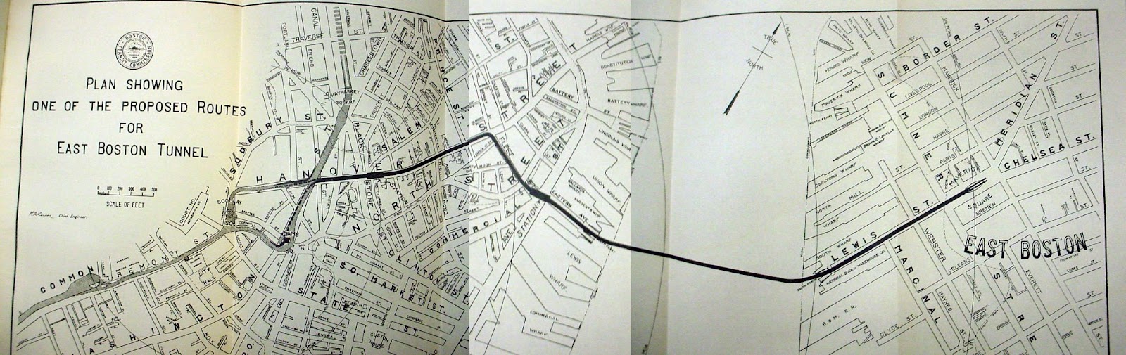
The same was true of the East Boston Tunnel. Extended from its Court Street terminus in 1916 to a portal on Cambridge Street (with a turnback loop at Bowdoin, still used today), the tunnel’s primary use was to bring East Boston trolleys under the Harbor into downtown. In fact, early in the planning of the East Boston Tunnel, one option that was considered was to have trolleys exit the tunnel from Maverick through a portal in the North End, and continue on street-level into downtown – similar to today’s Sumner & Callahan Tunnels. The primary use of the tunnel was to get trolleys (or “buses”, if you will) under the harbor – not to create rapid transit service.
In the early 1920s, that all began to change.
Conversion to Rapid Transit
Birth of the Blue Line
The 1924 conversion of the East Boston Tunnel to rapid transit is well-known and offers a clear example of how a streetcar tunnel can be transformed into a rapid transit subway. The vestigial surface route on Cambridge St was converted to bus, and the half-dozen streetcar routes to the east were cut back to terminate at a new transfer station at Maverick. Thereafter the local streetcar services fed into a dedicated rapid transit service, mirroring similar designs at Dudley, Harvard, Sullivan, and others.
This, I would argue, marked the birth of the modern Blue Line; while it is true that today’s State (f.k.a. Devonshire) and Aquarium (Atlantic) stations opened some 20 years prior, it was only with the 1924 conversion that the service became anything like its modern form.
(There’s also an argument to be made that the true birth of the modern Blue Line actually occurred a bit further to the east, during the early and highly successful years of the Boston, Revere Beach & Lynn Railroad, which was essentially running Indigo Line-style service 100 years before its time.)
As a matter of comparison: mainline rail service with today’s rapid transit stop spacing had been running along both the Highland Branch and what is now the Southwest Corridor for 70 years and 100 years respectively before their conversion to rapid transit; but I don’t think we would say that either the modern Green Line or Orange Line were born circa 1888. We would consider those to be predecessor services, and I would argue that we should view the streetcars in the East Boston Tunnel as a similar predecessor service (albeit of a different character).
Birth of the Green Line
Less well-noticed – but I would argue equally important – was the 1922 construction of the transfer station at Lechmere. Like at Maverick, local streetcars were now short-turned at a rapid transit station where passengers transferred to service that was dedicated to bringing riders downtown at high speed.
In fact, in those early years, BERy ran a dedicated service to Lechmere for this purpose; a “shuttle” service ran from Lechmere to the Pleasant Street Portal for the first six months, which was rerouted to Kenmore in early 1923. Note the similarity to the East Boston Tunnel’s rapid transit service – “shuttle” services whose sole purpose is to run between downtown and a transfer station. More information in a contemporary newspaper account here.
Over the following ten years, BERy experimented with extending Lechmere service on to the Commonwealth and Beacon branches, which eventually both through-ran to Lechmere until the early 1960s. With their dedicated medians, the Commonwealth and Beacon branches were indeed the most “rapid-transit”-like of the various services feeding into the Central Subway at the time. They still intermingled with “local bus”-like services to Watertown, Huntington, Egleston, Dudley, City Point, and Sullivan, but the clear intent was to create a “rapid transit” service, as much as possible.
The efforts to replicate the success of the “rapid transit transfer station” model were originally envisioned to go even further. As discussed previously in my Blue Line series, plans were made for another transfer station in Allston, which is why Kenmore station – not constructed until 1933 – was built with a loop for the Beacon line; the hope had been to convert Kenmore into a transfer station for a Beacon streetcar and a Commonwealth rapid transit line, Maverick-style. You can see a 1926 proposal for such a network here:
The construction of the Lechmere transfer station marked the turning point from BERy treating the Tremont Street Subway as a collection of independent streetcar routes into BERy treating the Subway like a trunk line with multiple feeder branches – in short, the modern Green Line.
Death of the Streetcar Network
Following the cutback of the Lechmere services, the once-expansive network of streetcar routes running into the subways (a subject for a later post) started a rapid winnowing in which the same story played out again and again: a transfer station was constructed and the streetcar route was cut back to the transfer; once a route no longer needed to travel into the subway, bustitution almost always quickly followed.
This is one place I want to draw our modern attention to. I’d always thought of bustitution as a phenomenon of the latter 20th century, driven by the post-war embrace of the automobile. In fact, the vast majority of bustitutions happened between 1922 and 1941. If anything, the pace rapidly slowed following the war, and it is in fact remarkable that Arborway survived all the way to 1985.
1922: Lechmere Network cut back once transfer station opens
1924: East Boston Network cut back once Maverick opens
1925: the Ipswich Street Lines (the predecessors to today’s 55, 60, and 65) were truncated at Massachusetts (now Hynes) station
1932: the routes along what is now Route 9 to Chestnut Hill were bustituted and redirected to Kenmore’s surface station
1935: last year that foreign streetcars from the North Shore ran into the subway, halted by the loss of the bridge over the Mystic River
1938: the local streetcar running below the El along Washington St between Dudley and the subway was substituted with a bus (described here)
1941: the Huntington Avenue Subway opened, and streetcars stopped using the Public Garden Incline.
At this point, the winnowing slowed significantly, and the system had largely transformed into the modern Green Line we know today, with a few extra branches (to Egleston, City Point, and Charlestown) hanging around.
Late ‘40s: the two Charlestown branches are eliminated, just barely outliving BERy itself
1953: the City Point branch is eliminated by the MTA
1956: the Egleston branch is cut back to Lenox Street
1959: the Riverside Line is converted to light rail, expanding the MTA’s reach to Route 128
1961: the Lenox Street branch (formerly running to Egleston) is cut back to the Pleasant Street Portal, and briefly runs as a shuttle service between Boylston and Pleasant Street
1962: the shuttle to Pleasant Street is canceled, and the Pleasant Street Portal – once an anchor of the streetcar subway – falls into disuse
1969: the “A Line” – having survived long enough to actually be called “the Green Line” – is eliminated
And in this context, we now see that Arborway’s survival all the way to 1985 almost seems improbable by comparison – the last in a 60-year effort to remove all streetcars from the subway.
The cruel irony is that this effort – originally intended to speed up service and improve reliability in the subway – contributed to an overall degradation of transit access in the region over the following century. Once streetcar routes were taken out of the subway, they were very easy to replace with buses, and once they were replaced with buses, it was very easy to quietly degrade or eliminate service.
Conclusion: 100 years of the Green Line
In writing this, I read a lot of old reports written about Boston transit in the early twentieth century. One thing that struck me is that the reports written in the 1920s have much more in common – in terms of priorities and perspectives – with today’s approaches than they do with the reports written by their predecessors a mere 30 years beforehand.
By the 1920s, recognition had set in that the streetcar subways could and should be converted into rapid transit, using the same transfer hub model that had been successfully deployed at Sullivan, Dudley and Harvard.
(Interestingly enough, it had also become clear by this point that those elevated railways – built barely twenty years earlier – were awful and needed to be replaced as soon as possible; both the Southwest Corridor alignment and the current Haymarket North alignment to Sullivan were explicitly described in the 1926 report.)
The 1922 opening of the new Lechmere transfer station marked this pivot point, after which every single capital exercise carried out on the streetcar network was done with the aim of turning the subway service into a rapid transit service – or getting it as close as possible.
This continues to this day! The Green Line Extension project is undeniably a rapid transit project, and not just a resurrection of the former Lechmere streetcar network, and the same will be true if the Green Line is ever extended to Needham. Moreover, it seems all but certain that a Green Line extension to Nubian Square would need to find ways to make itself as “rapid transit”-like as possible – or else face a century of institutional inertia to overcome.
The notion of a “Green Line” with branches feeding into a trunk – as opposed to an urban streetcar network whose density called for a tunnel in key locations – arose in the early 1920s. Today’s Green Line is much more closely related to the LRT subway service of the 1920s than of the 1900s, in structure, operation, and public branding. It arises out of 1920s ideas about hub-and-feeder networks, which had previously been applied on other routes, and were then brought to the streetcar networks following their success.The creation of the rapid transit line that would become the Green Lineoccurred not in 1897, but in 1922.
And so, that is why, this summer I’m celebrating the Green Line’s (true) 100th birthday.
Acknowledgements
I am indebted to a host of transit historians, who have produced reams of carefully researched accounts detailing the stories of Boston’s transit system over the decades; most of them did so as volunteers, producing labors of love that exemplify the root of the term “amateur”. I want to specifically mention the names of Ron Newman, Bradley Clarke, O.R. Cummings, Frank Cheney, and Anthony Sammarco, as well as the volunteers who maintain the Wikipedia pages on Boston’s transit network.
Some of the earliest public feedback on the MBTA’s Bus Network Redesign (mapped in a previous post) came from residents of Somerville (and, to a lesser extent, Cambridge) who were – almost unanimously – unhappy with the proposals.
Based on my anecdotal observation on social media platforms, it appears that initial reaction from other communities has been more muted; this may change in the coming weeks with the further feedback sessions the T has planned. But still, I thought it was interesting that there was such an immediate and resounding response by comparison from Somerville.
I don’t envy the Redesigners their task with the Northwest Quadrant um, Sextant (?). Uniquely, they had to design for a system that doesn’t exist yet: GLX will be a seismic shift in transit access for Somerville, and while some of its effects are predictable, some are not. That’s a pretty big wildcard to toss into the mix.
The early signs suggest the Redesigners missed the mark, at least from the perspective of the community. I wanted to dig in to this and – of course – wanted to make a map to add to the conversation. I believe that I have been able to piece together a visualization that offers context and some explanation for this initial pushback; based on these, I have also generated some modest suggestions for revisions to the Redesign.
Further details are below, but the core of my suggestion is “swapping” the proposed T39 and proposed 90; this provides an increase in service to most riders, but is a more conservative change that does not disrupt existing travel patterns. This extension can be “paid for” by a dramatic shortening of the proposed 87 to its core service area, a reroute of the 90 to a shorter well-established corridor, and the use of a lower-freq crosstown route and a shuttle service to address connectivity gaps to Sullivan and Assembly.
The Map
I had two goals with this map: visualize frequency, and visualize potential destinations. I chose these goals because they reflected themes I saw in the initial feedback: frustration at multiple transfers (meaning, need for direct access to a larger number of destinations), and loss of service, particularly for lower-income residents (which I believe in some cases was a result of the Redesign’s shift away from “mid-low frequency” routes – think 45-min peak headways, that kind of thing).
Line color denotes reachable destinations. This system isn’t perfect, but I think captured some key dynamics.
Dark red lines reach Red Line stations
Dark orange lines reach Sullivan Square specifically, and light orange lines serve other Orange Line stations
Dark green lines reach Lechmere
Dark blue lines serve Longwood Medical Area
Some lines see multiple colors, meaning a rider might board a bus for multiple destinations; a good example of this is the 87 & 88 north of Davis, where a rider might board destined for Davis or for Lechmere.
Line width indicates frequency.
The thinnest lines have peak headways more than 30 minutes
such as the 85 or 90
The next size up, forming a large swath of the network, denotes headways between 15 and 30 minutes at peak, including
the 95 along Mystic Ave,
the 87 along Somerville Ave,
the 83 along Somerville Ave and Beacon St
Thick lines indicate peak headways of 15 minutes or better – matching the target for the Redesign’s frequent network, and including major corridors along
Broadway
Highland Ave,
College Ave,
Washington St
The thickest lines – matching the width of the rapid transit lines – see peak headways of less than 10 minutes, including
the 77,
the cumulative 87 & 88 between Davis and Clarendon Hill,
the 101 & 89 on Broadway running into Sullivan
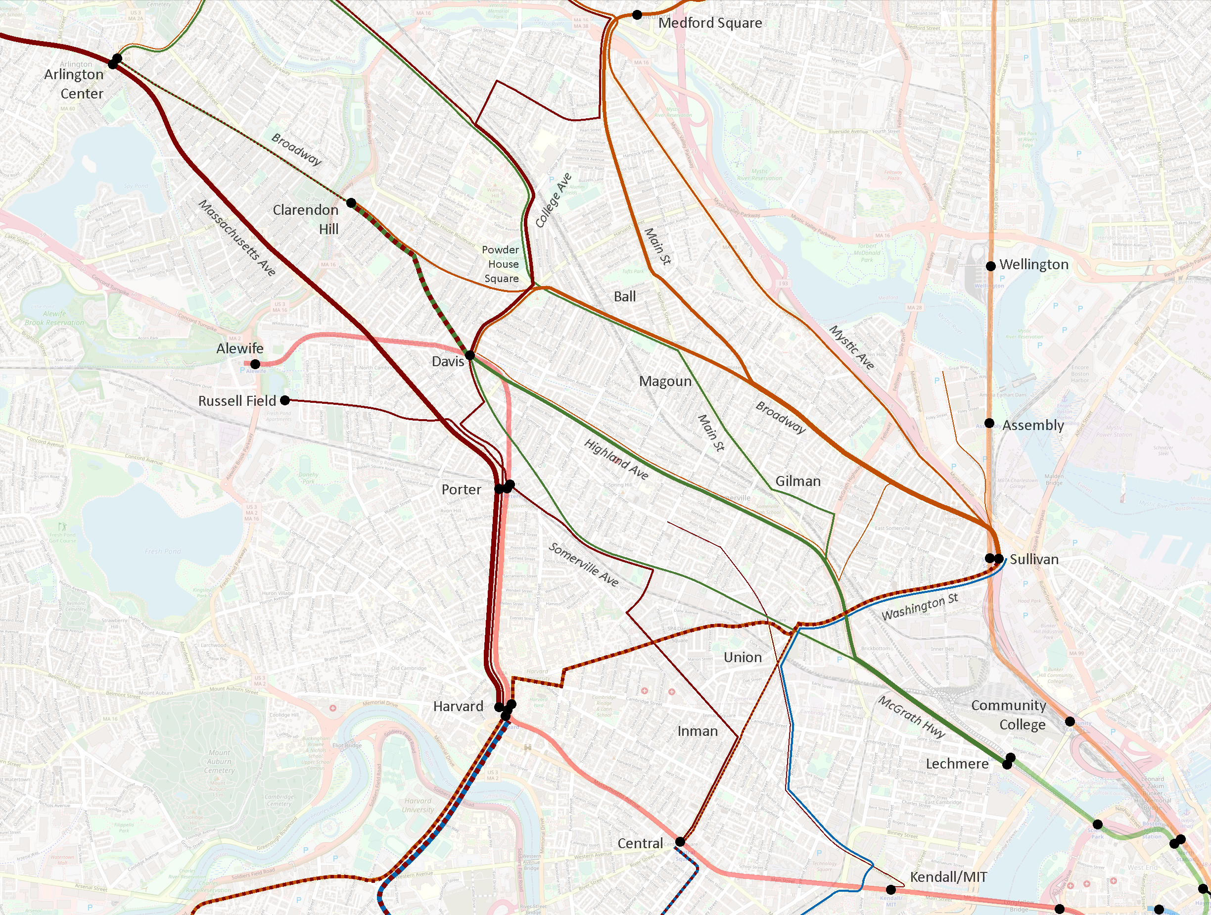
Here’s a version of the current system only showing routes that see 15-min peak headways or better.
Here we see six distinct corridors emerge:
Medford Square (and Malden) – Main St – Broadway – Sullivan
Powder House Square – Broadway – Sullivan
College Ave – Powder House Square – Davis
Clarendon Hill – Davis – Highland Ave – Lechmere
Arlington Center – Porter – Harvard
Sullivan – Union – Harvard – Allston/Brighton and Reservoir
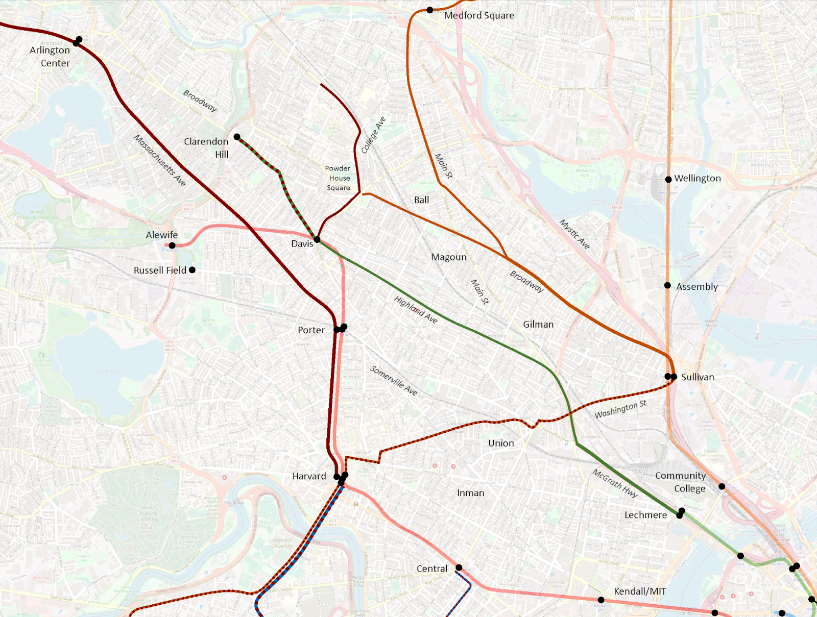
I then created a map using the same design language to visualize the Redesign proposal.
(I recommend opening the “before” and “after” images in separate tabs, and then switching between them to hone in on the differences. I tried creating a GIF, but was unsatisfied with the results.)
Impact to current high-freq corridors
Let’s first review the impact to the current high-freq corridors:
Medford Square (and Malden) – Main St – Broadway – Sullivan
Largely intact
Goes near but does not provide transfer to GLX at Ball Sq
Extended beyond Sullivan to provide a (long) one-seat ride to Lechmere and Kendall
Powder House Square – Broadway – Sullivan
Eliminated
Moreover, this route is actually composed of a pair of branching routes:
a mid-freq route to Davis
a low-freq route direct to Clarendon Hill
Davis and Clarendon Hill lose direct service to Ball Sq GLX and Broadway
Davis and Clarendon Hill maintain roundabout access to Sullivan via Mystic Ave, an increase of 0.5 miles
College Ave – Powder House Square – Davis
Intact and strengthened
Newly anchored at north by Medford/Tufts GLX and extension to Medford Sq
Worth noting that the twice-hourly one-seat ride beyond Davis to Porter and Harvard is eliminated
Clarendon Hill – Davis – Highland Ave – Lechmere
Significantly reduced, and partially eliminated
Clarendon Hill – Davis gets a pair of the Redesign’s “30-min-or-better” routes, which could approximate 15-min headways, but still does not meet the current service’s average sub-10-min frequencies
Highland Ave drops into the Redesign’s “30-min-or-better” routes, but does not connect to Lechmere, or to Union GLX, or even to Gilman GLX (though it comes close), but instead is rerouted over toward Sullivan… which it doesn’t actually reach, instead ultimately diverting to Assembly
Arlington Center – Porter – Harvard
Intact
Sullivan – Union – Harvard – Allston/Brighton and Reservoir
Partially eliminated
Sullivan – Harvard is maintained, and combined with through-service to Everett
However, ridership from one side of Harvard to the other is actually surprisingly high, so this elimination is not trivial
Of the six current high-frequency corridors, three are maintained and three are significantly impacted. This does seem counterintuitive – as far as I can tell, all other existing high-freq corridors across the system were maintained in the Redesign, and most were significantly strengthened. I suspect the difference in Somerville was the future presence of the Green Line Extension.
Green Line integration (or lack thereof)
One of my biggest surprises on seeing the Redesign was how little integration there was to the GLX stations. Ball Sq and Gilman Sq will both see bus routes pass less than a quarter mile from the station without offering door-to-door service.
In addition, despite the arrival of the Green Line, Union Square now sees less connectivity than it did before, including the loss of one-seat rides from Clarendon Hill, Davis, and Kendall. As Councilor Pineda Neufeld pointed out, this also reduces access to the Market Basket in Union Square, as well as the Star Markets on Beacon St and Elm St.
I would argue that the Redesign treats the Green Line Extension more like one of its high-freq bus routes than like a rapid transit line – as if the GLX has said, “Don’t worry buses, I’ve got this stretch”, and thus bus routes are routed away from it. That is not done with any other rapid transit lines, and with good reason: rapid transit access is concentrated in discrete areas around stations; a key role of surface transit is to provide access to a station from beyond its walkshed. Unlike rapid transit, the close stop spacing of bus routes provides continuous access along the entire route, which GLX lacks.
To be clear, for over a century now, Somerville’s surface transit routes have had to play double-duty, providing both feeder service into rapid transit stations, as well as longer-distance service to support journeys that would in other areas be covered by rapid transit. GLX relieves them of the second burden, but not the first.
To wit: the entire Red Line from Davis to Kendall is doubled by surface transit routes in the Redesign. It is true that GLX’s stop spacing is closer than the Red Line’s, but it’s still well-above typical surface transit stop spacing. The Green Line is not a wholesale replacement of local buses.
Highland Ave vs Elm St & Somerville Ave
In the current system, Highland Ave sees mostly 15-min-or-better service at peak on the 88, from Davis to Lechmere. Pre-pandemic, the average AM Peak frequency was 10 minutes. (The 90 layers on about one trip per hour to Sullivan.)
By contrast, in the current system, Elm St & Somerville Ave sees lower frequencies on the 87, wobbling between 15 and 20 minute headways. Pre-pandemic, the average AM Peak frequency was 22 minutes.
(A short stretch of half-a-mile between Elm and Park Sts on the northern half of Somerville Ave sees additional 20 minute headways on the 83, running to Central Square via Inman. North of Elm, the 87 and 83 split, though remain only a couple of blocks apart for some distance. Pre-pandemic, the 83’s average AM Peak frequency was also 22 minutes.)
In the Redesign, Highland Ave drops into the 30-min-or-better category, and loses direct connections both to the Green Line and to Sullivan. (I should again note that 30-min-or-better routes still may see high-frequency peak service, which perhaps is the vision in this case.)
By contrast, Somerville Ave sees a significant increase: the 83 holds its place, while the 87 between Union and Porter is supercharged as the T39, receiving 15-min-or-better service. Somerville Ave also maintains a direct connection to the Green Line – only one of two radial routes in Somerville that do so, the other being the T96.
In essence, the Redesign swaps the frequency tiers of Highland Ave and Elm St & Somerville Ave. As mentioned above, Highland Ave is one of the current high-freq corridors, so its exclusion is puzzling.
I am guessing that the Redesigners saw the extent to which the 88 parallels GLX, and believed the Green Line would be an adequate replacement. As discussed above, however, surface transit and rapid transit are different beasts; the 88 is being relieved of its rapid transit duties by GLX, but not its surface transit duties.
Moreover, while it’s true that the 88 parallels GLX for a lengthy distance, they diverge significantly after Magoun Sq GLX – GLX aims for Tufts and beyond, while the 88 aims for Davis and beyond. And as numerous people noted in the reactions I linked earlier, the 88’s corridor north of Davis is not meaningfully accessible from GLX.
Increasing frequency on Somerville Ave is not necessarily a bad thing – the problem is how the increase is achieved. The current Somerville Ave corridor runs uninterrupted from Clarendon Hill to Davis to Porter to Union to Lechmere. The Redesign shears off the southern half of this corridor, and joins it to an extended T39, running Porter to Union to Central and beyond to Longwood. That is a bold proposal, but it also dismantles a one-seat ride that has been in place for over a century.
This reflects a larger challenge introduced by treating the Clarendon Hill buses as feeders to Davis Sq, rather than acknowledging their actual roles as parallel spines threading the city together, radiating not from the Red Line at Davis, but from the Green Line at Lechmere.
Lack of through-running from Clarendon Hill
It is worth highlighting that the current system offers one-seat rides at least half-hourly from Clarendon Hill to:
Davis station
Porter station
Harvard station
Powder House Square
Ball Square
Magoun Square
Broadway
Sullivan station
Highland Ave
Somerville Ave
Union Square
Lechmere station
The Redesign reduces that list significantly:
Davis station
Powder House Square
Highland Ave
Sullivan station (bus journey lengthened by half mile)
Southernmost Broadway, near Sullivan
Ball Square (via a 6 minute walk)
Porter station
Harvard station
Magoun Square
Most of Broadway
Somerville Ave
Union Square
Lechmere station
For over 100 years, Somerville has been tied together by crosstown routes on Highland and Somerville. The Redesign makes the unfortunate decision to reduce the Highland corridor, and breaks what is currently a single seat journey across the city from Clarendon Hill to Union Square via Somerville Ave into an almost-certainly three-seat journey.
On paper, it may look like Clarendon Hill is all set with feeding into a hub at Davis; in reality, the Redesign takes numerous journeys that have been single-seat rides for – again I emphasize – over 100 years and makes them essentially impossible.
Suggested revisions
I want to emphasize that I don’t mean to besmirch the Redesigners or their efforts: this was a herculean task that is impossible to get perfect. Tradeoffs had to be made, and balances struck. I can understand how they arrived at their current proposal, and I also can understand why community members are deeply unhappy.
In this post, I have attempted to detail the nuances of the current system, to illustrate some of the features that I believe underlie many of the criticisms that have been levied against the Redesign. I want to conclude by offering some modest suggestions for revising the Redesign to address the concerns that have been raised.
The Map
Methodology and fudge functors
While I am not sure that it has been stated explicitly, I believe the Redesign was undertaken with a “net zero” assumption – meaning the Redesigners assumed they could only work with the existing buses the system has today, and not increase the number of buses overall. As such, I am going to frame my suggested modifications through a reallocation lens: if I propose lengthening one route, I will attempt to balance it out by shortening another.
There are also fudge factors at play here that may provide some wiggle room on these proposals. First, infrastructure upgrades such as bus lanes and transit priority signaling may enable faster service and thereby reduce the number of buses needed to maintain frequencies. Second, it may be possible to spread minor frequency decreases across multiple routes to free up enough buses to add a new route – enabling the creation of a new high-freq route without eliminating routes elsewhere.
These fudge factors cut both ways, of course – in some cases, they may make things harder, not easier. So while I’ve done my best to consider these suggestions as carefully as I can, I am of course limited to the data available to me; these suggestions should thus be considered preliminary.
Shorten the proposed 87 along Mystic Ave to terminate at Harvard St
Shorten and reroute the proposed 90 to Union Sq GLX via Somerville Ave (essentially recreating the current 87’s route)
Institute an MBTA-run frequent shuttle service between Sullivan and the Assembly Row development, potentially leveraging public-private partnerships
Cumulatively, these modifications generate a surplus of 6.18 “route-miles” at 30-min-or-better frequencies.
Utilizing the surplus
Reroute and extend the proposed T39, running Union Sq – Highland Ave – Davis – Clarendon Hill
Revise the proposed network to include a 60-min-or-better route running Davis – Highland Ave – Sullivan, along the corridor of the current 90 (it may be possible to run this service at 30-min-or-better)
Suggested revisions in review
The core of my suggestion is “swapping” the proposed T39 and proposed 90; this provides an increase in service to most riders, but is a more conservative change that does not disrupt existing travel patterns. This extension can be “paid for” by a dramatic shortening of the proposed 87 to its core service area, a reroute of the 90 to a shorter well-established corridor, and the use of a lower-freq crosstown route and a shuttle service to address connectivity gaps to Sullivan and Assembly.
As detailed in my appendix, I believe these changes
are achievable with a net-zero impact on the overall Redesign
maintain better continuity with established travel patterns and community corridors
still provide specific and general enhancements of service to most riders, per the Redesign’s objectives and philosophy
I commend the Redesign team on their thorough and innovative work. I hope they will carefully review these suggestions and the further feedback provided by the community, and consider adopting these changes into a revised version of the Bus Network Redesign.
Thank you, as always, for taking the time to read!
Proposals to extend what would become the MBTA’s Blue Line west of downtown have been floating around for over a hundred years. While most of these ideas have fallen out of the present discourse, they remain worth discussion, as they continue to inform today’s proposals.
Blue Eats Boylston Subway
Last week, I explained a 1926 proposal that would have linked the East Boston Tunnel to the Boylston Street Subway, freeing up the Tremont Street Subway to serve a dedicated line running from Huntington to Lechmere. Let’s quickly run through the challenges with enacting the 1926 proposal today.
First, the Green Line now has four branches that fan out across a wide area. It would be impractical to create so many branches of the Blue Line. Even if the E Line were rerouted into the old Pleasant Street Portal, it’s still not feasible to convert the B, C and D Lines all to HRT. The original plan in 1926 was for the Beacon, Commonwealth, and Watertown trolleys to terminate at transfer stations at Kenmore and in Allston, mirroring similar designs in place at Harvard, Forest Hills, Dudley (now Nubian), Sullivan, and others. But in the intervening century, residents in Brookline and Allston have become accustomed to a one-seat ride to downtown, so short-turns with a transfer are much less politically feasible than they once were.
Additionally, there are a large number of corridors throughout Greater Boston that are more appropriate for LRT than HRT. Maintaining the Boylston Street Subway as LRT would provide a core piece of infrastructure for that network, benefitting the system overall. Conversion to HRT would hamper that effort.
Finally, the turn at Boylston is too sharp for HRT vehicles. So not only would Park Street need major reconstruction to hook in the Blue Line, but Boylston would either need to be rebuilt, or altogether bypassed. At that point, you are basically rebuilding everything between Arlington and Haymarket, as opposed to reusing the existing infrastructure.
Blue to Huntington
This idea and ones similar have floated around for a while, popping up here and there, so it is worth mentioning for completeness. This one runs into the same challenges as the original 1926 proposal, in that you have to dig up the Common and then figure out what to do south of Park Street.
However, a roundabout route via Charles/MGH, Arlington St, and something like Stuart St could potentially be more feasible (as diagrammed below). The construction would be more complicated, and the alignment as the subway turns west past Arlington would be tricky — HRT can’t make the sharp turns that LRT can. Additionally, the roundabout route takes about 1.3 miles to go the ~.75 miles that the crow flies between Arlington and Government Center, which is makes for a substantial diversion.
For those reasons, I see this route as implausible. That being said, if it could be swung, it would be a monster success. The ridership on the E Line is ridiculous, and you’ll notice that even on the 1926 map, they were proposing HRT under Huntington. Longwood is a beast of an employment center, and that’s not even considering the schools and the Pru.
That being said, I believe that an extended subway under Huntington Avenue, running modern LRT (like Los Angeles’s) can effectively meet the needs of this corridor, and can do so as part of a larger more robust network that would see more one-seat rides into this neighborhood. In that respect, HRT is both unnecessary and would constrain the rest of the system.
[EDIT] Looking again, I noticed that leveraging Columbus Ave between Arlington Street and the Mass Pike could enable you to tunnel from Arlington Station to Back Bay Station using cut-and-cover and keeping the turn radius moderate enough that HRT could probably swing it.
This route would still be pretty roundabout between Back Bay and Government Center. And I still maintain that Huntington is a better fit for an LRT trunk subway. However, it could be more doable than I originally thought.
[END EDIT]
Blue Eats GLX
Once upon a time, when the T and the state were reviewing alternatives for providing service along what is now the Green Line Extension, one idea considered was extending the Blue Line instead. There is some logic here — the GLX corridor probably could merit HRT.
There are some major downsides though. Beyond the obvious — GLX is finally nearing completion and it seems silly to be already talking about ripping it out and replacing with HRT — turning the Blue Line north after Bowdoin would eliminate any possibility of a Red-Blue Connection, which is sorely needed and pretty much must be included in any Blue Line Extension. Realistically, Blue-to-Charles is going to be built before any of these further proposals will ever be seriously considered, so we should assume Charles/MGH as the launching point for all such proposals.
One alternative that could perhaps be feasible on a fifty-year timescale would be to extend the Blue Line to Kendall, and from there turn north to pick up either or both of the GLX branches. Depending on how the Green Line evolves in the next few decades, it may be advantageous to provide some relief to its northwest quadrant.
There are some things I actually like about this idea — there’s a certain symmetry to it that I find aesthetically pleasing, for lack of a better term. There are specific challenges — for example, I think it would be difficult to find a good spot for a Green-Blue transfer station — but unfortunately the biggest challenge is still that it’s way too early to be planning another massive construction project on the GLX corridor.
Fifty or sixty years from now, if GLX trains are packed to the brim, and the Blue Line still terminates at Charles/MGH or Kendall/MIT, then this idea might merit closer consideration.
[EDIT] In conversation with user Brattle Loop on ArchBoston, I realized that a better path from Kendall/MIT to the GLX ROW would be via Inman and Union Squares. This would require significantly more tunneling — cut-and-cover to Inman, and then bored tunnel through Union Square and north to the GLX ROW. However, it would allow for a strong Green/Blue interchange at Union Square, potentially also with circumferential LRT service from Union to Sullivan and beyond. It would also provide a one-seat ride from Union to Kendall — hardly a critical pairing, but still one that is not possible via the Grand Junction. (I have also since been reminded that the Grand Junction is probably less-than-ideal for actual tunneling, given its landfill history. If Blue-Eats-GLX is ever to happen, the Union Square alignment is probably the way to go, though it would be expensive.)
[END EDIT]
Blue Horseshoe
One of the major gaps in the MBTA’s rail network is Chelsea and Everett. Most proposals suggest adding rapid transit along the commuter rail line, running circumferentially between the Orange and Blue Lines. Typically this is suggested as LRT or BRT, and indeed Chelsea (in theory) now sits on the MBTA’s rapid transit network thanks to the efforts at BRT on the SL3 branch; there are also official discussions afoot to extend SL3 to Everett.
I sometimes see folks — especially when working on their first “crayon map” of possible extensions — who propose branching either the Blue Line or the Orange Line to serve this corridor:
Neither of these are a “Blue Line West” extension proposal, so I won’t go into detail here, but neither of these branches are likely to ever get built. Right now, the T runs as many Orange Line trains as it can to Wellington and Malden Center, and as many Blue Line trains to Wonderland (and hopefully someday Lynn) as it can. It does this because those are all massive bus transfer nodes with huge ridership. Branching either the Blue or the Orange means that the transfer nodes in question will get half as many trains, and that’s just not feasible.
One wild idea for a radial line would be to build it from Charles/MGH via Science Park and Charlestown, alongside or possibly on the Tobin Bridge. To my knowledge, the first person to propose something like this was user davem on ArchBoston, though his proposal lacked the horseshoe element, and instead turned Charles/MGH into a traditional diverging point. I think the diverging alignment isn’t a feasible service pattern, so I’ve drawn a horseshoe instead that takes the idea but creates an unbroken line of track from Chelsea to Charles to Maverick.
Once Chelsea is reached, one could continue on all the way to Lynn, though that would open its own share of complications. One could instead press north into Chelsea, and/or veer over to Everett. The challenge with both of these is that neither has seen rail, so there are no existing ROWs to leverage; the closest equivalent is the Route 1 highway. Rapid transit can built along highways, but it’s not ideal; transit should go close to where people live, and people try to avoid living near highways. A Blue Line extension would likely need to be a subway, with all the complication and cost that entails.
Plus, there’s still the challenge of getting to Chelsea. The Tobin Bridge aside, how do you get to the Tobin? On paper, it is true that Charles St between Charles/MGH and Science Park is pretty much straight-shot aligned with Route 1 on the other side of the Orange Line, but the challenges become apparent in three dimensions — between Science Park and Route 1 is a spaghetti of highways, ramps, Orange Line subway tracks, commuter rail tracks, a dam, and the Charles River.
On top of that, as mentioned above, you need to have a Red-Blue connection, and that basically has to be at Charles. Hence the horseshoe: Government Center-Bowdoin-Charles/MGH-Science Park. But even this alignment still leaves you lacking a connection between the Chelsea branch and the Orange Line.
My feeling is that there are more cost-effective solutions to serving Chelsea and the North Shore, and stronger cases for the Blue Line elsewhere.
In the next post, we’ll start to examine proposals that are more frequently discussed in contemporary planning and crayoning.
The MBTA’s Blue Line is one that has frequently captured the imagination of amateur transit planners. A proper HRT line like the Red and Orange Lines, but much shorter, and terminating in downtown Boston. Proposals to extend the Blue Line to the northeast to Lynn and beyond have been floating around for most of a century now, and the so-called “BLX” project is one that is alive and well and commonly discussed in the domain of “serious” proposals.
At the other end, there is an active proposal to extend the Blue Line west the short distance to Charles/MGH, to provide a badly needed connection to the Red Line. (This is the rare extension that is entirely missing from BERy’s proposed expansion map from 1945.) Personally, I think this is pretty likely to be built in the next 15 years, and I suspect it will be the next major project that advocates focus on once GLX finally opens.
For amateur transit planners, that terminus at Charles/MGH beckons for extension. “It’s a whole untapped HRT line!”, we say to ourselves. “With its own tunnel through downtown and to the airport to boot! Surely it’s worth extending it… somewhere.”
This post is the first in a series that will examine the different possibilities for extending the Blue Line west from Charles/MGH. Today’s post reviews some historical background that is relevant for this topic. Subsequent posts will review specific proposals, and the benefits and challenges of each.
Why isn’t there an obvious answer?
The first thing to acknowledge is that there is not an obvious answer for where the Blue Line should go west. Though it may not seem like it, this is actually a big deal. For all other major endpoints, there is general consensus for feasible corridors:
Wonderland: northeast to Lynn and beyond
Oak Grove: north to Reading
Medford/Tufts: north toward Winchester
Union Square: northwest toward Porter and beyond
Alewife: northwest toward Arlington and/or west to Waltham
Riverside: no further extension, as you’ve already reached Route 128
Forest Hills: southwest to Roslindale Village and/or south to Readville
Ashmont: convert the Mattapan High Speed Line to HRT
Braintree: no further extension (already reached the proverbial Route 128 boundary, even though, yes, it’s technically not Route 128 at that point)
That brings us back to that 1945 map. By and large, these corridors have been identified for a century, and are closely tied to the paths Massachusetts’ original railroads struck out in the 19th century.
But as you can see, there is no vision for where the Blue Line should go in 1945.
Now, to be clear, I am not saying that there’s nowhere for the Blue Line to go simply because transit planners in 1945 had no ideas. But it gives us a clue as to why there isn’t an obvious corridor — and for that, we need to look further back into history.
The Blue Line is half a line — and the Green Line has the other half
A brief refresher: the Tremont Street Subway opened in 1897 between Boylston and Park, enabling the street above to be liberated from the crush of streetcars coming from all over the city. The rest of the subway opened, running from Haymarket to Pleasant Street (south of today’s Boylston station), providing a north-south spine for streetcar service through downtown. In 1906, a tunnel opened between downtown and East Boston — today used by the Blue Line, but originally used by streetcars, providing a east-west complement to the Tremont Street Subway.
In the early 1920s, the East Boston Tunnel was converted to “rapid transit”, as they called it at the time: platforms were raised to high level, streetcar routes were truncated to a transfer station at Maverick, and heavy rail rolling stock — like those used on the Cambridge-Dorchester Subway and the El — replaced the streetcars in the tunnel. BERy was seeking to replicate successful models used at Harvard, Sullivan, Dudley (now Nubian), Forest Hills and others: maintain streetcars as local feeder services into large transfer stations where passengers can be whisked downtown by rapid transit.
In the early ‘20s, at the same time that the East Boston Tunnel was being converted to Rapid Transit, efforts were underfoot to do the same on what would become the Green Line. Those efforts are worth a post of their own, but suffice it to say that plans were grand.
One such plan — dating from 1926 — is illustrative for our present question. In addition to converting both the proto-Blue Line and proto-Green Line to full HRT rapid transit, this proposal also called for hooking the East Boston Tunnel into the Central Subway by way of Park Street, and then take over the subway to Kenmore and beyond. (You can view the original high-res map on Wikimedia Commons.)
As you can see, this proposal breaks the Green Line in half, and gives half of it to the Blue Line. And let’s be clear: then and now, the corridor from Longwood to Huntington to Back Bay to downtown to Lechmere absolutely merits a rapid transit line of its own. The Green Line of today pulls double duty, covering the role of at least two rapid transit lines, if not more.
Broadly heading west from downtown, there are three broad corridors, each meriting rapid transit: Boylston Street, Huntington Ave/Southwest Corridor, and Washington Street. The 1926 proposal lines up the proto-versions of the Blue, Green, and Orange Lines, and launches them out to those three corridors, one by one.
This proposal, had it come to fruition, would have created a very balanced network, with relatively evenly spaced “spokes” radiating out from downtown, and each major corridor covered.
So, as seen here, it is possible to design a Boston subway system with 4 “full” lines, each with fully developed “legs” running into downtown. Today’s network — 2 full lines (Red and Orange), 1 half line (Blue), and 1 half-ish line (Green, at least until GLX opens) — is not an inevitability.
Since the 1926 plans never came to fruition, we instead had the Blue Line and Green Line each running into downtown and basically terminating there. The 1926 plans illustrate how reasonable it would have been to consolidate the existing Blue Line and existing Green Line into a single line, and thus illustrate how the Green Line has essentially been acting like the second half of the Blue Line.
(Imagine if the Red Line were two lines: A Crimson Line running from Cambridge to South Station, and a Purple Line running from Post Office Square to South Station to Andrew and beyond. Both lines terminate downtown in this example, but very logically could be stitched together, forming a natural corridor through the core. I’m arguing that the same is true of the Green and Blue Lines: just as the hypothetical Crimson and Purple Lines combine to make the Red Line, the Green and Blue functionally combine to create a single corridor through the core.)
The Green Line has taken over what would have been the logical western half of a full-build crosstown Blue Line. This is why there is no obvious “next step” beyond Charles/MGH: the Green Line has been taking care of the East Boston Tunnel’s western counterpart all this time.
Why can’t 2026 be like 1926?
By which I mean, why can’t we take the 1926 proposal and use it today? There are quite a few reasons, and many of them overlap with other challenges for crayoning the Blue Line west, which I’ll describe in subsequent posts.
The first and most immediate reason is that the 1926 proposal called for a tunnel under the Boston Common to connect then-Scollay Square Station with Park Street Station so that the “Blue Line” could hook into the Tremont Street Subway and Boylston Street Subway. While I wouldn’t want to say that a new tunnel under the Boston Common will never happen, it’s extremely unlikely. Moreover, hooking a new subway into Park Street would almost certainly require massive modifications to the existing station.
The larger reason, which is illustrative of the general challenges of planning a westward extension of the modern Blue Line, is that the Green Line is no longer the vaguely mirror image of the East Boston Tunnel it once was. The Green Line has become an entire subnetwork of its own, with potential for radical expansion, and a century’s worth of inertia behind the current design. It has grown beyond what it was in 1926, and can’t be quite so easily replaced.
In the next posts, we’ll go through different proposals from past and present, examining the benefits and challenges for each.