In my previous post, I described how large swaths of today’s MBTA run on land that was set aside for transit use anywhere from 140 to 170 years ago. (The converse of this is also notable: how little new space has been set aside in the last five generations.) I described how, outside of the core, the T almost entirely runs on the ROWs of 19th century railroads. And I mentioned that the downtown subways were, in a sense, the “original” North South Rail Link.
The “Boston Metropolitan Railway” imagines, in loose alternate history fashion, a system where those railroads built a turn-of-the-century North South Rail Link and ran their suburban services directly through downtown, filling the niche currently occupied by the T’s subway lines. This produces a system with some similarities to Tokyo’s system or Philadelphia’s SEPTA… with some surprises.
This map essentially superimposes Boston’s early 20th century railroad network on top of a modified version of its streetcar network. There are three key differences (with loose but not developed alternate history “lore” behind each):
The Washington St, Atlantic Ave, and Charlestown Elevateds are built for streetcars, using the “Kenmore Model” still used by today’s B and C Lines, in which surface routes feed into a transfer station before running in a grade-separated ROW into downtown. The Washington St Subway (today’s Orange Line) is never built.
The Cambridge Subway is built as an extension of the East Boston Tunnel (today’s inner Blue Line), as was originally considered in initial planning; an extension to a transfer station with the BRB&L (outer Blue Line) gave that railroad a reliable link across the harbor, allowing it to survive the rise of the automobile; the cross-harbor cross-Charles subway is called the Central Line.
The suburban railroads somehow (magically?) build a “Suburban Rail Link” tunnel connecting North and South Stations, electrify their inner routes, and start running mid-high frequency service directly into downtown, with transfers to the Streetcar Subway, Streetcar El, and Central Line.
Don’t look too hard at the alternate history lore behind the scenes here — it’s not meant to be precise, and instead serves as source material for reimagination.
I’ll probably write more about this map in a future post, but previous readers of my blog will recognize a challenge here: core and branch capacity.
To provide “show-up-and-go” (SUAG) headways of 12 minutes or better to all Suburban stations on the above map, the core tunnel would need a capacity of 40 tph or more in each direction. SEPTA’s Center City connection, and recent analysis of the proposed NSRL, suggest that a realistic capacity for a single dual-track mainline tunnel would be about 22 tph. This imaginary “Suburban Rail Link” would need to be quad-tracked (and I don’t even know if that would’ve been possible at the time). This also illustrates a key point: providing SUAG frequencies to all suburbs requires at least two dual-track subways across downtown.
A single tunnel Suburban Rail Link
Let’s imagine what the system looks like if the Suburban Rail Link is a single tunnel with a constrained capacity of about 22 tph:
Now we get a map that looks much more like the subway maps we are familiar with, where there is a division between higher frequencies in the inner section, and lower frequencies further out. In our real MBTA, this division is largely between the subway lines and the commuter rail, whereas for the BMR it is the division between higher frequency mainline trunks (“Metropolitan” services) and lower frequency branches (“Suburban” services).
While not exactly the same, the BMR has transition points in several of the same places as today’s MBTA:
Somerville Junction (today’s Magoun Square)
Cambridge station (Porter Square)
Forest Hills
Likewise, Harrison (playing the role of JFK/UMass) and Brookline Junction (Kenmore) serve as branch points for the T’s unusually long lines to Braintree and Riverside.
One key difference is the character of the SUAG frequencies: in a well-functioning version of today’s MBTA, the SUAG headways on its subway lines are usually 5-6 minutes, whereas the BMR’s Metropolitan headways would be roughly 12 minutes. The Suburban branch lines to Braintree, Riverside, and Malden would be relegated to roughly half-hour headways. On the other hand, stations like Newtonville, Hyde Park, and Chelsea would see much higher frequencies than they do today.
A pair of Suburban Rail Links
Finally, let’s imagine a third version of this map, in which two separate dual-track subways (instead of a single quad-track tunnel) are built across downtown, providing sufficient capacity for SUAG frequencies on most Suburban branches:
Now we start to see a convergence between the BMR’s system and the MBTA’s, made more obvious by my use of orange for the “Washington Tunnel Suburban” network. With the increased capacity, the BMR can match the MBTA’s 5-6 minute headways to
Sullivan
Magoun Square
Porter
Kenmore
Forest Hills
Mattapan
Braintree
And provide 12-minute headways to the entire MBTA rapid transit system, as well as to the target corridors for higher-frequency Regional Rail, including:
Lynn
Reading
Winchester
Lexington
Waltham
Watertown
Auburndale
Needham
(The Fairmount Line is harder to analyze in this context, since it lost most of its passenger stations much earlier on, and has current stations in greenfield locations. However, it could easily be added to the purple “Franklin Suburban” network, with 6 min headways to Fairmount, and 12-min to Braintree and Mattapan.)
(The Fairmount Line was also going to be harder to map as a full line, so I admit I took the easy way out to avoid mapping it.)
Are the BMR systems “fit for purpose”? Are they better than today’s MBTA network? There are definitely pros and cons to each, but I will save those for a later post (along with some comments about the BMR’s Central Line and “Revere-Lynn High Speed Line”).
Tunnels and takeaways
These maps illustrate that serving Boston’s suburbs with SUAG frequencies physically requires the capacity of at least two downtown tunnels. The MBTA’s Orange Line addresses the need for one of these. The other “tunnel equivalent” is split between the Green Line and Red Line: the northern Red Line fulfills the Central Line’s obligation to link Cambridge and downtown, and then attempts to capture some of the niche occupied by the BMR’s Watertown, Waltham, and Lexington/Bedford branches; the southern Red Line captures the BMR’s Braintree and Mattapan branches; and the Green Line handles the BMR’s Winchester/Woburn, Lexington/Bedford, and Riverside branches.
But note that that second “tunnel equivalent” is also pulling double duty, shouldering some of the burden of the BMR’s (absurd and surely barely functional) Subway-Streetcar network, plus half of the Central Line. And note that today’s Green Line runs services in all four niches described above: Surface (B, C, E), Subway (e.g. to Kenmore), Metropolitan (e.g. to Medford), and Suburban (to Riverside).
Those niches demonstrate the final point I want to make today: the BMR thought exercise elucidates characteristics about different components of the MBTA network, in particular by dividing services up based on their distance from downtown and number of interlined branches. By better understanding those characteristics, we can design a better MBTA for the future.
Let’s look at a map of Boston’s railroads (courtesy of Alexander Rapp, links at end of post).
Let’s add highlighting to show the railroad ROWs that are now used by, or shared with, rapid transit.
Let’s also add dashed marks to indicate common proposals. Aside from the Red-Blue Connector, most of the SLX alignment, and the North-South Rail Link, all common proposals travel along historical ROWs. (The Union Freight RR doesn’t count.)
And now let’s also add (imprecisely drawn) solid lines to indicate the new subways that were built across downtown, which now connect historical ROWs on opposite sides of the city. (This reveals that the subway was in fact “the original North South Rail Link”.)
Now, here’s the kicker: the original underlying map showing Boston’s railroads… shows how they looked in 1890.
Which brings us to our first point: the large majority of the T’s (rapid transit) route miles run on the same paths that were carved out before 1890 (many before 1870, and quite a few as early as 1855).
What’s more: many common proposals to expand the T simply reactivate ROWs that were first carved out in the 19th century (in some cases, as much as 170 years ago).
The core of Greater Boston was the exception to this. Like London’s railroads forbidden from entering the City of London, the late 19th century saw railroad terminals circling downtown, with clusters at the sites of today’s North and South Stations, and one terminal near today’s Back Bay. As a result, when rapid transit was first built around the turn of the century, new routes across downtown had to be built from scratch.
But there are three other corridors, outside of downtown, which also needed to be built for the burgeoning network. These three corridors – and why they were needed – still hold lessons for us today. And it comes down to water, wetlands, and peninsulas.
Wetlands and Peninsulas
While today’s Orange Line runs along the historical Boston & Providence ROW along the Southwest Corridor, its original route ran down Washington St to what is now Nubian Square, and then further south to Forest Hills. The lack of a historical ROW continues to vex transit designs to Nubian to this day.
So, if so much of today’s network did already exist in 1890, why wasn’t there a railroad ROW to Nubian? A map from 1852 sheds some light:
(courtesy of mapjunction.com, this is the 1852 Boston McIntyre map from their collection)
For much of the 19th century, Boston northwest of Tremont St in what is now the South End… was wetland. (Technically a mudflat.) When the Boston & Providence went to survey the route between their eponymous cities, they opted to build a nearly-straight route on a trestle over the mudflat – entirely bypassing the long-settled Boston Neck, which centered on Washington St from downtown to Nubian Square.
For an intercity railroad, this made a lot of sense. They weren’t in the business of providing local service, and plowing through a long-standing neighborhood in the city would have been costly and complicated.
What is now the Fairmount Line had a similar story. Built by the Norfolk County Railroad as an alternative to the B&P’s route through Back Bay, they opted for a route that reached downtown Boston by way of the South Bay… which, at the time, like Back Bay, was an actual “bay” but also was basically wetlands. Again, the new ROW bypassed the Boston Neck altogether.
And Boston Neck hardly lacked access to downtown. Horsecars and streetcars ran down Washington and Tremont, and Boston Neck held the only route into downtown that did not require a water crossing by bridge or ferry.
By the turn of the century, Boston’s built-up environment had expanded significantly. No longer a bucolic suburb, Dorchester was now indisputedly part of the city. Streetcars trundled on a long slow journey into the center of the city, where they joined streetcars coming in from all across the region. Congestion was extreme and the city needed a way to get streetcars off its downtown streets.
So, a subway was built to send local streetcars from nearby neighborhoods underground, and an elevated was constructed to reimagine the commutes from more distant neighborhoods and suburbs: instead of a single long streetcar ride, commuters would make a short streetcar trip to a transfer station, and then take an express rapid transit train into downtown.
The El running south of downtown traveled directly down Washington St, the heart of the historic settlements on Boston Neck. Unlike the steam railroads’ avoidance of the neighborhood, the elevated railroad was designed to be woven into the expanding cityscape.
The rest is an ironic history. Arguably because it was among the oldest part of the city, Boston Neck never received the kind of railroad ROW which, by the end of the 20th century, was essentially the only place rail transit was allowed to run.
The wetlands surrounding Boston Neck were easier to go through than the neighborhood itself, which doomed the neighborhood to miss out on the “transit land grab” of the 19th century, which continues to govern the location of rapid transit to this day.
Water – Rivers
Rivers divide and unite cities. They split cities into left banks and right banks, and they simultaneously attract settlement to their shores as urban centers of gravity. The city of Boston-Cambridge is no different.
In their earliest days, the cores of Cambridge and Boston/Charlestown sat about 3 miles apart as the crow flies, with Boston/Charlestown sitting at the mouth of the Charles as it empties into Boston Harbor, and Cambridge (its earliest village located in Harvard Square) located about 4 miles upriver. By road, it was a circuitous journey of 8 miles via Boston Neck, Roxbury, and Brookline (along a route likely similar to today’s Silver Line and 66 buses) to cross between them.
(Map courtesy of mapjunction.com and the Library of Congress; this is from the 1775 Boston and Environs map.)
A bit more than 150 years after their founding, the effective distance between Boston and Cambridge was cut in half by the construction of the West Boston Bridge (where the Longfellow Bridge is today) in 1792.
(Map reproduction courtesy of the Norman B. Leventhal Map & Education Center at the Boston Public Library; this is a 1795 map with a lengthy titled which begins To the select-men of the town of Boston; the West Boston Bridge is visible in the top left.)
In the ensuing hundred years, Cambridge’s center of gravity drifted closer and closer to Boston, as main thoroughfares stretched from the West Boston Bridge straightaway across to Harvard Square.
Broadway (originally a turnpike), Harvard St, and today’s Main St and Mass Ave ran in parallel between the two poles of Old Cambridge and Boston, forming the backbone of the city that would eventually develop along their roughly east-west axes. Cambridge St connected East Cambridge to the rest of the town, and gradual land reclamation filled in Cambridgeport and expanded East Cambridge, bringing the edge of Cambridge’s shores literally closer to Boston.
The Charles River, in its meandering, deposited Old Boston and Old Cambridge a mere three miles apart. The settlements were far enough apart to develop separately, but close enough that they were inevitably drawn toward each other. Boston was anchored by the Harbor and could not move, but Cambridge had plenty of open space to expand into. The opening of the West Boston Bridge created a focal point for Cambridge’s expansion.
(Map reproduction courtesy of the Norman B. Leventhal Map & Education Center at the Boston Public Library; this is James Hayward’s 1838 A map of Cambridge, Mass, showing Cambridge’s east-west growth.)
The combination of the new river crossing and the original location of the settlement at Harvard Square effectively ensured Cambridge’s development stretching west from downtown Boston.
Notably absent, once again, were the railroads. A mid-century short-lived branchline to Harvard Square lasted a mere six years. Cambridge’s expansion was instead fueled by its horsecar and streetcar connections to Boston via the bridges. (Indeed, the first horsecars in the region ran across the bridge, from Bowdoin Sq to Harvard Sq.)
Municipal boundaries notwithstanding, Cambridge became indisputably part of the Boston-Cambridge city, just as Dorchester had. And just like Dorchester, its streetcars were choking Downtown. Dorchester got an elevated railway, and while an elevated was also considered for Cambridge, eventually a subway was chosen instead – a fateful stroke of luck that continues to impact transit access inequity to this day.
Just as the geography of the Boston Neck did, the opening of the West Boston Bridge meant that, by the time railroads started being built, the corridor between downtown Boston and Harvard Square was already well-settled. The railroads had incentive to avoid the area, not serve it.
The dual examples of Cambridge and Boston Neck demonstrate that the construction of railroad ROWs has frozen in time the idiosyncratic mid-19th century divisions between “old” and “new” settlements.
A note on South Boston and the South Bay
I exclude the southern half of the Red Line from my set of corridors that needed to be created to tie the emerging rapid transit network together, beyond merely stringing together railroad ROWs.
While it is true that the subway between Andrew and South Station was not itself ever a railroad ROW, it runs parallel to the historical Old Colony ROW (which ran in part along what is now Old Colony Ave), and to the historical ROW of the Midland Route (which ran along what is now Track 61 before curving west to a terminal near South Station, producing a route of similar shape, though different location, to today’s Red Line). The decision to run the subway under Dorchester Avenue was not forced by a lack of other options.
(Map reproduction courtesy of the Norman B. Leventhal Map & Education Center at the Boston Public Library; this is an excerpt from JG Chase’s 1865 railroad map showing how the Old Colony and Norfolk County railroads presaged the path of today’s Red Line.)
The South Bay was, and remains, an odd no-man’s-land separating South Boston from the rest of the city. 150 years ago, water separated the two, and today they are divided by railroad yards and a highway. As such, like Back Bay, it is unsurprising that the Old Colony and Norfolk County Railroads used it as their route in and out of the city.
I argue that the Dorchester Ave subway is essentially a modest relocation and consolidation of these two historical ROWs, and therefore does not represent a “new” taking of land for transit use in the way that the Cambridge Tunnel and the Washington St El did.
(To put it another way, in some alternate history, BERy used either/both of the ROWs in lieu of the Dorchester Ave subway, producing a Red Line very similar to our real one.)
South Boston provides a third example to support the pattern demonstrated by Cambridge and Boston Neck: areas already-settled by the mid-19th century were bypassed by the new railroad ROWs that now serve as our primary space for transit. The Old Colony RR built their ROW along the edge of Southie, just as they built their Dorchester ROW along the edge of the neighborhood hugging the shoreline.
Water – Harbors
The last piece of today’s MBTA rapid transit system that was not built on land set aside in the 19th century (see below) is the East Boston Tunnel, crossing the waters of Boston Harbor.
(In this piece, I don’t discuss the Green Line’s development, as I’ve covered that elsewhere — see links above. I will note, however, that the B and C’s reservations on Beacon and Commonwealth both also date from the 19th century. The vast majority of our dedicated transit land comes from this era.)
There’s an argument to make that the East Boston Tunnel was, in fact, set aside by private railroads in the 19th century. The Boston, Revere Beach and Lynn Railroad ran from the wharves of East Boston to Lynn along what is today the Blue Line. The railroad was enormously successful, running high frequency electric trains with (I believe) near-24 hour service at some points. The “last mile” of the journey was completed by ferry across the Harbor to Rowes Wharf (likely the reason for BERy’s construction of an el station there).
Given the close connection between the rail service and the ferry service, there’s an argument to make that the cross-Harbor corridor was, in fact, “claimed” by a private railroad in the 19th century, just as I argue most of the T’s current network was.
The popularity of the BRB&L, and the 1924 conversion of BERy’s East Boston Tunnel to heavy rail, speaks to the importance of a Boston Harbor Crossing. East Boston itself, originally an island, remained isolated from the mainland by Chelsea Creek. And Revere, though served by the B&M’s Eastern Route (today’s Newburyport/Rockport Line), was much more directly served by the near-direct 4.5 mile corridor via East Boston, compared to the 7 miles via Chelsea.
Crossing Boston Harbor has a similar effect to crossing the Charles River – providing an alternative to the roundabout route (whether via Brookline or Chelsea or via an unreliable ferry) creates a strong focal point at the crossing, drawing the previously remote far shore closer (both metaphorically and sometimes literally).
(Off-topic but I always want to emphasize this: the BRB&L ran rapid-transit-like service to Lynn until 1940; only eight years later, the MTA began construction of a true rapid transit line along that ROW, intended to once again reach Lynn. The first phase opened in 1952, and the second phase, to Wonderland, opened in 1954, truncated short of Lynn for budgetary and political reasons. There was only an eight year gap in service before public plans were made to restore service to Revere and Lynn, and Revere’s service was restored a mere four years after that. We shouldn’t talk about extending the Blue Line to Lynn – we should talk about restoring the Blue Line to Lynn.)
Like the rapid transit lines across Boston Neck and Cambridge, a rapid transit line across Boston Harbor was needed precisely because it had been too expensive and unappealing for a private intercity railroad company to build the ROW.
And that’s where the rubber hits the road on this topic, even today.
Implications
Most of the MBTA is built along corridors where for-profit railroads found it advantageous to build in the mid-19th century, usually through areas that were lightly settled, avoiding the historical cores that had driven the growth of the region until that point.
Setting aside the Green Line, there are four exceptions to this pattern:
Downtown: where the Main Line’s Washington St Subway provided the “original North-South Rail Link”
Boston Neck: where the El ran above one of Boston’s earliest pieces of land, to serve the large streetcar suburbs in Dorchester beyond, in the 1.6 mile gap between the Boston & Providence RR and the Norfolk County RR’s Midland Route – the largest gap between railroad lines in Boston’s immediate suburbs, except for the gap in Cambridge
Cambridge: where the subway ran along an east-west axis that had been rapidly settled starting at the dawn of the century, filling a 2 mile gap between the B&A’s railroad in Allston and the Fitchburg Railroad’s line in Somerville
Boston Harbor: where a tunnel literally was dug under the ocean to clear a 3,000 foot gap, replacing the choice between an unreliable ferry and a detour of 4 miles (or more)
Among other things, this highlights – yet again – how damaging the loss of a radial line to Nubian is. Imagine if the Red Line had been relocated out of its tunnel to a route along the B&A ROW with a Ruggles-like transfer station near Braves Field, or along the Fitchburg ROW, with a transfer station at Union Square.
I believe this demonstrates that a transit approach that limits itself to existing transit ROWs threatens to overlook corridors that could be as vital in the 21st century as the above corridors were in the 20th.
In December of last year, I submitted two maps to the Boston Public Library’s Norman B. Leventhal Map & Education Center’s Transportation Dreams contest. The first is entitled “Project Electric Sheep,” and the second is “Project Gold Line.”
I’m a firm believer in dual creative processes — “campaign in poetry, govern in prose,” “write drunk, edit sober” (in the metaphorical sense), creation and refinement. These two maps present a similar duality: one is wider-ranging in its creativity; the other is a refinement into a focused proposal.
I do want to emphasize that, even on the creative map, all proposals are grounded in examinations of feasibility, cost-effectiveness, and efficiency. These are indeed “transportation dreams”, but they absolutely could be realities.
(I am told these and the other submissions will be on display at the BPL through the end of February!)
“Project Electric Sheep” — a feasible yet fun “crayon map”
This is the statement accompanying my submission:
This map has been perhaps a decade or more in the making. Drawing heavily on discussions I’ve participated in on ArchBoston, I have sought to generate a vision for Boston transit that is both inspiring and feasible.
This design adds over 44 miles of rail to the T’s existing network, only about 9 miles of which would require new tunneling. By focusing on existing infrastructure, extant ROWs, and opportunities for low-cost construction (such as wide streets and areas with well-mapped geologies), we can achieve a radical increase in transit access across the region.
My proposals are built on data from a range of sources, including:
newspaper clippings sourced through Wikipedia (with grateful thanks to the tireless contributors there), and
numerous historical works by Frank Cheney, Anthony Sammarco, Bradley Clarke, O.R. Cummings, George Chiasson, Jr, Jonathan Belcher, Thomas Humphrey and others
I have also drawn on the qualitative experiences of myself and other T riders.
This map would not have been possible without the years of collaborative discussion at ArchBoston. Much of my thought process in developing this map is documented there, and some proposals are also documented on my website (ever a work in progress).
A small number of stations have been renamed on this map, for ease of wayfinding and to celebrate a fuller array of figures from Boston’s rich history.
This diagram includes the “Gold Line,” an articulation of a long-discussed idea on ArchBoston, which is presented in greater detail in my second submission (below) and here on my website.
(The submitted map had the Bronze Line J service terminating at West Station rather than Boston Landing. Further details in the appendix. The submitted map also had the labels for Edgeworth, River’s Edge, and Wellington in incorrect order, which I have fixed here.)
This diagram is, in some ways, meant to be “fun” (in a way that crayon maps are supposed to be). There isn’t a specific date tied to this map, and it neither represents a “preferred build” nor a “full build” nor a “must build”. Rather, it’s a vision of one possible future.
Project Gold Line
This is the statement accompanying my submission:
Like my other submission, this map has also been long in the making.
Over the last decade, an ongoing discussion on ArchBoston has examined ways to remake the Green Line into a better version of itself. These discussions have been wide-ranging, at times ruthless in pragmatism, and equally unbound in imagination.
Only in the last couple of years has a consensus emerged on certain key pieces of this “Green Line Reconfiguration”. I myself have struggled to find a way to articulate the possibilities afforded by these (relatively mundane and unflashy) key pieces.
Which brings us to: the Gold Line. The “Gold Line” concept seeks to pithily capture the key projects needed to unlock the system’s full potential:
Reroute the E Line via Back Bay to utilize the unused Tremont St Subway
Extend the E Line’s subway west down Huntington, at least to Brigham Circle
Construct a short subway to South Station and run trains through the Silver Line tunnel, linking the Seaport, Downtown, Back Bay, and Longwood
There are additional components beyond these, including connecting the D and E Lines to create a full-length rapid transit line, as well as extending the Green Line to Nubian Square, but the three investments listed above would, in tandem, be transformative.
Beyond ArchBoston, some of these proposals are also documented on my website (ever a work in progress).
Additional details on the Gold Line concept are available here on my website.
~~~
Teban54Transit also submitted a map to Transportation Dreams detailing the Green Line Reconfiguration concept. He and I corresponded while creating our maps and we decided to intentionally pursue different approaches. My Gold Line map focuses on a set of core components, while Project Electric Sheep shows the Gold Line in a systemwide context with other extensions, such as a Bronze Line through Kendall; his map falls in between, showing a larger and more detailed view of the expansions to the existing Green Line that become possible through the Green Line Reconfiguration. Our maps have some differences, which intentionally demonstrates the flexibility of the improvements we propose.
The following is purely a fun exercise for a highly hypothetical scenario. I’m posting it more as an illustration of thought process, and not really in advocacy of the proposal itself. (There are many things I would prioritize above an Urban Ring LRT station in the Seaport!)
The scenario
Let’s assume a few things are true for this scenario:
The Piers Transitway (currently serving SL1, SL2, and SL3) is converted to light rail and connected to the larger light rail network via a subway running from Huntington Ave to Back Bay to South Station — we’ll call this the “Magenta Line”
“T-under-D” has been completed, meaning the subway now extends from World Trade Center station under the current grade crossing at D St to a portal near the current Silver Line Way station
Center-running bus lanes on Congress St in downtown and Summer Street in the Seaport have been built, and the T7 upgraded into a full bus rapid transit service, which we’ll call the “Navy Line”
SL1 service has been transferred to the Navy Line, to provide a one-seat ride connecting North Station, the Financial District, South Station, the Seaport, and the Airport
We’ll loosely assume that a lane in each direction of the Ted Williams Tunnel has been dedicated to mass transit use
An LRT iteration of the Urban Ring has been built on the southside of the network, connecting Longwood, Nubian, and the Seaport, approaching the Seaport via the Track 61/South Boston Haul Road ROW
In short, our starting point looks like this:
The satellite image doesn’t tell us the whole story, however. This is a highly three-dimensional space, where Summer St and World Trade Center Ave sit elevated above the rest of the street grid, and where a slew of highway tunnels sit under the surface.
World Trade Center Ave looking east, as seen from Summer StWorld Trade Center Ave from above, looking north, with Haul Road below and to the rightWorld Trade Center Ave at “elevated street level” looking north, from nearly the same vantage point as above, but lower downTrack 61 and Haul Road passing underneath Summer St, from above World Trade Center Ave, looking west; the Boston Convention and Exhibition Center is visible at the far leftOpenStreetMap showing the tunnels below the surface
Where to place an Urban Ring LRT station?
“The gravel pile”
As visible in the photo above looking west along Summer St, there is a triangular plot of land bounded by Track 61, the embankment of Summer St, and (effectively) the elevated WTC Ave. (There’s actually an access road that cuts off the corner of the plot slightly east of WTC Ave.) That plot currently is occupied by a massive pile of gravel. (Last I checked, the plot is owned by MassPort, though I assume they would sell it off to a developer if/when they could.)
This is probably the most obvious place to plop down an LRT platform. It’s accessible from the current ROW with minimal modification and landtaking required; it provides good access to BCEC and easy transfer to the Navy Line services (including services to the airport); the Magenta Line subway station at World Trade Center is about 400′ away, which isn’t ideal but is certainly manageable, especially if one of the sidewalks can be covered for protection from the elements.
There are some downsides. The plot is a little small; if we leave the access road untouched, it’s just about 230′ along the long edge, which would be barely long enough for a double-set of the 114′ Type 10 “supertrains” that are expected on the Green Line in the next several years. So it’s likely the modifications at the east end, west end, or both would be needed to fit a center platform, two side tracks and a crossover. (Depending on how the Track 61 ROW is converted to double track LRT, some space might already be reclaimed from Haul Road at the western end, which might simplify the design somewhat.)
The other downside is that this location serves the Seaport, but only somewhat so. A lot of the Seaport is located on the other side of the “highway canyon” that Track 61 and Haul Road sit within, so Urban Ring passengers would need to go “up-and-over” for the last segment of their journey. The current World Trade Center station is much more centrally located.
The gravel pile is potentially an adequate location for a station, and would likely be the least expensive option. On the other hand, if we are going to go to the expense of building an LRT Urban Ring, there’s an argument that it should be built for maximum efficacy, rather than just minimal cost.
The underground parking lots
As can be seen in the photos, there are a number of parking lots at the grade level of Track 61, including one parking lot that directly abuts the southern wall of the current World Trade Center station; open that wall up, and you have a strong transfer to the Magenta Line.
The problem here is that you need to cut across Haul Road and the Mass Pike ramps in order to access the lot. And while that’s doable, it’s far from ideal. There actually already is a traffic light directly underneath WTC Ave on Haul Road, so in theory the disruption to traffic flow would not be new. On the other hand, you could only run trains so often if they need to disrupt traffic, probably capping headways at 5 minutes. Again, that is doable, but seems to trigger the same question as above — if we’re gonna build this thing, why not do it properly?
World Trade Center Ave
One thing that bothered me when thinking about mini-project was how to provide good transfers to both Summer St BRT and Transitway LRT. The distance between a stop in front of BCEC and the entrance to WTC station is roughly 650′, which is long for a transfer but not unheard of. (If I recall correctly, it’s roughly the distance of the transfer between Southbound Orange and Blue at State. Of course, State has the benefit of being entirely indoors, while BCEC <> WTC would have significant exposure to the elements, even if the sidewalk were covered.)
Having two Urban Ring stations — one for the Transitway and one for Summer St — seemed excessive. So then I got to thinking more about what the objectives are for stations/connections at each location.
Summer St
Boston Convention and Exhibition Center
Transfer to Summer St BRT toward downtown: South Station, Post Office Square, Haymarket, North Station
Transfer to Summer St BRT toward Logan
Transfer to Summer St BRT toward South Boston
Transitway (World Trade Center)
Seaport core, including Congress St and Seaport Boulevard
Transfer to Magenta Line westbound: western Seaport, South Station, Back Bay, Longwood
Transfer to Magenta Line eastbound: eastern Seaport
On paper, that looks like a lot of reasons for each, and maybe even more in favor of Summer St due to its connectivity, but when you look closer, some are less relevant:
Summer St
Boston Convention and Exhibition Center
Transfer to Summer St BRT toward downtown: South Station, Post Office Square, Haymarket, North Station
By definition, the Urban Ring will have multiple connections to downtown, so this is not a vital benefit
Also, Urban Ring riders will all but certainly be coming from locations that already have direct service to downtown — it’ll be a very uncommon journey to transfer in the Seaport
Transfer to Summer St BRT toward Logan
As you’ll see below, this benefit is in fact not going to be unique to Summer St
Transfer to Summer St BRT toward South Boston
I won’t put strikethrough on this one, but I will point out that most of the previous connection points along the Urban Ring corridor (e.g. Broadway, Mass Ave/BU Medical Center, Nubian) will hopefully have — and will be better served anyway — by direct bus service from South Boston
Again, the Seaport itself wouldn’t be a common transfer point
Transitway (World Trade Center)
Seaport core, including Congress St and Seaport Boulevard
Transfer to Magenta Line westbound: western Seaport, South Station, Back Bay, Longwood
As mentioned above, pretty much all of the Urban Ring stops between Nubian and the Seaport will have better ways to connect to South Station, Back Bay, and Longwood than via the Seaport
Transfer to Magenta Line eastbound: eastern Seaport
So, to me, the goal of an Urban Ring LRT station would be twofold: connect to the Seaport, and connect to Logan. A stop anchored by the Transitway station better serves the Seaport and, as you will shortly see, also serves Logan. So, insofar as we need to choose which connection to prioritize, we should focus on a Magenta Line connection at World Trade Center station.
Getting to Logan
In some alternate timeline, the Ted Williams Tunnel was built with a third tunnel to carry rapid transit rail service to Logan. This would’ve been so much better than today’s system, but alas.
In the scenario I’ve outlined here (and, in my opinion, in any vaguely realistic scenario), service to Logan is provided by BRT. Now, to be clear, BRT can be a lot better than what we have today. For one, a lane in each tunnel could be dedicated to transit and perhaps very-high-occupancy vehicles, with semi-permanent lane protection to ensure speedy and unencumbered journeys.
But our BRT services still need to get in to the tunnel, and the solution to that problem also solves the problem of Summer St vs the Transitway.
Today’s SL1 and SL3 services make a semi-unadvertised stop at street level on Congress St just outside of World Trade Center station; they do this immediately after exiting the off-ramp, which has the benefit of getting travelers from Logan to a stop in the Seaport quickly, without needing to double back from Silver Line Way.
This stop is marked on my diagram from the top of the post (though I am supposing that the simple sidewalk stop has been expanded into something more like a proper BRT platform):
As far as I can tell, absent a major rework of the Mass Pike tunnels, Logan-originating buses will exit from that off-ramp for the foreseeable future. Now, it is true that Logan buses could instead turn left and use Congress St bus lanes to head toward downtown. However, that would duplicate the lanes on Summer St which would still be needed for South Boston service (i.e. the T7), and would be more awkward to connect to South Station. And while Logan -> South Station is mildly more direct via Congress, the journey in the opposite direction is significantly worse, requiring a lengthy diversion down Haul Road in order to reach the on-ramp.
Funneling Downtown <> Logan service through Summer St maximizes frequencies on the shared trunk, minimizes redundant infrastructure, and maintains good Logan -> World Trade Center service. It is somewhat more roundabout, but connects to more places. (And if we are really worried about an express South Station <> Logan connection, using dedicated lanes in the Mass Pike tunnel running direct into the South Station Bus Terminal is probably a stronger solution anyway.)
So we’ve identified a way for our Logan -> South Station service to transfer at WTC station, but what about the other direction? Well, that’s where those parking garages can come in handy.
Running directly parallel to the Transitway is a small side street/alley that runs into the lower level of the parking garage, and which, I think exits on to Haul Road just underneath World Trade Center Ave. Visible in the second Streetview photo are two large metal doors: I am pretty sure that those lead directly into the lobby of the World Trade Center station — meaning that with some modifications, you could put a BRT platform near there, and have buses immediately proceed to the on-ramp.
This would then provide a strong transfer point to Logan-bound services at World Trade Center proper — benefitting Magenta Line riders, but also providing a crucial transfer point enabling an Urban Ring station at World Trade Center.
Placing an Urban Ring LRT station at World Trade Center
So, where to put a new LRT station at World Trade Center?
We can’t put it at grade level without disrupting all the highway ramps, or otherwise settling for a station at Summer St instead.
We can’t put it below grade level because of the highway tunnels.
What about above grade along the World Trade Center viaduct?
Building a short rising viaduct on the gravel pile’s plot and claiming some of World Trade Center Ave (more details on that below) to add a above-grade LRT platform, combined with building an at-grade BRT platform for Downtown -> Logan services by reclaiming some space under the parking garage and adding a BRT platform on Congress St for Logan -> Downtown service, enables all three services to be centralized in a single station for easy transfers between all three.
So how do you reach the World Trade Center Ave viaduct?
Some of this will depend on how Haul Road is reconfigured for double-track LRT, particularly in terms of the horizontal alignment (do you steal a lane, or eat into the gravel pile?), but I think there’s enough open space to feel comfortable that something could fit, even if we don’t work out the details right now.
One area we have less flexibility on is the vertical alignment: there’s approximately 310 feet of horizontal running space between the Summer St underpass and the edge of the World Trade Center Ave viaduct, and we have to fit our rising viaduct in there.
The WTC Ave viaduct is approximately 25 feet high; 25 feet rise over 310 feet run yields a grade of 4.61°, which is well within the comfort zone for LRT grades. Even a rise of 33 feet over that distance would still come in at our 6° threshold. Likewise, rising 25 feet at <6° is doable in as little as 240 feet. Therefore, even with the known limits, it should be possible to rise from the Summer St underpass to the World Trade Center Ave viaduct at a reasonable grade.
Fitting a terminal on the World Trade Center Ave viaduct
The main question facing us here is whether to maintain some level of automobile access through WTC Ave. I believe I’ve come across proposals to fully pedestrianize that street, which, honestly, based on my experience, seems pretty reasonable. Mostly it seems like the street is used to deliver goods to the World Trade Center proper.
If I needed to maintain some level of automobile access, I would use a staggered pair of side platforms to maintain LRT capacity and keep a shared bidirectional lane open for vehicles to pass through on a limited as-needed basis, placing signals/traffic lights at each entry to coordinate passes through the right-of-way.
Obviously, this arrangement is complicated and would create some disruption to the system, depending on the road traffic volume. This option would need to be considered carefully to assess the cost vs benefit.
The key thing to note is that there is horizontal space to fit all the necessary elements:
First 230′ platform (enough to accommodate a doubleset of the 114′ Type 10 supertrains)
90′ to fit a crossover to provide passing access
Second 230′ platform
A 100′ radius curve from the rising viaduct on to WTC Ave
Reasonably short walking distance between platform and current headhouse to streamline transfers
Maintain pedestrian access to the elevated greenspace between Congress St and Seaport Blvd
The second option is more conventional and straightforward: pedestrianize the whole viaduct, and claim part of it for a GLX-style center-platform terminal station.
There are lots of potential variations on this design — adjusting the width, length, and placement of the platform, trying out different methods of pedestrian access — but they all more-or-less look like this.
Keen observers will note that none of these designs feature fare gates or paid-access vs unpaid-access areas. Numerous transit systems, both in the US and around the world, have demonstrated that it is possible to run ticketed transit systems that do not require metal barriers to enforce payment. Eliminating fare gates makes it possible to build transit access more directly into the fabric of a neighborhood. Both station designs, but particularly the staggered platforms alternative, see no clear demarcation of the “edge” of the station, but rather allow the space to be woven together into a seamless whole.
So how do you site an Urban Ring LRT station in the Seaport?
To me, it looks like this:
Add a BRT platform at World Trade Center station for Downtown -> Logan services (under the parking garage just south of the station)
Build a viaduct to connect Track 61 LRT to the WTC Ave viaduct
Add an LRT station at-grade on the elevated World Trade Center Ave viaduct
Should you put an Urban Ring LRT station in the Seaport?
One thing this exercise illustrates is that the Seaport is not very wide. This sounds obvious and trivial, but one result is that there isn’t really space nor need for a “crosstown” service. The Piers Transitway and Summer St already form strong “east-west” transit corridors (whose elevation difference reduces their overlapping walksheds slightly). But they’re still close enough that a perpendicular service between/across them wouldn’t make much sense (particularly since both originate at South Station and come very close to connecting again at World Trade Center).
So a Track 61 LRT service basically needs to choose a particular point along the “linear Seaport corridor” to terminate. That increases the pressure on that station to be located optimally to maximize access to jobs as well as to transfers. World Trade Center does reasonably well on that front, but both the eastern Seaport (e.g. Design Center) and western Seaport (e.g. Courthouse) would require transfers for short last-mile journeys. But this need to choose lies at the heart of why siting an Urban Ring LRT station in the Seaport is difficult in the first place.
A Track 61 LRT service will likely reach the Seaport in part by passing near Broadway station. Regardless of origin point beyond there, a service near Broadway likely could instead be aligned to pass through South Station instead — and then continue to Seaport along one of the east-west corridors. (For reasons I won’t get into here, a Piers Transitway LRT corridor would very likely have excess capacity to absorb Urban Ring LRT in addition to the Magenta Line LRT I’ve described here.)
Sending an “Urban Ring” LRT service down one of the east-west corridors would provide better access to the entire Seaport, and reduce/eliminate the need for transfers. Running LRT service via Track 61 may in fact be unnecessary.
This brings us to a key difference between an LRT Urban Ring and a BRT one: BRT can continue to Logan Airport and on to Chelsea much more easily than LRT. Rapid transit on the Track 61 ROW, with a transfer station roughly at World Trade Center, and continuing service to Logan is able to catch a much broader swath of journeys (in italics below), compared to service terminating in the Seaport:
Longwood <> Seaport
Nubian <> Seaport
Red Line transfer point TBD (e.g. Broadway) <> Seaport
Longwood <> Logan
Nubian <> Logan
Red Line transfer <> Logan
Longwood <> Chelsea
Nubian <> Chelsea
Red Line transfer <> Chelsea
Seaport <> Chelsea
Logan <> Chelsea
The concept of the Urban Ring was to provide circumferential service that bypasses downtown, for speedier journeys and reduced crowding in the core. A route that terminates at Seaport curtails possible destination pairs, and becomes less competitive against transferring downtown via the radial services (especially for long circumferential journeys).
Returning to the point about connecting at Broadway vs South Station: South Station is, to be clear, the bigger fish. Nubian <> South Station journeys surely outnumber Nubian <> Broadway journeys. Urban Ring concepts usually favor a transfer at Broadway or to the south — but can justify skipping South Station because they are providing speedier service to Logan and Chelsea. Track 61 LRT can’t do that.
So I think Urban Ring LRT service via Track 61 presents a weaker case than it first appears. Now, it bears mentioning that capital costs for a Track 61 LRT route would probably be less expensive than a journey via South Station. If given the choice between Track 61 LRT and nothing, I’ll be entirely in favor of the former.
Conclusion
Ultimately, this is a fun thought exercise. The scenario I’ve contrived here presupposes a lot of things, so its “real-world relevance” is somewhat limited. A few final thoughts:
The problems I’ve outlined here will impact any Track 61 proposal; Track 61 will always be on the wrong side of the Mass Pike between Summer and Congress Streets, so you’ll always need to figure out a way to bridge that gap
This conversation becomes radically different if an LRT connection between Seaport and Logan is built — although even then, Track 61 will still be on the wrong side relative to the Transitway
Urban Ring considerations aside, I’d suggest that a Navy Line service to Logan would significantly benefit from the “under-the-garage” platform I propose here, especially if the Transitway is converted to LRT and thus cut off from Logan
The Seaport is centered on two east-west corridors, and there’s an argument to make that almost all services, even circumferential ones, would do well to feed into or otherwise align with those
For all the reasons outlined here, and others, most of my crayon maps going forward will favor both LRT and BRT Urban Ring services that run via South Station, rather than Track 61/Haul Road. At most, I can see Haul Road being useful for express service to Logan that bypasses the Seaport — that, it could do quite well. But for serving the Seaport proper, I think it comes up short.
In a previous post, I described the mathematical inevitability of decreased frequencies on branchlines. But I also alluded to a particular feature that certain systems have that allows them to bypass this particular pitfall. And that brings us to today’s post.
Introduction
Let’s take a simple trunk-and-branch system, which sees 10 tph six-min headways on the core and 5 tph twelve-min headways on the branches:
If those branches are out in the suburbs, those lower frequencies may be justifiable. But what if your system needs to branch within the core?
Introducing the Aldgate Junction:
(“Aldgate Junction” is a term I’ve coined to describe this kind of infrastructure and service pattern; there are other related terms, but I think the way I’ll be using this term is a useful addition to our vocabulary.)
An Aldgate Junction enables a second layer of service to travel in one branch and out the other, without touching the core and (usually) without a reverse move. Sometimes this can be created via a relatively minor infrastructure change, such as adding a third leg to create a wye junction, but sometimes a more significant capital project is required.
The original Aldgate Junction
The original “Aldgate Junction” is actually a trio of junctions and is located at the interchange of the District, Metropolitan, Circle, and Hammersmith & City lines:
The Aldgate Junction concept is deployed here to create a triangle of one-seat rides:
Liverpool St to Aldgate East via the H&C
Aldgate East to Tower Hill via the District Line
Tower Hill to Liverpool St via the Circle Line
Modifying my original diagram above to match the colors allows us to see how the Tube’s topology maps on to the generic model I’m discussing here:
The downside of the original Aldgate Junction in London is that it’s a level crossing, meaning trains block each other as they pass through, which creates a bottleneck. Some Aldgate Junctions utilize flying interchanges to avoid conflicts and increase capacity.
Real-life examples of Aldgate Junctions
There are lots of ways to deploy an Aldgate Junction. It can provide distributed service to decongest central transfer points, or can be used to serve pluricentric regions with multiple “downtowns”. It can also be used to increase frequencies within the corridors of the branchlines, which is valuable for local trips as well as cases where the branch line is unusually long.
Northern California
In my previous post, I mentioned that BART – a rather exceptional rapid transit system due to its enormous reach and mid-low frequencies on each branchline – uses an Aldgate Junction to increase frequencies on its East Bay services.
BART’s Orange Line (also still sometimes called the verbose “Richmond-Berryessa/North San Jose Line”) plays the role of the “branch-to-branch bypass service”. For example: without the Orange Line, stations like Fremont would only see 15-min headways; Fremont is about 30 miles away from San Francisco, so 15-min headways might be appropriate for that service. But Fremont is only 15 miles away from San Jose, and there is a steady level of density running all the way up the East Bay – there are plenty of local journeys that sit squarely in “Rapid Transit Land”, and 15-min headways underserve that.
Providing the Orange Line overlay raises headways to less than 10 minutes throughout the entire West Bay, without impacting capacity in the San Francisco core. Key to this is the Oakland Wye, a three-way flying junction to enable crossovers without interference. This is an example where an Aldgate Junction required significant infrastructure.
There are numerous other systems that use variants of the Aldgate Junction.
First, we see that the Orange County, Inland Empire-Orange County, and 91/Perris Valley lines form an Aldgate Junction in Anaheim. This creates a three-way link between Orange County, LA County, and Riverside County.
But there is a second, more abstract Aldgate Junction, formed by the Orange County, Inland Empire-Orange County, and San Bernardino Line, between LA County, San Bernardino County, and Orange County.
In both cases, these exemplify the use of Aldgate Junctions to serve distributed areas of density. Los Angeles is the core of the system, but Riverside and San Bernardino are major urban centers in their own right, and the use of the Aldgate Junction model creates two sub-networks based in Riverside and in San Bernardino.
The “Riverside Network”
The “San Bernardino Network”
These examples, it should be noted, are cases where an Aldgate Junction is not functioning to increase frequencies; Metrolink’s frequencies are pretty poor, usually only about 1 tph at peak, and little-midday service. In this case the focus is on providing one-seat-rides across a decentralized network, enabling transit journeys to non-Los Angeles destinations that otherwise simply wouldn’t be possible.
New York & New Jersey
Finally, the reigning North American monarch of the Aldgate Junction is New York City.
The New York City Subway has several physical Aldgate Junctions, a notably consistent design feature of the old IND network, highlighted below.
PATH and the HBLR offer an additional lesson about the operational realities of Aldgate Junctions; the maps above represent the daytime versions of those networks. On weekends (and in PATH’s case, at night), the Aldgate Junctions functionally disappear.
All journeys remain possible, but some require transfers.
PATH offloads its HOB-WTC journeys into a two-seat journey with transfer at Grove St; meanwhile, its two routes out of 33rd St are combined into one, with a reverse-move at Hoboken as part of the revenue service pattern. (Functionally, Hoboken is serving as a transfer point in the same way as Grove St; PATH just does the transfer for the passengers by throwing the switches rather than swapping out trains.)
HBLR maintains weekend service to Hoboken, but riders from the north must transfer at Pavonia/Newport and backtrack.
Summary
Aldgate Junctions provide a way to distribute service across a larger area and offer a way to increase service levels on branches without being constrained by trunk line capacity. Their physical form and implementation vary widely, from level wye junctions to complicated flying interchanges to dispersed routes spread across miles. These forms defer in capacity, reliability, and cost.
Despite these differences, Aldgate Junctions are united by consistent contributions to network topologies, and are a valuable tool when designing (and future-proofing) complex systems.
In this diagram, the trunkline sees high-frequency headways of 4 minutes (which is better than many subway lines in North America). With such a high frequency, it’s easy to think that there’d be enough trains to serve a bunch of branches.
But as you can see, four-minute headways equals 15 trains per hour. If you have three branches, that means each branch gets 5 trains per hour – which yields 12 minute headways. If these branches are out in suburbia, 12 minute headways might be appropriate, but you’ve nearly reached the limit. If you were to add a fourth branch, each branch would see less than 4 trains per hour, at 16 minute headways, at which point you really no longer have a claim to “frequent service”.
In my last post, I recommended, as a rule of thumb, no more than two branches per line. However, I didn’t explain why. It comes down to a combination of typical throughput capacities, and mathematical inevitabilities.
Divvying up trains-per-hour among multiple branches
Consider this chart:
On the left side, we have a list of potential trunkline capacities, measured in trains per hour. These indicate how many trains in each direction you can squeeze through your trunkline in an hour. (Don’t worry about converting these numbers to headways – I’ll get to that below.)
For some perspective (most numbers pre-covid):
BART ran 16 tph through its core section from Daly City to West Oakland
CTA ran between 12 and 20 tph on its Red and Blue Lines during peak
WMATA ran 15 tph on its Red Line during peak
MBTA ran 15 tph on its Red Line during peak
London Underground’s throughputs vary widely from line to line, with some lines seeing over 30 trains per hour, following major infrastructure and modernization improvements
Beijing’s subway runs between 30 and 35 tph on several of its routes
Shanghai’s subway runs between 15 and 32 tph on most of its inner routes
All of which is to say, the top few rows represent trunkline capacities that require major investment in transportation infrastructure.
To the right of those trunkline capacities are the number of trains available to each branch, depending on how many branches you have. So, for example, in the first row, a 40 tph trunk will provide 20 tph to two branches, 13.3 tph to three branches, 10 tph to four branches, and so on.
As mentioned before: you’ll notice that, as you move from left to right across the chart, the numbers in each row drop dramatically. In fact, the decrease is literally exponential; you can describe the chart above using
y = n-x
where n is the capacity of your trunkline in tph, x is the number of branches, and y is the resulting tph per branch.
Decreasing frequencies due to decreasing tph
It’s helpful to start this discussion using tph as a measure, because it’s easier to recognize the patterns in the numbers’ decrease. However, once we convert those tph into headways, it’ll become that much clearer why branching quickly leads to decreased frequencies.
I’ve added some (opinionated) color-coding, meant to suggest the various “levels” of service these different frequencies provide.
The bright green (every 5 minutes or better) represent the highest tier of frequent service an agency might provide. “Turn up and go.”
The pale green (every 5-10 minutes) are still comfortably in the realm of rapid transit, but are probably better suited to off-peak periods and lower-ridership networks. “Turn up and wait a couple minutes and go.”
The yellow (every 10-15 minutes) are the lowest tier of what could be considered “turn-up-and-go,” describing services where riders don’t need to check a schedule when planning journeys. Call this tier “turn up and wait.”
This tier should be approached cautiously, with careful attention paid to the specific corridor where these frequencies would be deployed.
(Sadly, consideration should also be given to reliability; if a bus is scheduled to show up every 13 minutes, but one run gets dropped, suddenly you have folks waiting nearly a half-hour for their bus.)
The subsequent tiers are rarely going to be considered “frequent service”; some could be “salvaged” by adhering to a strict clockfacing schedule: a route that reliably comes exactly :13 minutes and :43 minutes past the hour can be a useful service that isn’t “turn-up-and-go”, but doesn’t require consulting a schedule either. These tiers break down something like this:
Orange = “plan when to leave, but journey whenever”
Light grey = “plan when to journey”
Dark grey = “schedule around the schedule”
As you can see, our frequencies drop through the tiers I’ve described above quite quickly. Once you hit the yellow tier, you’re teetering on the edge of frequent service, and once you hit the orange and beyond, you’re definitely over the edge.
Different regions will have different definitions of “high frequency”. For example, it’s pretty rare to wait more than 4 minutes for a tube train in central London; a six-minute headway would be considered sub-par. In Boston, we are sadly accustomed to six-minute peak headways on the Orange Line, while Baltimore’s subway sees peak service every 8 minutes.
It’s worth highlighting that reaching 90-second headways at 40 tph on heavy rail is exceptionally difficult. If you have multiple tracks in the same direction, it becomes more manageable, but a standard two-track subway is nearly impossible to operate at 40 tph per direction, outside of the world’s most advanced subway systems. And notice – even the top examples I listed above, such as Beijing or London, you’re still looking at that second row as your baseline, at around 30 tph. Even in those systems, having more than two branches knocks each branch down into a lower “tier”, meaning it’s not suitable to do within the urban core.
If your crayon map requires shoveling 40 trains per hour through a trunk line, then probably it’s worth trying to plan a second trunk line!
Gaming out examples, and dealing with the unideal real world
Many of the North American systems I mentioned above see 4 minute headways on their core. If we go to that row, we can see two branches gives us 8 min (good so far), three branches gives us 12 min (borderline), and four branches gives us 16 min (no good).
Some North American systems see base headways of 7 or 8 minutes. In that case, our drop-off happens even faster: 2 branches becomes borderline, and 3 branches sinks us with headways longer than 20 minutes.
On the London and Chinese systems mentioned above, trunklines see headways around 2 minutes or better. In theory, those trunklines could accommodate five or six branches; but if you drop the core headways by just one minute, suddenly you can only accommodate three or four branches at similar frequencies.
And that “in theory” caveat is what’s really going to get us. Even if you can squeeze 30 tph through your trunkline to get 2-min headways, if you are feeding that trunk from five branches, that’s five times as many opportunities for delays and disruptions. We just saw above that the difference between a 2-min headway and a 3-min headway is worth two whole branches of throughput. That’s a very thin margin for error – meaning that you need reliability to be extremely high, or else the whole system will unravel, with cascading delays across your network.
The exceptions that prove the rule: North American legacy subway-streetcar networks
There are only two networks that I’m aware of which see sub-10 minute headways on four or more branches, feeding into a trunkline handling 40 tph: the MBTA’s Green Line and SEPTA’s Subway-Surface Lines.
This level of throughput is achieved (see caveat below) mostly because they are light rail lines rather than heavy rail. This means shorter trains which can start and stop faster, and therefore can be run closer together (albeit at lower speeds). The MBTA allows multiple Green Line trainsets to enter certain stations simultaneously, and SEPTA actually treats a couple of its subway stations as “request stops”, with trolleys rolling through non-stop if no one signals to board or alight.
(I haven’t done the math on this, but it would be worth someone calculating the actual capacity of those two systems compared to heavy rail equivalents. It is true that the TPH levels are higher, but since the trains are shorter, I don’t know that you actually end up carrying more passengers.)
The reality, sadly, is that both of these networks are infamous for their reliability issues. (Full disclosure: I’m much more familiar with the MBTA than SEPTA, but I believe most of the T’s problems also exist in Philadelphia.) Delays are common, both on the branches and then resultantly in the core, potentially resulting in less than forty actual trains per hour through the core.
Having four or five branches is somewhat workable on these two systems due to their unusual characteristics. Replicating that success elsewhere would likely require replicating those characteristics as well.
The other exceptions that prove the rule: hybrid rapid transit/commuter rail systems
BART’s core trunkline from Daly City to West Oakland feeds out into four eastern branches (Richmond, Antioch, Dublin/Pleasanton, Berryessa/North San Jose). Likewise, the London Undergroud’s Metropolitan Line runs to four termini in the northwestern suburbs (Uxbridge, Amersham, Chesham, Watford).
Both networks accomplish this by running service to distant suburbs that is more like high-frequency commuter rail than traditional rapid transit service. Each branch on the BART runs every fifteen minutes, which isn’t super unreasonable given that most of those branches travel over thirty miles from downtown San Francisco. (BART is also a pluricentric network, which makes the ridership patterns a bit different than, for example, Chicago’s.)
The Met in London is a bit more complicated, but the concept is similar. Similar to New York, and unlike BART, the Metropolitan is quad-tracked for certain stretches, and therefore runs both local services and express services. During peak hours:
Uxbridge sees 10 tph (6 min) spread across local and express services, with 4 of those trains short-turning at Baker Street
Amersham sees 4 tph (15 min), half of which are express
Chesham sees 2 tph (30 min)
Watford sees 8 tph (7.5 min), again with some short-turns and some expresses
A couple of further notes for context:
Almost all of the Uxbridge branch is also served by Piccadilly trains – 12 tph at peak – providing a robust 22 tph, which creates headways under 3 minutes
The Amersham and Chesham services run together until Chalfont & Latimer, before splitting off and going one stop each to their terminus, meaning most of the branch in fact sees 6 tph; these services are also supplemented by at least 2 tph that run on Chiltern Railways to Amersham and beyond.
Chesham is also the most distant Underground station – 25 miles from Charing Cross in central London, and technically outside of Greater London – well into territory where 30-minute headways might be reasonable
The town of Watford is served by three other stations; the largest of these is Watford Junction, which is less than a mile from the Met station, and sees 4 Overground trains and about 5 London Northwestern Railways trains toward London per hour
So, the Met has a few mitigating factors:
Its branches are supplemented by additional services
Despite four possible termini, really it just has three branches, one of which splits at the very end
The only stations that see 15-minute-or-worse headways are distant suburbs, over 20 miles from the core of London
Like SEPTA and the MBTA, both BART and the Metropolitan also have unusual characteristics that enable them to get away with breaking my “two branches max” rule of thumb.
However, both BART and the Met also have an additional special feature that allow them to have their cake and eat it too… to be continued in the next post!
When I was a kid, I wanted to send branches everywhere. As a child, it was an easy concept to understand — I knew that branches came (like the Braintree or Riverside branches) and that branches went away (like Watertown), and if the Green Line used to have five branches, maybe it could have six or seven or eight! And if the Green Line could have eight branches, why couldn’t the Orange Line?
Obviously, with age has come a modicum of learned wisdom; I stopped drawing branches everywhere and tried to focus on only sending branches where train service actually was reasonable. But there is more to the picture than that.
It is tempting to think of subway branches like roads. If you build a new road, it means that more places are connected. Providence and Hartford don’t have an interstate highway between them — you have to drive north or south first and pick up Route 84 or Route 95, and then head west. It takes longer than it would if there were an interstate directly between them, which is why you will occasionally hear proposals for one. Two disconnected places ought to have a connection between them.
Rail systems don’t work like that most of the time (and actually road systems don’t either, but that’s a different topic).
There actually is a surprising amount to discuss on this topic! Here are some rules of thumb:
Two branches max
For most systems, do not give an HRT/subway line more than 2 branches. A light rail line, or a commuter/regional rail line, can probably take more, but keep in mind the other rules of thumb below.
One evening I decided to jump down this rabbit hole and did a cursory review of pretty much every heavy rail subway system in the world. Almost none had HRT lines with more than 2 branches. Most of the exceptions were themselves exceptional systems, such as BART or London’s Metropolitan Line, both “subway” lines that act more like commuter rail lines, especially along their branches.
Consider frequencies
Branches have low frequencies, trunks have high frequencies. Trunks should only branch once they are far enough from the urban core that lower frequencies will be feasible.
Most transit systems in North America have a “full-build reach” (even if hypothetical) of a 10 mile radius from the center. Your trunk shouldn’t branch too close to downtown; every city will be different, but in general you’ll want your trunk to branch no closer than 5 miles to the core. If you need to branch closer to the core, you should try to create a second trunk line.
Remember that branching frequencies are almost always a hard-and-fast math problem: If your trunk line can take x trains per hour max, then two branches can each feed no more than 50% of x. That is often going to be enough to knock a “high-frequency” trunk service into a “mid-frequency tier” on the branches. As such, it’s worth conceptualizing a branch as something less than a “full” rapid transit line.
In the diagram below, note how the trunk line has a high frequency of 4 minute headways via 15 trains per hour, but that splitting it up into three branches very quickly drops frequencies to 12 minutes on each branch.
It’s important to recognize that branches are (usually) a game of subtraction, not addition. Your trunk line provides the pool of trains that you can send out to multiple branches. Unless you know that the trunk line is under capacity, you should assume that they are shoveling through as many trains as they possibly can, and can’t add more. So you need to think about redirecting the existing pool of trains, which is why this is a game of subtraction and not addition.
Note that I said this is usually a subtraction game – some newer/younger rail systems will not be at capacity. When that is the case, a branch proposal can work in your favor: proposing the addition of a second mid-capacity branch can combine with the existing mid-capacity service to create high-capacity service in the core (where presumably demand will be higher). Especially in newer metro systems, there may not be sufficient existing demand to justify the capital expenses of expanding the fleet to increase service in the core; adding a branch can broaden your revenue base, and enable the purchase of enough vehicles to run high-frequencies in the core. (Sometimes – these calculations are always going to be complicated.)
Look for short-turn services (and over-capacity extremities)
Transit agencies are incentivized not to run extraneous services. The further out from the core, the lower the demand for service (very much theoretically, but I digress). One solution agencies use are short-turn services, in which some fraction of vehicles do not run the full-length of the route. Sometimes this is done to reduce the number of near-empty vehicles running on the outskirts of the line, and sometimes this is done in order to increase the reliability of service on the inner sections of the line (and sometimes both). Short-turns are very common on bus routes, but do have their role in rail transit as well.
If your trunkline has an existing short-turn service, that is a very strong jumping-off point for a new branch: it points to a confirmed high-frequency trunk/mid-frequency branch demand model, and it doesn’t require additional capacity to be freed up in your trunk, since you aren’t trying to funnel a greater number of trains per hour through. (You will still need to expand your fleet size to maintain existing frequencies, although you may be able to adjust frequencies elsewhere in the network to account for the longer trips your short-turn services will now be taking on the branch).
But be careful – this technique works well if the short-turn is intended to avoid excess capacity on the extremities of the existing service. If the short-turn is intended instead to increase reliability within the core, then extending those short-turns out onto a new branch may jeopardize that reliability. And make sure to take note of the pitfalls of junctions, below.
Be cautious with reverse branching
Be cautious with reverse-branching, which is when a transit service splits into multiple branches going in to the city, rather than going out. (SEPTA’s Broad-Ridge Spur is a good example of this on-paper. In practice, it’s actually a little more complicated, but that’s a post for another time.)
Recall what we went through above: branches are lower frequency than trunks. Reverse-branching into an urban core thus means you are reducing frequency precisely in the area you need it most.
Note that I say “be cautious,” not “avoid.” I think that one of the major values of crayon maps is that they sometimes value creativity over feasibility. Reverse-branching is usually more creative than it is feasible, but sometimes it sparks good follow-up ideas. So, I wouldn’t forbid it as a hard-and-fast rule, but it’s good to be aware of its drawbacks.
Junctions are complicated
Junctions where branches come together will always have one of two drawbacks, so be careful where you put them:
If a level junction is used, then you will have capacity limits and sometimes delays, as trains need to wait for each other to cross, and may need to leave a whole signal block free (i.e. the train may not be able to wait right at the junction like a car at an intersection, but may need to be hundreds or thousands of feet away).
A flying junction avoids those problems and should be the standard for any new rapid transit junction. However, flying junctions are much more expensive, and also take up more space — horizontally and vertically — than level junctions. So, as with all things, it’s a trade-off between cost and quality of service. If you want your proposal to be taken seriously, make sure your proposal is ambitious enough to merit building the flying junction.
In conclusion, branches are not your friend
Branches are not the friend of the crayon-mapper. They look great on paper but require a lot of careful planning to be done well; when done poorly, they can be actively detrimental to the individual branches and the system overall. If you really want to use them on a subway network:
No more than two branches
Aim to branch at least 5 miles from the core
Look for segments where there already is reduced service (short-turns) or reduced demand for service (lower density)
If both branches demand full-frequency service, then both branches warrant their own trunklines through the core: i.e. they shouldn’t be branches, but should be separate lines
Post-script on LRT, BRT and mainline rail
All of the dynamics I describe here hold true on other modes of service. However, the cost-benefit calculations work out a little differently because there are different standards for these modes.
LRT
For the most part, LRT is going to have the same struggles as an HRT subway would. The main differences are all knock-on effects of light rail’s shorter and more nimble rolling stock. Shorter trains makes it easier to “fudge” capacity in a trunk line, with multiple trains stopping in a single station at once, and shorter signal blocks allowing trains to run closer together. The shorter signal blocks also mean that flat junctions – while still disruptive – can be mildly less problematic.
LRT also – by virtue of its lower capacity – is sometimes a better fit for serving lower-density regions, which can sometimes mean that the frequency cost of more than two branches is more manageable, especially if combined with a higher frequency on the trunk than you could achieve with larger trains.
Boston and Philadelphia both run a scheduled 40 light rail trains per hour through their tunnels (Philly apparently swings even more than that), with four and five branches respectively. San Francisco runs at a lower frequency (I think) in the Muni Metro subway, also with five branches. All three of these systems are plagued with reliability and other issues. (Muni recently tried to redirect two of its branches out of the subway, but now has returned them to the tunnel). That isn’t to say that these systems can’t be improved, nor am I denying benefits to their approaches. But it’s probably best to think of these as the exceptions which prove the rules.
BRT
BRT comes in lots of flavors, some of which are more amenable to branches than others. Christof Spieler gave an excellent presentation at TransitCon 2022 on the varieties of BRT, and discussed some of the pros and cons of branching on each. In short, I’d say that the more you want your BRT line to act like a subway line, the more you should follow the same rules about branching.
Mainline rail
Mainline rail faces all of the same dynamics I outlined above. The major difference is that the costs of branching don’t always end up being “disqualifying.” If you take a 20tph rapid transit line and give it 10 branches, each branch will get 30 minute headways, which no longer is “rapid transit.” But if you give a 20tph commuter rail line 10 branches, the 30-minute headways on each branch may be perfectly reasonable. The same dynamic is at play — it’s just that the requirements are different and therefore the costs are more acceptable.
On the other hand, some dynamics remain equally if not more problematic. Junctions, for example, will still be disruptive if built flat and costly if built flying. And reverse branching’s impact may be felt even more acutely: many American commuter rail lines run once per hour; split those between two downtown terminals – we’ll call them “Northtown” and “Southtown” –, and commuters now have to wait two hours between trains, which reduces flexibility for riders and may have an overall chilling effect on ridership on both branches.
Consider this fictional system below:
At first glance, it looks like a relatively robust commuter rail network. Each suburb sees 30-minute headways, and that segment between Newtown and Riveredge sees rapid transit-frequencies of 7.5 minutes. And every community sees direct service to both Northtown and Southtown.
But most commuters don’t care about going to two different workplaces – their destination is the same everyday. Let’s look at what the network looks like for a Northtown commuter:
This paints a significantly different picture. Most suburbs are reduced to hourly service, and the turn-up-and-go frequencies at Newtown are gone.
(To be fair, in this example, most American cities would be thrilled to see commuter rail service at this level – hourly commuter rail is nothing to sneeze at. But I’m keeping the numbers simple to keep the math simple; if most cities start with hourly commuter rail, then reverse branching drops the effective frequency of each branch down to every two hours, which is pretty rough. You get the idea.)
Instead of a robust trunk-and-branch network, reverse-branching reduces this network into two significantly diluted networks operating in parallel.
There are many ways to draw crayon maps – many more than could fit in one post. In this post I will talk about the software that I use to create maps for this blog.
Software
Really we should be starting with something more fundamental like “pen-and-paper” or “the ideas”. But, assuming you’ve got some of the basics in mind, one of the big questions next is the software. (Although, don’t underestimate the effectiveness of a good hand-drawn diagram that is scanned/photographed and uploaded! No need for software if you feel like going old-school.)
It’s worth distinguishing two kinds of goals one can have with transit maps and diagrams. First, one can focus on elegant design solutions (especially for existing systems); TransitMap.net is a great blog that focuses on transit map/diagram design. Second, one can focus on conveying detail, particularly of proposed systems, with less focus on “looking good”. While these two obviously overlap in significant measure (elegant design also usually is particularly good at conveying detail), my focus is usually on the latter more than the former.
Put another way: I don’t worry too much about my diagrams looking pretty. In my case, this is somewhat self-serving, because I don’t have the know-how to make good-looking diagrams at a pro or even semi-pro level. But put more positively: this also means that you don’t need to worry about getting your diagrams to look good either! Don’t let that be a barrier to getting started!
Okay, but actually, what software should I use?
Okay, sorry for getting distracted. The short answer: start with what you have, and then try some of the ones I suggest here.
Microsoft Paint or Paintbrush (for Mac)
I can guarantee you that any designer who happens to read this post will physically grimace at this suggestion, so I do want to be clear that both of these programs are extremely limited; if you are going to use them, keep things simple: straight lines, 45-degree angles, simple text.
That being said, especially when you just want to sketch something out, Paint is a very useful tool, precisely because of its simplicity. With some effort and care, you can indeed use it to make clear, straightforward diagrams.
For example, this is something I threw together in MS Paint just now, illustrating a possible commuter rail network for Rhode Island, with the existing MBTA Commuter Rail line, a new RI Commuter Rail service from Worcester to Westerly, and an extra layer of local trains running between Pawtucket and TF Green:
Is it pretty? No, not really. Is it even particularly clean or neat? No – my spacing of station names is inconsistent, the size of the station markers varies, and the bends of the lines are a bit sloppy.
But does it convey the information I needed to? Yes. Station are clearly and legibly marked (yes, I got tired of labeling the MBTA stations), the service patterns are clearly indicated (at least I hope they are clear – can you tell which stops the MBTA skips?), and there are enough nods to geographic fidelity (such as the curve through Providence) to provide context for the viewer.
And while it’s true that a lot of the details are sloppy, the overall design is generally symmetrical and balanced, the stop spacing is mostly even, and the visual is streamlined and simplified – all of which means that even though the design itself is hardly inspired, it’s also not going to be too distractingly bad.
(To editorialize briefly: there is something to be said for transit diagrams and transit proposals which are straightforward enough to visualize using Paint.)
There are several downsides to using Paint, though. As mentioned above, you can get clear diagrams – “with some effort and care”. The time and effort is where you pay the price. It takes a while to do simple things nicely with Paint, and it takes a long time to do complicated things at all.
If you’re just getting started, I highly recommend playing around with Paint a little bit – get a feel for what “looks good” in the kinds of diagrams you’re making, but aim to “level up” once you can.
Metro Map Maker
This website lets you make transit diagrams from scratch, or remix those created by other users. It is very simple to learn, and can be pretty fun to use. That said, I myself don’t use Metro Map Maker, and I think there are a couple of things to bear in mind if you choose to do so.
First, I myself find the interface “fiddly” and difficult to draw things precisely the way I intend (which is my main reason for using a computer rather than sketching something by hand). I think this is visible in some of the maps in the gallery, some of which are quite clean and clear, and others of which struggle a bit. In particular, I have a hard time with the way Metro Map Maker renders Y junctions, where two branches feed into a single trunk; the way Metro Map Maker does it, it’s very easy to mistake those for three-way junctions.
The other thing to be aware of is that Metro Map Maker diagrams sometimes get poo-pooed by folks on aesthetic or “professionalism” grounds. There are some venues where such criticisms are appropriate – I would not, for example, recommend that transit advocates use this site to create visualizations of the services they are advocating for. But, especially if you’re just doing this for fun, I think it’s a perfectly reasonable tool. Just keep in mind who your audience is!
Paint.NET
This is my application of choice these days, and the way I create most of the visualizations on this blog. (Unfortunately it is Windows-only, and I haven’t yet found a Mac equivalent that has the same “sweet spot” of features.) Paint.NET is available on its website and on the Windows store.
For me, Paint.NET has an excellent balance of ease-of-use and useful-features. Eventually I plan to “graduate” into one of the programs listed below, but for now, I’ve gotten pretty darn good with Paint.NET, so I’m sticking with it for now.
One of the biggest reasons to use Paint.NET instead of MS Paint is the ability to use layers. For example, let’s say that I’m drawing up plans for Super High Speed Rail between Boston and New York, but I’m trying to decide between an alignment via Hartford and an alignment via New London. In MS Paint, I’d have to settle for a workaround: draw both using different colors, make a copy of my file after drawing the Boston-Providence and NYC-NH segments and work on two separate diagrams, or just pick one and forget about the other. In Paint.NET, on the other hand, I can just create a new layer for each alternative, and show/hide them depending on which version I want to look at.
You can also use layers to add and hide different levels of detail. For example, in one of my big maps, I have the local bus routes drawn in a layer of their own; I keep it hidden most of the time to reduce clutter, but sometimes show it in order to see things in full context.
I also recommend isolating lines, station markers, and labels each into their own layer. This will make it easier later on to make quick changes en masse, such as changing the color of a line.
Paint.NET still has downsides. It produces raster graphics and not vector graphics, which means things are pixellated when zoomed, and you actually physically cannot create pure curves (although if you are zoomed out reasonably, no one will notice the difference aside from professional designers). And as far as I know, Paint.NET has no concept of “linked objects”, meaning that if you create a fancy icon as a station marker, you’ll have to copy and paste it each time you want to use it, and you’ll have to manually modify every single copy if you want to make changes later. (This is why I just use a simple black circle for my station markers.)
Overall, however, I’ve found Paint.NET to be extremely useful.
Inkscape and Adobe Illustrator
Now we have “graduated” into the top tier: vector graphics. These are the programs used by professionals, and damn can you make things look good with them! Vector graphics allow you to infinitely zoom without pixelation and draw perfect curves without jagged edges.
Adobe Illustrator is part of the Adobe Creative Cloud suite (along with the perhaps more famous Adobe Photoshop program). Inkscape is open-source, and available for free.
Becoming more comfortable with Inkscape is a medium-term goal of mine, but it’s not a tool that I am experienced with at this point. So, for once, I don’t have much to say on the topic. But if you get the opportunity to practice with either of these programs, I highly recommend it!
What about Google Maps?
Good question. You also may have questions about using Paint.NET specifically, or what I’m talking about in the footer of my blog about “basemaps” (and why I have that footer in the first place), or why I’ve been talking more about “diagrams” than about “maps”. All great questions! I hope to get to them in a subsequent post. In the meantime, hopefully I’ve given curious readers enough to get a running start! Have fun crayoning!
In this and the following post, I’ll go through the Blue Line West extension proposals that are commonly discussed these days.
Route 128 is well-accepted as the limit of what might be called “Metro Boston”, and typically is the outer limit of most transit proposals, and has been for decades, even before Route 128 was built. It sits 10 miles outside of downtown, which often is the limit of a rapid transit system’s reach, in cities around the world.
There is a much fuzzier “Inner Belt” that encircles what we might call “Greater Downtown”, encompassing not only the Financial District, but also the built-up areas of the Seaport, Back Bay, Longwood, and Kendall. This is definitely not a hard-and-fast delineation, but there is a subtle but noticeable shift in character for both the city and the transit network as you cross through the “inner belt”.
The name “Inner Belt” comes from a thankfully-cancelled proposed interstate highway (the remnants of which can be seen in the Inner Belt District and Inner Belt Road in Somerville). Its approximate path was also used in various plans for the Urban Ring. It sits approximately 3 miles outside of downtown, which is also a very typical location for circumferential rapid transit routes. The Inner Belt is roughly demarcated by a series of major transfer hubs: JFK/UMass, Nubian, Ruggles, Kenmore, Kendall or Central, Lechmere, Sullivan, and Maverick. Most of these are the first major transfer hubs outside of downtown on each route.
Any expansion of the Blue Line beyond Charles will come in phases, and the first phase will be about carving a path to the Inner Belt. The second phase will be about where to go after that. This post will go through the major “first phase” proposals in common circulation these days.
Blue to Kenmore
The Boylston Street Subway isn’t the only way to reach Kenmore. Once again, everything old is new again, and we find inspiration from an early 20th century proposal:
The proposed “Riverbank Subway” would have run from Park Street (upper level) under Chestnut Street to what is now Storrow Drive out to Kenmore. Note that at the time, the Boylston Street Subway did not exist — the Riverbank would’ve been the access point for trolleys from Watertown, Allston, and Brookline.
The modern incarnation of the Riverbank Subway proposal sees the Blue Line extended to Charles/MGH, down along the Esplanade and picking up Storrow out to Kenmore (with a quick jog over to Beacon after Mass Ave). In my opinion, you could see anywhere from 1 to 3 stations between Kenmore and Charles/MGH — definitely one at Mass Ave, and then perhaps one or two serving the far ends of Beacon Hill and/or Back Bay.
This is my preferred extension for the Blue Line. Kenmore is a major transfer hub and will become all the more so as the Urban Ring concept continues to be quietly implemented. An extension to Kenmore would then also provide relief to the Green Line.
While I believe this route also has the fewest problems of the alternatives, it does still present challenges. A subway under Storrow wouldn’t need to contend with too many utilities, and since it’s landfill there should be fewer 17th-century surprises underneath; however, that same landfill can be tricky to work with and would complicate construction.
Additionally, and I’ll discuss this further in my next post, there isn’t a clear “next step” beyond Kenmore for further extension. It’s not quite a dead-end, but it’s less clear than some of these other proposals would be.
Blue to Cambridge
Blue-to-Kenmore definitely does not enjoy unanimous support among enthusiasts like myself. The most common alternative is to send the Blue Line over to Cambridge — either directly under the Longfellow, or sometimes at an angle toward Binney Street. Once in Cambridge, there are a number of options. The most common I’ve seen is to turn west after Kendall to serve MIT and Cambridgeport. From there, you might cross back over to Kenmore, or head directly into Allston and beyond.
To be clear, I think these ideas have merit and should be seriously considered. Challenges to overcome include a subway under the Charles — and in fact in all likelihood, a second subway as well to cross back again –, the landfill around MIT (most of the Grand Junction would be hard to tunnel under, due to the landfill underneath), avoiding redundancy with the Red Line, and lack of a good clear “landing point” at the end (the equivalent of Kenmore, in the example above). Of these, the biggest to me is the need for two subway crossings under the Charles, which to be honest I really have no idea about the feasibility or cost of.
I also worry a bit about redundancy with the Red Line; Cambridgeport aside, Cambridge generally isn’t underserved by rapid transit, and I do believe there are equity and justice aspects to consider.
Blue-to-Cambridge alternatives can be distinguished by their subsequent destinations:
Kenmore
Crossing back over to Kenmore is tempting, given that Kenmore is and will become more of a “gravitational center” for transfers. But a pair of lengthy river crossings seems hard to justify. If Kenmore is your destination for the extension, I think the Riverbank option makes more sense.
BU Bridge
Carrying on straight to the BU Bridge makes for a more direct route. However, missing Kenmore is a significant loss. Moreover, all future alignments from BU Bridge could be accessed via a Riverbank subway to Kenmore. What you get uniquely from this alignment is HRT service to Cambridgeport. Given that LRT service is much more achievable for Cambridgeport and would likely satisfy the need there effectively, this seems like a less efficient alternative.
Central
Doubling up to Central Square and then heading west has, on paper, some real strengths. Unlike Kendall, Central is a legitimate feeder bus transfer hub of its own right. From Central, further extensions appear ripe (on paper) to Watertown, Allston, and/or Brighton, following existing higher-ridership bus routes, on near-straightaway alignments.
The strongest argument in favor of an extension to Central Square is the access to Watertown. Access to Watertown via the Mass Pike ROW is shared between the Central Square alignment, the BU Bridge alignment, and the Kenmore alignment, but access via Western Ave & Arsenal St (the route of the 70 bus) is unique to the Central Square alignment.
Doubling up all the way to Harvard yields a similar set of pros and cons as Central does, although Harvard makes it much more difficult to continue on to Allston and Brighton.
Doubling the Red Line
Doubling along the Red Line in general is tempting, as a way to increase capacity. But I think this is a situation where the details of the build have outsized importance. In New York City, 4-track subways are mostly constructed on a single level, with shared platforms between services going in the same direction; if you are heading uptown, you go to the uptown platform and have the benefit of choosing the express vs local service based on which train arrives first.
If you aren’t able to unify services on single platforms, you run into drawbacks very quickly that will severely undercut your hoped-for capacity boost. For example, I’ve seen proposals that place a Blue Line station at Kendall off-set to the north, near the Volpe building. This may be a useful footprint in which to build a station, but it means that the Blue and Red Line platforms will be some distance apart.
Distanced platforms means that riders will need to commit to a line decision very early in the boarding process. This means that agnostic riders — those destined for Charles/MGH, Park, Government Center, State, DTX — will still have to pick a line, even though either one will work for them. They won’t have that New York-style “stand on the platform and grab the first train to arrive” option. Given that Red will eventually have 3-min headways and Blue (as far as I know) will have 5-min, you also won’t see an even split among agnostic riders, as some will prefer the higher-frequency service – the Blue Line will probably get very few agnostic riders, and instead will be only picking up riders who were destined for the Blue Line anyway.
It’s true that doing so would still relieve crowding on the Red Line, but it still is targeting only a particular subset of riders. Additionally, depending on how far the Blue Line doubles (Kendall, Central, Harvard), you’ll still need to contend with riders transferring from the Red Line (e.g. from Davis) to the Blue Line – where will they make the jump from Red to Blue (and therefore where could we expect crowding relief to start)? Charles/MGH looks like it will be very well-designed for easy transfers, so if Charles provides a shorter walk than Kendall does, many riders will continue to stay on the crowded Red Line, even though in theory the Blue is available.
I should also note that doubling up the Red Line would entail significantly more complicated tunneling than other proposals would.
There are other ways to address capacity on the Red Line. Increasing headways will add about 50% additional capacity. Extending the Green Line to Porter will siphon off both downtown and Longwood/Back Bay commuters, looking for a faster and/or one-seat ride to their destination. Providing circumferential service – for example LRT on the Grand Junction, or a Green Line spur to Harvard – will also reduce the number of riders needing to go downtown. Doubling up with the Blue Line is not the only option.
A verdict?
As mentioned above, I believe a first phase extension to Kenmore is the stronger option. I will discuss my reasoning in further detail in the final post in this series. That being said, I firmly believe that both alternatives present benefits and drawbacks, and neither presents a perfect solution.
Both alignments require study. As I laid out in previous posts, we’re in uncharted waters here. No heavy rail service has ever existed along the trajectory we are discussing, making this corridor almost unique among transit expansion proposals in Boston. So I absolutely want to be clear that a firm verdict is both impossible and undesirable at this stage.
What I will state with greater confidence is what options are created and eliminated by each of these alternatives. And what I will go into further depth on is how these alternatives reflect larger systemic choices we need to make as we envision the T’s future in the third millennium. This isn’t just about job growth in Kendall, or passenger transfers at Kenmore: it’s much bigger than that.
In the next post, I’ll talk about where the Blue Line might go after a Phase 1 extension.
Proposals to extend what would become the MBTA’s Blue Line west of downtown have been floating around for over a hundred years. While most of these ideas have fallen out of the present discourse, they remain worth discussion, as they continue to inform today’s proposals.
Blue Eats Boylston Subway
Last week, I explained a 1926 proposal that would have linked the East Boston Tunnel to the Boylston Street Subway, freeing up the Tremont Street Subway to serve a dedicated line running from Huntington to Lechmere. Let’s quickly run through the challenges with enacting the 1926 proposal today.
First, the Green Line now has four branches that fan out across a wide area. It would be impractical to create so many branches of the Blue Line. Even if the E Line were rerouted into the old Pleasant Street Portal, it’s still not feasible to convert the B, C and D Lines all to HRT. The original plan in 1926 was for the Beacon, Commonwealth, and Watertown trolleys to terminate at transfer stations at Kenmore and in Allston, mirroring similar designs in place at Harvard, Forest Hills, Dudley (now Nubian), Sullivan, and others. But in the intervening century, residents in Brookline and Allston have become accustomed to a one-seat ride to downtown, so short-turns with a transfer are much less politically feasible than they once were.
Additionally, there are a large number of corridors throughout Greater Boston that are more appropriate for LRT than HRT. Maintaining the Boylston Street Subway as LRT would provide a core piece of infrastructure for that network, benefitting the system overall. Conversion to HRT would hamper that effort.
Finally, the turn at Boylston is too sharp for HRT vehicles. So not only would Park Street need major reconstruction to hook in the Blue Line, but Boylston would either need to be rebuilt, or altogether bypassed. At that point, you are basically rebuilding everything between Arlington and Haymarket, as opposed to reusing the existing infrastructure.
Blue to Huntington
This idea and ones similar have floated around for a while, popping up here and there, so it is worth mentioning for completeness. This one runs into the same challenges as the original 1926 proposal, in that you have to dig up the Common and then figure out what to do south of Park Street.
However, a roundabout route via Charles/MGH, Arlington St, and something like Stuart St could potentially be more feasible (as diagrammed below). The construction would be more complicated, and the alignment as the subway turns west past Arlington would be tricky — HRT can’t make the sharp turns that LRT can. Additionally, the roundabout route takes about 1.3 miles to go the ~.75 miles that the crow flies between Arlington and Government Center, which is makes for a substantial diversion.
For those reasons, I see this route as implausible. That being said, if it could be swung, it would be a monster success. The ridership on the E Line is ridiculous, and you’ll notice that even on the 1926 map, they were proposing HRT under Huntington. Longwood is a beast of an employment center, and that’s not even considering the schools and the Pru.
That being said, I believe that an extended subway under Huntington Avenue, running modern LRT (like Los Angeles’s) can effectively meet the needs of this corridor, and can do so as part of a larger more robust network that would see more one-seat rides into this neighborhood. In that respect, HRT is both unnecessary and would constrain the rest of the system.
[EDIT] Looking again, I noticed that leveraging Columbus Ave between Arlington Street and the Mass Pike could enable you to tunnel from Arlington Station to Back Bay Station using cut-and-cover and keeping the turn radius moderate enough that HRT could probably swing it.
This route would still be pretty roundabout between Back Bay and Government Center. And I still maintain that Huntington is a better fit for an LRT trunk subway. However, it could be more doable than I originally thought.
[END EDIT]
Blue Eats GLX
Once upon a time, when the T and the state were reviewing alternatives for providing service along what is now the Green Line Extension, one idea considered was extending the Blue Line instead. There is some logic here — the GLX corridor probably could merit HRT.
There are some major downsides though. Beyond the obvious — GLX is finally nearing completion and it seems silly to be already talking about ripping it out and replacing with HRT — turning the Blue Line north after Bowdoin would eliminate any possibility of a Red-Blue Connection, which is sorely needed and pretty much must be included in any Blue Line Extension. Realistically, Blue-to-Charles is going to be built before any of these further proposals will ever be seriously considered, so we should assume Charles/MGH as the launching point for all such proposals.
One alternative that could perhaps be feasible on a fifty-year timescale would be to extend the Blue Line to Kendall, and from there turn north to pick up either or both of the GLX branches. Depending on how the Green Line evolves in the next few decades, it may be advantageous to provide some relief to its northwest quadrant.
There are some things I actually like about this idea — there’s a certain symmetry to it that I find aesthetically pleasing, for lack of a better term. There are specific challenges — for example, I think it would be difficult to find a good spot for a Green-Blue transfer station — but unfortunately the biggest challenge is still that it’s way too early to be planning another massive construction project on the GLX corridor.
Fifty or sixty years from now, if GLX trains are packed to the brim, and the Blue Line still terminates at Charles/MGH or Kendall/MIT, then this idea might merit closer consideration.
[EDIT] In conversation with user Brattle Loop on ArchBoston, I realized that a better path from Kendall/MIT to the GLX ROW would be via Inman and Union Squares. This would require significantly more tunneling — cut-and-cover to Inman, and then bored tunnel through Union Square and north to the GLX ROW. However, it would allow for a strong Green/Blue interchange at Union Square, potentially also with circumferential LRT service from Union to Sullivan and beyond. It would also provide a one-seat ride from Union to Kendall — hardly a critical pairing, but still one that is not possible via the Grand Junction. (I have also since been reminded that the Grand Junction is probably less-than-ideal for actual tunneling, given its landfill history. If Blue-Eats-GLX is ever to happen, the Union Square alignment is probably the way to go, though it would be expensive.)
[END EDIT]
Blue Horseshoe
One of the major gaps in the MBTA’s rail network is Chelsea and Everett. Most proposals suggest adding rapid transit along the commuter rail line, running circumferentially between the Orange and Blue Lines. Typically this is suggested as LRT or BRT, and indeed Chelsea (in theory) now sits on the MBTA’s rapid transit network thanks to the efforts at BRT on the SL3 branch; there are also official discussions afoot to extend SL3 to Everett.
I sometimes see folks — especially when working on their first “crayon map” of possible extensions — who propose branching either the Blue Line or the Orange Line to serve this corridor:
Neither of these are a “Blue Line West” extension proposal, so I won’t go into detail here, but neither of these branches are likely to ever get built. Right now, the T runs as many Orange Line trains as it can to Wellington and Malden Center, and as many Blue Line trains to Wonderland (and hopefully someday Lynn) as it can. It does this because those are all massive bus transfer nodes with huge ridership. Branching either the Blue or the Orange means that the transfer nodes in question will get half as many trains, and that’s just not feasible.
One wild idea for a radial line would be to build it from Charles/MGH via Science Park and Charlestown, alongside or possibly on the Tobin Bridge. To my knowledge, the first person to propose something like this was user davem on ArchBoston, though his proposal lacked the horseshoe element, and instead turned Charles/MGH into a traditional diverging point. I think the diverging alignment isn’t a feasible service pattern, so I’ve drawn a horseshoe instead that takes the idea but creates an unbroken line of track from Chelsea to Charles to Maverick.
Once Chelsea is reached, one could continue on all the way to Lynn, though that would open its own share of complications. One could instead press north into Chelsea, and/or veer over to Everett. The challenge with both of these is that neither has seen rail, so there are no existing ROWs to leverage; the closest equivalent is the Route 1 highway. Rapid transit can built along highways, but it’s not ideal; transit should go close to where people live, and people try to avoid living near highways. A Blue Line extension would likely need to be a subway, with all the complication and cost that entails.
Plus, there’s still the challenge of getting to Chelsea. The Tobin Bridge aside, how do you get to the Tobin? On paper, it is true that Charles St between Charles/MGH and Science Park is pretty much straight-shot aligned with Route 1 on the other side of the Orange Line, but the challenges become apparent in three dimensions — between Science Park and Route 1 is a spaghetti of highways, ramps, Orange Line subway tracks, commuter rail tracks, a dam, and the Charles River.
On top of that, as mentioned above, you need to have a Red-Blue connection, and that basically has to be at Charles. Hence the horseshoe: Government Center-Bowdoin-Charles/MGH-Science Park. But even this alignment still leaves you lacking a connection between the Chelsea branch and the Orange Line.
My feeling is that there are more cost-effective solutions to serving Chelsea and the North Shore, and stronger cases for the Blue Line elsewhere.
In the next post, we’ll start to examine proposals that are more frequently discussed in contemporary planning and crayoning.
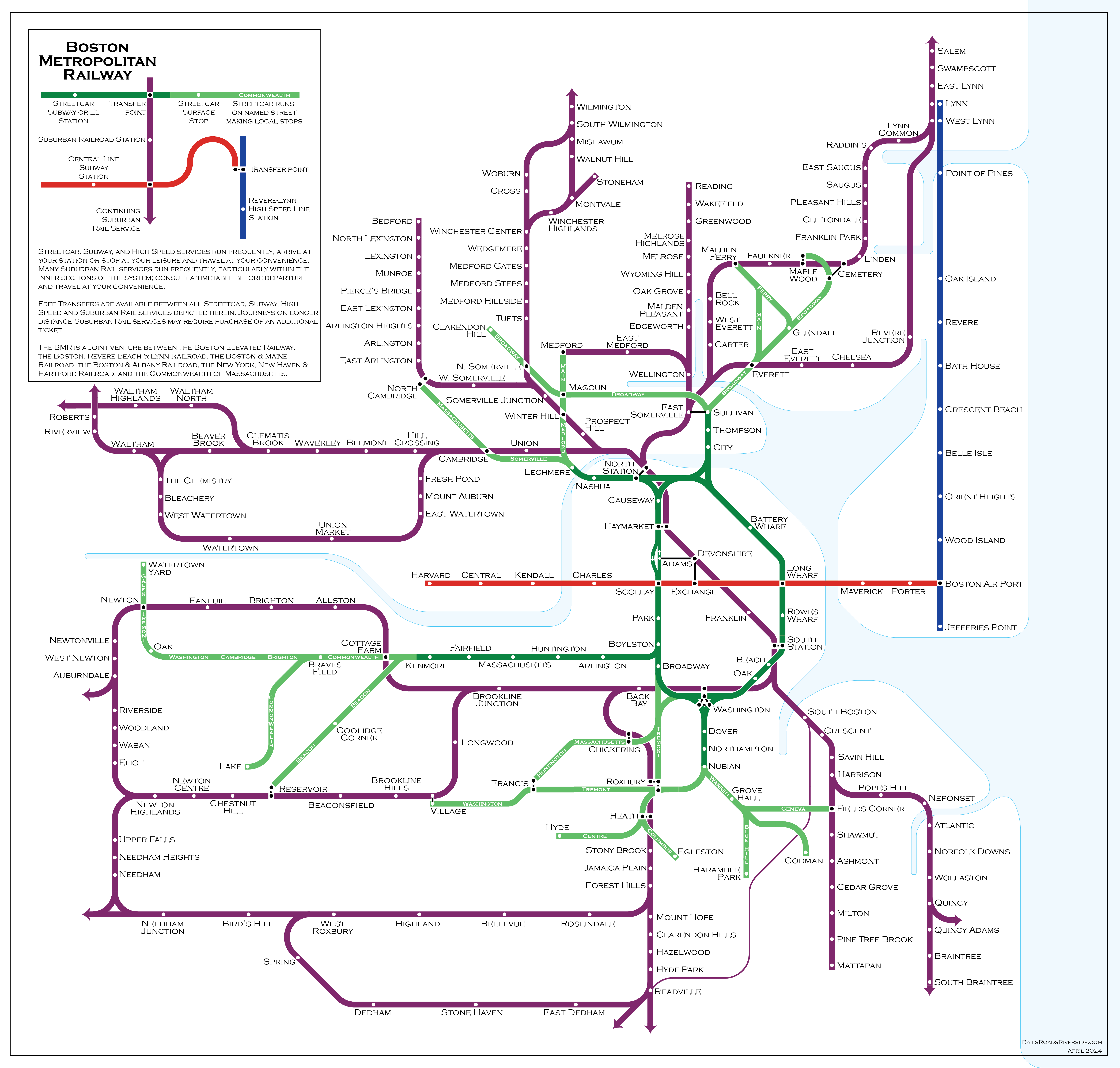
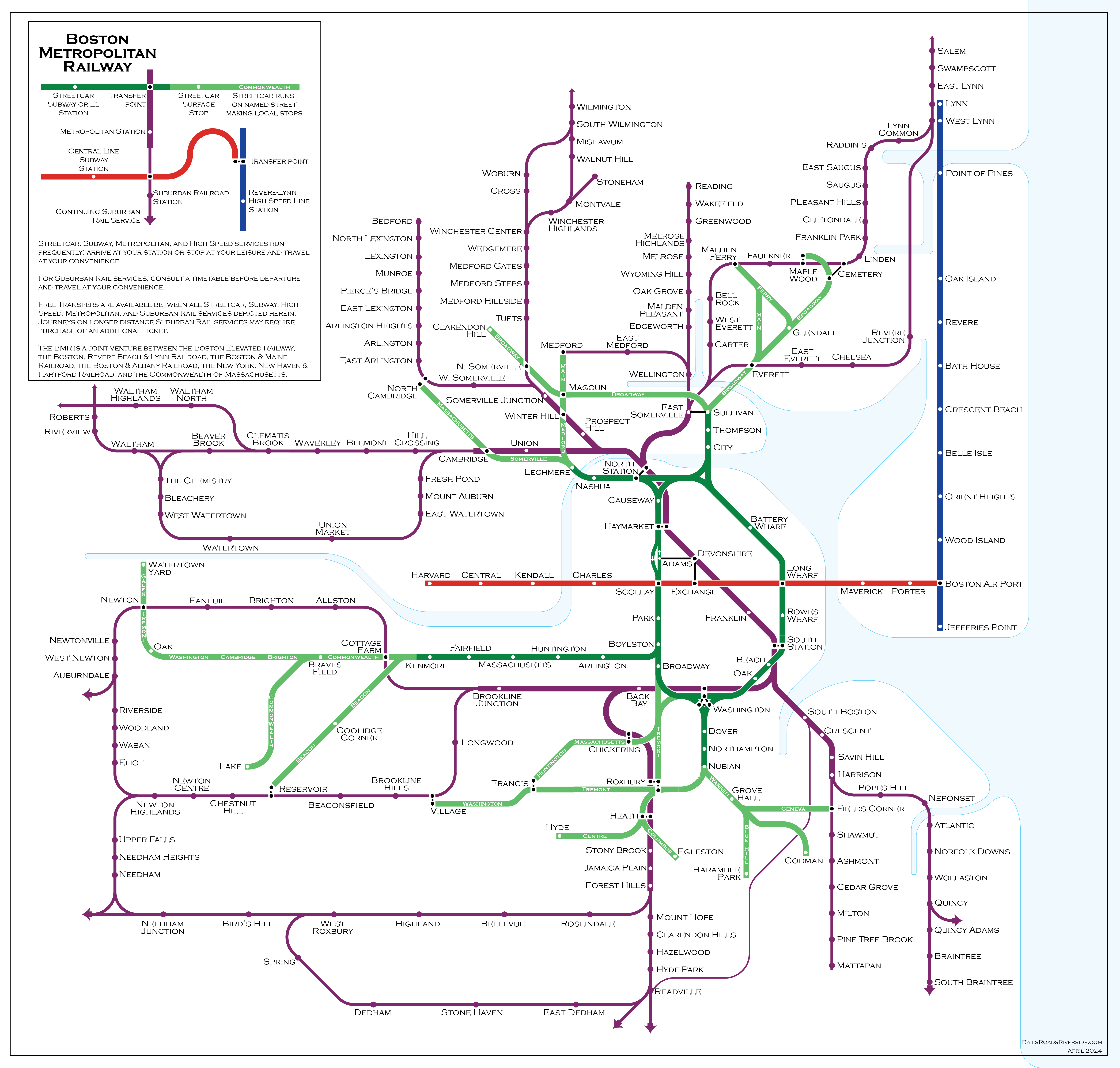
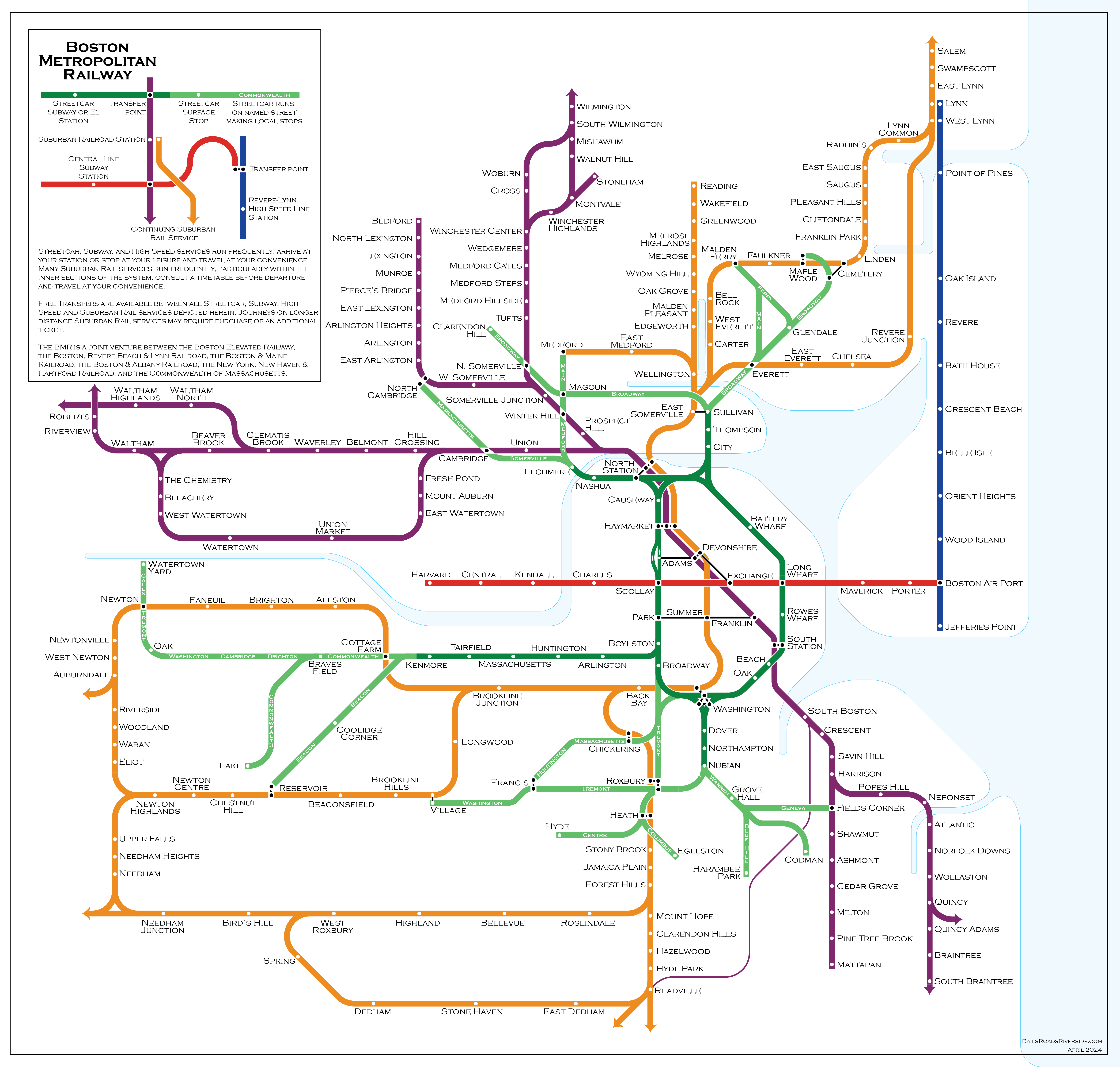
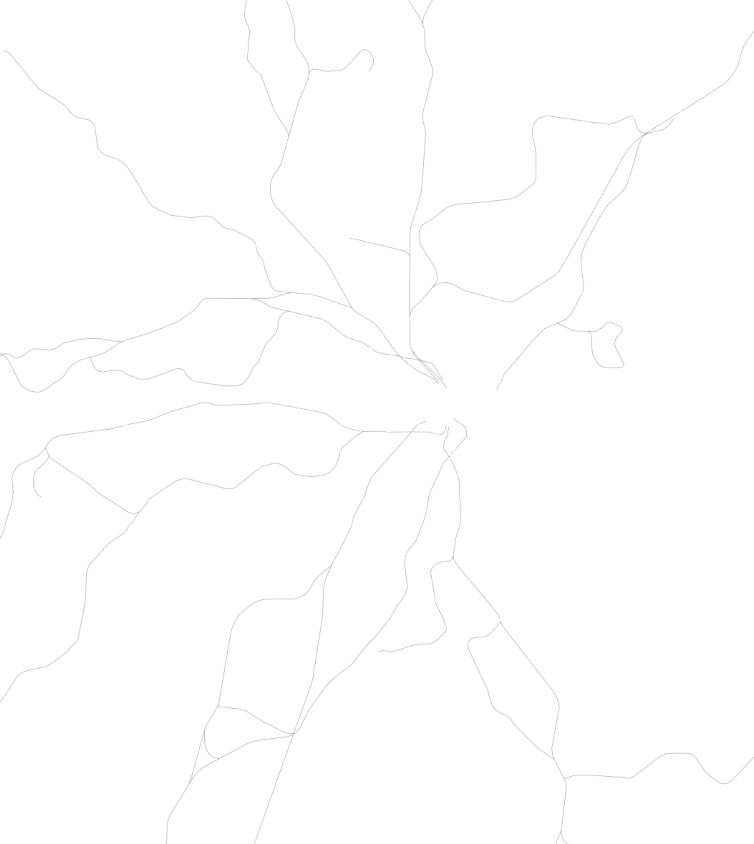
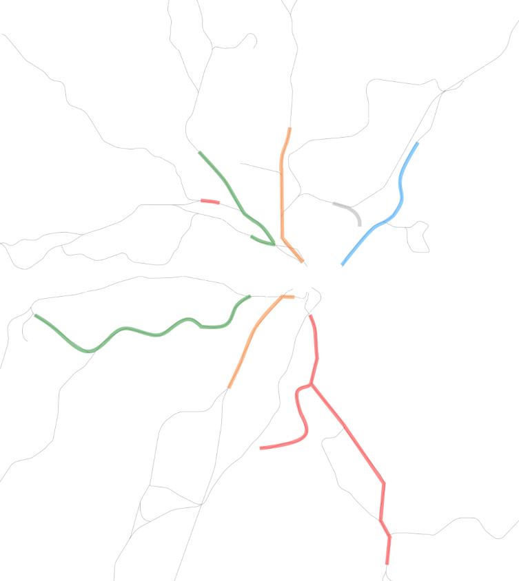
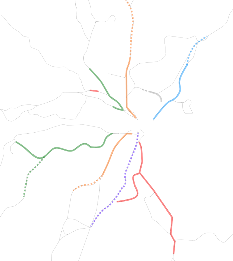
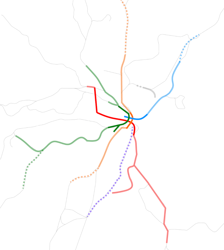
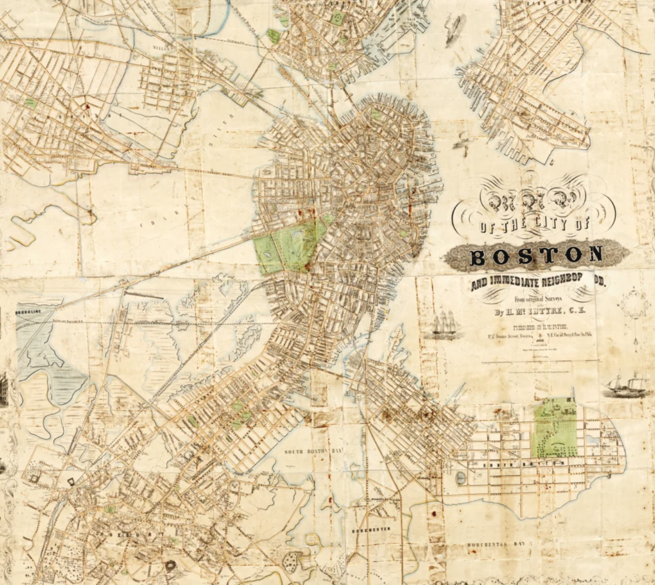
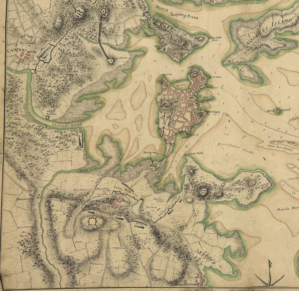
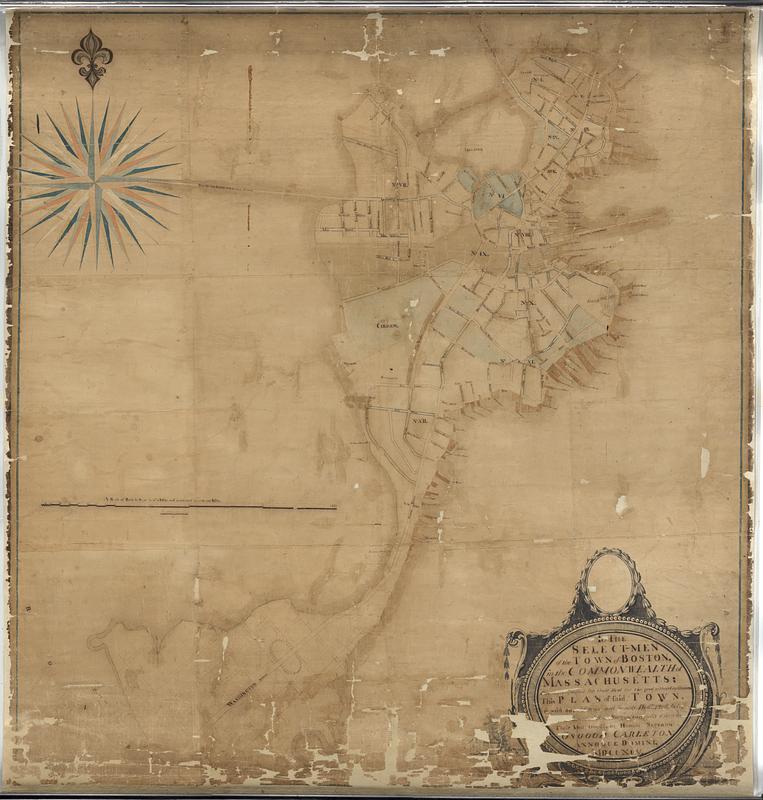
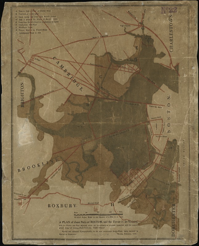
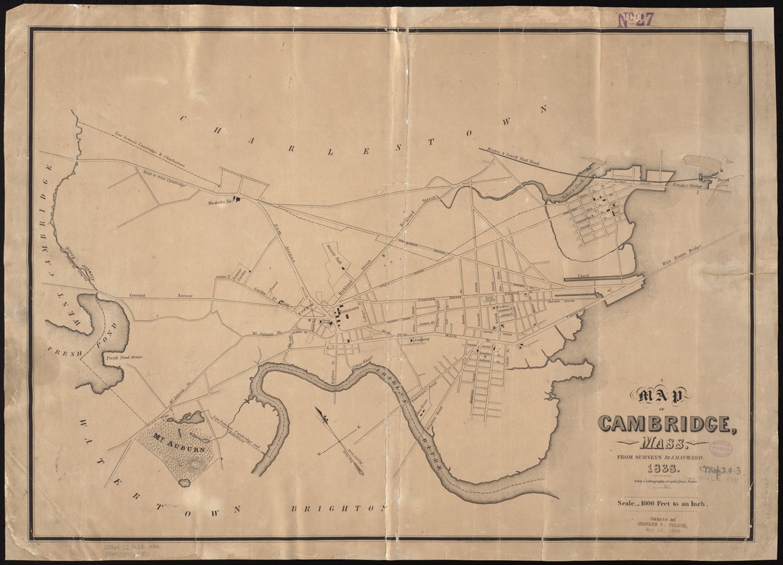
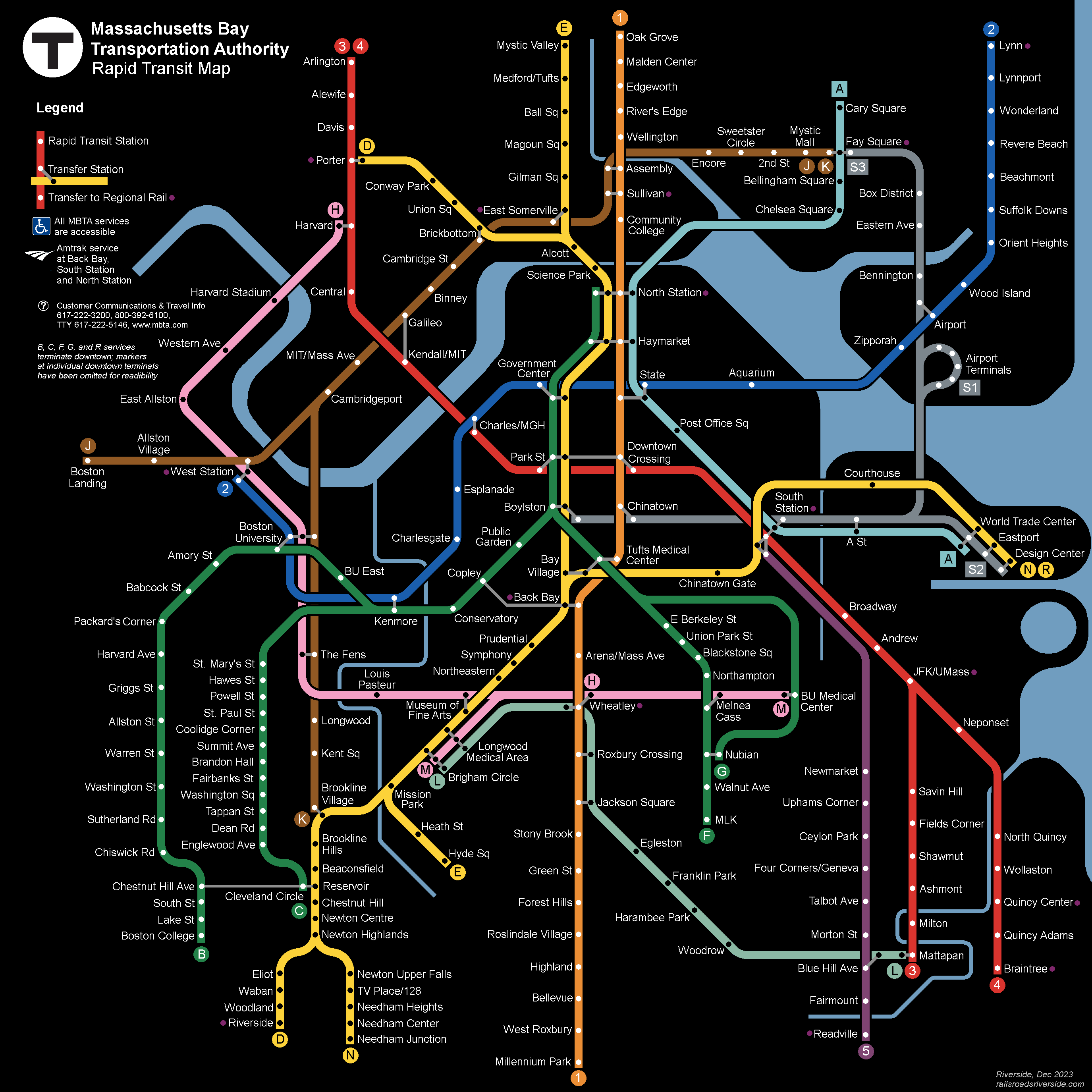
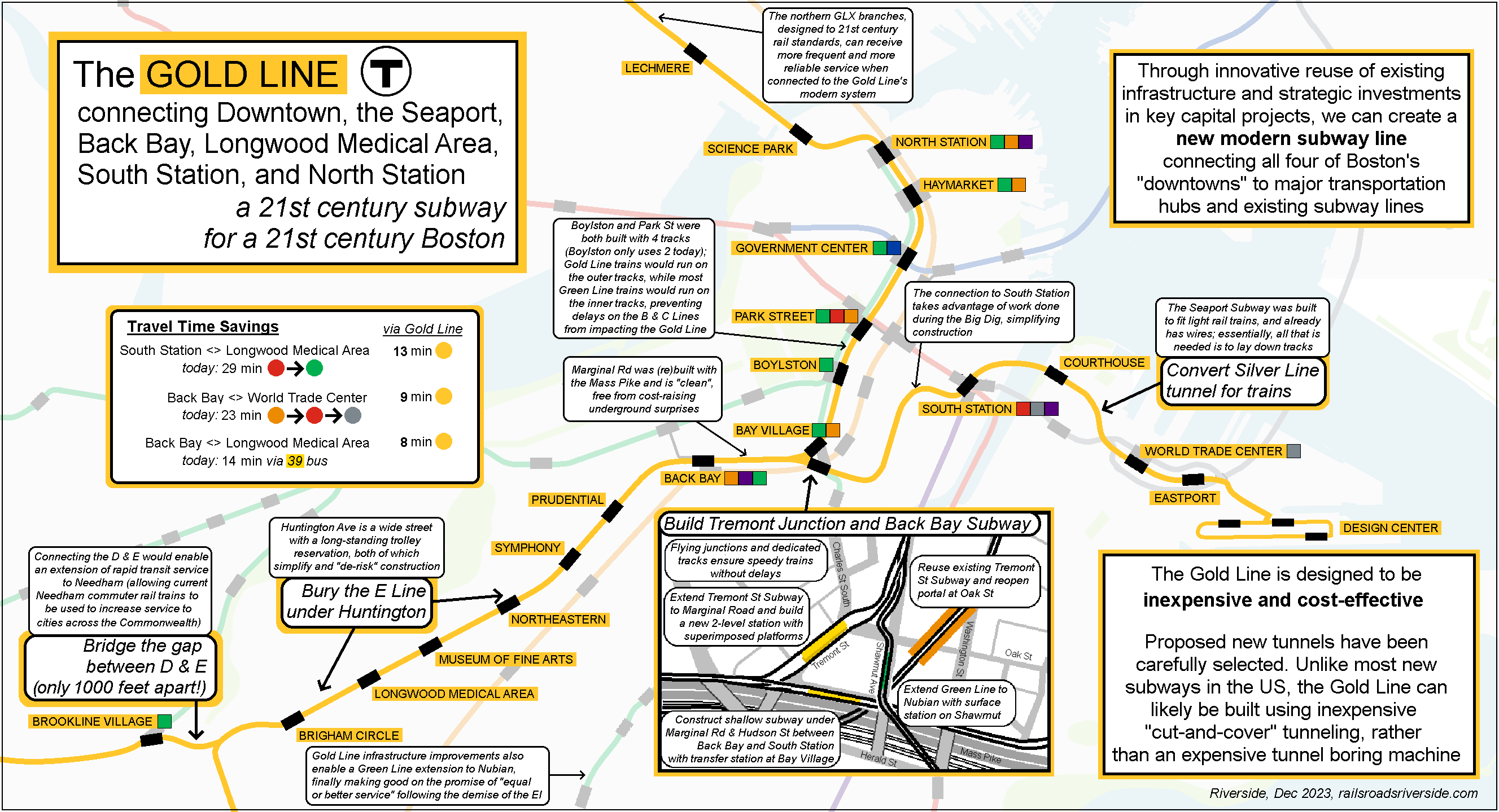
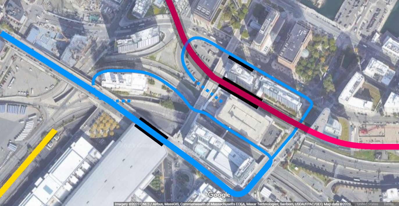
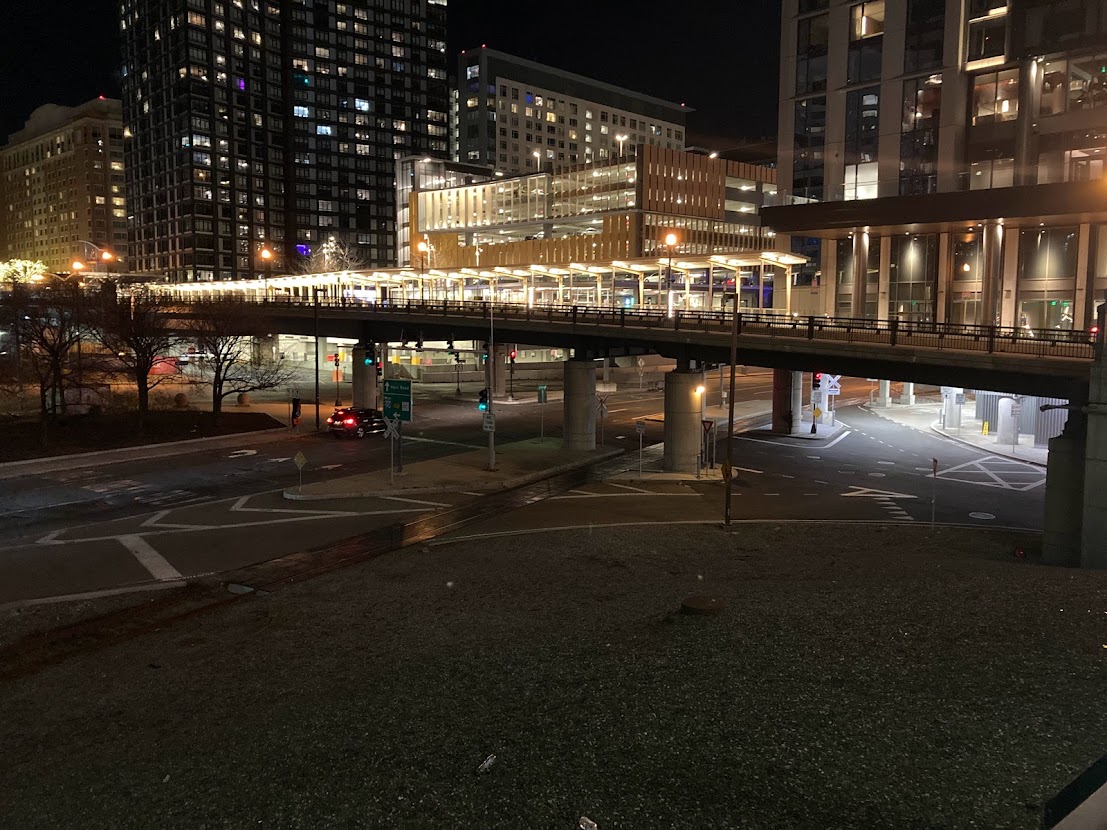
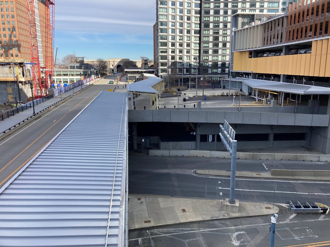
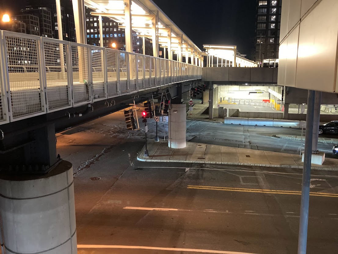
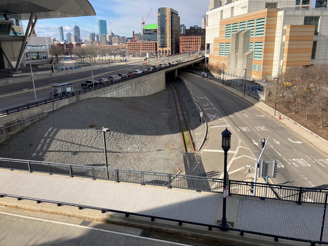
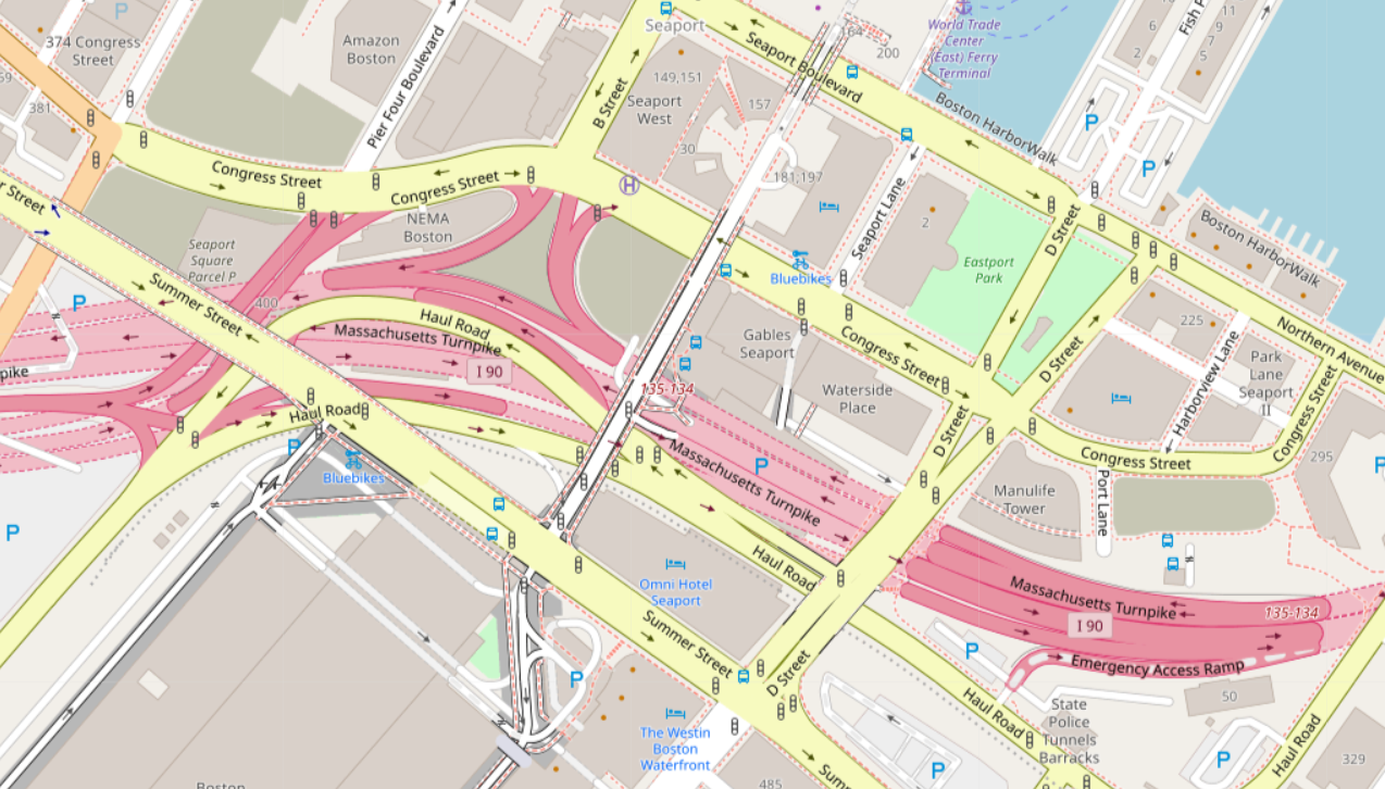

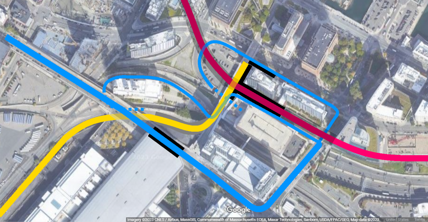
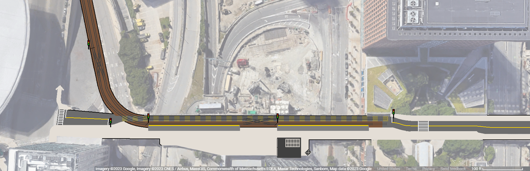
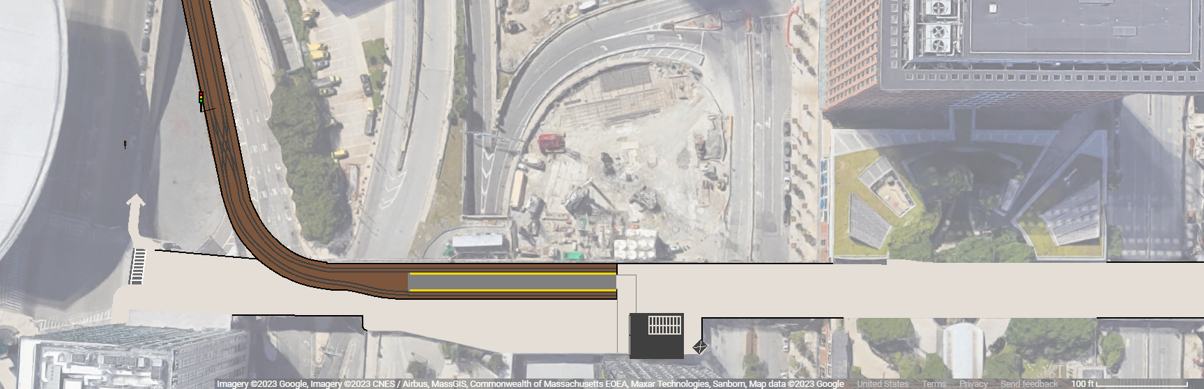
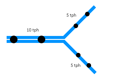
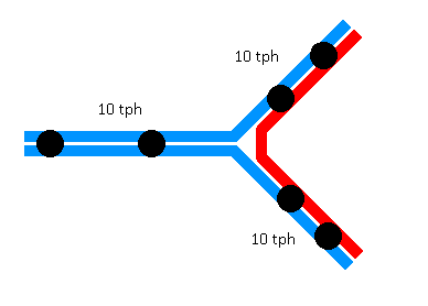
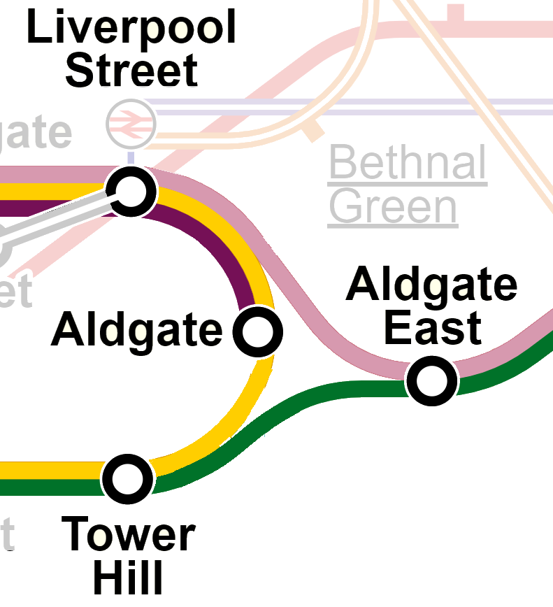
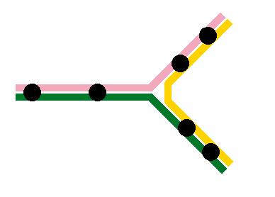
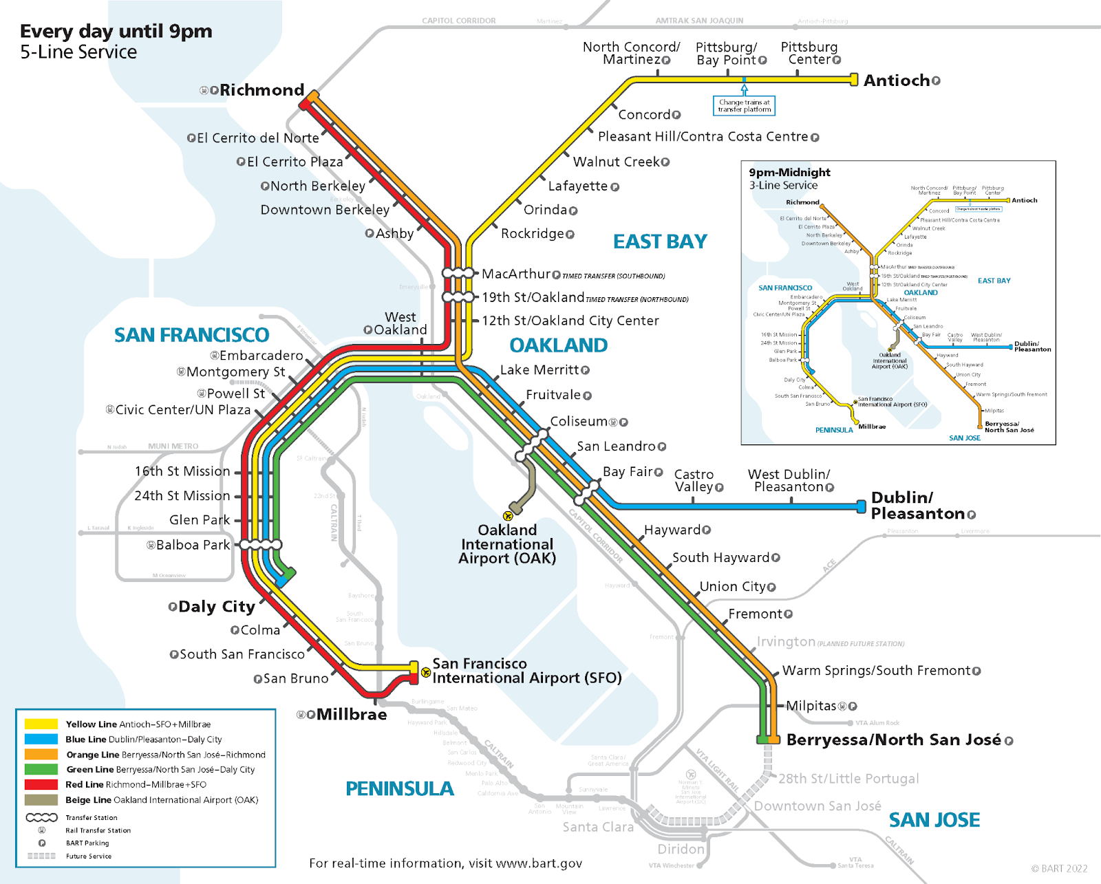
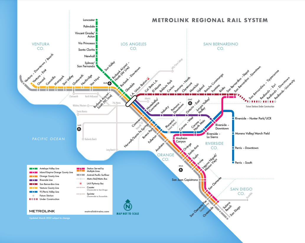
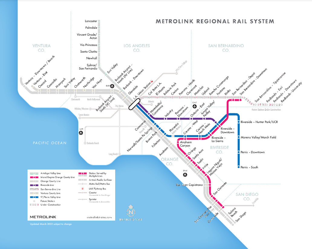
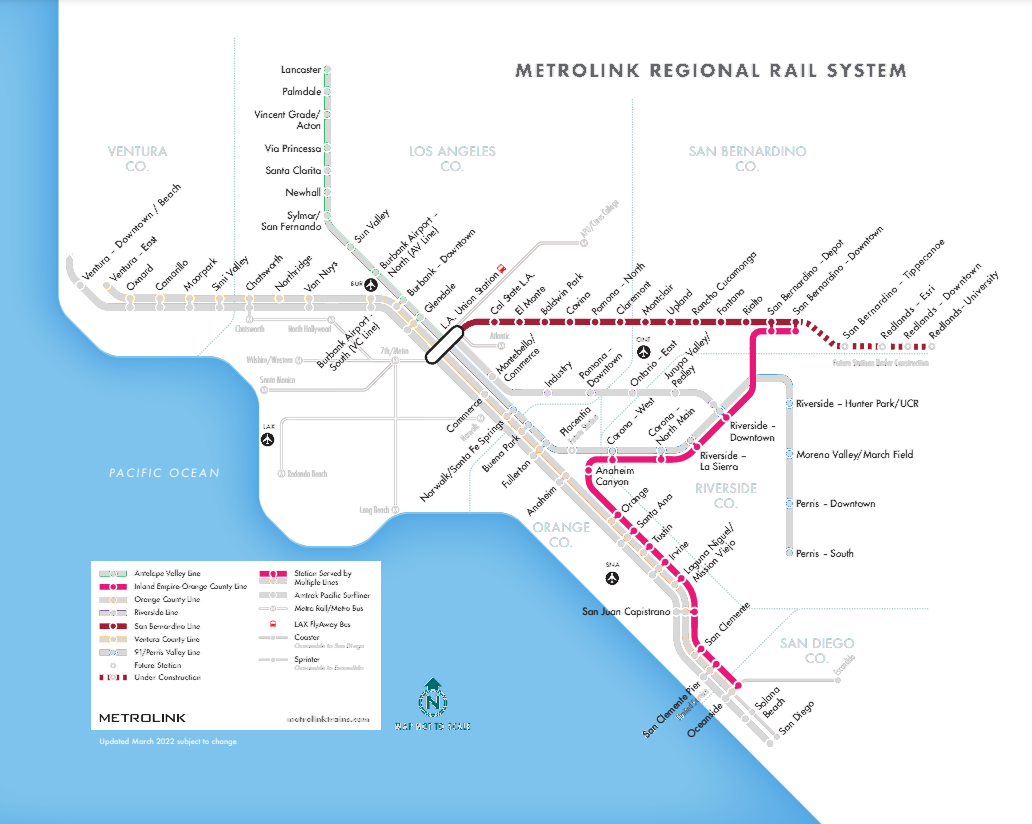

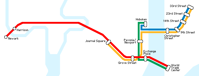
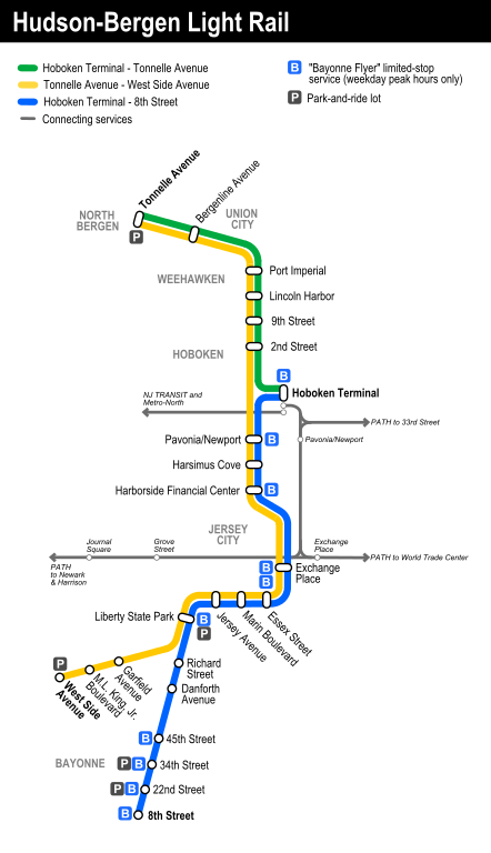

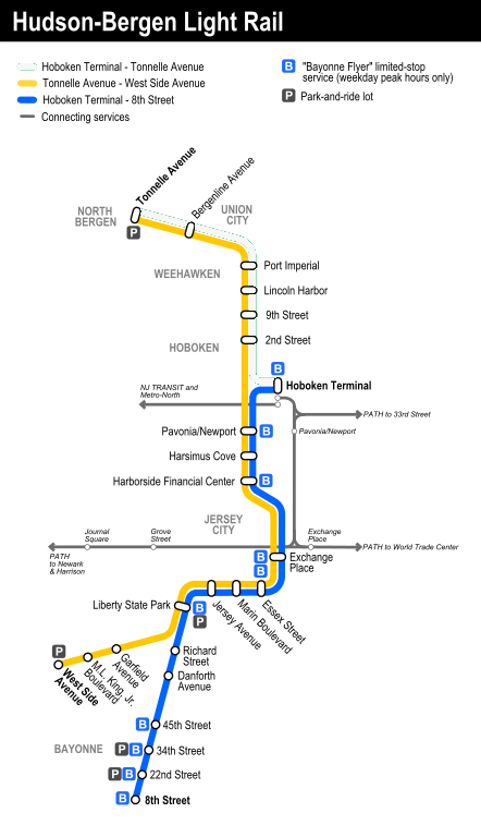

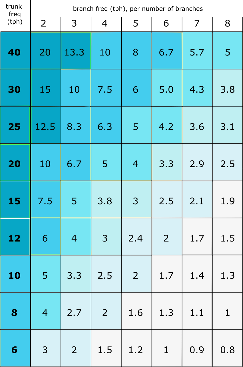
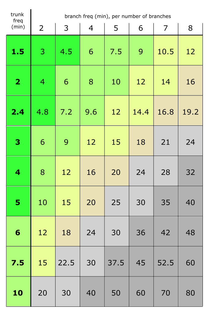
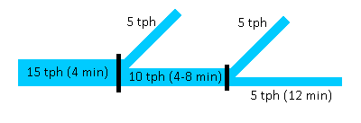
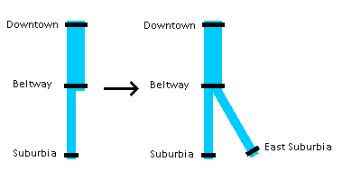
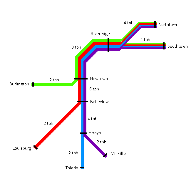
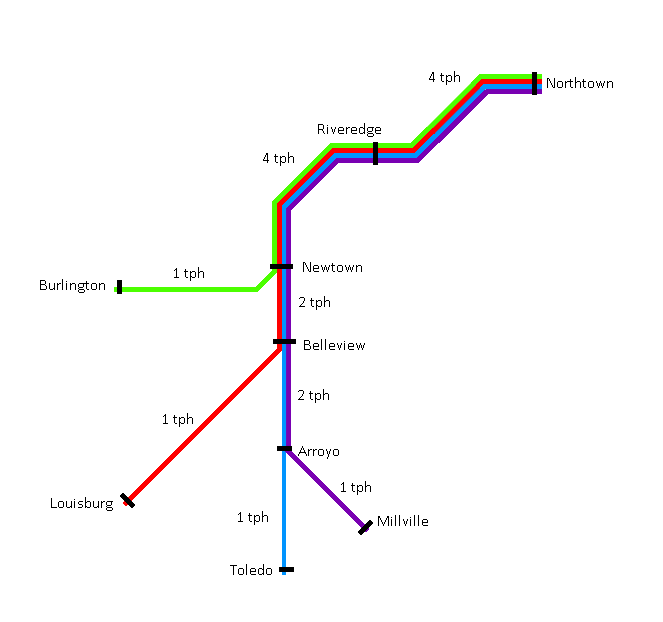
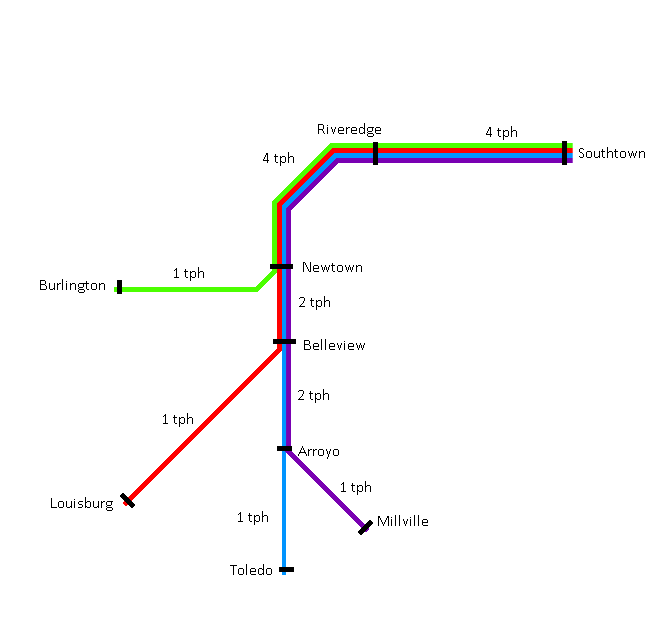

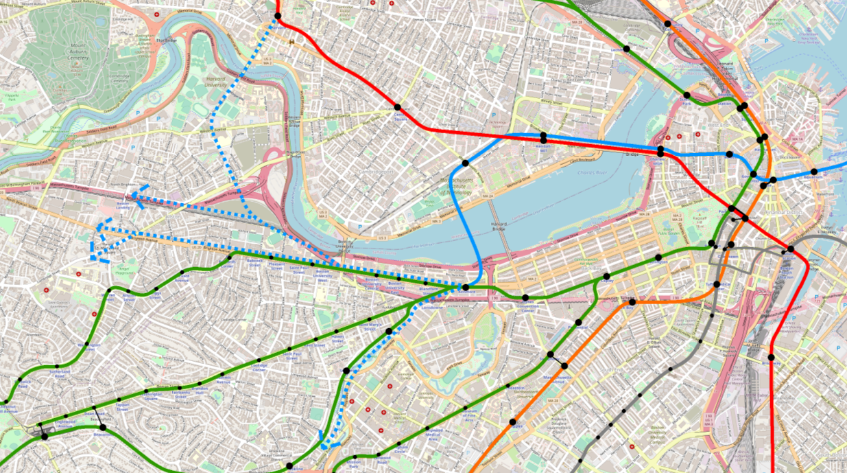
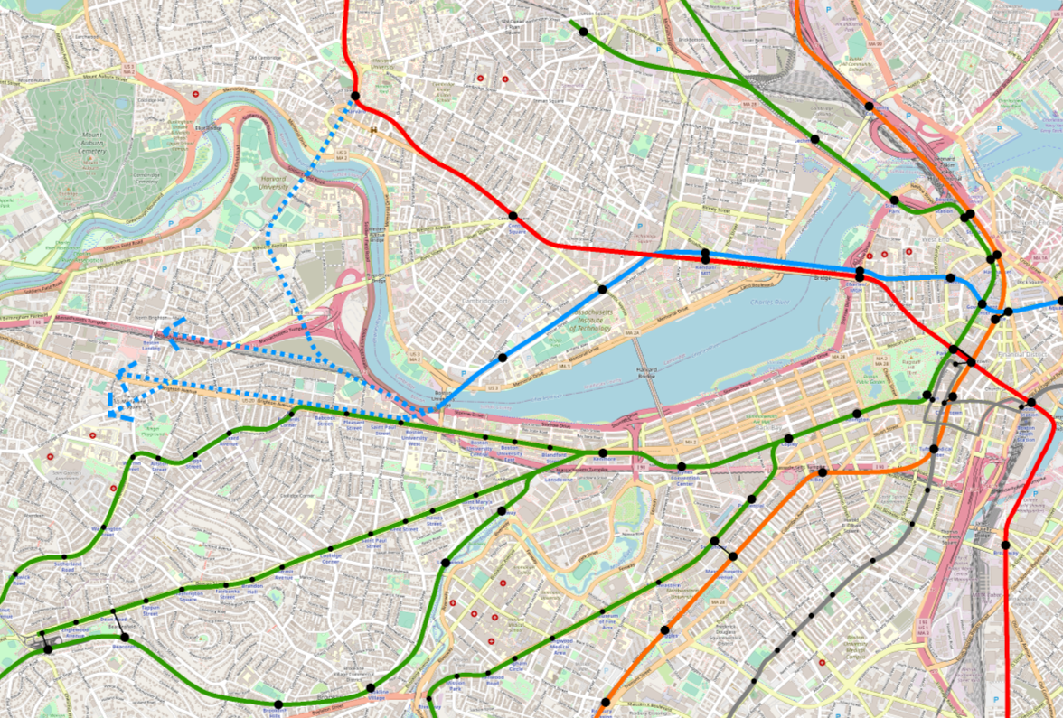
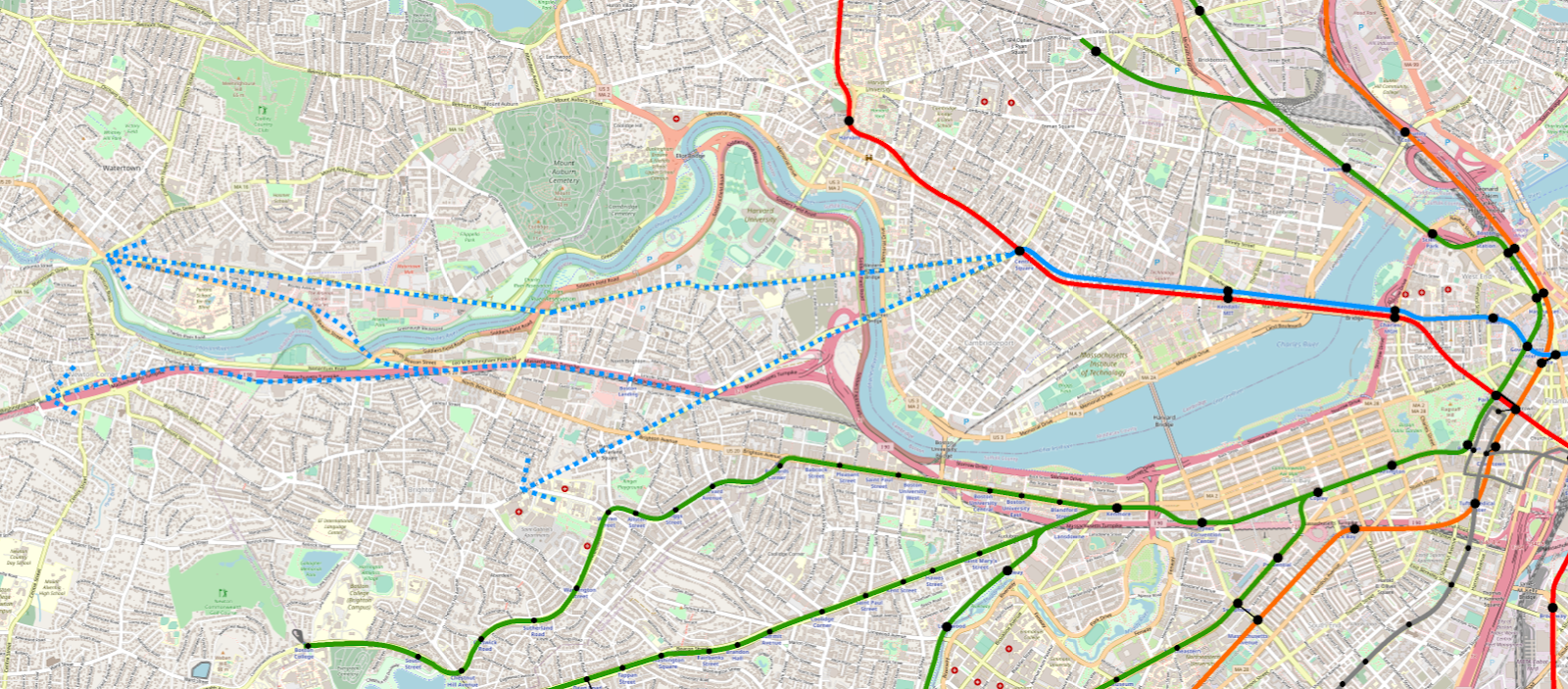
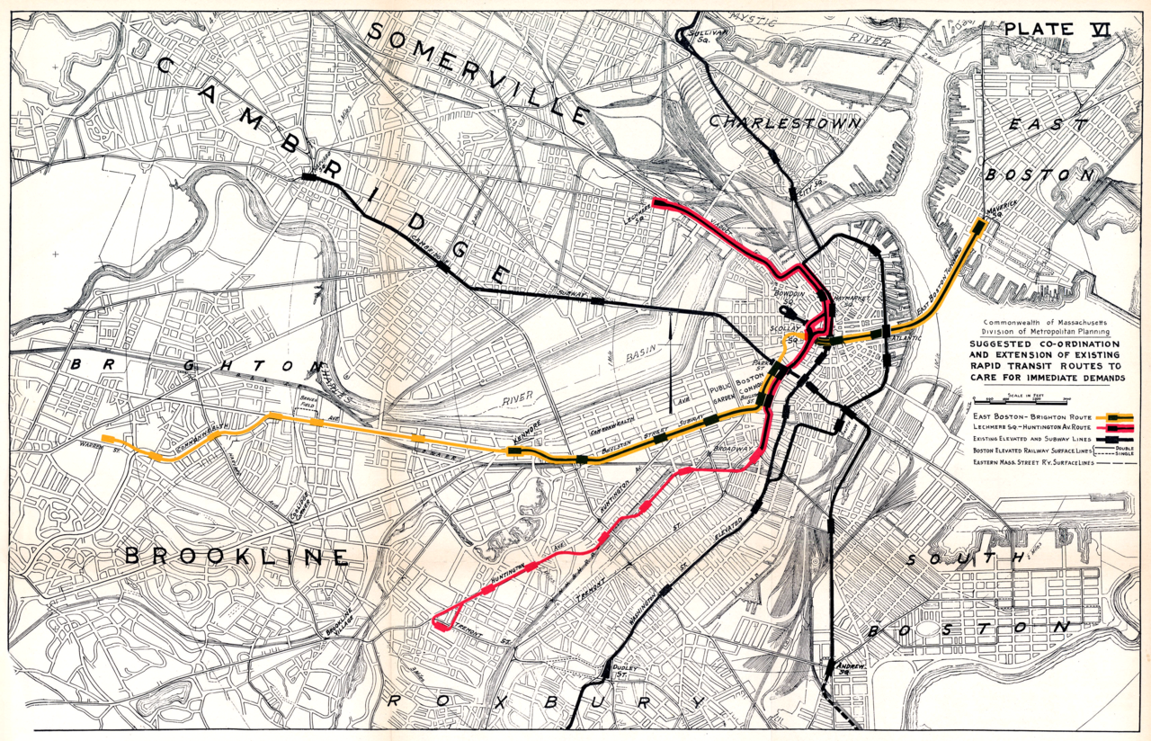
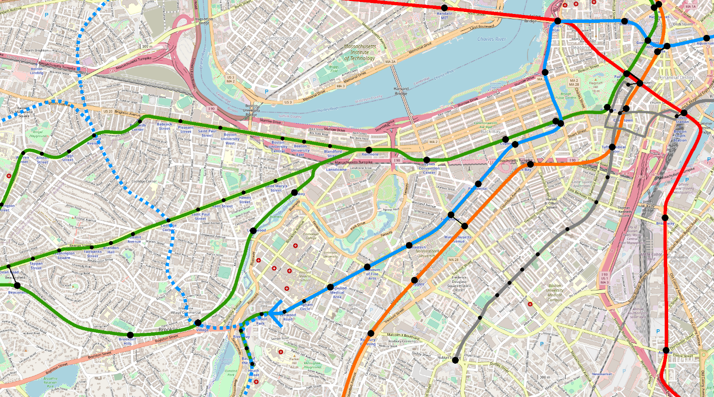
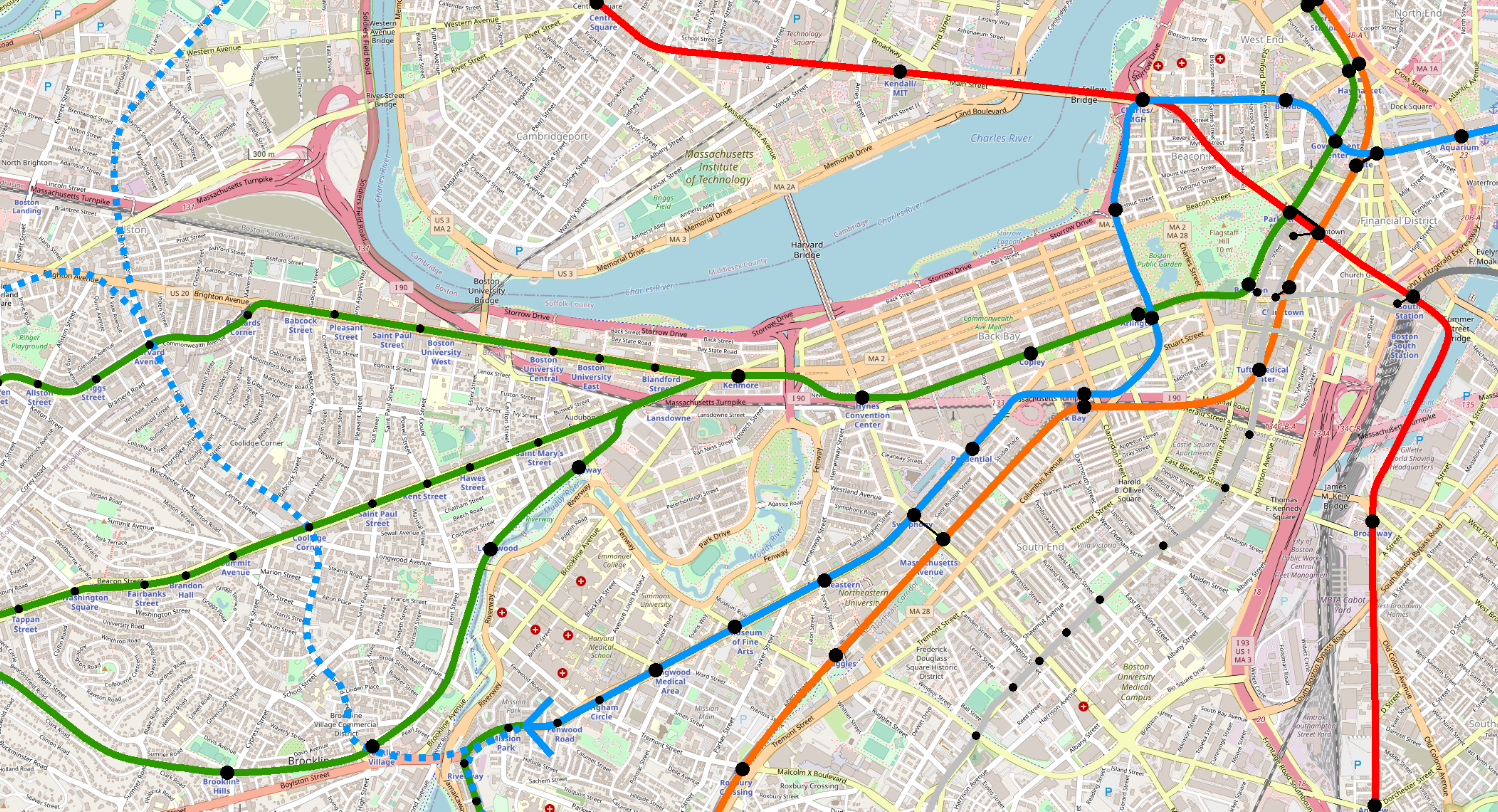
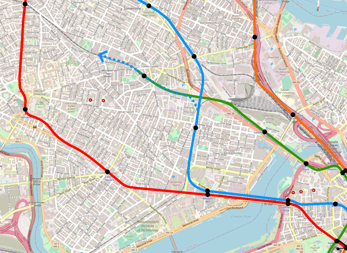
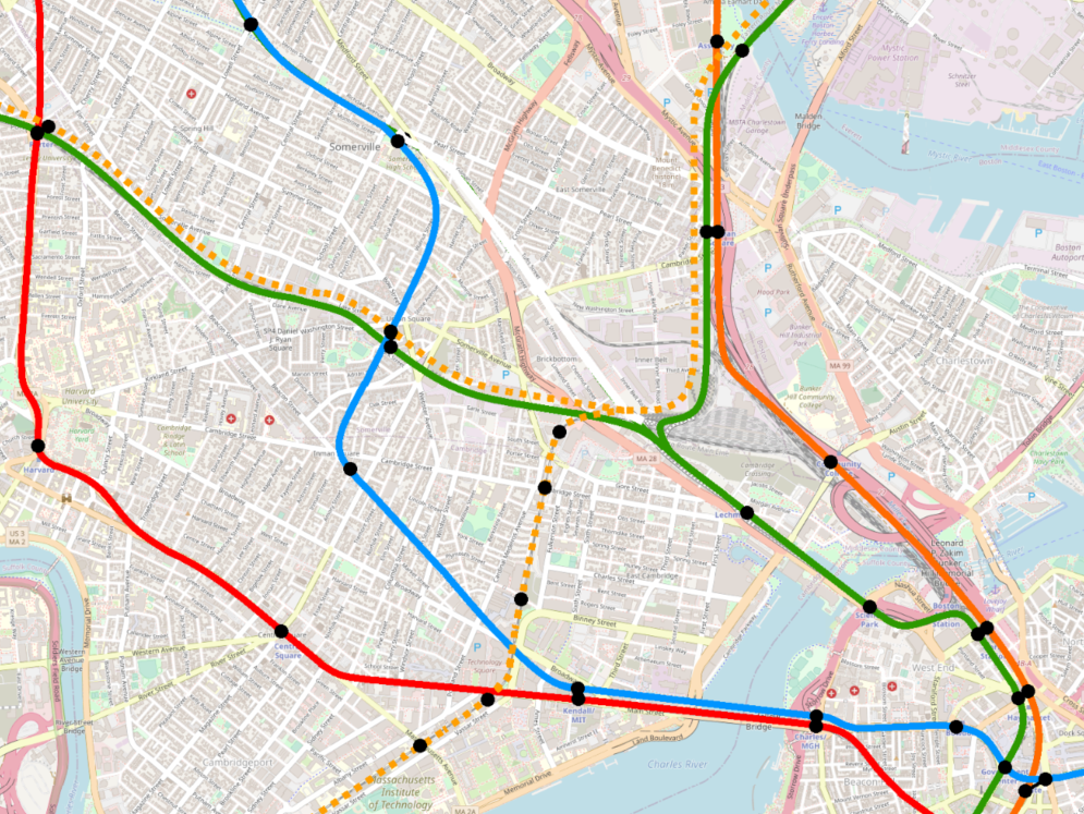
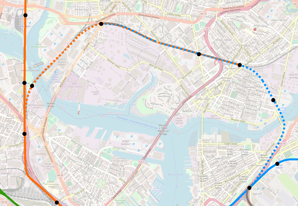