There are many ways to draw crayon maps – many more than could fit in one post. In this post I will talk about the software that I use to create maps for this blog.
Contents
Software
Really we should be starting with something more fundamental like “pen-and-paper” or “the ideas”. But, assuming you’ve got some of the basics in mind, one of the big questions next is the software. (Although, don’t underestimate the effectiveness of a good hand-drawn diagram that is scanned/photographed and uploaded! No need for software if you feel like going old-school.)
It’s worth distinguishing two kinds of goals one can have with transit maps and diagrams. First, one can focus on elegant design solutions (especially for existing systems); TransitMap.net is a great blog that focuses on transit map/diagram design. Second, one can focus on conveying detail, particularly of proposed systems, with less focus on “looking good”. While these two obviously overlap in significant measure (elegant design also usually is particularly good at conveying detail), my focus is usually on the latter more than the former.
Put another way: I don’t worry too much about my diagrams looking pretty. In my case, this is somewhat self-serving, because I don’t have the know-how to make good-looking diagrams at a pro or even semi-pro level. But put more positively: this also means that you don’t need to worry about getting your diagrams to look good either! Don’t let that be a barrier to getting started!
Okay, but actually, what software should I use?
Okay, sorry for getting distracted. The short answer: start with what you have, and then try some of the ones I suggest here.
Microsoft Paint or Paintbrush (for Mac)
I can guarantee you that any designer who happens to read this post will physically grimace at this suggestion, so I do want to be clear that both of these programs are extremely limited; if you are going to use them, keep things simple: straight lines, 45-degree angles, simple text.
That being said, especially when you just want to sketch something out, Paint is a very useful tool, precisely because of its simplicity. With some effort and care, you can indeed use it to make clear, straightforward diagrams.
For example, this is something I threw together in MS Paint just now, illustrating a possible commuter rail network for Rhode Island, with the existing MBTA Commuter Rail line, a new RI Commuter Rail service from Worcester to Westerly, and an extra layer of local trains running between Pawtucket and TF Green:
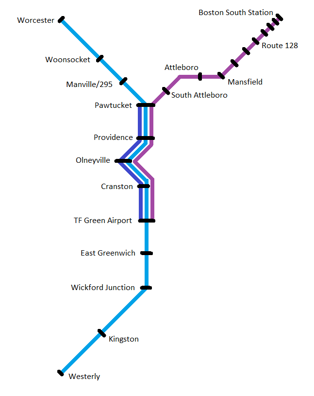
Is it pretty? No, not really. Is it even particularly clean or neat? No – my spacing of station names is inconsistent, the size of the station markers varies, and the bends of the lines are a bit sloppy.
But does it convey the information I needed to? Yes. Station are clearly and legibly marked (yes, I got tired of labeling the MBTA stations), the service patterns are clearly indicated (at least I hope they are clear – can you tell which stops the MBTA skips?), and there are enough nods to geographic fidelity (such as the curve through Providence) to provide context for the viewer.
And while it’s true that a lot of the details are sloppy, the overall design is generally symmetrical and balanced, the stop spacing is mostly even, and the visual is streamlined and simplified – all of which means that even though the design itself is hardly inspired, it’s also not going to be too distractingly bad.
(To editorialize briefly: there is something to be said for transit diagrams and transit proposals which are straightforward enough to visualize using Paint.)
There are several downsides to using Paint, though. As mentioned above, you can get clear diagrams – “with some effort and care”. The time and effort is where you pay the price. It takes a while to do simple things nicely with Paint, and it takes a long time to do complicated things at all.
If you’re just getting started, I highly recommend playing around with Paint a little bit – get a feel for what “looks good” in the kinds of diagrams you’re making, but aim to “level up” once you can.
Metro Map Maker
This website lets you make transit diagrams from scratch, or remix those created by other users. It is very simple to learn, and can be pretty fun to use. That said, I myself don’t use Metro Map Maker, and I think there are a couple of things to bear in mind if you choose to do so.
First, I myself find the interface “fiddly” and difficult to draw things precisely the way I intend (which is my main reason for using a computer rather than sketching something by hand). I think this is visible in some of the maps in the gallery, some of which are quite clean and clear, and others of which struggle a bit. In particular, I have a hard time with the way Metro Map Maker renders Y junctions, where two branches feed into a single trunk; the way Metro Map Maker does it, it’s very easy to mistake those for three-way junctions.
The other thing to be aware of is that Metro Map Maker diagrams sometimes get poo-pooed by folks on aesthetic or “professionalism” grounds. There are some venues where such criticisms are appropriate – I would not, for example, recommend that transit advocates use this site to create visualizations of the services they are advocating for. But, especially if you’re just doing this for fun, I think it’s a perfectly reasonable tool. Just keep in mind who your audience is!
Paint.NET
This is my application of choice these days, and the way I create most of the visualizations on this blog. (Unfortunately it is Windows-only, and I haven’t yet found a Mac equivalent that has the same “sweet spot” of features.) Paint.NET is available on its website and on the Windows store.
For me, Paint.NET has an excellent balance of ease-of-use and useful-features. Eventually I plan to “graduate” into one of the programs listed below, but for now, I’ve gotten pretty darn good with Paint.NET, so I’m sticking with it for now.
One of the biggest reasons to use Paint.NET instead of MS Paint is the ability to use layers. For example, let’s say that I’m drawing up plans for Super High Speed Rail between Boston and New York, but I’m trying to decide between an alignment via Hartford and an alignment via New London. In MS Paint, I’d have to settle for a workaround: draw both using different colors, make a copy of my file after drawing the Boston-Providence and NYC-NH segments and work on two separate diagrams, or just pick one and forget about the other. In Paint.NET, on the other hand, I can just create a new layer for each alternative, and show/hide them depending on which version I want to look at.
You can also use layers to add and hide different levels of detail. For example, in one of my big maps, I have the local bus routes drawn in a layer of their own; I keep it hidden most of the time to reduce clutter, but sometimes show it in order to see things in full context.
I also recommend isolating lines, station markers, and labels each into their own layer. This will make it easier later on to make quick changes en masse, such as changing the color of a line.
Paint.NET still has downsides. It produces raster graphics and not vector graphics, which means things are pixellated when zoomed, and you actually physically cannot create pure curves (although if you are zoomed out reasonably, no one will notice the difference aside from professional designers). And as far as I know, Paint.NET has no concept of “linked objects”, meaning that if you create a fancy icon as a station marker, you’ll have to copy and paste it each time you want to use it, and you’ll have to manually modify every single copy if you want to make changes later. (This is why I just use a simple black circle for my station markers.)
Overall, however, I’ve found Paint.NET to be extremely useful.
Inkscape and Adobe Illustrator
Now we have “graduated” into the top tier: vector graphics. These are the programs used by professionals, and damn can you make things look good with them! Vector graphics allow you to infinitely zoom without pixelation and draw perfect curves without jagged edges.
Adobe Illustrator is part of the Adobe Creative Cloud suite (along with the perhaps more famous Adobe Photoshop program). Inkscape is open-source, and available for free.
Becoming more comfortable with Inkscape is a medium-term goal of mine, but it’s not a tool that I am experienced with at this point. So, for once, I don’t have much to say on the topic. But if you get the opportunity to practice with either of these programs, I highly recommend it!
What about Google Maps?
Good question. You also may have questions about using Paint.NET specifically, or what I’m talking about in the footer of my blog about “basemaps” (and why I have that footer in the first place), or why I’ve been talking more about “diagrams” than about “maps”. All great questions! I hope to get to them in a subsequent post. In the meantime, hopefully I’ve given curious readers enough to get a running start! Have fun crayoning!