
I can never stop fiddling with things, and my redesign of the MBTA’s system diagram is no different. In organizing some files as I finished up the BPL’s Transportation Dreams map contest, I found a few revisions of my redesign that I hadn’t posted here yet. They are also far from perfect, but they’re definitely improvements on my last.
Version 10.0.1 looked somewhat promising:
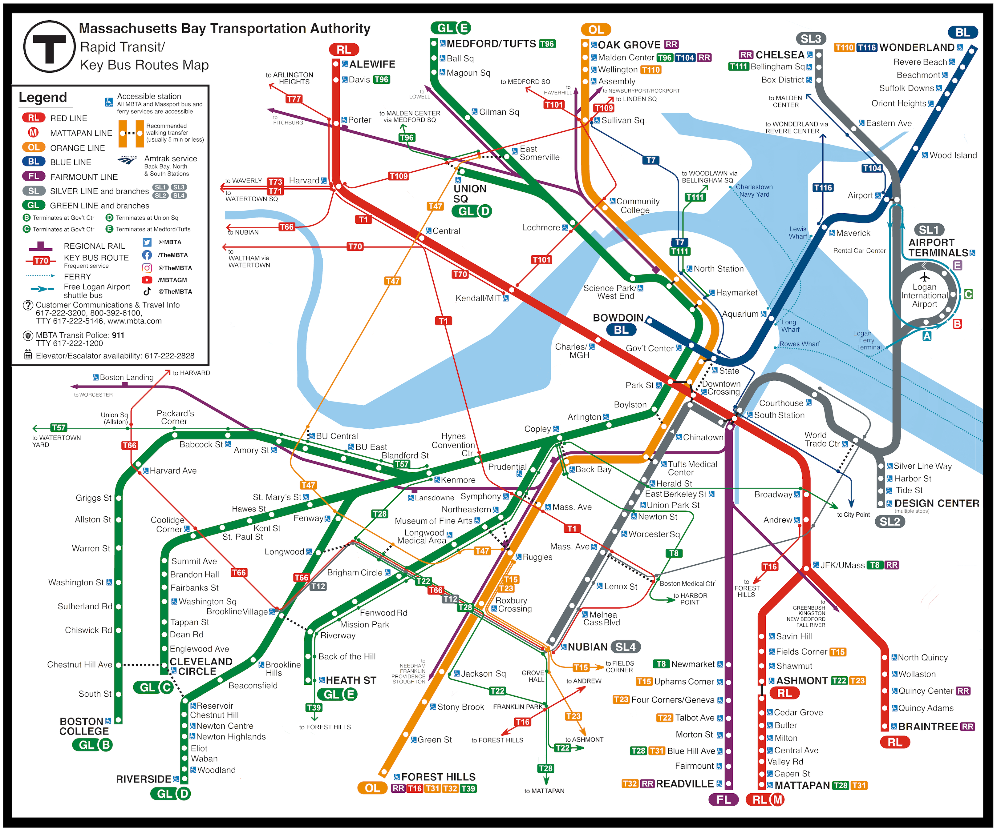
This version adjusted the Red Line branches, which were probably the ugliest part of the last diagram. I also extended out the southern part of the Orange Line to take better advantage of the extra space at the bottom of the diagram.
Definitely still had problems though — lots of crowding at the top, for one.
Version 10.0.3 looked to address that spacing issue at the top:
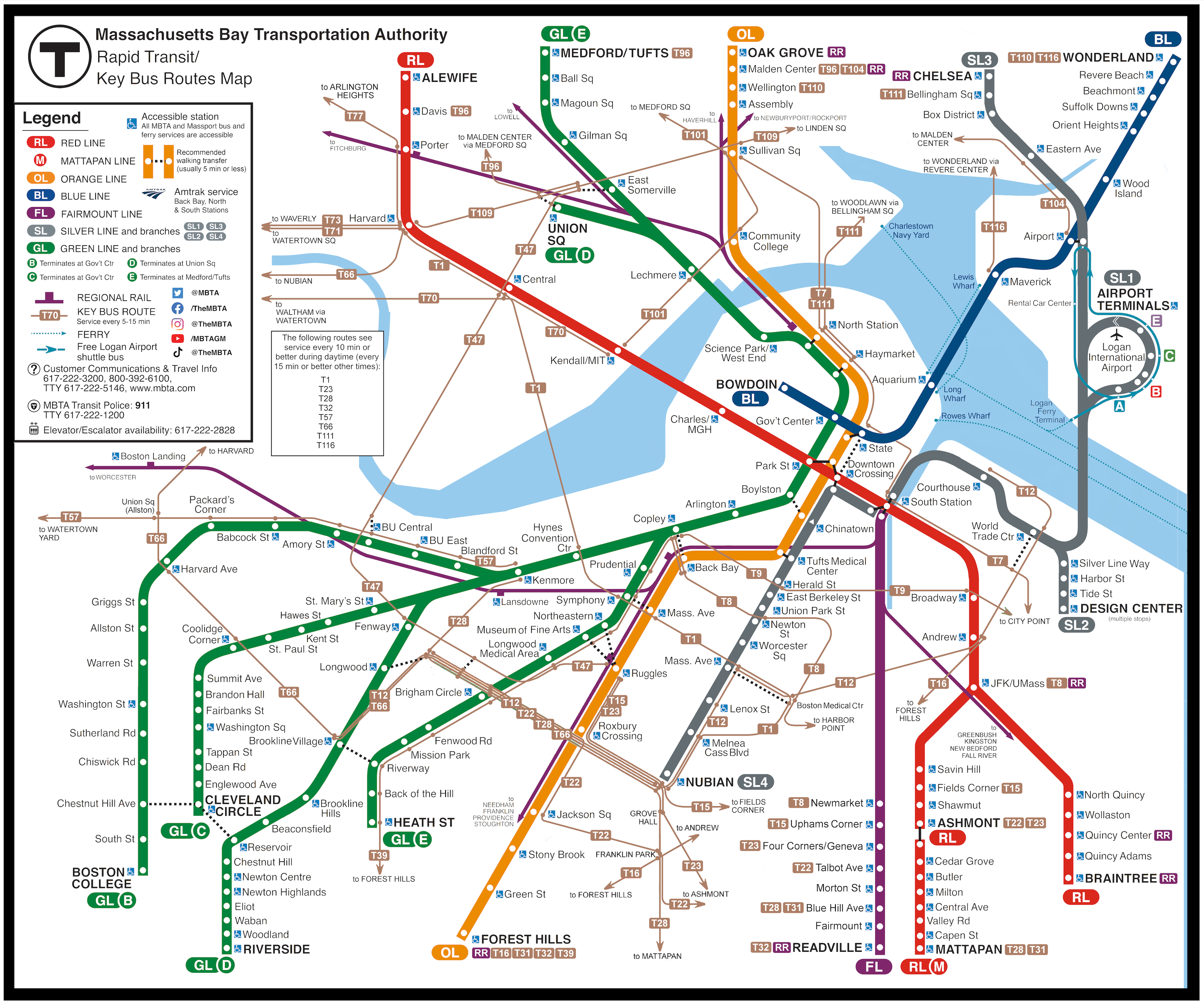
I do feel this is the strongest version yet. The spacing is gentler, as are the curves. I feel that the subway lines on a map should create an image that is distinctive but simple enough to remember, and I think this version comes closest to that.
Having experimented with designs that are exclusively 45° / 90°, exclusively 30°/ 60°/ 90°, and a mix of the two (like this one), I wish I had designed this diagram with fewer angles. The bend at Brookline Village, for example, is distracting; my goal had been to align it with the straightaway of the E Line, but that didn’t really have the visual effect I was hoping for. I think that this concept could work with 45° / 90°, so I might eventually give that a try.
The other big change with this version was getting rid of the coloring of the bus routes. It certainly makes the diagram “quieter”, which ultimately is a good thing. I had originally been very opposed to the idea of uniformly brown bus routes, because I didn’t want it to look like cobwebs criss-crossing all over the map. But I don’t think that turned out to be the outcome, and in fact if anything it seems like the quieter bus routes provide a stronger “grounding” for the map.
I also added a text inset to call out the key bus routes that are gonna have really high frequencies, as I feel that’s a valuable piece of information.
I still would like to try to bring some color back into the bus routes. But for now, that version 10.0.3 seems like a satisfying enough place to leave things.