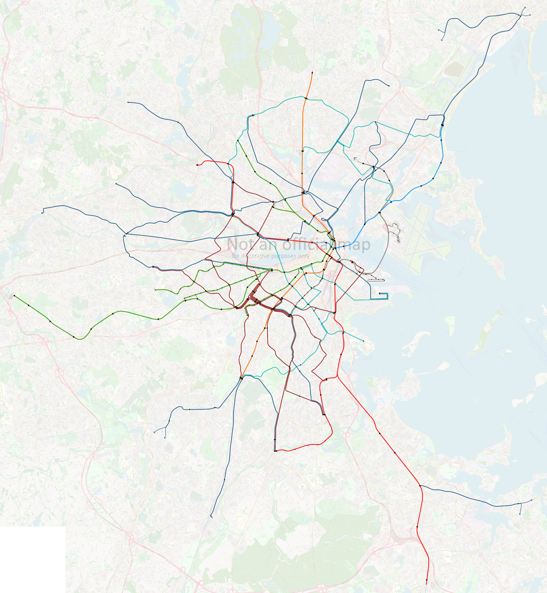
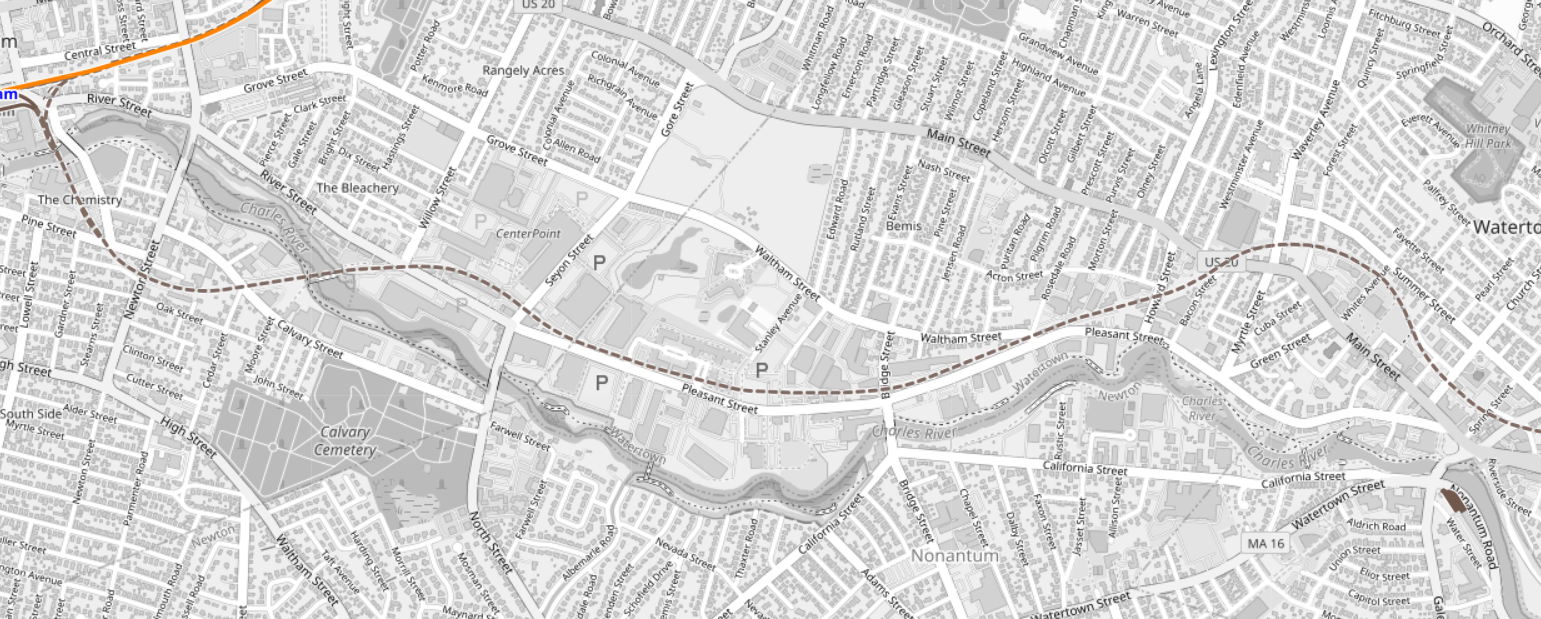
Over the past week, I’ve been iterating on modified versions of the T’s official subway map to illustrate the closures and shuttle services that begin tonight and will continue for 30 days. This map will likely continue to evolve, and I will continue to post the latest revision here. As always, please note that this is not an official map — always refer to the MBTA’s website and to the City of Boston’s website for up-to-date information.
Notes for transit and design nerds
This exercise started relatively simple: show the Orange Line and northern Green Line in some alternate manner to indicate the bustituted segments. This was relatively straightforward: I borrowed design language from the Arborway bustitution in the late ’80s, with a colored outline, white fill, and colored circles for the stops.
On the further advice of someone with better aesthetic sense than I, I shifted the white fill to a lightly colored fill, to better differentiate the lines, and avoid the perception of a total absence of service. The light fill seemed to strike a good balance between maintaining the line’s identity, showing the continued existence of service, and also indicating a significant difference in service.
But, as happens with many projects, I kept on thinking of, “Oh, just one more thing I can add!”
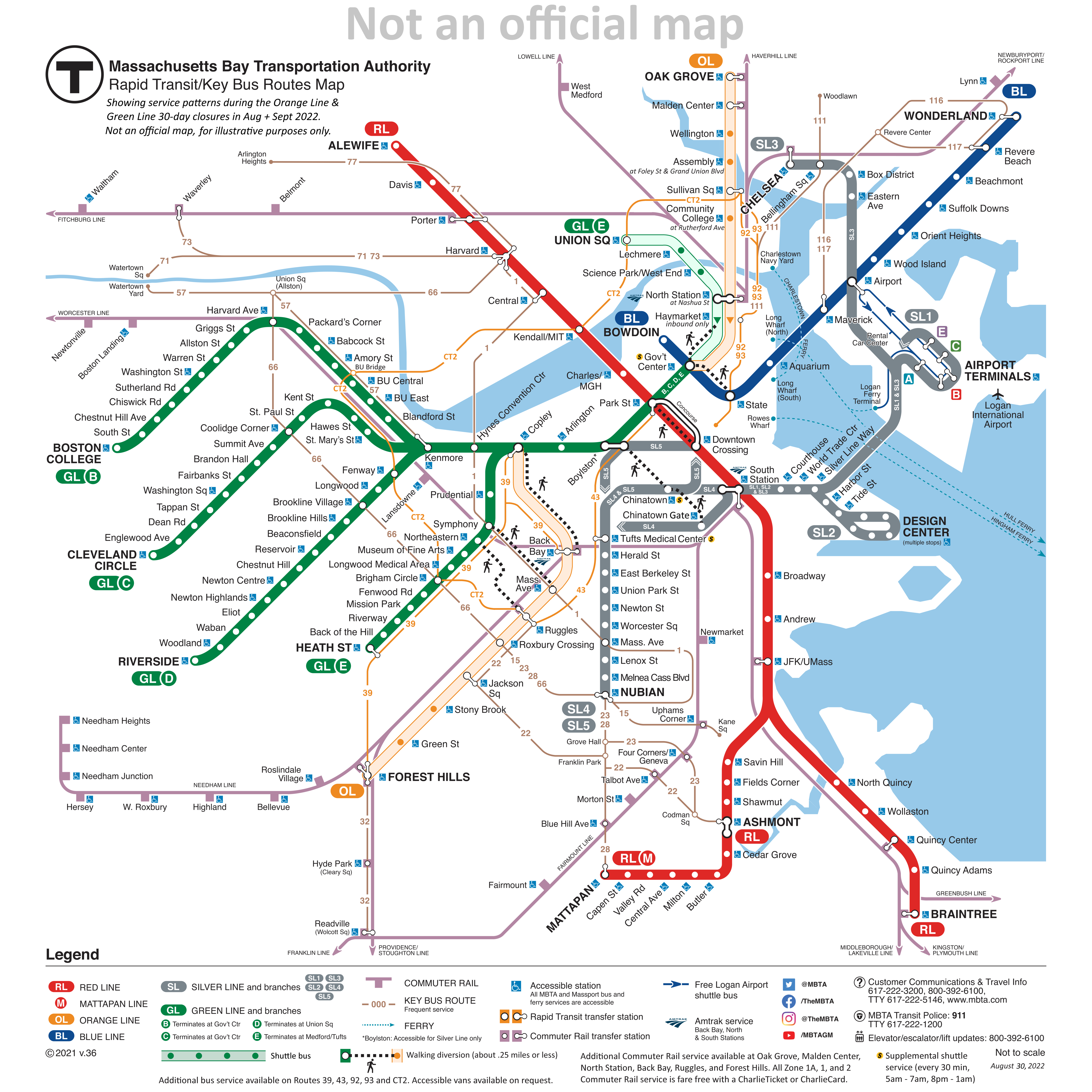
Which brings us to the current design, which pushes the original map’s information design to the limits. I wanted to show:
The bustituted segments
The un-bustituted segments
Text notes on significantly relocated shuttle stops
The one-way service at Haymarket
The early-morning/late-night shuttle to Chinatown and Tufts Medical
The bus routes the T suggests as alternatives to the Orange Line (39, 43, 92, 93, CT2)
The suggested walking transfers between Orange Line and Green Line stations
That is a lot of information to cram onto a diagram that was originally designed to be rather sparse. The current official subway map is an evolution of a design from the early 2000s that primarily showed the rapid transit routes, with commuter rail and ferries being shown secondarily, and limited-access highways being shown tertiarily. In the late 2000s, the key bus routes were added, and a subsequent redesign shifted some parts of the map around while maintaining the same visual language overall.
Evaluating my attempts
Was I successful? Ehn.
I was pleasantly surprised when an earlier version of this map gained a small amount of traction of Twitter, so it’s nice to know that at least some people found it useful. But at a certain point, I fear the level of detail hinders rather than helps. Part of the brilliance of Cambridge Seven Associates’ original “spider map” design was in its simplicity; even if you didn’t memorize the whole thing, the visual concept was highly memorable: four lines, crossing each other in a square and radiating out. That basic schema was easy to recognize and recall, and created a foundation to understand the rest of the system, even if it wasn’t put into one single map.
The eventual addition of commuter rail lines, key bus routes, and now all of the additional information I’ve added here is all very reasonable, especially when done incrementally. But I find myself questioning the ultimate usefulness of the diagram I’ve created. Is it really useful enough for journey-planning? Or is it too confusing to parse?
Simple maps and specific signage
Ultimately, I’ve come to believe that clear and specific wayfinding signage in and around stations is much more important than a detailed system diagram, both under ordinary and extraordinary circumstances such as the Orange Line Closure. (This despite my own love for detailed system diagrams.) In that way, perhaps my earlier, simpler diagrams were more effective.
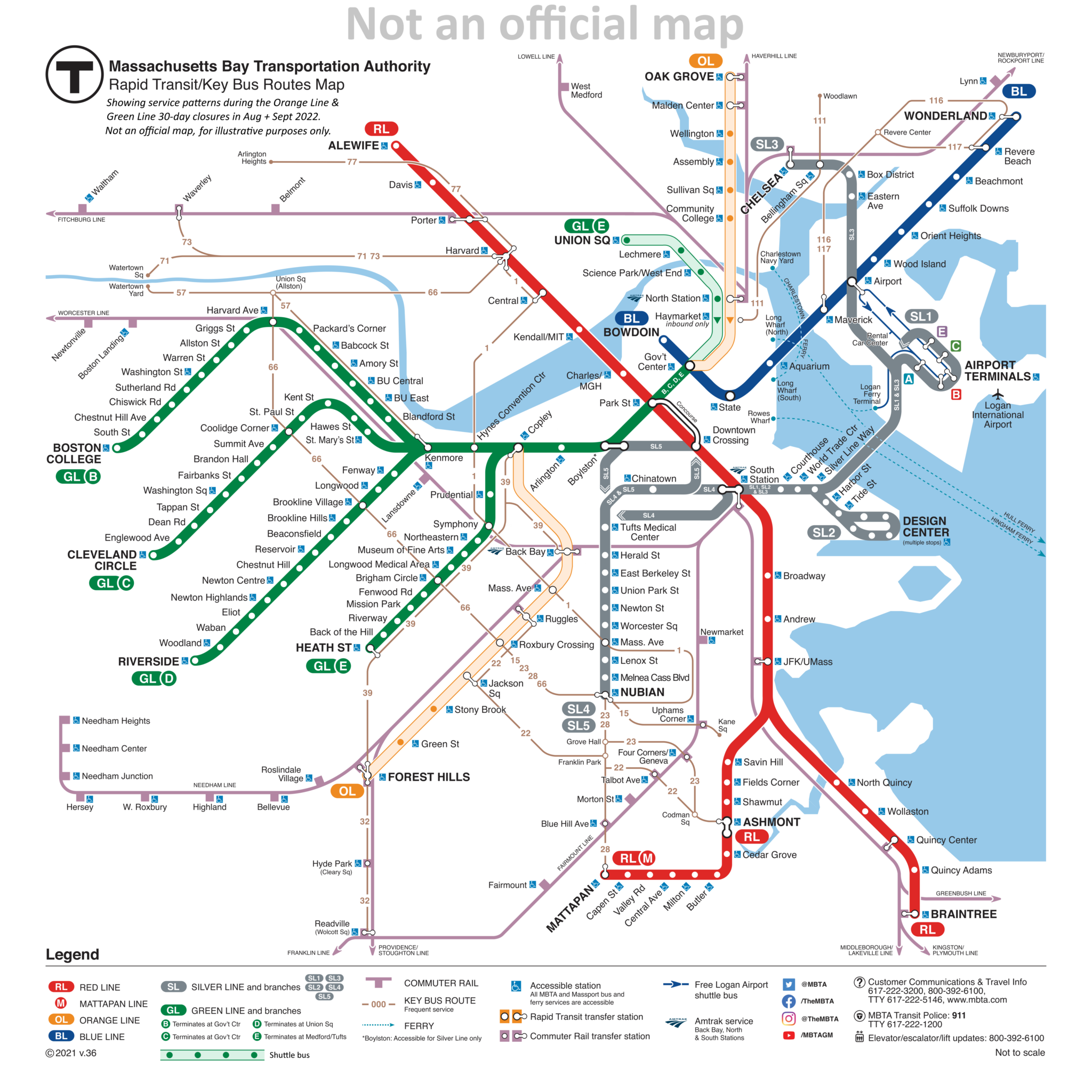
Shuttle routes only
In this simplest version, the shuttle routes are shown and nothing else:
The advantage of this design is how minimally it alters the original, and (hopefully) how starkly clear the changes are: the most important thing is that the Orange Line and northern Green Line are different and need to be planned around. The question all of this hinges on: can the diagram provide enough information to adequately re-plan the journey? And that’s the part I don’t know.
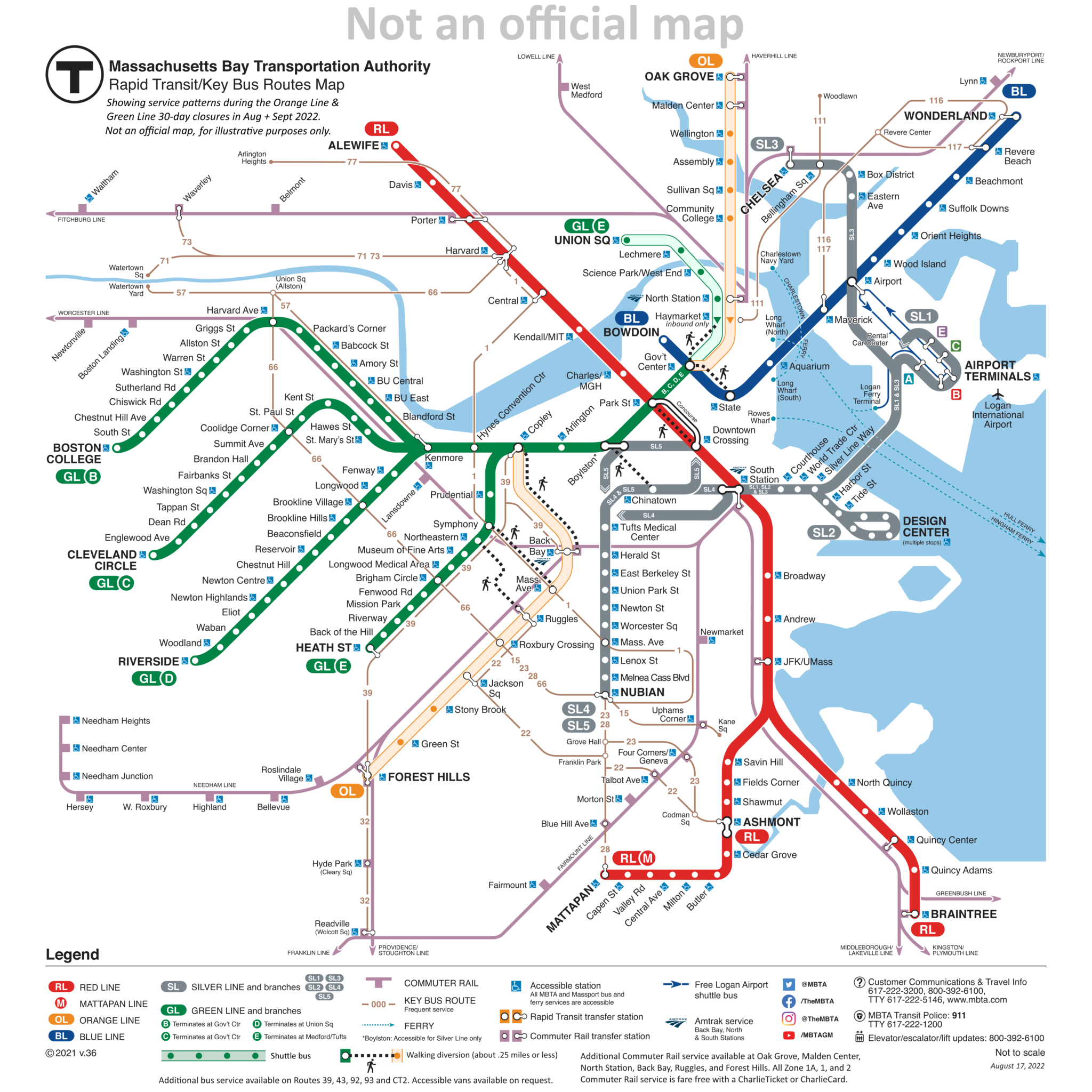
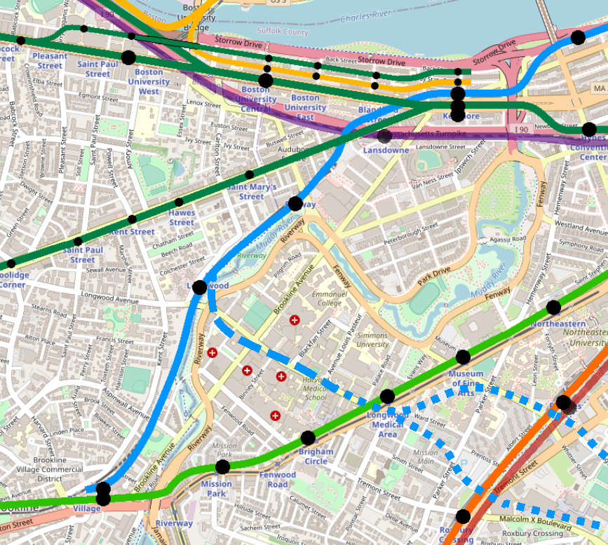
Walking transfers
The second-simplest iteration added the walking transfers:
Including the walking transfers worked better than I expected. Quite frankly, I’d like to see these added to the official map (though hopefully a little more elegantly than I’ve done here). There are a lot of walking transfers that ought to be indicated on the system diagram, such as the ones I’ve included here, but also additionally:
State – Downtown Crossing
Government Center – Park
Riverway – Brookline Village
Reservoir – Cleveland Circle – Chestnut Hill Ave
Kenmore – Lansdowne
These transfers would not be suitable for everyone — and it should be noted that they are not free transfers under the current model — but if you are able-bodied and have a monthly pass that doesn’t charge per ride, these transfers are useful, speedy, and potentially can relieve congestion on key sections of the network.
Adding these transfers to the map is a good idea in general, but does it help in the case of the Orange Line & Green Line Closures? Again, I’m not quite sure. In most of these cases, I would guess that regular commuters are pretty familiar with the areas in question, and likely are well-aware that, for example, State and Gov’t Center are practically a stone’s throw apart. And if you aren’t a regular commuter… well, the pretty clear (and dire) direction from both the City and the T has been, “Please, stay away.”
Concluding Thoughts
Working on this diagram has been fun. It also has been nice to see positive response from numerous folks on Twitter. (Shout out to Jeremy Siegel at WGBH for sharing it with his followers!) And at least some of those positive responses have made comments to the effect of, “This is easier to understand than the materials the T has put out.” A few comments on Twitter aren’t necessarily a representative sample; however, the negative reaction to the T’s materials have been widespread and resounding — the Boston Globe going so far as to publish a parody of the official closure diagram.
That negative reaction suggests that there is room for improvement in how the T communicates these closures. I’d argue that the positive reaction to my diagram has been driven by its recognizable similarity to the “normal” map, combined with the clear-and-obvious differences that are blatant and draw attention to themselves.
With rumors swirling of partial shutdowns of the Green and Red Lines later this year, perhaps the T might consider adopting a similar strategy to what I’ve presented here.
Some of the earliest public feedback on the MBTA’s Bus Network Redesign (mapped in a previous post) came from residents of Somerville (and, to a lesser extent, Cambridge) who were – almost unanimously – unhappy with the proposals.
Based on my anecdotal observation on social media platforms, it appears that initial reaction from other communities has been more muted; this may change in the coming weeks with the further feedback sessions the T has planned. But still, I thought it was interesting that there was such an immediate and resounding response by comparison from Somerville.
I don’t envy the Redesigners their task with the Northwest Quadrant um, Sextant (?). Uniquely, they had to design for a system that doesn’t exist yet: GLX will be a seismic shift in transit access for Somerville, and while some of its effects are predictable, some are not. That’s a pretty big wildcard to toss into the mix.
The early signs suggest the Redesigners missed the mark, at least from the perspective of the community. I wanted to dig in to this and – of course – wanted to make a map to add to the conversation. I believe that I have been able to piece together a visualization that offers context and some explanation for this initial pushback; based on these, I have also generated some modest suggestions for revisions to the Redesign.
Further details are below, but the core of my suggestion is “swapping” the proposed T39 and proposed 90; this provides an increase in service to most riders, but is a more conservative change that does not disrupt existing travel patterns. This extension can be “paid for” by a dramatic shortening of the proposed 87 to its core service area, a reroute of the 90 to a shorter well-established corridor, and the use of a lower-freq crosstown route and a shuttle service to address connectivity gaps to Sullivan and Assembly.
The Map
I had two goals with this map: visualize frequency, and visualize potential destinations. I chose these goals because they reflected themes I saw in the initial feedback: frustration at multiple transfers (meaning, need for direct access to a larger number of destinations), and loss of service, particularly for lower-income residents (which I believe in some cases was a result of the Redesign’s shift away from “mid-low frequency” routes – think 45-min peak headways, that kind of thing).
Line color denotes reachable destinations. This system isn’t perfect, but I think captured some key dynamics.
Dark red lines reach Red Line stations
Dark orange lines reach Sullivan Square specifically, and light orange lines serve other Orange Line stations
Dark green lines reach Lechmere
Dark blue lines serve Longwood Medical Area
Some lines see multiple colors, meaning a rider might board a bus for multiple destinations; a good example of this is the 87 & 88 north of Davis, where a rider might board destined for Davis or for Lechmere.
Line width indicates frequency.
The thinnest lines have peak headways more than 30 minutes
such as the 85 or 90
The next size up, forming a large swath of the network, denotes headways between 15 and 30 minutes at peak, including
the 95 along Mystic Ave,
the 87 along Somerville Ave,
the 83 along Somerville Ave and Beacon St
Thick lines indicate peak headways of 15 minutes or better – matching the target for the Redesign’s frequent network, and including major corridors along
Broadway
Highland Ave,
College Ave,
Washington St
The thickest lines – matching the width of the rapid transit lines – see peak headways of less than 10 minutes, including
the 77,
the cumulative 87 & 88 between Davis and Clarendon Hill,
the 101 & 89 on Broadway running into Sullivan
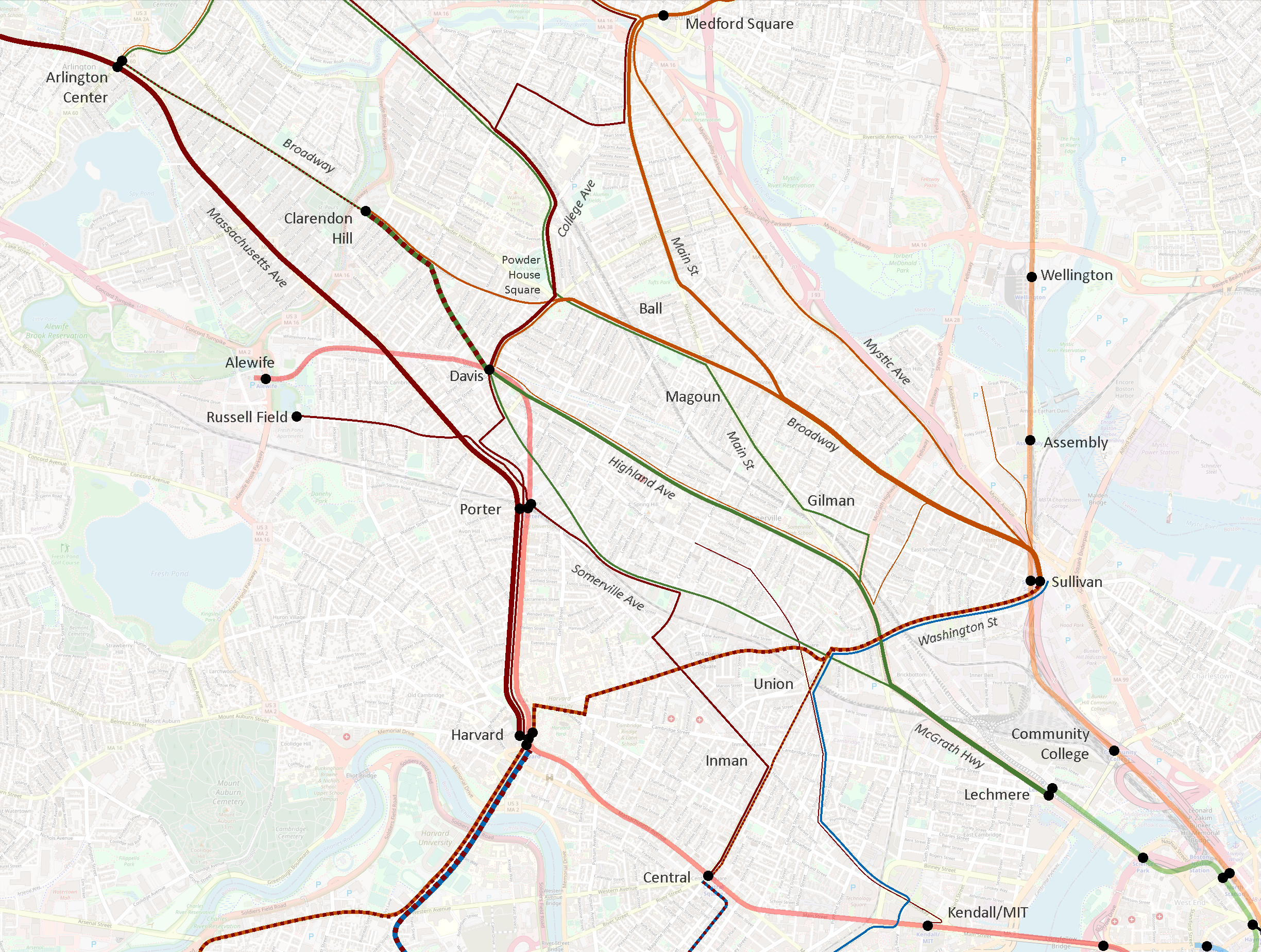
Here’s a version of the current system only showing routes that see 15-min peak headways or better.
Here we see six distinct corridors emerge:
Medford Square (and Malden) – Main St – Broadway – Sullivan
Powder House Square – Broadway – Sullivan
College Ave – Powder House Square – Davis
Clarendon Hill – Davis – Highland Ave – Lechmere
Arlington Center – Porter – Harvard
Sullivan – Union – Harvard – Allston/Brighton and Reservoir
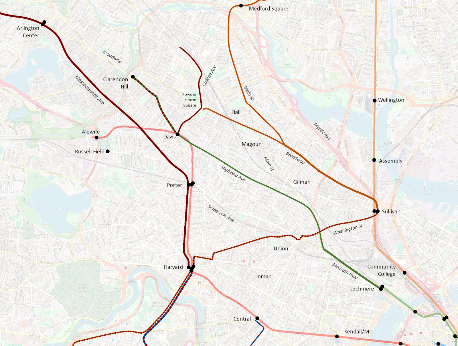
I then created a map using the same design language to visualize the Redesign proposal.
(I recommend opening the “before” and “after” images in separate tabs, and then switching between them to hone in on the differences. I tried creating a GIF, but was unsatisfied with the results.)
Impact to current high-freq corridors
Let’s first review the impact to the current high-freq corridors:
Medford Square (and Malden) – Main St – Broadway – Sullivan
Largely intact
Goes near but does not provide transfer to GLX at Ball Sq
Extended beyond Sullivan to provide a (long) one-seat ride to Lechmere and Kendall
Powder House Square – Broadway – Sullivan
Eliminated
Moreover, this route is actually composed of a pair of branching routes:
a mid-freq route to Davis
a low-freq route direct to Clarendon Hill
Davis and Clarendon Hill lose direct service to Ball Sq GLX and Broadway
Davis and Clarendon Hill maintain roundabout access to Sullivan via Mystic Ave, an increase of 0.5 miles
College Ave – Powder House Square – Davis
Intact and strengthened
Newly anchored at north by Medford/Tufts GLX and extension to Medford Sq
Worth noting that the twice-hourly one-seat ride beyond Davis to Porter and Harvard is eliminated
Clarendon Hill – Davis – Highland Ave – Lechmere
Significantly reduced, and partially eliminated
Clarendon Hill – Davis gets a pair of the Redesign’s “30-min-or-better” routes, which could approximate 15-min headways, but still does not meet the current service’s average sub-10-min frequencies
Highland Ave drops into the Redesign’s “30-min-or-better” routes, but does not connect to Lechmere, or to Union GLX, or even to Gilman GLX (though it comes close), but instead is rerouted over toward Sullivan… which it doesn’t actually reach, instead ultimately diverting to Assembly
Arlington Center – Porter – Harvard
Intact
Sullivan – Union – Harvard – Allston/Brighton and Reservoir
Partially eliminated
Sullivan – Harvard is maintained, and combined with through-service to Everett
However, ridership from one side of Harvard to the other is actually surprisingly high, so this elimination is not trivial
Of the six current high-frequency corridors, three are maintained and three are significantly impacted. This does seem counterintuitive – as far as I can tell, all other existing high-freq corridors across the system were maintained in the Redesign, and most were significantly strengthened. I suspect the difference in Somerville was the future presence of the Green Line Extension.
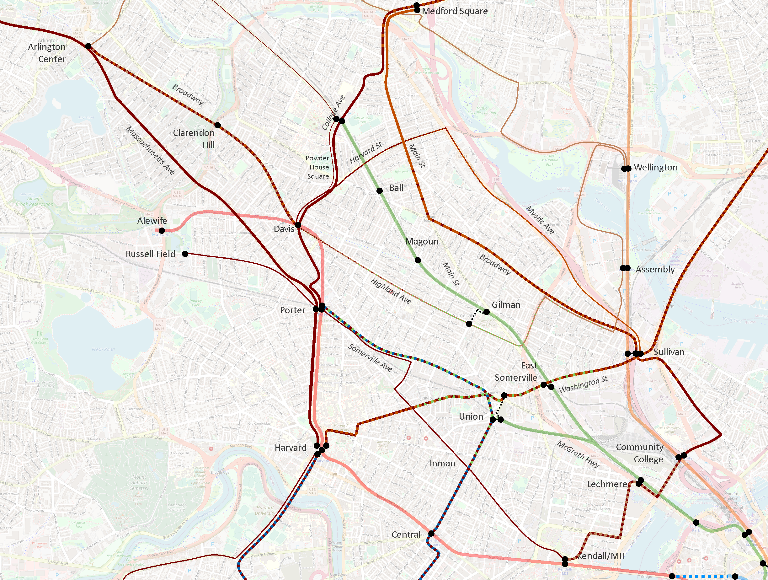
Green Line integration (or lack thereof)
One of my biggest surprises on seeing the Redesign was how little integration there was to the GLX stations. Ball Sq and Gilman Sq will both see bus routes pass less than a quarter mile from the station without offering door-to-door service.
In addition, despite the arrival of the Green Line, Union Square now sees less connectivity than it did before, including the loss of one-seat rides from Clarendon Hill, Davis, and Kendall. As Councilor Pineda Neufeld pointed out, this also reduces access to the Market Basket in Union Square, as well as the Star Markets on Beacon St and Elm St.
I would argue that the Redesign treats the Green Line Extension more like one of its high-freq bus routes than like a rapid transit line – as if the GLX has said, “Don’t worry buses, I’ve got this stretch”, and thus bus routes are routed away from it. That is not done with any other rapid transit lines, and with good reason: rapid transit access is concentrated in discrete areas around stations; a key role of surface transit is to provide access to a station from beyond its walkshed. Unlike rapid transit, the close stop spacing of bus routes provides continuous access along the entire route, which GLX lacks.
To be clear, for over a century now, Somerville’s surface transit routes have had to play double-duty, providing both feeder service into rapid transit stations, as well as longer-distance service to support journeys that would in other areas be covered by rapid transit. GLX relieves them of the second burden, but not the first.
To wit: the entire Red Line from Davis to Kendall is doubled by surface transit routes in the Redesign. It is true that GLX’s stop spacing is closer than the Red Line’s, but it’s still well-above typical surface transit stop spacing. The Green Line is not a wholesale replacement of local buses.
Highland Ave vs Elm St & Somerville Ave
In the current system, Highland Ave sees mostly 15-min-or-better service at peak on the 88, from Davis to Lechmere. Pre-pandemic, the average AM Peak frequency was 10 minutes. (The 90 layers on about one trip per hour to Sullivan.)
By contrast, in the current system, Elm St & Somerville Ave sees lower frequencies on the 87, wobbling between 15 and 20 minute headways. Pre-pandemic, the average AM Peak frequency was 22 minutes.
(A short stretch of half-a-mile between Elm and Park Sts on the northern half of Somerville Ave sees additional 20 minute headways on the 83, running to Central Square via Inman. North of Elm, the 87 and 83 split, though remain only a couple of blocks apart for some distance. Pre-pandemic, the 83’s average AM Peak frequency was also 22 minutes.)
In the Redesign, Highland Ave drops into the 30-min-or-better category, and loses direct connections both to the Green Line and to Sullivan. (I should again note that 30-min-or-better routes still may see high-frequency peak service, which perhaps is the vision in this case.)
By contrast, Somerville Ave sees a significant increase: the 83 holds its place, while the 87 between Union and Porter is supercharged as the T39, receiving 15-min-or-better service. Somerville Ave also maintains a direct connection to the Green Line – only one of two radial routes in Somerville that do so, the other being the T96.
In essence, the Redesign swaps the frequency tiers of Highland Ave and Elm St & Somerville Ave. As mentioned above, Highland Ave is one of the current high-freq corridors, so its exclusion is puzzling.
I am guessing that the Redesigners saw the extent to which the 88 parallels GLX, and believed the Green Line would be an adequate replacement. As discussed above, however, surface transit and rapid transit are different beasts; the 88 is being relieved of its rapid transit duties by GLX, but not its surface transit duties.
Moreover, while it’s true that the 88 parallels GLX for a lengthy distance, they diverge significantly after Magoun Sq GLX – GLX aims for Tufts and beyond, while the 88 aims for Davis and beyond. And as numerous people noted in the reactions I linked earlier, the 88’s corridor north of Davis is not meaningfully accessible from GLX.
Increasing frequency on Somerville Ave is not necessarily a bad thing – the problem is how the increase is achieved. The current Somerville Ave corridor runs uninterrupted from Clarendon Hill to Davis to Porter to Union to Lechmere. The Redesign shears off the southern half of this corridor, and joins it to an extended T39, running Porter to Union to Central and beyond to Longwood. That is a bold proposal, but it also dismantles a one-seat ride that has been in place for over a century.
This reflects a larger challenge introduced by treating the Clarendon Hill buses as feeders to Davis Sq, rather than acknowledging their actual roles as parallel spines threading the city together, radiating not from the Red Line at Davis, but from the Green Line at Lechmere.
Lack of through-running from Clarendon Hill
It is worth highlighting that the current system offers one-seat rides at least half-hourly from Clarendon Hill to:
Davis station
Porter station
Harvard station
Powder House Square
Ball Square
Magoun Square
Broadway
Sullivan station
Highland Ave
Somerville Ave
Union Square
Lechmere station
The Redesign reduces that list significantly:
Davis station
Powder House Square
Highland Ave
Sullivan station (bus journey lengthened by half mile)
Southernmost Broadway, near Sullivan
Ball Square (via a 6 minute walk)
Porter station
Harvard station
Magoun Square
Most of Broadway
Somerville Ave
Union Square
Lechmere station
For over 100 years, Somerville has been tied together by crosstown routes on Highland and Somerville. The Redesign makes the unfortunate decision to reduce the Highland corridor, and breaks what is currently a single seat journey across the city from Clarendon Hill to Union Square via Somerville Ave into an almost-certainly three-seat journey.
On paper, it may look like Clarendon Hill is all set with feeding into a hub at Davis; in reality, the Redesign takes numerous journeys that have been single-seat rides for – again I emphasize – over 100 years and makes them essentially impossible.
Suggested revisions
I want to emphasize that I don’t mean to besmirch the Redesigners or their efforts: this was a herculean task that is impossible to get perfect. Tradeoffs had to be made, and balances struck. I can understand how they arrived at their current proposal, and I also can understand why community members are deeply unhappy.
In this post, I have attempted to detail the nuances of the current system, to illustrate some of the features that I believe underlie many of the criticisms that have been levied against the Redesign. I want to conclude by offering some modest suggestions for revising the Redesign to address the concerns that have been raised.
The Map
Methodology and fudge functors
While I am not sure that it has been stated explicitly, I believe the Redesign was undertaken with a “net zero” assumption – meaning the Redesigners assumed they could only work with the existing buses the system has today, and not increase the number of buses overall. As such, I am going to frame my suggested modifications through a reallocation lens: if I propose lengthening one route, I will attempt to balance it out by shortening another.
There are also fudge factors at play here that may provide some wiggle room on these proposals. First, infrastructure upgrades such as bus lanes and transit priority signaling may enable faster service and thereby reduce the number of buses needed to maintain frequencies. Second, it may be possible to spread minor frequency decreases across multiple routes to free up enough buses to add a new route – enabling the creation of a new high-freq route without eliminating routes elsewhere.
These fudge factors cut both ways, of course – in some cases, they may make things harder, not easier. So while I’ve done my best to consider these suggestions as carefully as I can, I am of course limited to the data available to me; these suggestions should thus be considered preliminary.
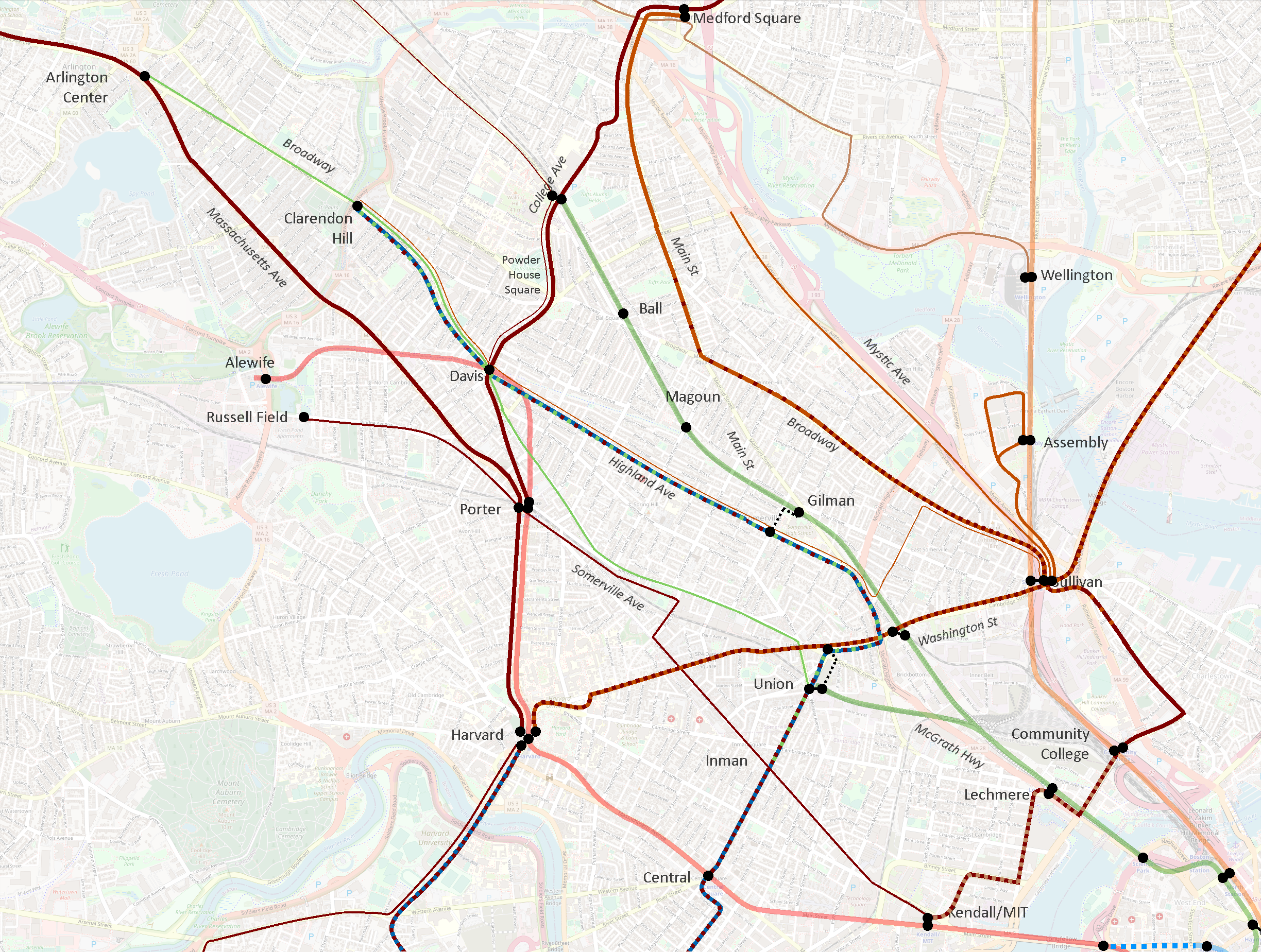
Shorten the proposed 87 along Mystic Ave to terminate at Harvard St
Shorten and reroute the proposed 90 to Union Sq GLX via Somerville Ave (essentially recreating the current 87’s route)
Institute an MBTA-run frequent shuttle service between Sullivan and the Assembly Row development, potentially leveraging public-private partnerships
Cumulatively, these modifications generate a surplus of 6.18 “route-miles” at 30-min-or-better frequencies.
Utilizing the surplus
Reroute and extend the proposed T39, running Union Sq – Highland Ave – Davis – Clarendon Hill
Revise the proposed network to include a 60-min-or-better route running Davis – Highland Ave – Sullivan, along the corridor of the current 90 (it may be possible to run this service at 30-min-or-better)
Suggested revisions in review
The core of my suggestion is “swapping” the proposed T39 and proposed 90; this provides an increase in service to most riders, but is a more conservative change that does not disrupt existing travel patterns. This extension can be “paid for” by a dramatic shortening of the proposed 87 to its core service area, a reroute of the 90 to a shorter well-established corridor, and the use of a lower-freq crosstown route and a shuttle service to address connectivity gaps to Sullivan and Assembly.
As detailed in my appendix, I believe these changes
are achievable with a net-zero impact on the overall Redesign
maintain better continuity with established travel patterns and community corridors
still provide specific and general enhancements of service to most riders, per the Redesign’s objectives and philosophy
I commend the Redesign team on their thorough and innovative work. I hope they will carefully review these suggestions and the further feedback provided by the community, and consider adopting these changes into a revised version of the Bus Network Redesign.
Thank you, as always, for taking the time to read!
In short, the MBTA is undertaking its first bottom-up redesign of its surface transport network in 100 years. The vast majority of the T’s bus routes once were streetcar routes; some routes have seen minor-to-moderate modifications in the ensuing decades, but the need to avoid disrupting the live system — which governs the day-to-day realities of thousands of people — has always capped how much could be done. As part of the long-running Better Bus Project, the T has conducted a deep dive review of its existing routes, including their ridership and reliability (see the Better Bus Profiles) and user research speaking directly to riders and community members.
Years in the making, the T this month released a proposed redesign of its bus network — details at the first link. This is a massive undertaking, and I give the redesigners credit for very clearly trying to avoid the “We’ve Always Done It Like This” Syndrome that plagues so much of American transit planning (especially in Boston).
Like any proposal, it has its imperfections and flaws. From my perspective, there are some things I like, and some things I don’t. There already has been some initial community feedback, and the T has a docket of public meetings (in-person and virtual) through mid-summer to collect feedback.
For the most part, I don’t intend to use my platform here to evaluate the merit of these proposals. The most important voices here are those of community members — their opinions should be listened to first, and given paramount consideration. Instead, my hope is to add to the discourse by providing additional ways to view and conceptualize the redesigned network — mainly through maps.
(There is one area of the proposal which received swift and strong public criticism. I have a post, and a pair of maps, in the works on that, where I will attempt to illustrate the flaws that have been pointed out by the community, and hopefully offer some modest suggestions to improve the proposal to address those problems. Stay tuned.)
In this post, I will share a map I have created to illustrate the Redesign’s “15-minute network”: a series of bus routes that are proposed to have 15-min-or-better headways all day from 5am to 1am, seven days a week. I’ll use the map to highlight some system-level features of the Redesign, and hopefully provide a framework for deeper discussion.
Very few circumferential or crosstown corridors — almost everything was radial
Morning peak frequencies were often higher than afternoon
The bus network “breathes”
An entire subnetwork of high frequency services turns on and off during the peak, providing much more comprehensive service during rush hour, but a signficantly sparser network during middays, evenings, and weekends
The entire northern quadrant of the network — everything between the Red Line and the Blue Line — was bereft of (intentional) high-frequency all-day routes, with the sole exceptions of the 111 in Chelsea and the 116/117 in Chelsea/Revere
Some communities, like Everett, don’t show up on the “Gold Network” (high freq all day) because they are instead served by a more diffuse number of routes spread across the city, operating at lower frequencies
The absence of the North Shore network — meaning the absence of consistent high frequency service — was conspicuous
The Dorchester network is one-of-a-kind, with features that don’t exist elsewhere
The network itself is actually three networks superimposed: a “10-minute all-day network”, a “15-min peak, low off-peak network”, and a “low frequency network” — most routes fall very cleanly into one of these three buckets
(Interestingly, that last point about the Dorchester network[s] seemed to be on the mind of the Redesigners as well — they’ve also adopted three primary tiers: a “≤15-minute all-day network,” a mid-frequency network that I’m guessing will be “15-min peak, 30-min off-peak”, and a low frequency network that, like Dorchester’s, would mostly see hourly services. I won’t really go into much detail here, but in my previous analysis, I did note consistent characteristics about each of the Dorchester subnetworks, and I see many of those ideas applied systemwide in the Redesign.)
I mention all of these points because I believe the Redesign recognized these features as well, and explicitly designed their proposal to address them.
The Proposed 15-Minute Network
The Redesign calls for a series of 26 high-frequency routes that would see 15-min-or-better headways all day everyday from 5am to 1am. This proposal goes much farther than the system I described above — in particular with its commitment to late night and weekend service. Vanishingly few corridors see any level of service approaching this currently. Routes on this network would be indicated by a “T” prepended to their route number: the T39, the T111, and so on.
I’ve spent a while digging through the weeds of the Redesign, and have concluded that the 15-Minute Network is composed of three kinds of routes.
Radial Routes
These are straightforward: routes that radiate out from the core, and which feed into major transfer stations such as Harvard or Forest Hills. On my map below, I have used a dark blue for these routes. Most of these routes are unsurprising, and many of them are identified on my Gold Network map above.
Circumferential Routes
These routes offer crosstown service that goes around the core rather than pointing toward it. Some of these routes behave like radial routes as they approach their terminals; for example, the southern half of the T96 essentially radiates out from Porter and Davis. So these routes still will be used by commuters going to downtown — but they also will enable journeys between multiple subway lines that can avoid going all the way to downtown. The T1 is a classic example, connecting Roxbury and Cambridge without requiring riders to change at Downtown Crossing.
Two exceptions
There are two proposed routes that do not fit cleanly into the categories above or below: the T109 and T101, both running through Sullivan. North of Sullivan, they behave clearly like radial routes, to Medford/Malden, and to Everett/Malden. South of Sullivan, they do something that bus routes historically have not done: continue on from one transfer station to another.
Traditionally, these would be considered circumferential routes. However, I have mapped them as radial routes — I believe the Redesigners are trying to reconceptualize these corridors as radiating instead from Harvard and from Kendall, passing through Sullivan somewhat incidentally. I of course have no insight into their actual thought process, but I think it reflects general trends they’ve shown in favor of longer routes that pass through multiple quadrants of the system.
Longwood Medical Area Routes
This is by far the most seismic shift in the redesigned network. For the first time, Boston is proposing a transit network that acknowledges that Longwood is a major employment center, a third “downtown” equivalent to Back Bay and the Financial District. See for yourself:
The Redesign proposes extending most major routes from Ruggles beyond to Longwood; it extends Cambridge crosstown service beyond Central to Inman, Union, and Porter; it adds a new crosstown route to the Seaport; and it increases frequencies on most existing routes.
When I did my analysis in 2020, the Kenmore-Longwood-Ruggles corridor saw 15 buses per hour during the morning peak, 4 per hour midday, and 6 per hour during the evening peak. The Redesign notes that exact routings through LMA are tentative pending further study, but by my count, the number of buses per hour between Longwood and Ruggles, Nubian, or Roxbury Crossing is proposed to increase to at least 20 buses per hour, all day.
I’ve colored the Longwood routes in dark red on the map. Some also act as radial routes to other hubs, and some do double duty as circumferential services in the larger network. But Longwood is undeniably the center of gravity, and makes for a distinct subnetwork, worthy of its own identification.
The Map
A few additional notes here:
This map is my creation, based on materials published by the MBTA; it is not an official map and any errors are mine. I recommend using my map as a jumping off point before reviewing the official materials.
Each route is marked separately and indicates a minimum of 15-minute headways (4 buses per hour) all day every day — I am sure that many if not most routes will see significantly higher headways during peak
Certain major bus stops are indicated, largely for the purpose of indicating transfer points to rapid transit; stop placement is not exact
Some potential “transfers” would require some walking, indicated by a dotted black line
The proposed Blue-Red Connector and potential Silver Line Extensions are indicated with dotted lines
Some corridors see high-frequency service provided by layered mid-frequency services; these are mostly indicated by the line splitting and ending with arrows
This map is not precise and is meant to illustrate the overall network, not detail individual routes
Some routes have been simplified to reduce clutter. For example, the T39, T9, T70, and most of the routes in Chelsea, all have significant stretches where the route splits on to parallel one-way streets; most of these, I have simplified by drawing the route through the block in between the streets
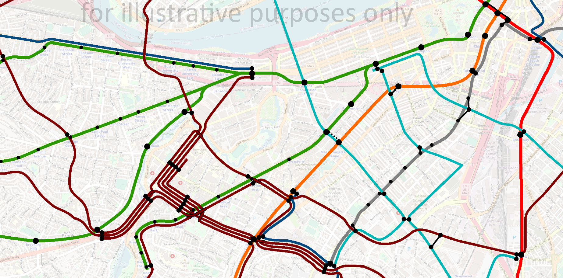
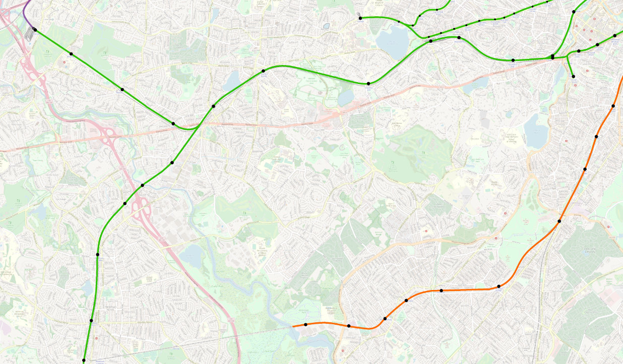
Here’s a detail view on Back Bay and Longwood, probably the most visually cluttered part of the map:
Conclusion
I do want to emphasize again that I am not trying to evaluate the quality or suitability of the Better Bus Project’s Bus Network Redesign proposals. There are elements of the proposal that I believe are transformative in that they are shifting the conversation in ways that are vitally necessary: centering Longwood, insisting on consistent high frequencies all day everyday, and creating wholesale new corridors that do not descend from the old streetcar network.
But the devil is always in the details, and there are many details to sort through in this proposal. My hope is that my overview and map can make it easier for you to wrap your head around this sprawling project, and from there, dive into the details, well-armed with a larger context.
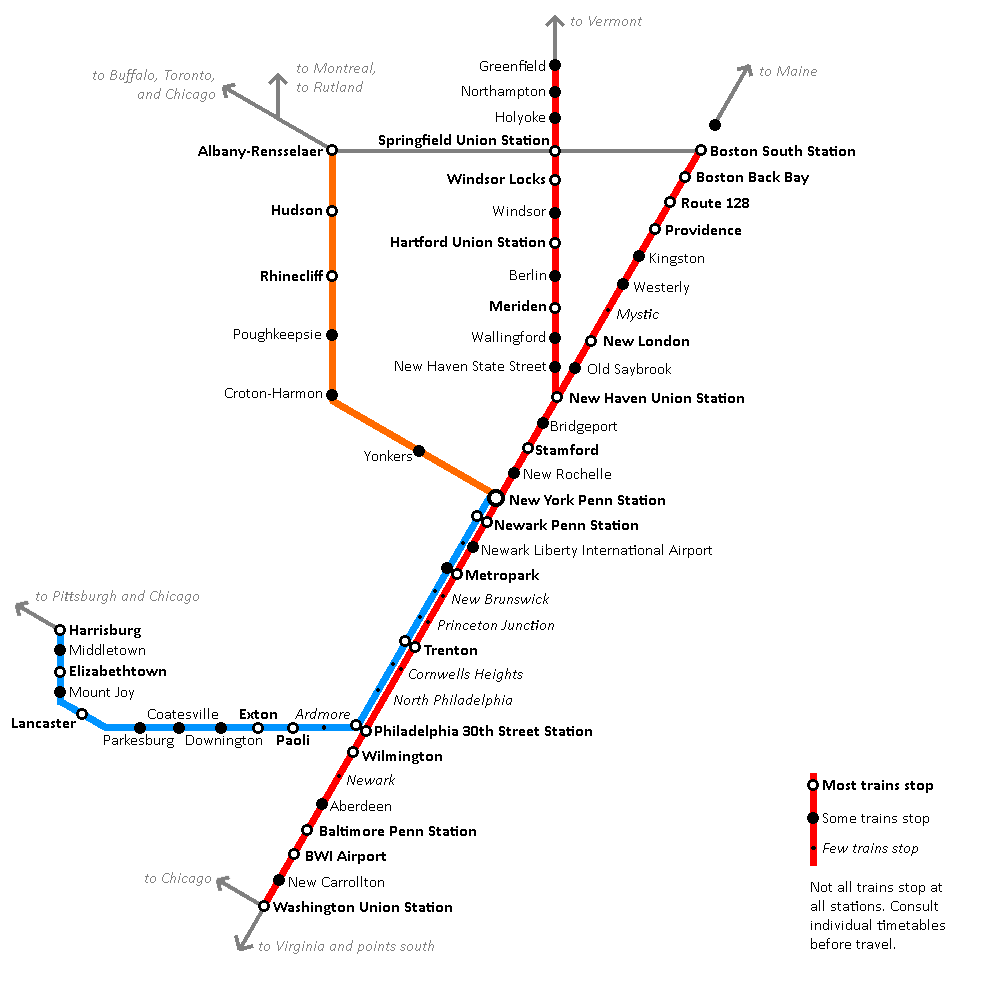
Some time ago (before the pandemic), I considered taking a job in New York City. Having no desire to relocate, and understanding that there would be some flexibility for how often I actually needed to be in the office, I pondered whether I would be interested in becoming a “super commuter”.
What is a “super commuter”?
According to most definitions I’ve found, a super commuter is someone who lives in one city/metropolitan area but works in another. This seems like a somewhat uselessly vague definition, at least in the Northeast Corridor, but (with apologies to Justice Potter Stewart) you definitely know a super commute when you see it.
Most super commuters do not go to the office five days a week, which is one reason they are willing to make the longer journey. For my part, I’d argue that a super commute is one which takes, let’s say, 2.5 hours or more one-way.
This definition probably encompasses more commuters than Moss & Qing’s analysis did, but it seems to me that travel time is more likely to affect behavior than raw distance or crossing MSA boundaries. Philadelphia-NYC takes 1h50m by Amtrak, but numerous Metro North journeys are comparable, such as from Poughkeepsie (1h50m), Wassaic (2h), Danbury (2h), New Haven (2h), or Waterbury (2h45m).
Amtrak schedules for super commuters
In any case, as I began to ponder this lifestyle change, I started looking at the Amtrak schedule. From what the hiring officer had told me, it would be alright for me to do some flexible hours when I showed up at the Manhattan office — for example, it’d be fine to arrive around 10:30, and then either leave at 3 on a short day, or put in the extra hours and leave around 6 or so.
Morning inbound journeys
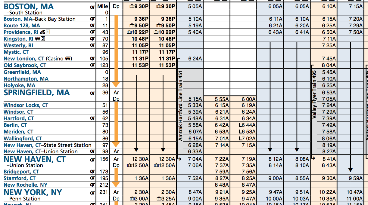
Christopher Juckins’ Amtrak schedule archive lets us review Amtrak timetables from before the pandemic (and before Amtrak stopped publishing PDFs on their website). As can be seen on the Boston-Washington Northeast Corridor schedule, getting into Midtown from Eastern New England for a 9am start is barely doable, but additional options open up as the morning goes on:
In summary, journeys which arrive in NYC before lunch included:
5:05am to 8:47am
6:05am to 9:47am
6:10am to 10:22am
7:15am to 10:47am
I figured I would probably aim for those 6am departures, maybe with some of the 7:15’s mixed in. That seemed manageable to me.
Afternoon & evening outbound journeys
So then I took a look at the trip home. There are too many trips to took a screenshot, but in summary:
3pm to 6:46pm
3:30pm to 8:12pm
4pm to 7:40pm
5pm to 8:50pm
5:38pm to 10:10pm
6pm to 9:45pm
7pm to 10:50pm
7:50pm to 12:20am
Now, to be fair, some of those later trains really do get you home quite late. But that 4pm trip in particular struck me as perfectly fine — especially if your job is one where having uninterrupted time at the beginning and end of the day is valuable (for example, time to write or read). That could really work (and held some real appeal to an introvert like myself).
But the other thing that struck me was, “Damn. that’s a better schedule than the MBTA Commuter Rail.” Hourly departures, predictable journey times, a couple of extra trips layered in? Not bad!
The map
And this got me thinking… there are several other corridors that feed into NYC; do they all have frequencies to support this super commute?
And by now, you surely can guess that that is true (otherwise there would be no post!). I have some further observations in the appendix below about individual routes (which I think are worthwhile reading, as they illustrate what a behemoth the Northeast Corridor is), but the main reason I’ve written all this is as prelude to a map:
This map treats Amtrak’s services into New York like commuter rail services — and I would argue that they essentially are indeed a “super commuter rail” network. All of the stations and routes marked on this map have the ability to support the kind of “super commute” I was considering for myself: leave home early, get to New York mid-morning, leave New York mid-afternoon-ish, get home late, repeat once or twice a week, depending on distance.
Scope of the network
As you can see, it’s actually quite a sprawling network — stretching from Albany to Washington, Boston to Harrisburg, close to 200 miles in each direction. Boston, with the itineraries I listed above, is actually on the extreme end of the network, with its ~4h travel times; a place like Wilmington, DE is a mere 1h40m journey, comfortably below Metro North’s longest journeys (and in significantly more comfortable seating). Hartford, CT and Lancaster, PA are both about a 3h journey.
All of the journeys depicted on this map are available via services with modest frequencies (to enable flexibility) and a short enough travel time to accommodate a same-day round trip.
Local and express tiers
One of the things that was fun about making this map was poring over the different timetables to look at which stations were frequently served. For example, the Northeast Corridor schedule for NYC-Washington lists out a whole bunch of stations, which most trains then skip. Despite the timetable listing 8 stations between New York and Philadelphia, most trains only stop at 4: Newark Penn, Newark Airport, Metropark, and Trenton.
In this way, Amtrak builds an informal tiered network akin to a local-express model. Virtually all trains stop at places like Stamford, Trenton, and Rhinecliff; some trains skip stations like Kingston, Poughkeepsie, or Downington; and then there are some stations, like Princeton Junction and Newark, DE, which may only get one train a day, or even less (spiritual successors to “whistle stops”). Acela service mainly restricts itself to the major stations, leaving the Regionals to pick up the leftovers.
The big picture
Amtrak (and/or the City of New York) would do well to publish a formal map like this, one which highlights that these are routes with high frequency service, modest journey times, and flexible schedules, and one which likewise differentiates between different service levels at each station. This network is a tremendous success story for Amtrak, and for American rail in general.
A map like this also illustrates what is possible with a strong piece of core infrastructure — in this case, the Northeast Corridor. Even communities which aren’t directly on the Northeast Corridor, such as Harrisburg, Springfield, or Albany, are able to benefit, as it becomes possible for them to “tag along” for the ride.
When advocates talk about high speed rail in places like Texas, Florida, or the Piedmont Corridor, it’s not just about connecting Atlanta to Charlotte, but about building a core piece of infrastructure that then enables branch lines to be built to Birmingham, Chattanooga, and Augusta. High speed rail infrastructure not only enables long-distance travel (for business or pleasure), it also enables daily commutes — and super commutes.
There are many ways to draw crayon maps – many more than could fit in one post. In this post I will talk about the software that I use to create maps for this blog.
Software
Really we should be starting with something more fundamental like “pen-and-paper” or “the ideas”. But, assuming you’ve got some of the basics in mind, one of the big questions next is the software. (Although, don’t underestimate the effectiveness of a good hand-drawn diagram that is scanned/photographed and uploaded! No need for software if you feel like going old-school.)
It’s worth distinguishing two kinds of goals one can have with transit maps and diagrams. First, one can focus on elegant design solutions (especially for existing systems); TransitMap.net is a great blog that focuses on transit map/diagram design. Second, one can focus on conveying detail, particularly of proposed systems, with less focus on “looking good”. While these two obviously overlap in significant measure (elegant design also usually is particularly good at conveying detail), my focus is usually on the latter more than the former.
Put another way: I don’t worry too much about my diagrams looking pretty. In my case, this is somewhat self-serving, because I don’t have the know-how to make good-looking diagrams at a pro or even semi-pro level. But put more positively: this also means that you don’t need to worry about getting your diagrams to look good either! Don’t let that be a barrier to getting started!
Okay, but actually, what software should I use?
Okay, sorry for getting distracted. The short answer: start with what you have, and then try some of the ones I suggest here.
Microsoft Paint or Paintbrush (for Mac)
I can guarantee you that any designer who happens to read this post will physically grimace at this suggestion, so I do want to be clear that both of these programs are extremely limited; if you are going to use them, keep things simple: straight lines, 45-degree angles, simple text.
That being said, especially when you just want to sketch something out, Paint is a very useful tool, precisely because of its simplicity. With some effort and care, you can indeed use it to make clear, straightforward diagrams.
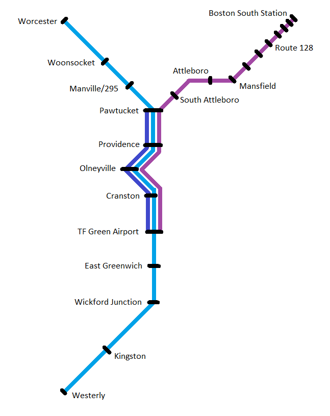
For example, this is something I threw together in MS Paint just now, illustrating a possible commuter rail network for Rhode Island, with the existing MBTA Commuter Rail line, a new RI Commuter Rail service from Worcester to Westerly, and an extra layer of local trains running between Pawtucket and TF Green:
Is it pretty? No, not really. Is it even particularly clean or neat? No – my spacing of station names is inconsistent, the size of the station markers varies, and the bends of the lines are a bit sloppy.
But does it convey the information I needed to? Yes. Station are clearly and legibly marked (yes, I got tired of labeling the MBTA stations), the service patterns are clearly indicated (at least I hope they are clear – can you tell which stops the MBTA skips?), and there are enough nods to geographic fidelity (such as the curve through Providence) to provide context for the viewer.
And while it’s true that a lot of the details are sloppy, the overall design is generally symmetrical and balanced, the stop spacing is mostly even, and the visual is streamlined and simplified – all of which means that even though the design itself is hardly inspired, it’s also not going to be too distractingly bad.
(To editorialize briefly: there is something to be said for transit diagrams and transit proposals which are straightforward enough to visualize using Paint.)
There are several downsides to using Paint, though. As mentioned above, you can get clear diagrams – “with some effort and care”. The time and effort is where you pay the price. It takes a while to do simple things nicely with Paint, and it takes a long time to do complicated things at all.
If you’re just getting started, I highly recommend playing around with Paint a little bit – get a feel for what “looks good” in the kinds of diagrams you’re making, but aim to “level up” once you can.
Metro Map Maker
This website lets you make transit diagrams from scratch, or remix those created by other users. It is very simple to learn, and can be pretty fun to use. That said, I myself don’t use Metro Map Maker, and I think there are a couple of things to bear in mind if you choose to do so.
First, I myself find the interface “fiddly” and difficult to draw things precisely the way I intend (which is my main reason for using a computer rather than sketching something by hand). I think this is visible in some of the maps in the gallery, some of which are quite clean and clear, and others of which struggle a bit. In particular, I have a hard time with the way Metro Map Maker renders Y junctions, where two branches feed into a single trunk; the way Metro Map Maker does it, it’s very easy to mistake those for three-way junctions.
The other thing to be aware of is that Metro Map Maker diagrams sometimes get poo-pooed by folks on aesthetic or “professionalism” grounds. There are some venues where such criticisms are appropriate – I would not, for example, recommend that transit advocates use this site to create visualizations of the services they are advocating for. But, especially if you’re just doing this for fun, I think it’s a perfectly reasonable tool. Just keep in mind who your audience is!
Paint.NET
This is my application of choice these days, and the way I create most of the visualizations on this blog. (Unfortunately it is Windows-only, and I haven’t yet found a Mac equivalent that has the same “sweet spot” of features.) Paint.NET is available on its website and on the Windows store.
For me, Paint.NET has an excellent balance of ease-of-use and useful-features. Eventually I plan to “graduate” into one of the programs listed below, but for now, I’ve gotten pretty darn good with Paint.NET, so I’m sticking with it for now.
One of the biggest reasons to use Paint.NET instead of MS Paint is the ability to use layers. For example, let’s say that I’m drawing up plans for Super High Speed Rail between Boston and New York, but I’m trying to decide between an alignment via Hartford and an alignment via New London. In MS Paint, I’d have to settle for a workaround: draw both using different colors, make a copy of my file after drawing the Boston-Providence and NYC-NH segments and work on two separate diagrams, or just pick one and forget about the other. In Paint.NET, on the other hand, I can just create a new layer for each alternative, and show/hide them depending on which version I want to look at.
You can also use layers to add and hide different levels of detail. For example, in one of my big maps, I have the local bus routes drawn in a layer of their own; I keep it hidden most of the time to reduce clutter, but sometimes show it in order to see things in full context.
I also recommend isolating lines, station markers, and labels each into their own layer. This will make it easier later on to make quick changes en masse, such as changing the color of a line.
Paint.NET still has downsides. It produces raster graphics and not vector graphics, which means things are pixellated when zoomed, and you actually physically cannot create pure curves (although if you are zoomed out reasonably, no one will notice the difference aside from professional designers). And as far as I know, Paint.NET has no concept of “linked objects”, meaning that if you create a fancy icon as a station marker, you’ll have to copy and paste it each time you want to use it, and you’ll have to manually modify every single copy if you want to make changes later. (This is why I just use a simple black circle for my station markers.)
Overall, however, I’ve found Paint.NET to be extremely useful.
Inkscape and Adobe Illustrator
Now we have “graduated” into the top tier: vector graphics. These are the programs used by professionals, and damn can you make things look good with them! Vector graphics allow you to infinitely zoom without pixelation and draw perfect curves without jagged edges.
Adobe Illustrator is part of the Adobe Creative Cloud suite (along with the perhaps more famous Adobe Photoshop program). Inkscape is open-source, and available for free.
Becoming more comfortable with Inkscape is a medium-term goal of mine, but it’s not a tool that I am experienced with at this point. So, for once, I don’t have much to say on the topic. But if you get the opportunity to practice with either of these programs, I highly recommend it!
What about Google Maps?
Good question. You also may have questions about using Paint.NET specifically, or what I’m talking about in the footer of my blog about “basemaps” (and why I have that footer in the first place), or why I’ve been talking more about “diagrams” than about “maps”. All great questions! I hope to get to them in a subsequent post. In the meantime, hopefully I’ve given curious readers enough to get a running start! Have fun crayoning!
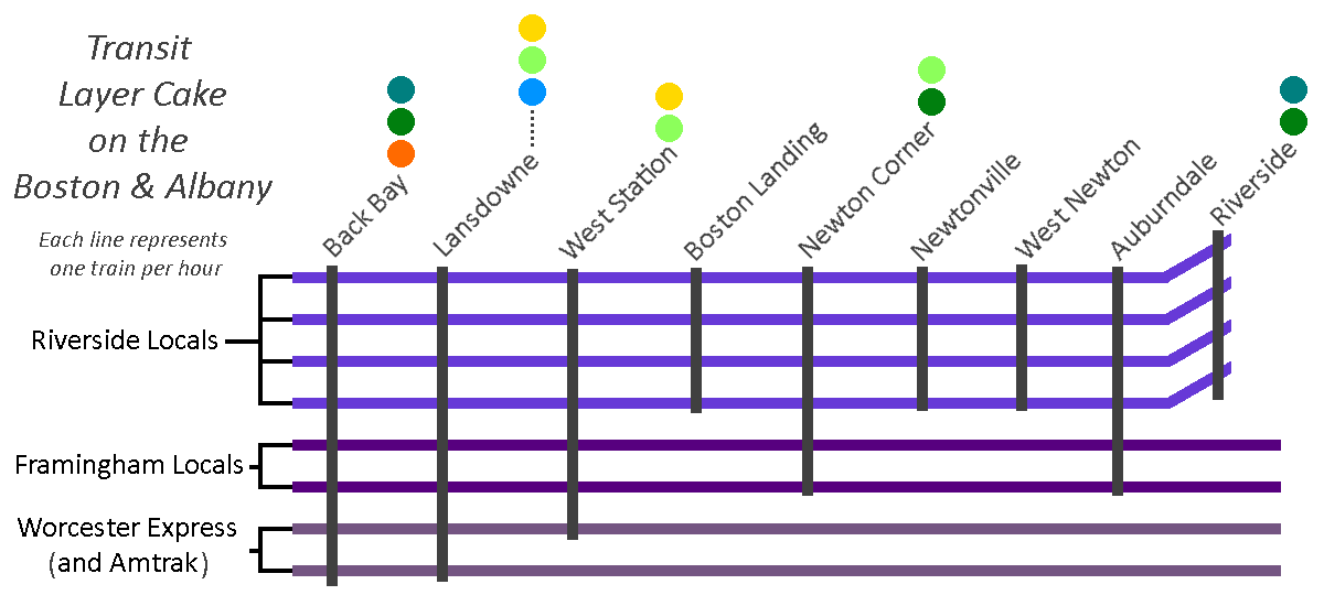
One peculiarity of this whole situation is that most of the options for “Phase 2” are available from both the Riverbank alignment and the Kendall alignment. They aren’t fully interchangeable, but there is a surprising amount of overlap, and most of them can be discussed largely independently of which Phase 1 alignment is used to reach them.
The modern incarnation would see the Blue Line taking the most direct route from its Phase 1 terminus and then running out west parallel to the Worcester Line tracks.
Unfortunately, the 1945 proposal was made before the construction of the Mass Pike east of 128. For those who don’t know, this part of the Mass Pike was constructed by taking land previously occupied by railroad tracks; this stretch once had four or more tracks, like the Southwest Corridor did at the time. The vision would’ve been quite similar to today’s Southwest Corridor: take a couple of tracks and devote them to rapid transit, and leave the rest for mainline rail.
Now with only two tracks, it’ll be much harder to enact that vision. If you wanted to be bold, you could propose reclaiming land from the Mass Pike, but good luck with that; likewise to building a cut-and-cover subway, or an elevated.
In today’s climate, this stretch is much more favorable to an Indigo Line-style service, with perhaps 4 local trains per hour making all stops to Riverside supplemented by 2 trains an hour that run on to Framingham (with 2 additional trains expressing through on the journey to Worcester). This would provide modest frequencies while maintaining a single mode of service. (And, for what it’s worth, would still leave the door open to building a subway or reclaiming some of the Pike later — the capital improvements to support Indigo service would still benefit continued mainline use, even after the construction of HRT extension.)
This is an example of what a “layer cake” of services on the Boston & Albany might look like, though these service patterns are purely conceptual (or put more bluntly, I just made them up as an example). In this example, I’ve made the Framingham trains run semi-express, but I think it’s hardly vital; I’ve also suggested that 2 slots per hour would be reserved for express trains to Worcester, with the assumption that Amtrak intercity service to Springfield would occupy one or two of those slots in each peak period — again, purely arbitrary. The connection colors are also somewhat conceptual, though they do point to where transfer hubs would be: Newton Corner would become a bus hub, displacing some feeder routes from Watertown Square; West Station would likely offer transfers to some sort of circumferential service; and Lansdowne would offer a walking transfer to the Kenmore hub.
Blue to Riverside (and Needham)
This is probably the most important one to discuss. Extending the Blue Line to Riverside (usually via Kenmore, though occasionally via Huntington) is frequently proposed by amateur transit planners, and is reflective of the D Line’s unusual nature as a Green Line branch: being a converted railroad line, it has rapid transit stop spacing, akin to the Blue or Orange Lines, unlike the other Green Line branches, which stop every few blocks. If you were going to replace one branch of the Green Line with the Blue Line, there are obvious reasons to pick the D, including the fact that it is (nearly) completely grade-separated.
There are lots of good reasons why it would make sense to extend the Blue Line to Riverside. Unfortunately, there is one very good reason against doing so, and to understand it, we need to take about two steps back and look at the bigger picture.
Northeast Corridor capacity along the Southwest Corridor
Railroad tracks into downtown are like pipes. They need to be able to feed all of the branches they go out to, and likewise they need to be able to accept all of the trains coming in from each branchline.
So we need to turn our attention to the mainline tracks on the Southwest Corridor, which ironically is also sometimes called the Northeast Corridor — southwest of downtown Boston, northeast of the rest of the country. There are three mainline tracks running from Forest Hills to Back Bay, which need to serve:
Commuter rail to Franklin and beyond
Commuter rail to Foxboro
Commuter rail to Providence and South County
Commuter rail to Stoughton, and eventually Fall River and New Bedford
Amtrak to New York and beyond
Commuter rail to Needham
As you can see, one of these things is not like the other. The Needham Line is the shortest commuter rail line after the Fairmount Line, it only serves two municipalities, and shares origins with the D Line, both being built from the remnants of some of the region’s oldest railroads. (If you’ve ever wondered why inbound Needham Line trains start their journey by going away from Boston, that’s why.)
You’ll notice that the list above includes some destinations that are future-state, including South Coast Rail, as well as expanded Amtrak service. The NEC is going to need more capacity, and there isn’t room to build more north of Forest Hills. That means diverting trains away. Franklin and Foxboro can be diverted to the Fairmount Line (and leverage existing grade separation to boot), but the longer distances to Providence, South County, Fall River and New Bedford necessitate access to the high-speed non-stop trackage along the NEC.
Needham should get rapid transit
Moreover, sitting just under 11 miles outside of downtown, Needham clearly sits within “Rapid Transit Land”, along with the likes of Riverside, Braintree, Lynn, and Waltham (despite technically sitting outside of 128). The NEC should be reserved for high(er)-speed regional rail, and the Needham Line should be served by rapid transit.
For those unfamiliar, converting the Needham Line to rapid transit is usually envisioned by splitting it in two: an extension from Forest Hills to West Roxbury, and an extension from Newton Highlands to Needham. (Once again, everything old is new: these alignments in fact were the paths of the original railroads, when built 150 years ago; Riverside-Newton Highlands and Needham Junction-West Roxbury were cut-offs added in later on.)
So, the Needham Line needs to be converted to rapid transit, and the Needham section ought to be served by trains coming from Newton Highlands. Extending the Green Line to Needham is a well-known and widely-accepted proposal (at least in terms of its feasibility), and is yet another proposal that dates from the 1945 map. Needham Heights to Needham Junction is a good candidate for LRT — the stop spacing is good, the existing station footprints are conducive to light rail stops, and the surrounding density is on-par for what we might expect, similar to the villages in Newton to the north.
Needham can’t provide the Blue Line what it needs: grade separation
Okay, so what happens if the Blue Line eats the D Line? In that case, we would need to have the Blue Line extend down to Needham too, and that’s where we hit the Big Problem: grade separation.
HRT like the Blue Line basically always needs what we call “full grade separation.” Basically that means “no railroad crossings” — bridges and tunnels only. “Light rail” is “light” in part because its vehicles are light enough that they can (sometimes) stop quickly enough to avoid hitting a pedestrian, and because they could collide with an automobile (potentially) non-lethally. “Heavy rail” fails both of those tests: trains that are longer, heavier, and faster which cannot safely coexist with pedestrians and autos without major safety measures.
If you want to extend the Blue Line, you need to find a way to grade-separate the tracks. Whether going over or going under, that will add enormous cost in terms of both finances and likely in terms of disrupting the built environment of the villages. Those costs will be extremely hard to justify.
To review…
So, barring major changes to the community, the following things are all true:
The Northeast Corridor will need capacity freed up for expanded service to Providence, the South Coast, and other distant locations
The Needham Commuter Rail Line is the odd one out on the NEC, and the only one that can be feasibly removed from the Commuter Rail system altogether
The Needham Commuter Rail Line therefore needs to be converted to rapid transit
The Needham segment of the Needham Line needs to be converted to LRT specifically
A Needham LRT branch would need to be fed from Newton Highlands
Therefore, Newton Highlands must be served by LRT
Therefore, converting the Riverside Line to Blue Line HRT is not feasible due to foreclosing the possibility of service to Needham, thus limiting vitally-needed capacity on the Northeast Corridor
Blue to Watertown and Waltham
Watertown and Waltham create an interesting quandary. There is a large gap between the Worcester Line and the Fitchburg Line, in which Watertown sits, right next to Waltham – both moderately dense communities and employment centers in their own right. And if you draw a line directly west from Bowdoin station, you almost directly hit Watertown Square and then Brandeis head-on; you only need to shift that line up 7 degrees in order to hit Waltham Central Square. Whether from Kenmore, Kendall, or Central, it seems perfectly reasonable to extend the Blue Line to Watertown Square and then on to Waltham.
The immediate challenge with this is that there has never been a railroad ROW between Watertown and Allston. Complete greenfield subway projects are extremely rare – almost the entire MBTA is built on land where rails were laid or tunnels dug over 100 years ago. To build straight across Allston from Cambridge to Watertown would require a major political and financial investment. If support for such an investment could be marshalled, it would be transformative for the area. But it’s worth considering the alternatives; in my opinion, there are more achievable transit solutions for both communities.
A combination of these services resurrected would be significantly easier to build than a brand-new HRT line, and would offer reasonable service with increased flexibility at much lower cost. The ROW of the Watertown Branch is largely intact, and would be an easy and natural extension of GLX’s Union Square branch; LRT would offer greater flexibility for grade separation and limited street-running, if needed. Newton Corner can be rebuilt and served by frequent electrified regional rail service and feeder bus service. And infrastructure investments along the 57’s corridor can increase reliability of service and lay the groundwork for eventual return of light rail service.
In this map, service to Watertown is restored from the north via mostly-grade separated LRT line from Porter Square and Union Square, using the recently-abandoned Watertown Branch ROW, connecting to an Indigo Line station at Newton Corner, offering riders a direct trip to downtown via Lechmere, or alternatively a transfer to the Red Line at Porter, or a transfer to the Indigo Line at Newton Corner. A separate LRT line to Newton Corner from the south (a resurrected “A Line”) is included here, but would be optional; in the interim, infrastructure improvements for the 57 would provide alternate enhancements.
It’s also worth comparing ridership on the 70 (between Watertown and Central) and the 71 (between Watertown and Harvard): along the stretches between Watertown and the respective Red Line transfer station, the 71 saw over 1500 boardings compared to the 985 boardings on the 70 (not including boardings from Watertown Square on either, although the 71 performs stronger there as well). The 70 corridor is itself not crying out for rapid transit; its main appeal is its directness, and a frequent regional rail service from Newton Corner will likely be just as fast. It is true that, from Watertown Square itself, a Newton Corner transfer hub will be less convenient; but for any riders coming from outside of Watertown Square, it will just be a matter of riding a couple extra minutes on a feeder service.
Waltham
Readers of the Wikipedia article on the Watertown Branch will note that it used to run all the way from Watertown Square to Waltham Central Square. Why not run the Blue Line to Watertown via the B&A ROW (with a short hop between Newton Corner and Watertown Square), and then follow the old ROW to Waltham? The problem is that the ROW really isn’t intact west of Watertown Square. Even for LRT, it’s very curvy and crosses streets at odd angles.
Again, for HRT, you would need to grade separate the route, which means subway, elevated, or lots of embankments with short bridges over streets. None of those would be popular in the suburbs, especially when rail has been gone for generations (unlike in East Watertown, where trains ran as recently as the 2010s).
Waltham is also much better served by the Fitchburg ROW – whether by frequent regional rail, an HRT extension of the Red Line from Alewife, an LRT extension of the Green Line from Union Square, or some combination of the above. And if you really wanted a rail connection between Waltham and Watertown, LRT would win out again, as you could look at lane-taking on Route 20 to do protected-street-running – again, not an option with HRT at all.
Blue to Brookline, Longwood, and points south
I’ve discussed above how an extension of the Blue Line to Riverside via Newton Highlands creates challenges. However, a partial extension could be more viable. Assuming a D-to-E connection is built, allowing D Line trains to run into Huntington Ave, an extended Blue Line could take over the ROW between Kenmore and Brookline Village.
This would require some clever tunneling underneath the Mass Pike to hook into the D branch – currently the D shares tracks with the C on the approach to Kenmore, so you would need to find an alternate route. But aside from that, this would probably be a relatively straightforward extension, as the ROW is already grade-separated. This would also have the significant benefit of providing HRT service to Longwood, a major employment center that is notoriously difficult to serve with transit.
One downside is that you would lose some operational flexibility on the Green Line. The trade-off would need to be studied to get a clear cost-benefit analysis, but I personally think the trade-off could be a reasonable one. An HRT link between LRT stations at Kenmore and Brookline Village could also provide benefit to a larger LRT network overall, depending on final design.
The other downside is that I think this alignment produces a dead-end. Once at Brookline Village, you can’t continue west, for reasons explained above. You could continue south toward Forest Hills, along South Huntington or the Jamaicaway, but at that point you begin to duplicate Orange Line service, at the expense of a lot of tunneling along an environmentally sensitive stretch of greenspace.
If you wanted to go for the moonshot, you could abandon the southern half of the ROW, and turn east at Longwood to tunnel directly underneath the LMA, potentially continuing further to Ruggles, Nubian, and points east and/or south – essentially building the southern half of the Urban Ring. This extension would require an enormous capital investment, though would likely also see enormous ridership.
In my next and final post on this topic, I will discuss why I believe the Kenmore alignment is the stronger choice, and what I think this choice represents for the system overall.
I’ve created a page called “Useful Things“. There is an incredible wealth of information available online these days, some of it produced by official agencies, and some created by devoted enthusiasts. This list is my effort to draw attention to particular resources I’ve found useful.
Some of these materials are relatively well-known — Vanshnookenraggen‘s marveloustrackmaps, for example. Others are, I believe, more obscure — tucked away in massive collections, or legacies of earlier days of the internet. My list is hardly exhaustive or comprehensive, nor is it a “who’s who” of our transit enthusiast community; we are very fortunate to have such an active community, and I could never hope to list everyone.
If you have suggestions of other resources similar to the ones I’ve listed here, let me know!
Update, September 2024: These maps are now extremely out of date. ArchBoston user Delvin4519 has created a fantastic set of updated maps which should be referenced going forward.
Original content below, posted in September 2021 but written some time before that
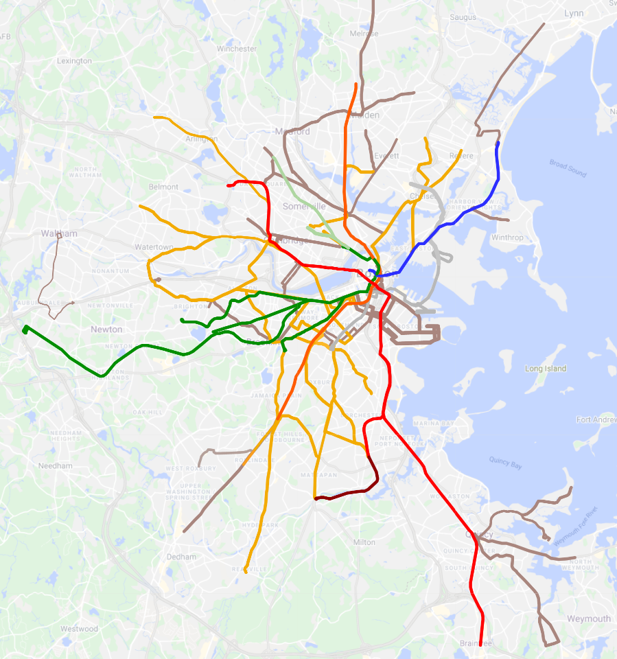
Over the course of 2020, I undertook an exercise to identify all MBTA bus services which run at “rapid transit frequencies” at some point during the day. (I chose to focus on pre-pandemic schedules, under the theory that eventually we would return to those levels.) Unsurprisingly, I made a map, which can be viewed on Google Maps: MBTA Subway + Frequent Bus.
At a high level, what I found was that there were two layers of frequent bus networks: those that were frequent all day and those that were frequent at peak only. I termed the all-day services as “Gold Line” services, and the peak-only services as “Bronze Line”.
Turning on and off the Bronze layer on the Google Map reveals how the MBTA’s network “breathes” over the course of the day, in and out of peak periods. During the height of rush hour, a comprehensive hub-and-spoke network emerges, which then fades away in the mid-day, only to return in the afternoon.
Additionally, more notably within the Bronze network, multiple “cumulative corridors” appear when you stack several modest-frequency routes on top of each other. Washington Street south of Forest Hills, or Broadway in Everett, are good examples of this phenomenon.
To my knowledge, there is no other map or analysis that examines this particular topic. (If I am wrong, please let me know! I’d love to see that!) So I hope this is useful, or at least of interest, to someone out there.
Taken altogether, this map gives a truer picture of where Greater Boston’s high-frequency than either the Key Bus Route system (which aligns somewhat but not entirely with the Gold network) or the MBTA Bus Map (which is useful, but overwhelming). Take a look: play around with turning on and off the different layers, click into individual corridors to see their frequencies and constituent routes, and let me know about any corridors I may have missed!
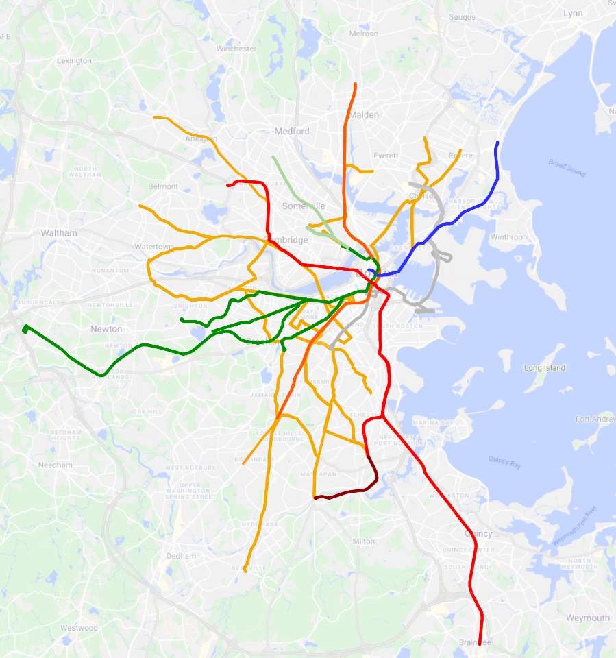
The full network during peak hours. The off-peak network, with routes that see high frequencies all day.The rapid transit network.