Introduction
Proposals to extend what would become the MBTA’s Blue Line west of downtown have been floating around for over a hundred years. While most of these ideas have fallen out of the present discourse, they remain worth discussion, as they continue to inform today’s proposals.
Blue Eats Boylston Subway
Last week, I explained a 1926 proposal that would have linked the East Boston Tunnel to the Boylston Street Subway, freeing up the Tremont Street Subway to serve a dedicated line running from Huntington to Lechmere. Let’s quickly run through the challenges with enacting the 1926 proposal today.
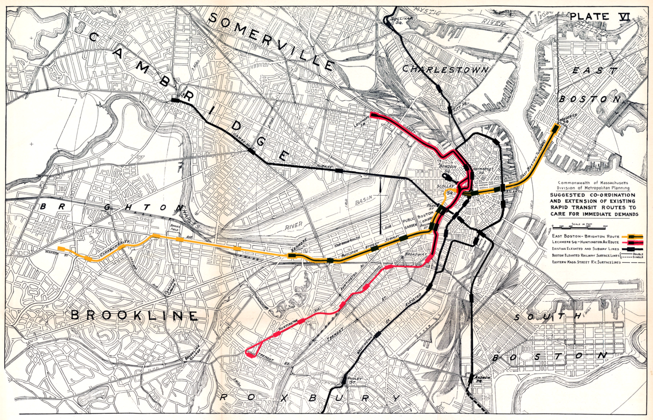
First, the Green Line now has four branches that fan out across a wide area. It would be impractical to create so many branches of the Blue Line. Even if the E Line were rerouted into the old Pleasant Street Portal, it’s still not feasible to convert the B, C and D Lines all to HRT. The original plan in 1926 was for the Beacon, Commonwealth, and Watertown trolleys to terminate at transfer stations at Kenmore and in Allston, mirroring similar designs in place at Harvard, Forest Hills, Dudley (now Nubian), Sullivan, and others. But in the intervening century, residents in Brookline and Allston have become accustomed to a one-seat ride to downtown, so short-turns with a transfer are much less politically feasible than they once were.
Additionally, there are a large number of corridors throughout Greater Boston that are more appropriate for LRT than HRT. Maintaining the Boylston Street Subway as LRT would provide a core piece of infrastructure for that network, benefitting the system overall. Conversion to HRT would hamper that effort.
Finally, the turn at Boylston is too sharp for HRT vehicles. So not only would Park Street need major reconstruction to hook in the Blue Line, but Boylston would either need to be rebuilt, or altogether bypassed. At that point, you are basically rebuilding everything between Arlington and Haymarket, as opposed to reusing the existing infrastructure.
Blue to Huntington
This idea and ones similar have floated around for a while, popping up here and there, so it is worth mentioning for completeness. This one runs into the same challenges as the original 1926 proposal, in that you have to dig up the Common and then figure out what to do south of Park Street.
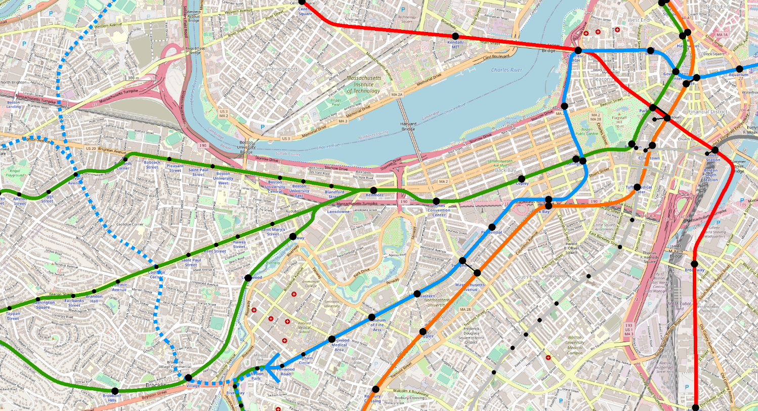
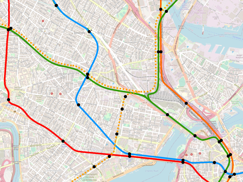
However, a roundabout route via Charles/MGH, Arlington St, and something like Stuart St could potentially be more feasible (as diagrammed below). The construction would be more complicated, and the alignment as the subway turns west past Arlington would be tricky — HRT can’t make the sharp turns that LRT can. Additionally, the roundabout route takes about 1.3 miles to go the ~.75 miles that the crow flies between Arlington and Government Center, which is makes for a substantial diversion.
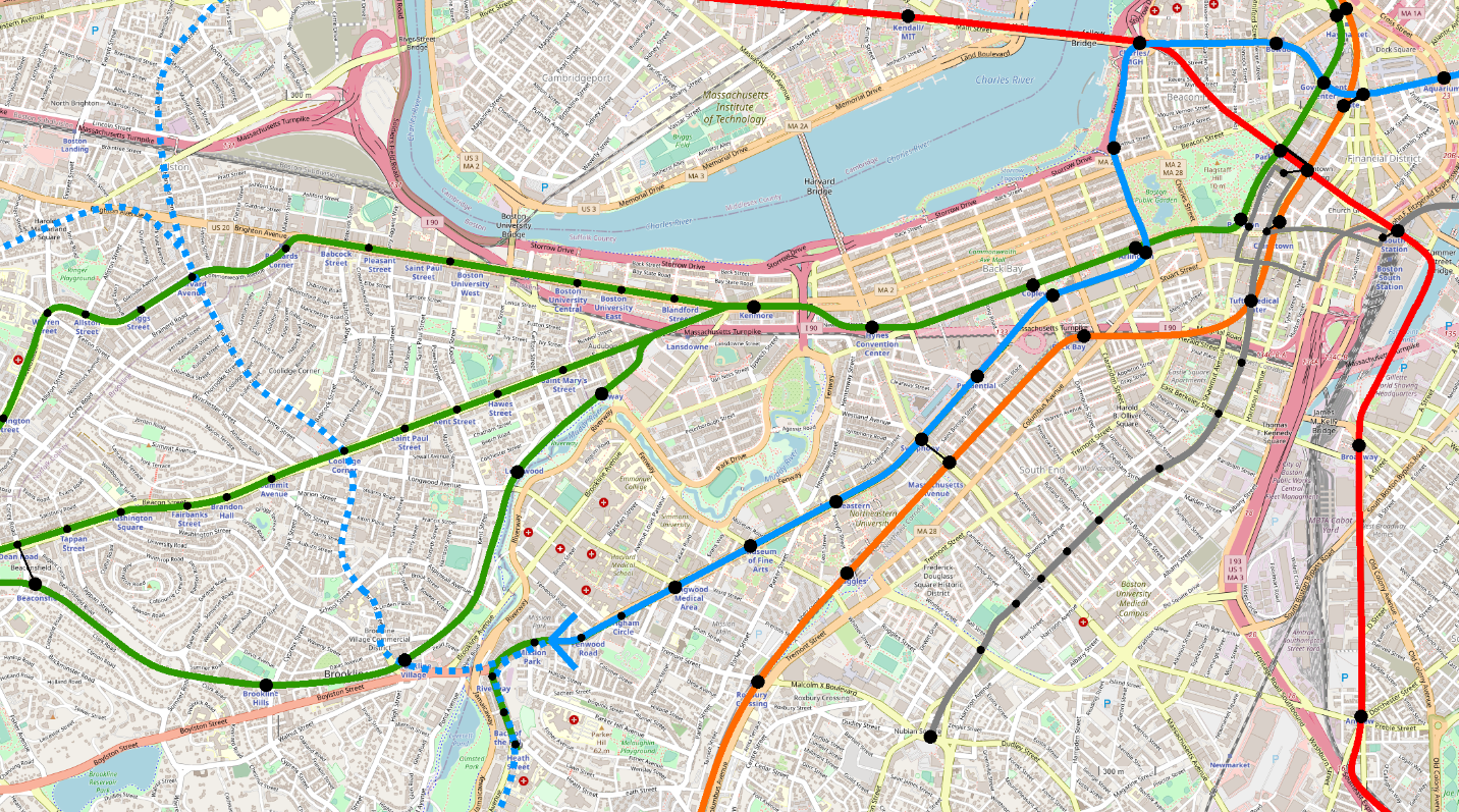
For those reasons, I see this route as implausible. That being said, if it could be swung, it would be a monster success. The ridership on the E Line is ridiculous, and you’ll notice that even on the 1926 map, they were proposing HRT under Huntington. Longwood is a beast of an employment center, and that’s not even considering the schools and the Pru.
That being said, I believe that an extended subway under Huntington Avenue, running modern LRT (like Los Angeles’s) can effectively meet the needs of this corridor, and can do so as part of a larger more robust network that would see more one-seat rides into this neighborhood. In that respect, HRT is both unnecessary and would constrain the rest of the system.
[EDIT] Looking again, I noticed that leveraging Columbus Ave between Arlington Street and the Mass Pike could enable you to tunnel from Arlington Station to Back Bay Station using cut-and-cover and keeping the turn radius moderate enough that HRT could probably swing it.
This route would still be pretty roundabout between Back Bay and Government Center. And I still maintain that Huntington is a better fit for an LRT trunk subway. However, it could be more doable than I originally thought.
[END EDIT]
Blue Eats GLX
Once upon a time, when the T and the state were reviewing alternatives for providing service along what is now the Green Line Extension, one idea considered was extending the Blue Line instead. There is some logic here — the GLX corridor probably could merit HRT.
There are some major downsides though. Beyond the obvious — GLX is finally nearing completion and it seems silly to be already talking about ripping it out and replacing with HRT — turning the Blue Line north after Bowdoin would eliminate any possibility of a Red-Blue Connection, which is sorely needed and pretty much must be included in any Blue Line Extension. Realistically, Blue-to-Charles is going to be built before any of these further proposals will ever be seriously considered, so we should assume Charles/MGH as the launching point for all such proposals.
One alternative that could perhaps be feasible on a fifty-year timescale would be to extend the Blue Line to Kendall, and from there turn north to pick up either or both of the GLX branches. Depending on how the Green Line evolves in the next few decades, it may be advantageous to provide some relief to its northwest quadrant.
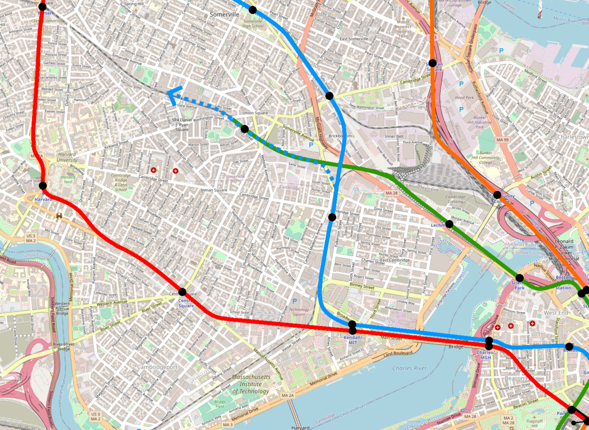
There are some things I actually like about this idea — there’s a certain symmetry to it that I find aesthetically pleasing, for lack of a better term. There are specific challenges — for example, I think it would be difficult to find a good spot for a Green-Blue transfer station — but unfortunately the biggest challenge is still that it’s way too early to be planning another massive construction project on the GLX corridor.
Fifty or sixty years from now, if GLX trains are packed to the brim, and the Blue Line still terminates at Charles/MGH or Kendall/MIT, then this idea might merit closer consideration.
[EDIT] In conversation with user Brattle Loop on ArchBoston, I realized that a better path from Kendall/MIT to the GLX ROW would be via Inman and Union Squares. This would require significantly more tunneling — cut-and-cover to Inman, and then bored tunnel through Union Square and north to the GLX ROW. However, it would allow for a strong Green/Blue interchange at Union Square, potentially also with circumferential LRT service from Union to Sullivan and beyond. It would also provide a one-seat ride from Union to Kendall — hardly a critical pairing, but still one that is not possible via the Grand Junction. (I have also since been reminded that the Grand Junction is probably less-than-ideal for actual tunneling, given its landfill history. If Blue-Eats-GLX is ever to happen, the Union Square alignment is probably the way to go, though it would be expensive.)
[END EDIT]
Blue Horseshoe
One of the major gaps in the MBTA’s rail network is Chelsea and Everett. Most proposals suggest adding rapid transit along the commuter rail line, running circumferentially between the Orange and Blue Lines. Typically this is suggested as LRT or BRT, and indeed Chelsea (in theory) now sits on the MBTA’s rapid transit network thanks to the efforts at BRT on the SL3 branch; there are also official discussions afoot to extend SL3 to Everett.
I sometimes see folks — especially when working on their first “crayon map” of possible extensions — who propose branching either the Blue Line or the Orange Line to serve this corridor:
Neither of these are a “Blue Line West” extension proposal, so I won’t go into detail here, but neither of these branches are likely to ever get built. Right now, the T runs as many Orange Line trains as it can to Wellington and Malden Center, and as many Blue Line trains to Wonderland (and hopefully someday Lynn) as it can. It does this because those are all massive bus transfer nodes with huge ridership. Branching either the Blue or the Orange means that the transfer nodes in question will get half as many trains, and that’s just not feasible.
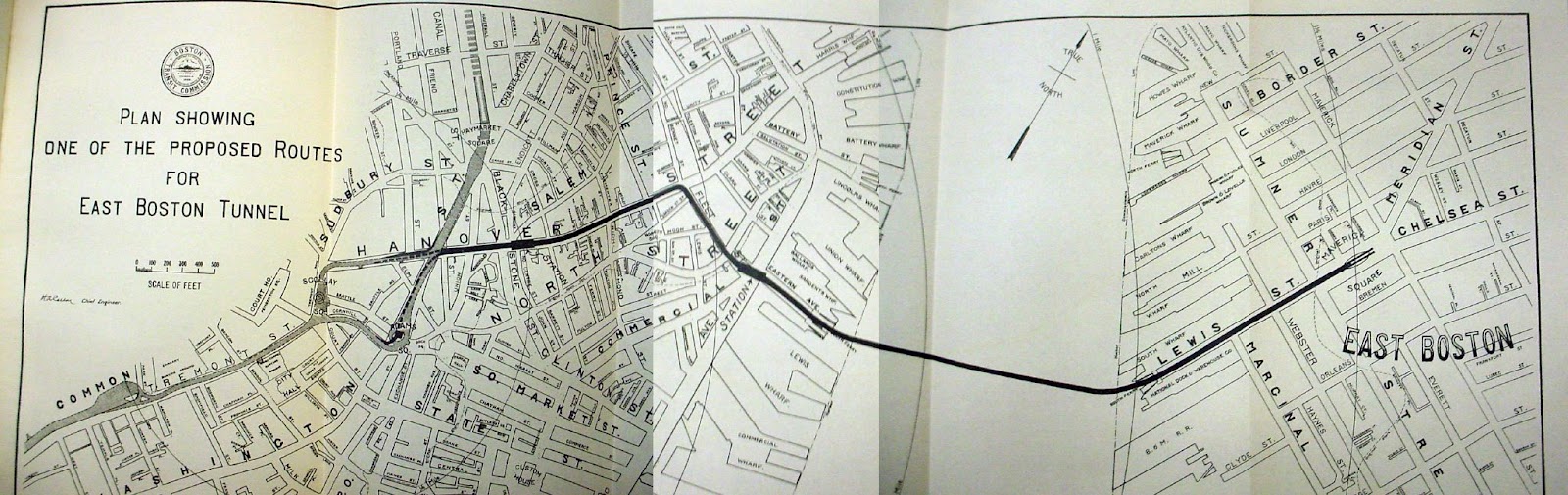
Every so often, someone rightly points out that we could do a moonshot and build a radial line to Chelsea, particularly if we could somehow integrate it to the Tobin Bridge. Radial service to Chelsea has been occasionally discussed, for over 100 years. See for example page 76 and 77 in the 1910 report of the Boston Transit Commission and pages 71 through 73 in the 1914 report of the Boston Transit Commission. (Boston in Transit has a scan of the map from the 1914 report.) Vanshnookenraggen also refers to a proposal for an elevated line to Revere via Chelsea and Charlestown on his historic track map, though I haven’t been able to locate the original source for this. (Van, if you see this and can share your source, I’ll update the post!)
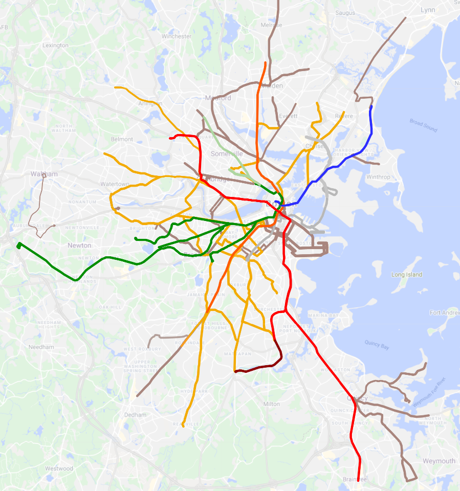
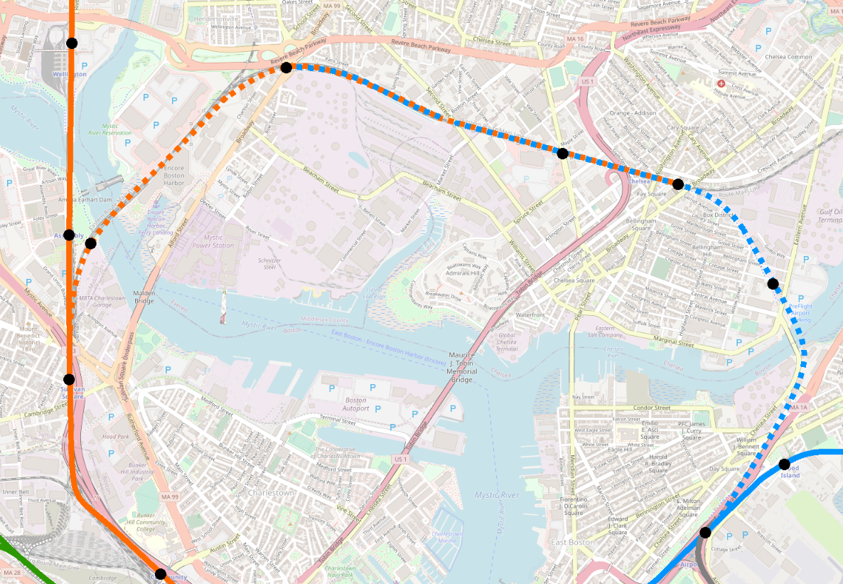
One wild idea for a radial line would be to build it from Charles/MGH via Science Park and Charlestown, alongside or possibly on the Tobin Bridge. To my knowledge, the first person to propose something like this was user davem on ArchBoston, though his proposal lacked the horseshoe element, and instead turned Charles/MGH into a traditional diverging point. I think the diverging alignment isn’t a feasible service pattern, so I’ve drawn a horseshoe instead that takes the idea but creates an unbroken line of track from Chelsea to Charles to Maverick.
Once Chelsea is reached, one could continue on all the way to Lynn, though that would open its own share of complications. One could instead press north into Chelsea, and/or veer over to Everett. The challenge with both of these is that neither has seen rail, so there are no existing ROWs to leverage; the closest equivalent is the Route 1 highway. Rapid transit can built along highways, but it’s not ideal; transit should go close to where people live, and people try to avoid living near highways. A Blue Line extension would likely need to be a subway, with all the complication and cost that entails.
Plus, there’s still the challenge of getting to Chelsea. The Tobin Bridge aside, how do you get to the Tobin? On paper, it is true that Charles St between Charles/MGH and Science Park is pretty much straight-shot aligned with Route 1 on the other side of the Orange Line, but the challenges become apparent in three dimensions — between Science Park and Route 1 is a spaghetti of highways, ramps, Orange Line subway tracks, commuter rail tracks, a dam, and the Charles River.
On top of that, as mentioned above, you need to have a Red-Blue connection, and that basically has to be at Charles. Hence the horseshoe: Government Center-Bowdoin-Charles/MGH-Science Park. But even this alignment still leaves you lacking a connection between the Chelsea branch and the Orange Line.
My feeling is that there are more cost-effective solutions to serving Chelsea and the North Shore, and stronger cases for the Blue Line elsewhere.
In the next post, we’ll start to examine proposals that are more frequently discussed in contemporary planning and crayoning.