In an effort to provide more frequent service to the three stations in Newton, I’ve developed a rework of the Framingham/Worcester Line schedule; there are lots of open questions that I can’t answer at this point, but from what information I do have, I believe the rework would be feasible, and would in fact improve service for the majority of riders on the line.
I propose switching from a “zonal express” model to a “skip-stop” model; this would keep travel times under control, while enabling trains to stop more frequently within the higher density suburb of Newton. Based on my analysis, this would require no additional rolling stock, and possibly may be able to use one fewer train than today. Operational expenses would potentially increase mildly, but no capital expenditures should be required to enable this proposed schedule, aside from the already-underway Worcester Union Station platform project.
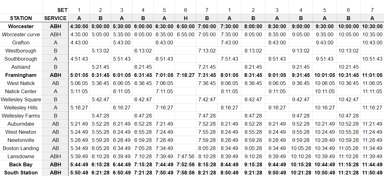
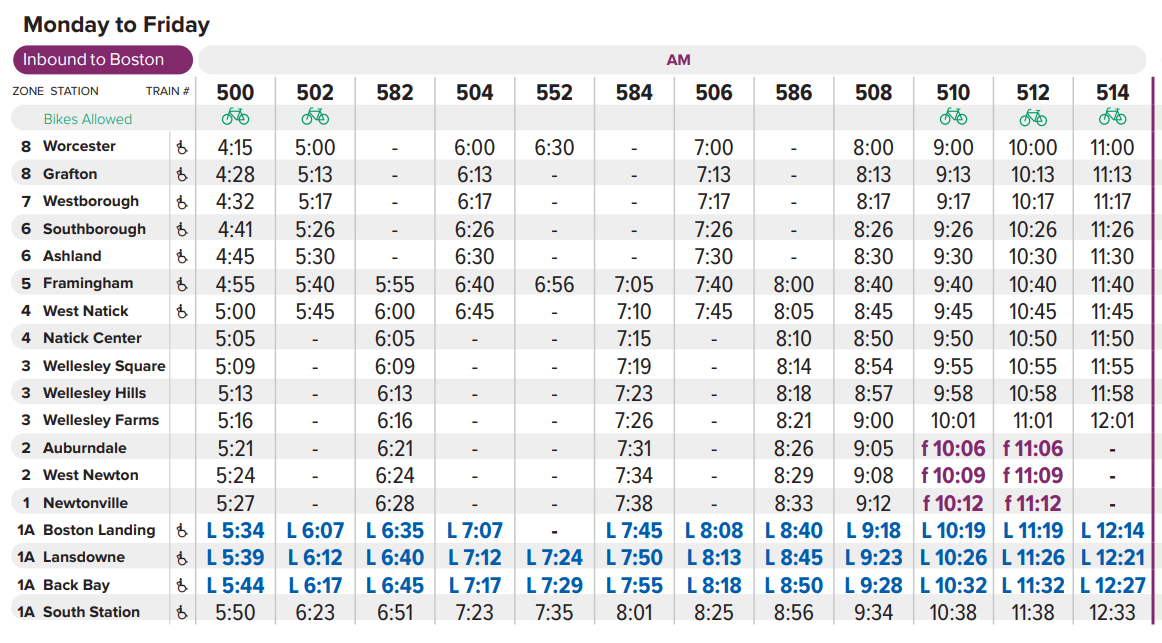
Here is a tentative draft of my proposed schedule; background, methodology, and details described below.
Background and current conditions
The Framingham/Worcester Line is a difficult line to run. It presents multiple challenges:
- It is long: about 43 miles as the crow flies from Worcester to Boston – comparable to the Providence Line (measured from Providence)
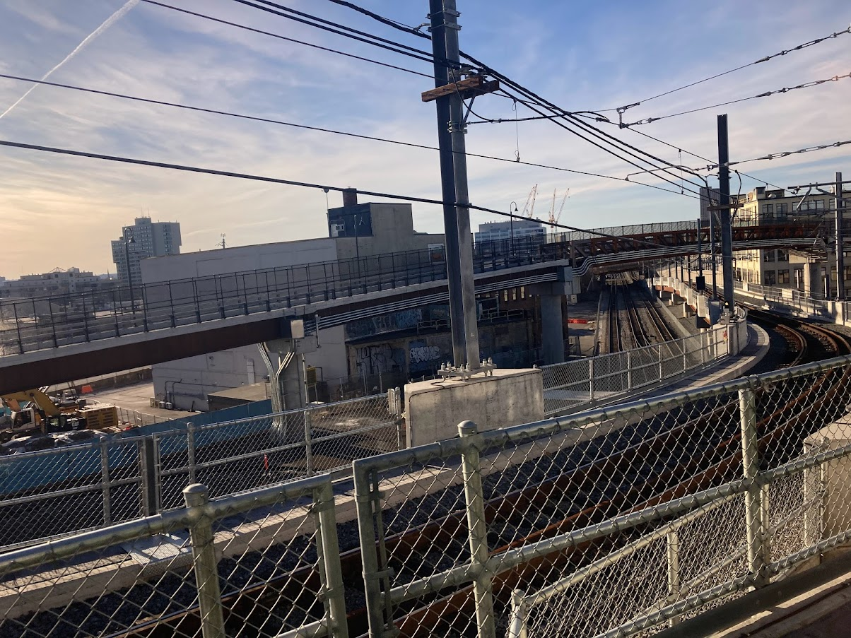
- But, unlike the Providence Line, which has lengthy straightaway segments, the Worcester Line has curves aplenty, including a pair of modestly tight S-curves as the rails wind their way into Worcester
- It has lots of stops: 15 between Worcester and Back Bay (compared to 8 on the Providence Line)
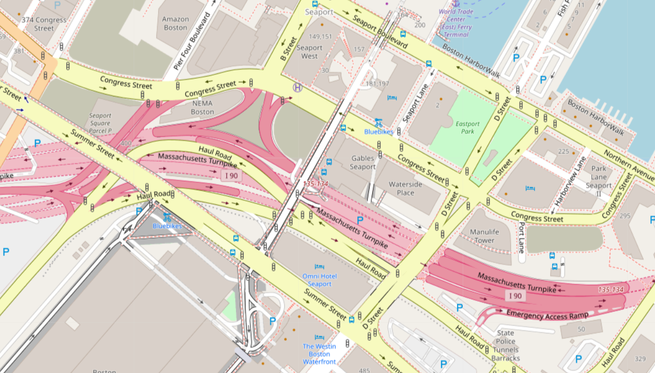
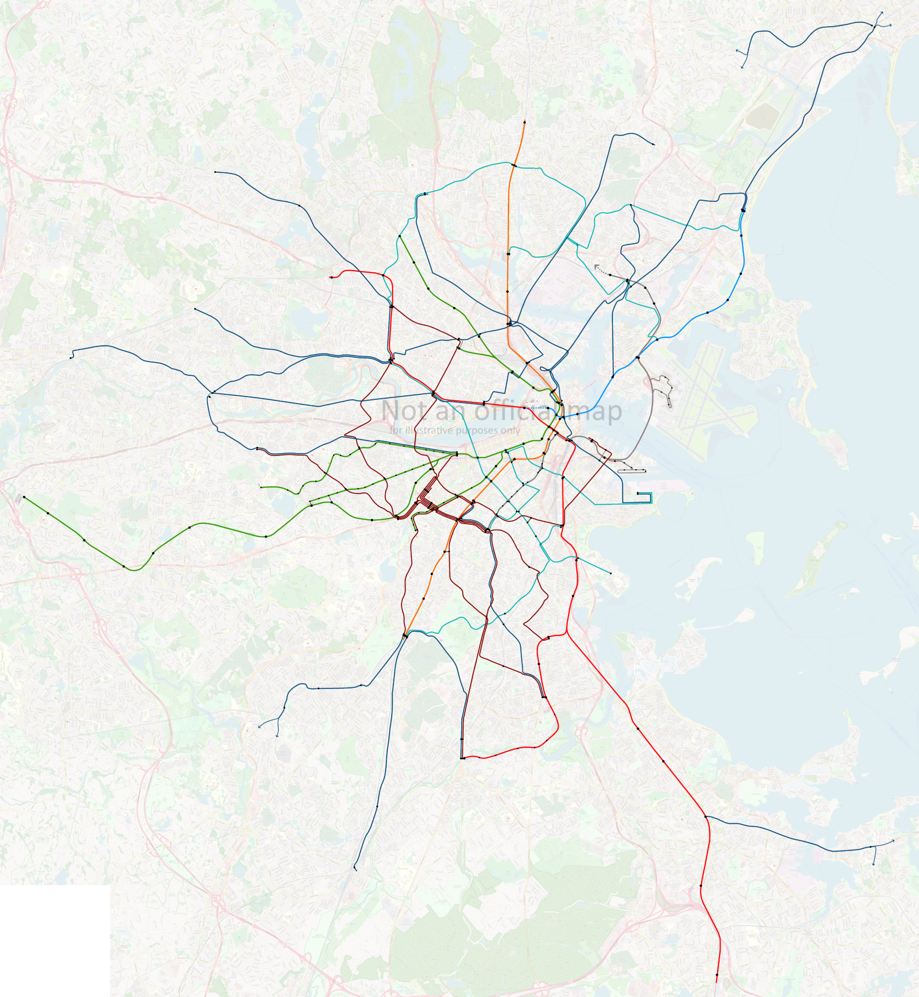
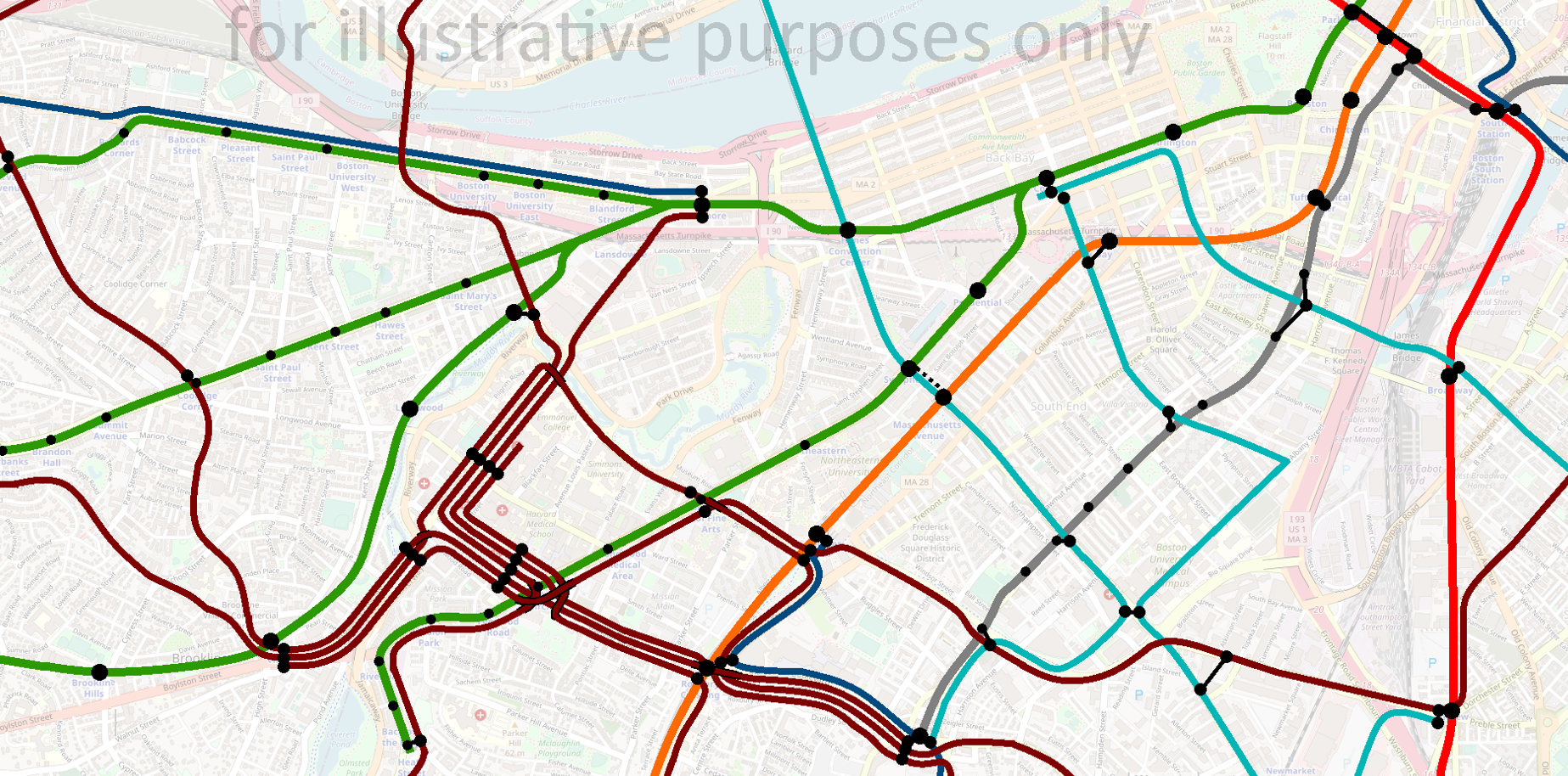
- It has operational constraints due to the locations of platforms (see this post by Dave Perry explaining the track numbers, and detailing some of the operational constraints):
- “The Newtons” (Newtonville, West Newton, Auburndale) currently have platforms only on Track 2
- At Wellesley Hills and West Natick, the parking lots are located next to the platform on Track 2; the platform for Track 1 is only accessible via an at-grade crossing across the tracks
- The T therefore runs all peak direction trains on Track 2 through these stations to avoid having large crowds of commuters crossing live tracks
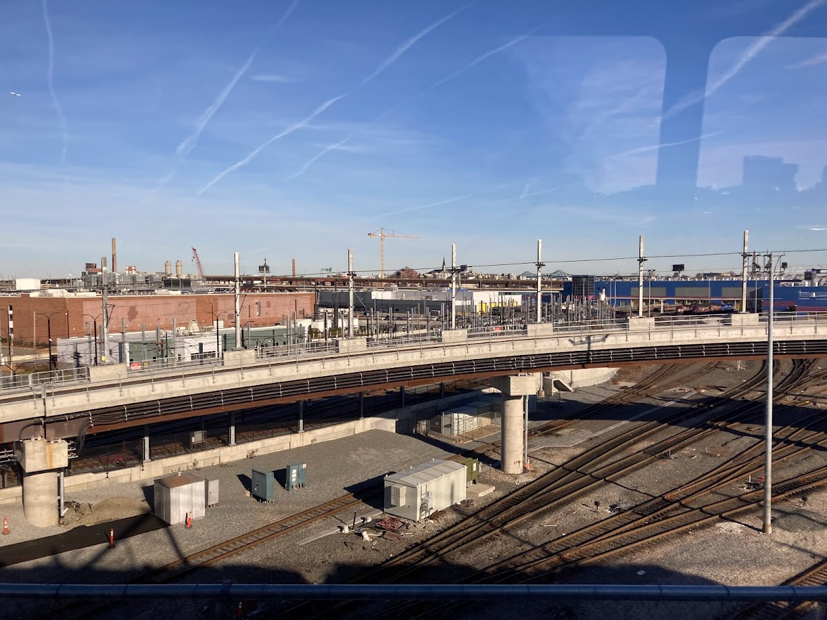
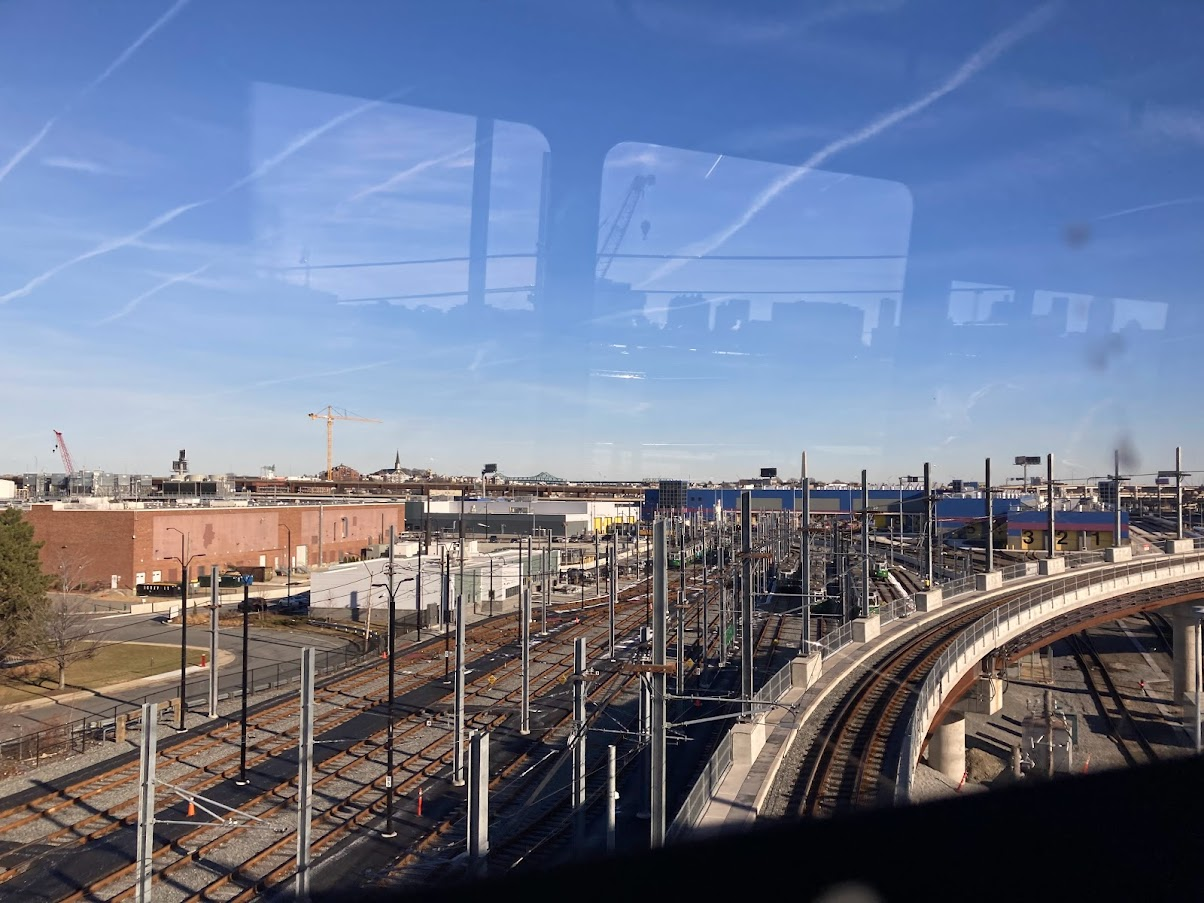
- Worcester’s platform is currently only accessible from Track 1, though the T is building a center platform to allow access from both tracks and enable more than one train to occupy the station at once
The T addresses these challenges through two methods.
First, peak direction trains are divided into “Worcester expresses” and “Framingham locals”, where hourly trains depart from Worcester and make all stops to West Natick before expressing to Boston Landing, while offset hourly trains depart from Framingham and make all local stops. A single “Heart to Hub” (or “H2H”) train leaves Worcester and runs express to Framingham and then express again to Lansdowne, to provide Worcester commuters an option that arrives within Boston’s borders in less than an hour. (Journey time to South Station is 1h5m.)

Second, to accommodate the single platforms at the Newtons, as well as the pedestrian-unfriendly conditions at Wellesley Hills and West Natick, the T runs all peak-direction trains on Track 2 between Framingham and Boston. In essence, Track 2 acts as the “inbound” track in the morning and transforms into the “outbound” track in the afternoon.
Reaching toward frequent Regional Rail service for the Newtons
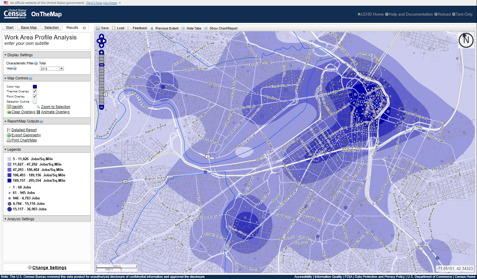
This project began with an effort to identify ways to increase the frequency of service to the Newtons, which sit in modestly walkable neighborhoods of similar density to the villages served by the Green Line to the south, but which only see hourly service during rush hour.
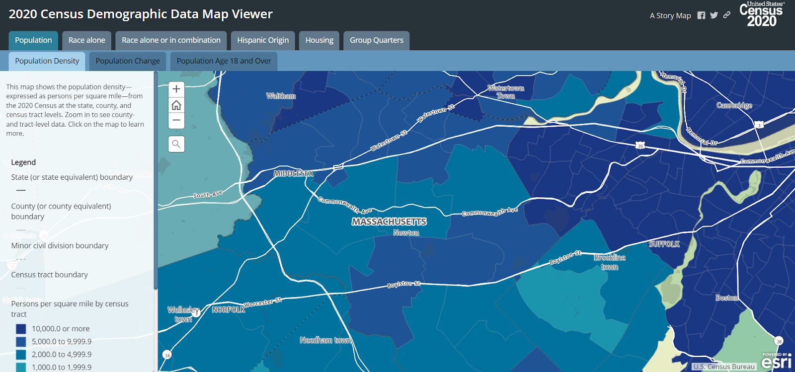
from https://mtgis-portal.geo.census.gov/arcgis/apps/MapSeries/index.html?appid=2566121a73de463995ed2b2fd7ff6eb7
What’s more, there are trains running through these stations during rush hour, roughly every thirty minutes; the problem is that those Worcester expresses run non-stop in order to keep travel times down for the longer commutes.
If only there were a way for those Worcester expresses to stop at the Newtons without impacting the commute times for riders west of Framingham.
Then something occurred to me: what about a skip-stop service?
Skip-Stop Services
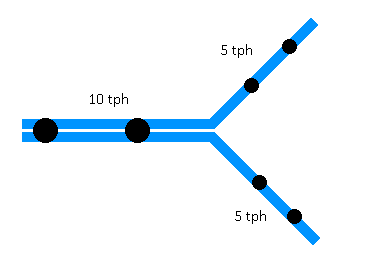
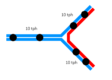
For those unfamiliar, skip-stop services are a technique to speed up journeys on lengthy routes by dividing trainsets into two groups, with consecutive stations alternating between the two groups, punctuated by periodic “all trains” stops served by both groups.
Skip-stop service was used throughout the 20th century on major American subways. New York, Chicago, and Philadelphia all used skip-stop patterns to varying extents, though today I believe only one set of services remains in use (the J/Z in New York). They have fallen out of favor in part because they make the system more confusing for new riders and because (in my opinion) the time savings on a rapid transit system simply aren’t particularly large. And particularly for “local” journeys on a subway line – e.g. in New York if you’re only looking to go 30 blocks, about 3 stops – skip-stop service is much more disruptive, requiring a transfer.
Skip-stop service potentially can be effective, but it needs to be on a corridor where there are both significant time-savings and minimal intra-corridor (“local”) journeys.
So, I wondered, could skip-stop service patterns generate enough time-savings to “free up” space in the schedule for Worcester expresses to stop at the Newtons?
The answer, I believe, is yes.
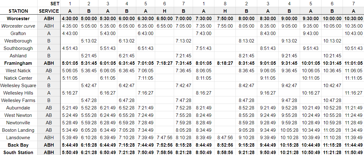
Generating a schedule
To test different service patterns, I built an interactive spreadsheet that allows you to
- Assign stations to different service groups (e.g. “A” or “B”)
- Set each train’s departure times from Worcester
- Assign each train to one of the service groups
And from there, the spreadsheet will auto-generate the schedule for each train. Critically, this spreadsheet takes into account the time-savings from skipping a stop. (It also takes into account the significant speed restriction due to the curve in eastern Worcester, which will slow trains regardless of whether they make the subsequent stop in Grafton.)
To confirm the accuracy of the spreadsheet’s predictions, I provided it with the service patterns and Worcester origination times for the current schedule. (One major limitation of the spreadsheet is that it only supports calculations for trains originating in Worcester, so I used a hypothetical Worcester departure time that calculated a Framingham departure time matching the current schedule.)
The schedule predicted by the spreadsheet matches the current schedule with high accuracy, in most cases deviating from the current schedule by less than 60 seconds. (The deviations are slightly higher for the H2H service, but my spreadsheet overestimates travel times, and only by 3 or 4 minutes.) So, I am modestly confident in the accuracy of my model’s predictions.
Presenting: Half-hourly skip-stop service from Worcester
By moving the stops between Worcester and Framingham, and the stops between West Natick and Auburndale, into a skip-stop pattern, we get the following schedule.

This schedule achieves the primary objective: providing more frequent (half-hourly) peak direction service to the Newtons, without requiring additional rolling stock or capital improvements (beyond the new platform at Worcester, currently under construction).
This schedule provides additional benefits.
Benefits to frequencies and journey times
Service from Worcester doubles to half-hour headways. Additionally, coming from Worcester the travel times are equal (or slightly better) to today’s Worcester expresses, at about 1h21m (compared to today’s 1h23m).
Service from Framingham becomes clock-facing with half-hour headways. There is a resulting trade-off: the current schedule offers hourly 43 min journeys in addition to hourly 56 min journeys (offset from each other by about 15 minutes); my proposed schedule sees consistent journey times of 50 min, which is a bit slower for commuters who are used to the current Worcester expresses. On the other hand, my proposal eliminates the 45 min gap between trains, significantly improving commute flexibility.
(And, as I’ll discuss below, it may be possible to run two H2H trains, which would provide an additional express option for Framingham commuters.)
Journey times either remain constant (within 3 minutes) or improve from most stations. Ashland and West Natick see a similar tradeoff to Framingham – journey times increase by 6-7 minutes; in West Natick’s case, that is off-set by consistent 30 min frequencies, rather than today’s lopsided 15-min/45-min pattern. (An earlier version of this piece misstated that West Natick would see a frequency increase under my proposal; rather than an increase, it will see improved consistency.)
Benefits to rolling stock efficiency
Finally, this schedule requires no additional trainsets, and may in fact require fewer trains than the current schedule. By my reckoning, the current schedule requires about 8 or 9 trains, possibly with one or two intermingled with other lines. My schedule requires 8 trains, which can be reduced to 7 if most reverse services make limited stops (which would be commensurate with the reverse peak demand, which, at least in 2018, was focused on commutes from Boston to Framingham and to Worcester, and to a lesser extent, Natick.)
If even one trainset is freed up, this opens the door to several possibilities.
Additional “Heart-to-Hub” service
First, the newly available sets can be repurposed to provide additional service on the Framingham/Worcester Line. For example, one of those extra sets could be used to add an additional “Heart-to-Hub” express service from Worcester:
(In the not-too-distant future, I would love to see a second H2H slot instead filled by a MassDOT service from Springfield, ideally using rolling stock that has been sourced externally.)
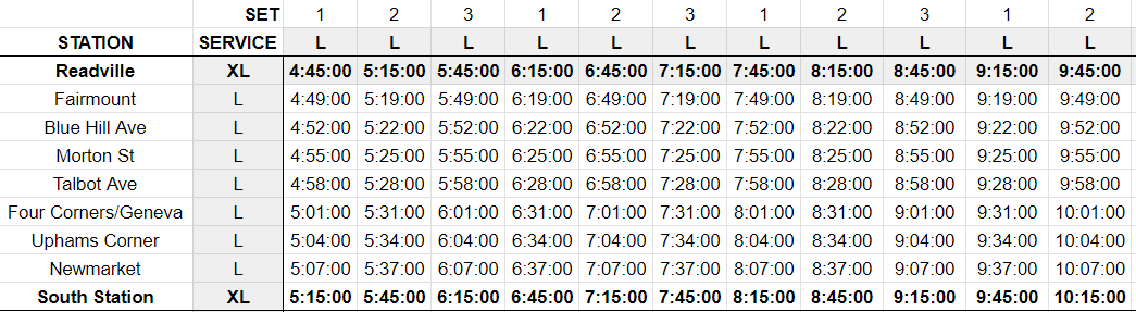
30-min headways on the Fairmount Line
Possibly most importantly, even just freeing up a single extra set would allow the Fairmount Line to increase from 45-minute headways to clockfacing 30-min headways, which would be a big step forward in getting the Fairmount Line closer and closer to rapid transit service.
Higher frequencies to the Newtons
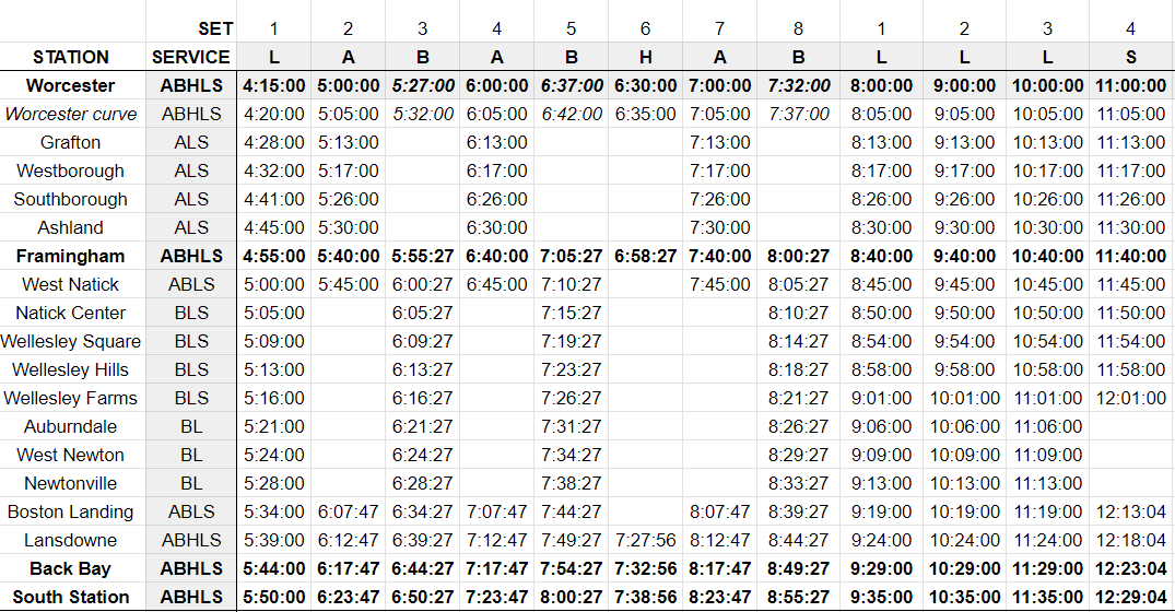
Finally, while it would definitely require at least one additional trainset relative to today, I sketched out a schedule that would add a third stopping pattern, originating at Framingham, expressing to Auburndale and making all stops thereafter, providing 3 tph to Framingham, and providing clockfacing 20-minute headways to the Newtons. This schedule would (I believe) require 8 sets operating from Worcester, and two additional sets operating from Framingham.
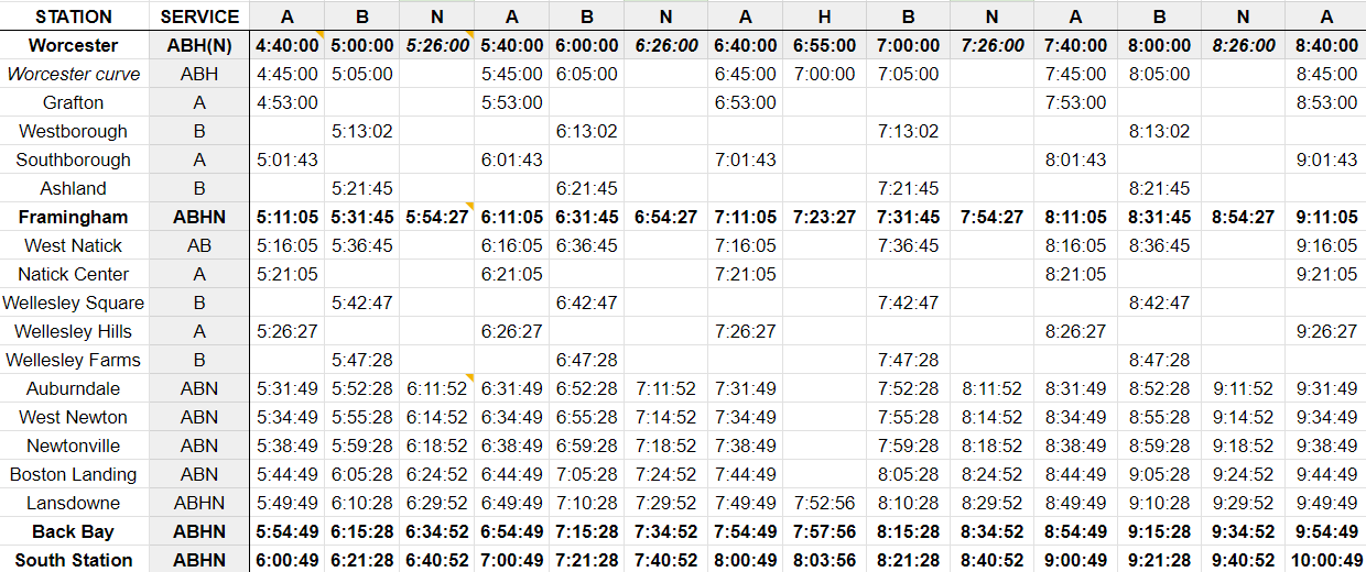
(The schedule generator I built requires trips to “originate” in Worcester, so I’ve included hypothetical departure times from Worcester in italics – trains with the N service pattern would in reality originate at Framingham.)
Overall, I would use the extra trainset(s) to reduce Fairmount headways to 30 minutes as a first priority, and add a second H2H service as a second priority. I don’t see an urgent need to provide 20 minute headways to the Newtons – I offer it more as a fun bit of imagination.
Conclusion
To review, I believe using a skip-stop service pattern originating from Worcester will:
- Provide half-hourly service from Worcester at the same travel time as today
- Provide half-hourly service in the peak direction to the three stations in Newton
- Provide near clock-facing service from Framingham at a consistent journey time comparable to today
- Maintain existing frequencies for all other stations
- Maintain equal or faster journey times for most stations
- Require no additional rolling stock
- Potentially free up existing rolling stock to raise frequencies on the Fairmount Line to 30 min
To me, that sounds like a palpable improvement in service — and something I believe would be well worth the MBTA’s consideration.


