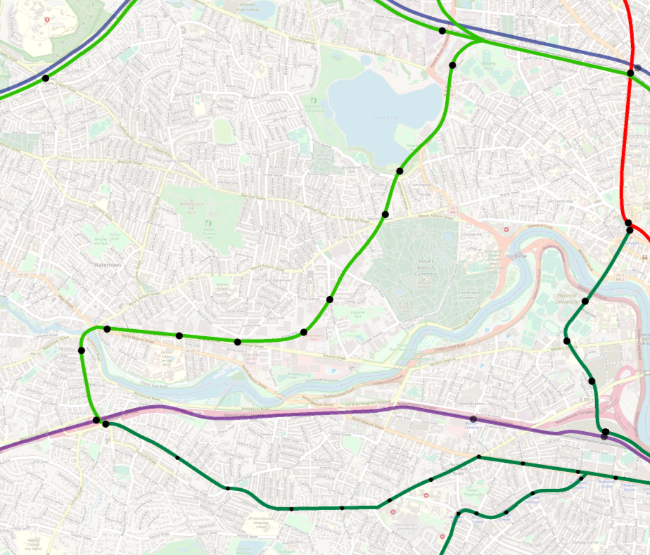
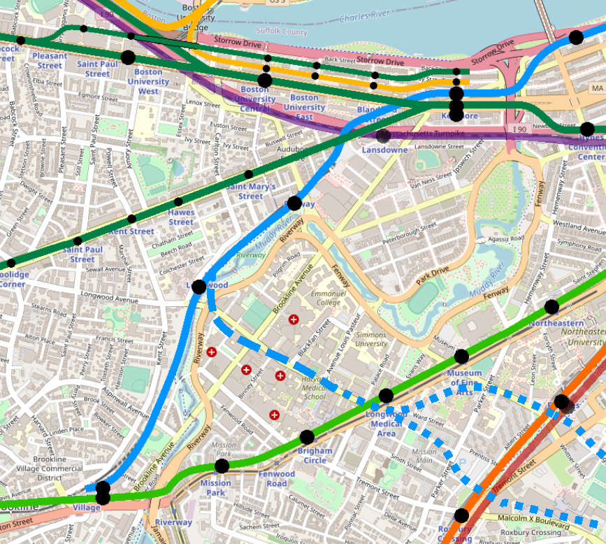
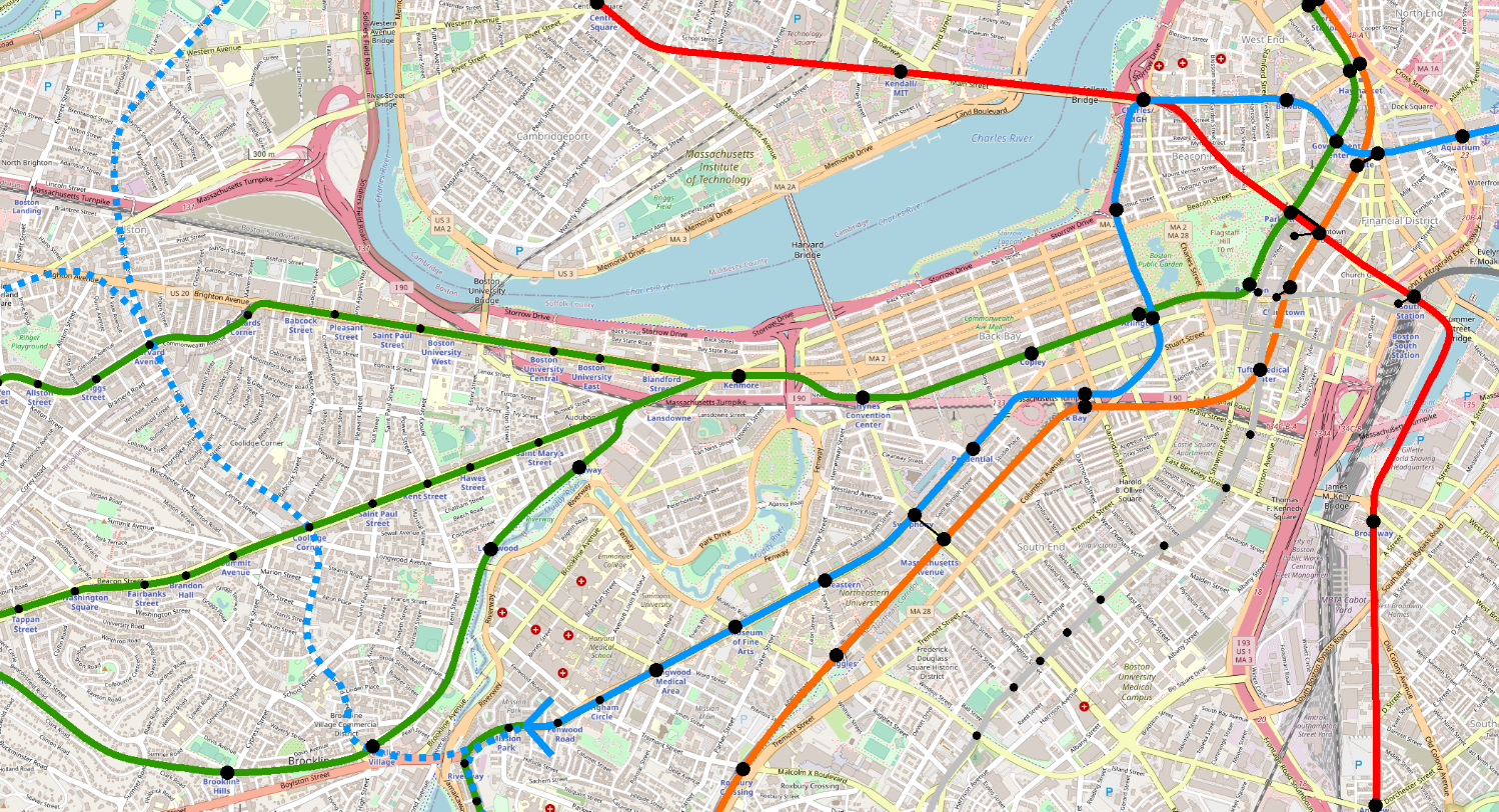
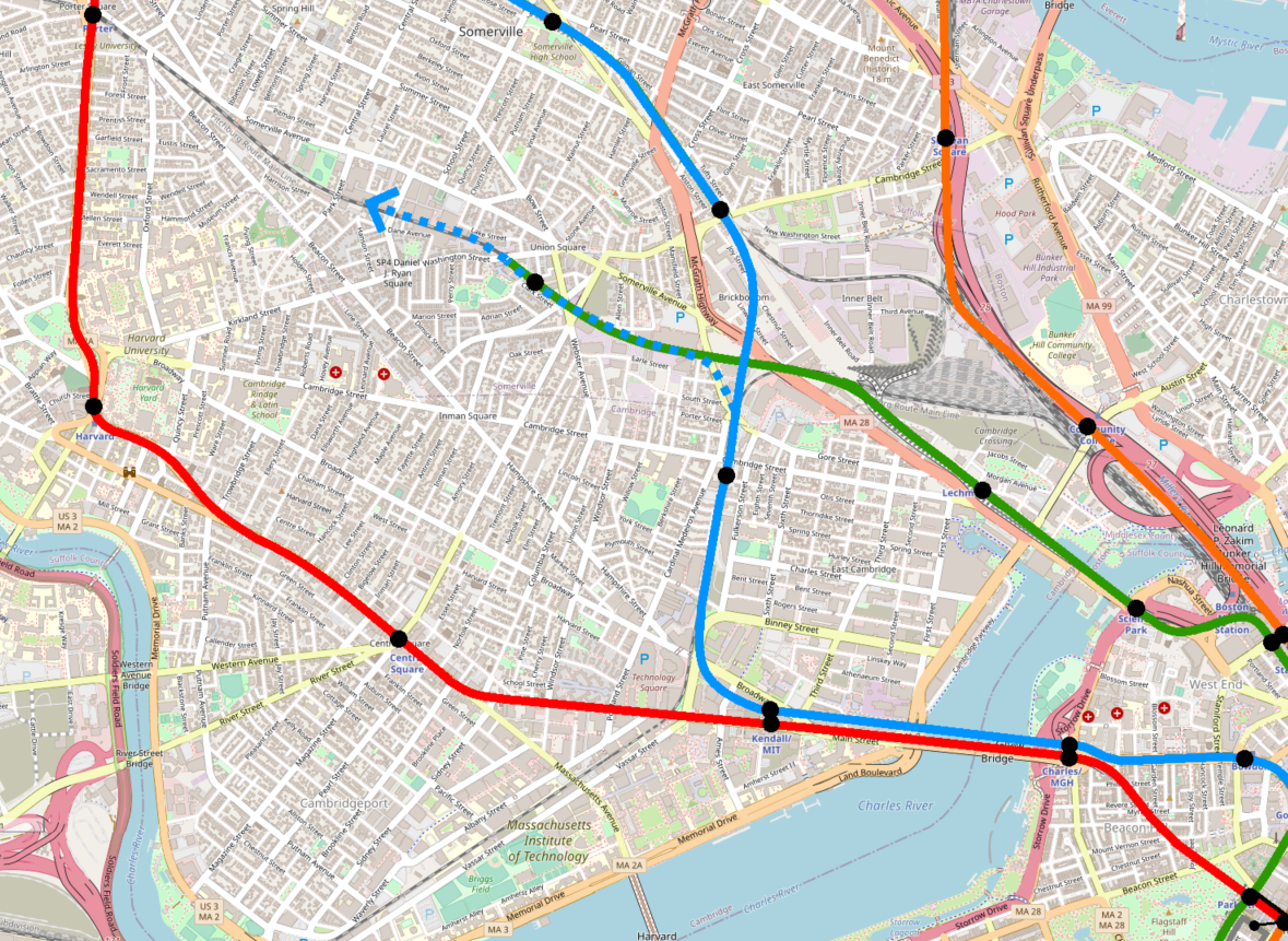
The Atlantic Ave El: A Story of Failed Aldgate Junctions

Earlier this year, I described how Aldgate Junctions can be used to provide additional service along branchlines without impacting capacity on the core. But Aldgate Junctions have their limitations – a lesson that the Boston Elevated Railway (BERy) learned the hard way, 100 years ago.

The original Main Line El network

When what is now the Orange Line was first built, it was very different. In fact, the earliest iteration of the Orange Line did not use a single piece of track, tunnel, station, or right-of-way that the current Orange Line uses.

The Main Line El, as it was called, was opened in 1901, as a collection of three elevateds and one subway: the Charlestown El, the Washington St El, the Atlantic Ave El, and the Tremont St Subway. Yes – despite being opened less than 5 years before as a streetcar subway, the Tremont St Subway was semi-temporarily converted to third-rail and high-level platforms. (The four-track sections of the subway saw the inner tracks maintained for streetcars.)

The infrastructure of the Main Line El when it opened looked something like this:

Single els at the northern and southern ends were connected by a pair of downtown trunk lines, all linked together by a pair of Aldgate Junctions, the northern junction called “Tower C”, and the southern one called “Tower D”. This arrangement allowed all trains to run everywhere. For example, the following array of service patterns would have been readily achievable, with bidirectional service on each “line”:

(Note that I’m not sure a full service pattern like this ever existed; but, as you will see below, it looks like BERy experimented with many permutations, so this one may have been attempted at one point or another.)

Shifting into the Washington Street Tunnel and reshaping the network

The original network was short-lived. Within the decade, the Washington Street Tunnel opened:

As you can see, the Aldgate Junction at Tower C was preserved, but Tower D was modified into a simple flat junction. I argue that the asymmetric presence of the northern Aldgate Junction fatally undercut the Atlantic Ave El’s ability to contribute usefully to the network.

Mapping the lasting impact of the asymmetric Aldgate Junction

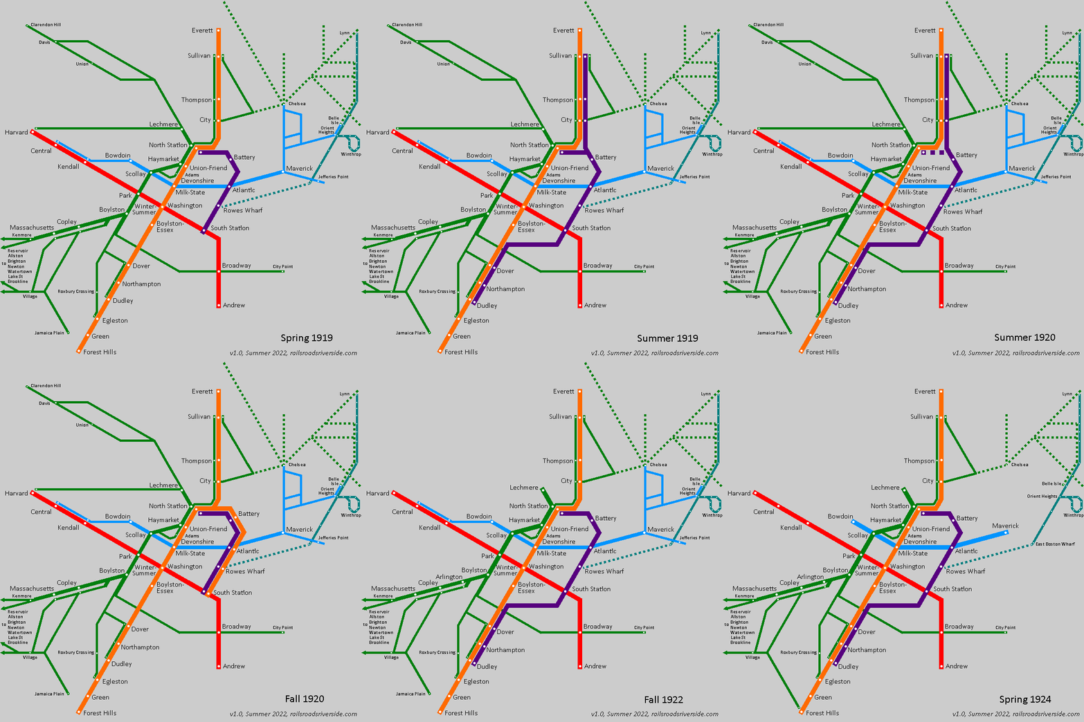
In the course of researching another project, I ended up doing a deep dive into BERy’s experiments with different service patterns on the Atlantic Ave El from 1919 to 1924. You can follow the evolution step-by-step below.

Ultimately, I would argue that the problem they were trying to tackle was a geometric one. Without an Aldgate Junction at Tower D, the Washington St El is hobbled by reverse-branching: every train you try to send from Dudley to Atlantic is one fewer train that you can send from Dudley to downtown; as it is today, downtown was the more popular destination and could hardly afford to lose service.

Trying out a shuttle service + deinterlining

This is why it is unsurprising that in 1919, BERy stopped running trains from Dudley to Atlantic via Beach St – all trains from Dudley would run through the Washington St Subway, as detailed in this newspaper announcement:

As you can see, BERy sought to increase frequencies on both the Tunnel and the El by isolating each other’s services; the Tunnel would be served by Forest Hills/Dudley-Sullivan trains, and the El would be served by North Station-South Station shuttles. (Not mentioned here is a dedicated track that existed at North Station, allowing Atlantic shuttles to reverse direction without blocking Tunnel traffic.) Drawing on the style of the Cambridge Seven Associates “spider map”, a diagram of the system at the time might have looked like this:

This was certainly a reasonable idea, and is a technique called “deinterlining” that remains in use to this day. (Every so often, you will see someone put forward a proposal to deinterline the NYC Subway, for example.) Two low-freq services offering dedicated one-seat-rides to multiple destinations are reshuffled into two high-freq services that provide higher frequencies to all stations, improve reliability, and maintain some OSRs, at the cost of turning other journeys into two-seaters. 

The push for deinterlining highlights a common pitfall of Aldgate Junctions: it entangles all three branches into a single shared timetable. Trains on one branch need to be coordinated with trains on both other branches. Even if your train is bypassing a branch, delays on that branch will still impact your journey through ripple effects. 

Pitfalls of a deinterlined main line + shuttle, and an attempt at remediation

But BERy’s own announcement reveals a fatal flaw in their plan: most of the major destinations on the Atlantic Ave El could be reached by other two-seat rides that were often more direct, especially for riders coming from the south. Why would anyone board a train at Dudley, ride it all the way to North Station, and then transfer to a shuttle and ride it the long way round to disembark at Atlantic (today’s Aquarium)? It would likely be significantly faster to transfer at State/Milk/Devonshire and ride an East Boston train one stop. (And probably would be just as fast to walk.) 

And from a convenience perspective: a two-seater is a two-seater, so Washington + East Boston is equally convenient as Washington + Atlantic. At that point, journey time becomes the deciding factor. 

Perhaps an Atlantic shuttle service could have been more successful if it had offered a southern transfer at Dover. Unfortunately, the Washington St El’s station construction style meant that significant capital investments would have been required to turn trains at Dover. 

As it stood, the 1919 Atlantic shuttle service was useful for three specific things:

  1. Shuttling passengers between South Station and North Station
    • Perhaps of limited use to long-distance travelers, but hardly a large market
  2. Serving Battery St
    • Located at the farthest edge of the North End, with half of its walkshed underwater
  3. Serving Rowes Wharf
    • Faced with declining ferry ridership and likewise only half of a walkshed

That is pretty wobbly, especially given the cost of maintaining the El and the diversion of rolling stock away from more heavily used segments.

(Of note – though I believe ultimately not of very much consequence to this particular topic – is the Great Molasses Flood, a disaster that occurred about two weeks after BERy’s announcement, and which put the Atlantic Ave El out of service for over two months.)

This experiment in pure deinterlining was short-lived. Just six months later (and less than three months into the service actually being consistently run following the flood), a Dudley-Atlantic-Sullivan service was reinstated:

Which would have looked like this (although I am unclear whether the Sullivan-Dudley service itself was weekends-only):

Implementing a “wraparound” service

The Dudley-South Station-Sullivan service – whether it was truly daily or only on weekends – only lasted another six months. In December of 1919, a fascinating “wraparound” service was instituted that essentially turned the Atlantic Ave El into a second northern branch of this predecessor to the Orange Line:

This change was briefly announced in November:

But it was given much more fanfare upon actually starting in December, including an interview with the Superintendent of Transportation. The article also includes details on the frequencies breakdown: 

The core stretch through the Washington Street Tunnel would see 24 trains per hour (tph) at peak. To the north, 8 of those trains would head to South Station, while the other 16 would go to Sullivan; in essence, BERy “paid” for a one-seat-ride to the Atlantic Ave El by diverting about one-third of Sullivan trains. 

(To the south, it should be noted, the 8 tph from South Station were short-turned at Dudley, again leaving the other 16 tph available to serve Forest Hills, though I’m not sure that they all did.)

Seasonal direct service

Sometime in the summer of 1920, a direct Dudley-South Station-Sullivan service was reinstated, to accommodate increased traffic from summer travelers. It’s unclear to me whether a North Station-South Station service remained during this time. 

Wraparound service + shuttle

However, by the end of September, the through-run was canceled, replaced by a return of the wraparound service – now only 6 tph – but now supplemented by a dedicated North Station-South Station shuttle, also running at 6 tph. 

Again, we see BERy reducing the frequency of one-seat rides, but adding additional short-turn service to raise frequencies on the El itself higher. 

Low-freq seasonal direct service + high-freq shuttle

Once more, however, after several months BERy shifted the service pattern again. In June 1921, BERy announced the return of Dudley-South Station-Sullivan direct service, citing the need to accommodate summer travelers.

Once again, the wraparound service was discontinued. This time around, however, BERy reduced the frequency of the direct service lower than I believe they ever had before: only 5 trains per hour. This was again supplemented by a much higher frequency on the North Station-South Station shuttle, which saw 10 tph during rush hour.

I think there’s actually a lot to be said for this arrangement. The lack of wraparound services means that trains aren’t doubling back on themselves; the frequency for Dudley-Atlantic-Sullivan services seems to match the present-but-low demand, sitting at the edge (but still within) the realm of “turn up and go”; and frequencies remain high on the core segments, meaning that riders who are impatient have the alternative of a two-seat journey between services with high frequencies (and therefore short transfer times).

Reverse branching from the south

It’s unclear to me whether BERy returned to a “Winter” service pattern after the 1921 Summer was over, and if so, which Winter service pattern they used.

However, it appears that the Summer pattern was again used in Summer 1922, before being replaced in September 1922 with yet another new service pattern:

This pattern essentially extended the North Station-South Station shuttle – a relatively constant fixture of all these variations – from South Station to Dudley. This again turned the Atlantic Ave El into a second northern branch of the Main Line El, but shifted the split point to the south to avoid the roundabout journeys of the wraparound pattern. This of course came at the classic cost of reverse branching: radial service from Dudley was rerouted away from the core, reducing the number of trains that could run between Dudley and Downtown.

As I understand it, this service pattern remained somewhat stable, though I am unsure how long it remained in place. By 1924, the predecessors to the Blue and Green Lines saw many of their surface routes truncated at Maverick and Lechmere respectively, which leaves us a map like this:

Writing on the wall

In 1926, the Report on improved transportation facilities in the Boston Metropolitan District noted that (p. 26):

At the present time the Atlantic Avenue Elevated loop is utilized principally as a rapid transit connection between the North and South Stations. It also affords a convenient means of reaching the several steamboat and ferry terminals along the waterfront. The total traffic served by this loop is not particularly important in a comparative sense. 

That same report called for the demolition of the Atlantic Ave El and replacing it with an “elevated roadway” (p. 41 and on) – essentially proposing the Central Artery, some 30 years before its time. 

By the late ‘30s, BERy listed the Atlantic Ave El as a separate route on its maps, running primarily between North and South Station. The El itself was demolished in 1938.

Other disadvantages faced by the Atlantic Ave El

To be clear, there were a number of factors that put the Atlantic Ave El at a disadvantage. For one, running along the shoreline meant that half of its walkshed was literally underwater. The route also avoided the densest parts of downtown Boston, in favor of serving the docks, which also reduced transfer opportunities to the Tremont Street streetcar services and to mainline railroads at North Station. 

(Transfer opportunities to the East Boston Tunnel were available at Atlantic, and to the Cambridge-Dorchester Subway at South Station; I would speculate, however, that passengers would likely prefer the shorter and fully-indoors transfers available on the Washington St Tunnel.)

Serving the docks was an understandable design decision at the time, but became more problematic as time went on. Tunnels under the harbor significantly reduced ferry ridership; for reference, the highly popular Boston, Revere Beach & Lynn Railroad ferried passengers across the harbor from their terminal at Jefferies Point to Rowes Wharf – surely a large source of passengers for the El.

Finally, it bears mentioning that Elevateds themselves quickly became unpopular. They were noisy, unsightly, and brought the noise of transportation up from street-level directly outside residents’ windows. Furthermore, since the Els were a rapid transit service that BERy used to express riders in from streetcar transfer hubs further out from downtown, stops were spaced distantly, and thus provided that much less advantage to residents who endured the costs of living nearby. 

What if?

Would things have been different if Tower D had been maintained as an Aldgate Junction? It’s hard to say. Maintaining a central “loop” service as I showed in my diagram above would still mean reducing the number of trains that could run directly between Dudley and downtown. 

On the other hand, a loop would have kept frequencies maximally high within the core Washington Street Tunnel, keeping capacity high for transfers from Cambridge, Dorchester, East Boston, and North Station. A loop service would also have created a one-seat ride from South Station to (what is now) Chinatown, State, and Haymarket.

Would it have been enough to save the Atlantic Ave El? In the end, I doubt it. The waterfront routing and probably the mere fact of being an elevated likely would have doomed it anyway. These were the early days of rapid transit – some ideas were simply best guesses, and so some ideas were inevitably wrong. 

Lessons for today

It’s clear that the asymmetric availability of an Aldgate Junction following the construction of the Washington Street Tunnel is the fundamental reason BERy kept changing the service patterns seemingly every six months circa 1920. BERy was trying, I would argue, to solve a physically impossible puzzle, experimenting with basically every possible permutation of service on the El, and failing to make any of them work.

The history of the Main Line El offers a lesson, not in the benefits of Aldgate Junctions, but in the perils of reverse branching and doubleback services. A key advantage of an Aldgate Junction is the “branch bypass” service: recall BART’s Orange Line that runs from Richmond to the East Bay without entering the core in San Francisco. 

In the case of the Atlantic Ave El, that advantage was negated: the experimental wraparound service was inefficient because it was a doubleback service that was roundabout and not fast enough to compete with more direct two-seat journeys. South Station-Sullivan service avoided the core of downtown, and consumed slots needed for the more valuable Sullivan-Dudley service. 

Why does it work in London?

London’s example may be a closer comparison than the BART’s: the eastern end of the Circle Line is also a doubleback service, as can be seen in the 2015 London Connections Map:

Why does it work in London where something similar failed in Boston? I think there are a few reasons:

  1. London has more people – a lot more people. Greater London had about 7.5 million residents in 1920, while Boston had a tenth of that (see pg. 143). Being physically smaller, 1920s Boston may actually have been roughly as dense as London, but you could probably fit (and I’m making a wild guess here) four or five “Bostons” into London’s areas of high density. 

    With that many people, the numbers game really begins to change. (This is a useful point to remember when comparing [Western] cities to London, New York, and to a certain extent Paris and Los Angeles – those cities are simply different due to their scale and are hard to use for comparisons.)
  1. The northern and southern legs of the Circle Line are a little bit further apart than the El and the Tunnel were, increasing incentive for passengers to ride around the bend even if it is slightly more roundabout.

  2. The Circle Line has fewer “crossing services” than Boston did: recall that riders could use the predecessors to the Red and Blue Lines to access most of the stops served by the El; London by contrast had more stops and fewer crossing services.

    If you were coming from Farringdon or points west and wanted to go to Monument, you could alight from the Circle Line at Moorgate and transfer to the Northern Line and go south one stop… but if you were going to Cannon Street or Mansion House, then you’d need to get back on a Circle or District Line train anyway, so why not stay on? The Central Line and Thameslink also presented options, but might have been undesirable for other reasons (see below).
  1. London’s large population becomes relevant when considering transfers; I don’t know what it was like in 1920, but today those segments of the Northern Line and Central Line are extremely crowded, while the Circle Line is noticeably less so. This again incentivizes riders to continue “round the bend”, to avoid an extremely crowded transfer.

Planning and crayoning

So what does all this mean from a transit planning and crayon mapmaking perspective? It means that an Aldgate Junction can solve some problems with branching, but it’s not a cure-all. 

It’s still vulnerable to the pitfalls of reverse-branching, diverting radial services away from the core. Every train from Dudley that went to South Station was a train taken away from the more valuable Dudley-Downtown route.

If the branches are close together, then an Aldgate Junction becomes less useful because it won’t be used for through-journeys from branch to branch – there will be other “crossing services” (including walking or biking) that are faster. Someone journeying from Scollay Square to what is now Aquarium was better off traveling via the East Boston Tunnel than going the long way around.

If the branches are long and are corridors unto themselves, then the Aldgate Junction can still be a useful way to increase frequencies within the corridor – but in that case it may be more efficient and reliable simply to short-turn supplementary services within the branchline itself, rather than deal with the logistics of a junction. 

In a Boston context, this would be relevant on the western branches of the Green Line: a “wraparound service” that jumps from the B to C Lines while avoiding Kenmore would be a poor alternative to the (idealized, well-running) 66, 65, or 47 buses. If frequencies need to increase within the Beacon or Commonwealth corridors, short-turning trains at Blandford St, St. Mary St or Kenmore would be more reliable and less complex than a junction. 

(This also holds true, in my opinion, at the western end of those branches, where there is a true set of Aldgate Junctions at Cleveland Circle and Chestnut Hill Ave.)

Summary

An Aldgate Junction is more useful when as many of the following are true:

  1. Branches are evenly distributed geographically
  2. The region is pluricentric, where key destinations are located across multiple branches
  3. The branches are long and form corridors unto themselves
  4. Direct “crossing services” (such as circumferential routes) are not available between the branches, or are too centralized resulting in three-seat-journeys (such as Farringdon-Moorgate-Monument-Cannon Street)

Even before the elimination of the Aldgate Junction at Tower D, the Atlantic Avenue El failed all of these. Following the relocation into the Washington Street Tunnel, BERy was hamstrung with no way to serve the El without incurring reverse-branching, doubleback services, or both. This is vividly illustrated by the rapid changes and experimentation with service patterns circa 1920. 

While the Atlantic Avenue El was demolished over sixty years ago, its history can still teach us lessons today.

Addendum: a GIF
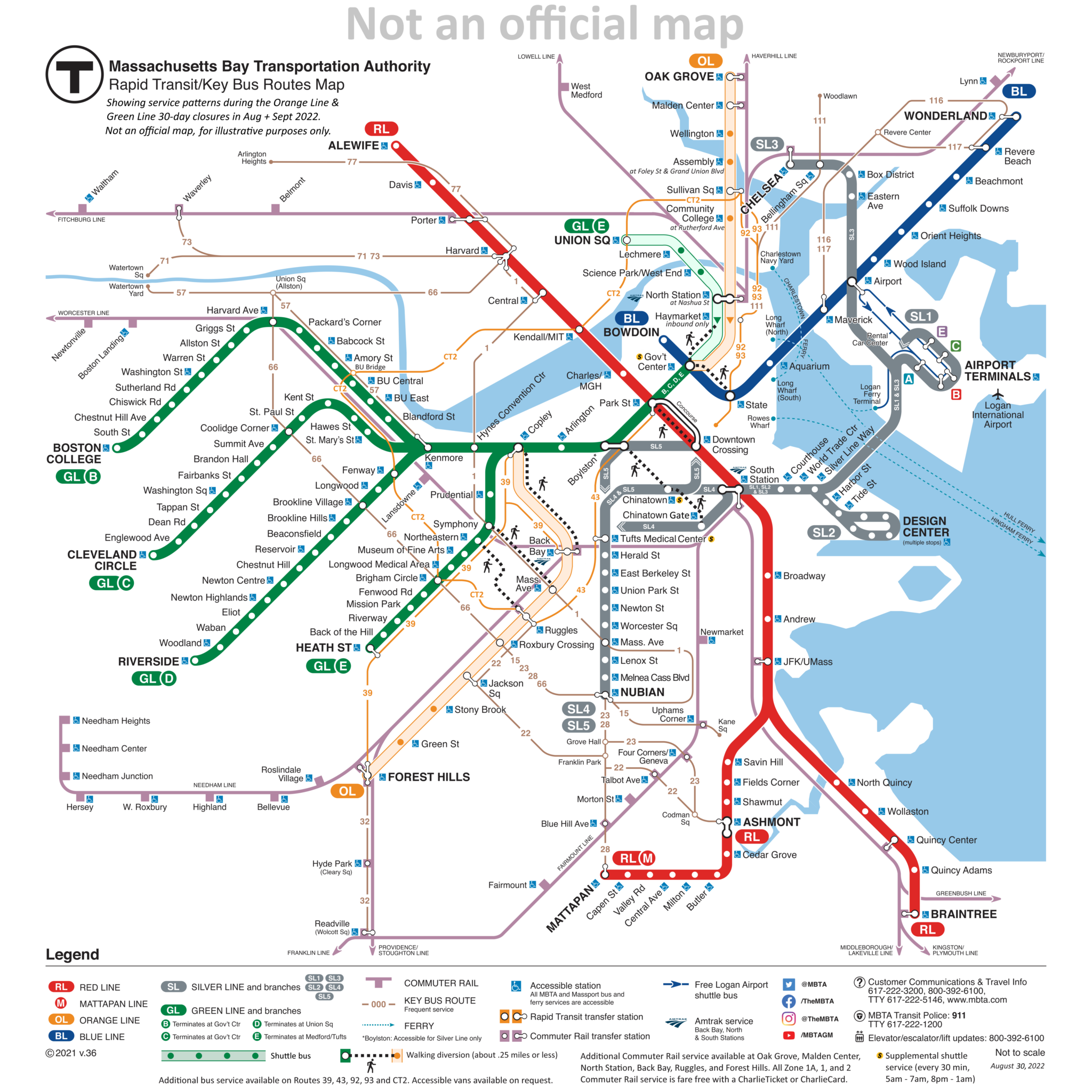
Mapping the Orange & Green Line Closures

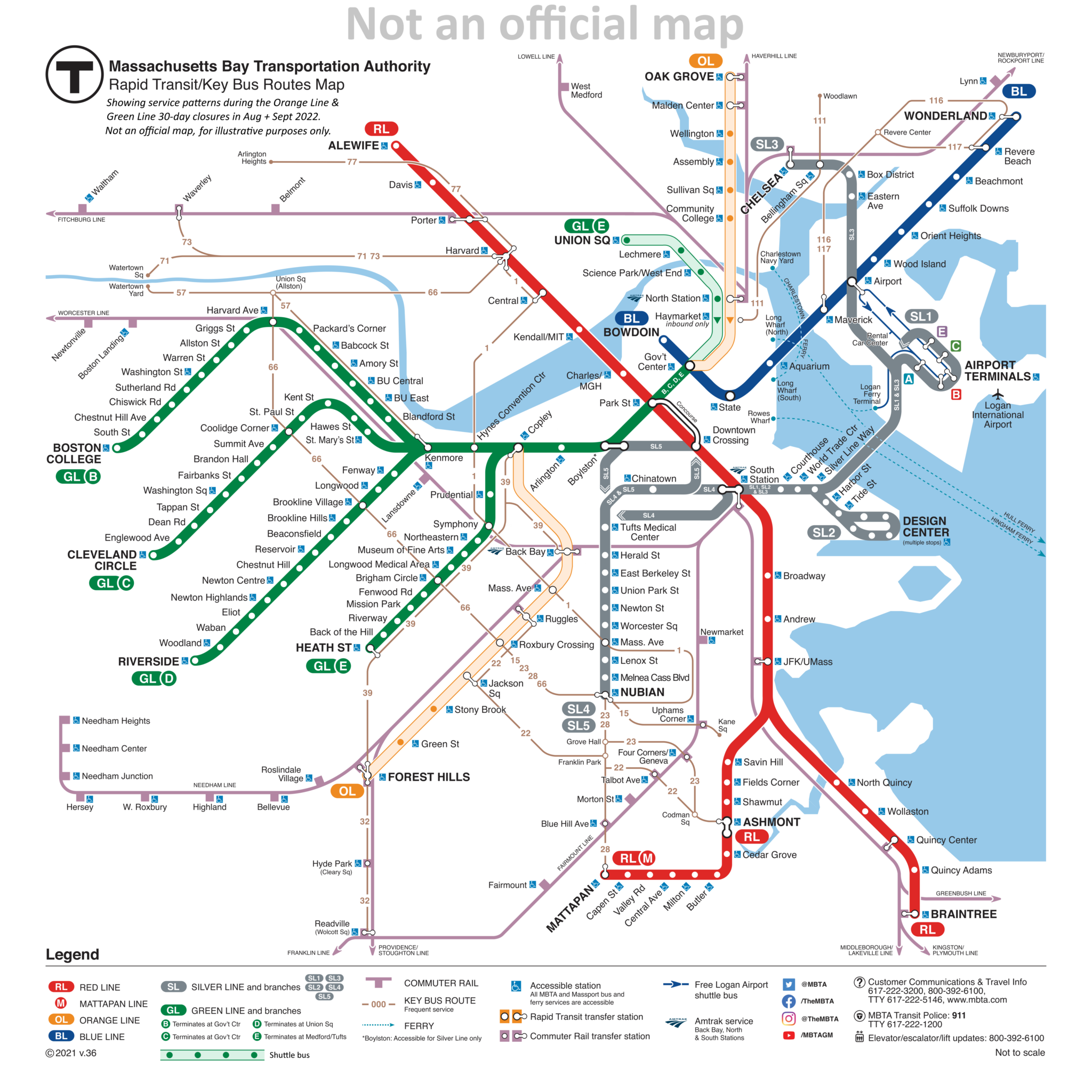
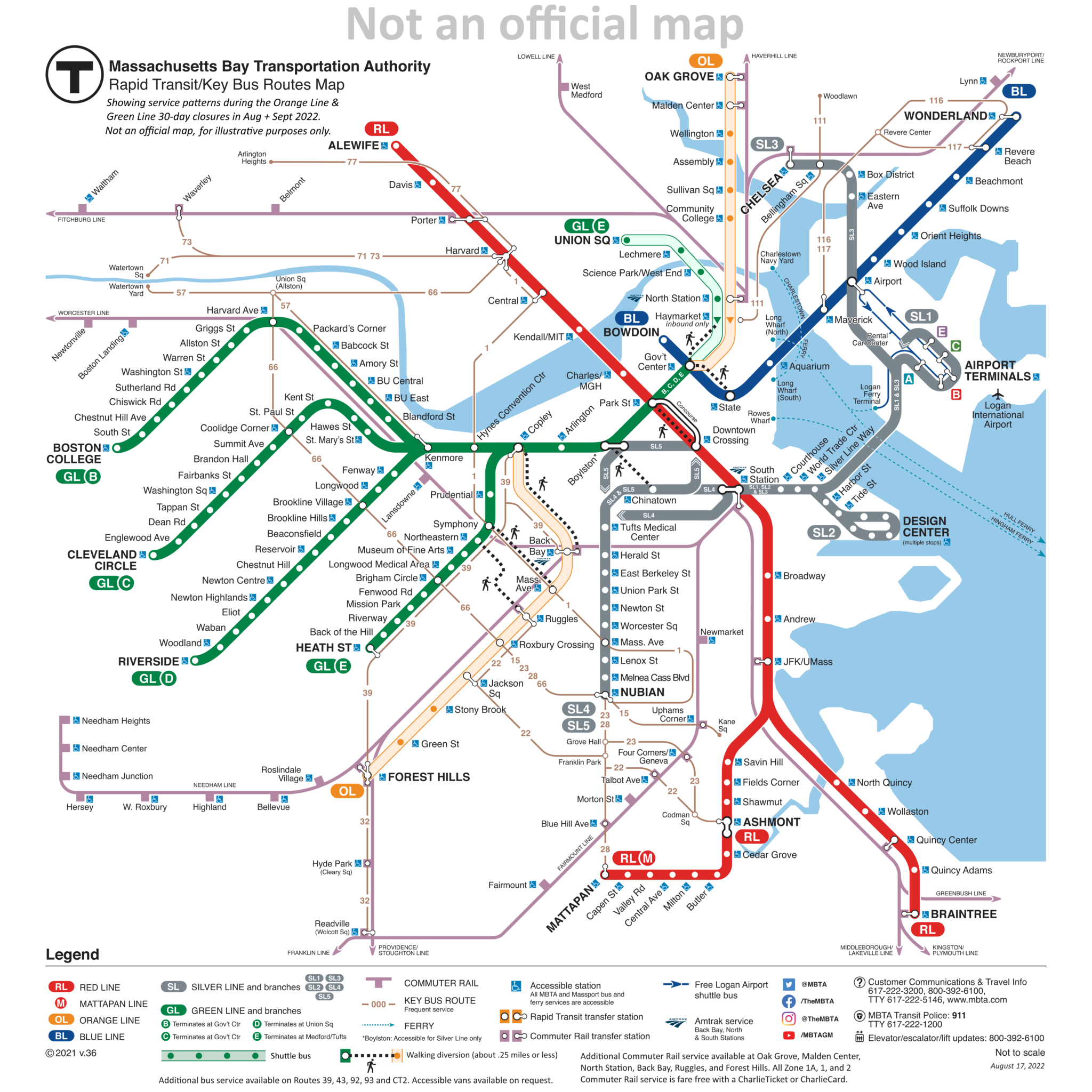
Over the past week, I’ve been iterating on modified versions of the T’s official subway map to illustrate the closures and shuttle services that begin tonight and will continue for 30 days. This map will likely continue to evolve, and I will continue to post the latest revision here. As always, please note that this is not an official map — always refer to the MBTA’s website and to the City of Boston’s website for up-to-date information.

Notes for transit and design nerds

This exercise started relatively simple: show the Orange Line and northern Green Line in some alternate manner to indicate the bustituted segments. This was relatively straightforward: I borrowed design language from the Arborway bustitution in the late ’80s, with a colored outline, white fill, and colored circles for the stops.

On the further advice of someone with better aesthetic sense than I, I shifted the white fill to a lightly colored fill, to better differentiate the lines, and avoid the perception of a total absence of service. The light fill seemed to strike a good balance between maintaining the line’s identity, showing the continued existence of service, and also indicating a significant difference in service.

But, as happens with many projects, I kept on thinking of, “Oh, just one more thing I can add!”

Which brings us to the current design, which pushes the original map’s information design to the limits. I wanted to show:

  • The bustituted segments
  • The un-bustituted segments
  • Text notes on significantly relocated shuttle stops
  • The one-way service at Haymarket
  • The early-morning/late-night shuttle to Chinatown and Tufts Medical
  • The bus routes the T suggests as alternatives to the Orange Line (39, 43, 92, 93, CT2)
  • The suggested walking transfers between Orange Line and Green Line stations

That is a lot of information to cram onto a diagram that was originally designed to be rather sparse. The current official subway map is an evolution of a design from the early 2000s that primarily showed the rapid transit routes, with commuter rail and ferries being shown secondarily, and limited-access highways being shown tertiarily. In the late 2000s, the key bus routes were added, and a subsequent redesign shifted some parts of the map around while maintaining the same visual language overall.

Evaluating my attempts

Was I successful? Ehn.

I was pleasantly surprised when an earlier version of this map gained a small amount of traction of Twitter, so it’s nice to know that at least some people found it useful. But at a certain point, I fear the level of detail hinders rather than helps. Part of the brilliance of Cambridge Seven Associates’ original “spider map” design was in its simplicity; even if you didn’t memorize the whole thing, the visual concept was highly memorable: four lines, crossing each other in a square and radiating out. That basic schema was easy to recognize and recall, and created a foundation to understand the rest of the system, even if it wasn’t put into one single map.

The eventual addition of commuter rail lines, key bus routes, and now all of the additional information I’ve added here is all very reasonable, especially when done incrementally. But I find myself questioning the ultimate usefulness of the diagram I’ve created. Is it really useful enough for journey-planning? Or is it too confusing to parse?

Simple maps and specific signage

Ultimately, I’ve come to believe that clear and specific wayfinding signage in and around stations is much more important than a detailed system diagram, both under ordinary and extraordinary circumstances such as the Orange Line Closure. (This despite my own love for detailed system diagrams.) In that way, perhaps my earlier, simpler diagrams were more effective.

Shuttle routes only

In this simplest version, the shuttle routes are shown and nothing else:

The advantage of this design is how minimally it alters the original, and (hopefully) how starkly clear the changes are: the most important thing is that the Orange Line and northern Green Line are different and need to be planned around. The question all of this hinges on: can the diagram provide enough information to adequately re-plan the journey? And that’s the part I don’t know.

Walking transfers

The second-simplest iteration added the walking transfers:

Including the walking transfers worked better than I expected. Quite frankly, I’d like to see these added to the official map (though hopefully a little more elegantly than I’ve done here). There are a lot of walking transfers that ought to be indicated on the system diagram, such as the ones I’ve included here, but also additionally:

  • State – Downtown Crossing
  • Government Center – Park
  • Riverway – Brookline Village
  • Reservoir – Cleveland Circle – Chestnut Hill Ave
  • Kenmore – Lansdowne

These transfers would not be suitable for everyone — and it should be noted that they are not free transfers under the current model — but if you are able-bodied and have a monthly pass that doesn’t charge per ride, these transfers are useful, speedy, and potentially can relieve congestion on key sections of the network.

Adding these transfers to the map is a good idea in general, but does it help in the case of the Orange Line & Green Line Closures? Again, I’m not quite sure. In most of these cases, I would guess that regular commuters are pretty familiar with the areas in question, and likely are well-aware that, for example, State and Gov’t Center are practically a stone’s throw apart. And if you aren’t a regular commuter… well, the pretty clear (and dire) direction from both the City and the T has been, “Please, stay away.”

Concluding Thoughts

Working on this diagram has been fun. It also has been nice to see positive response from numerous folks on Twitter. (Shout out to Jeremy Siegel at WGBH for sharing it with his followers!) And at least some of those positive responses have made comments to the effect of, “This is easier to understand than the materials the T has put out.” A few comments on Twitter aren’t necessarily a representative sample; however, the negative reaction to the T’s materials have been widespread and resounding — the Boston Globe going so far as to publish a parody of the official closure diagram.

That negative reaction suggests that there is room for improvement in how the T communicates these closures. I’d argue that the positive reaction to my diagram has been driven by its recognizable similarity to the “normal” map, combined with the clear-and-obvious differences that are blatant and draw attention to themselves.

With rumors swirling of partial shutdowns of the Green and Red Lines later this year, perhaps the T might consider adopting a similar strategy to what I’ve presented here.

The Green Line turns 100 today

“Wait”, you say, “that’s not right. The Green Line turned 100 in 1997, with the centennial of the Tremont Street Subway’s opening.”

True enough. But the Tremont Street Subway, for its first quarter-century of operation, looked quite different from the modern Green Line. It was only in the early 1920s that it began to resemble the system we know today, and it was only in 1922 – not 1897 – that the modern Green Line was born.  

An Underground Street

BERy (the Boston Elevated Railway Company, the MBTA’s primary private predecessor) saw the tunnel more like a substitute for the crowded street above than as a proper rapid transit subway. 

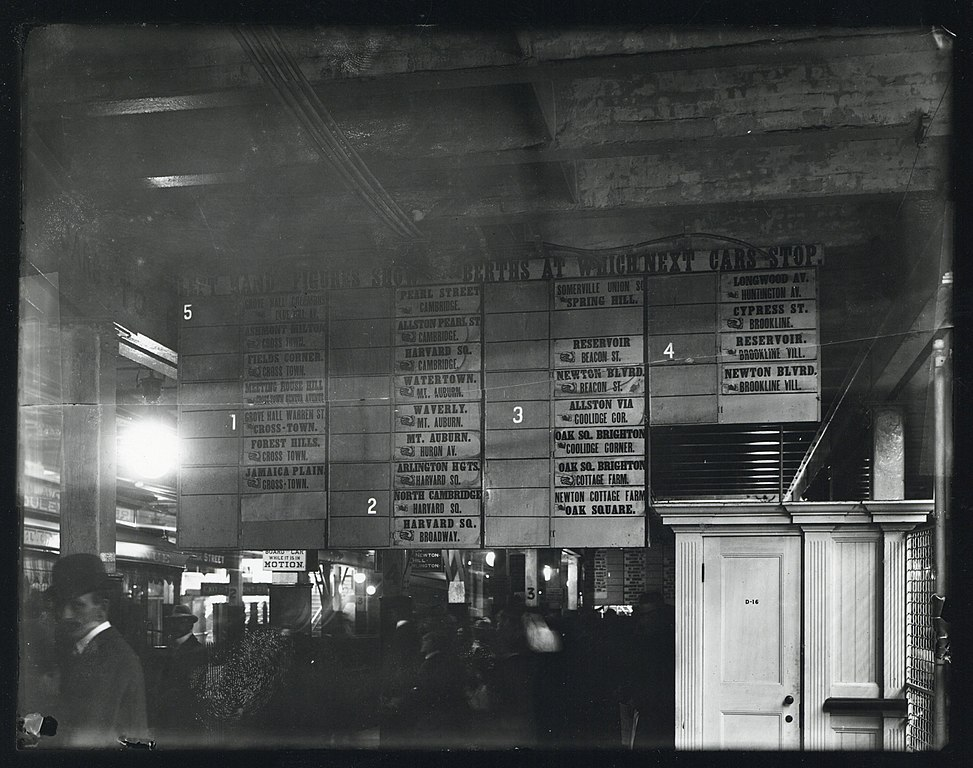
Streetcars funneled in from all over the city and distant suburbs, squeezing into the subway and crawling along at the speed of a modern bicycle. Contemporary accounts describe crowds surging down the platform at Park Street when the boarding location of the next trolley to such-and-such suburb was announced. The destination board at Park Street in 1899 resembles a departure board at a mainline station like South Station or Grand Central much more than that of a rapid transit station:

The streetcar subways draw a clear contrast with the services which BERy did consider rapid transit (the predecessors to today’s Red and Orange Lines). Beyond the difference in rolling stock (high-platform third rail vs low-platform wired), the rapid transit lines were also distinguished by their use of transfer stations.

A Tale of Two Transit Trips

Compare these two rider experiences:

  1. A commuter from Somerville boards a trolley at the intersection Highland Avenue and Willow Avenue. 
  2. The car trundles down Highland, stopping every couple of blocks to pick up passengers. 
  3. After 2.7 miles, the car reaches Lechmere Square…
  4. …where it departs from the street and enters the streetcar-only Lechmere Viaduct…
  5. …which snakes over the Charles and around the West End before…
  6. …diving into the subway just north of Haymarket.
  7. After another 1.5 miles, the commuter disembarks at Scollay Square

Vs.

  1. A commuter from Dorchester boards a trolley at the intersection of Blue Hill Avenue and Seaver Street (equidistant from downtown to the Highland/Willow intersection in Somerville). 
  2. They actually have a choice of trolleys – bound for Egleston, or bound for Dudley (now Nubian). 
  3. They travel by streetcar for 1 to 1.7 miles, stopping every couple of blocks to pick up passengers, 
  4. before arriving at their rapid transit station where they get a (free) transfer to the Elevated. 
  5. The Elevated speeds into downtown, with stops roughly every three-quarters of a mile. 
  6. The commuter disembarks at State Street.

The Somerville commuter takes a long slow ride from the suburb to the core, while the Dorchester commuter takes a short slow ride followed by a short fast ride, enabled by a transfer station.

A Tunnel Filled With Buses

For BERy, in those first 25 years, the Tremont Street and Boylston Street Subways were just ways of getting the huge volumes of streetcars off of the streets in downtown. In today’s terms, those tunnels were essentially filled with buses. This was useful transit service, to be sure, but it wasn’t rapid transit.

The same was true of the East Boston Tunnel. Extended from its Court Street terminus in 1916 to a portal on Cambridge Street (with a turnback loop at Bowdoin, still used today), the tunnel’s primary use was to bring East Boston trolleys under the Harbor into downtown. In fact, early in the planning of the East Boston Tunnel, one option that was considered was to have trolleys exit the tunnel from Maverick through a portal in the North End, and continue on street-level into downtown – similar to today’s Sumner & Callahan Tunnels. The primary use of the tunnel was to get trolleys (or “buses”, if you will) under the harbor – not to create rapid transit service. 

In the early 1920s, that all began to change. 

Conversion to Rapid Transit

Birth of the Blue Line

The 1924 conversion of the East Boston Tunnel to rapid transit is well-known and offers a clear example of how a streetcar tunnel can be transformed into a rapid transit subway. The vestigial surface route on Cambridge St was converted to bus, and the half-dozen streetcar routes to the east were cut back to terminate at a new transfer station at Maverick. Thereafter the local streetcar services fed into a dedicated rapid transit service, mirroring similar designs at Dudley, Harvard, Sullivan, and others. 

This, I would argue, marked the birth of the modern Blue Line; while it is true that today’s State (f.k.a. Devonshire) and Aquarium (Atlantic) stations opened some 20 years prior, it was only with the 1924 conversion that the service became anything like its modern form.

(There’s also an argument to be made that the true birth of the modern Blue Line actually occurred a bit further to the east, during the early and highly successful years of the Boston, Revere Beach & Lynn Railroad, which was essentially running Indigo Line-style service 100 years before its time.)

As a matter of comparison: mainline rail service with today’s rapid transit stop spacing had been running along both the Highland Branch and what is now the Southwest Corridor for 70 years and 100 years respectively before their conversion to rapid transit; but I don’t think we would say that either the modern Green Line or Orange Line were born circa 1888. We would consider those to be predecessor services, and I would argue that we should view the streetcars in the East Boston Tunnel as a similar predecessor service (albeit of a different character).

Birth of the Green Line

Less well-noticed – but I would argue equally important – was the 1922 construction of the transfer station at Lechmere. Like at Maverick, local streetcars were now short-turned at a rapid transit station where passengers transferred to service that was dedicated to bringing riders downtown at high speed.

In fact, in those early years, BERy ran a dedicated service to Lechmere for this purpose; a “shuttle” service ran from Lechmere to the Pleasant Street Portal for the first six months, which was rerouted to Kenmore in early 1923. Note the similarity to the East Boston Tunnel’s rapid transit service – “shuttle” services whose sole purpose is to run between downtown and a transfer station. More information in a contemporary newspaper account here.

Over the following ten years, BERy experimented with extending Lechmere service on to the Commonwealth and Beacon branches, which eventually both through-ran to Lechmere until the early 1960s. With their dedicated medians, the Commonwealth and Beacon branches were indeed the most “rapid-transit”-like of the various services feeding into the Central Subway at the time. They still intermingled with “local bus”-like services to Watertown, Huntington, Egleston, Dudley, City Point, and Sullivan, but the clear intent was to create a “rapid transit” service, as much as possible. 

The efforts to replicate the success of the “rapid transit transfer station” model were originally envisioned to go even further. As discussed previously in my Blue Line series, plans were made for another transfer station in Allston, which is why Kenmore station – not constructed until 1933 – was built with a loop for the Beacon line; the hope had been to convert Kenmore into a transfer station for a Beacon streetcar and a Commonwealth rapid transit line, Maverick-style. You can see a 1926 proposal for such a network here:

The construction of the Lechmere transfer station marked the turning point from BERy treating the Tremont Street Subway as a collection of independent streetcar routes into BERy treating the Subway like a trunk line with multiple feeder branches – in short, the modern Green Line.

Death of the Streetcar Network

Following the cutback of the Lechmere services, the once-expansive network of streetcar routes running into the subways (a subject for a later post) started a rapid winnowing in which the same story played out again and again: a transfer station was constructed and the streetcar route was cut back to the transfer; once a route no longer needed to travel into the subway, bustitution almost always quickly followed.

This is one place I want to draw our modern attention to. I’d always thought of bustitution as a phenomenon of the latter 20th century, driven by the post-war embrace of the automobile. In fact, the vast majority of bustitutions happened between 1922 and 1941. If anything, the pace rapidly slowed following the war, and it is in fact remarkable that Arborway survived all the way to 1985. 

  • 1922: Lechmere Network cut back once transfer station opens
  • 1924: East Boston Network cut back once Maverick opens
  • 1925: the Ipswich Street Lines (the predecessors to today’s 55, 60, and 65) were truncated at Massachusetts (now Hynes) station
  • 1932: the routes along what is now Route 9 to Chestnut Hill were bustituted and redirected to Kenmore’s surface station
  • 1935: last year that foreign streetcars from the North Shore ran into the subway, halted by the loss of the bridge over the Mystic River
  • 1938: the local streetcar running below the El along Washington St between Dudley and the subway was substituted with a bus (described here)
  • 1941: the Huntington Avenue Subway opened, and streetcars stopped using the Public Garden Incline. 

At this point, the winnowing slowed significantly, and the system had largely transformed into the modern Green Line we know today, with a few extra branches (to Egleston, City Point, and Charlestown) hanging around.

  • Late ‘40s: the two Charlestown branches are eliminated, just barely outliving BERy itself
  • 1953: the City Point branch is eliminated by the MTA
  • 1956: the Egleston branch is cut back to Lenox Street
  • 1959: the Riverside Line is converted to light rail, expanding the MTA’s reach to Route 128
  • 1961: the Lenox Street branch (formerly running to Egleston) is cut back to the Pleasant Street Portal, and briefly runs as a shuttle service between Boylston and Pleasant Street
  • 1962: the shuttle to Pleasant Street is canceled, and the Pleasant Street Portal – once an anchor of the streetcar subway – falls into disuse
  • 1965: through a consulting engagement with Cambridge Seven Associates, the newly incorporated MBTA assigns colors to its rapid transit lines for the first time – the literal origin of the term “Green Line” (as well as the birth of the iconic spider map)
  • 1969: the “A Line” – having survived long enough to actually be called “the Green Line” – is eliminated

And in this context, we now see that Arborway’s survival all the way to 1985 almost seems improbable by comparison – the last in a 60-year effort to remove all streetcars from the subway.

The cruel irony is that this effort – originally intended to speed up service and improve reliability in the subway – contributed to an overall degradation of transit access in the region over the following century. Once streetcar routes were taken out of the subway, they were very easy to replace with buses, and once they were replaced with buses, it was very easy to quietly degrade or eliminate service. 

Conclusion: 100 years of the Green Line

In writing this, I read a lot of old reports written about Boston transit in the early twentieth century. One thing that struck me is that the reports written in the 1920s have much more in common – in terms of priorities and perspectives – with today’s approaches than they do with the reports written by their predecessors a mere 30 years beforehand. 

By the 1920s, recognition had set in that the streetcar subways could and should be converted into rapid transit, using the same transfer hub model that had been successfully deployed at Sullivan, Dudley and Harvard. 

(Interestingly enough, it had also become clear by this point that those elevated railways – built barely twenty years earlier – were awful and needed to be replaced as soon as possible; both the Southwest Corridor alignment and the current Haymarket North alignment to Sullivan were explicitly described in the 1926 report.)

The 1922 opening of the new Lechmere transfer station marked this pivot point, after which every single capital exercise carried out on the streetcar network was done with the aim of turning the subway service into a rapid transit service – or getting it as close as possible. 

This continues to this day! The Green Line Extension project is undeniably a rapid transit project, and not just a resurrection of the former Lechmere streetcar network, and the same will be true if the Green Line is ever extended to Needham. Moreover, it seems all but certain that a Green Line extension to Nubian Square would need to find ways to make itself as “rapid transit”-like as possible – or else face a century of institutional inertia to overcome. 

The notion of a “Green Line” with branches feeding into a trunk – as opposed to an urban streetcar network whose density called for a tunnel in key locations – arose in the early 1920s. Today’s Green Line is much more closely related to the LRT subway service of the 1920s than of the 1900s, in structure, operation, and public branding. It arises out of 1920s ideas about hub-and-feeder networks, which had previously been applied on other routes, and were then brought to the streetcar networks following their success. The creation of the rapid transit line that would become the Green Line occurred not in 1897, but in 1922.

And so, that is why, this summer I’m celebrating the Green Line’s (true) 100th birthday.

Acknowledgements 

I am indebted to a host of transit historians, who have produced reams of carefully researched accounts detailing the stories of Boston’s transit system over the decades; most of them did so as volunteers, producing labors of love that exemplify the root of the term “amateur”. I want to specifically mention the names of Ron Newman, Bradley Clarke, O.R. Cummings, Frank Cheney, and Anthony Sammarco, as well as the volunteers who maintain the Wikipedia pages on Boston’s transit network. 

Introducing the Aldgate Junction, a countermeasure to reduced frequencies on branches

In a previous post, I described the mathematical inevitability of decreased frequencies on branchlines. But I also alluded to a particular feature that certain systems have that allows them to bypass this particular pitfall. And that brings us to today’s post. 

Introduction

Let’s take a simple trunk-and-branch system, which sees 10 tph six-min headways on the core and 5 tph twelve-min headways on the branches:

If those branches are out in the suburbs, those lower frequencies may be justifiable. But what if your system needs to branch within the core?

Introducing the Aldgate Junction:

(“Aldgate Junction” is a term I’ve coined to describe this kind of infrastructure and service pattern; there are other related terms, but I think the way I’ll be using this term is a useful addition to our vocabulary.)

An Aldgate Junction enables a second layer of service to travel in one branch and out the other, without touching the core and (usually) without a reverse move. Sometimes this can be created via a relatively minor infrastructure change, such as adding a third leg to create a wye junction, but sometimes a more significant capital project is required.

The original Aldgate Junction

The original “Aldgate Junction” is actually a trio of junctions and is located at the interchange of the District, Metropolitan, Circle, and Hammersmith & City lines:

(Image modified from Wikipedia’s version.)

You can see the layout of the three junctions and their names on this track map from CartoMetro.

The Aldgate Junction concept is deployed here to create a triangle of one-seat rides:

  • Liverpool St to Aldgate East via the H&C
  • Aldgate East to Tower Hill via the District Line
  • Tower Hill to Liverpool St via the Circle Line

Modifying my original diagram above to match the colors allows us to see how the Tube’s topology maps on to the generic model I’m discussing here:

The downside of the original Aldgate Junction in London is that it’s a level crossing, meaning trains block each other as they pass through, which creates a bottleneck. Some Aldgate Junctions utilize flying interchanges to avoid conflicts and increase capacity. 

Real-life examples of Aldgate Junctions

There are lots of ways to deploy an Aldgate Junction. It can provide distributed service to decongest central transfer points, or can be used to serve pluricentric regions with multiple “downtowns”. It can also be used to increase frequencies within the corridors of the branchlines, which is valuable for local trips as well as cases where the branch line is unusually long. 

Northern California

In my previous post, I mentioned that BART – a rather exceptional rapid transit system due to its enormous reach and mid-low frequencies on each branchline – uses an Aldgate Junction to increase frequencies on its East Bay services. 

BART’s Orange Line (also still sometimes called the verbose “Richmond-Berryessa/North San Jose Line”) plays the role of the “branch-to-branch bypass service”. For example: without the Orange Line, stations like Fremont would only see 15-min headways; Fremont is about 30 miles away from San Francisco, so 15-min headways might be appropriate for that service. But Fremont is only 15 miles away from San Jose, and there is a steady level of density running all the way up the East Bay – there are plenty of local journeys that sit squarely in “Rapid Transit Land”, and 15-min headways underserve that. 

Providing the Orange Line overlay raises headways to less than 10 minutes throughout the entire West Bay, without impacting capacity in the San Francisco core. Key to this is the Oakland Wye, a three-way flying junction to enable crossovers without interference. This is an example where an Aldgate Junction required significant infrastructure.

There are numerous other systems that use variants of the Aldgate Junction. 

The VTA Light Rail in San Jose has one between Tasman, Champion, and Baypointe. This is a simple flat junction in a four-way intersection.

Southern California

Moving further down the coast, we find that Los Angeles’ Metrolink commuter rail system actually has two Aldgate Junctions, of different varieties.

First, we see that the Orange County, Inland Empire-Orange County, and 91/Perris Valley lines form an Aldgate Junction in Anaheim. This creates a three-way link between Orange County, LA County, and Riverside County.  

But there is a second, more abstract Aldgate Junction, formed by the Orange County, Inland Empire-Orange County, and San Bernardino Line, between LA County, San Bernardino County, and Orange County. 

In both cases, these exemplify the use of Aldgate Junctions to serve distributed areas of density. Los Angeles is the core of the system, but Riverside and San Bernardino are major urban centers in their own right, and the use of the Aldgate Junction model creates two sub-networks based in Riverside and in San Bernardino. 

The “Riverside Network”
The “San Bernardino Network”

These examples, it should be noted, are cases where an Aldgate Junction is not functioning to increase frequencies; Metrolink’s frequencies are pretty poor, usually only about 1 tph at peak, and little-midday service. In this case the focus is on providing one-seat-rides across a decentralized network, enabling transit journeys to non-Los Angeles destinations that otherwise simply wouldn’t be possible.

New York & New Jersey

Finally, the reigning North American monarch of the Aldgate Junction is New York City.

The New York City Subway has several physical Aldgate Junctions, a notably consistent design feature of the old IND network, highlighted below. 

The PATH system is built around a pair of Aldgate Junctions (forming an impressive set of underground flying junctions):

And the Hudson-Bergen Light Rail offers a classic example of a simple Aldgate Junction near Hoboken Terminal:

PATH and the HBLR offer an additional lesson about the operational realities of Aldgate Junctions; the maps above represent the daytime versions of those networks. On weekends (and in PATH’s case, at night), the Aldgate Junctions functionally disappear.

All journeys remain possible, but some require transfers. 

PATH offloads its HOB-WTC journeys into a two-seat journey with transfer at Grove St; meanwhile, its two routes out of 33rd St are combined into one, with a reverse-move at Hoboken as part of the revenue service pattern. (Functionally, Hoboken is serving as a transfer point in the same way as Grove St; PATH just does the transfer for the passengers by throwing the switches rather than swapping out trains.) 

HBLR maintains weekend service to Hoboken, but riders from the north must transfer at Pavonia/Newport and backtrack. 

Summary

Aldgate Junctions provide a way to distribute service across a larger area and offer a way to increase service levels on branches without being constrained by trunk line capacity. Their physical form and implementation vary widely, from level wye junctions to complicated flying interchanges to dispersed routes spread across miles. These forms defer in capacity, reliability, and cost.

Despite these differences, Aldgate Junctions are united by consistent contributions to network topologies, and are a valuable tool when designing (and future-proofing) complex systems. 

Inevitabilities in Life: Death, taxes, and decreased frequencies on branches

In my previous post about branches, I briefly discussed the rapid decrease in frequencies as you add more branches to a trunk line. You might remember a diagram that I showed: 

A service level diagram, where the trunk has 15 tph, and then 5 tph branch off, leaving only 10 tph to the next station, after which the line splits into two branches of 5 tph each

In this diagram, the trunkline sees high-frequency headways of 4 minutes (which is better than many subway lines in North America). With such a high frequency, it’s easy to think that there’d be enough trains to serve a bunch of branches.

But as you can see, four-minute headways equals 15 trains per hour. If you have three branches, that means each branch gets 5 trains per hour – which yields 12 minute headways. If these branches are out in suburbia, 12 minute headways might be appropriate, but you’ve nearly reached the limit. If you were to add a fourth branch, each branch would see less than 4 trains per hour, at 16 minute headways, at which point you really no longer have a claim to “frequent service”.

In my last post, I recommended, as a rule of thumb, no more than two branches per line. However, I didn’t explain why. It comes down to a combination of typical throughput capacities, and mathematical inevitabilities. 

Divvying up trains-per-hour among multiple branches

Consider this chart:

I will post a text version of this table in the next few days!

On the left side, we have a list of potential trunkline capacities, measured in trains per hour. These indicate how many trains in each direction you can squeeze through your trunkline in an hour. (Don’t worry about converting these numbers to headways – I’ll get to that below.) 

For some perspective (most numbers pre-covid): 

  • BART ran 16 tph through its core section from Daly City to West Oakland
  • CTA ran between 12 and 20 tph on its Red and Blue Lines during peak
  • WMATA ran 15 tph on its Red Line during peak
  • MBTA ran 15 tph on its Red Line during peak
  • London Underground’s throughputs vary widely from line to line, with some lines seeing over 30 trains per hour, following major infrastructure and modernization improvements
  • Beijing’s subway runs between 30 and 35 tph on several of its routes
  • Shanghai’s subway runs between 15 and 32 tph on most of its inner routes

All of which is to say, the top few rows represent trunkline capacities that require major investment in transportation infrastructure.

To the right of those trunkline capacities are the number of trains available to each branch, depending on how many branches you have. So, for example, in the first row, a 40 tph trunk will provide 20 tph to two branches, 13.3 tph to three branches, 10 tph to four branches, and so on. 

As mentioned before: you’ll notice that, as you move from left to right across the chart, the numbers in each row drop dramatically. In fact, the decrease is literally exponential; you can describe the chart above using

y = n-x

where n is the capacity of your trunkline in tph, x is the number of branches, and y is the resulting tph per branch.

Decreasing frequencies due to decreasing tph

It’s helpful to start this discussion using tph as a measure, because it’s easier to recognize the patterns in the numbers’ decrease. However, once we convert those tph into headways, it’ll become that much clearer why branching quickly leads to decreased frequencies.

I will post a text version of this table in the next few days!

I’ve added some (opinionated) color-coding, meant to suggest the various “levels” of service these different frequencies provide. 

  • The bright green (every 5 minutes or better) represent the highest tier of frequent service an agency might provide. “Turn up and go.”
  • The pale green (every 5-10 minutes) are still comfortably in the realm of rapid transit, but are probably better suited to off-peak periods and lower-ridership networks. “Turn up and wait a couple minutes and go.”
  • The yellow (every 10-15 minutes) are the lowest tier of what could be considered “turn-up-and-go,” describing services where riders don’t need to check a schedule when planning journeys. Call this tier “turn up and wait.”
    • This tier should be approached cautiously, with careful attention paid to the specific corridor where these frequencies would be deployed.
    • (Sadly, consideration should also be given to reliability; if a bus is scheduled to show up every 13 minutes, but one run gets dropped, suddenly you have folks waiting nearly a half-hour for their bus.)
  • The subsequent tiers are rarely going to be considered “frequent service”; some could be “salvaged” by adhering to a strict clockfacing schedule: a route that reliably comes exactly :13 minutes and :43 minutes past the hour can be a useful service that isn’t “turn-up-and-go”, but doesn’t require consulting a schedule either. These tiers break down something like this:
    • Orange = “plan when to leave, but journey whenever”
    • Light grey = “plan when to journey”
    • Dark grey = “schedule around the schedule” 

As you can see, our frequencies drop through the tiers I’ve described above quite quickly. Once you hit the yellow tier, you’re teetering on the edge of frequent service, and once you hit the orange and beyond, you’re definitely over the edge.

Different regions will have different definitions of “high frequency”. For example, it’s pretty rare to wait more than 4 minutes for a tube train in central London; a six-minute headway would be considered sub-par. In Boston, we are sadly accustomed to six-minute peak headways on the Orange Line, while Baltimore’s subway sees peak service every 8 minutes. 

It’s worth highlighting that reaching 90-second headways at 40 tph on heavy rail is exceptionally difficult. If you have multiple tracks in the same direction, it becomes more manageable, but a standard two-track subway is nearly impossible to operate at 40 tph per direction, outside of the world’s most advanced subway systems. And notice – even the top examples I listed above, such as Beijing or London, you’re still looking at that second row as your baseline, at around 30 tph. Even in those systems, having more than two branches knocks each branch down into a lower “tier”, meaning it’s not suitable to do within the urban core. 

If your crayon map requires shoveling 40 trains per hour through a trunk line, then probably it’s worth trying to plan a second trunk line!

Gaming out examples, and dealing with the unideal real world

Many of the North American systems I mentioned above see 4 minute headways on their core. If we go to that row, we can see two branches gives us 8 min (good so far), three branches gives us 12 min (borderline), and four branches gives us 16 min (no good). 

Some North American systems see base headways of 7 or 8 minutes. In that case, our drop-off happens even faster: 2 branches becomes borderline, and 3 branches sinks us with headways longer than 20 minutes.

On the London and Chinese systems mentioned above, trunklines see headways around 2 minutes or better. In theory, those trunklines could accommodate five or six branches; but if you drop the core headways by just one minute, suddenly you can only accommodate three or four branches at similar frequencies. 

And that “in theory” caveat is what’s really going to get us. Even if you can squeeze 30 tph through your trunkline to get 2-min headways, if you are feeding that trunk from five branches, that’s five times as many opportunities for delays and disruptions. We just saw above that the difference between a 2-min headway and a 3-min headway is worth two whole branches of throughput. That’s a very thin margin for error – meaning that you need reliability to be extremely high, or else the whole system will unravel, with cascading delays across your network.

The exceptions that prove the rule: North American legacy subway-streetcar networks

There are only two networks that I’m aware of which see sub-10 minute headways on four or more branches, feeding into a trunkline handling 40 tph: the MBTA’s Green Line and SEPTA’s Subway-Surface Lines.

This level of throughput is achieved (see caveat below) mostly because they are light rail lines rather than heavy rail. This means shorter trains which can start and stop faster, and therefore can be run closer together (albeit at lower speeds). The MBTA allows multiple Green Line trainsets to enter certain stations simultaneously, and SEPTA actually treats a couple of its subway stations as “request stops”, with trolleys rolling through non-stop if no one signals to board or alight. 

(I haven’t done the math on this, but it would be worth someone calculating the actual capacity of those two systems compared to heavy rail equivalents. It is true that the TPH levels are higher, but since the trains are shorter, I don’t know that you actually end up carrying more passengers.)

The reality, sadly, is that both of these networks are infamous for their reliability issues. (Full disclosure: I’m much more familiar with the MBTA than SEPTA, but I believe most of the T’s problems also exist in Philadelphia.) Delays are common, both on the branches and then resultantly in the core, potentially resulting in less than forty actual trains per hour through the core. 

Having four or five branches is somewhat workable on these two systems due to their unusual characteristics. Replicating that success elsewhere would likely require replicating those characteristics as well.

The other exceptions that prove the rule: hybrid rapid transit/commuter rail systems

BART’s core trunkline from Daly City to West Oakland feeds out into four eastern branches (Richmond, Antioch, Dublin/Pleasanton, Berryessa/North San Jose). Likewise, the London Undergroud’s Metropolitan Line runs to four termini in the northwestern suburbs (Uxbridge, Amersham, Chesham, Watford). 

Both networks accomplish this by running service to distant suburbs that is more like high-frequency commuter rail than traditional rapid transit service. Each branch on the BART runs every fifteen minutes, which isn’t super unreasonable given that most of those branches travel over thirty miles from downtown San Francisco. (BART is also a pluricentric network, which makes the ridership patterns a bit different than, for example, Chicago’s.)

The Met in London is a bit more complicated, but the concept is similar. Similar to New York, and unlike BART, the Metropolitan is quad-tracked for certain stretches, and therefore runs both local services and express services. During peak hours: 

  • Uxbridge sees 10 tph (6 min) spread across local and express services, with 4 of those trains short-turning at Baker Street
  • Amersham sees 4 tph (15 min), half of which are express
  • Chesham sees 2 tph (30 min)
  • Watford sees 8 tph (7.5 min), again with some short-turns and some expresses

A couple of further notes for context:

  • Almost all of the Uxbridge branch is also served by Piccadilly trains – 12 tph at peak – providing a robust 22 tph, which creates headways under 3 minutes
  • The Amersham and Chesham services run together until Chalfont & Latimer, before splitting off and going one stop each to their terminus, meaning most of the branch in fact sees 6 tph; these services are also supplemented by at least 2 tph that run on Chiltern Railways to Amersham and beyond. 
  • Chesham is also the most distant Underground station – 25 miles from Charing Cross in central London, and technically outside of Greater London – well into territory where 30-minute headways might be reasonable
  • The town of Watford is served by three other stations; the largest of these is Watford Junction, which is less than a mile from the Met station, and sees 4 Overground trains and about 5 London Northwestern Railways trains toward London per hour

So, the Met has a few mitigating factors:

  • Its branches are supplemented by additional services
  • Despite four possible termini, really it just has three branches, one of which splits at the very end
  • The only stations that see 15-minute-or-worse headways are distant suburbs, over 20 miles from the core of London

Like SEPTA and the MBTA, both BART and the Metropolitan also have unusual characteristics that enable them to get away with breaking my “two branches max” rule of thumb.

However, both BART and the Met also have an additional special feature that allow them to have their cake and eat it too… to be continued in the next post

Extending the T’s Blue Line west: In favor of a Kenmore alignment

I believe extending the Blue Line from Charles/MGH to Kenmore via a Riverbank subway along Storrow Memorial Drive is the stronger “first phase” extension.

The truth of the matter is that we don’t have enough data to say which is better. As I’ve outlined above, almost any extension of the Blue Line west will be treading new ground, bringing rail transit to corridors that have never seen it before. This is virtually unprecedented in the history of Boston transit, so we are in uncharted waters.

Any construction at Charles/MGH should be done to leave open as many possibilities for future extension, including both to Kendall and Kenmore if possible; if a choice must be made, my preference is for Kenmore.

I have are four overarching reasons:

Complementing the Green Line

As outlined previously, the Blue Line and the Green Line have a long historical relationship of interdependence and interweaving. The Kenmore alignment maintains that relationship, and provides relief for the Green Line, freeing it up to adapt to the flexibility offered by LRT without needing to bear the burden of being a pseudo-HRT subway line. 

The Riverbank alignment sends the Blue Line straight down the middle of the gap between Red and Orange, landing it at Kenmore – the major bus transfer hub between Central and Ruggles. This is where the Green Line’s burden would be relieved: it would no longer need to serve as the radial link between the Kenmore hub and downtown.

I have a large and expansive vision for the future of the Green Line, and many more options are opened up through the Kenmore alignment than the Kendall alignment. 

Filling a gap in the HRT network 

We often think of the MBTA as having 4 subway lines, plus a handful of BRT lines. Strictly speaking, that is not quite true. The MBTA has 3 heavy rail lines, a handful of light rail lines, and a handful of BRT lines. The T uses layered LRT and BRT services as stand-ins for HRT services in the Boylston Street Subway, the Tremont Street Subway, and the Piers Transitway, because the ridership along those corridors demands it, but they still are different beasts. 

The future of expanded rail service in Boston lies in LRT and in frequent regional rail. These services are easier to create because they are either easier to construct or are better able to leverage existing infrastructure. With a small number of exceptions (Lynn, Arlington, Mattapan, and West Roxbury), bringing rail service to new locations will be much easier to do with LRT and regional rail (Needham, Watertown, Jamaica Plain, Waltham, Lexington, Grand Junction, Everett, Chelsea, and Dorchester). 

Heavy rail rapid transit provides best-in-class service, there is no denying it. But it also requires the most up-front expense, and is rapidly becoming a form of boutique construction – a Blue Line extension will be usable by Blue Line trains alone, while new stations and improved tracks along the Worcester Line will be usable by metro Indigo Line services, local Framingham services, and expresses to Worcester (and will benefit Amtrak service to Springfield and beyond). Heavy rail expansion therefore must meet a higher threshold of viability and benefit.

As such, I think we need to reconceptualize our idea of Boston’s rapid transit system into three tiers: light metro, heavy metro, and regional metro.

  • Light metro: LRT and BRT services, with smaller vehicles and smaller infrastructure footprints, particularly useful for suburban radial service and urban circumferential service 
  • Heavy metro: your standard HRT, as well as rapid-transit-frequency mainline rail, and Los Angeles-style light rail (e.g. longer trains, high-level boarding, dedicated ROWs). 
  • Regional metro: reimagined commuter rail – 15-minute headways, limited stops within 128, service to suburbs and satellite cities.

These tiers are obviously interconnected, but do form distinct networks. And I believe we need to view them as such. As can be seen here, any Blue Line West extension will serve to fill in the large gap between the Red Line and the Orange Line.

A map of the MBTA's current rapid transit system, showing only the Red, Orange, and Blue Lines. A sizable gap between the Orange and Red Lines to the west of Boston is plainly visible, stretching all the way to Route 128

When we exclude light metro services from the map, the gap in the heavy metro network becomes clear. The streetcar services that run into Kenmore from Beacon and Commonwealth will always prevent that stretch of the Green Line from becoming proper heavy metro, which means an alternative is sorely needed to fill in the gap.

As mentioned above, the future of rail expansion is in LRT, not HRT. Wholesale greenfield rail construction in Boston will mostly be LRT going forward. HRT expansions should therefore be sparing, and strategic, benefiting the entire network as a whole as opposed to specific corridors. Extension to Kenmore balances the heavy metro network overall, and frees up capacity on the Green Line to expand the light metro network into new areas across Greater Boston.

Put heavy metro service to its unique purpose

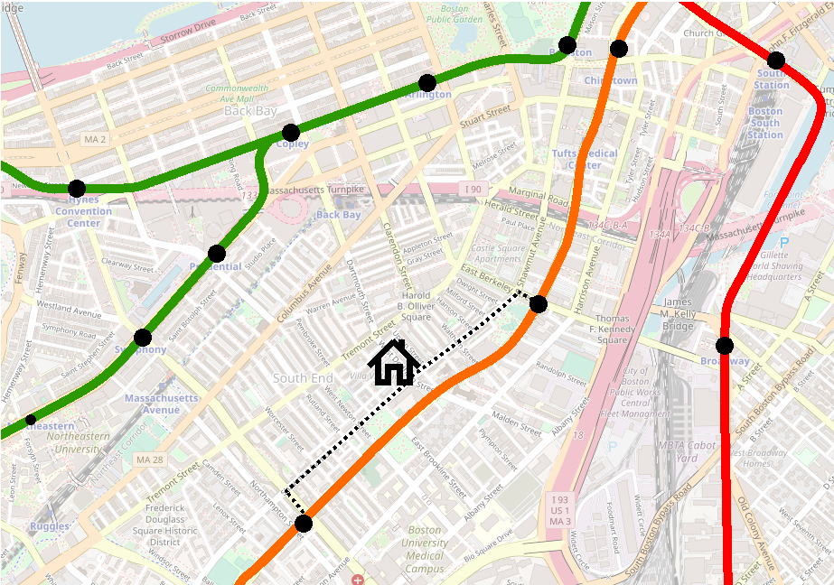
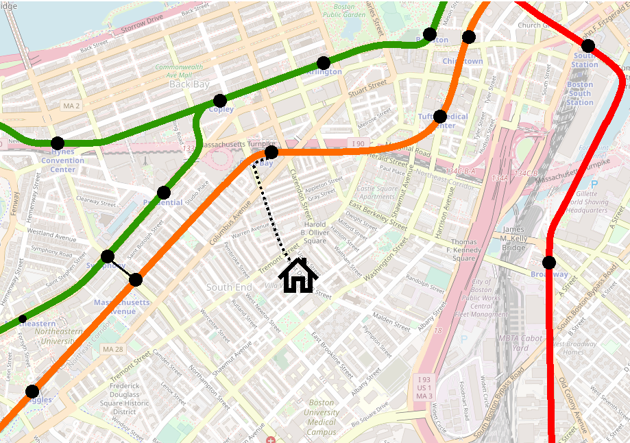
Let’s hearken back to the days of the El. You live on West Dedham Street in the South End, halfway between Shawmut and Tremont, a block and a half from Washington Street – you can see the El from your front door. A generation goes by, and the Orange Line is relocated out of sight, a bit less than a half mile away in the Southwest Corridor. On the balance, you’re pretty happy – the El was loud, rumbly, an eyesore, a relic of an age past.

But isn’t the loss of transit access a downside? (You are asked by your railfan friend.) Not really, you reply. Even though the El was a three minute walk away, it was nearly 10 minutes to the nearest stations, at Dover or Northampton. The El rumbled by your block every day, speeding through without making a stop. The new station at Back Bay is just as long of a walk, but now Washington Street is sunny and quiet(er). On the balance, you’re pretty happy.

A map of the MBTA rapid transit system in the South End, circa 1980
Before: about a 10 minute walk to either Dover or Northampton
A map of the current MBTA rapid transit system in the South End
After: about a 10 minute walk to Back Bay

(At various points through the 20th century, you might not have walked to the El at all, but instead caught a streetcar or bus at surface level and rode that in.)

The same was true in Charlestown: for nearly three-quarters of a mile along Main Street, the El expressed through, while local residents took the 92. Sullivan, with its massive hub of transfers from Everett, Malden, Medford, and Somerville, was the objective, not the northern half of Charlestown itself. Main Street suffered the drawbacks of rail infrastructure, and for the most part got none of the benefits.

To be clear, I am not claiming that the Orange Line Relocation Projects were net improvements for transit access; the sad story of Equal or Better makes clear that there were drastic downsides that persist to this day. My point is that the Relocation Projects demonstrate that the purpose of the early rapid transit lines was not to serve the neighborhoods they passed through, but to offer a bypass to enable faster journeys to downtown.

The primary role of heavy rail in Boston has historically been to whisk riders in to downtown from the Inner Belt regions and beyond. This is why the Red Line has such lengthy distance between stops in Cambridge, and why the extension beyond South Station headed down along Dorchester Ave instead of heading into Southie: the whole point was to express in to downtown. 

Prior to the Orange Line relocation, the “Inner Belt” transfer hubs – with the exception of Kenmore – were at most two stops away from downtown: Dudley-Northampton-Dover-Essex, Kendall-Charles-Park, Sullivan-Community College-North Station, Maverick-Aquarium-State, Columbia-Andrew-Broadway-South Station. All those intermediate stops were themselves major transfer points or at major destinations. The whole point was to speed the journey downtown from the outer parts of the city, whence a bus or streetcar journey would be painfully long. 

A Blue Line extension to Kenmore fills that gap, and provides the western feeder services (the B, the C, the 57, the 60) with a proper heavy metro express link into downtown, providing a speedy and reliable transfer consistent with similar hubs across the system. This need exists at Kenmore, but does not exist on the other side of the river.

Follow existing ROWs and generally have easier construction

To my knowledge, with three exceptions, all expansion of Boston rail infrastructure in the last 100 years has occurred on alignments and ROWs which were carved out by railroads in the 19th century. (The three exceptions are Harvard-Davis, the stretch between Chinatown and the portal east of Back Bay, and the Huntington Ave Subway.) The Blue-Red Connector would mark the fourth such exception. 

It is incredibly difficult to build rail where none existed before, and it is incredibly rare. The Huntington Subway was decades in planning, Harvard-Davis was built under exceptionally favorable political circumstances, and the Orange Line connection was the lynchpin in a massive service relocation that had been in the works since the 1900s. Virtually no current expansion proposals – official or amateur – call for laying rails where none have been laid before. (The North-South Rail Link is the exception that proves the rule in this case.)

Blue Line West proposals are the only ones where we consistently see greenfield ROWs being proposed. For the Phase 1 alignments I discussed before, this is a necessity – there simply is no way to continue west from Charles/MGH without building new ROWs. Several of the Phase 2 alignments, however, do leverage existing ROWs.

The “Phase 2” alignments I discussed earlier fall into three categories: Watertown, Mass Pike, and Longwood. Kenmore offers access via existing ROWs to all three, due to its location at the confluence of the Highland Branch and the B&A (Worcester Line) ROWs. (Watertown would be the trickiest of the three, but still could utilize the B&A ROW for at least half of the journey.) 

The Kendall alignments are more of a mixed bag. Longwood technically could be accessed from the BU Bridge via a subway under Amory Street, but at significant expense and with some tricky track geometry (i.e. sharp turns). Watertown and the Mass Pike could be reached via Kendall, the Grand Junction, and the BU Bridge, largely utilizing extant ROWs, but at the cost of two river crossings and the lack of access to the Kenmore transfer hub. (Circumferential service from a Kenmore hub to Longwood, Ruggles, and Nubian would be pretty easy to plan with BRT. Relocating the transfer hub to a Blue Line station at BU Bridge would be more difficult.)

One hundred years ago, the mainline gateway to Boston’s western suburbs was located in the Fenway at Brookline Junction station. Despite all that has happened in the intervening century, the ROWs that were laid out feeding into that junction have persisted over all these years. Because of that, Kenmore has remained a transit nexus, and remains the strongest “launchpoint” for any future expansion to the west.

Conclusion

Basically this all boils down to “serving Kenmore” vs “serving Kendall”. Both alignments can land you in Beacon Yard, setting the stage for service to Auburndale, Watertown, or Waltham. Both alignments could (at moderate-to-significant expense) lead to service to Longwood. 

Kendall is a massive employment center, growing every year. Kenmore is a massive transfer hub that will only become more important as the T improves circumferential service. Kendall’s Red Line service is at capacity; Kenmore’s Green Line service is at capacity.

To a certain extent, I’m sufficiently convinced in favor of the Kenmore alignment by the added cost and expense of the dual river crossings needed for any Kendall alignment. Greenfield HRT is going to be hard enough on its own – at the very least, let’s choose the easier option.

But beyond that, I think the Kenmore alignment is simply better for the whole network overall. The Kendall alignments would benefit their immediate corridors, while a Kenmore alignment’s effect would be felt system-wide. 

  • Consolidating Kenmore as a transfer hub makes it easier to build a flexible Urban Ring, in stages if needed. 
  • Complementing the Green Line frees up resources to be redirected into a semi-heavy metro corridor along Huntington, and creates more flexibility for short-turning LRT services at Kenmore. 
  • Focusing construction efforts along the Grand Junction on LRT rather than HRT creates a potentially unbroken LRT corridor from Allston to Cambridge to Sullivan to Chelsea to the Airport. 
  • And a Phase 1 extension to Kenmore leaves open the most possibilities for Phase 2 extensions without the need for massive tunneling projects.

All of this is many years, if not decades, in the future. For now, I reiterate my original point: Any construction at Charles/MGH should be done to leave open as many possibilities for future extension, including both to Kendall and Kenmore if possible; if a choice must be made, Kenmore is the stronger option.

Extending the T’s Blue Line west: Second phases – Reaching toward 128

One peculiarity of this whole situation is that most of the options for “Phase 2” are available from both the Riverbank alignment and the Kendall alignment. They aren’t fully interchangeable, but there is a surprising amount of overlap, and most of them can be discussed largely independently of which Phase 1 alignment is used to reach them.

Blue to Auburndale (and Riverside)

Another proposal from 1945’s yesteryear is extending HRT rapid transit along the Boston & Albany (Worcester Commuter Rail) line to Newton Corner, Auburndale, and then hooking around to Riverside. At the other end, it would have been connected to the Tremont Street Subway via the Pleasant Street Portal. This was a great idea. 

The modern incarnation would see the Blue Line taking the most direct route from its Phase 1 terminus and then running out west parallel to the Worcester Line tracks.

Unfortunately, the 1945 proposal was made before the construction of the Mass Pike east of 128. For those who don’t know, this part of the Mass Pike was constructed by taking land previously occupied by railroad tracks; this stretch once had four or more tracks, like the Southwest Corridor did at the time. The vision would’ve been quite similar to today’s Southwest Corridor: take a couple of tracks and devote them to rapid transit, and leave the rest for mainline rail.

Now with only two tracks, it’ll be much harder to enact that vision. If you wanted to be bold, you could propose reclaiming land from the Mass Pike, but good luck with that; likewise to building a cut-and-cover subway, or an elevated.

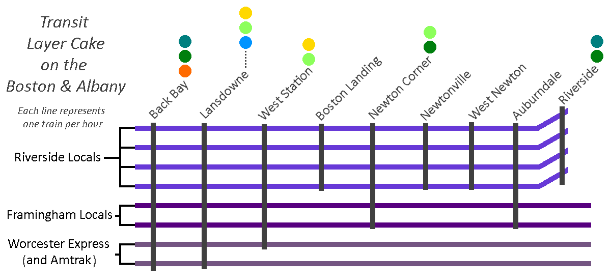
In today’s climate, this stretch is much more favorable to an Indigo Line-style service, with perhaps 4 local trains per hour making all stops to Riverside supplemented by 2 trains an hour that run on to Framingham (with 2 additional trains expressing through on the journey to Worcester). This would provide modest frequencies while maintaining a single mode of service. (And, for what it’s worth, would still leave the door open to building a subway or reclaiming some of the Pike later — the capital improvements to support Indigo service would still benefit continued mainline use, even after the construction of HRT extension.)

A services diagram showing a "Transit Layer Cake on the Boston & Albany," where each line represents one train per hour. 4 tph run from Back Bay to Riverside, making all stops, 2 tph run to Framingham, stopping at Lansdowne, West Station, Newton Corner, and Auburndale, and 2 tph run express to Worcester or are Amtrak, stopping at Lansdowne, with 1 tph also stopping at West Station. Stations include transfer indicators: Back Bay (Orange, Green, Teal), Lansdowne (Blue, Emerald, Gold), West Station (Emerald, Gold), Boston Landing, Newton Corner (Teal, Emerald), Newtonville, West Newton, Auburndale, and Riverside (Green, Teal)
This is an example of what a “layer cake” of services on the Boston & Albany might look like, though these service patterns are purely conceptual (or put more bluntly, I just made them up as an example). In this example, I’ve made the Framingham trains run semi-express, but I think it’s hardly vital; I’ve also suggested that 2 slots per hour would be reserved for express trains to Worcester, with the assumption that Amtrak intercity service to Springfield would occupy one or two of those slots in each peak period — again, purely arbitrary. The connection colors are also somewhat conceptual, though they do point to where transfer hubs would be: Newton Corner would become a bus hub, displacing some feeder routes from Watertown Square; West Station would likely offer transfers to some sort of circumferential service; and Lansdowne would offer a walking transfer to the Kenmore hub.

Blue to Riverside (and Needham)

This is probably the most important one to discuss. Extending the Blue Line to Riverside (usually via Kenmore, though occasionally via Huntington) is frequently proposed by amateur transit planners, and is reflective of the D Line’s unusual nature as a Green Line branch: being a converted railroad line, it has rapid transit stop spacing, akin to the Blue or Orange Lines, unlike the other Green Line branches, which stop every few blocks. If you were going to replace one branch of the Green Line with the Blue Line, there are obvious reasons to pick the D, including the fact that it is (nearly) completely grade-separated. 

There are lots of good reasons why it would make sense to extend the Blue Line to Riverside. Unfortunately, there is one very good reason against doing so, and to understand it, we need to take about two steps back and look at the bigger picture.

Northeast Corridor capacity along the Southwest Corridor

Railroad tracks into downtown are like pipes. They need to be able to feed all of the branches they go out to, and likewise they need to be able to accept all of the trains coming in from each branchline. 

So we need to turn our attention to the mainline tracks on the Southwest Corridor, which ironically is also sometimes called the Northeast Corridor — southwest of downtown Boston, northeast of the rest of the country. There are three mainline tracks running from Forest Hills to Back Bay, which need to serve:

  • Commuter rail to Franklin and beyond
  • Commuter rail to Foxboro
  • Commuter rail to Providence and South County
  • Commuter rail to Stoughton, and eventually Fall River and New Bedford
  • Amtrak to New York and beyond
  • Commuter rail to Needham

As you can see, one of these things is not like the other. The Needham Line is the shortest commuter rail line after the Fairmount Line, it only serves two municipalities, and shares origins with the D Line, both being built from the remnants of some of the region’s oldest railroads. (If you’ve ever wondered why inbound Needham Line trains start their journey by going away from Boston, that’s why.)

You’ll notice that the list above includes some destinations that are future-state, including South Coast Rail, as well as expanded Amtrak service. The NEC is going to need more capacity, and there isn’t room to build more north of Forest Hills. That means diverting trains away. Franklin and Foxboro can be diverted to the Fairmount Line (and leverage existing grade separation to boot), but the longer distances to Providence, South County, Fall River and New Bedford necessitate access to the high-speed non-stop trackage along the NEC. 

Needham should get rapid transit

Moreover, sitting just under 11 miles outside of downtown, Needham clearly sits within “Rapid Transit Land”, along with the likes of Riverside, Braintree, Lynn, and Waltham (despite technically sitting outside of 128). The NEC should be reserved for high(er)-speed regional rail, and the Needham Line should be served by rapid transit. 

For those unfamiliar, converting the Needham Line to rapid transit is usually envisioned by splitting it in two: an extension from Forest Hills to West Roxbury, and an extension from Newton Highlands to Needham. (Once again, everything old is new: these alignments in fact were the paths of the original railroads, when built 150 years ago; Riverside-Newton Highlands and Needham Junction-West Roxbury were cut-offs added in later on.)

A map of the current MBTA rapid transit system, focused on Newton, Brookline, Needham, Jamaica Plain, Roslindale, and West Roxbury. The Orange Line has been extended along the Needham Line ROW to a station just past the VFW Parkway at Millennium Park, with intermediate stops at Roslindale Village, Bellevue, Highland, West Roxbury, and VFW Parkway. A new branch of the Green Line has been added, branching west of Newton Highlands, heading southwest to Newton Upper Falls, New England Business Center, Gould Street, Needham Heights, Needham Center, and Needham Junction. Additional extensions visible include a D-E connector between Brookline Village and Riverway, and Indigo Line service to Riverside via Auburndale

So, the Needham Line needs to be converted to rapid transit, and the Needham section ought to be served by trains coming from Newton Highlands. Extending the Green Line to Needham is a well-known and widely-accepted proposal (at least in terms of its feasibility), and is yet another proposal that dates from the 1945 map. Needham Heights to Needham Junction is a good candidate for LRT — the stop spacing is good, the existing station footprints are conducive to light rail stops, and the surrounding density is on-par for what we might expect, similar to the villages in Newton to the north.

Needham can’t provide the Blue Line what it needs: grade separation

Okay, so what happens if the Blue Line eats the D Line? In that case, we would need to have the Blue Line extend down to Needham too, and that’s where we hit the Big Problem: grade separation.

HRT like the Blue Line basically always needs what we call “full grade separation.” Basically that means “no railroad crossings” — bridges and tunnels only. “Light rail” is “light” in part because its vehicles are light enough that they can (sometimes) stop quickly enough to avoid hitting a pedestrian, and because they could collide with an automobile (potentially) non-lethally. “Heavy rail” fails both of those tests: trains that are longer, heavier, and faster which cannot safely coexist with pedestrians and autos without major safety measures.

If you want to extend the Blue Line, you need to find a way to grade-separate the tracks. Whether going over or going under, that will add enormous cost in terms of both finances and likely in terms of disrupting the built environment of the villages. Those costs will be extremely hard to justify. 

To review…

So, barring major changes to the community, the following things are all true:

  1. The Northeast Corridor will need capacity freed up for expanded service to Providence, the South Coast, and other distant locations
  2. The Needham Commuter Rail Line is the odd one out on the NEC, and the only one that can be feasibly removed from the Commuter Rail system altogether
  3. The Needham Commuter Rail Line therefore needs to be converted to rapid transit
  4. The Needham segment of the Needham Line needs to be converted to LRT specifically
  5. A Needham LRT branch would need to be fed from Newton Highlands
  6. Therefore, Newton Highlands must be served by LRT
  7. Therefore, converting the Riverside Line to Blue Line HRT is not feasible due to foreclosing the possibility of service to Needham, thus limiting vitally-needed capacity on the Northeast Corridor

Blue to Watertown and Waltham

Watertown and Waltham create an interesting quandary. There is a large gap between the Worcester Line and the Fitchburg Line, in which Watertown sits, right next to Waltham – both moderately dense communities and employment centers in their own right. And if you draw a line directly west from Bowdoin station, you almost directly hit Watertown Square and then Brandeis head-on; you only need to shift that line up 7 degrees in order to hit Waltham Central Square. Whether from Kenmore, Kendall, or Central, it seems perfectly reasonable to extend the Blue Line to Watertown Square and then on to Waltham.

The immediate challenge with this is that there has never been a railroad ROW between Watertown and Allston. Complete greenfield subway projects are extremely rare – almost the entire MBTA is built on land where rails were laid or tunnels dug over 100 years ago. To build straight across Allston from Cambridge to Watertown would require a major political and financial investment. If support for such an investment could be marshalled, it would be transformative for the area. But it’s worth considering the alternatives; in my opinion, there are more achievable transit solutions for both communities. 

Watertown

Historically, Watertown had three rail links to Boston: the A Line streetcar, a mainline rail station at Newton Corner, and the Watertown Branch of the Fitchburg Railroad. 

A map of extant and abandoned ROWs in Waltham, Watertown, Cambridge, Newton, and Allston. Today's commuter rail and rapid transit lines are visible, as is an abandoned ROW that branches off the Fitchburg Line west of Porter, heading southwest into Watertown (passing Fresh Pond and Mt Auburn Cemetery on the way), before turning west along Arsenal Street, and then winding a circuitous path roughly parallel to the narrow Charles River from Watertown to the Waltham station on the Fitchburg Line.
openrailwaymap.org

A combination of these services resurrected would be significantly easier to build than a brand-new HRT line, and would offer reasonable service with increased flexibility at much lower cost. The ROW of the Watertown Branch is largely intact, and would be an easy and natural extension of GLX’s Union Square branch; LRT would offer greater flexibility for grade separation and limited street-running, if needed. Newton Corner can be rebuilt and served by frequent electrified regional rail service and feeder bus service. And infrastructure investments along the 57’s corridor can increase reliability of service and lay the groundwork for eventual return of light rail service. 

In this map, service to Watertown is restored from the north via mostly-grade separated LRT line from Porter Square and Union Square, using the recently-abandoned Watertown Branch ROW, connecting to an Indigo Line station at Newton Corner, offering riders a direct trip to downtown via Lechmere, or alternatively a transfer to the Red Line at Porter, or a transfer to the Indigo Line at Newton Corner. A separate LRT line to Newton Corner from the south (a resurrected “A Line”) is included here, but would be optional; in the interim, infrastructure improvements for the 57 would provide alternate enhancements.

It’s also worth comparing ridership on the 70 (between Watertown and Central) and the 71 (between Watertown and Harvard): along the stretches between Watertown and the respective Red Line transfer station, the 71 saw over 1500 boardings compared to the 985 boardings on the 70 (not including boardings from Watertown Square on either, although the 71 performs stronger there as well). The 70 corridor is itself not crying out for rapid transit; its main appeal is its directness, and a frequent regional rail service from Newton Corner will likely be just as fast. It is true that, from Watertown Square itself, a Newton Corner transfer hub will be less convenient; but for any riders coming from outside of Watertown Square, it will just be a matter of riding a couple extra minutes on a feeder service. 

Waltham

Readers of the Wikipedia article on the Watertown Branch will note that it used to run all the way from Watertown Square to Waltham Central Square. Why not run the Blue Line to Watertown via the B&A ROW (with a short hop between Newton Corner and Watertown Square), and then follow the old ROW to Waltham? The problem is that the ROW really isn’t intact west of Watertown Square. Even for LRT, it’s very curvy and crosses streets at odd angles. 

A map of extant and abandoned ROWs in southern Waltham and western Watertown, winding a circuitous path roughly parallel to the narrow Charles River from Watertown to the Waltham station on the Fitchburg Line. There is a three-way Y junction just east of Waltham station.
openrailwaymap.org

Again, for HRT, you would need to grade separate the route, which means subway, elevated, or lots of embankments with short bridges over streets. None of those would be popular in the suburbs, especially when rail has been gone for generations (unlike in East Watertown, where trains ran as recently as the 2010s).

Waltham is also much better served by the Fitchburg ROW – whether by frequent regional rail, an HRT extension of the Red Line from Alewife, an LRT extension of the Green Line from Union Square, or some combination of the above. And if you really wanted a rail connection between Waltham and Watertown, LRT would win out again, as you could look at lane-taking on Route 20 to do protected-street-running – again, not an option with HRT at all.  

Blue to Brookline, Longwood, and points south

I’ve discussed above how an extension of the Blue Line to Riverside via Newton Highlands creates challenges. However, a partial extension could be more viable. Assuming a D-to-E connection is built, allowing D Line trains to run into Huntington Ave, an extended Blue Line could take over the ROW between Kenmore and Brookline Village.

This would require some clever tunneling underneath the Mass Pike to hook into the D branch – currently the D shares tracks with the C on the approach to Kenmore, so you would need to find an alternate route. But aside from that, this would probably be a relatively straightforward extension, as the ROW is already grade-separated. This would also have the significant benefit of providing HRT service to Longwood, a major employment center that is notoriously difficult to serve with transit. 

One downside is that you would lose some operational flexibility on the Green Line. The trade-off would need to be studied to get a clear cost-benefit analysis, but I personally think the trade-off could be a reasonable one. An HRT link between LRT stations at Kenmore and Brookline Village could also provide benefit to a larger LRT network overall, depending on final design.

The other downside is that I think this alignment produces a dead-end. Once at Brookline Village, you can’t continue west, for reasons explained above. You could continue south toward Forest Hills, along South Huntington or the Jamaicaway, but at that point you begin to duplicate Orange Line service, at the expense of a lot of tunneling along an environmentally sensitive stretch of greenspace. 

If you wanted to go for the moonshot, you could abandon the southern half of the ROW, and turn east at Longwood to tunnel directly underneath the LMA, potentially continuing further to Ruggles, Nubian, and points east and/or south – essentially building the southern half of the Urban Ring. This extension would require an enormous capital investment, though would likely also see enormous ridership. 

A map showing the Blue Line replacing the Riverside Line between Kenmore and Brookline Village; dotted lines indicate possible extensions to Nubian via LMA and Ruggles or Roxbury Crossing

In my next and final post on this topic, I will discuss why I believe the Kenmore alignment is the stronger choice, and what I think this choice represents for the system overall.

Extending the T’s Blue Line west: First Phases – Reaching the “Inner Belt”

In this and the following post, I’ll go through the Blue Line West extension proposals that are commonly discussed these days.

Route 128 is well-accepted as the limit of what might be called “Metro Boston”, and typically is the outer limit of most transit proposals, and has been for decades, even before Route 128 was built. It sits 10 miles outside of downtown, which often is the limit of a rapid transit system’s reach, in cities around the world.

There is a much fuzzier “Inner Belt” that encircles what we might call “Greater Downtown”, encompassing not only the Financial District, but also the built-up areas of the Seaport, Back Bay, Longwood, and Kendall. This is definitely not a hard-and-fast delineation, but there is a subtle but noticeable shift in character for both the city and the transit network as you cross through the “inner belt”.

The name “Inner Belt” comes from a thankfully-cancelled proposed interstate highway (the remnants of which can be seen in the Inner Belt District and Inner Belt Road in Somerville). Its approximate path was also used in various plans for the Urban Ring. It sits approximately 3 miles outside of downtown, which is also a very typical location for circumferential rapid transit routes. The Inner Belt is roughly demarcated by a series of major transfer hubs: JFK/UMass, Nubian, Ruggles, Kenmore, Kendall or Central, Lechmere, Sullivan, and Maverick. Most of these are the first major transfer hubs outside of downtown on each route. 

Any expansion of the Blue Line beyond Charles will come in phases, and the first phase will be about carving a path to the Inner Belt. The second phase will be about where to go after that. This post will go through the major “first phase” proposals in common circulation these days.

Blue to Kenmore

The Boylston Street Subway isn’t the only way to reach Kenmore. Once again, everything old is new again, and we find inspiration from an early 20th century proposal:

A 1910 BERy map showing the East Boston Tunnel, Washington Street Tunnel, Cambridge subway (terminating at Park), the Atlantic Ave El, and a proposed "Riverbank Subway", originating at Charlesgate & Beacon St, heading east along the Charles River, then tunneling under Chestnut St in Beacon Hill, before curving over the Cambridge Subway and terminating in a loop at the northern end of Boston Common, integrated into Park Street Station
https://commons.wikimedia.org/wiki/File:1910_map_of_Boston_subway_including_proposed_Riverbank_Subway.jpg

The proposed “Riverbank Subway” would have run from Park Street (upper level) under Chestnut Street to what is now Storrow Drive out to Kenmore. Note that at the time, the Boylston Street Subway did not exist — the Riverbank would’ve been the access point for trolleys from Watertown, Allston, and Brookline. 

The modern incarnation of the Riverbank Subway proposal sees the Blue Line extended to Charles/MGH, down along the Esplanade and picking up Storrow out to Kenmore (with a quick jog over to Beacon after Mass Ave). In my opinion, you could see anywhere from 1 to 3 stations between Kenmore and Charles/MGH — definitely one at Mass Ave, and then perhaps one or two serving the far ends of Beacon Hill and/or Back Bay.

A map of the current MBTA rapid transit system, focused on Back Bay, showing the Blue Line extended to Charles/MGH along the Charles River to Kenmore, with stops at Arlington St (near the Hatch Shell), Exeter St, and Mass Ave

This is my preferred extension for the Blue Line. Kenmore is a major transfer hub and will become all the more so as the Urban Ring concept continues to be quietly implemented. An extension to Kenmore would then also provide relief to the Green Line.

While I believe this route also has the fewest problems of the alternatives, it does still present challenges. A subway under Storrow wouldn’t need to contend with too many utilities, and since it’s landfill there should be fewer 17th-century surprises underneath; however, that same landfill can be tricky to work with and would complicate construction.

Additionally, and I’ll discuss this further in my next post, there isn’t a clear “next step” beyond Kenmore for further extension. It’s not quite a dead-end, but it’s less clear than some of these other proposals would be.

An expansion on the previous map, using dotted lines to show possible extensions south through Longwood on the Riverside Branch, and west to Allston/Brighton via Commonwealth or via the Mass Pike, or north to Harvard Square via Allston.

Blue to Cambridge

Blue-to-Kenmore definitely does not enjoy unanimous support among enthusiasts like myself. The most common alternative is to send the Blue Line over to Cambridge — either directly under the Longfellow, or sometimes at an angle toward Binney Street. Once in Cambridge, there are a number of options. The most common I’ve seen is to turn west after Kendall to serve MIT and Cambridgeport. From there, you might cross back over to Kenmore, or head directly into Allston and beyond. 

To be clear, I think these ideas have merit and should be seriously considered. Challenges to overcome include a subway under the Charles — and in fact in all likelihood, a second subway as well to cross back again –, the landfill around MIT (most of the Grand Junction would be hard to tunnel under, due to the landfill underneath), avoiding redundancy with the Red Line, and lack of a good clear “landing point” at the end (the equivalent of Kenmore, in the example above). Of these, the biggest to me is the need for two subway crossings under the Charles, which to be honest I really have no idea about the feasibility or cost of. 

I also worry a bit about redundancy with the Red Line; Cambridgeport aside, Cambridge generally isn’t underserved by rapid transit, and I do believe there are equity and justice aspects to consider. 

Blue-to-Cambridge alternatives can be distinguished by their subsequent destinations:

Kenmore

A map of the current MBTA rapid transit system, showing Back Bay, Longwood, Brookline, Allston, and Cambridge. The Blue Line is extended to Charles/MGH and then across the river to Kendall/MIT, where it then turns under the Grand Junction, stopping at Mass Ave, and then crossing under the Charles River again to land at Kenmore. Dotted lines mark possible extensions south to Longwood via the Riverside Branch, west to Allston/Brighton via Commonwealth or via the Mass Pike, or north to Harvard Square via Allston.

Crossing back over to Kenmore is tempting, given that Kenmore is and will become more of a “gravitational center” for transfers. But a pair of lengthy river crossings seems hard to justify. If Kenmore is your destination for the extension, I think the Riverbank option makes more sense. 

BU Bridge

A map of the current MBTA rapid transit system, showing Back Bay, Longwood, Brookline, Allston, and Cambridge. The Blue Line is extended to Charles/MGH and then across the river to Kendall/MIT, where it then turns under the Grand Junction, stopping at Mass Ave, continuing on with a stop at Cambridgeport near Amesbury St, and continuing across the BU Bridge. Dotted lines mark possible extensions west to Allston/Brighton via Commonwealth or via the Mass Pike, or north to Harvard Square via Allston.

Carrying on straight to the BU Bridge makes for a more direct route. However, missing Kenmore is a significant loss. Moreover, all future alignments from BU Bridge could be accessed via a Riverbank subway to Kenmore. What you get uniquely from this alignment is HRT service to Cambridgeport. Given that LRT service is much more achievable for Cambridgeport and would likely satisfy the need there effectively, this seems like a less efficient alternative. 

Central

A map of the current MBTA rapid transit system, showing Back Bay, Longwood, Brookline, Allston, and Cambridge. The Blue Line is extended to Charles/MGH and then across the river to Kendall/MIT, doubling the Red Line to Central. Dotted lines mark possible extensions west to Watertown via Western Ave & Arsenal St or Cambridge St, the Mass Pike & N Beacon St, to Newton Corner via Cambridge St & the Mass Pike, or to Allston/Brighton via Cambridge St.

Doubling up to Central Square and then heading west has, on paper, some real strengths. Unlike Kendall, Central is a legitimate feeder bus transfer hub of its own right. From Central, further extensions appear ripe (on paper) to Watertown, Allston, and/or Brighton, following existing higher-ridership bus routes, on near-straightaway alignments.

The strongest argument in favor of an extension to Central Square is the access to Watertown. Access to Watertown via the Mass Pike ROW is shared between the Central Square alignment, the BU Bridge alignment, and the Kenmore alignment, but access via Western Ave & Arsenal St (the route of the 70 bus) is unique to the Central Square alignment.

Doubling up all the way to Harvard yields a similar set of pros and cons as Central does, although Harvard makes it much more difficult to continue on to Allston and Brighton.

Doubling the Red Line

Doubling along the Red Line in general is tempting, as a way to increase capacity. But I think this is a situation where the details of the build have outsized importance. In New York City, 4-track subways are mostly constructed on a single level, with shared platforms between services going in the same direction; if you are heading uptown, you go to the uptown platform and have the benefit of choosing the express vs local service based on which train arrives first.

If you aren’t able to unify services on single platforms, you run into drawbacks very quickly that will severely undercut your hoped-for capacity boost. For example, I’ve seen proposals that place a Blue Line station at Kendall off-set to the north, near the Volpe building. This may be a useful footprint in which to build a station, but it means that the Blue and Red Line platforms will be some distance apart.

Distanced platforms means that riders will need to commit to a line decision very early in the boarding process. This means that agnostic riders — those destined for Charles/MGH, Park, Government Center, State, DTX — will still have to pick a line, even though either one will work for them. They won’t have that New York-style “stand on the platform and grab the first train to arrive” option. Given that Red will eventually have 3-min headways and Blue (as far as I know) will have 5-min, you also won’t see an even split among agnostic riders, as some will prefer the higher-frequency service – the Blue Line will probably get very few agnostic riders, and instead will be only picking up riders who were destined for the Blue Line anyway.

It’s true that doing so would still relieve crowding on the Red Line, but it still is targeting only a particular subset of riders. Additionally, depending on how far the Blue Line doubles (Kendall, Central, Harvard), you’ll still need to contend with riders transferring from the Red Line (e.g. from Davis) to the Blue Line – where will they make the jump from Red to Blue (and therefore where could we expect crowding relief to start)? Charles/MGH looks like it will be very well-designed for easy transfers, so if Charles provides a shorter walk than Kendall does, many riders will continue to stay on the crowded Red Line, even though in theory the Blue is available.

I should also note that doubling up the Red Line would entail significantly more complicated tunneling than other proposals would.

There are other ways to address capacity on the Red Line. Increasing headways will add about 50% additional capacity. Extending the Green Line to Porter will siphon off both downtown and Longwood/Back Bay commuters, looking for a faster and/or one-seat ride to their destination. Providing circumferential service – for example LRT on the Grand Junction, or a Green Line spur to Harvard – will also reduce the number of riders needing to go downtown. Doubling up with the Blue Line is not the only option.

A verdict?

As mentioned above, I believe a first phase extension to Kenmore is the stronger option. I will discuss my reasoning in further detail in the final post in this series. That being said, I firmly believe that both alternatives present benefits and drawbacks, and neither presents a perfect solution.

Both alignments require study. As I laid out in previous posts, we’re in uncharted waters here. No heavy rail service has ever existed along the trajectory we are discussing, making this corridor almost unique among transit expansion proposals in Boston. So I absolutely want to be clear that a firm verdict is both impossible and undesirable at this stage.

What I will state with greater confidence is what options are created and eliminated by each of these alternatives. And what I will go into further depth on is how these alternatives reflect larger systemic choices we need to make as we envision the T’s future in the third millennium. This isn’t just about job growth in Kendall, or passenger transfers at Kenmore: it’s much bigger than that.

In the next post, I’ll talk about where the Blue Line might go after a Phase 1 extension.

Extending the T’s Blue Line west: Ideas of Yestercentury

Introduction

Proposals to extend what would become the MBTA’s Blue Line west of downtown have been floating around for over a hundred years. While most of these ideas have fallen out of the present discourse, they remain worth discussion, as they continue to inform today’s proposals.

Blue Eats Boylston Subway

Last week, I explained a 1926 proposal that would have linked the East Boston Tunnel to the Boylston Street Subway, freeing up the Tremont Street Subway to serve a dedicated line running from Huntington to Lechmere. Let’s quickly run through the challenges with enacting the 1926 proposal today.

A 1926 map of the Boston Elevated Railway system, with extant routes drawn in black, and two new routes highlighted in color: a yellow line, stretching from Maverick to Scollay to Boylston to Kenmore to Commonwealth to Allston, and a pink line, running from Lechmere to Boylston to Back Bay station to Huntington to Brigham Circle
https://commons.wikimedia.org/wiki/File:Map_of_1926_proposal_for_Boston_rapid_transit_lines.png

First, the Green Line now has four branches that fan out across a wide area. It would be impractical to create so many branches of the Blue Line. Even if the E Line were rerouted into the old Pleasant Street Portal, it’s still not feasible to convert the B, C and D Lines all to HRT. The original plan in 1926 was for the Beacon, Commonwealth, and Watertown trolleys to terminate at transfer stations at Kenmore and in Allston, mirroring similar designs in place at Harvard, Forest Hills, Dudley (now Nubian), Sullivan, and others. But in the intervening century, residents in Brookline and Allston have become accustomed to a one-seat ride to downtown, so short-turns with a transfer are much less politically feasible than they once were.

Additionally, there are a large number of corridors throughout Greater Boston that are more appropriate for LRT than HRT. Maintaining the Boylston Street Subway as LRT would provide a core piece of infrastructure for that network, benefitting the system overall. Conversion to HRT would hamper that effort. 

Finally, the turn at Boylston is too sharp for HRT vehicles. So not only would Park Street need major reconstruction to hook in the Blue Line, but Boylston would either need to be rebuilt, or altogether bypassed. At that point, you are basically rebuilding everything between Arlington and Haymarket, as opposed to reusing the existing infrastructure.

Blue to Huntington

This idea and ones similar have floated around for a while, popping up here and there, so it is worth mentioning for completeness. This one runs into the same challenges as the original 1926 proposal, in that you have to dig up the Common and then figure out what to do south of Park Street.

However, a roundabout route via Charles/MGH, Arlington St, and something like Stuart St could potentially be more feasible (as diagrammed below). The construction would be more complicated, and the alignment as the subway turns west past Arlington would be tricky — HRT can’t make the sharp turns that LRT can. Additionally, the roundabout route takes about 1.3 miles to go the ~.75 miles that the crow flies between Arlington and Government Center, which is makes for a substantial diversion.

A map of today's MBTA rapid transit system, focused on Back Bay, Longwood, and Brookline. The Blue Line extends from Bowdoin to Charles/MGH, down Storrow Drive to the north end of Arlington Street, runs along the Public Garden to the Green Line's Arlington station, before vaguely turning west under Stuart St (the diagram is imprecise) until reaching Huntington Avenue, where it continues until the Mission Hill neighborhood. From there, dotted lines show possible further extensions south to Forest Hills, and north to Brookline and then Harvard or Brighton

For those reasons, I see this route as implausible. That being said, if it could be swung, it would be a monster success. The ridership on the E Line is ridiculous, and you’ll notice that even on the 1926 map, they were proposing HRT under Huntington. Longwood is a beast of an employment center, and that’s not even considering the schools and the Pru. 

That being said, I believe that an extended subway under Huntington Avenue, running modern LRT (like Los Angeles’s) can effectively meet the needs of this corridor, and can do so as part of a larger more robust network that would see more one-seat rides into this neighborhood. In that respect, HRT is both unnecessary and would constrain the rest of the system.

[EDIT] Looking again, I noticed that leveraging Columbus Ave between Arlington Street and the Mass Pike could enable you to tunnel from Arlington Station to Back Bay Station using cut-and-cover and keeping the turn radius moderate enough that HRT could probably swing it.

A map of today's MBTA rapid transit system, focused on Back Bay, Longwood, and Brookline. The Blue Line extends from Bowdoin to Charles/MGH, down Storrow Drive to the north end of Arlington Street, runs along the Public Garden to the Green Line's Arlington station, before turning southwest under Columbus Ave, and then turning west next to the Mass Pike, stopping at Back Bay and continuing until reaching Huntington Avenue, where it continues until the Mission Hill neighborhood. From there, dotted lines show possible further extensions south to Forest Hills, and north to Brookline and then Harvard or Brighton

This route would still be pretty roundabout between Back Bay and Government Center. And I still maintain that Huntington is a better fit for an LRT trunk subway. However, it could be more doable than I originally thought.

[END EDIT]

Blue Eats GLX

Once upon a time, when the T and the state were reviewing alternatives for providing service along what is now the Green Line Extension, one idea considered was extending the Blue Line instead. There is some logic here — the GLX corridor probably could merit HRT.

There are some major downsides though. Beyond the obvious — GLX is finally nearing completion and it seems silly to be already talking about ripping it out and replacing with HRT — turning the Blue Line north after Bowdoin would eliminate any possibility of a Red-Blue Connection, which is sorely needed and pretty much must be included in any Blue Line Extension. Realistically, Blue-to-Charles is going to be built before any of these further proposals will ever be seriously considered, so we should assume Charles/MGH as the launching point for all such proposals.

One alternative that could perhaps be feasible on a fifty-year timescale would be to extend the Blue Line to Kendall, and from there turn north to pick up either or both of the GLX branches. Depending on how the Green Line evolves in the next few decades, it may be advantageous to provide some relief to its northwest quadrant.

A map of the current MBTA rapid transit system, focused on eastern Cambridge and Somerville, showing the Blue Line extended from Bowdoin to Charles/MGH, across the Longfellow Bridge to Kendall/MIT, after which it turns north under the Grand Junction, with a stop at Cambridge Street, before meeting the alignment of the present-day GLX Medford Branch, and carrying on from there; a dotted line indicates an optional extension to Union Square and beyond

There are some things I actually like about this idea — there’s a certain symmetry to it that I find aesthetically pleasing, for lack of a better term. There are specific challenges — for example, I think it would be difficult to find a good spot for a Green-Blue transfer station — but unfortunately the biggest challenge is still that it’s way too early to be planning another massive construction project on the GLX corridor.

Fifty or sixty years from now, if GLX trains are packed to the brim, and the Blue Line still terminates at Charles/MGH or Kendall/MIT, then this idea might merit closer consideration.

[EDIT] In conversation with user Brattle Loop on ArchBoston, I realized that a better path from Kendall/MIT to the GLX ROW would be via Inman and Union Squares. This would require significantly more tunneling — cut-and-cover to Inman, and then bored tunnel through Union Square and north to the GLX ROW. However, it would allow for a strong Green/Blue interchange at Union Square, potentially also with circumferential LRT service from Union to Sullivan and beyond. It would also provide a one-seat ride from Union to Kendall — hardly a critical pairing, but still one that is not possible via the Grand Junction. (I have also since been reminded that the Grand Junction is probably less-than-ideal for actual tunneling, given its landfill history. If Blue-Eats-GLX is ever to happen, the Union Square alignment is probably the way to go, though it would be expensive.)

A map of the current MBTA rapid transit system, focused on eastern Cambridge and Somerville, showing the Blue Line extended from Bowdoin to Charles/MGH, across the Longfellow Bridge to Kendall/MIT, after which it turns north under Hampshire Street, to a station at Inman Square, and then to a station at Union Square, before meeting the alignment of the present-day GLX Medford Branch at Gilman Square, and carrying on from there; a dotted Gold Line indicates potential circumferential service to Sullivan from the Grand Junction line and from Porter Square; the Grand Junction branch of the Gold Line has stops at Twin City Plaza, Cambridge St, Binney St, Main St/Kendall, and Mass Ave/MIT

[END EDIT]

Blue Horseshoe

One of the major gaps in the MBTA’s rail network is Chelsea and Everett. Most proposals suggest adding rapid transit along the commuter rail line, running circumferentially between the Orange and Blue Lines. Typically this is suggested as LRT or BRT, and indeed Chelsea (in theory) now sits on the MBTA’s rapid transit network thanks to the efforts at BRT on the SL3 branch; there are also official discussions afoot to extend SL3 to Everett.

I sometimes see folks — especially when working on their first “crayon map” of possible extensions — who propose branching either the Blue Line or the Orange Line to serve this corridor:

A map of the current MBTA subway network, focused on Chelsea and Everett, showing dashed line branches of both the Blue and Orange Lines, originating at Maverick and Sullivan respectively, following the historic ROW of the Grand Junction across the rivers into Chelsea and Everett, paralleling the Eastern Route Commuter Rail line

Neither of these are a “Blue Line West” extension proposal, so I won’t go into detail here, but neither of these branches are likely to ever get built. Right now, the T runs as many Orange Line trains as it can to Wellington and Malden Center, and as many Blue Line trains to Wonderland (and hopefully someday Lynn) as it can. It does this because those are all massive bus transfer nodes with huge ridership. Branching either the Blue or the Orange means that the transfer nodes in question will get half as many trains, and that’s just not feasible.

Every so often, someone rightly points out that we could do a moonshot and build a radial line to Chelsea, particularly if we could somehow integrate it to the Tobin Bridge. Radial service to Chelsea has been occasionally discussed, for over 100 years. See for example page 76 and 77 in the 1910 report of the Boston Transit Commission and  pages 71 through 73 in the 1914 report of the Boston Transit Commission. (Boston in Transit has a scan of the map from the 1914 report.) Vanshnookenraggen also refers to a proposal for an elevated line to Revere via Chelsea and Charlestown on his historic track map, though I haven’t been able to locate the original source for this. (Van, if you see this and can share your source, I’ll update the post!)

One wild idea for a radial line would be to build it from Charles/MGH via Science Park and Charlestown, alongside or possibly on the Tobin Bridge. To my knowledge, the first person to propose something like this was user davem on ArchBoston, though his proposal lacked the horseshoe element, and instead turned Charles/MGH into a traditional diverging point. I think the diverging alignment isn’t a feasible service pattern, so I’ve drawn a horseshoe instead that takes the idea but creates an unbroken line of track from Chelsea to Charles to Maverick. 

Once Chelsea is reached, one could continue on all the way to Lynn, though that would open its own share of complications. One could instead press north into Chelsea, and/or veer over to Everett. The challenge with both of these is that neither has seen rail, so there are no existing ROWs to leverage; the closest equivalent is the Route 1 highway. Rapid transit can built along highways, but it’s not ideal; transit should go close to where people live, and people try to avoid living near highways. A Blue Line extension would likely need to be a subway, with all the complication and cost that entails. 

Plus, there’s still the challenge of getting to Chelsea. The Tobin Bridge aside, how do you get to the Tobin? On paper, it is true that Charles St between Charles/MGH and Science Park is pretty much straight-shot aligned with Route 1 on the other side of the Orange Line, but the challenges become apparent in three dimensions — between Science Park and Route 1 is a spaghetti of highways, ramps, Orange Line subway tracks, commuter rail tracks, a dam, and the Charles River. 

On top of that, as mentioned above, you need to have a Red-Blue connection, and that basically has to be at Charles. Hence the horseshoe: Government Center-Bowdoin-Charles/MGH-Science Park. But even this alignment still leaves you lacking a connection between the Chelsea branch and the Orange Line.

My feeling is that there are more cost-effective solutions to serving Chelsea and the North Shore, and stronger cases for the Blue Line elsewhere.

In the next post, we’ll start to examine proposals that are more frequently discussed in contemporary planning and crayoning. 

Extending the T’s Blue Line west: Historical Background

Introduction

The MBTA’s Blue Line is one that has frequently captured the imagination of amateur transit planners. A proper HRT line like the Red and Orange Lines, but much shorter, and terminating in downtown Boston. Proposals to extend the Blue Line to the northeast to Lynn and beyond have been floating around for most of a century now, and the so-called “BLX” project is one that is alive and well and commonly discussed in the domain of “serious” proposals.

At the other end, there is an active proposal to extend the Blue Line west the short distance to Charles/MGH, to provide a badly needed connection to the Red Line. (This is the rare extension that is entirely missing from BERy’s proposed expansion map from 1945.) Personally, I think this is pretty likely to be built in the next 15 years, and I suspect it will be the next major project that advocates focus on once GLX finally opens.

For amateur transit planners, that terminus at Charles/MGH beckons for extension. “It’s a whole untapped HRT line!”, we say to ourselves. “With its own tunnel through downtown and to the airport to boot! Surely it’s worth extending it… somewhere.”

This post is the first in a series that will examine the different possibilities for extending the Blue Line west from Charles/MGH. Today’s post reviews some historical background that is relevant for this topic. Subsequent posts will review specific proposals, and the benefits and challenges of each. 

Why isn’t there an obvious answer?

The first thing to acknowledge is that there is not an obvious answer for where the Blue Line should go ​​west. Though it may not seem like it, this is actually a big deal. For all other major endpoints, there is general consensus for feasible corridors:

  • Wonderland: northeast to Lynn and beyond
  • Oak Grove: north to Reading 
  • Medford/Tufts: north toward Winchester
  • Union Square: northwest toward Porter and beyond
  • Alewife: northwest toward Arlington and/or west to Waltham
  • Riverside: no further extension, as you’ve already reached Route 128
  • Forest Hills: southwest to Roslindale Village and/or south to Readville
  • Ashmont: convert the Mattapan High Speed Line to HRT
  • Braintree: no further extension (already reached the proverbial Route 128 boundary, even though, yes, it’s technically not Route 128 at that point)

That brings us back to that 1945 map. By and large, these corridors have been identified for a century, and are closely tied to the paths Massachusetts’ original railroads struck out in the 19th century. 

But as you can see, there is no vision for where the Blue Line should go in 1945. 

1945 map by the Boston Elevated Railway company, showing proposed extensions of the rapid transit network, to Lynn, Reading, Woburn, Arlington, Riverside, Needham, Dedham, Milton, and Braintree
https://commons.wikimedia.org/wiki/File:1945_BERy_extensions_map.jpg

Now, to be clear, I am not saying that there’s nowhere for the Blue Line to go simply because transit planners in 1945 had no ideas. But it gives us a clue as to why there isn’t an obvious corridor — and for that, we need to look further back into history.

The Blue Line is half a line — and the Green Line has the other half

A brief refresher: the Tremont Street Subway opened in 1897 between Boylston and Park, enabling the street above to be liberated from the crush of streetcars coming from all over the city. The rest of the subway opened, running from Haymarket to Pleasant Street (south of today’s Boylston station), providing a north-south spine for streetcar service through downtown. In 1906, a tunnel opened between downtown and East Boston — today used by the Blue Line, but originally used by streetcars, providing a east-west complement to the Tremont Street Subway.

In the early 1920s, the East Boston Tunnel was converted to “rapid transit”, as they called it at the time: platforms were raised to high level, streetcar routes were truncated to a transfer station at Maverick, and heavy rail rolling stock — like those used on the Cambridge-Dorchester Subway and the El — replaced the streetcars in the tunnel. BERy was seeking to replicate successful models used at Harvard, Sullivan, Dudley (now Nubian), Forest Hills and others: maintain streetcars as local feeder services into large transfer stations where passengers can be whisked downtown by rapid transit. 

Ideas to unify the Central Subway with a link to East Boston have been around since the subway was first envisioned. You can see on Vanshnookenraggen’s Flickr an early plan to hook the East Boston tunnel (in planning at the time) directly in to the subway, via the loop at Scollay Square. (I can’t remember right now exactly when this particular map dates from, but I believe it’s late 1890s.)

A paper map of the "Plan showing one of the proposed Routes for East Boston Tunnel", where the route extends out of the loop at Scollay Square, continues under Hanover street before cutting east under the Harbor, and arriving in East Boston under Lewis Street
https://www.flickr.com/photos/vanshnookenraggen/346212879/in/album-72157594460286528/

In the early ‘20s, at the same time that the East Boston Tunnel was being converted to Rapid Transit, efforts were underfoot to do the same on what would become the Green Line. Those efforts are worth a post of their own, but suffice it to say that plans were grand.

One such plan — dating from 1926 — is illustrative for our present question. In addition to converting both the proto-Blue Line and proto-Green Line to full HRT rapid transit, this proposal also called for hooking the East Boston Tunnel into the Central Subway by way of Park Street, and then take over the subway to Kenmore and beyond. (You can view the original high-res map on Wikimedia Commons.)

https://commons.wikimedia.org/wiki/File:Map_of_1926_proposal_for_Boston_rapid_transit_lines.png

As you can see, this proposal breaks the Green Line in half, and gives half of it to the Blue Line. And let’s be clear: then and now, the corridor from Longwood to Huntington to Back Bay to downtown to Lechmere absolutely merits a rapid transit line of its own. The Green Line of today pulls double duty, covering the role of at least two rapid transit lines, if not more. 

Broadly heading west from downtown, there are three broad corridors, each meriting rapid transit: Boylston Street, Huntington Ave/Southwest Corridor, and Washington Street. The 1926 proposal lines up the proto-versions of the Blue, Green, and Orange Lines, and launches them out to those three corridors, one by one. 

This proposal, had it come to fruition, would have created a very balanced network, with relatively evenly spaced “spokes” radiating out from downtown, and each major corridor covered.

So, as seen here, it is possible to design a Boston subway system with 4 “full” lines, each with fully developed “legs” running into downtown. Today’s network — 2 full lines (Red and Orange), 1 half line (Blue), and 1 half-ish line (Green, at least until GLX opens) — is not an inevitability. 

Since the 1926 plans never came to fruition, we instead had the Blue Line and Green Line each running into downtown and basically terminating there. The 1926 plans illustrate how reasonable it would have been to consolidate the existing Blue Line and existing Green Line into a single line, and thus illustrate how the Green Line has essentially been acting like the second half of the Blue Line.

(Imagine if the Red Line were two lines: A Crimson Line running from Cambridge to South Station, and a Purple Line running from Post Office Square to South Station to Andrew and beyond. Both lines terminate downtown in this example, but very logically could be stitched together, forming a natural corridor through the core. I’m arguing that the same is true of the Green and Blue Lines: just as the hypothetical Crimson and Purple Lines combine to make the Red Line, the Green and Blue functionally combine to create a single corridor through the core.)

The Green Line has taken over what would have been the logical western half of a full-build crosstown Blue Line. This is why there is no obvious “next step” beyond Charles/MGH: the Green Line has been taking care of the East Boston Tunnel’s western counterpart all this time.

Why can’t 2026 be like 1926?

By which I mean, why can’t we take the 1926 proposal and use it today? There are quite a few reasons, and many of them overlap with other challenges for crayoning the Blue Line west, which I’ll describe in subsequent posts.

The first and most immediate reason is that the 1926 proposal called for a tunnel under the Boston Common to connect then-Scollay Square Station with Park Street Station so that the “Blue Line” could hook into the Tremont Street Subway and Boylston Street Subway. While I wouldn’t want to say that a new tunnel under the Boston Common will never happen, it’s extremely unlikely. Moreover, hooking a new subway into Park Street would almost certainly require massive modifications to the existing station.

The larger reason, which is illustrative of the general challenges of planning a westward extension of the modern Blue Line, is that the Green Line is no longer the vaguely mirror image of the East Boston Tunnel it once was. The Green Line has become an entire subnetwork of its own, with potential for radical expansion, and a century’s worth of inertia behind the current design. It has grown beyond what it was in 1926, and can’t be quite so easily replaced.

In the next posts, we’ll go through different proposals from past and present, examining the benefits and challenges for each.