This page collects several analyses I’ve done on different aspects of Silver Line ridership.
Contents
Very few SL1 riders disembark in the Seaport: almost everyone is journeying between Logan and South Station
By querying the MBTA Open Data Portal with the right filters, we can see how many SL1 riders board and disembark at each station on the route on an average trip:

On a typical outbound trip, most riders board at South Station and disembark at the Airport terminals, and the inverse is true on an inbound trip. Very few riders board in the Seaport heading toward the Airport, and very few riders coming in from the Airport disembark in the Seaport. Journeys that avoid South Station account for about 10% overall. South Station is the center of gravity for the whole shebang.
So should SL1 be rerouted out of the Transitway?
Quite possibly. I don’t think that’s the definitive conclusion, but I think it’s worth consideration.
SL1 serves two major markets: South Station-Seaport and South Station-Logan; the Seaport-Logan market is much much smaller. If the primary destination for 90% of riders is South Station, it seems worth condisdering sending buses straight there, minimizing their time in the Seaport. Let SL2 and SLW focus on South Station-Seaport, and let SL1 focus on South Station-Logan.
Rerouting SL1 out of the Transitway could open additional possibilities for through-running on surface streets into downtown (as I’ve proposed as part of the Navy Line). In all likelihood, a surface-running reroute would still be able to stop at/near the World Trade Center, which does see the highest number of Seaport-Logan riders.
Alternatively, assuming favorable conditions on I-90 could be ensured, SL1 buses could run directly into the South Station bus terminal, offering an express route to South Station while still affording riders a proper station to disembark within.
SL3 serves a coalition of both short-distance and medium-distance ridership markets
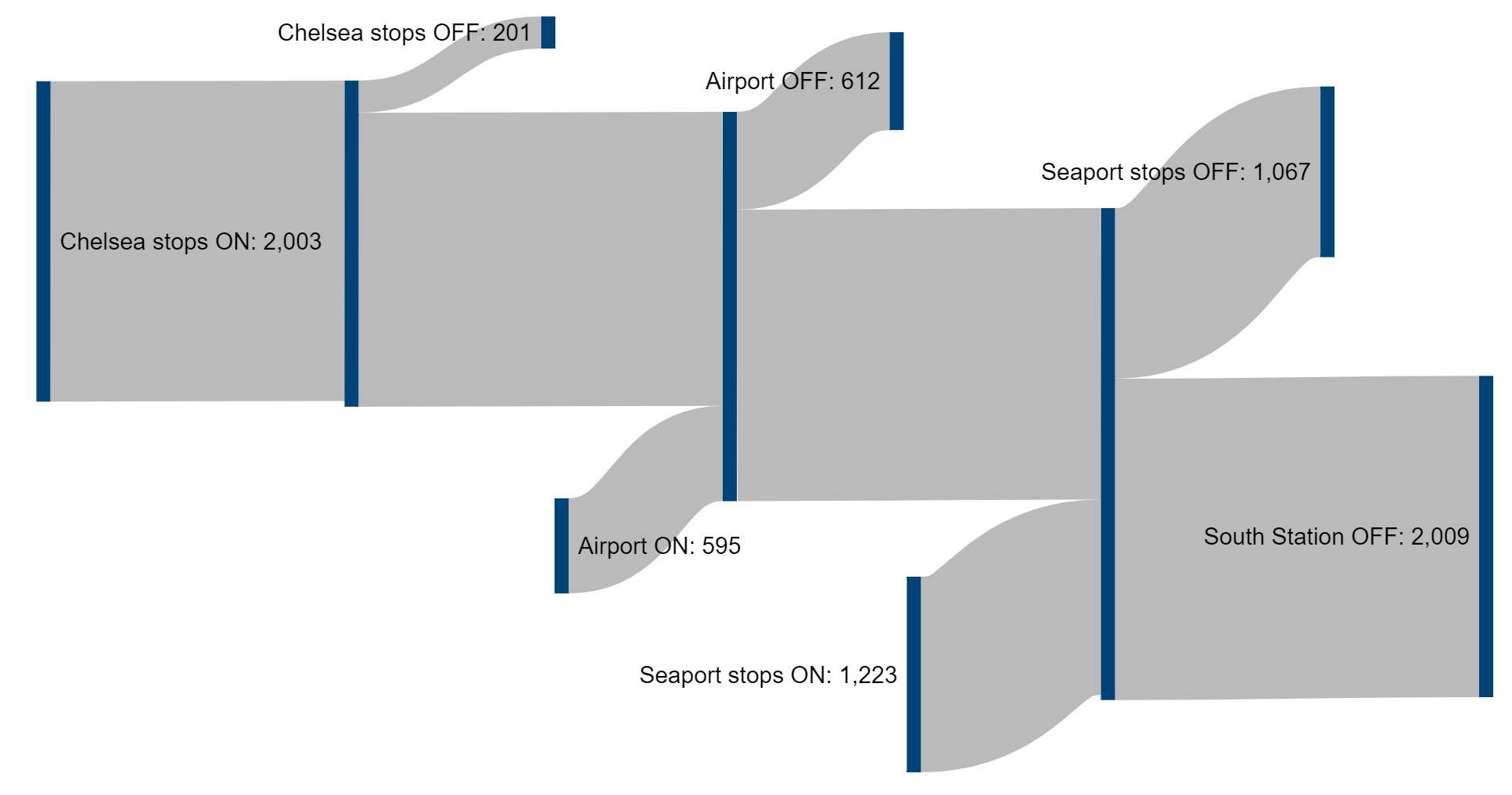
SL3 serves four destination regions: Chelsea, Airport (East Boston), Seaport, and South Station. Somewhat unusually for an MBTA service, it travels into one “hub” station — Airport — before carrying on to another hub at South Station. This leads us to ask: is ridership bifurcated into two halves, or are there a strong number of through-journeys?
Using the MBTA’s open data portal, and a Sankey diagram tool, I created this visualization:

What’s striking is that SL3 sees remarkably consistent turnover at key locations along its route: roughly as many passengers board at Airport as those who disembark, and the situation is broadly similar in the Seaport.
We can definitely conclude a few things:
- Chelsea-Airport is a significant market
- But, the majority of Chelsea customer continues through the Ted Williams Tunnel
- Airport through the Ted Williams Tunnel is also a significant market
- But is unclear whether those riders are skewed toward South Station, the Seaport, or evenly distributed between the two
- At least some Chelsea passengers ride all the way to South Station
- This number may be somewhat small (e.g. ~200 in the above diagram) or more be more sizable — it depends on how many Chelsea-Seaport riders there are, which I can’t infer from this data
SL5 riders disembarking at Downtown Crossing are likely transferring to the Orange & Red Lines, not the Green Line
The Bus Network Redesign proposes combining SL4 and SL5 into a novel route that serves both South Station and Downtown Crossing, but does so with a stop at the Chauncy Street end of the station, rather than the current stop at Temple Place.
There’s a lot to be said in favor of this plan. It simplifies the route, increases its wayfinding legibility, and raises overall frequencies thanks to the eliminated reverse-branching. Moreover, stopping at the eastern end of DTX rather than the western makes for a better transfer to the Red Line, whose platforms stretch well out to the east of the Orange Line platforms. Silver-Orange transfers remain easily available at Tufts Medical Center to the south.
The downside of relocating the Silver Line Downtown Crossing stop is that, on the face of it, it reduces access to the Green Line. Isn’t that a problem?
Examining rider transfer data
Below, I’ve gone through some data that suggests that the number of Silver-Green transfers is actually quite low. It’s a little bit fuzzy in places due to lack of available data (though if someone can point me to anything more robust, I’d love to see!), but I think it’s still thought-provoking.
The best data I could find was from the 2015-17 MBTA Passenger Survey, specifically the full raw data. For each station, the survey asked passengers about, among other things, which mode of transit they transferred from. This approach isn’t perfect for our question here — for example, Downtown Crossing is also served (somewhat indirectly) by the 7 and 11 and some express buses, but we can still investigate by comparing the subway station numbers to the Silver Line numbers.

Silver to Green vs Silver to Red/Orange
As we can see, about 600 riders boarding the Green Line at Boylston or Park Street originated on a bus; some of those may be from the 43, but the 43 had about 1,000 passengers pre-covid, while SL5 had about 10,000, so I feel fine assuming that most of those 600 were coming from SL5 — let’s estimate 500 Silver-Green transfers from SL5.
By contrast, the Red Line and Orange Line at Downtown Crossing+Park Street saw 3,630 passengers originating from bus routes. Like Park Street, Downtown Crossing is served by other bus routes; according to the Better Bus Profiles, SL5 alightings at Downtown Crossing were twice the total alightings of the 7 and 11.
So, among the Passenger Survey data, that suggests about 2,430 riders transferring to Red or Orange from buses specifically did so from SL5 (based on 66% of 3,630). That points to there being almost five times as many Silver-Red/Orange transfers as Silver-Green transfers.
(It’s worth noting that the numbers from the Passenger Survey are not absolute ridership figures — the survey had a low response rate — but they should be valid for indicating the ratios of riders from different modes and at different stops.)
Green to Silver vs Red/Orange to Silver
We can do the analysis from the other direction too: looking at Silver Line passengers and what their previous mode of transit was. Chinatown and Tufts Medical Center see ~1,600 passengers, presumably boarding almost entirely from the Orange Line (and probably boarding almost entirely at Tufts).
Downtown Crossing and Boylston see 982 SL5 passengers originating from rail, which must then be divvied up between Red, Orange, and Green at DTX, Park, and Boylston. Recall that the Red Line at Park Street saw 960 passengers originating on buses, which suggests that most of those 982 riders are Red-Silver transfers, not originating on Green or Orange. (The high number at Tufts suggests that it’s the primary Orange-Silver transfer.)
Trying to unravel the exact breakdown of Red-Silver vs Orange-Silver transfers at Park/DTX gets fuzzy very quickly. But we know the following with high certainty:
- The Orange and Red Lines at the core stations receive about ten times as many bus-originating passengers as the Green Line.
- Pre-pandemic, SL5 provided two-thirds of all bus passengers alighting near Downtown Crossing (among SL5, the 7 and the 11), and likely provided about ten times as many passengers as the 43 — meaning that a large fraction of the bus-originating transfers mentioned above simply have to come from SL5
- Put those together, and it suggests that only a small fraction of SL5 riders do a Silver-Green transfer
So, in my opinion, that suggests that relocating the Downtown Crossing Silver Line stop — doubling the frequency of service there — is a reasonable tradeoff.
Benefits even to Silver-Green riders
Furthermore, I’d argue there are benefits to Silver-Green passengers to the relocation.
First, the frequency increase means that even with a longer walk, their overall journey time may be equal or better.
Second, the inbound Silver-Green transfer requires an unprotected walk of over 500 feet at street level. On a nice day, this is fine. During the 130 days in a Boston year (one in three) when we have precipitation, or the full four months of the year when the average temperature is below 40° F, being able to exit Downtown Crossing at Chauncy Street and walk right across the street to a Silver Line stop (and be able to wait in the protection of the station vestibule until the bus is in sight) will be better.
Moreover, by redirecting transfers between Green and Silver through the Winter and Summer Street concourses, the T will be able to provide better wayfinding signage, making the system more welcoming for new riders.
Overall, relocating the Silver Line Downtown Crossing stop seems like a reasonable compromise. It appears likely that it will benefit most riders (including Silver-Red transfers, which will be much faster), and will have benefits and tradeoffs for the remaining others.
